
Global
Looking for great mobile app designs? Explore a collection of the best mobile app UI/UX design examples and get inspired. See how top apps create smooth user experiences, clear navigation, and eye-catching interfaces.

Looking for great mobile app designs? Explore a collection of the best mobile app UI/UX design examples and get inspired. See how top apps create smooth user experiences, clear navigation, and eye-catching interfaces.

Not able to find the right Mobile App Card UI design? Cards are a crucial part of mobile app UI, making content easy to scan and interact with. If you're struggling to find the perfect design, we’ve got you covered. Explore real-world Mobile App Card UI Design Examples to get inspired and create user-friendly, visually appealing interfaces.

Here are some of the most impactful and engaging app home screens for your inspiration. Browse through our collection, and don’t forget to bookmark this page for the latest updates!
A minimal, brand-aligned login screen with dark theme elements and quick access—great for design tools prioritizing flow continuity.
A swipe-friendly, modular card layout optimized for food browsing and discovery. Emphasizes visual hierarchy and tap zones for fast ordering.
A data-focused homescreen with clear vertical structure and bold CTA sections—ideal for apps emphasizing goals, stats, and daily tracking.

Bright, travel-focused layout with friendly visuals and fast access for mobile users. A great example of category-driven login UI.

Bold typography and instant-action layout make this login screen ideal for auction or live-selling platforms requiring urgency.

Sleek and fashion-forward login design with strong visual emphasis and minimal input fields—ideal for luxury or e-commerce brands.

Clean and distraction-free design using calming visuals and soft UI cues—perfect for wellness or mindfulness apps.

Business-focused login with a corporate yet welcoming tone. Prioritizes form structure and trust cues for professional tools.

Premium dark-themed login screen with luxury aesthetic and strong typography. A refined example for finance or lifestyle apps.

Gaming-inspired interface with strong brand colors, secure UX, and cross-platform sync. Great for real-time community platforms.
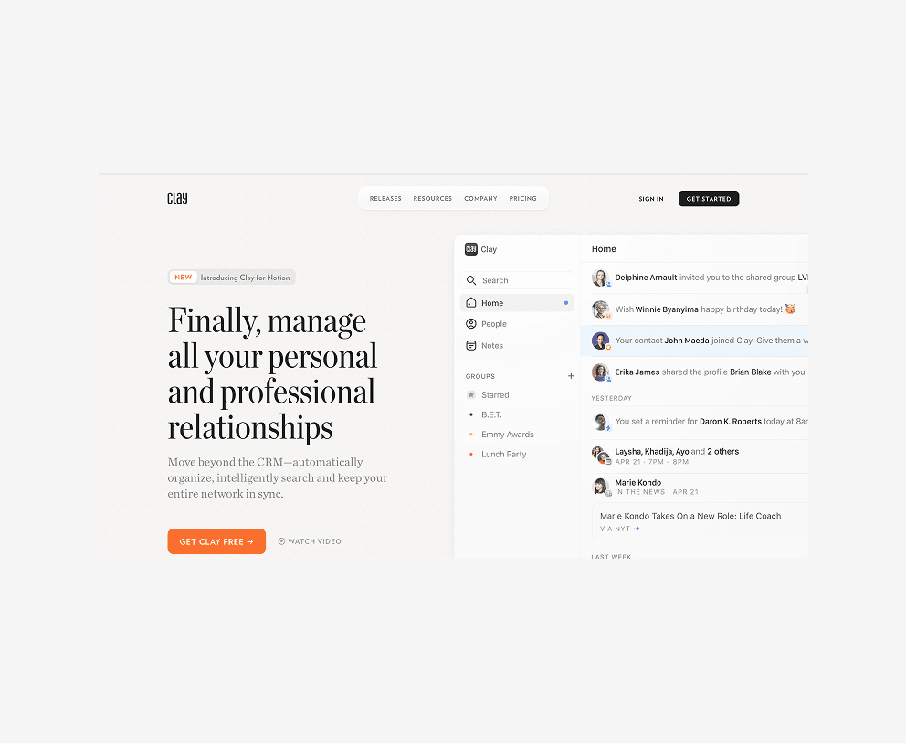
Neutral, minimal design with focused form layout and smart structure. Ideal for productivity or contact management mobile apps.

Clean, task-focused cards with visual tags and minimalist layouts. Perfect for organizing workstreams and status indicators on mobile.

Bold, minimal cards designed for speed and clarity. Uses large type and spacing to highlight balances, boosts, and financial summaries.

A utility-driven card interface with fast-access action buttons, location highlights, and travel summaries in digestible modules.

Conversational UI with profile-led, swipeable cards. Prioritizes media, avatars, and simplified call-to-actions for personal engagement.

Well-structured travel cards separating bookings, dates, and offers. Great model for content-dense layouts with mobile responsiveness.

Polished and luxe-feeling cards using sharp typography, dark themes, and elevated visuals—ideal for financial tools or loyalty programs.

Uses soft colors and card segmentation to guide wellness journeys. Thoughtful balance of content hierarchy and emotional design.

Highly flexible modular cards that adapt to content types—checklists, notes, or docs—offering UI inspiration for creative organization apps.

Contact-centric card UI with clear structure and micro-interactions. Leverages space and labels for relationship-focused mobile tools.

Multiservice hub-style layout using icon grids, smart hierarchy, and fast-access visuals—great for super-apps or bundled service tools.

Card-driven layout that emphasizes data clarity, investment insights, and quick-action buttons—perfect for fintech dashboards.

Modular, component-based design with real-time collaboration features surfaced early. A strong reference for productivity and team apps.
Soft visuals, white space, and minimal interface cues help users ease into tasks. Ideal for wellness and mindfulness mobile journeys.

Social and financial activity blend in a scrollable feed. Great inspiration for apps merging communication and transactions.
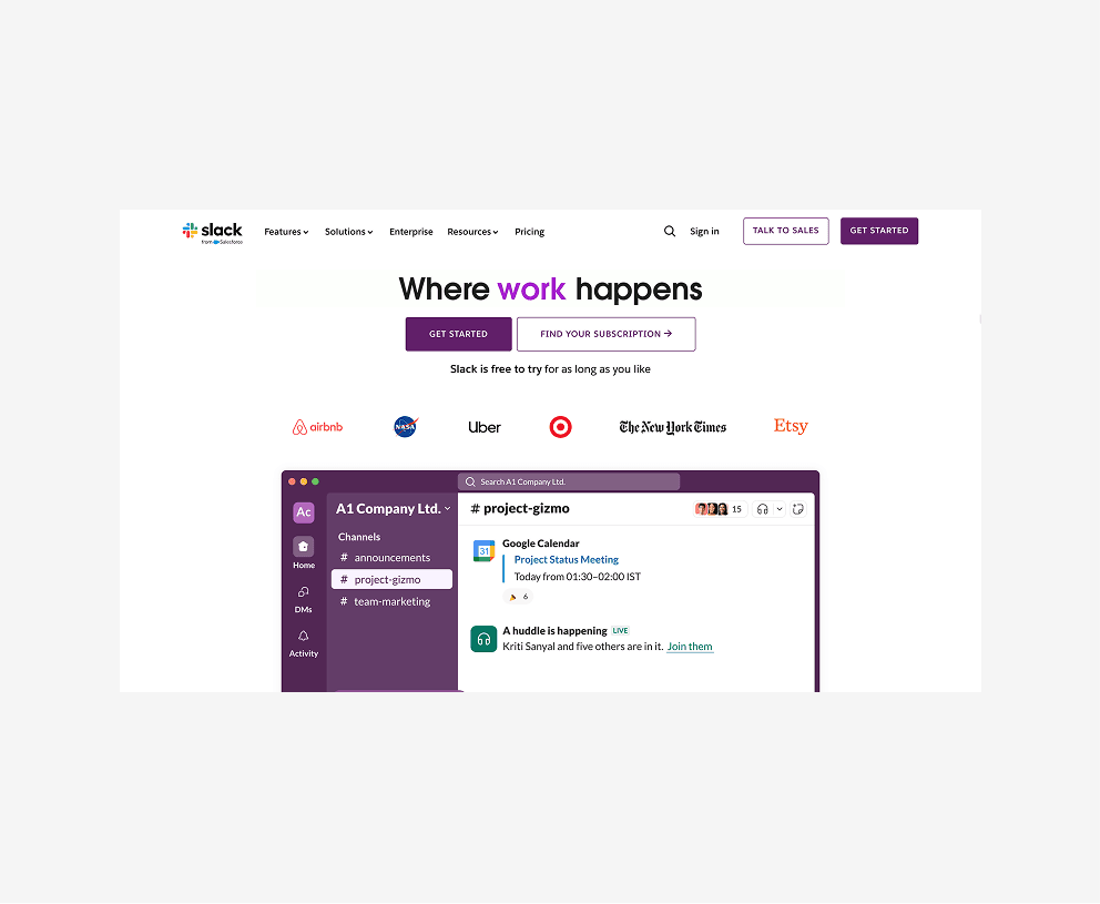
Segmented cards for channel updates and mentions. Prioritizes clarity and hierarchy for communication-heavy apps.

Bright and modular layout showcasing balances, goals, and recent transactions. An intuitive model for personal finance UIs.
Visually balanced layout with emotion-driven illustrations and habit trackers. A great design for routine and mood-based guidance.
Relationship-centered structure that organizes contacts, reminders, and insights using soft cards and clean list views.
A great mobile app is more than just good looks. Your users want an app they can rely on—one that feels effortless to use. If navigation is confusing or interactions feel slow, they will leave. A well-designed UI/UX ensures that every tap, swipe, and scroll makes sense. It helps users complete tasks quickly without frustration.
Every element in your app should serve a purpose. Cluttered screens, unnecessary steps, or unclear buttons create friction. A smooth and intuitive design keeps users engaged. It makes their experience simple and enjoyable, increasing the chances they will keep using your app.
Finding the right inspiration for your mobile app design can be challenging. To make it easier, we have researched and listed some of the best mobile app UI/UX design examples. These include login screens, app card designs, home screens, and more. Whether you are designing a new app or improving an existing one, these examples will help you create a better user experience. If you need any guidance, our team is here to help.
We are a leading UI/UX design agency with a strong presence in India, the USA, the UAE, and the UK. With experience serving over 300 global brands, including Coca-Cola, Pizza Hut, Gartner, Kawasaki, and G42 Group, we understand what makes a great app. Our team specializes in creating intuitive, user-friendly designs that improve engagement and usability.
A great app design makes using the app easy and enjoyable. It should feel smooth, intuitive, and visually appealing. Every detail matters, from how users navigate to how quickly they complete tasks. Here are the key elements of a well-designed mobile app:


