Global
Industry
Enterprise
Services Provided
Brand Strategy
Brand Research
UI UX Design
Marketing Collateral
Logo Design
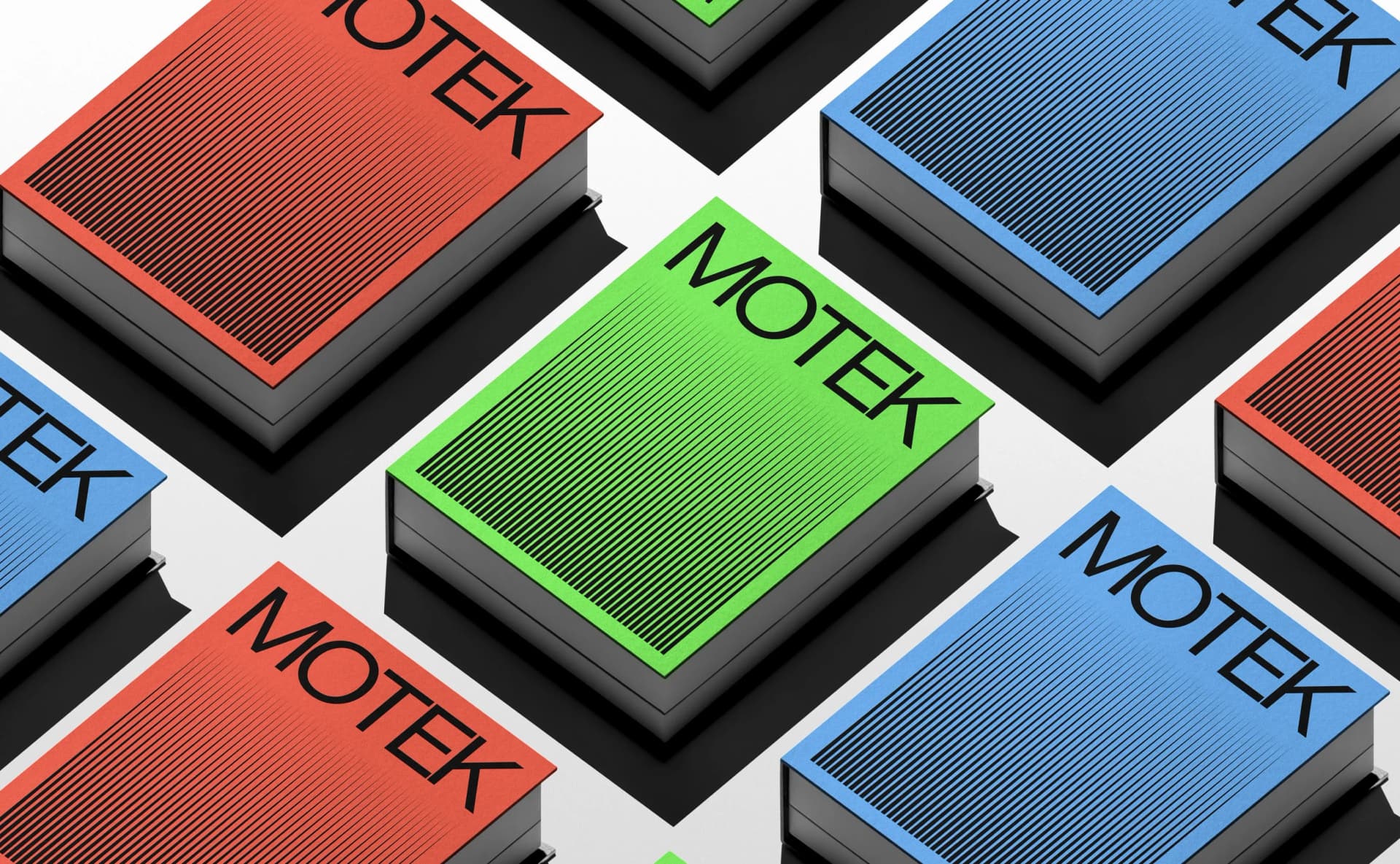

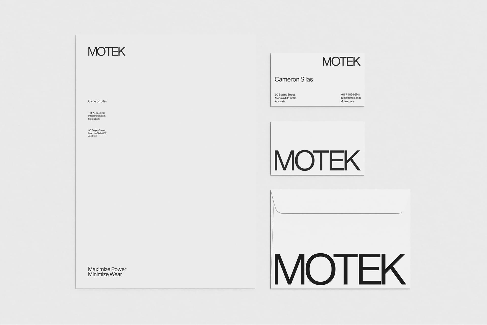
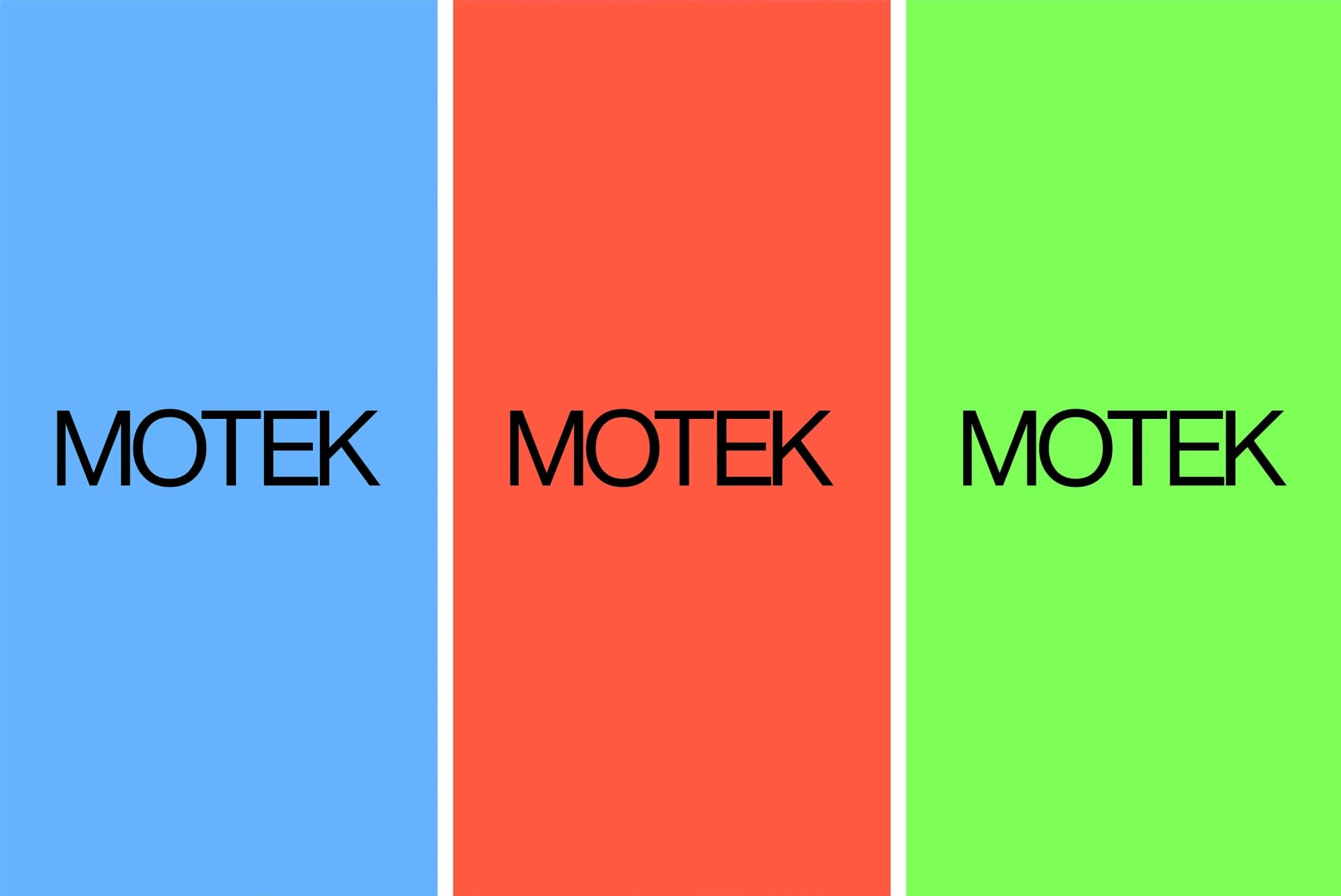
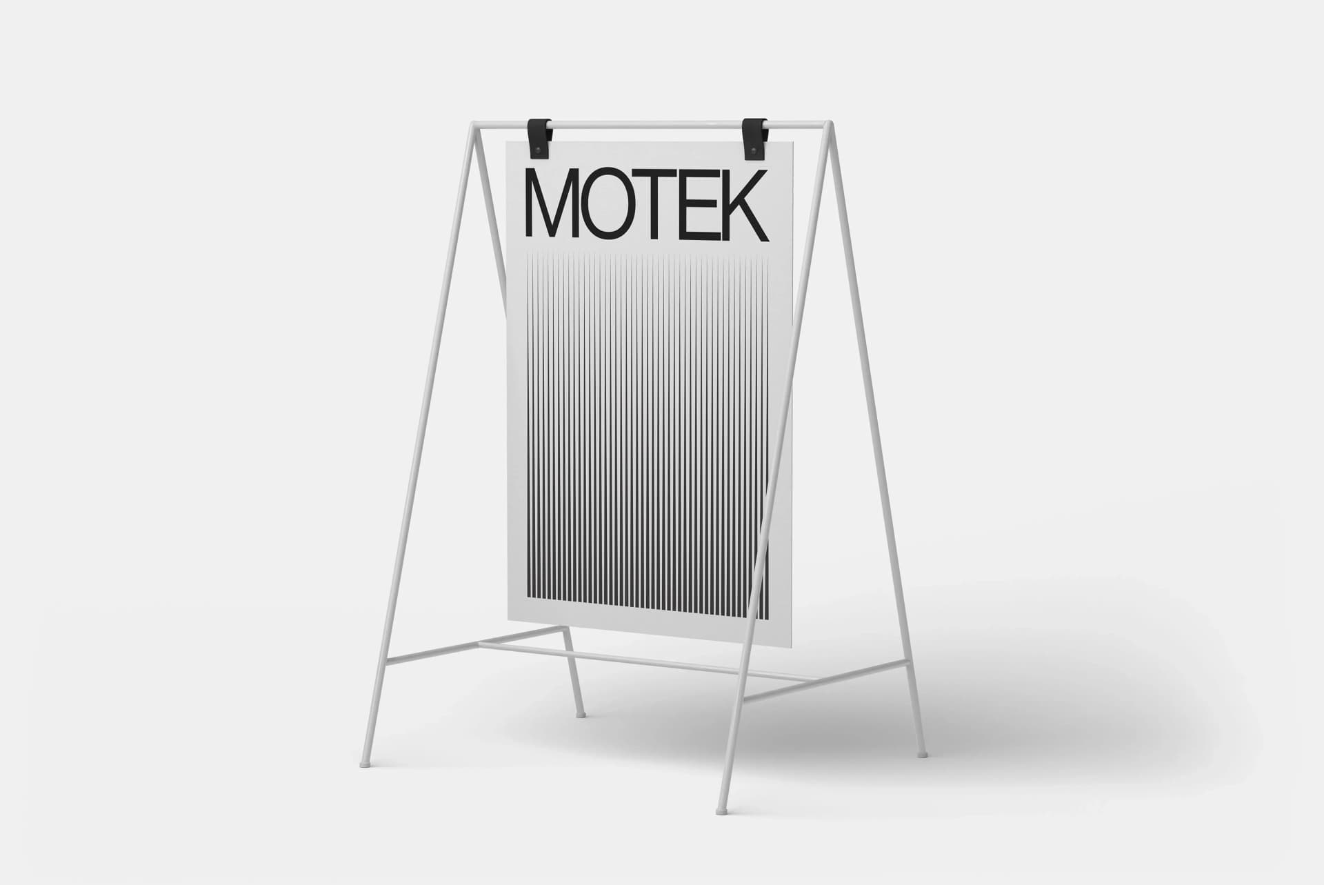
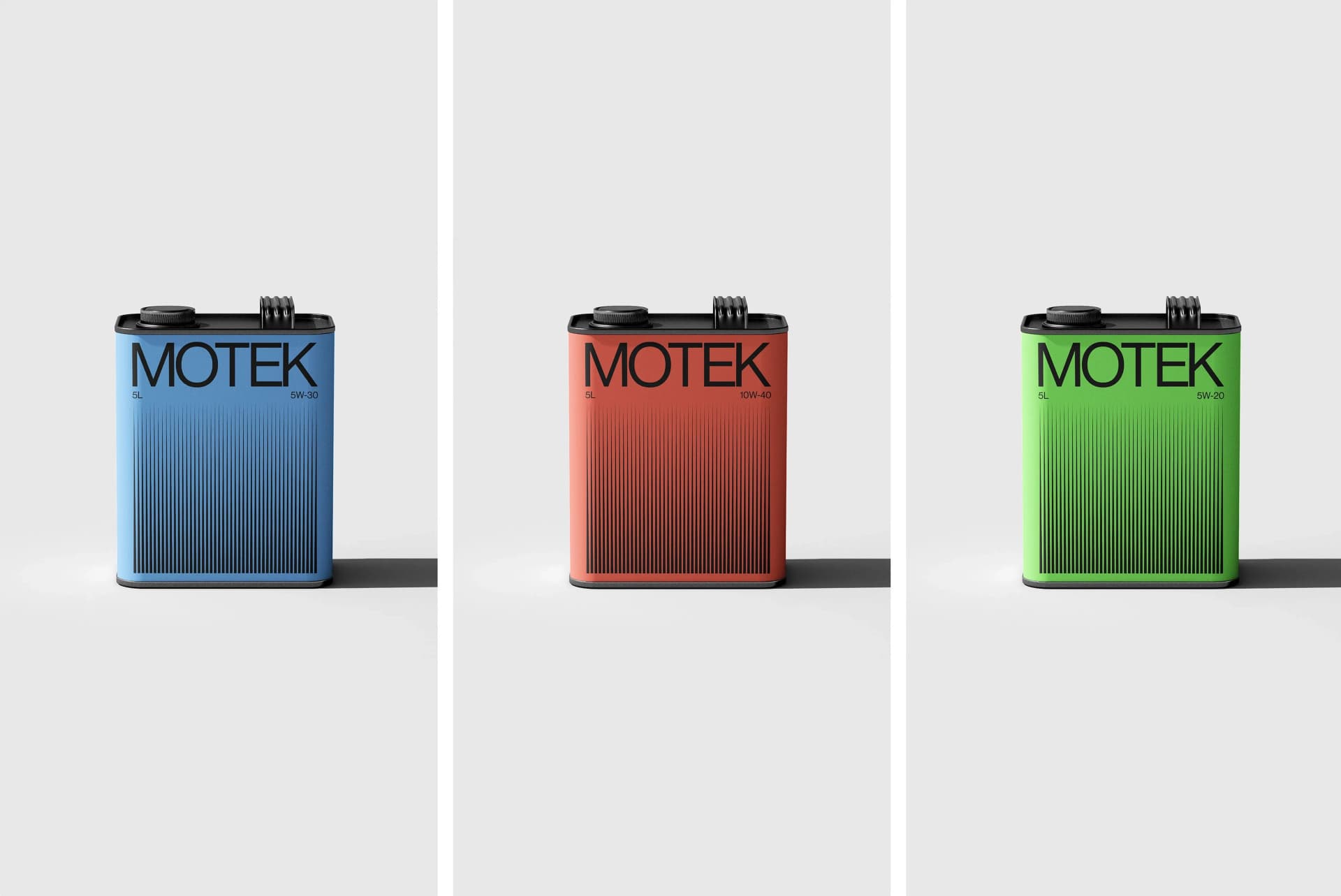
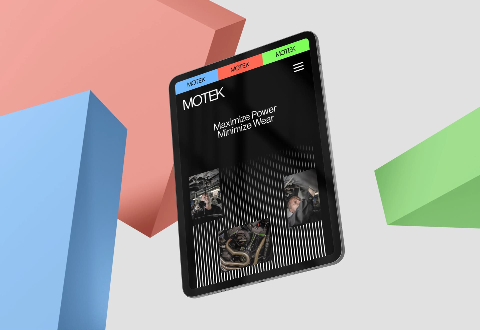
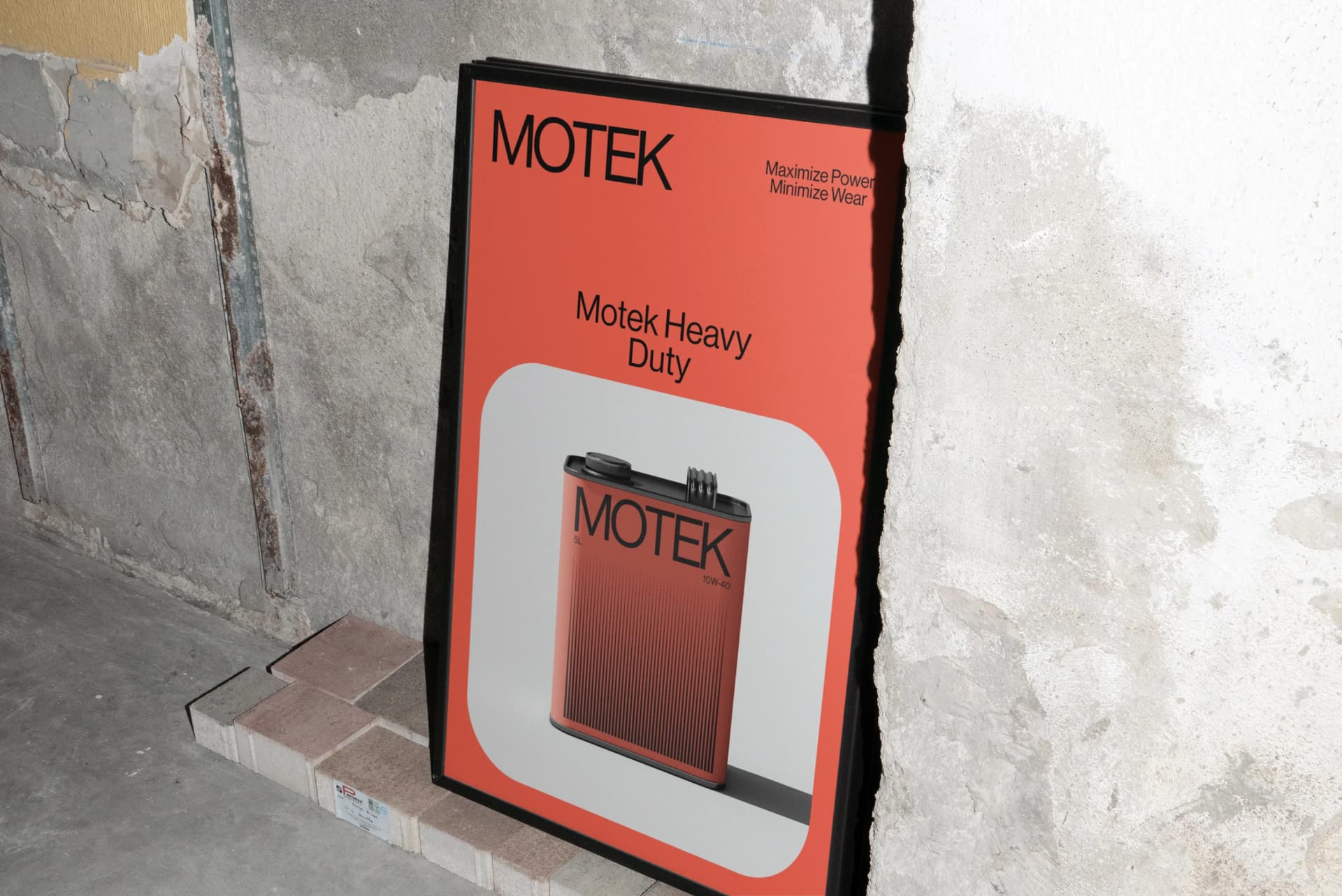
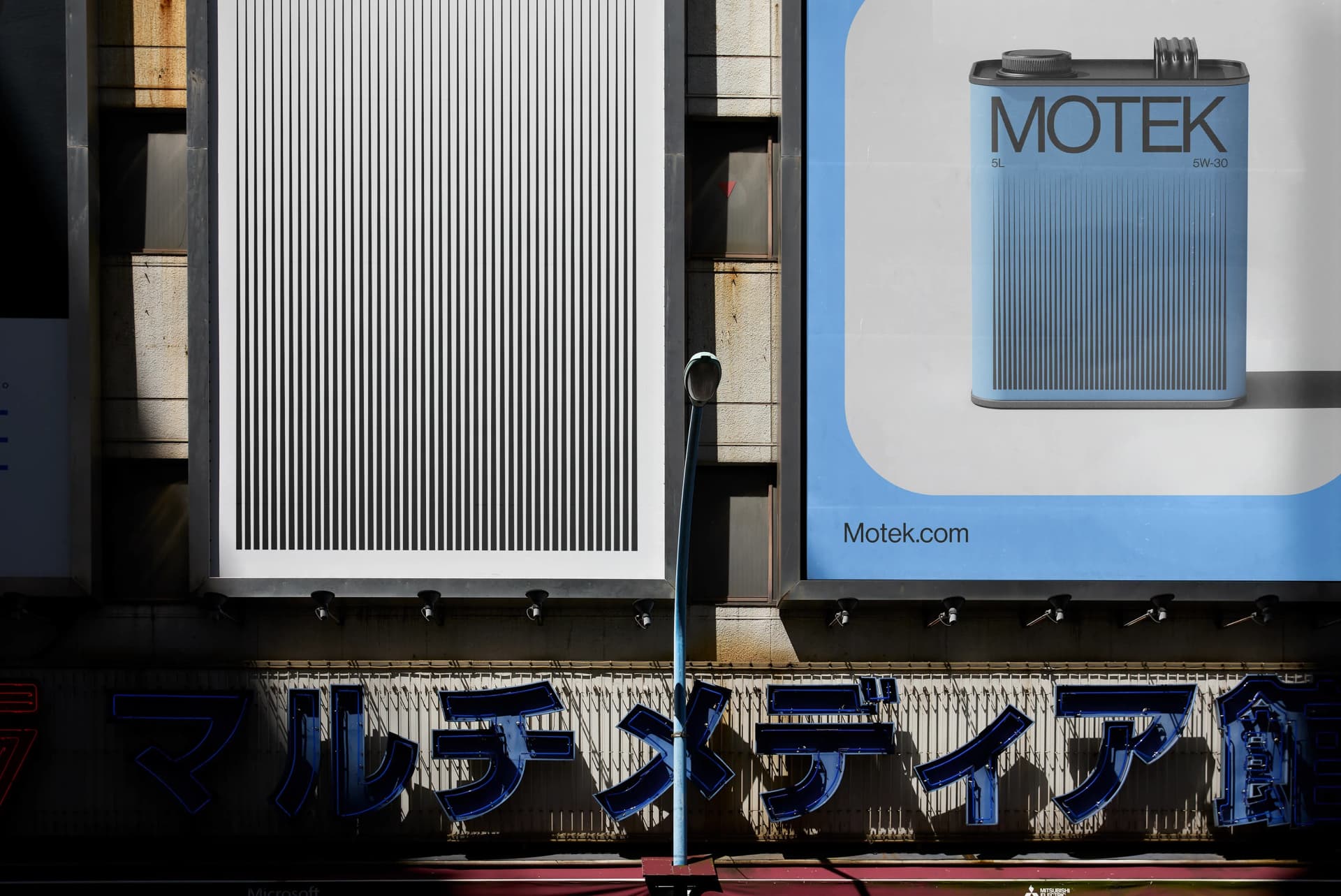
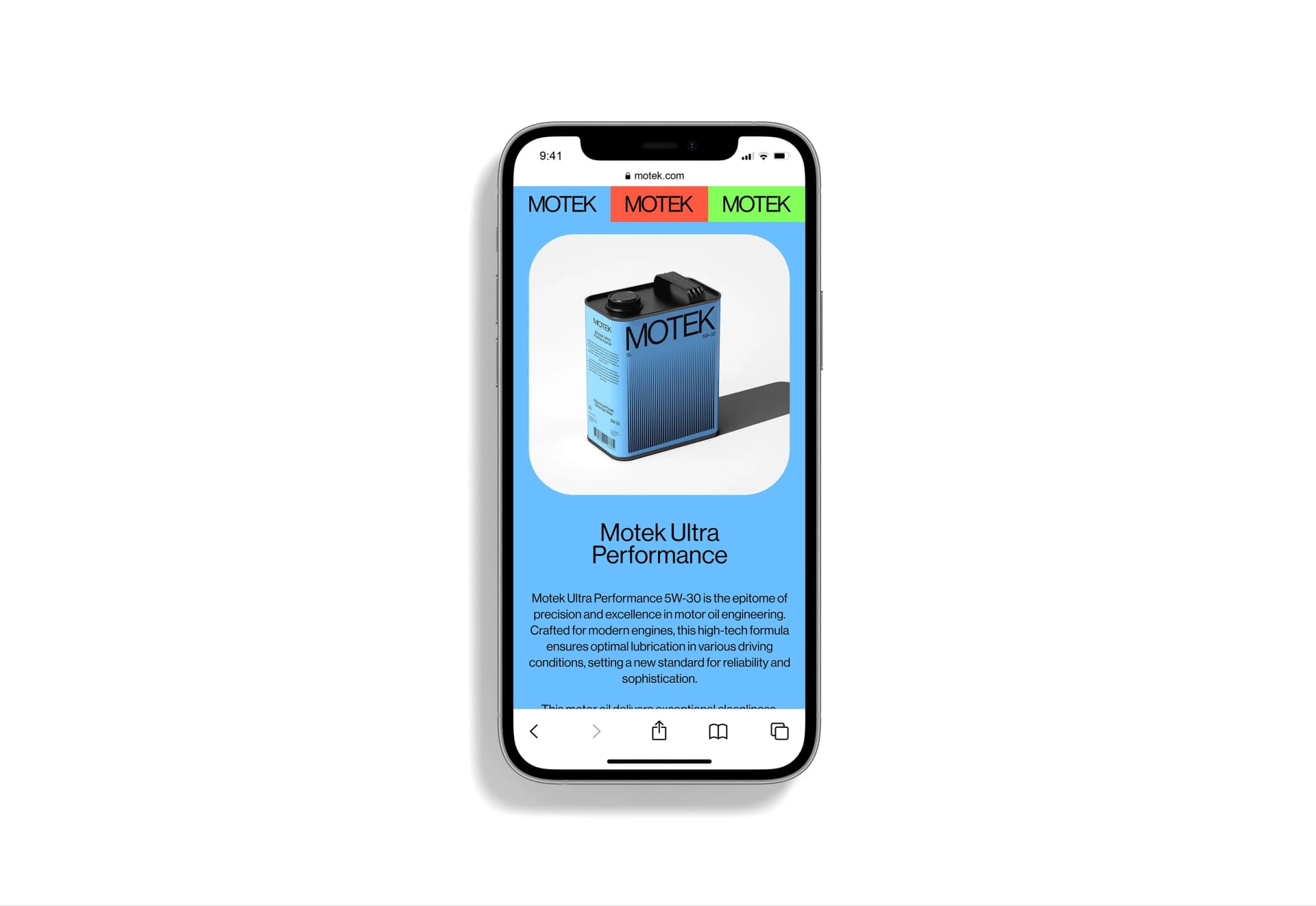
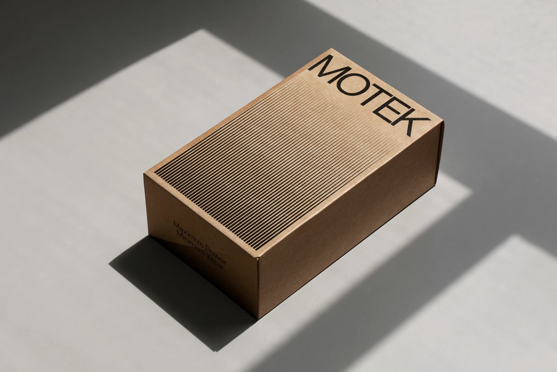
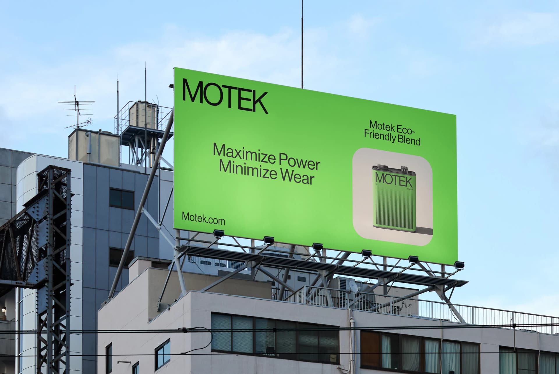
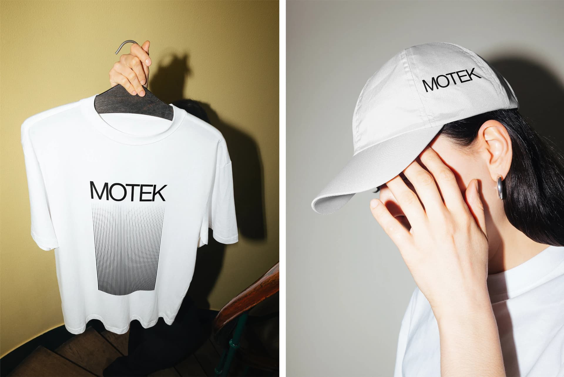
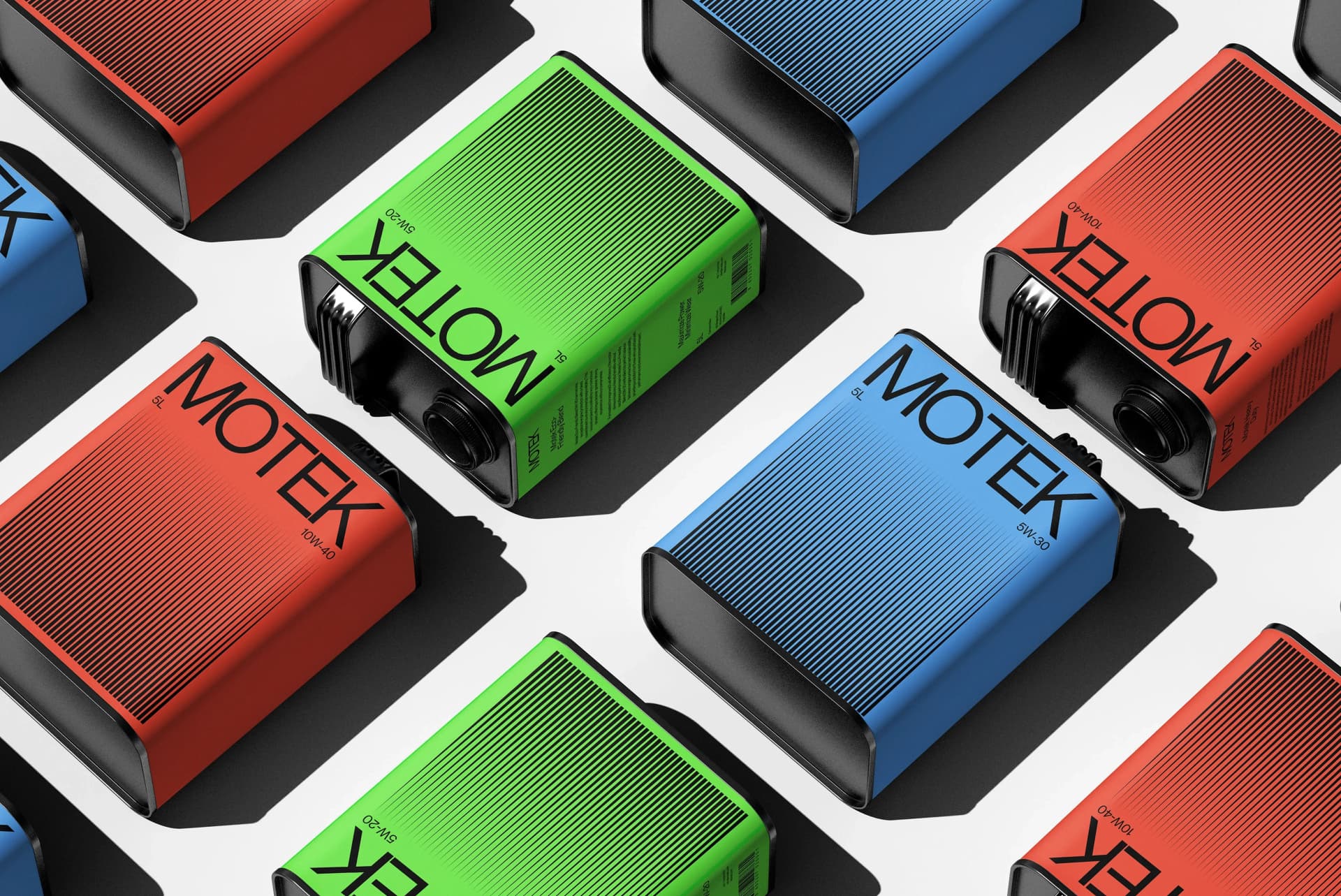
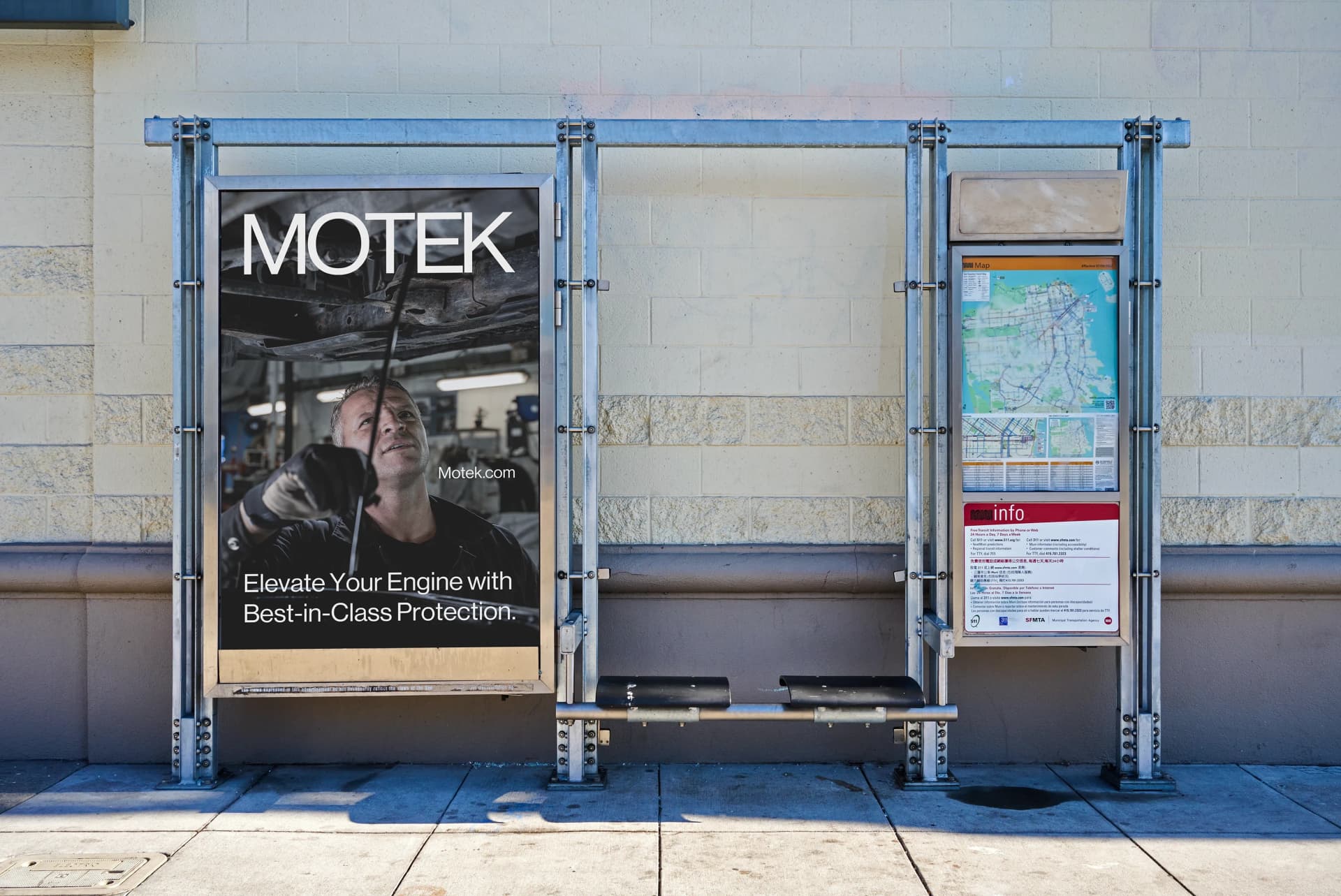
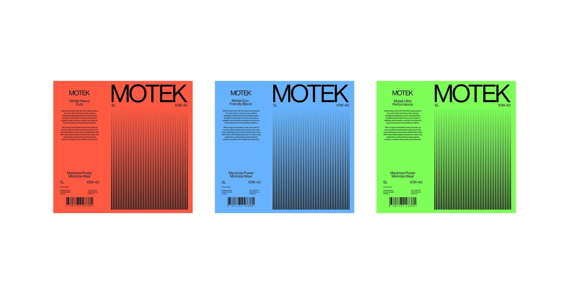
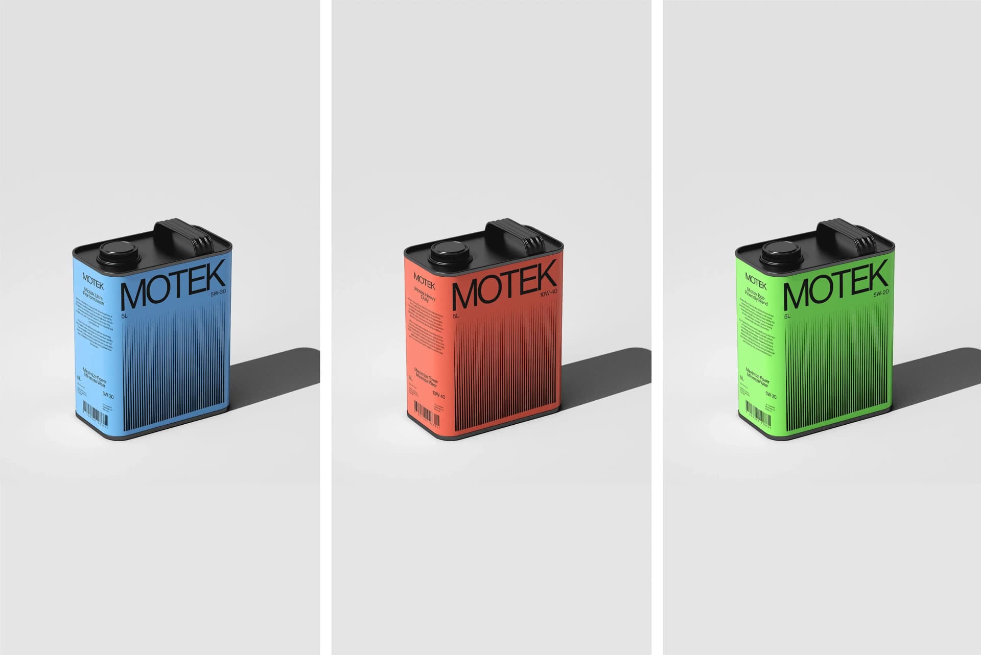
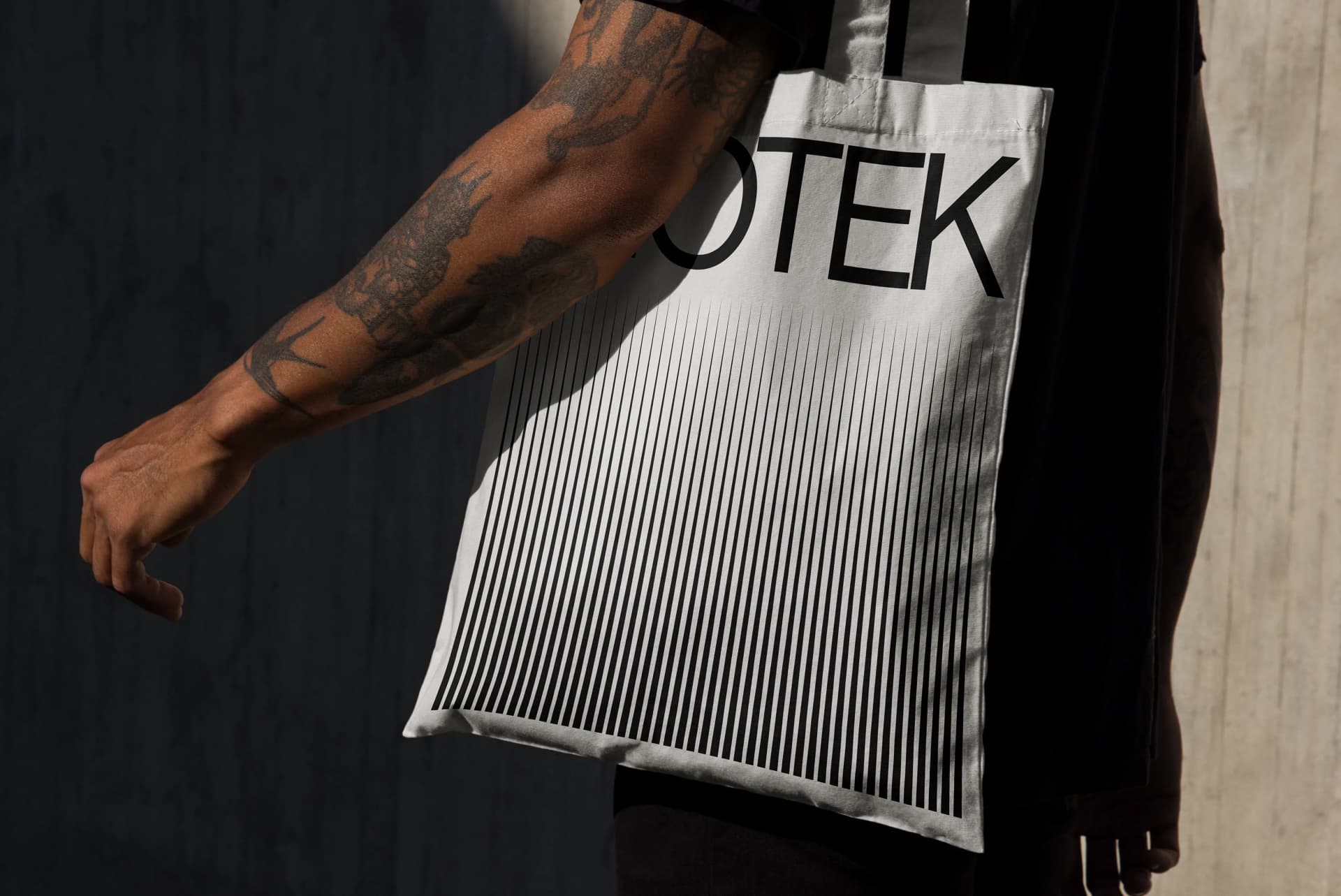
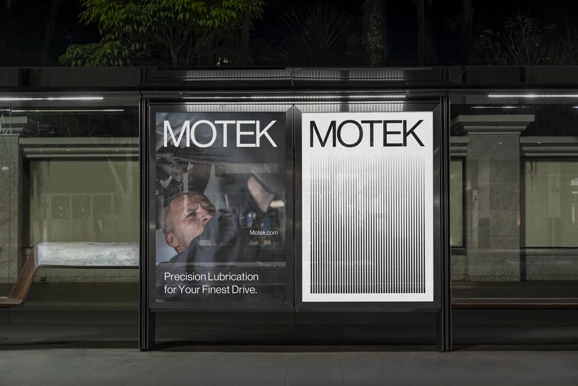
Motor oil isn't glamorous, but it's essential. Every engine depends on it. Yet most motor oil brands look interchangeable: generic packaging, forgettable logos, no real identity beyond technical specs. Motek wanted to break that pattern. They came to Tenet with a clear goal: create a brand that felt as precise and reliable as the product inside the bottle. We built the "Motek Fluid Refresh" identity around those core values. The logo uses deep blues and metallic tones that communicate both modernity and trustworthiness, standing apart from the sea of red and yellow packaging that dominates the category. The packaging system prioritizes clarity, with viscosity labels that are easy to read and graphics that engage rather than overwhelm. Every element reinforces the brand's positioning around precision and performance, captured in taglines like "Precision Drives Performance." The visual identity extends seamlessly across digital platforms, where Motek emphasizes quality and innovation, and social media, where limited edition promotions and consistent engagement keep the brand relevant and exciting. The result is a motor oil brand that doesn't just sit on a shelf waiting to be picked, it commands attention and earns trust before the customer even reads the specs.
Impact Delivered
450+
Solutions Delivered
for our clients & partners
20M+
People Impacted
through our solutions
15+
Countries Catered
for our global clientele
98%
Client Satisfaction
through verified reviews
Explore other works

We’d love to hear about your brand, your visions, current challenges, even if you’re not sure what your next step is.
Let’s talk


