
Global
In this collection, we explore some of the best SaaS UI/UX design examples that balance aesthetics, usability, and functionality. Whether you're building a new platform or refining an existing one, these curated designs will inspire you to create a seamless, user-friendly SaaS experience.

A great onboarding experience helps users get started quickly and see value fast. Our expert designers have curated some of the best SaaS onboarding examples to show what works. Explore these real-world examples and get inspired to create a seamless, user-friendly onboarding flow for your SaaS app.

Looking for inspiration for the homepage for your SaaS website? Explore our list of the best SaaS homepage designs and UI examples. We’ve curated 30+ high-quality designs that showcase effective layouts, clear messaging, and user-friendly navigation. Get inspired and create a homepage that converts.

Looking for inspiration to design a high-converting SaaS pricing page? We’ve curated 30+ of the best SaaS pricing page examples to help you get started. These designs showcase clear layouts, smart pricing strategies, and user-friendly experiences. Browse through the list, see what works, and use these ideas to create a pricing page that drives conversions.

Looking for inspiration to create a high-converting signup page? Our expert designers have curated some of the best SaaS signup page design examples from top brands worldwide. See what works, learn from proven designs, and build a signup flow that turns visitors into users.

Team Tenet has curated some of the best SaaS login page design examples to inspire you. Explore these designs to see how top platforms create simple, secure, and user-friendly login experiences. Use these ideas to design a login page your users will love.

Explore some of the best SaaS dashboard design examples to get inspired. Whether it's a user-facing dashboard or an admin panel, a well-designed interface makes data easy to understand and actions simple to take. We create dashboards that are engaging, visually clear, and built for real-world use.
An inviting, visually-led onboarding that guides users through template selection and tool capabilities with minimal friction and strong visual cues.
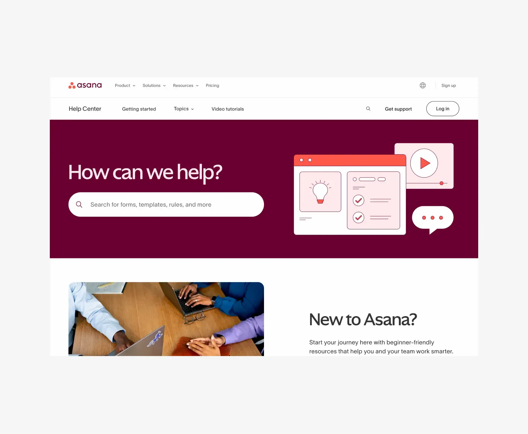
Discover Asana’s intuitive onboarding flows to streamline team setup and ensure smooth project transitions.

Notion personalizes onboarding to meet user needs, boosting engagement and encouraging long-term use.
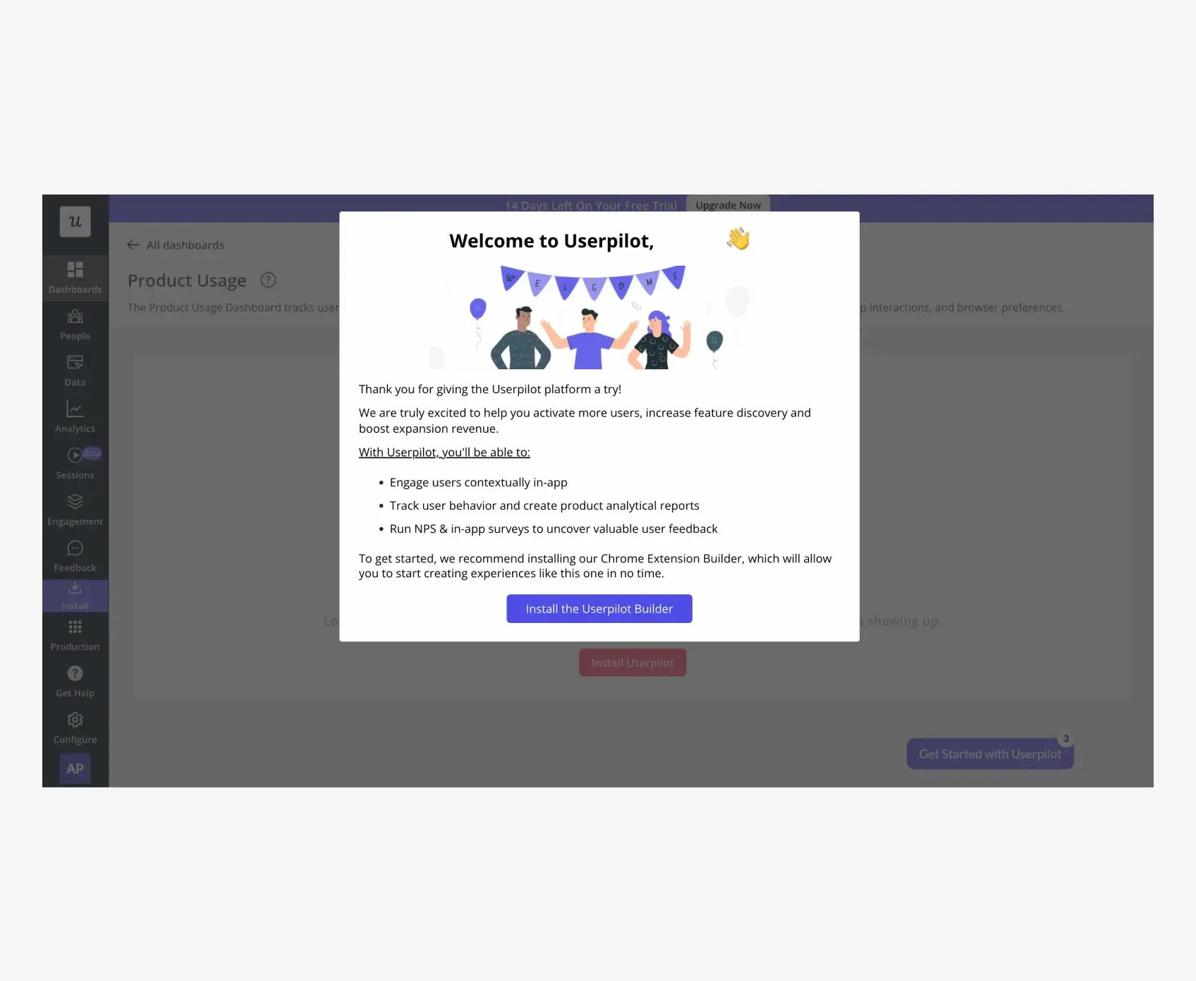
Adaptive onboarding with dynamic tooltips, modals, and checklists. Personalizes flows based on user actions and behavioral cues.

Uses a clean setup wizard and educational prompts to streamline account linking and dashboard familiarity for social media teams.

Minimalist flow with illustration-led guidance. Focuses on role-based journeys and simple form-based task orientation.

A strong SaaS homepage example with focused messaging, quick navigation, and a lead-capturing hero layout that balances clarity with visual energy.

Clean, compliance-focused layout that shows how to organize dense content with trust signals, minimalist CTAs, and subtle data visuals.

High-impact visuals and modular grids show how storytelling and visual hierarchy can drive exploration and conversion in creative tools.

Developer-focused homepage with a dark UI, tech-centric copy, and interactive elements that speak to performance and ecosystem value.

Bold typography and a dark theme convey a modern, tech-heavy feel, while placing emphasis on speed, collaboration, and ease of access.

A polished, upscale homepage example with editorial-style layout, brand-forward visuals, and centered messaging for premium positioning.
Clear tier breakdown, strong CTA hierarchy, and a balance of copy and whitespace make Notion’s pricing page ideal for scalable freemium models.

A great example of feature comparison in a card layout with clean toggles and upfront plan summaries tailored for collaborative tools.

Minimal, no-fluff layout focusing on trust-building with transparent pricing tiers and compact descriptions. Ideal for AI or tech-forward tools.

Visually segmented layout with email capture and demo nudges makes this an example of gated pricing flows that support sales-led growth.

High-contrast, dark UI pricing with bold typography—great inspiration for AI tools and developer-focused products with sleek branding.

Straightforward and playful. Great use of calm colors, trust indicators, and pricing cards without heavy feature noise.

Bright, goal-oriented onboarding path with financial guidance elements. Uses illustrative storytelling to build trust in a complex domain.

Frictionless setup using a conversational tone, inline tutorials, and collaborative space introductions for first-time users.

Code-free, structured onboarding with tooltips and task checklists. Prioritizes user autonomy and progress visibility.

Onboarding optimized for task execution — walks users through document creation with sample templates and prefilled content.

Onboarding flow tailored for marketers with guided walkthroughs on campaign setup, segmentation, and automation logic.

Emotionally engaging onboarding with a storytelling approach. Incorporates family photos and memories to make setup feel personal.

Efficient onboarding with bold CTAs and product tours. Emphasizes value proposition and helps users launch outreach quickly.

Focuses on action-led onboarding — simplifies document e-signing with clear steps, minimal design, and smart form fields.

Intuitive and sleek onboarding with AI-powered hints. Tailors the product walkthrough to boost user productivity from the first login.
Soft colors and spacious design make this homepage ideal inspiration for calm, collaborative SaaS platforms with async workflows.
A homepage that blends product functionality with conversion cues. Great reference for showcasing features with demo-led storytelling.
A refined example of homepage minimalism, with focused messaging and high-contrast sections that support automation-first products.

Vibrant, interactive layout combining community energy with clarity. A great case of visual storytelling for creative collaboration tools.

Layered sections, case studies, and trust signals converge in this homepage that balances enterprise credibility with product accessibility.
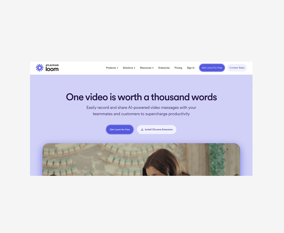
Engaging homepage with demo-first orientation. Ideal inspiration for showcasing one core feature (like video) as a hero-level asset.

Tech-savvy yet humanized, Stripe’s homepage is a blueprint for complex product storytelling with crisp visuals and high trust value.

A data-rich layout that makes analytics accessible. Strong example of balancing technical depth with startup-friendly visual tone.

Developer-focused homepage that uses clarity, cards, and a pricing CTA approach to serve scale-up SaaS or infra platforms.

Content-heavy layout broken into digestible zones. Great use of badges, performance claims, and documentation-forward navigation.
Beautifully simple SaaS pricing layout using clean typography, subtle colors, and logical tier organization. Perfect for async work tools.
Effortless layout with toggled pricing and succinct plan descriptions. A strong example of how onboarding tools can sell by clarity.

Robust layout with feature-based comparison and toggle options. Great inspiration for platforms with tiered usage models or integrations.
Data-rich yet lightweight. Emphasizes scalability, engagement stages, and plan depth while staying accessible with minimal distraction.
Focused pricing block with conversion-led language and CTAs for outreach tools. Highlights benefits over features with simple visuals.

Compact, trust-driven pricing layout with testimonials and social proof integrated below plan cards. Works well for SaaS legal tools.
Vivid, colorful layout with plan separation based on team sizes. Great use of personality in an otherwise standard tiered layout.
Layered pricing design with optionality and upsell paths. Excellent for AI or customer support platforms with tiered add-ons.
Simple, modular pricing blocks with usage examples and toggles. Ideal for tools offering core freemium functionality.

Lightweight, ecommerce-friendly pricing page with great use of iconography, visual contrast, and single-plan messaging.
A clean and conversion-friendly sign-up flow with a focused layout, prominent CTA, and minimal fields to reduce friction during onboarding.
Quick, engaging, and minimal. Figma’s sign-up UI uses smart hierarchy and progressive disclosure for a frictionless entry into the platform.
Developer-friendly sign-up with elegant layout and efficient form handling. Sets a benchmark for payment tools prioritizing clarity and trust.
Straightforward and distraction-free. A great example of single-page sign-up UX designed for rapid access and reduced cognitive load.

Simple layout with visual hierarchy optimized for user testimonials. A smooth and inviting entry point for first-time users.

Compact and intuitive. AliDrop showcases a signup form designed for speed, conversion, and drop shipping-specific onboarding goals.

Structured sign-up with social proof, clear tier differentiation, and minimal input friction. Perfect for AI or SaaS content tools.
A clean, B2B-focused sign-up interface with gated access elements. Balances form usability with messaging around personalization.
No-code friendly layout with logical grouping and trust indicators. Great example of an onboarding-centric sign-up experience.
Streamlined form with headline clarity and guided onboarding steps. A model sign-up for SaaS tools focused on communication.
Quick-start design that leads with demo imagery. The layout encourages users to take the first action fast—ideal for tools with freemium models.
A minimalist, distraction-free login screen focused on productivity. Strong use of white space and clear CTAs ensure fast, secure access.
Clean layout with brand consistency and high usability. Great inspiration for secure login flows that integrate support or multi-tool access.
Functional, enterprise-ready login interface with document-focused layout. Demonstrates clarity for tools requiring strong access control.
Bold and modern login design, using high-contrast elements and clean navigation—ideal for B2B SaaS platforms with data-rich dashboards.
Login UI with human-first design. Strong visual cues and simplicity make it approachable for platforms with media-based workflows.
A commerce-oriented login with clear input fields and crisp layout. Great model for SaaS tools dealing with store or order management.
Engaging login with well-structured segmentation for content creators. Smart layout makes it fast to access core tools post-login.

Professional and data-heavy login interface. Uses minimalism and smart typography for tools offering deep insights and analytics.

Straightforward login screen that prioritizes speed and trust. A useful reference for tools that offer quick access to document editing.

Secure login design with dark theme aesthetics and professional tone. Ideal for fintech or trade-based platforms with regulatory needs.

Balanced login UI with illustrated brand elements and clear navigation. Works well for business management platforms requiring CRM access.
A clean, finance-focused dashboard that excels in minimalist design, easy data segmentation, and intuitive balance between summary and detail views.

Dark-themed dashboard with clear side navigation and dense yet digestible data. Great example for multi-location or operational tracking UIs.

Highly customizable dashboard with modular widgets, bright visuals, and layered navigation — a strong reference for task or workflow tools.

Commerce-focused dashboard with visual hierarchy for quick metrics, trend graphs, and clear CTAs. Ideal inspiration for real-time sales data views.

Streamlined dashboard designed around scheduling and analytics. Combines utility with brand familiarity and real-time user insights.

IT-centric SaaS management UI with detailed data cards, security alerts, and usage visuals. Great model for dashboards handling layered access control.
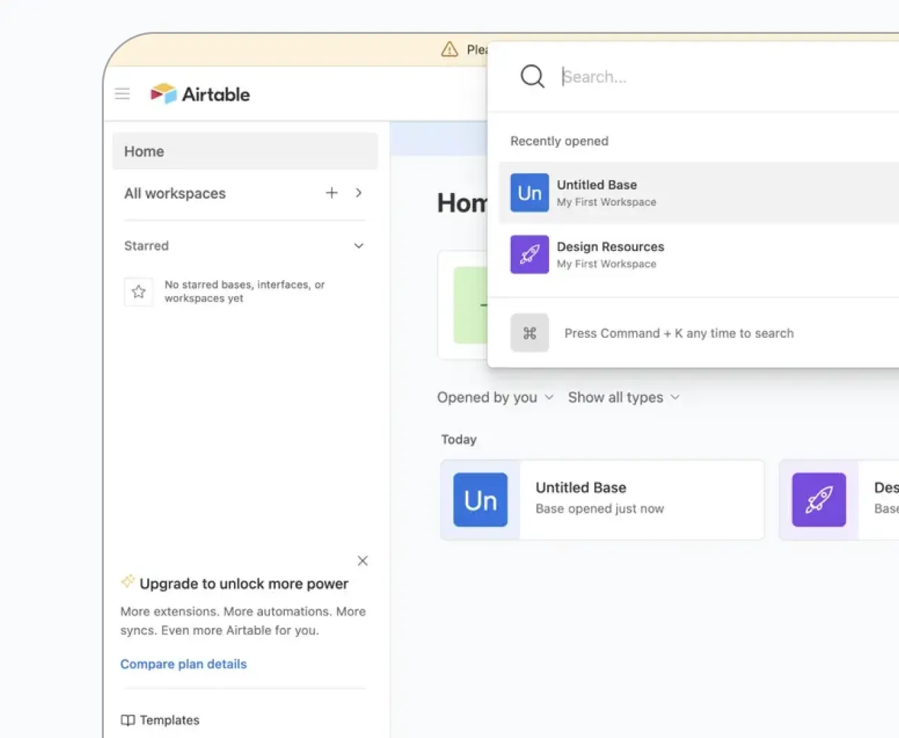
A flexible, grid based dashboard that adapts across grid, kanban, and calendar views without losing clarity. A strong reference for tools handling varied data types.
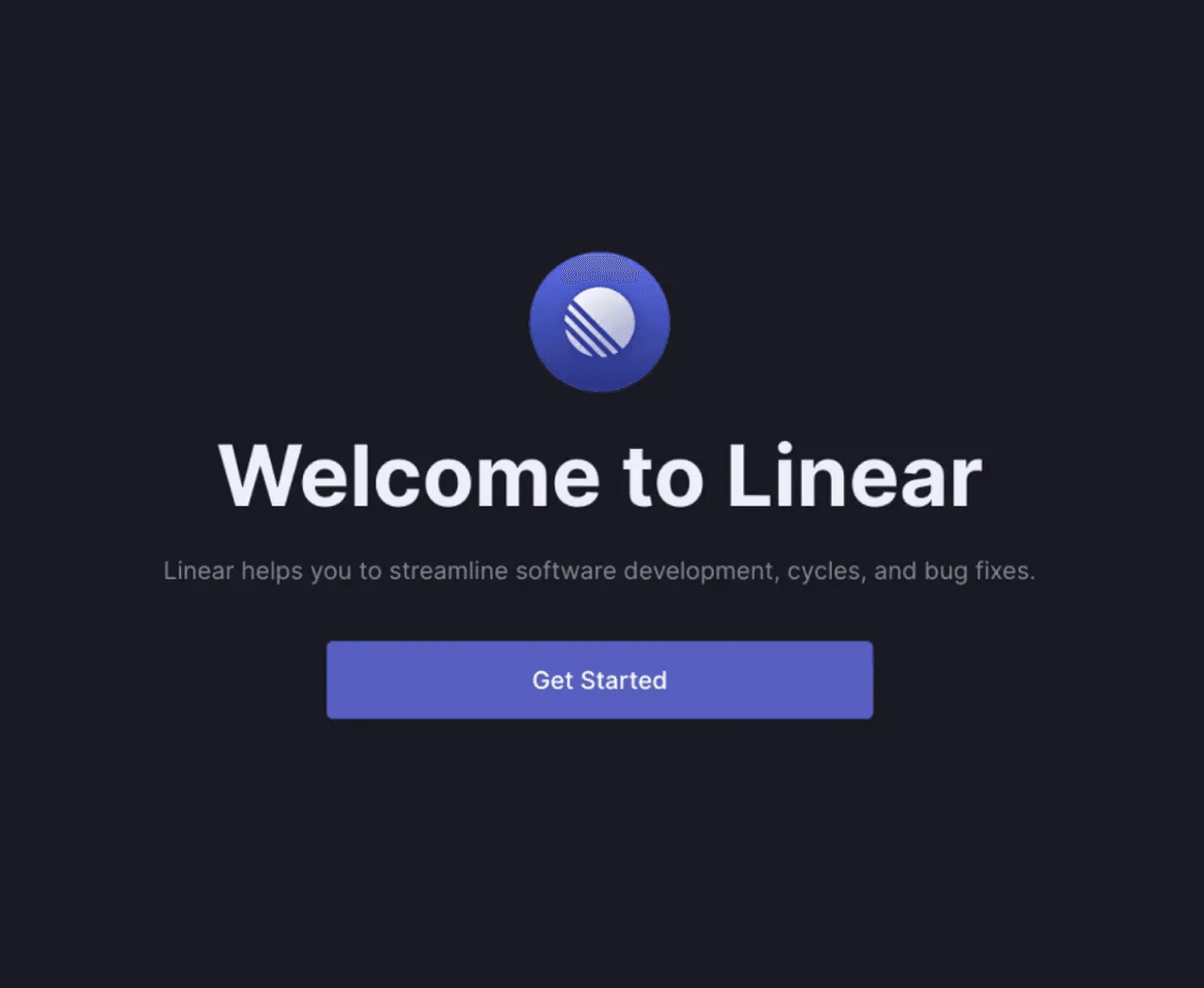
Fast, keyboard first interface with a dark theme and minimal chrome. A benchmark for developer and product tools that prioritize speed over decoration.
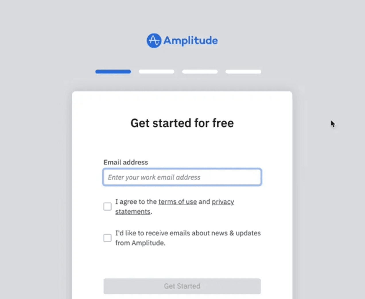
Data dense analytics dashboard that uses progressive disclosure to keep charts readable without overwhelming first time users.
Good UI/UX design is essential for SaaS products because it directly impacts user experience, adoption, and retention. A well-designed interface makes it easy for users to navigate, complete tasks, and find value quickly. If a SaaS platform is confusing or frustrating, users are more likely to abandon it, leading to higher churn rates.
Strong UI/UX design also reduces support costs and improves efficiency. When users can complete actions without needing help, businesses spend less on customer support. A well-structured design minimizes friction, reduces learning curves, and ensures users can achieve their goals with minimal effort.
Our design experts have carefully curated some of the best SaaS UI/UX design examples to inspire your next project. From About Us pages that build trust to pricing pages that drive conversions, and onboarding experiences that enhance user engagement, these examples showcase effective design strategies used by top SaaS products.
Whether you're refining an existing platform or starting from scratch, these ideas will help you create a scalable, user-friendly, and visually engaging SaaS product. Explore these designs to see what works—and how you can apply these principles to your own platform.
Looking to design a world-class SaaS app? Connect with Tenet, a leading SaaS UI UX design agency. With 7+ years of experience, we have helped leading SaaS brands create user-friendly, scalable, and high-performing products. Our expertise goes beyond just design—we can develop and optimize your SaaS platform to ensure it grows with your business.
Whether you need a fresh UI/UX design, a complete product revamp, or help in scaling your SaaS, we’ve got you covered. Let’s build a SaaS product that stands out.


