The Micro Design Decisions That Reduce User Drop-offs By Up to 40%
Share
Share
Get a quick blog summary with


Every time we audit a digital product with high drop-offs, we see the same pattern. The core product is strong. The problem is mostly in the invisible details that define how users feel while using it.
These are not broken features or missing pages but small moments that quietly create friction. These tiny gaps in what needs to be done, like timing or feedback, can make a user pause, hesitate, and even leave.
At Tenet, we have been tracking these patterns closely for a long time and have referred to them as micro design decisions. They are the small choices that are often ignored or might go unnoticed during design sprints, but have the biggest impact on users’ confidence & trust towards a product and the brand behind it.
Fixing these details across several client products helped us reduce user drop-offs by up to 40 percent. It was not a full redesign but a series of simple adjustments that made users feel more guided and in control at every step.
Drop-Offs Are Not Always a Conversion Issue
Most UI UX design teams see drop-offs as a conversion issue. I do not blame them because that is how most analytics tools show the data, and even clients view it the same way. But not every drop-off occurs because of weak funnels or ineffective calls-to-action. More often than not users exit because of small emotional or usability gaps that the data cannot articulate.
While working with global clients, we were always curious about what really happens between a click and a decision. We analyzed the points in multiple users’ journeys across a wide range of products, where an individual either seems distracted, is stuck, or walks away from an interface even when, on the surface, it seems like the user journey is frictionless.
Some of the insights we uncovered on the impact of the experience gaps of a few seconds or less are truly surprising.
Why traditional analytics (bounce rate, CTR) miss the why behind drop-offs
The usual analytics tools show what happened but rarely explain why it happened. Bounce rate, CTR, and average session time are all surface-level indicators. They do not, and often cannot, check the hesitation, doubt, or friction that happens inside the experience. A user may leave a page or an app interface not because it failed technically but because it failed emotionally.
If you really want to learn more about the issues, then heatmaps, session replays and micro-interaction tracking can give a better picture, but usually only when studied in parallel to piece together a holistic analysis. We use it to understand intent and confidence which is way beyond than just clicks. We also found that watching real user behavior tells us more than any dashboard ever could. The problem is never the data volume but the lack of human context behind it.
How emotional uncertainty, not interface error, causes most exits
Users often leave because they feel unsure about that specific interface. In our audits, we found that drop-offs happen when the interface does not reassure or guide.
This emotional uncertainty can come from:
- Missing confirmation after a key action
- Vague button labels that create hesitation
- Lack of visual feedback during loading or waiting
- Empty states that feel like dead ends
Such signals trigger uncertainty about whether users are making correct decisions. Once trust breaks even for a second the natural instinct is to exit. Reducing uncertainty through microfeedback, a clear scope, and a consistent tone builds confidence that keeps users moving forward.
Why micro friction adds up faster than major bugs
Most teams rush to fix visible bugs while ignoring microfriction like the tiny, repeated moments that quietly exhaust users. A small delay, a poorly named label, and an additional confirmation step all feel normal, but they add up and drain mental resources. In longer processes such as onboarding or checkout, these momentary friction points pile up and aggravate frustration. Ultimately, they kill user retention.
How We Diagnose Drop-Off Triggers With Our Own Framework?
We have worked on over 200 digital products and our team has seen almost every type of user behavior possible. Over time we noticed that traditional analytics were not enough to explain why users leave even when the product flow looks perfect.
So we built our own framework to find what really causes those exits. We call it the Micro-Friction Mapping Framework, a process that helps us identify and fix the smallest usability gaps before they become big conversion problems. It includes several steps that connect real behavior data with design psychology.
Let’s take a look at how this framework actually works:
→ We start with real user sessions. Using tools like Hotjar, PageSense, FullStory, and more, we identify moments where users hesitate, scroll back, or pause. Each hesitation is treated as a friction signal, not just a data point.
→ Every hesitation is categorized into types such as confusion, uncertainty, overload, or mistrust. This step connects UX data with psychology and helps us see why the user might have stopped.
→ We map the decision context around each signal. We review the last three actions, the copy near the element, the visual hierarchy, load time, and any missing feedback. We create a cause and effect thread for every single drop-off trigger.
→ Our team then designs micro fixes targeted to one friction type at a time. This includes clearer labels, inline helper text, visible loading states, forgiving form rules, smarter defaults, and guided empty states. We keep changes small and testable.
→ We validate and iterate with behavior metrics. We track hesitation time, task completion, scroll depth, and return visits. We run short A/B tests, keep winners, and repeat the loop until the flow feels smooth and drop-offs decline.
Just like any good product our process keeps evolving with every new project. We make frequent improvements to the Micro-Friction Mapping Framework based on fresh user insights and changing interaction patterns. The more we study these small behaviors the clearer it becomes that growth does not always come from big redesigns but from constant refinement.
The Micro Decisions That Changed Everything
To make things more practical, let me share a few real examples from some of our recent projects. These cases will help you see how small interface decisions can lead to major behavioral changes. None of them required a big redesign or long sprints.
Each was a focused and thoughtful adjustment made during regular design cycles. Once you see the difference these micro decisions created, you will understand how simple changes can change the experience for the users and reduce drop-offs in a measurable way.
Designing Better Empty States
When users land on an empty screen after completing an action, it often feels like the product has stopped responding. In one project for a project management tool, new users were taken straight to an empty workspace after signing up.
There were no sample projects, no hints, and no clear next step. Most users dropped off within 20 seconds. We redesigned this state to show a welcome message, a short description of how projects work, and a single call-to-action button labeled “Create Your First Project.” We also added a pre-filled sample board to demonstrate what a completed setup looks like.
- What change we made: Added a welcome message, example content, and one clear next step.
- Why: Users need early visual cues that show progress and purpose. Seeing a working example helps them understand the product faster.
- Impact: Onboarding completion rate increased by 22 percent and time spent on the first screen nearly doubled.
Introducing Micro-Feedback
In one SaaS onboarding flow, users often clicked buttons multiple times because nothing happened immediately (aka rage click). It made them think the system was unresponsive.
We added small micro-feedback elements such as button color transitions, loading dots, and brief confirmation states like “Saving your info.” These details made the product feel alive and responsive.
- What change we made: Added visible loading indicators and feedback animations on some major actions.
- Why: Users need confirmation that their actions are being processed. Feedback builds trust.
- Impact: The number of repeated clicks and reloads dropped sharply, improving completion rates by 12 percent.
Reducing Visual Noise
An enterprise client's settings page was overcrowded with checkboxes, links, and tooltips. Users scrolled and took no action as everything fought for their attention. Non-essential items were eliminated, related settings were placed in collapsable groupings, and white space was added around important items.
- What change we made: Prioritized key metrics, grouped related filters under collapsible panels, reduced redundant text, and created consistent spacing for visual clarity.
- Why: Reducing the extra elements helps users focus on one decision at a time.
- Impact: Completion rate for the settings update increased by 20 percent and time on page dropped by 30 percent.
Providing Early Wins
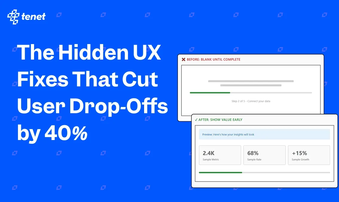
In one SaaS analytics platform, new users had to complete several setup steps before they could see any data. Many dropped off midway because the product felt too abstract until everything was connected.
To solve this issue, we redesigned the onboarding flow to give users a sense of achievement within the first minute. Instead of waiting for all data integrations, we showed a sample dashboard with placeholder metrics and a banner that said, “Here’s how your insights will look once your data syncs.”
This created anticipation and reduced the feeling of starting from zero.
- What change we made: Added an interactive sample dashboard that shows simulated results even before setup is complete.
- Why: Users stay motivated when they see visible progress early. Early wins trigger curiosity and help them understand the product’s value faster.
- Impact: Setup completion rate improved by 33 percent, and average session time in the first visit nearly doubled.
How to Replicate This in Your Product
While the actual process depends on your product’s scale and data setup, let me give you a simple 3-step framework to get started. It helps you find friction, understand it, and fix it without needing a full redesign.
Record → Start by observing what users actually do. Use tools like Hotjar, Microsoft Clarity, or FullStory to record sessions and find hesitation points, rage clicks, or scroll loops. Export short clips or heatmaps for review. Combine this with funnel tracking in GA4 or Mixpanel to see where drop-offs get mixed. Document these findings with screenshots and timestamps so your team can revisit the exact context.
Reassure → Once you identify areas where users get stuck, find opportunities to enhance scopes and build users’ confidence. Incorporate loading indicators, interaction design, microcopy that addresses user concerns, and confirmation messages after important steps. If users feel more confident about what comes next, A/B tests or usability surveys will show that. Aim to eliminate doubt and replace it with confidence.
Refine → Track how each fix changes user behavior over time. Use proper tracking items like task completion rate, hesitation time, and click depth. Keep a shared Google spreadsheet or Notion doc that logs what changed, why, and what the outcome was. This turns micro-improvements into a repeatable cycle that your team can keep running across every product update.
Let Our UX Experts Help You Reduce Drop-Offs
Let the experts at Tenet help you find and fix the small design issues that silently cost your business conversions. We are a global design agency with a deep focus on UX research, product design, and data-driven experimentation. Our team has worked with startups, SMBs, and global enterprises like Google, Paytm, Pizza Hut, Coca-Cola, and Mercedes-Benz, helping them create digital experiences that keep users engaged and confident across touchpoints.
So, whether you are scaling a SaaS platform, improving your eCommerce funnel, or redesigning a B2B product, you can apply the same strategies that power some of the world’s biggest brands and impact millions of users daily. Let’s start improving your product, one micro-decision at a time and turn user hesitation into steady growth.
Expertise Delivered Straight to Your Inbox
Expertise Delivered Straight to Your Inbox


Got an idea on your mind?
We’d love to hear about your brand, your visions, current challenges, even if you’re not sure what your next step is.
Let’s talk


