Designing for the Impatient User in a Hyper-Fast Digital World
Share
Share
Get a quick blog summary with


Today’s user needs everything in seconds. Whether it is loading, understanding what a screen means, or taking an action, their patience is almost zero.
Over the years at Tenet, we have seen this pattern become stronger while working on fintech products, eCommerce platforms, government apps, and large enterprise systems. Users do not wait. If something feels slow or confusing, they leave.
What drives this impatience is a mix of speed, clarity, cognitive load, and the overall feeling of effort. When any of these break, the experience collapses. This is why designing for impatient users is not just a UX choice. It is a business requirement.
We have prepared this extensive guide based on real projects and real problems we solved. You will find practical examples, specific UX strategies, and clear methods we use at Tenet to build digital products that feel fast, simple, and effortless for the modern user.
Why Today’s Users Are More Impatient Than Ever
A few decades ago, people had the time to wait. Websites loaded slowly, apps were basic, and technology was still developing. Expectations were low and patience was high.
As technology evolved, user behavior changed with it. Faster networks, instant payments, one-tap checkouts, and endless content made people used to getting everything right away. Now users expect both speed and clarity at the same time.
When users open an app today, they are already overwhelmed with information from other platforms. Notifications, messages, ads, and constant digital noise push them to make quick decisions. If your product does not give them what they want instantly, they move on to the next option without thinking twice.
Let us take a look at the major reasons behind this shift in user impatience.
Instant Gratification Conditioning
People are trained by apps like Instagram, UPI payments, and Amazon to receive results in seconds. This becomes the benchmark for every other digital experience. If your product feels slower than their fastest app, they lose patience.
Cognitive Overload
Users handle too many apps and too much information every day. Their brain avoids anything that feels heavy or confusing. Even a small delay or unclear screen increases drop-offs. We have seen this firsthand in enterprise dashboards where even senior leaders prefer quick, simple paths.
Selective Attention
Attention spans are not shrinking. Users simply choose where to give their attention. They focus only on what feels immediately relevant and skip everything else. If your product does not highlight the most important action instantly, the user feels lost.
The 3-Second Rule That Tenet Uses in All Projects
At Tenet, we design over 40 types of digital products including websites, mobile apps, SaaS platforms, dashboards, booking systems, and enterprise web apps.
In every project, we use a simple internal rule to make sure the user does not feel slow or confused at any point. We call it the 3-second rule. It focuses on what the user must feel and understand within the first three seconds of landing on any screen.
0–1 second: Perception of Speed
This is where the user decides if the product feels fast or slow. Even if the backend needs time, the interface must communicate instant response. We learned this while building a government service app where actual processing took time but users stayed calm because the UI reacted immediately.
What we do in this phase
- Show skeleton screens instead of blank screens
- Trigger instant visual feedback on tap or click
- Preload common screens and actions
- Use lightweight layouts that render quickly
When the user sees movement or progress right away, they feel the system is fast, even if the real operation continues in the background.
1–2 seconds: Orientation and Clarity
The next one second is where the user decides if the screen makes sense. They should know where they are, what the screen is for, and what the primary action is. This is where most apps lose impatient users. We keep the layout simple, highlight one clear action, and remove anything that creates confusion.
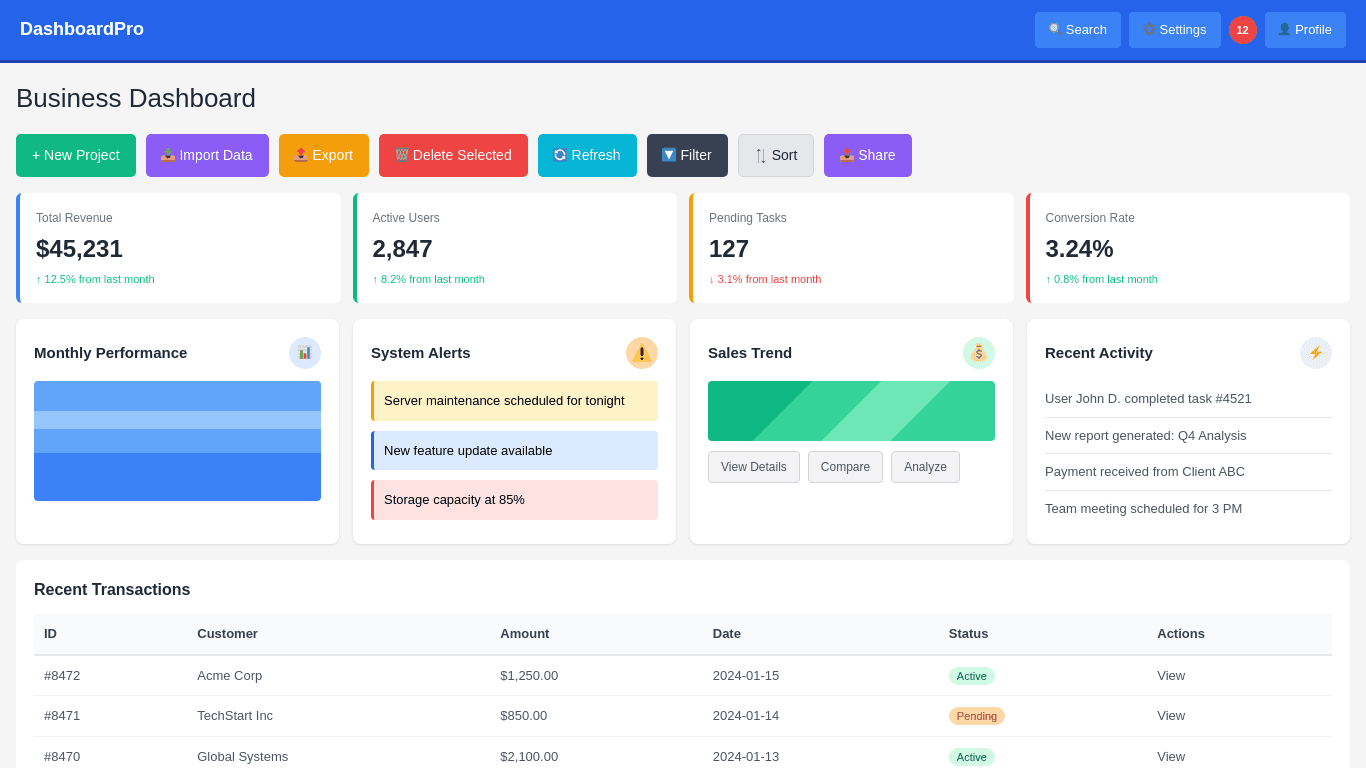
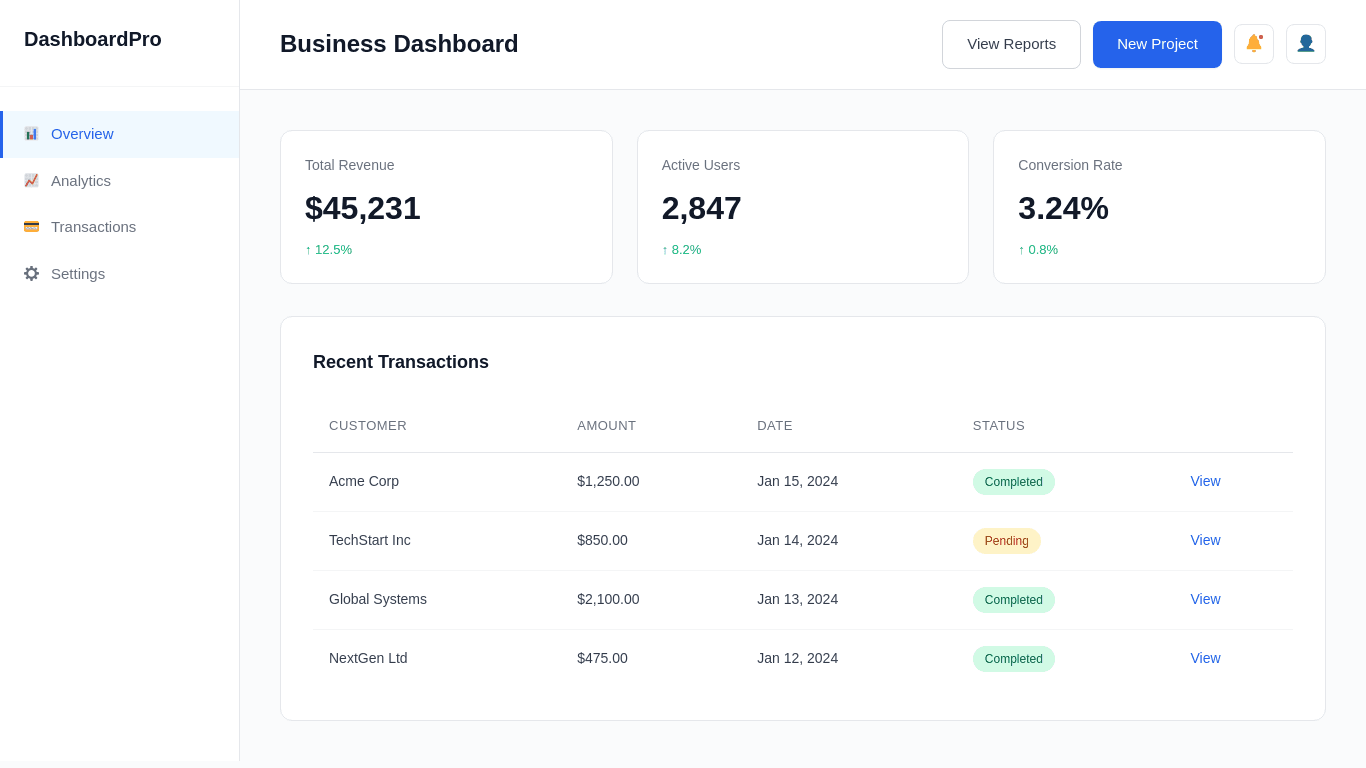
Below you can find one of our recent SaaS dashboard redesign examples. The original dashboard screen had eight competing elements above the fold. Users took almost six to seven seconds to understand it.
We reorganized the layout, reduced the noise, and surfaced only two key actions. The average time to understand the screen dropped to under two seconds.
2–3 seconds: Action and Momentum
By the third second, the user should already know what to do next. This is where we guide them toward the core action with minimal effort. We reduce decision points, use clear labels, provide smart defaults, and keep the path linear.
When the product helps the user move forward without thinking too much, the experience feels fast. In our work with financial apps, this approach has often doubled the completion rate of important tasks like onboarding, verification, or quick transactions. When momentum is built early, users follow through.
Behavioral UX Principles That Drive Speed for Impatient Users
Based on our experience working on products across fintech, eCommerce, government platforms, and enterprise systems, we have seen how certain UX principles directly influence speed and user satisfaction.
When these principles are applied correctly, even complex products feel quicker and easier to use. Here are the behavioral UX methods we rely on to design for impatient users.
Progressive Disclosure
Progressive disclosure is about showing users only what they need at the moment and revealing more details as they move forward. In our experience, most drop-offs happen when users see too much on the screen at once. Their brain slows down because they are forced to process everything before making a decision. Instead of giving everything upfront, we guide them step by step.
We use this heavily in onboarding flows, KYC journeys, enterprise dashboards, and account setup processes. For example, instead of showing nine fields on a single form, we group them into three simple steps.
Users see only the essential fields first. Once they complete those, the next set appears. This keeps the flow light and reduces hesitation. As a result, completion rates always improve because the user feels in control and not overwhelmed.
Interaction Biasing
Interaction biasing is the practice of guiding users toward the fastest and most effective action through design. Users follow visual hierarchy without thinking, so when the interface is structured with clear priorities, they automatically choose the right path. We apply this by making the primary action visually stronger, reducing the weight of secondary actions, and placing frequently used options where the eye naturally moves first.
In our experience, this is especially useful in high-stakes paths like checkout, onboarding, or verification. When the design makes the correct option feel obvious, users do not get stuck comparing choices. It increases speed and reduces hesitation.
Fewer Choices = Faster Actions
When users see too many options, their decision time increases. This is why reducing choices is one of the simplest ways to improve speed. We have seen dashboards where teams wanted to show every possible feature on the main screen. The result was slower understanding and more mistakes.
We fix this by removing rare-use options, grouping related items, and prioritizing only the top three actions users take most often. This makes the product feel lighter and faster. Users move through the interface without thinking too much, which is exactly what impatient users need.
Preemptive Intelligence
Preemptive intelligence means predicting user intent and reducing the steps required to complete an action. This can be done through smart defaults, pre-filled data, remembering preferences, or using previous behavior to shape the next screen. When the system takes initiative, users feel the product is helping them instead of slowing them down.
For example, if a user always selects the same branch, date range, or filter, we auto-apply it instead of making them choose again.
In internal enterprise apps, this alone has reduced the time to complete tasks by a large margin. With the right data and logic, the product can feel almost effortless.
Design Choices That Instantly Improve User Flow
Let us look at some of the straightforward design choices that make any product feel faster. These methods help users move from one step to the next without hesitation. They work well across websites, mobile apps, dashboards, and SaaS platforms.
Navigation Structures for Impatient Users
Navigation is one of the first places where users lose time. If they cannot find the main action quickly, they feel the product is slow. We design navigation to reduce thinking and shorten the path to the most common tasks.
For web based products
We keep the top bar simple and place the highest value actions in the first two positions. We avoid long menus and instead use short groups that match how users think.
Mega menus work only when they are structured well so we make category labels clear, readable, and tied to actual tasks rather than internal team terminology.
For mobile based products
We rely on a bottom navigation with three to five items. The center or first item is always the primary action. We avoid deep layers where users need to tap five or six times to reach a feature. Swipe based shortcuts and floating action buttons help reduce the number of steps in common tasks. Everything is built around quick access.
Writing Microcopy for Impatient Users
Microcopy shapes how fast users move because it tells them exactly what to do next. Short, direct, and familiar words lower the mental effort. The aim is to remove confusion so the user does not stop to think.
In an employee engagement platform we worked on, the original button text said “Proceed with Acknowledgement.” Most employees paused because it felt formal and unclear. We replaced it with “Confirm and Continue.”
This small change reduced hesitation and increased task completion because the wording was familiar and easy to understand.
Visual Design That Feels Swift and Light
A fast feeling interface does not come from animation. It comes from clean structure and simple visuals. We use clear spacing, a calm color palette, and a strong hierarchy so the eye moves smoothly across the screen.
We avoid heavy gradients, oversized illustrations, or elements that distract. The primary action stands out through size and contrast, not decoration. Consistent spacing helps users scan faster. When users can understand a screen in two seconds, they feel the product is quick.
Light visual design also reduces load on the device. Fewer visual effects, smaller images, and simpler shapes help screens render faster. This makes a noticeable difference on older devices and slow networks.
Designing for Immediacy Is Designing for Loyalty
Users reward speed with loyalty. When a product loads fast, feels simple, and guides them without effort, they return more often. If the experience feels slow or confusing, they drop off and rarely come back. This is why immediacy is not just a UX goal. It is a long term business advantage.
At Tenet, we focus on this every day. As a leading global design agency, our team has designed digital products for startups, enterprises, and government organisations across multiple regions. Our expert designers and strategists help brands create fast and reliable experiences across UI UX design, website design, branding, and complete digital product development.
Our headquarters are in the UAE and we also operate in India, the UK, the USA, and other regions. So no matter where your team is based or what stage your product is in, you can work with us easily.
If you are planning to improve your product, redesign your platform, or build something new, the next step is simple. Let us take a look at your current experience and help you create a faster, clearer, and more user friendly product that keeps your users loyal.
Expertise Delivered Straight to Your Inbox
Expertise Delivered Straight to Your Inbox


Got an idea on your mind?
We’d love to hear about your brand, your visions, current challenges, even if you’re not sure what your next step is.
Let’s talk


