Liquid Glass Is Apple’s Boldest Yet Most Risky Design Move
Share
Share
Get a quick blog summary with


Every few years, Apple resets how we think about digital design. Liquid Glass is that reset in the year 2025.
While it brings a new level of beauty and depth to software, it also comes with risks that cannot be ignored.
As the founder of Tenet, a design and technology agency working with global brands, I was very eager to see what this new system means for the future of user experience.
This system will shape how apps look and feel across iPhone, iPad, Mac, and even Apple Watch. And for designers, developers, and businesses, it sets both exciting opportunities and serious challenges that we need to prepare for now.
What Exactly Is Liquid Glass?
Liquid Glass is the new design system Apple launched at WWDC 2025. It is rolling out across iOS 26, iPadOS 26, macOS Tahoe, watchOS, and tvOS. Apple describes it as a material that makes software feel alive by simulating the qualities of real glass.
It adds transparency, depth, blur, and motion that change depending on what is behind the surface or how the device is being used.
Apple’s positioning is to move beyond flat static design and create interfaces that feel dynamic and responsive. There will be two variants for developers to work with: a regular version and a clear version.
For early users, the reaction has been mixed. Some people on X (formerly Twitter) are praising the visuals and calling it Apple’s most beautiful system yet.
Others are sharing that older iOS versions felt more usable and less distracting than Liquid Glass. And Apple fans, as usual, are celebrating it as another bold step forward.
Why Apple Went Bold with Liquid Glass
Apple is a brand known for making bold choices in design. While it often receives criticism at first, these shifts are usually followed by wide adoption across the industry. They are often divisive in the beginning, but in the long run, they set new standards. It makes them a company that does not just follow design trends but defines them.
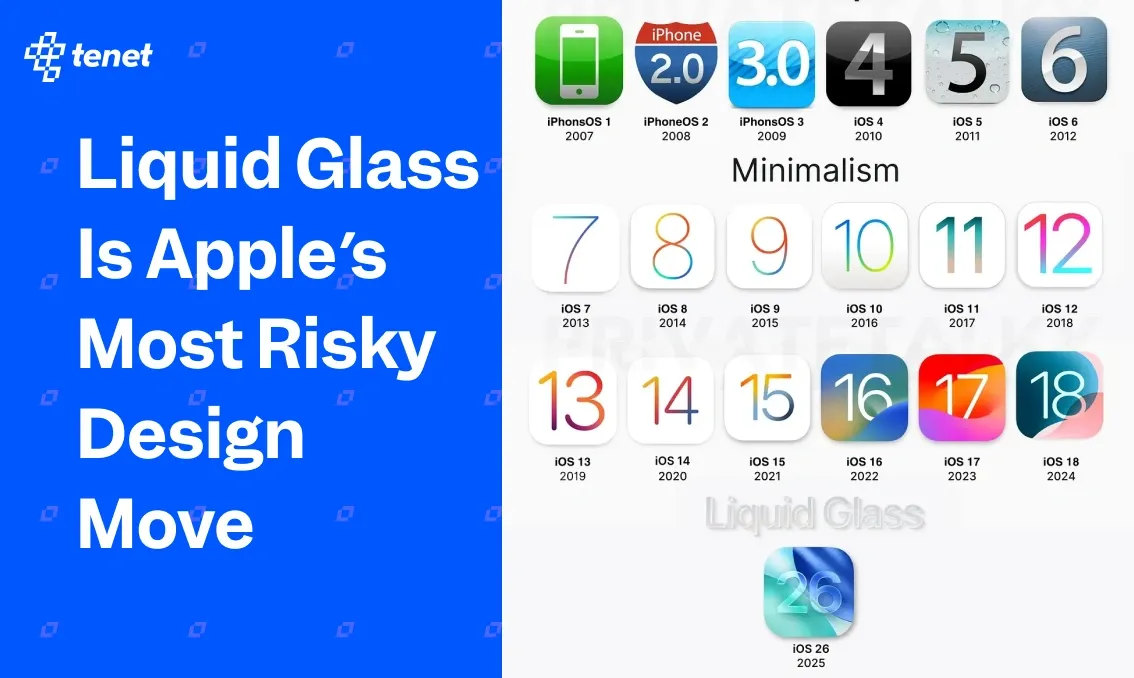
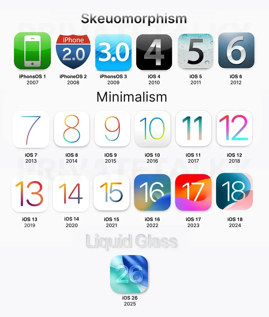
Apple has in the past moved from skeuomorphism to flat design to glass blur, and now to Liquid Glass. So, it is not a new design refresh but a new design language that changes how software looks and behaves across devices.
Here is a showcase of all the design language changes done previously by Apple:
Their main aim with Liquid Glass is to bring more life and depth into the interface by using materials that feel dynamic, responsive, and almost physical. It is Apple’s way of making the digital world feel more natural while showing the strength of their hardware and software working together.
Where the Risk Lies
Based on my early observations and conversations with our design and tech teams, I can point down a few clear risks with Liquid Glass. It may look stunning, but when you study how it works in real use, the challenges start to appear.
1. Usability and Accessibility
The first risk is around usability and accessibility. Transparency, blur, and depth may look impressive, but they can interfere with legibility. Text placed on semi-transparent backgrounds often suffers from low contrast, making it harder for users to read quickly or in poor lighting conditions. People with low vision or color sensitivity will feel this gap even more.
Motion effects in Liquid Glass can also trigger discomfort for users sensitive to animation or parallax. From a UX perspective, these are not minor issues. If designers do not test thoroughly with accessibility settings and high-contrast modes, the system can unintentionally exclude people instead of creating delight.
2. Developer and Designer Complexity
I was having a discussion over this with our senior design manager, Alisha Pandey, and she pointed out how Liquid Glass raises the bar for everyday design decisions. While it is visually powerful, it forces teams to design with far more precision. Backgrounds are no longer neutral and they shift and affect readability dynamically.
That means designers must consider multiple states for every element. Developers face equal complexity because they need to implement Apple’s new materials framework without sacrificing consistency across platforms. Smaller teams may find it especially difficult to balance design fidelity with performance. This complexity increases project timelines and the risk of inconsistency between devices.
3. Performance and Hardware Dependence
The third risk comes from performance and hardware dependence. Rendering dynamic glass effects at scale requires strong GPUs and efficient memory handling. On newer devices with Apple silicon, the experience feels smooth, but on older hardware, it may drain battery or cause lag.
- More GPU cycles are needed to constantly recalculate transparency, blur, and motion.
- Battery life can drop when animations and depth effects run continuously.
- Differences between high-end and older devices may lead to uneven user experiences.
For businesses targeting wide user bases, this means their apps might feel premium on flagship devices but sluggish or draining on others. This performance gap can directly impact adoption and customer satisfaction.
What It Means for Designers, Developers, and Businesses
Over the past few weeks, I have been studying how Liquid Glass is being received and tested in the design community. I discussed with a lot of our internal teams, connected with peers across agencies, and read reactions from early adopters online.
Based on all of this, here are my takeaways for designers, developers, and businesses who are preparing to work with this new system.
For Designers
If you are a designer, Liquid Glass demands more discipline. You cannot rely on static layouts anymore. Test for contrast, accessibility, and multiple states. Think about how backgrounds and motion will impact clarity before you focus on beauty.
For Developers
As a developer, your challenge is to balance fidelity with performance. Apple’s new material APIs are powerful, but you must optimize for battery and smoothness across devices. Work closely with designers to ensure the interface feels alive without breaking usability.
For Businesses
It matters for businesses because Liquid Glass is not just a design trend, it is Apple setting a new baseline. If your app feels outdated against native apps, users will notice. At the same time, chasing the look without strategy can increase costs.
The Real Test of Liquid Glass Will Be Usability
So that’s all at the heart of Apple’s bold move. The main question is not how beautiful Liquid Glass looks, but how usable it will be for people in their daily lives. The test of any design system is whether it helps users achieve their goals faster, with less effort and more clarity.
As our team continues to explore and design with this new system, we know the responsibility will be on us to make choices that put usability first. Designers, developers, and businesses all need to be careful not to get carried away by visuals alone.
And if you are someone looking to get your product ready for the next era of design, we are a global design team building world-class mobile apps, websites, SaaS tools, and enterprise platforms. Our focus has always been to create digital products that look beautiful but are also usable, scalable, and accessible.
Expertise Delivered Straight to Your Inbox
Expertise Delivered Straight to Your Inbox


Got an idea on your mind?
We’d love to hear about your brand, your visions, current challenges, even if you’re not sure what your next step is.
Let’s talk


