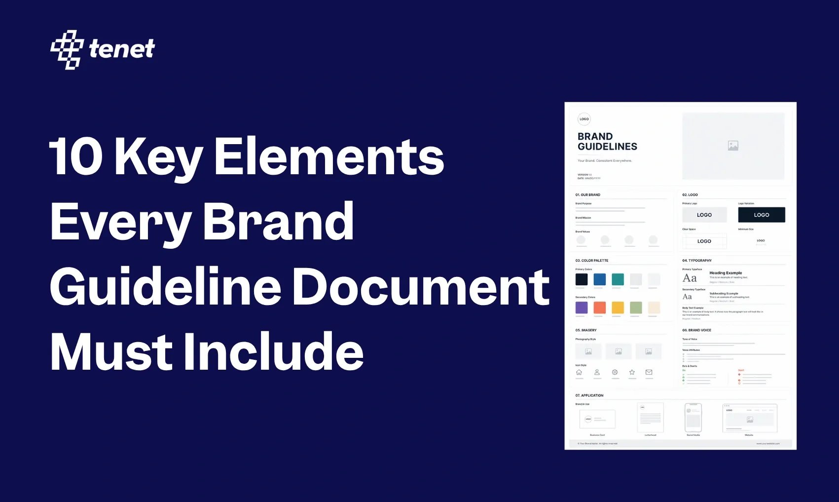
10 Key Elements Every Brand Guideline Document Must Include
 By
By Share
Share
Get a quick blog summary with


Key Highlights
- A brand guideline document defines visual identity, voice, messaging, and behavior across every channel
- It prevents inconsistent branding by giving teams one clear reference for design and communication decisions.
- Strong guidelines improve speed, reduce revisions, and make vendor and agency briefings easier.
- Essential elements include mission, logo rules, color codes, typography, imagery, voice, and layout systems.
Can your audience recognize your brand in less than 10 seconds without seeing your logo?
True brand authority comes from a signature color palette that can increase recognition by 80% and a voice that remains consistent across every digital and physical touchpoint.
Because it takes 5 to 7 impressions for a customer to remember a brand, any "off-brand" content resets your awareness-building back to zero.
At Tenet, our team has completed 450+ projects and maintains a 98% client satisfaction rate. Through that work, we have identified exactly which components turn a brand guidelines document into a daily tool. This guide walks you through each of those components so you can build brand guidelines your team will actually use.
What is a brand guideline document?
A brand guideline document is a reference file that defines how your brand should look, sound, and behave across every channel and format. It covers your visual identity (logo, colors, typography), your verbal identity (tone, voice, messaging), and the rules for applying both consistently.
Here is an image showing Duoling’s brand guideline document present on web:

Think of it as a rulebook that ensures everyone, whether it is your internal marketing team, a freelance designer in another country, or a print vendor, produces work that looks and feels unmistakably like your brand.
So, that instead of your marketing team asking "should this button be red or orange?" or your copywriter wondering whether to sound formal or casual, the guidelines answer those questions in advance.
Airbnb's brand guidelines, for example, go beyond colors and fonts.
They define how their photography should feel (warm, intimate, lived-in), what language patterns to avoid, and how their logo behaves on different backgrounds.
The image below shows how Airbnb has made it clear even how to write the word “ Airbnd”:

The result is a brand that feels unmistakable whether you are on their app, website, or seeing an out-of-home ad.
👉 If you want to see how a complete visual identity system comes to life in practice, our Visual Branding Guide breaks down exactly what makes a brand look consistent and ownable across every touchpoint.
Why do you need brand guidelines?
Without guidelines, brand decisions become personal preferences. One designer uses the dark logo, another uses the light version. One copywriter writes formally, another writes like they are texting a friend.
The result is a fragmented brand that customers cannot connect with consistently.
Consistency at scale
Once you have multiple people working on your brand, consistency breaks down fast. Guidelines give every team member the same reference point, whether they are an in-house designer or a freelancer you hired last week.
Faster production
Teams with clear guidelines spend significantly less time on design revisions and approval loops. There is no back-and-forth on "is this on-brand?" because the answer is already documented.
Better vendor and agency briefing
When you bring in an outside agency, a media partner, or a production house, you cannot afford to spend three meetings explaining your brand. A well-written guidelines document does that work for you from day one.
Stronger brand recall
68% of companies say that brand consistency adds up to 10–20% to revenue growth. That consistency starts with a document that tells everyone exactly what "consistent" means for your specific brand.
This works because it takes customers an average of 5 to 7 interactions to actually remember a brand, if your look changes every time, you're essentially starting from zero with every post or ad.
Foundation for scaling
As your company grows, the brand needs to grow with it without losing its identity. Guidelines create that stable foundation so that new product lines, market expansions, or rebrands stay anchored to something real.
Without this foundation, companies often see their identity diluted as they scale, whereas those with a steady identity see a 2.4x higher average growth rate.
👉 Scaling a brand without diluting it is a challenge many growing businesses face. Our Brand Growth & Recognition services are built to help businesses maintain that identity as they expand.
10 must-have elements of your brand guideline document
Element 01: Brand Foundation ( Mission, Vision, and Values )
A clear statement of why your brand exists (mission), where it aspires to be (vision), and the non-negotiable principles that guide its decisions and behavior (values).
Why it matters:
Every design choice, every campaign headline, every product decision is easier when teams understand the "why" behind the brand.
What to include:
- Mission Statement: A one-sentence declaration of the "Daily Action" (What you do + Who it is for + The immediate result).
- Vision Statement: The "Infinite Goal" (What the world looks like in 10 years because of your work).
- Core Values: 3 to 5 principles with a "Behavioral Standard" for each (e.g., "Radical Transparency: We share our mistakes publicly within 24 hours").
- Brand Essence: A single word or three-word phrase that summarizes the "feeling" of the brand (e.g., "Quietly Confident").
👉 Getting this foundation right is the starting point for everything else, our Brand Strategy service is designed to help businesses define exactly this kind of purposeful, positioning-driven foundation before a single visual is created.
Element 02: Logo Usage Rules
A set of rules defining how your logo can and cannot be used, including all approved versions and clear-space requirements.
Here are some images that shows the guidelines that Tenet provides related to logo:


Why it matters:
Your logo is the most recognizable asset of your brand. Misuse, even unintentional, dilutes that recognition instantly.
What to include:
- The Master Lockups: Don't just show one logo. Show the "Primary" (stacked), the "Secondary" (horizontal), and the "Icon" (the symbol alone). This ensures your brand fits everywhere from a giant billboard to a tiny browser tab.
- The "Clear Space" Calculation: Define a mathematical "buffer zone." For example, tell your team the logo must always have a "breathing room" equal to the width of the letter "O" in the logo on all sides. This prevents other elements from crowding it.
- Minimum Legibility Limits: Set a hard rule for size. State that the logo can never be smaller than 30px wide on screen or 15mm in print. If it gets smaller than that, the details blur and it looks unprofessional.
- The Forbidden List: Show "Don’ts" with visual examples. Specifically, ban stretching the logo out of proportion, changing its colors to non-brand shades, or placing it on a busy photo where it becomes unreadable.
👉 A strong logo is just the beginning of a cohesive visual identity, feel free to explore Tenet's dedicated Logo Design services to see how we build logos that are built to scale from day one.
Element 03: Color Palette with Technical Specifications
A defined set of colors with exact codes across formats, organized by primary, secondary, and neutral categories.
This visual shows how Tenet have made clear the technical aspects related to colour palette too in there guide:

Why it matters:
Color increases brand recognition by up to 80%. The moment you let colors vary even slightly across touchpoints, that recognition advantage disappears.
What to include:
- The 60-30-10 Distribution: Explain how to use the colors. Suggest that 60% of a design should be your primary color (usually a neutral), 30% should be your secondary, and 10% should be a bold accent color for buttons or calls-to-action.
- Full Technical Profiles: For every single color, you must provide the HEX code (for web), RGB (for digital screens), and CMYK (for professional printing). This stops your "navy blue" from looking "purple" when it comes off a printer.
- Functional UI Colors: Define specific shades for feedback. You need a standard red for "Errors," green for "Success," and yellow for "Warnings" that still feel like they belong to your brand family.
- Accessibility Pairings: Create a "Contrast Matrix." List exactly which text colors are allowed to sit on top of which background colors so your content remains readable for people with visual impairments.
👉 To understand how all of these visual elements (color, structure, and accessibility) fit together in a professionally built identity system, our guide on How to Design a Brand Identity walks through the full six-step process in detail.
Element 04: Typography System ( Fonts, Hierarchy, and Sizing )
The approved typefaces for your brand, along with a hierarchy showing how headings, body text, and supporting labels should be set.
The following visual is of Tenet’s primary typeface ( with both visual & written guidance):

Why it matters:
Typography carries personality. The difference between a serif and a sans-serif headline signals completely different brand characters to a reader, often before they process a single word.
What to include:
- The Font Stack: List your primary typeface for headlines and your secondary for body text. Provide direct links to where the team can download the licensed files so they don’t end up using a "close enough" substitute.
- The Hierarchy Scale: Don’t let people guess sizes. Define exactly what size and weight (Bold, Medium, Light) an H1, H2, and Body paragraph should be. For example: "Headlines are 48pt Bold; Body text is 16pt Regular.
- Spacing and Rhythm: Specify the "Leading" (line height). A good rule is to set body text at 1.5x the font size. This creates enough white space between lines to make long articles easy to read.
- Web-Safe Fallbacks: Always provide a "Plan B." If your custom brand font fails to load on a customer's computer, tell the system to use a specific web-standard font like Arial or Georgia instead of a random default.
Element 05: Imagery and Photography Style
Directions on what kinds of images represent your brand, including subject matter, lighting, composition, and what to avoid.
The given visual represents Tenet’s guidelines about the prohography:

Why it matters:
Stock photography is everywhere. A brand that uses the same generic images as everyone else in its category becomes invisible. Photography guidelines ensure every visual you use reinforces a distinct identity.
What to include:
- The Lighting Signature: Describe the "mood" of your photos. Should they be "high-contrast with deep shadows" for a dramatic look, or "bright and airy with natural sunlight" for a friendly feel?
- Subject Matter Rules: Give specific directions on people. For example, "Subjects should look candid and never stare directly into the lens," or "Focus on the hands and the process, not just the finished product."
- Editing Specifications: If you use a specific filter or color grade, define it. Tell your designers to "reduce saturation by 10%" or "increase the warmth of the highlights" so every photo looks like it came from the same photographer.
- The "Anti-Stock" Filter: List visual clichés to avoid. Tell your team to skip the "handshake in a boardroom" or "smiling people in headsets" photos. Practical guidelines help keep your brand from looking like a generic template.
Element 06: Brand Voice and Tone Guidelines
A set of defined characteristics that describe how your brand communicates in writing and conversation, along with practical examples for different contexts.
Here are Duolingo’s guidelines for Brand voice & expressions:

Why it matters:
Visuals attract attention and Voice builds trust. A brand that sounds different across its website, emails, and social channels signals either inconsistency or inauthenticity, neither of which builds loyalty.
What to include:
- The Persona Profile: Describe your brand as if they were a person at a dinner party. Are they the "expert professor" who uses precise language, or the "supportive friend" who uses contractions and slang? Giving your voice a personality makes it easier for writers to mimic.
- The Tone Shift Map: Explain how your voice adjusts to the situation. Your tone should be "Empathetic and Direct" when a customer has a billing issue, but "Playful and High-Energy" on an Instagram caption. Show examples of both.
- A "This, Not That" Glossary: Create a table of preferred vocabulary. For example: "We say 'Partner,' never 'Vendor'" or "We say 'Straightforward,' never 'Simple'." This prevents different writers from using synonyms that carry the wrong "vibe."
- Grammar and Punctuation Fixes: Make the "small" decisions for them. Do you use the Oxford Comma? Do you use emojis in professional emails? Deciding this now prevents your blog from looking like it was written by five different people.
Element 07: Iconography and Graphic Elements
The visual system of icons, patterns, shapes, and graphic motifs that appear consistently across your brand materials.
Here is a visual example of how Duolingo provides detailed guidelines about shapes, characters that they use:

Why it matters:
Icons and graphic elements are the connective tissue between your logo and your layouts. Without a defined system, every designer chooses a different icon library, and the result looks fragmented.
What to include:
- The Stroke Weight Rule: Be very technical here. State that "All icons must use a 2px center-aligned stroke with rounded caps." If one designer uses thick lines and another uses thin, your website will look like a jigsaw puzzle of different styles.
- The "Corner Radius" Constant: Define how "curvy" your brand is. Specify a pixel value (e.g., 12px) for every button corner, image frame, and icon container. This subtle detail is what makes a brand feel "unified."
- Graphic Motifs and Patterns: Don't just rely on photos. Define a specific pattern—like a geometric grid or a hand-drawn squiggle—that can be used as a background when you don’t have a good image. This keeps "empty" spaces on-brand.
- Shadow and Depth Logic: If you use shadows to make elements "pop," give the exact settings (Blur: 10px, Opacity: 5%). This ensures your digital "layers" look consistent across the entire app or site.
Element 08: Layout and Grid System
The structural rules that govern how content is arranged on any designed surface, from web pages to printed brochures.
Why it matters:
Layout consistency is what makes brand materials look like they belong to the same family, even before a viewer reads a single word or registers a color.
What to include:
- The Column Blueprint: Explain your grid. For a website, you likely need a 12-column grid; for a PDF, maybe a 3-column grid. Telling designers exactly where the "invisible lines" are ensures that text and images align perfectly every time.
- Spacing Units (The 8pt Rule): Instead of random spacing, tell your team to use multiples of 8 (8px, 16px, 32px, 64px) for all margins and padding. This "Vertical Rhythm" creates a professional, polished look that the human eye subconsciously loves.
- The "Safe Zone" Margins: Define the minimum distance between your content and the edge of the page. This prevents your text from getting too close to the screen edge on mobile or getting cut off in a printed brochure.
👉 A well-structured layout system is the backbone of every strong marketing collateral piece, Tenet's Marketing Collateral Design services are built around exactly these grid and spacing principles, so every asset looks like it belongs to the same brand family.
Element 09: Digital Application Guidelines ( Web, Social, and Email )
Channel-specific rules for how the brand system translates to websites, social media platforms, and email communications.
Why it matters:
What works as a print layout rarely works as an Instagram post. Each digital channel has its own format constraints, audience behavior, and visual conventions. Your brand needs to work within all of them without losing coherence.
What to include:
- Interactive UI States: A button isn't just a button. Show what it looks like when it's "Idle," what happens when a mouse "Hovers" over it, and what it looks like once it's been "Clicked." This is vital for a smooth user experience.
- Channel-Specific Templates: Don't expect one layout to work everywhere. Provide a template for a LinkedIn banner, a YouTube thumbnail, and an Email header. Each should have specific rules about where the logo sits so it doesn't get covered by profile pictures or text.
- The "Social Mark" Crop: Social media profile icons are almost always circular. Provide a version of your logo that is perfectly centered and cropped so your brand name doesn't get "cut off" by the Instagram circle.
Element 10: Brand Personality and Positioning Statement
A written articulation of how your brand is positioned in its market, who it is for, and the personality traits that define how it behaves.
Why it matters:
Positioning is the strategic layer that makes every other guideline make sense. Without it, a brand can follow all the visual rules and still feel hollow because there is no underlying strategic intent driving the choices.
What to include:
- The "Competitive Gap" Map: Show where you sit in the market. Are you the "High-End Luxury" option or the "Affordable Professional" option? Understanding your "neighbors" helps your team know how to stand out.
- The Target Persona Summary: Describe your ideal customer’s biggest "pain point" and how your brand specifically heals it. This keeps your marketing focused on the customer’s needs rather than just your features.
- The "Unlike" Formula: Write a one-sentence positioning statement: "We are the [Category] that provides [Benefit], unlike [Competitor] who focuses on [Competitor's Weakness]." This is the "North Star" for all future strategy.
The Brand Archetype: Choose a character type like "The Sage" (teaching) or "The Hero" (overcoming). This helps your team understand the attitude they should bring to every new project.

How Tenet created brand guidelines for a design school
Asian School of Design & Applied Vastu (ASDAV) is a modern, transformative school offering foundational and upskilling programs in design, engineering, architecture, and construction-related fields.
For over 3 years, the founders taught largely through offline channels. They had no cohesive platform to give their offerings a distinct identity.
So why did they collaborate with Tenet?
- They needed a brand that could scale across India's many languages
- They wanted to reflect experiential learning
- Their existing materials were unorganized and inconsistent
- They lacked a visual language that could grow with the business
The core challenge was clear: establish ASDAV as a school that delivers real learning without language barriers. India has many languages, and the brand had to resonate across them all.
How Tenet helped:
We began with guided discovery sessions and workshops. The team explored the founders' vision, collected their value propositions, USPs, and the core motivation behind building the school.
Here's what Tenet delivered:
- Defined brand values that work across the nation: Harmony, Innovation, Integrity, Sustainability, Community, and Empowerment
- A living brand identity system (not just static guidelines, because static documents are almost as bad as having none)
- Ready to use assets, including brochures, presentation templates, social media templates, and communication strategy guidelines
- A consistent brand voice that ensures the school not only looks but also sounds as intended
Here are some visuals that show how Tenet developed a living brand identity system that goes beyond static rules, ensuring consistency across every touchpoint.

The result?
A brand that delights, works, and gives ASDAV the confidence and clarity to revamp design education for a better future.
Got a brand vision that needs to be brought to life? We'd love to hear about your goals - let's talk 🙂
Talk to our branding experts and build a brand guideline system that keeps your identity consistent across every touchpoint.
Talk to our branding experts and build a brand guideline system that keeps your identity consistent across every touchpoint.


Got an idea on your mind?
We’d love to hear about your brand, your visions, current challenges, even if you’re not sure what your next step is.
Let’s talk


