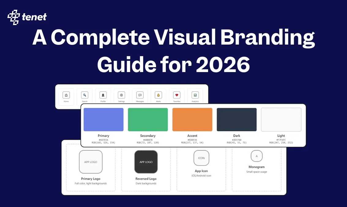
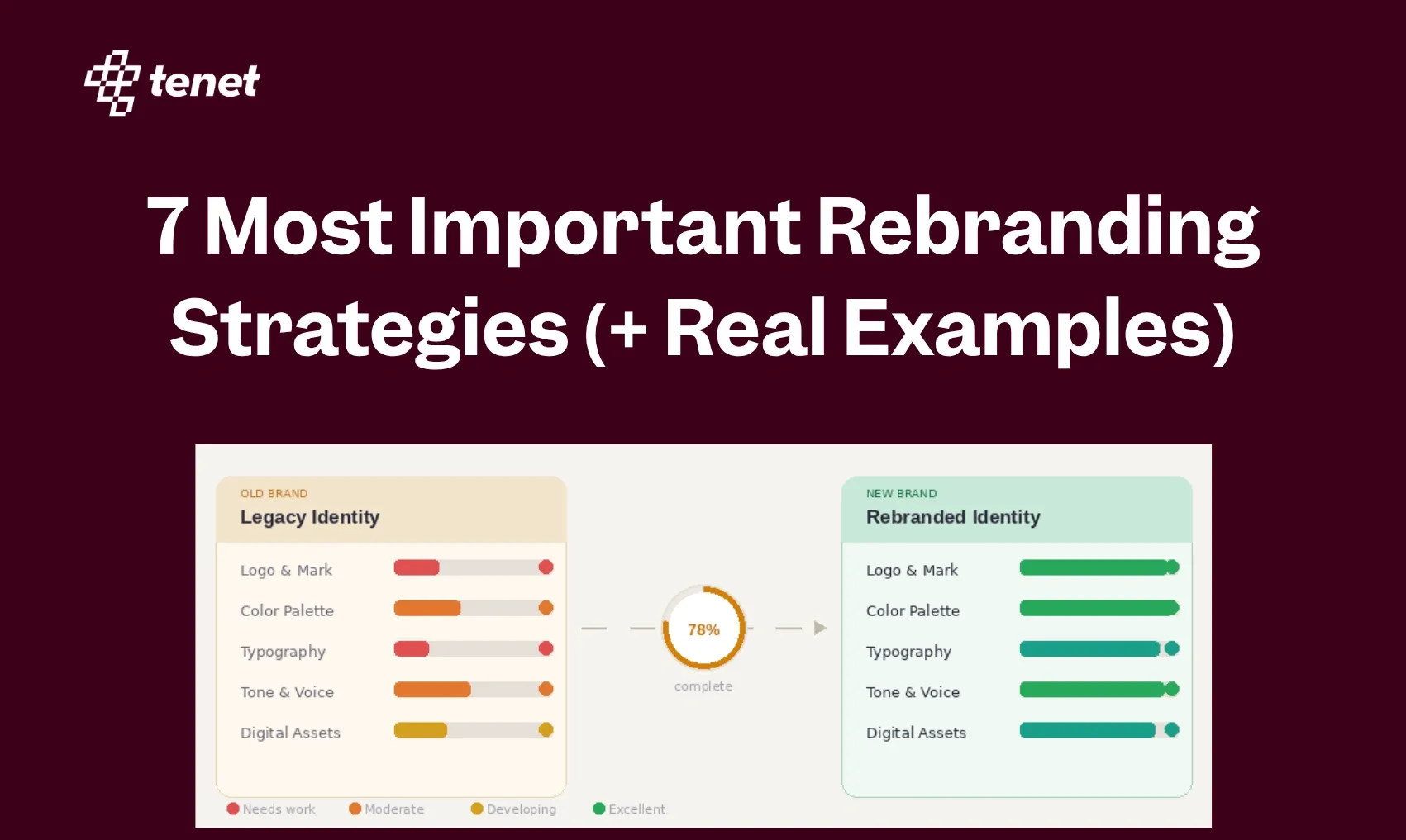
A Complete Visual Branding Guide for 2026
 By
By Share
Share
Get a quick blog summary with


It takes only 50 milliseconds for consumers to judge the visual appeal of your brand.
This split-second judgment influences every subsequent interaction, whether users trust your platform, how long they stay, and whether they convert into paying customers.
After completing more than 450 projects, we can tell you that consistent branding can significantly impact revenue, even research shows that brands presenting a consistent visual identity across all platforms experienced an average revenue increase of 33% compared to inconsistent brands.
This guide delivers the strategic frameworks, tactical processes, and real-world examples you need to build a visual identity that drives measurable business results for digital products.
💡 Before we start
Building a strong visual identity starts with research and strategy. At Tenet, we help brands find their unique position and turn it into a visual system that works across all platforms.
If you are planning to create or refresh your brand, explore our:
- Brand Strategy Service that helps define your mission, audience, and positioning with clear insights.
- Brand Research Service that studies your market, competitors, and user preferences to create visuals that connect.

What is visual branding?
Visual branding is the systematic and strategic use of stylistic elements (color, imagery, typography, and composition) to shape and reinforce the public's perception of a company or product. It's the visual component of your brand identity, transforming intangible values like "innovation" or "trust" into a consistent, recognizable sensory experience across all user touchpoints.
The human brain processes visuals 60,000 times faster than text. Your visual identity acts as a cognitive shortcut, instantly communicating your brand's quality, values, and personality before a single word is read. This isn't just about aesthetics; it's about creating mental real estate in your customers' minds.
A prime example is Airbnb’s rebrand, as it evolved from "air beds and breakfasts" to "belonging anywhere," their visual identity underwent a radical transformation. They replaced the generic blue wordmark with the "Bélo" symbol - a custom-designed mark representing people, places, love, and Airbnb.
The following visual breaks down the 'Bélo' symbol, a logo formed by combining people, places, love, and the letter 'A' that represents Airbnb.
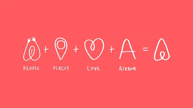
This wasn't merely a logo change; it was a visual manifestation of their new core value: belonging.
The supporting color palette shifted to warm, vibrant tones, and their photography guidelines emphasized authentic, traveler-centric moments rather than sterile property shots.
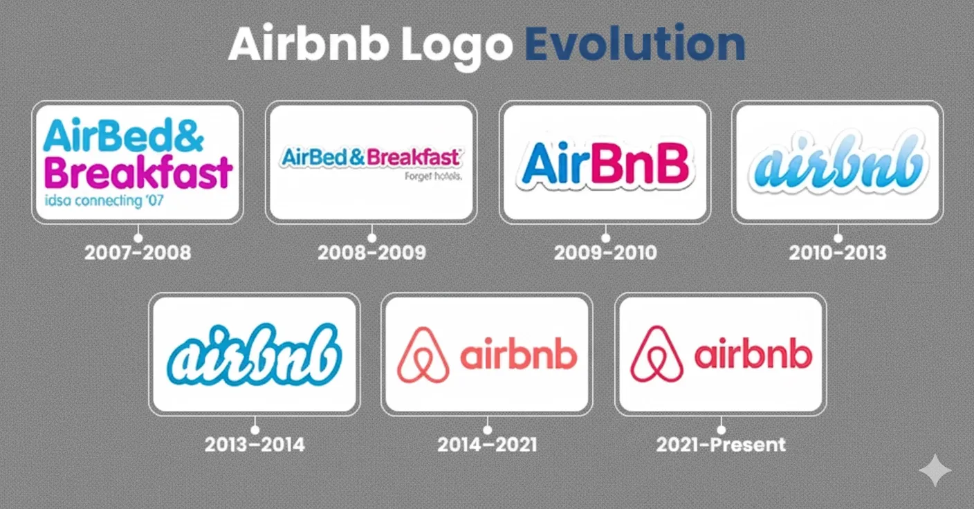
This visual demonstrates Airbnb’s logo evolution, reflecting the shift from a generic wordmark to a unified symbol and warmer, more distinctive visual identity.
This cohesive system successfully translated an abstract concept ("belonging") into a tangible visual experience across every touchpoint, directly supporting their business transformation.
👉 Learn about building scalable brand identities for digital products with our visual identity services.
What are the elements of a visual identity branding?
1. Logo
The logo is the primary graphical representation of a brand and must be designed for maximum versatility and clarity. It can come in different forms:
- Wordmark: Text-based logos (e.g., Google) focusing on typography.
- Symbol/Icon: Graphic-only marks (e.g., Apple’s apple).
- Combination Mark: Text plus a symbol (e.g., Adidas).
Key technical considerations include scalability (maintaining legibility at any size), clear space rules (minimum surrounding whitespace), and color variations (full color, monochrome, reversed). Usage guidelines prevent distortion, improper color application, or overcrowding, ensuring the logo appears consistently across all platforms.
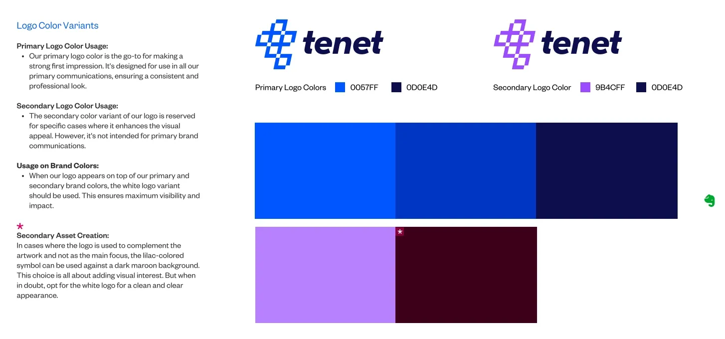
Here are some images that show Tenet’s logo and key technical considerations, like correct spacing, size, and color:
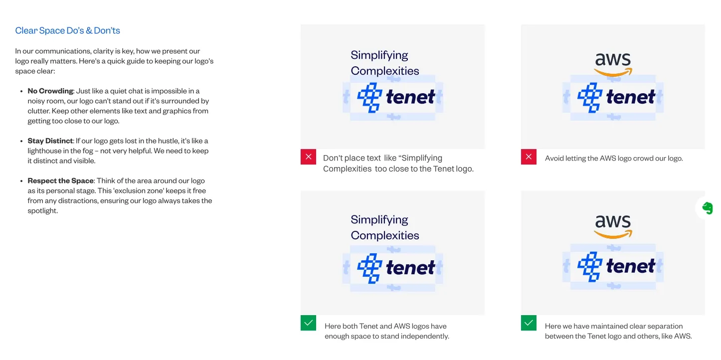
This visual shows essential clear space rules for Tenet’s logo, illustrating correct and incorrect applications to prevent overcrowding and preserve distinctness.
This image demonstrates Tenet’s logo color variants, including primary, secondary, and accent colors - ensuring brand versatility while maintaining strict technical standards.
2. Color Palette
The color palette establishes emotional tone and brand recognition before any text is read. Technically, it includes primary, secondary, and accent colors defined by exact digital (HEX, RGB) and print (CMYK, Pantone) values to ensure consistency.
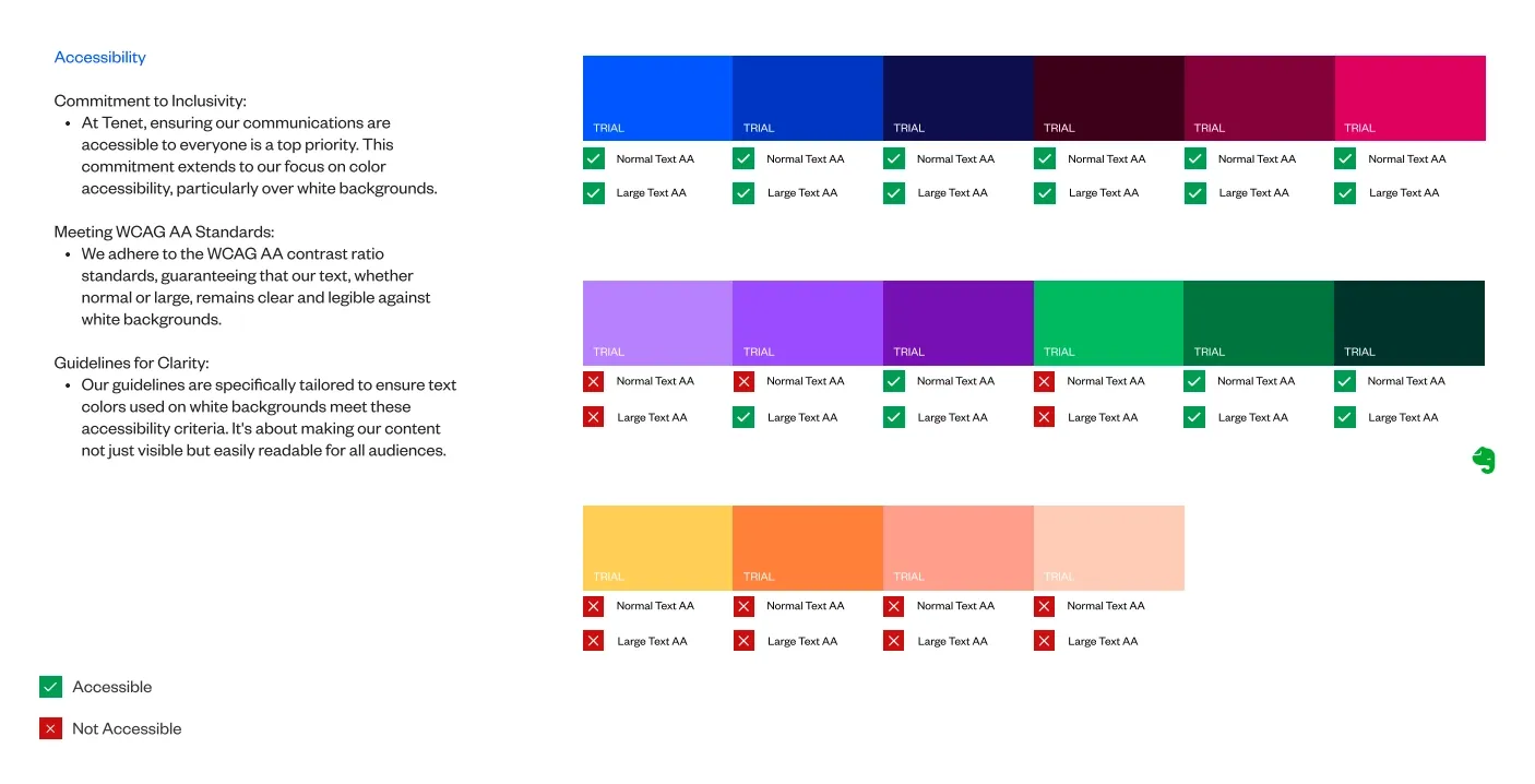
Accessibility standards mandate testing contrast ratios, especially for text and UI elements, ensuring readability for all users. Color usage rules cover when and where to apply each palette shade, dominant colors for backgrounds and major components, secondary colors for accents, and neutrals for typography or whitespace balance.
The following picture is of the Tenet visual identity guideline showing the accessibility standards:
3. Typography
Typography guidelines specify the typefaces, weights, sizes, and styles used to communicate brand voice and hierarchy visually. To maintain cohesion, brands usually limit their type families to 2-3 fonts, primary for headlines, secondary for body copy, and occasionally a UI-optimized font for digital interfaces.
This image displays the primary and secondary typefaces used by Tenet for ASDAV:
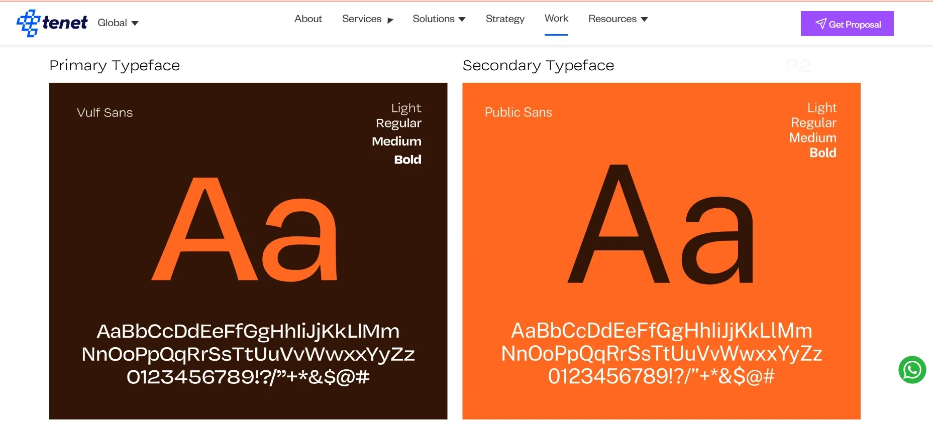
Guidelines include usage rules for italics, bold, and letter spacing, plus fallback fonts for different operating systems and web browsers. Technical detail extends to responsive typography scales to ensure legibility across devices and platforms.
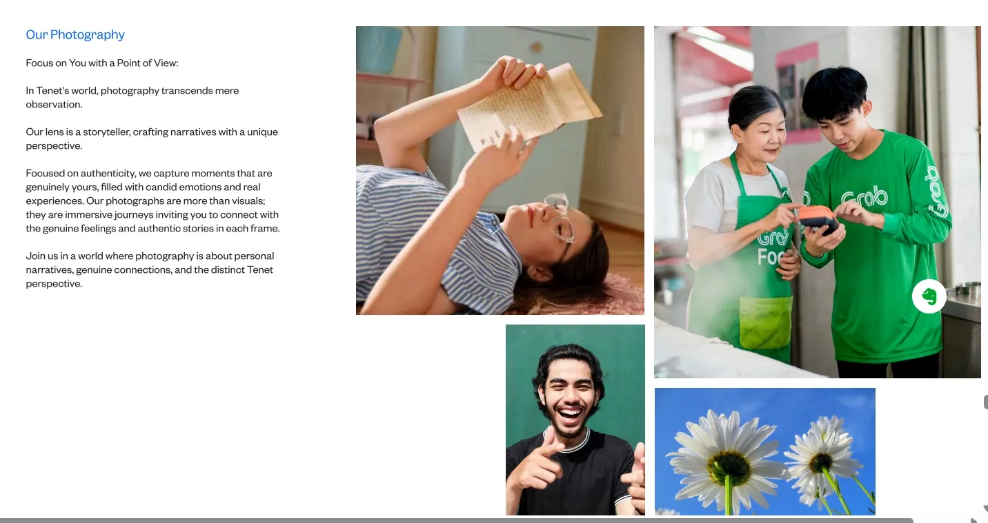
4. Imagery and Photography
Imagery standards define the style, mood, and subject matter of photos, illustrations, or iconography supporting brand storytelling. Specifications include color grading guidelines, composition rules (e.g., use of negative space, focus areas), and usage contexts.
Below are some images of Tenet’s imagery guidelines:
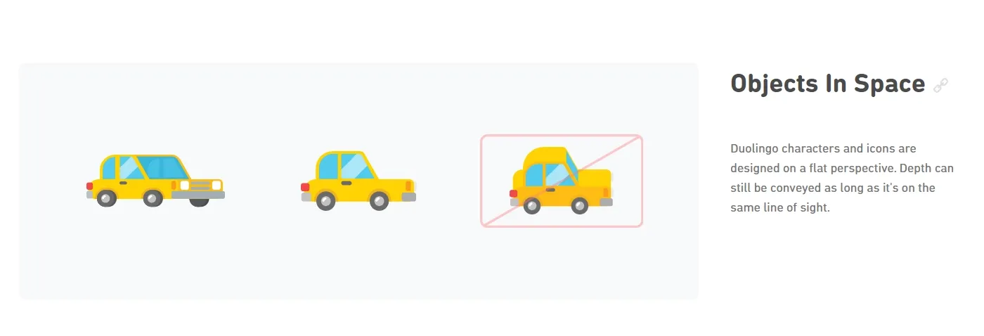
5. Graphic Elements and Patterns
These are supporting visuals such as icons, textures, backgrounds, shapes, and patterns that complement the core brand elements. Their design follows strict rules on scale, color usage, and repetition to maintain harmony with primary brand assets.
Guidelines include grid layouts to align elements precisely, ensuring modularity and visual rhythm that enhance user experience without overwhelming.
These are some graphic elements from Duolingo’s visual identity guidelines:
6. Layout and Composition
Layout principles dictate how visual components arrange within defined spaces, balancing alignment, hierarchy, and whitespace to optimize readability and aesthetic coherence.
Designers use grid systems, which are modular frameworks made of columns and gutters, to keep spatial consistency across web pages, mobile apps, and print materials. Composition rules help guide focus points, visual flow, and balance.
7. Brand Style Guide
A comprehensive brand style guide documents all these elements with detailed instructions and examples. It provides
- Comprehensive specs on logos, colors, typography, imagery, and layouts
- Do’s and don’ts with visual references to ensure correct usage
- Cross-platform application guidance for print, web, video, and social media
- Version control and accessibility for all internal and external brand stakeholders
The guide functions as a single source of truth to ensure brand consistency across departments, agencies, and digital platforms, facilitating scalable design implementation and reducing misuse or brand dilution risks.
👉 You can check out Tenet’s Brand guide or Duolingo’s Brand guide to see for yourself what a brand style guide contains.
How to create a visual identity for digital products?
Creating a visual identity for digital products requires a methodical approach that balances aesthetic appeal with functional requirements. Unlike static brand identities, digital products need systems that scale across multiple screen sizes and interaction states while maintaining consistency. Here's your practical blueprint:
Step 1: Conduct Brand Strategy Research
Start by defining your brand’s core mission, vision, and values. These create the base for all visual and communication decisions. Make sure your brand message is clear and consistent across every touchpoint.
Steps to follow:
- Run stakeholder workshops: Bring together key team members to define your product’s purpose, mission, and core values. This ensures alignment before you move to design.
- Build detailed user personas: Go beyond basic demographics. Use research and data to understand your target audience’s goals, frustrations, habits, and motivations. Identify which digital products they already use and what attracts them. This helps shape your visual style to match real preferences.
- Conduct competitor analysis: Study at least 3–5 direct competitors and 3–5 indirect or adjacent brands known for strong visual identities.
- Create a visual identity spreadsheet: Record each brand’s color palette, fonts, logo treatment, and image style. Look for trends and differences.
- Perform a visual SWOT audit: Use your research to identify strengths, weaknesses, opportunities, and threats in your current or planned branding approach.
By the end, you’ll have a complete visual audit deck with SWO analysis that clearly shows where your brand stands in the market and how your visual identity can stand out effectively.
Step 2: Define Precise Brand Positioning
Strategic positioning provides the framework for every visual decision. Without this foundation, design becomes an arbitrary personal preference rather than a strategic communication.
So, articulate what makes your product unique. Like, write positioning statements that clarify:
- Target Audience: Who specifically are you serving? Demographics matter less than psychographics - what motivates them, what they fear, what they aspire to become.
- Category: What market do you compete in? How do you define your competitive set?
- Point of Difference: What singular benefit do you deliver that competitors don't? This becomes your visual differentiator.
- Reasons to Believe: What proof supports your claims? How do we translate this into visual language?
Ask critical questions that guide visual development:
- What emotions should users feel when using our product?
- What should they think about our brand?
- How formal or casual should we appear?
- How innovative or traditional should we seem?
- How accessible or exclusive should we feel?
Example positioning for a fintech product:
"For millennial professionals who feel overwhelmed with traditional banking, FinanceApp is a financial management platform that makes money simple with transparent and easy guidance, along with automated smart saving.
It is different from traditional banks that make finances complex to hide fees and serve their own interests."
This positioning immediately suggests visual direction: approachable typography (not corporate banking fonts), transparent design patterns (clear information hierarchy, no hidden fees), simplified iconography (no complex financial symbols), and a warm but professional color palette (not cold institutional blue).
Step 3: Develop Core Visual Elements
This is where you build the core elements that will form your visual language. Create foundational brand assets with attention to scalability, accessibility, and cross-platform performance:
What to do:
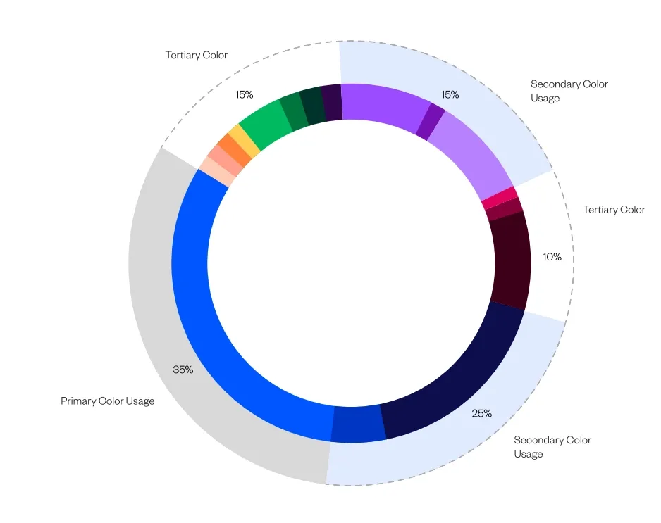
- Color Palette: Select 1 primary brand color, 2-3 secondary colors, and a complete neutral scale (from light background to dark text). Ensure all colors meet WCAG accessibility standards.
Here is the color palette that practically showcases the above (this is the color palette of Tenet):
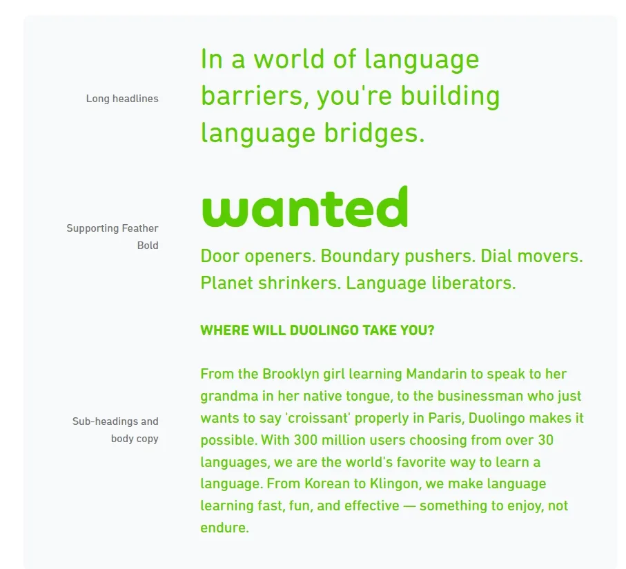
- Typography: Choose 2 typefaces maximum - one for headings, one for body text. Test readability across devices and establish a clear type scale (H1, H2, body, caption).
This picture demonstrates Duolingo’s typographic hierarchy, showing distinct fonts for headings, emphasis, and body text - optimizing clarity and brand personality across devices.
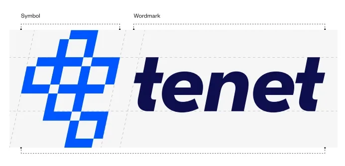
- Logo System: Design your primary logo, a simplified version for small spaces, and a functional icon/favicon.
This image shows the structural logic behind Tenet’s logo - illustrating how the symbol and wordmark combine for maximum legibility and brand impact, scalable across all digital touchpoints.
- Iconography and Graphics: Create icons and design motifs that support navigation and brand storytelling.
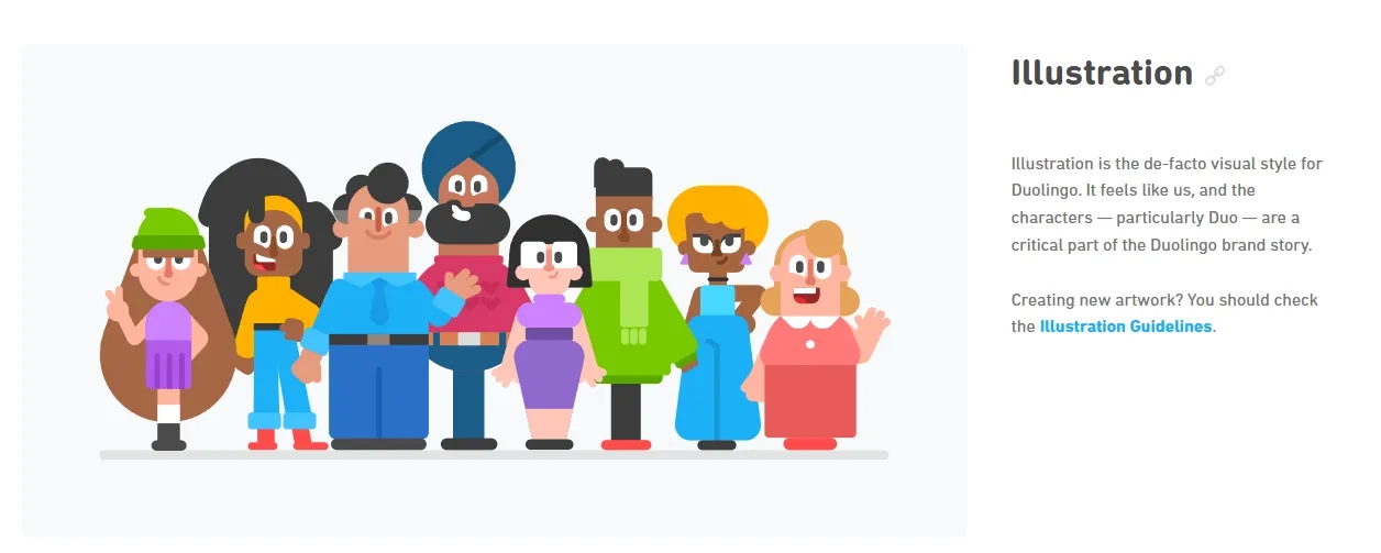
This illustration shows Duolingo’s playful iconography, with diverse characters and motifs reinforcing brand personality and making navigation engaging and memorable.
You can have a look at Tenet's Media Kit. Notice how they provide specific logo variations with clear spacing requirements, exact color codes, and typography guidelines. This level of detail ensures consistent application.
Step 4: Build Your UI Component Library
Your visual identity must work as a practical toolkit for building functional and consistent user interfaces. Design and document every core UI component, including:
- Buttons, form fields, navigation bars, alerts, and modals
- Multiple interaction states for each component: default, hover, active, disabled
- Spacing system based on a consistent grid (usually 4px or 8px increments)
- Icon sets designed with uniform stroke weights and style for coherence
This process results in a comprehensive design system housed in tools like Figma, Sketch, or Adobe XD, complete with clear guidelines on component usage. It ensures designers and developers deliver pixel-perfect, scalable interfaces aligned with your brand across all digital products.
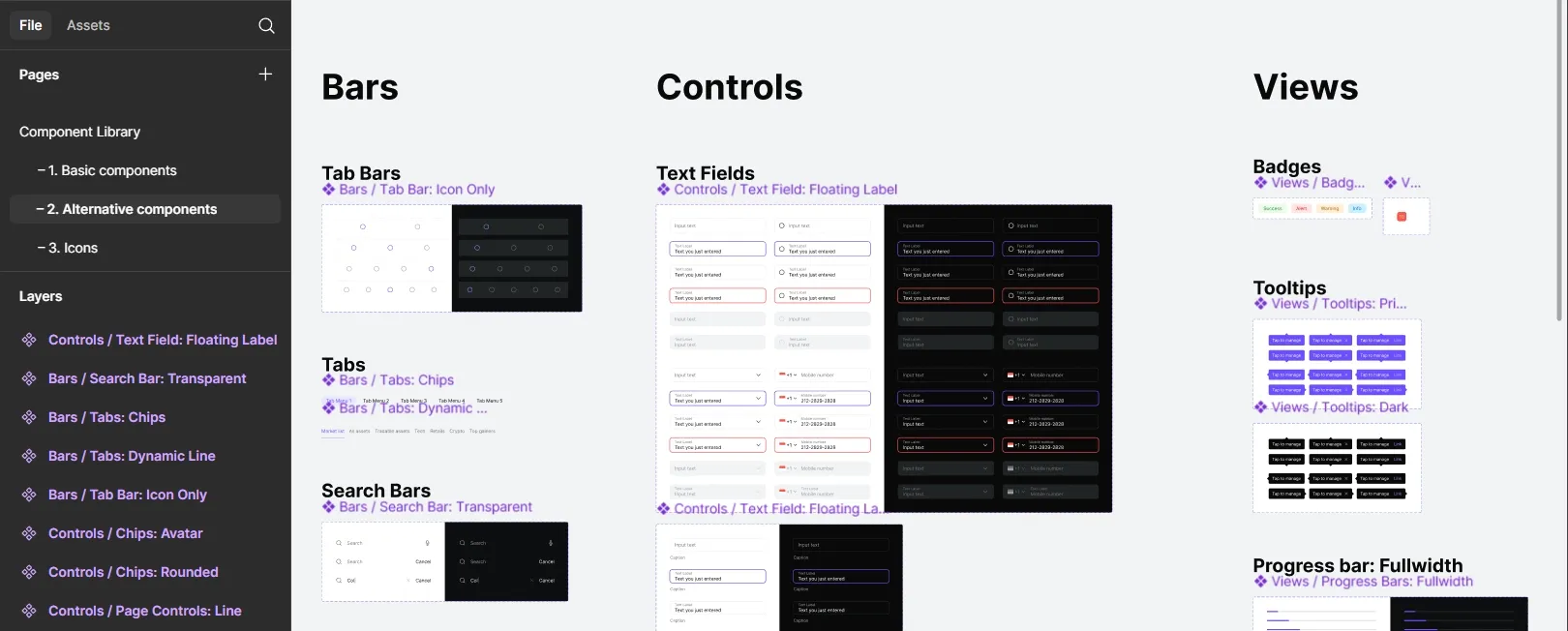
The following image shows a digital product’s UI component library in Figma - documenting layouts for bars, buttons, text fields, tooltips, and badges.
Step 5: Create Comprehensive Brand Guidelines
Formalize your brand’s visual rules in comprehensive design guidelines or a style guide. This document governs the usage of logos, colors, fonts, imagery, and layouts, ensuring every digital touchpoint maintains visual consistency.
This guide usually contains:
- Introduction & Brand Story: Briefly recap the mission and personality.
- Logo Usage: Exhaustive rules with clear-space diagrams, minimum sizes, and incorrect usage examples.
- Color Palette: Values, usage percentages, and accessibility contrast ratios.
- Typography: The complete scale with font weights and real-world examples.
- Imagery & Iconography: Style of photography/illustration (e.g., "authentic, not stock"), and icon grid specifications.
- UI Components: The interactive library with usage guidelines.
- Voice & Tone: Guidelines for microcopy and messaging that complement the visual style.
- Digital layout grids: Systematic use of grid templates (e.g., 12-column grid) for web and app interfaces to maintain spatial harmony.
- File formats and resolutions: Specifications for SVG for icons, optimized JPEG/WEBP for images, and colour profiles for accurate rendering.
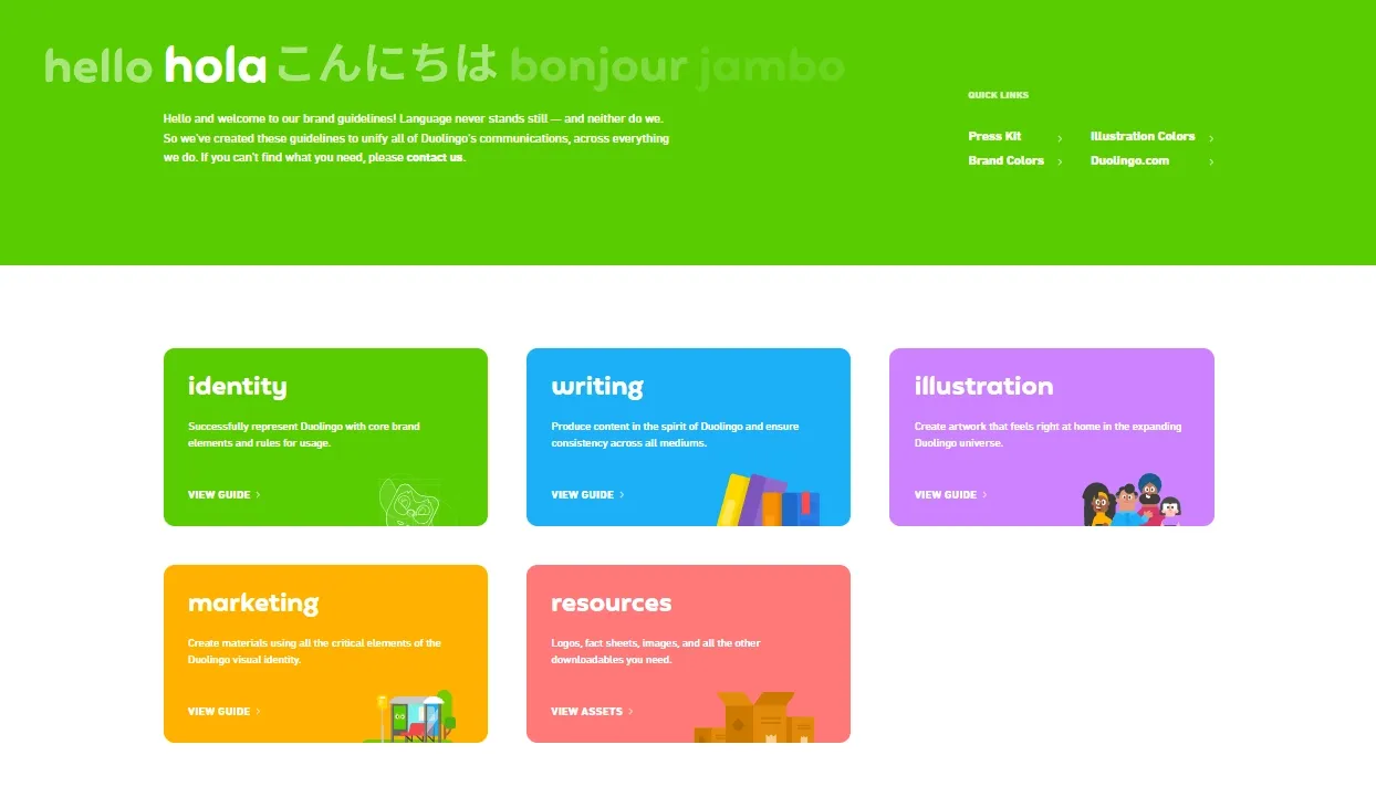
Duolingo’s publicly available brand guidelines set industry benchmarks for such documentation, enabling unified brand expression across platforms and teams. Here is the picture of Duolingo’s brand identity guide:
Step 6: Create High-Quality Visual Assets for Multiple Channels
Creating visually compelling assets is only half the battle; these must be technically optimized for performance, accessibility, and consistency across all digital touchpoints. Key considerations include:
- Web and Mobile: Use responsive images and scalable vector graphics to ensure crisp visuals on all screen sizes. Optimize assets for fast loading speeds without sacrificing quality by employing compression techniques and appropriate file formats.
- Social Media: Use Platform Platform-specific image sizes and formats (e.g., square posts, stories) with consistent branding overlays.
- Email Campaigns: Prioritize lightweight images with descriptive alt texts to ensure fast deliverability and accessibility compliance, improving user engagement and inclusivity.
- Video and Animation: Develop branded video elements such as intros, transitions, and lower-thirds that align with static brand visuals, incorporating motion design guidelines to maintain a coherent brand experience.
Use design tools like Figma, Sketch, and Adobe XD, which offer export presets and design tokens to facilitate high-quality output and smooth handoff between design and development teams.
Step 7: Integrate Visual Identity into User Experience
Work closely with UX/UI designers and developers to incorporate your visual identity meaningfully throughout the product interface. Ensure brand elements like logos, buttons, forms, and navigation bars reinforce the brand’s look without interfering with usability.
Check color contrast and font legibility for all interface states (normal, hover, disabled) to meet accessibility standards.
Build reusable UI kits and design tokens that help developers apply consistent styles across screens and devices. Add animations and micro-interactions that reflect the brand’s character, creating a more engaging user experience.
Step 8: Test, Iterate, and Evolve
Testing your visual identity helps you understand how effectively it connects with your audience and supports your brand goals. Use both quantitative and qualitative methods to gather insights.
- Track user engagement metrics and run A/B tests on different visual designs to see which elements perform better.
- Collect user feedback through surveys and usability tests focused on visual appeal and brand perception.
- Monitor accessibility compliance using tools like Axe or Lighthouse to ensure inclusive design.
- Use these insights to refine your visual assets, improving clarity, emotional resonance, and overall user satisfaction.
Further resources:
How Tenet helps build a strong visual branding for digital products
With experience working alongside over 300 clients (from early-stage startups to Fortune 1000 companies), we bring a data-driven and strategic approach to visual identity creation for digital products.
At Tenet, we start by understanding your users, competitors, and market position. Then we translate those insights into visual systems that scale.
You receive complete brand guidelines, design systems, and implementation support - not just pretty pictures, but working tools your team can use immediately.
Our clients see measurable results: improved conversion rates, stronger brand recall, and reduced design debt. Companies like G42 Healthcare and ASDAV trusted us to define their visual identities because we balance creativity with strategic rigor.
Here is a glimpse of our work that we have done for ASDAV:

Need a visual identity that drives business results?
Let's build something your users will remember.
Contact our branding team to discuss your project and see how we can help.
🔎 Here are some related case studies for future reference:
Talk to our branding team to create a brand your customers will remember
Talk to our branding team to create a brand your customers will remember


Got an idea on your mind?
We’d love to hear about your brand, your visions, current challenges, even if you’re not sure what your next step is.
Let’s talk


