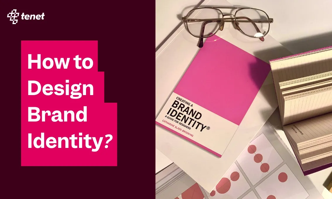
How to Design Brand Identity? (6 Key Steps)
 By
By Share
Share
Get a quick blog summary with


Why do some brands stick in your mind instantly, while others disappear the moment you look away? Think of Nike, Apple, or Coca-Cola.
You do not just see their logo, you feel their identity.
The difference is simple: strong brand identity. Yet many businesses stop at a logo and colour palette, only to realize people do not remember them, or worse, confuse them with competitors.
That is what happens when identity is not done right.
At Tenet, we have helped more than 300 clients across 15 countries build brand systems that people instantly recognize and trust.
With experience across 450 projects, we know what it takes to turn design into a true growth driver.
In this guide, we will share how we do it at Tenet step by step so you can design a brand identity that not only looks good but also creates real connection, trust, and long-term impact.
Branding vs Brand Identity vs Visual Identity
These three terms often get thrown around as if they mean the same thing. But they’re not interchangeable; each plays a different role in how a business presents itself and connects with people.
Here’s a simple way to break it down:
What is branding?
Branding is the collection of deliberate actions, strategies, and choices a company makes to shape how people perceive it. It goes beyond logos, taglines, and visual design; it’s the combined effect of every touchpoint a customer interacts with.
Branding answers questions like:
- How does this product make me feel?
- Do I trust this company?
- What kind of personality does this brand have?
For digital products, branding is often less about billboards or packaging and more about how the product behaves and communicates in everyday interactions. It can be seen in:
- Onboarding flow – Is the first experience overwhelming or smooth and welcoming?
- App experience – Does the interface feel consistent, intuitive, and designed with care?
- Tone of microcopy – Are the messages playful, professional, supportive, or empathetic?
- Customer support – Does the response feel cold and robotic, or warm and human?
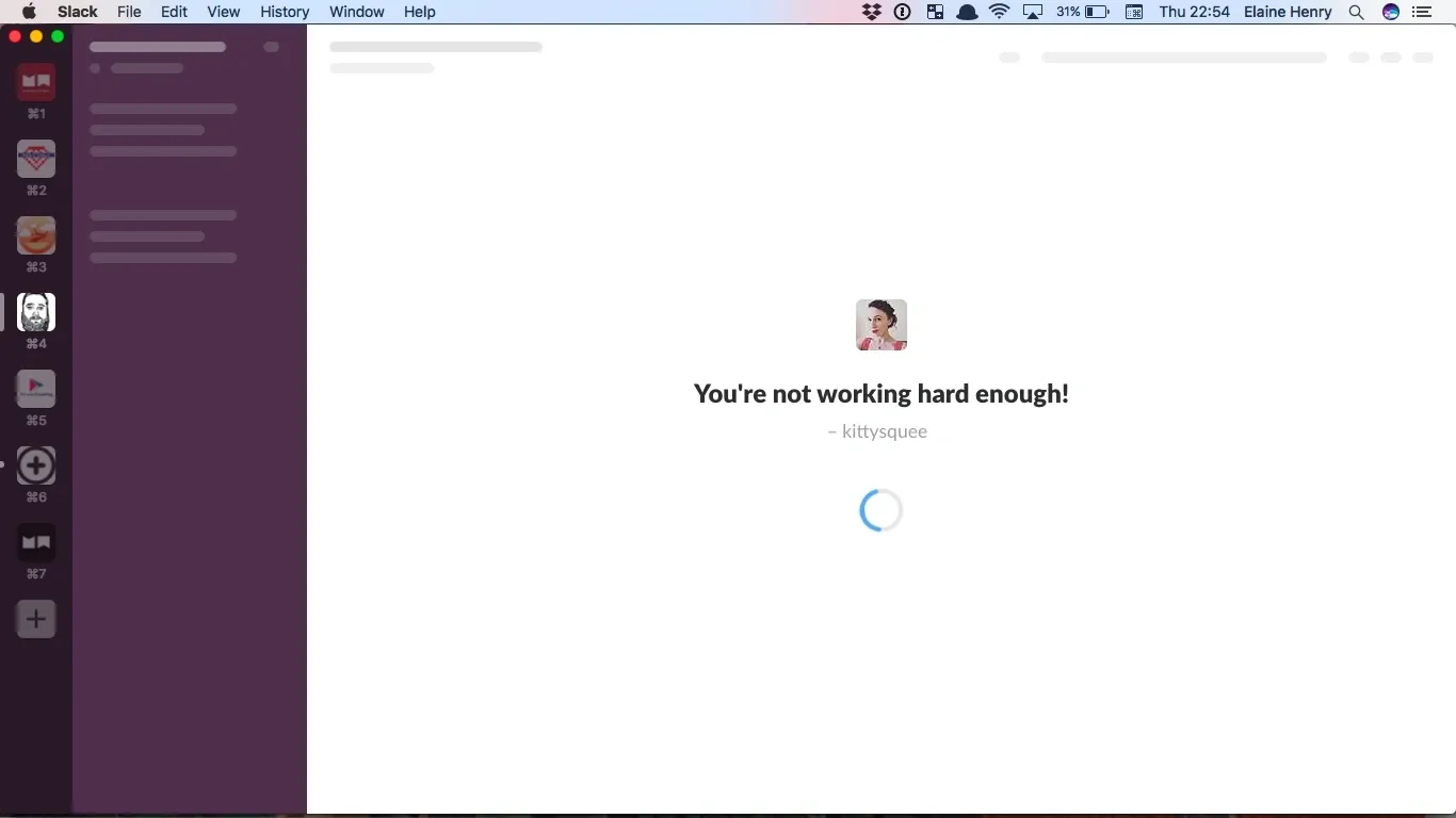
Here’s an example of Slack’s playful microcopy during loading - reinforcing brand personality and tone through everyday user interactions.
In fact, Slack’s interface delivers customer support in a channel, showing real-time, user-centric communication that builds trust and connection.
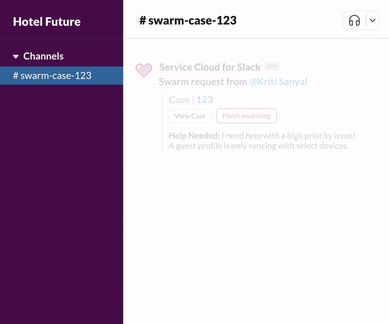
This captures branding in action via product behavior and messaging, not just visual design.
👉 If you want to differentiate from competitors and build a brand identity from scratch, here’s how Tenet can help you with:
- Expert Brand Strategy Services for Growth (also available in the US, UK, India, UAE)
- Leading Brand Research Services
What is Brand Identity?
Brand identity is the unique system of elements that makes a brand instantly recognizable and memorable. It is the collection of visual cues, communication styles, and experiential details that work together to shape how people perceive a product or company. It’s a complete framework that defines how the brand looks, how it feels, and how it interacts with people.
For digital products, brand identity becomes even more important because users experience it every day through design and interaction.
It can include:
- UI style and design language – Is the product sleek and minimal like Apple, or bold and expressive like Spotify?
- Interaction patterns – How the product guides the user, whether through gamification, subtle animations, or straightforward navigation.
- Voice and tone – The words used in push notifications, error messages, or onboarding tips. For example, a serious financial app might use a reassuring tone, while a language-learning app could be fun and cheeky.
- Accessibility and inclusivity choices – Offering features like dark mode, readable fonts, or screen-reader compatibility reflects a brand’s commitment to making its identity usable by everyone.
When these elements align, they create a cohesive system that tells users: “This is who we are, and this is what we stand for.” Over time, a strong identity builds recognition and trust; people know what to expect when they see or hear from the brand.
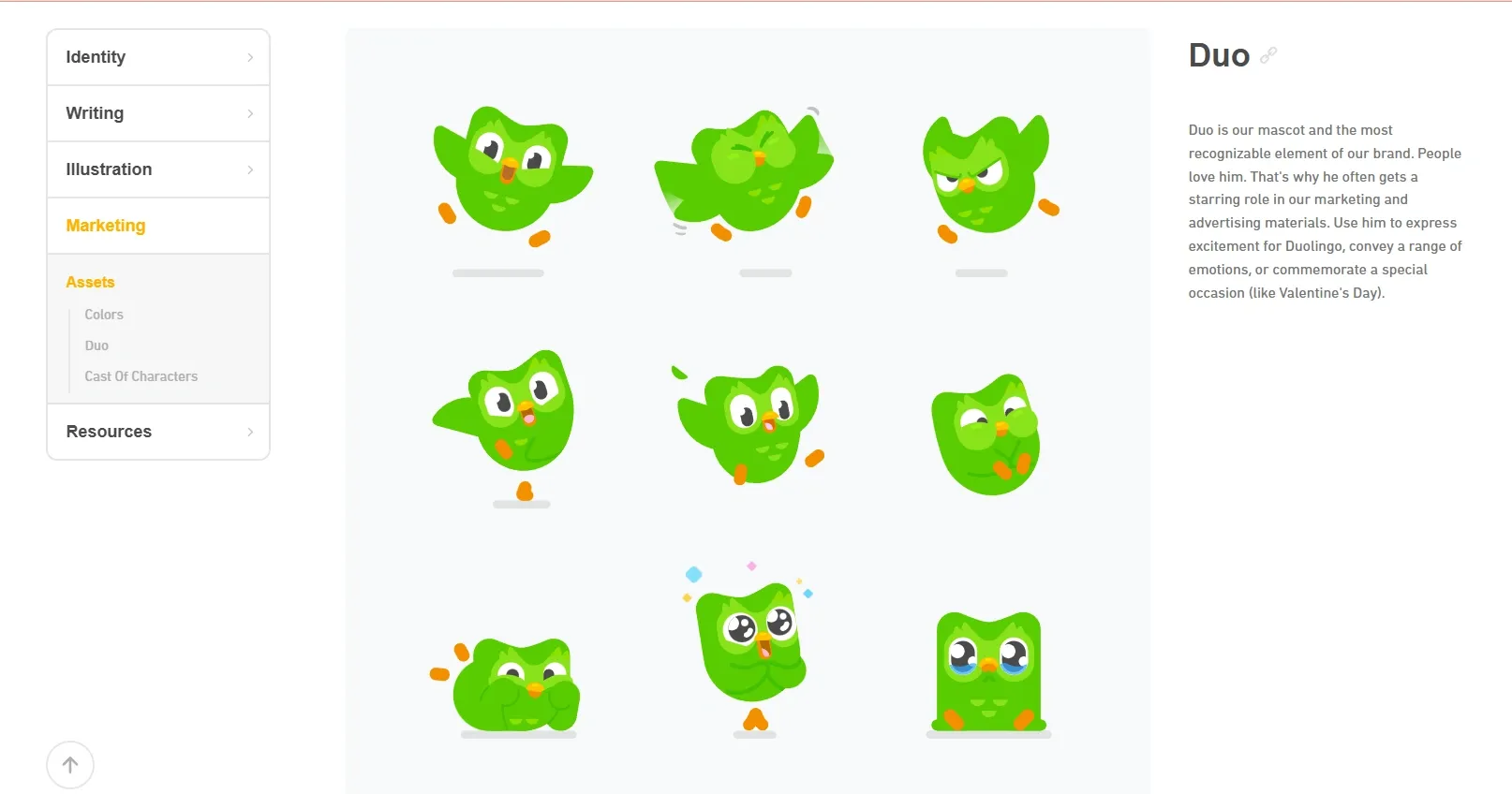
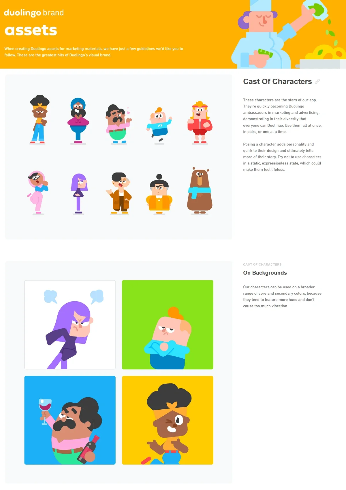
Example: Duolingo’s brand identity is instantly recognizable. The playful green owl mascot, vibrant color palette, gamified UI patterns, quirky notification copy (“Hey, you forgot your Spanish!”), and even sound effects work together to reinforce a consistent, playful identity. That’s why users can spot a Duolingo touchpoint even outside the app (it all ties back to the same identity system).
The Duo mascot embodies Duolingo’s brand personality, expressing a range of emotions and maintaining a fun, approachable tone in all interactions.
What is Visual Identity
Visual identity is the aspect of brand identity that establishes the consistent visual elements used to represent and distinguish a brand. It includes the logo, typography, color palette, iconography, illustration style, and photography guidelines, all with clear usage rules to ensure uniformity.
For digital products, it incorporates design tokens (standardized color, spacing, and typography values), UI component libraries (reusable interface elements), and UI kits, which together maintain a consistent appearance and behavior across platforms.
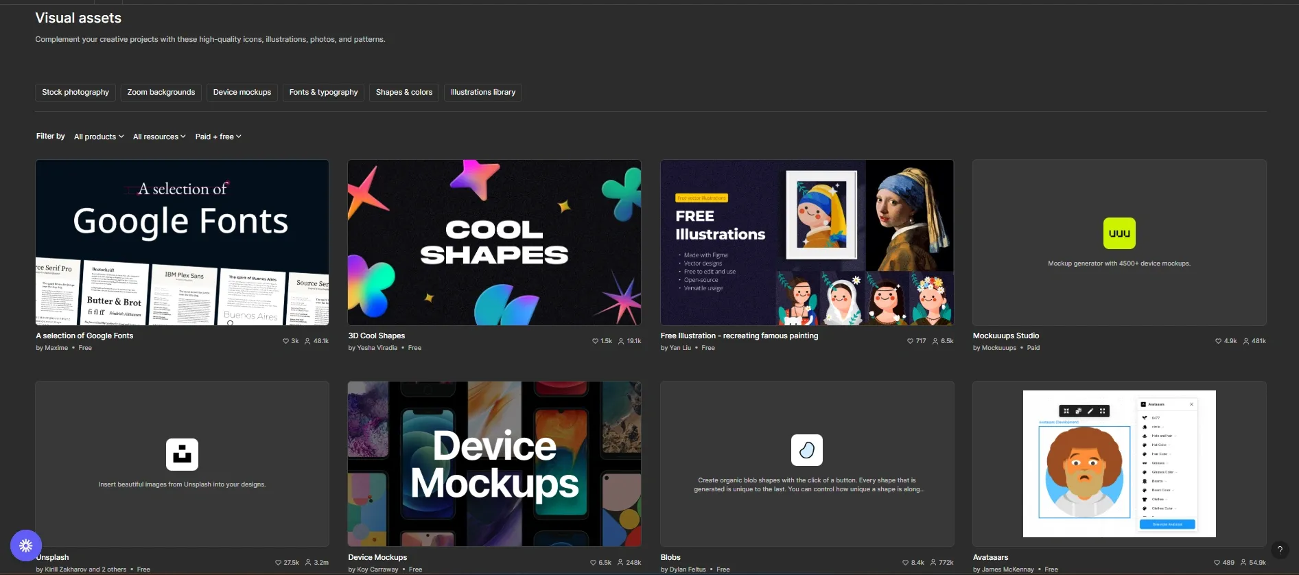
Example: Figma’s visual identity consists of a precise geometric logo, a defined color palette, consistent UI icons, and clear typography, all implemented through component libraries and design tokens to ensure brand consistency across digital interfaces.
Below is an overview of Figma’s essential visual assets that form the foundation of a consistent and recognizable digital brand identity.
What are the Core Elements of Brand Identity for Digital Products
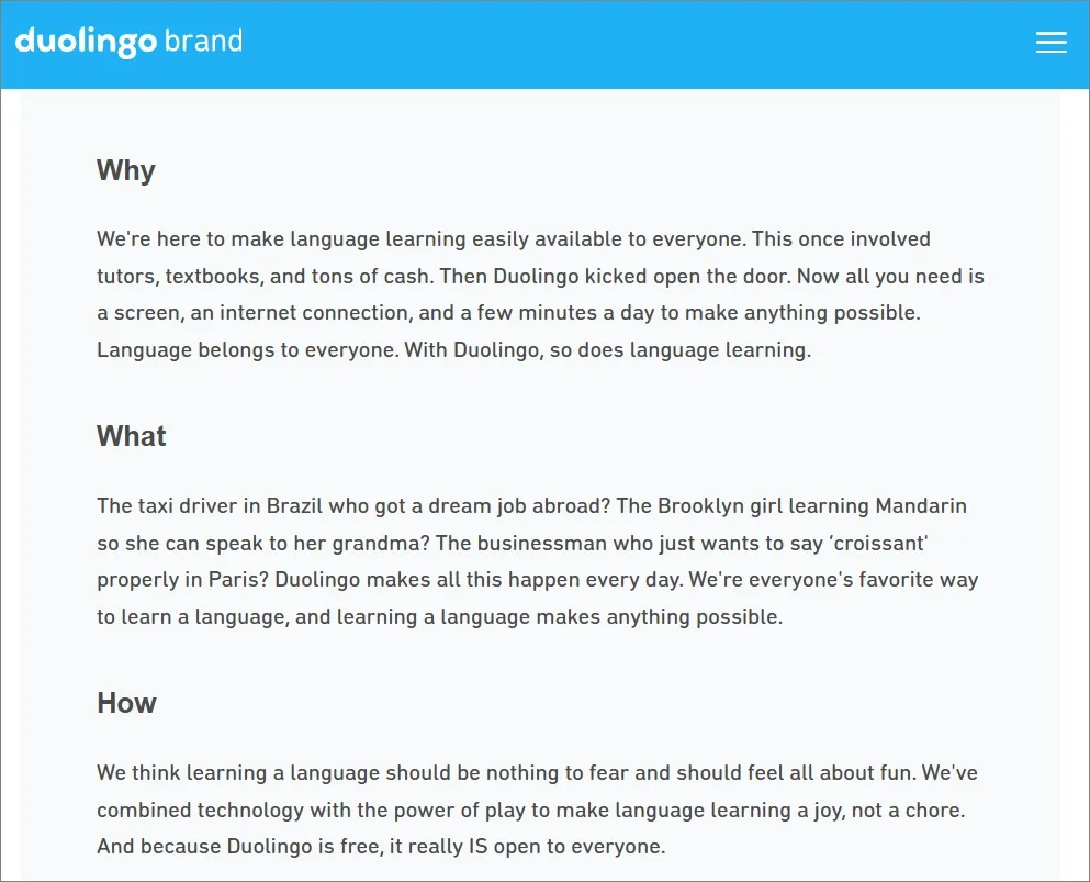
1. Brand Story
Brand story is the “why” behind a digital product, explaining its purpose and the problem it solves. For example, a remote collaboration app might exist to help distributed teams work smoothly together. This foundational narrative guides every design and communication decision.
Check out Dulolingo’s brand story shared officially on its website:
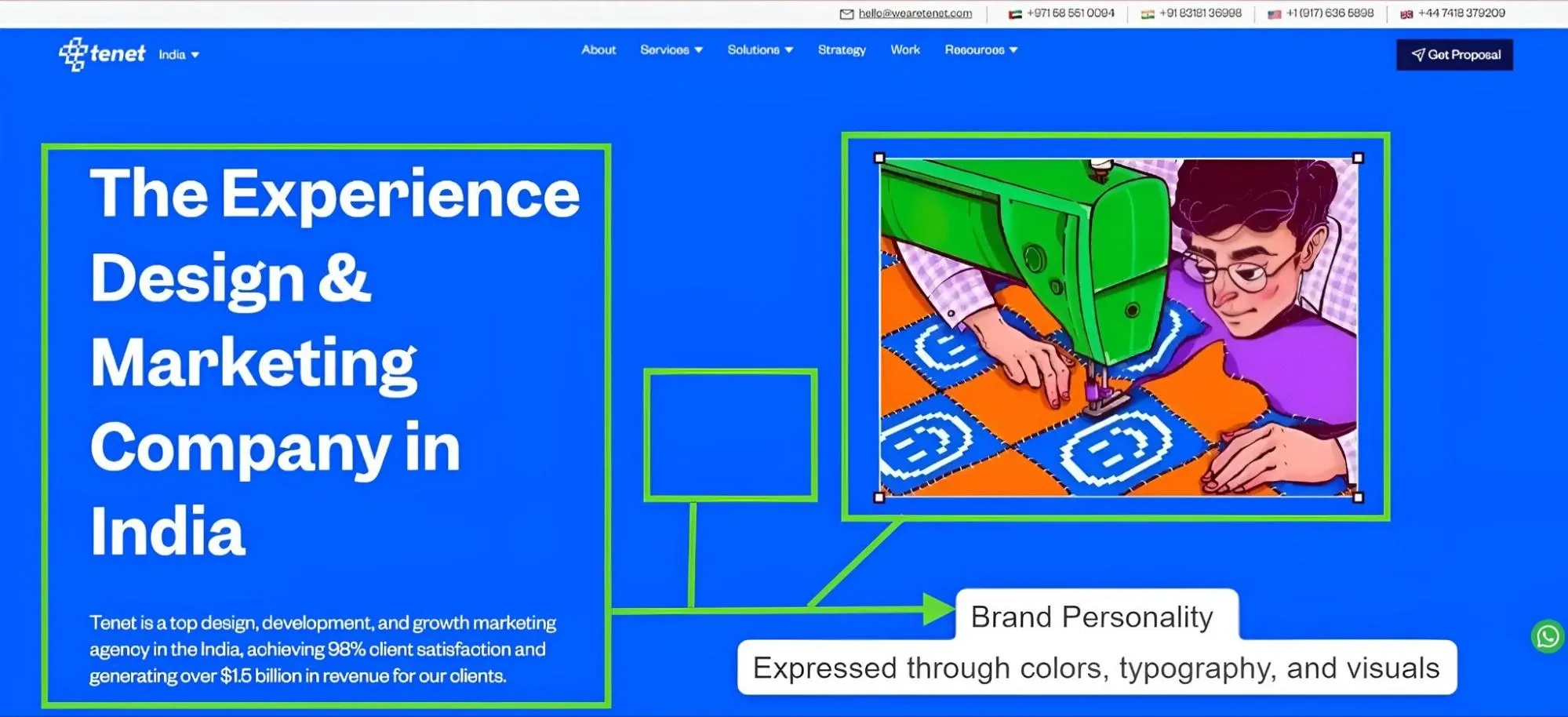
2. Brand Personality
Brand personality is the set of human traits expressed by the product, such as playful, bold, secure, or minimal. These traits show up in colors, tone, iconography, and user interactions, shaping how users emotionally connect with the app.
The design showcases Tenet’s personality through bold color choices and illustration style.
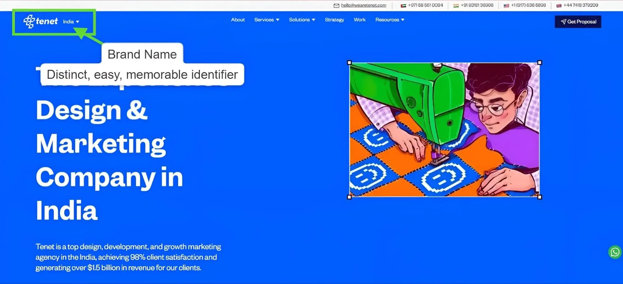
3. Brand Name
A brand name is the distinctive, memorable word or phrase users see first. It’s chosen to be short, easy to pronounce, easy to spell, and works well in app stores or digital marketplaces. A strong name quickly conveys identity and stands out in search results.
This image demonstrates Tenet’s distinct and memorable branding (brand name) in digital product contexts:
4. Products or Services
This covers the core features or offerings that define the app’s positioning. These are the tools, modules, or services that directly solve user problems and differentiate the product from others in the market.
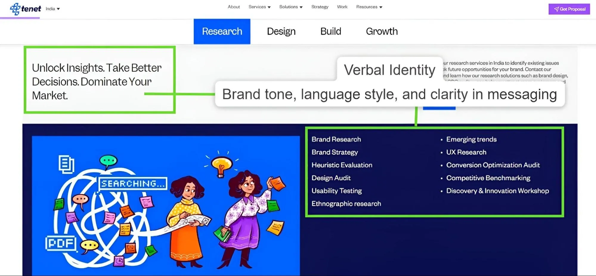
5. Verbal Identity
Verbal identity is how the brand “speaks” - the tone, language, and style found in onboarding text, notifications, and microcopy. A digital product’s verbal identity helps build trust. It can be playful and friendly or formal and instructional, but it should always stay clear and consistent.
This graphic highlights Tenet’s clear messaging and showcases the breadth of its digital research services:
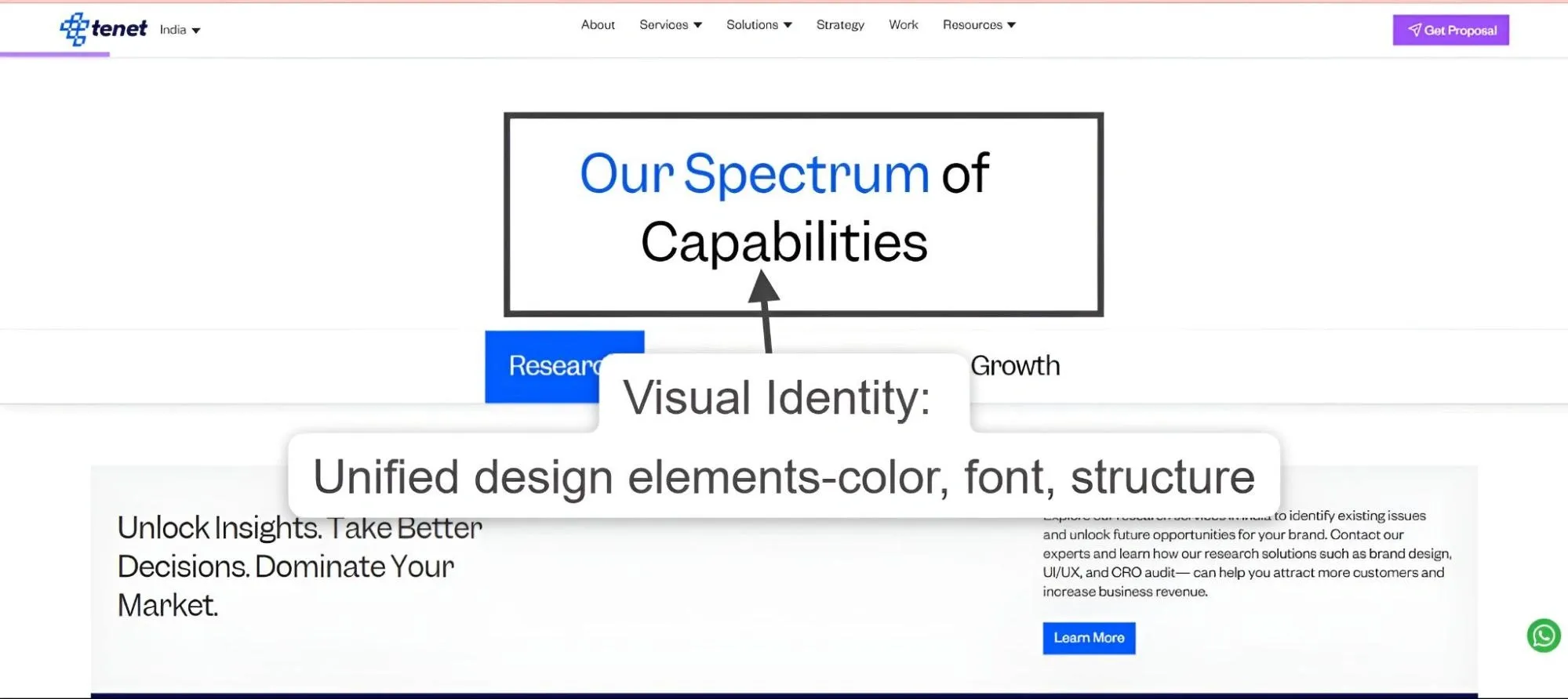
6. Visual Identity
Visual identity covers all the visual building blocks - logo, color palette, typography, icons, and imagery used in the UI and marketing. In digital products, this also includes UI kits, Figma libraries, and design tokens that ensure interfaces are visually unified and easily recognizable.
This illustration emphasizes Tenet’s consistent use of colors, typography, and layout across its interface:
Each element works together to create an identity that users remember and trust, helping digital products stand out in a crowded market.

The Process of Designing Brand Identity
Step 1: Define the brand in one clear phrase
Every strong brand identity begins with a definition that is precise and non-negotiable. Before you even touch colors, logos, or typography, the first responsibility is to decide: What does this brand stand for, and how should people perceive it?
Why this matters:
If you skip this step, design becomes decoration. You might end up with something attractive, but it won’t communicate. A clear definition ensures that your brand identity is not only aesthetically consistent but strategically aligned with business goals and customer expectations.
How to approach it:
1. Audit the business context
Begin by analyzing the company’s mission, long-term vision, and immediate priorities, ensuring they align with current market dynamics.
Review competitor strategies, promises, and visual identities to understand how saturated the market space is, then identify strategic gaps where the brand can differentiate.
Take an example from social media platforms and how they support business branding👇
- Facebook: Broad consumer base with focus on local businesses and community engagement.
- LinkedIn: Professional services, B2B networking, and thought leadership.
- YouTube: Education, entertainment, product demos, and tutorials.
- Pinterest: Lifestyle brands, e-commerce, and visual product discovery.
2. Run stakeholder interviews
Conduct interviews with founders, executives, sales representatives, and customer-facing teams to gather diverse insights about what the brand should represent.
Pay close attention to any conflicting viewpoints- like the leaders say the brand should feel exclusive, but sales say it should be affordable, this means the brand message is confusing and needs to be made clearer.
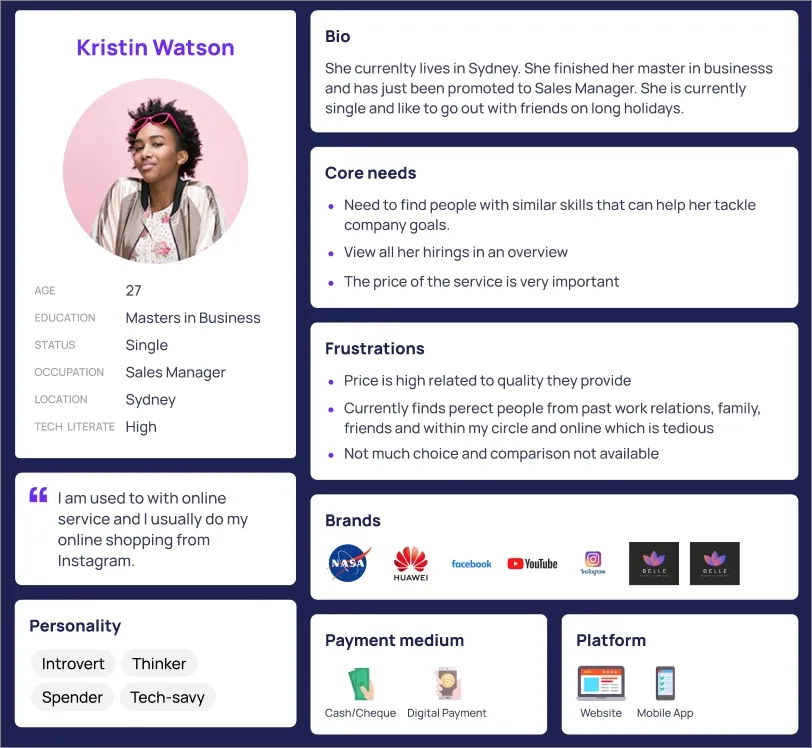
3. Map the audience
Create detailed audience personas that capture not only basic demographic information but also their core challenges, motivations, and emotional drivers.
For example, instead of simply identifying a persona as a “marketing manager aged 35,” understand that this individual struggles with meeting tight campaign deadlines and values tools that simplify workflows and deliver fast results.
Meanwhile, a procurement officer persona might prioritize vendor trustworthiness and cost control due to organizational budget pressures. This depth ensures the brand connects meaningfully with each audience’s real needs.
Here is a Persona card demonstrating how deep user insights guide brand strategy and design decisions.
4. Extract the brand attributes
From the above research, refine 3 or 5 core brand attributes, ensuring each accurately reflects the company’s true strengths.
These attributes should be tested for authenticity to ensure they represent the business’s actual market presence, rather than mere aspirations.
5. Condense into one phrase
Capture the brand’s essence in a short, clear phrase that highlights its unique value and audience.
Examples include “A privacy-focused SaaS solution designed for non-technical users” or “A bold, youthful fashion brand making style accessible.”
Without a precise brand statement, it is challenging to proceed effectively with design and messaging decisions.
💡 Expert Tip:
At this stage, do not move forward until leadership signs off on the brand definition. Designers and marketers should treat this phrase as the north star: every font, color, logo, and piece of messaging must align with it.
Step 2: Collect Images, Fonts, and Textures that Match the Essence
Once the brand is defined, the next step is to translate that strategy into visual references that guide every design decision. This is not about picking “what looks cool,” but about creating a visual language grounded in the brand attributes and audience expectations.
Why this matters:
Before wireframing, coding, or creating logos, you need a shared visual direction. Skipping this alignment and jumping straight into UI design often leads to inconsistent visuals and a misunderstood brand strategy. Curating references ensures the team has a common vision of how the brand feels.
How to approach it:
1. Curate references
Collect examples that clearly show the brand’s style and tone in digital formats such as dashboards, mobile apps, landing pages, icons, and product images. Look for patterns or textures that support the brand’s character, for example, using smooth gradients for friendly apps or grid layouts for professional business tools.
2. Use professional tools and platforms
Use Pinterest and Behance for wide-ranging visual ideas. Use Mobbin to find organized screenshots of mobile and web interfaces. Check the Figma Community for ready UI kits, icons, and style templates.
You may use Adobe Color to create consistent color schemes that follow accessibility contrast standards.
3. Build stylescapes
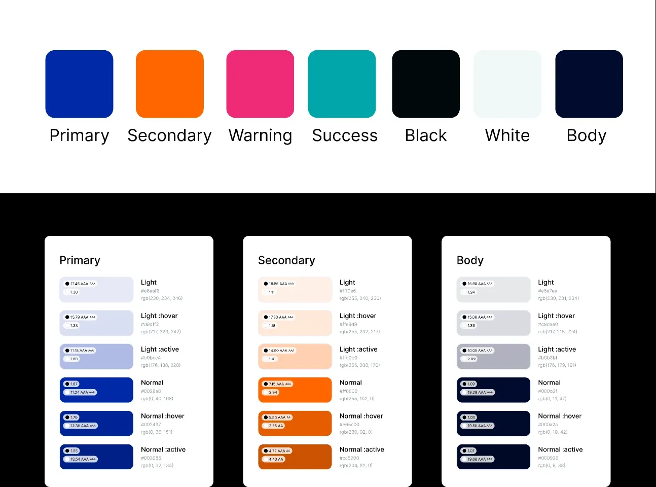
Create a stylescape, a visual board that combines real UI examples, color palettes, fonts, icons, and images related to how the product is used.
Unlike general mood boards, stylescapes show a close version of the final design look to test how the brand’s qualities appear visually. Include interface samples, brand colors, typography, and context-related images.
This image shows the chosen color palette and interactive state references for unified branding across UI elements.
4. Align internally
Share the stylescape with key team members and stakeholders before starting wireframes or coding. This step ensures the design direction is clear and shared, reducing errors from personal interpretation during development.
Step 3: Sketch Logo Ideas That Reflect the Mood
With the brand strategy defined and the stylescape providing a clear visual direction, the next step is to translate the essence into logo concepts.
This step is less about polished design and more about exploration, iteration, and alignment with brand attributes.
Why this matters:
A logo is often the first interaction users have with a brand. For digital products, it must be recognizable, scalable, and versatile across multiple platforms, from app store icons and favicons to onboarding screens and marketing materials. Early sketches allow you to test ideas rapidly without committing to high-fidelity designs, ensuring the final mark resonates with the brand’s core personality.
How to approach it:
1. Start with sketches
Begin by quickly sketching multiple logo ideas on paper or a tablet. Focus on capturing different visual concepts without worrying about precision. This early exploration helps identify strong visual metaphors that align with the brand’s essence.
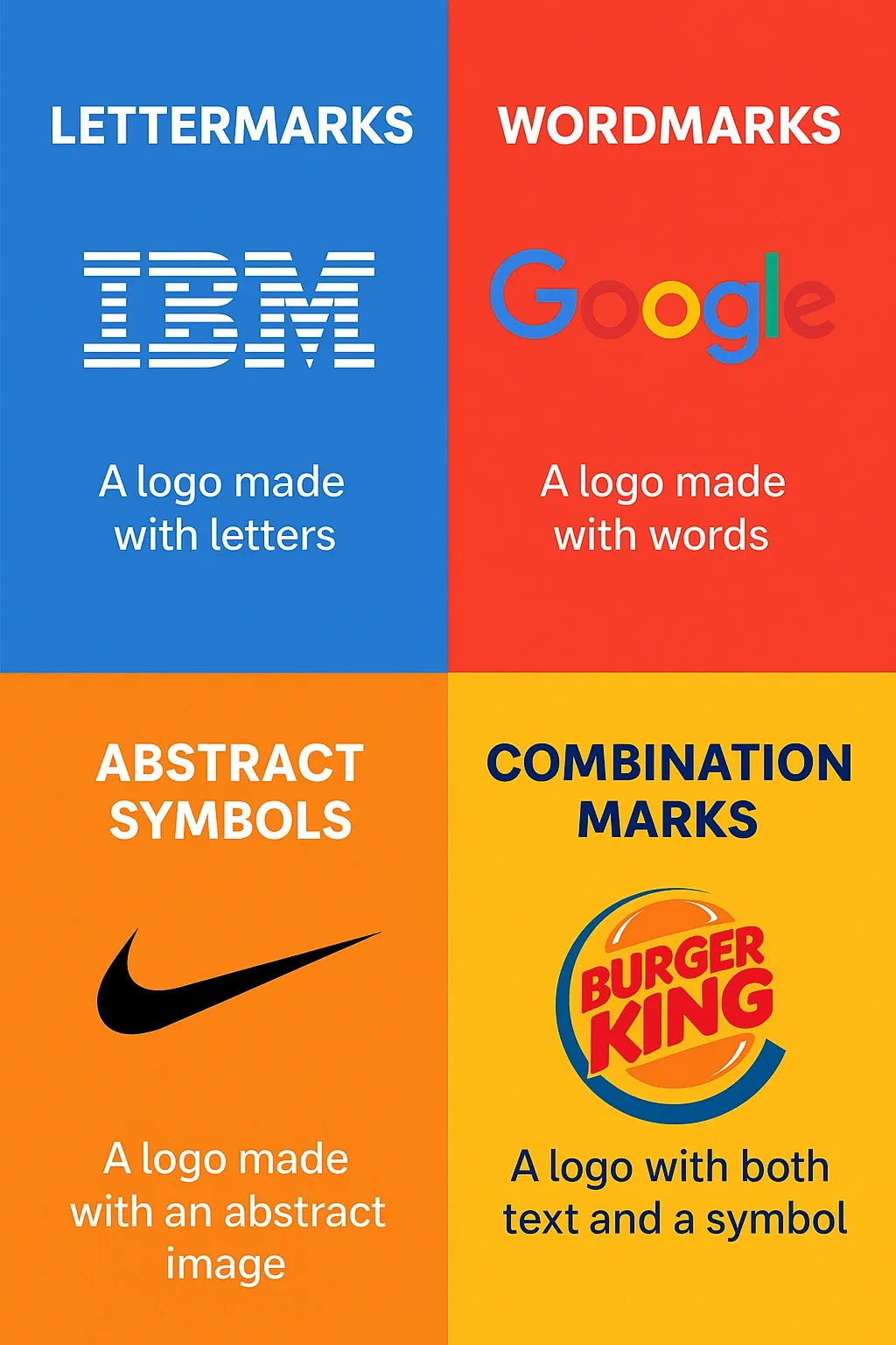
2. Explore different logo types
Experiment with a variety of logo formats to find what best fits the brand identity. Consider these common types:
- Lettermarks: Use single letters or initials to create a simple, memorable mark.
- Wordmarks: Focus on typography alone, selecting fonts that express the brand’s character.
- Abstract icons or symbols: Create geometric or conceptual shapes that express key brand values without using literal imagery.
- Combination marks: Blend text and icons to design flexible logos that work across different contexts.
This variety allows testing different visual approaches that align with the overall brand message and usage needs.
The given picture shows four fundamental logo types; each suited to different branding needs and identities.
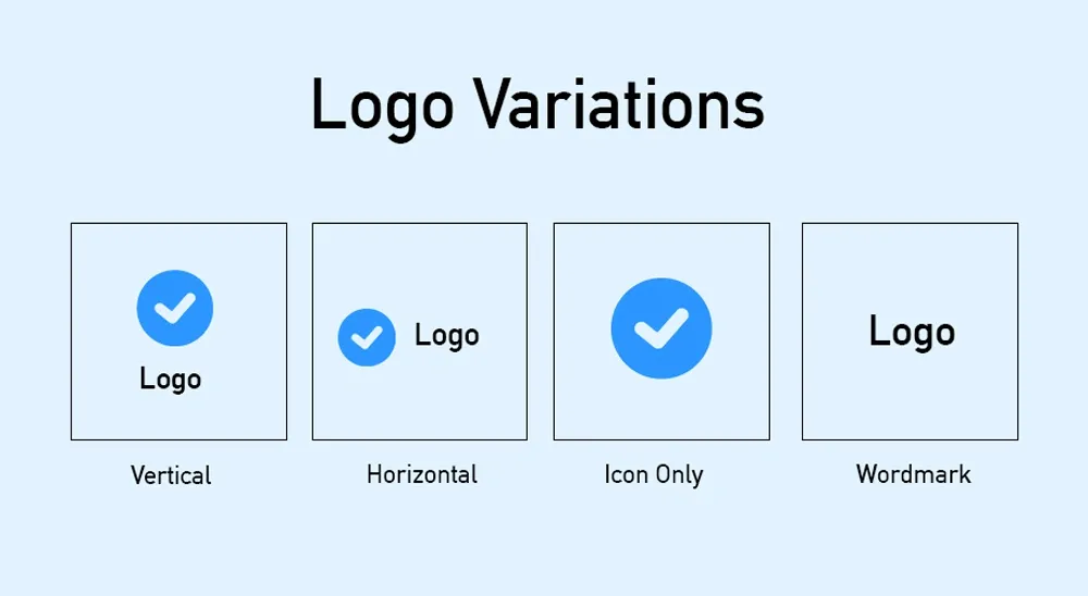
3. Test scalability and versatility
Check if each logo works well at small sizes like app icons or website favicons. Prepare versions such as a full logo for large formats, stacked versions for tight spaces, and simplified icons that remain clear when scaled down.
This image shows common logo format variations needed to ensure recognizability and adaptability in diverse contexts.
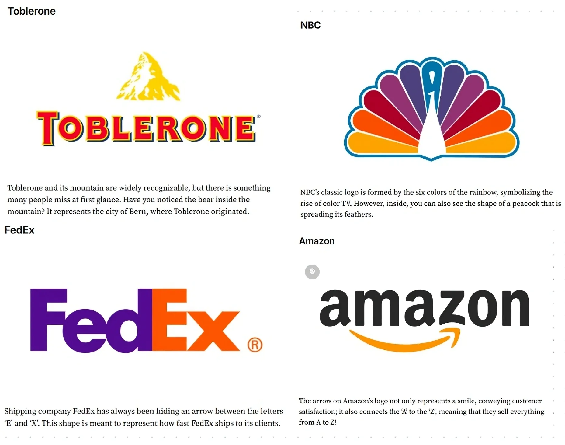
4. Tie ideas back to brand attributes
For each design, ensure it represents at least one brand quality. For example, a security app logo might use strong, geometric shapes like shields or locks, while a children’s learning app could use rounded shapes and bright colors. Avoid generic shapes; every element should have a clear reason tied to the brand.
This visual demonstrates how leading brand logos hide meanings and visual metaphors that align with their brand stories.
💡 Expert Tip:
This is the stage to iterate rapidly and think conceptually. The sketches don’t have to be final, but they must serve as a bridge between the brand strategy and the final visual identity.
For digital products, always check that designs remain legible, recognizable, and adaptable across all screen sizes and contexts.
Step 4: Create Visual Identity (Boards Mixing Color, Type, and Imagery)
With the logo concepts explored and brand attributes defined, the next step is to translate the strategy into a cohesive visual system. This system ensures every interface, screen, and digital asset reflects the same brand personality.
Why this matters:
A digital product’s visual identity is more than just a logo; it’s a framework that ensures a consistent user experience and perception. Colors, typography, iconography, and supporting visuals communicate the brand’s tone and help users recognize the product across touchpoints. Without a structured system, even a well-designed logo can feel out of place when applied to UI elements, notifications, or marketing materials.
How to approach it:
1. Build visual boards (stylescapes)
Create stylescapes by combining interface mockups, marketing materials, lifestyle photos, and reference designs that express the brand’s overall mood and style. Use these boards as a visual guide for UI design, illustrations, and photography, helping keep the creative direction consistent.
2. Define the color palette
Establish primary and secondary colors that work well on digital screens. Ensure colors have enough contrast for text, buttons, and backgrounds in both light and dark modes. The palette should support the brand’s personality and create a clear hierarchy among UI elements.
3. Select typography
Pick fonts optimized for screen use, covering headings, body text, and any code displays if necessary. Typography choices should match the brand’s tone while staying readable across all devices and screen sizes.
4. Develop supporting visuals
Design icon sets, illustration styles, and image assets that reflect the brand’s attributes. These visuals must be flexible to work within marketing materials as well as inside the app’s interface.
5. Ensure consistency
Maintain visual consistency by applying the same design rules across the marketing website, onboarding flows, app screens, and notifications. Before development, review everything against the stylescape to confirm alignment and cohesion.
Here is a clear example of a real digital product UI, showing consistent application of the visual system across device screens.
Step 5: Test & Refine
With the visual identity system in place, the next stage is to validate and refine. This ensures that the brand identity works effectively across all digital touchpoints before full-scale implementation.
Why this matters:
Even a well-crafted visual identity can fail if it doesn’t resonate with users or translate effectively in digital interfaces. Testing identifies whether the logo, colors, typography, and supporting visuals communicate the intended brand personality and function correctly in real-world contexts.
Early feedback reduces costly redesigns later.
How to approach it:
1. Present a range of identity options
Start by creating several distinct brand identity concepts, ranging from conservative “safe” styles to innovative “bold” designs. For each, develop multiple logo versions that vary in form and complexity, paired with adjusted color palettes and typography treatments.
Include real UI screen mockups showcasing these options in practical use cases like home screens or dashboards.
2. Test usability in context
Place these identity options directly into the product environment, testing how logos and visuals perform on app icons, onboarding screens, notification badges, and different device screen sizes.
Measure legibility under various lighting conditions and resolutions, ensuring all elements maintain clarity and distinctiveness.
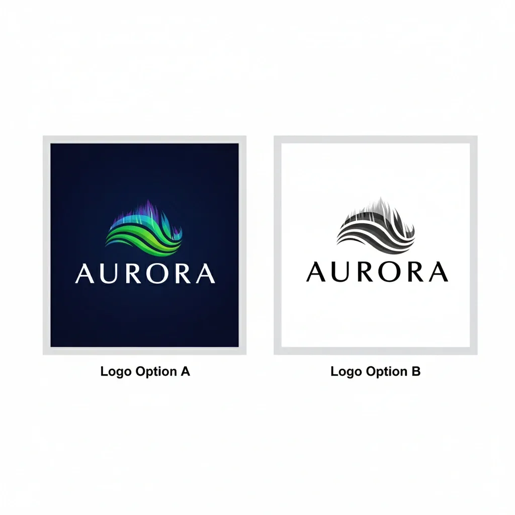
Use prototypes or clickable demos to observe how the identity feels in actual user flows, not just as static images.
Aurora logo options showcased for usability testing as part of digital brand identity refinement across UI environments.
3. Gather feedback
Engage a representative mix of stakeholders and end users through structured sessions or surveys. Use specific questions that reveal emotional and cognitive responses, such as
“Does this design inspire confidence or excitement?” and “Can you quickly identify the brand among others in a crowded app store?”
Collect qualitative insights to understand subjective impressions alongside quantitative ratings for usability and recognition.
4. Refine based on insights
Make targeted adjustments based on the feedback. Small changes in color contrast, icon shapes, or font weights often improve clarity and alignment with the brand’s character.
Repeat testing cycles rapidly to ensure each iteration enhances user experience and brand clarity before finalizing the design system.
💡 Expert Tip:
Emphasize usability testing as a critical step. A visual identity isn’t successful if it looks good in isolation but fails in real product interfaces.
The goal is to ensure that every element, from app icons to UI screens, feels cohesive, purposeful, and true to the brand strategy before moving to final delivery.
Step 6: Finalize & Package
Once the brand identity has been tested and refined, the final step is to deliver a complete, actionable system that can be applied consistently across all digital products and touchpoints.
Why this matters:
A brand identity only becomes powerful when it’s applied consistently. Deliverables like logos, color palettes, typography, and visual guidelines ensure that every designer, developer, and marketer can represent the brand correctly. Without a clear package, inconsistencies can dilute the brand’s perception and confuse users.
How to approach it:
1. Deliver final assets
- Provide all logo files in multiple formats: SVG for infinite scalability, PNGs optimized for web and digital use, and an app icon for iOS and Android platforms.
Logo file formats explained: Ensuring every brand asset is delivered in both print and digital formats to maintain quality and consistency across all platforms.
- Also include detailed color palette specifications with design tokens such as HEX codes, RGBA values, and CSS variables to ensure smooth implementation by developers.
- Supply typography guidelines that specify web-safe fonts and fallback options, with clear instructions for screen readability across devices.
Example from Duolingo:
2. Create a digital-first brand style guide
Develop a comprehensive style guide that documents correct usage of logos, color palettes, typography, icons, and illustrations. Incorporate examples of microcopy, notification messages, and social media posts to clearly illustrate voice, tone, and brand application in real communication scenarios.
3. Show real-world applications
Present the brand identity applied across practical touchpoints such as app store screenshots, SaaS dashboards, onboarding flows, and landing pages. Show how the identity adapts to different visual contexts, including light and dark modes, responsive screen sizes, and mobile environments, to confirm versatility.
4. Ensure cross-platform consistency
Stress that the brand identity must feel cohesive whether a user interacts with a mobile app, web interface, or marketing content. And try to provide clear guidelines and processes for future updates to the brand system to safeguard alignment with the core brand strategy over time.
Future Reads for Deeper Insights
👉Branding for Startups: Actionable Steps
How Tenet Helped ASDAV with Custom Branding and Web Design
ASDAV wanted to transform design and AEC education with a modern, experiential learning platform, but needed a clear brand identity and digital presence to communicate its values and engage students.
So, we onboarded ASDAV, and their goal was to build a cohesive brand and website that reflects ASDAV’s vision, connects with students, and supports an inspiring learning journey.
Here’s how we helped:
- Conducted workshops and interviews to define brand values like harmony, innovation, and empowerment
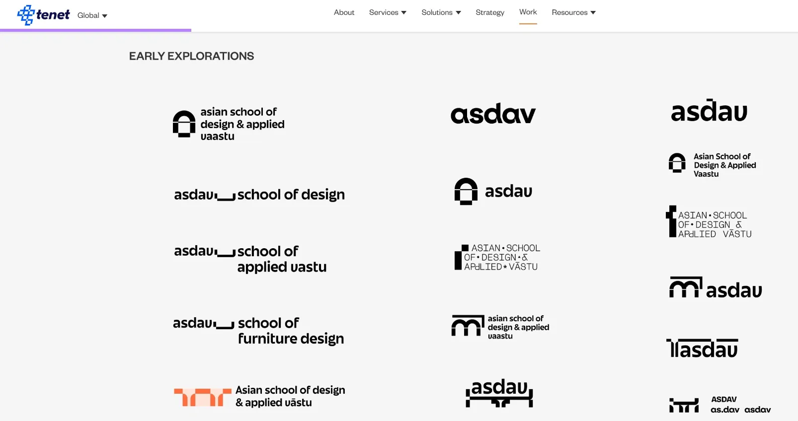
- Developed a visual identity covering logo variations, color palette, typography, and scalable brand elements
These early logo explorations for ASDAV illustrate the creative process and range of design directions considered for a distinctive brand identity.
- Designed a website structured for easy information discovery, multi-language accessibility, and engaging UX
- Created templates for social media, presentations, and marketing collateral to ensure consistent brand messaging
- Developed guidelines to maintain brand cohesion across all digital and physical touchpoints
The outcome?
- Clear, aligned brand strategy that guides founders, educators, and marketers
- Engaging, accessible website that resonates with students across regions
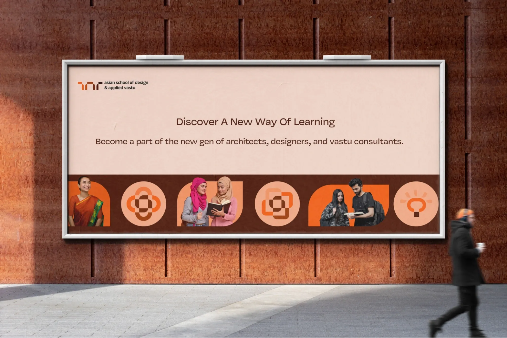
- A consistent visual identity applied across all materials strengthens brand recognition.
Showcasing Tenet’s expertise in strategic branding and visual identity, this billboard blends ASDAV’s core values, distinctive graphics, and inclusive messaging to attract and inspire the next generation of design professionals.
Want to build a brand and digital experience that truly reflects your vision?
👉 Explore our Branding Design services
Turn your design into a growth driver with expert branding
Turn your design into a growth driver with expert branding


Got an idea on your mind?
We’d love to hear about your brand, your visions, current challenges, even if you’re not sure what your next step is.
Let’s talk


