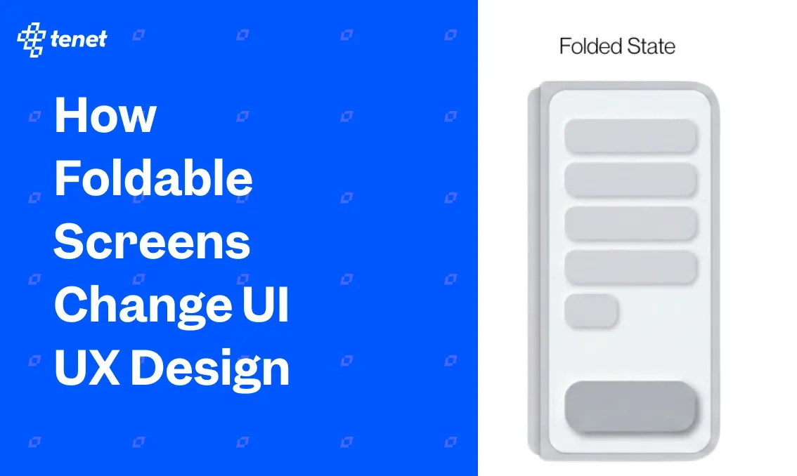
How Foldable Screens Change UI UX Design
Share
Share

Get a quick blog summary with
A few years back, foldable phones felt like a concept device. Mobile companies showed prototypes and early models, but most people saw them as experiments. Today, foldable devices are real products used for work, browsing, shopping, and content consumption.
Even after the hardware became stable, the real challenge moved to the software and design side. When the screen itself changes shape, size, and posture, the UI and UX cannot stay static. Layouts break, navigation feels awkward, and interactions that work on normal phones often fail on foldable screens.
At Tenet, we have worked on a few product experiences that needed to adapt for foldable devices. What we noticed was that designing for foldables is not about making the UI bigger. It is about designing for changing context. Users switch between quick one hand actions and deep two hand tasks within the same session.
In this blog, we will look at what changes when you design for foldable screens. We will break down the real UX challenges, the new opportunities foldables unlock, and practical design approaches teams can apply when building products for devices that change form.
Why Foldables Change the UX Game (Not Just Screen Size)
Most designers treat foldable devices like big phones. They stretch the same layouts, increase spacing, and call it done. That approach fails in real usage. Foldable devices are not just larger screens. They are context shifting devices. The user intent changes when the device changes form.
When a phone unfolds, the user is not just getting more space. They are switching their mindset. The task, posture, attention level, and interaction style change with it.
Here are a few shifts we see clearly in foldable usage
- Quick checks to focused sessions
- One hand use to two hand use
- Skimming to deep exploration
- Single task to multi task
- Passive consumption to active interaction
Based on our UX research across mobile apps, we see clear behaviour patterns on foldable devices. Users open the folded screen for fast actions like checking updates, replying, or scanning content. When they unfold the device, they expect a more structured and immersive experience. This shift in intent is what changes the UX game.
Core UX Challenges Unique to Foldables
With changing screen sizes and user intent, foldable devices introduce a new set of UX challenges that do not exist on standard smartphones. These challenges show up in real usage and often impact usability, task completion, and user trust if not handled well. Below are some of the core UX challenges teams face when designing for foldable screens.
Content continuity when folding and unfolding
Foldable devices change form, but users do not expect their task to change with it. When someone unfolds a device while reading, comparing products, or filling a form, they see it as a natural extension of the same moment. If the interface reloads, reshuffles content abruptly, or shifts focus, the experience starts to feel fragile.
This breaks trust and creates friction in flows that depend on attention and momentum. Strong foldable UX treats posture changes as a background event rather than a product event.
Here is an example of how the Samsung Galaxy Z Fold6 experience would change as users move from the outer screen to the larger unfolded display.

Layout reflow without breaking visual hierarchy
More screen space creates the illusion of more freedom, but it also increases the risk of visual chaos. When layouts expand on foldable screens, many products end up exposing too much information at once. Primary actions lose prominence, secondary content competes for attention, and scanning becomes harder instead of easier. The challenge is not filling space, but preserving clarity as density increases.
Gesture conflicts near the hinge
The hinge is both a physical and interaction boundary, and users feel it immediately in their hands. Gestures that work well on flat screens often become awkward or error prone near the fold because grip changes, finger angles shift, and system gestures compete for the same edges. This leads to accidental swipes, missed interactions, and hesitation around certain areas of the screen. Over time, users subconsciously avoid parts of the interface that feel unreliable.
Touch targets near fold areas
Foldable screens introduce subtle usability issues around touch accuracy that do not show up in static mockups. The curvature near the fold, slight shadows, and changes in how users grip the device all affect how precisely people can tap. Buttons placed close to fold edges may technically be reachable, but they feel less comfortable and less trustworthy to use.
Camera, thumb reach, and hinge blind spots
Foldable devices create new visual and ergonomic blind spots. Camera cutouts, hinge shadows, and shifting grip patterns change what users can comfortably see and reach. Elements that appear fine in design layouts can end up sitting in awkward zones where attention drops or interaction feels strained.
This is especially noticeable in longer sessions, where fatigue changes how people hold the device. Strong foldable UX design anticipates these blind spots and avoids placing high importance content or actions in areas that compete with hardware constraints.
Layout Systems That Actually Work on Foldables
The core concepts of user experience do not change just because screens fold. Clarity, hierarchy, focus, and ease of use still matter. What changes is how layouts respond to shifting context. At Tenet, we rely on layout systems that adapt to user intent and posture instead of simply reacting to screen size.
Below are the layout principles we apply when designing foldable-ready products.
Column-based adaptive grids vs breakpoint-based designs

Breakpoint based designs often treat each screen size as a separate layout. This works for static devices, but foldables live between states and shift frequently. When layouts snap between rigid breakpoints, users experience abrupt visual jumps and reflow that feels disconnected.
Column based adaptive grids behave more naturally on foldables because they expand and contract fluidly as space changes. The same content structure can stretch into more columns without altering the reading order or action hierarchy. This helps maintain familiarity across postures.
When to split content vs when to scale content
More space does not always mean content should be split into multiple panes. Some tasks benefit from focus and continuity, such as reading, form filling, or browsing a product list. Splitting these experiences can fragment attention and increase cognitive load. Other tasks benefit from parallel context, such as comparing items, reviewing details alongside a list, or working with data.
The decision to split or scale should follow user intent, not available pixels. Strong foldable UX scales content when the task requires flow and splits content when the task benefits from reference or comparison. The mistake teams make is assuming bigger screens always need more panels.
Designing dual pane experiences without overwhelming users
Dual pane layouts unlock real value on foldables, but they also introduce complexity. When both panes compete for attention, users struggle to know where to focus. The key is to design a clear primary and secondary relationship between panels. One pane should lead the task, while the other supports it.
This could mean a list on one side and details on the other, or content on one side and actions on the other. Visual hierarchy, contrast, and spacing should reinforce this relationship. Well designed dual pane experiences feel supportive and calm. Poorly designed ones feel busy and mentally tiring, even if the layout looks impressive.
Avoiding empty space design on unfolded screens
Unfolded screens often tempt teams to fill space for the sake of filling space. This leads to stretched layouts, oversized components, or decorative sections that add no functional value. Empty space itself is not a problem. The problem is space that has no purpose.
Foldable UX should treat space as a tool to improve readability, focus, and scanning. Sometimes the right choice is to keep content constrained to a comfortable reading width and use the remaining space to support secondary actions or contextual information. Interfaces that respect visual breathing room feel premium and intentional. Interfaces that stretch everything to the edges feel thin and under designed.
When Should Your Product Invest in Foldable UX?
Foldable UX is not for everyone, and it should not become a default investment just because the devices exist. Optimising for foldables touches your product strategy, design system, QA process, and release cycles. It adds real complexity, so the decision should come from user value, not device hype. Before committing design and engineering effort, teams need to step back and assess whether foldable specific UX will actually move outcomes for their product.
Here are a few questions worth asking before you invest
- Do a meaningful percentage of your users use foldable devices today
- Are foldable users growing within your core markets
- Do key user journeys benefit from more screen space
- Are users switching context within a single session
- Do users perform comparison, review, or creation heavy tasks
- Are users spending long sessions inside the product
- Do your power users rely on multi tasking
- Can your design system adapt to multiple postures
- Can your engineering team support posture based layouts
- Do you have access to real foldable devices for testing
If most of these answers lean towards yes, foldable UX is not an edge case for your product. It becomes part of your core experience quality. In that case, the right move is to start with high impact flows and treat foldable support as a phased capability rather than a full redesign.
Designing for Screens That Refuse to Stay Still
Foldable devices are pushing product teams to think beyond fixed screen sizes and static layouts. They force a deeper focus on context, intent, continuity, and adaptability. Teams that design well for foldables usually end up improving their overall mobile UX because they build stronger layout systems, clearer hierarchies, and more resilient interaction patterns.
At Tenet, we have designed hundreds of mobile apps and websites across 20 plus industries. We help teams move from device specific thinking to experience first design. If you are struggling to adapt your product for foldable devices or other emerging form factors, our UI UX designers can help you assess your current experience, understand real user behaviour, and design flows that work across changing screen states. Whether you are building for wearables, foldable phones, tablets, or large screen devices, the same principles apply when done right.
You can explore our case studies, especially our UI UX Design and Development work for a Doctor Appointment and Digital Health Platform, to see how we approach complex user flows and adaptive experiences. If this resonates, we can connect on a discovery call to understand your product goals and map out the right design approach for your users and platforms.
Expertise Delivered Straight to Your Inbox
Expertise Delivered Straight to Your Inbox

Got an idea on your mind?
We’d love to hear about your brand, your visions, current challenges, even if you’re not sure what your next step is.
Let’s talk


