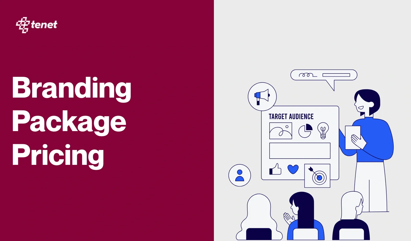
10 B2B UX Design Examples with Key Lessons
 By
By Share
Share

Get a quick blog summary with


Key Highlights
### Key Highlights
- Effective B2B UX helps users find information quickly and complete tasks without confusion.
- Clarity, simplicity, readability, functionality, trust signals, and conversion focus define strong B2B UX.
- Whimsical, Pilot, and Figma show how clean layouts and collaboration improve workflow efficiency.
- Vev, Tella, Stripe, and Faire reduce friction with guided flows, fast actions, and transparent details.
B2B platforms often confuse users with complex layouts and unclear steps. When users struggle to find what they need, they leave without taking action.
When this happens, it’s not just a missed click; it means lost sales, wasted marketing efforts, and fewer returning customers.
Over time, these missed chances add up and can hold back your business growth.
To help you avoid these pitfalls, here are 10 B2B UX examples that demonstrate how clear, simple design can guide users effectively and boost results.
What makes a B2B UX design effective?
An effective B2B UX design helps users quickly find information, complete tasks without confusion, and move through the platform smoothly. It is conversion-optimized, readable, easy to understand, and fully functional, which increases engagement and drives more business conversions.
Below are the key parameters that define an effective B2B UX design:
👉 To learn more about what makes B2B UX design work well, read our enterprise UX design principles.
10 Best B2B UX design examples to get inspired from in 2025
Below are 10 B2B UX design examples, each selected to help you create more intuitive and effective user journeys.
1. Whimsical
What it does:
An all-in-one collaborative workspace for teams to create flowcharts, wireframes, mind maps, sticky notes, docs, and project plans.
UX Breakdown:
Whimsical makes it easy for anyone to start building diagrams and wireframes, even if they’ve never used a design tool before. The workspace is clean and simple, so users can focus on their ideas.
Collaboration is straightforward; everyone can see changes as they happen and leave comments, making teamwork feel natural.
Here’s what the collaboration dashboard looks like:

Features like auto-arrange and keyboard shortcuts help users stay organized and work quickly, without getting lost in menus or options.
Here is a visual representing a simple UX design breakdown of whimsical:

Whimsical’s UX stands out for its clear panel structure and fast-access tool system. The left panel helps users navigate files easily, the middle bar offers always-visible tools, and the right panel gives full focus to design work.
Here is another screenshot showcasing Whimsical's efficient tool access: core tools with shortcut keys for a rapid workflow:

This minimalist setup removes distractions and guides users step by step, making Whimsical easy to use for brainstorming, wireframing, or diagramming, without any learning curve.
Best features in terms of UX Design:
- Drag and drop shapes and notes to build diagrams easily
- Multiple people can edit the same board at once, with live cursors and comments
- Items snap into place automatically for a tidy layout
- Keyboard shortcuts speed up common actions
- Boards and notes can be linked together to keep related ideas connected
- Minimal interface keeps distractions to a minimum
2. Pilot
What it does:
Pilot manages bookkeeping, taxes, and CFO services for startups and small businesses.
UX Highlights:
Pilot delivers a user experience that simplifies financial management for startup teams who may not have formal accounting knowledge. The dashboard immediately surfaces key numbers and charts, allowing users to grasp their financial health at a glance without hunting for information.
Onboarding is smooth and guided, with helpful prompts that reduce the need for external support or documentation.
Timely notifications and reminders keep users on track with tasks and deadlines, while clear, downloadable reports make it easy to share updates with stakeholders.
Altogether, the interface balances clarity, automation, and support to make complex finance workflows feel manageable and approachable.
Best features in terms of UX Design:
- Simple dashboard with clear financial numbers
- Easy-to-read charts and reports
- Guided onboarding with support
- Integration with accounting tools
- Timely notifications for important tasks
Here’s a simple visual showing how Pilot’s UX design keeps financial tools clear and easy to use for busy teams.


Pilot’s UX is designed to simplify finances for non-experts. A clear left-side menu makes it easy to switch between tasks, while the main dashboard shows key metrics like revenue, net income, and cash balance in simple charts.
Users get instant summaries, see trends over time, and access precise numbers for any date. This interface reduces complexity and supports confident decision-making.
3. Figma
What it does:
Figma is an online tool for designing, prototyping, and collaborating on digital products.
UX Highlights:
Figma stands out because it lets multiple people work on the same design file at the same time, making teamwork easy and fast.
The interface is simple to learn, with clear tools for drawing, editing, and arranging elements. Features like auto-layout, smart selection, and ready-made UI kits help users build and adjust designs efficiently.
Designers can create reusable components and styles, keeping projects organized and consistent.
Real-time feedback through comments and cursor chat makes collaboration smooth, and version history ensures changes are tracked. Figma also supports plugins and templates, so users can speed up their workflow and customize their workspace for different projects.
Take a look at how Figma’s UX design helps people work together on creative projects without confusion.


Best features in terms of UX Design:
- Real-time collaboration for teams
- Auto-layout and smart selection tools
- Reusable components and styles
- Easy sharing and feedback with comments
- Plugins, templates, and UI kits for faster work
4. Vev
What it does:
Vev lets teams design and publish web pages without any coding.
UX Highlights:
Vev’s platform makes web page creation accessible to everyone, not just designers or developers. The drag-and-drop editor allows users to build pages by simply moving sections and elements where they want them.
Ready-made content blocks help users get started quickly, and a live preview shows exactly how the page will look before it goes live. Multiple team members can work together on the same project and see updates instantly, making collaboration smooth and efficient.
The interface is clean and uncluttered, so users can focus on their content without distractions. Publishing is straightforward, turning ideas into live web pages with just a few clicks.
This image highlights how Vev’s UX design makes building web pages straightforward, even if you’re not a designer.

Best features in terms of UX Design:
- Drag-and-drop page building
- Real-time teamwork and collaboration
- Ready-to-use content blocks
- Live preview of changes
- Simple, fast publishing
5. Tella
What it does:
Tella is a tool for recording, editing, and sharing screen and camera videos.
UX Highlights:
Tella makes creating videos simple and fast, even for beginners. Users can start recording their screen or camera with a single click. After recording, the editing tools are easy to find and use, allowing users to trim clips, change layouts, and add captions without confusion.
The interface keeps everything straightforward, so users don’t get overwhelmed by options. Sharing videos is quick and can be done directly from the platform. Since everything works in the browser, there’s no need to download extra software.
Here’s a quick look at how Tella’s UX design makes recording and sharing videos feel simple for everyone.

Tella’s design focuses on making video creation accessible and efficient for all users.
Best features in terms of UX Design:
- One-click screen and camera recording
- Simple editing tools for trimming and layouts
- Auto captions for accessibility
- Fast sharing and downloads
- Clear, user-friendly interface
6. Stripe
What it does:
Stripe helps businesses accept and manage online payments.
UX Highlights:
Stripe’s dashboard is designed to show important payment information clearly and quickly. Users can see key stats and recent activity right when they log in.
Setting up new payment methods is straightforward, with clear instructions guiding users through each step. Reports are easy to generate and understand, helping businesses track their income and transactions. Helpful tooltips and guides are available throughout the platform to assist users whenever needed.
The clean layout reduces confusion, and support is easy to access if users have questions. Overall, Stripe’s design helps businesses manage payments smoothly without hassle.
See how Stripe’s UX design puts all your payment details in one place, making things easy to manage.


Best features in terms of UX Design:
- Clear dashboard with payment stats
- Easy setup for new payment options
- Simple, understandable reports
- Helpful tooltips and guides
- Quick access to support
7. Notion AI
What it does:
Notion AI is a collection of AI-powered features integrated into the Notion workspace, designed to increase productivity and creativity.
UX Highlights:
Notion offers a flexible space where users can create and organize almost anything, from notes and to-do lists to databases and wikis.
The sidebar makes navigation simple, helping users find pages quickly. Drag-and-drop functionality lets users arrange content easily, while real-time editing and comments support smooth collaboration.
Templates get the new users started sooner by not overwhelming them.. Linking and embedding pages keeps related information connected, reducing the need to jump between apps.
The clean design helps teams focus on their work without distractions.
This visual shows how Notion’s UX design brings notes, tasks, and teamwork together in a way that just makes sense.

Here’s a dashboard screenshot that shows how easy it is to collaborate on Notion.

Best features in terms of UX Design:
- Drag-and-drop page building
- Sidebar for easy navigation
- Real-time editing and comments
- Templates for quick setup
- Linking and embedding between pages
8. Faire
What it does:
Faire helps retailers link with brands to purchase wholesale goods online.
UX Highlights:
The design of the Faire website enables a retailer to locate and order products fast and conveniently. The search and filtering options are straightforward, allowing users to narrow down products by category, price, or other details.
Product pages provide clear photos, prices, and minimum order information, so users have all the facts upfront. The checkout process is simple and guides users step by step, reducing confusion.
After placing an order, users can track their shipments directly within their account. The platform also suggests related products, helping retailers discover new brands without extra effort.
Here’s how Faire’s UX design helps retailers find and order products quickly, without any hassle.

Best features in terms of UX Design:
- Easy-to-use product search and filters
- Clear product details and photos
- Step-by-step checkout process
- Order tracking in user accounts
- Helpful product recommendations
9. Slack
What it does:
Slack is a messaging tool for teams to chat, share files, and work together.
UX Highlights:
Slack organizes team conversations into channels and threads, making it easy to follow discussions without losing track. Users can quickly send messages, share files, and start calls all within the same app.
The search feature helps find past messages or files instantly. Notifications are clear but not overwhelming, so users stay informed without distraction.
The interface is simple and friendly, helping teams communicate smoothly and stay connected throughout the workday. Slack’s design balances functionality and ease, making teamwork feel natural.
Take a look at how Slack’s UX design keeps team chats organized and easy to follow, even as conversations grow.

This Slack interface efficiently showcases a variety of automation templates in categorized, descriptive cards, empowering users to discover and implement pre-built workflows quickly.

Best features in terms of UX Design:
- Organized channels and threads
- Quick file sharing and calls
- Powerful search for messages and files
- Customizable notifications
- Simple, user-friendly layout
10. Airtable
What it does:
Airtable is a versatile digital tool that allows organizing and managing data like spreadsheets and a database.
UX Highlights:
Airtable’s interface feels familiar to spreadsheet users but offers much more flexibility through customizable views like grids, Kanban boards, calendars, and forms.
Its drag-and-drop design and pre-built templates make onboarding smooth and let users quickly organize workflows to their needs. Collaboration is seamless with real-time syncing, role-based access, and clear task assignments.
The clean layout balances powerful functionality with ease of use, helping teams manage projects, content, or any data-driven work efficiently without coding knowledge.
Here’s a visual that shows how Airtable’s UX design lets you organize and share information smoothly, no matter your project.
Best features in terms of UX design:
- Familiar spreadsheet-like interface with added flexibility
- Multiple customizable views (grid, Kanban, calendar, form)
- Real-time collaboration and syncing
- Automation to streamline workflows
- Pre-built templates for quick starts
⭐ If you need help in implementing these B2B UI/UX design best practices, check out our B2B UI/UX services.
👉 Here are some of the key industries where we offer our UI/UX design services:
- E-commerce
- Healthcare & Fitness
- Events
- Finance
- SaaS
- Travel & Hospitality
- On-Demand
- Food & Restaurant
- Real Estate
Here are the B2B UX lessons at a glance
1. Whimsical – Use spatial hierarchy to reduce user effort
Whimsical applies spatial hierarchy to keep the user experience organized and efficient. By clearly separating navigation, tool access, and workspace zones, it minimizes visual clutter and cognitive load. This layout helps users move through complex design tasks without losing context, making the product approachable for both beginners and advanced users.
2. Pilot – Turn high-complexity workflows into guided experiences
Pilot simplifies financial operations by guiding users through structured, step-by-step interactions. It transforms intimidating tasks like bookkeeping and tax reporting into manageable flows through progressive disclosure and contextual explanations. The UX lesson here is to break down complex B2B workflows into small, confidence-building steps that feel achievable.
3. Figma – Build real-time collaboration into the core UX
Figma does not treat collaboration as an add-on. Instead, it embeds multi-user interaction directly into the core product experience. Real-time editing, shared cursors, and contextual comments allow teams to work as if they are co-located. This reinforces the UX principle that true collaboration tools must support synchronous activity without sacrificing speed or clarity.
4. Vev – Eliminate technical barriers through visual composition
Vev empowers non-designers to build web pages through an intuitive visual interface. It abstracts technical decisions into easy drag-and-drop actions, real-time previews, and reusable blocks. This teaches a key UX principle: when you remove technical complexity from the UI, you widen your user base and reduce support dependency.
5. Tella – Optimize for instant interaction and minimal friction
Tella shows that reducing the number of steps between entry and output increases engagement. By offering one-click recording and browser-based editing, it eliminates traditional setup barriers. The UX takeaway is to prioritize fast time-to-value. Let users do meaningful work immediately, especially in task-oriented tools.
6. Stripe – Build user trust through guided and predictable flows
Stripe makes high-risk workflows feel safe through clear guidance, inline instructions, and confirmation feedback. Every interaction—whether setting up a payment gateway or reviewing a transaction—is broken into logical, visually digestible steps. The UX lesson is to design financial and sensitive operations with high transparency and error prevention.
7. Notion – Let users shape their own information systems
Notion enables teams to build custom systems using modular building blocks. Users can create databases, documents, and dashboards using the same interface. The takeaway is to design with flexibility and composability in mind. Giving users control over structure allows the product to scale across departments and industries.
8. Faire – Surface key decision inputs early to drive conversion
Faire optimizes the B2B buyer experience by front-loading product filters, prices, shipping rules, and vendor details. This transparency shortens the time it takes to evaluate and act. The UX principle here is to eliminate ambiguity by showing all critical purchase information before the user needs to commit.
9. Slack – Structure information flow to prevent communication overload
Slack controls conversational complexity using channels, threads, and scoped notifications. These patterns let teams maintain ongoing discussions without chaos. The UX lesson is to prioritize information architecture in communication tools, ensuring that users can participate, search, and retrieve conversations efficiently.
10. Airtable – Introduce power features gradually using progressive UX
Airtable starts users with a familiar spreadsheet view and introduces advanced features like Kanban, automation, and integrations only when needed. This is an example of progressive feature reveal. The UX principle is to start simple, then scale complexity based on user intent and maturity, not all at once.
👉 Want to know more about designing SaaS products? Check out our SaaS UX design blog.
Final words
At Tenet, UI and UX aren’t just about making things look good; they’re about making digital experiences feel natural, intuitive, and genuinely helpful for real people doing real work.
Every color, icon, and interaction is chosen with your users in mind. We believe that great B2B design should make complex tasks feel simple and empower teams to do their best work.
Here is an image of our work for Angles’ UI UX for Ecommerce:

👉 Contact our experts and get a free UI/UX design roadmap and a proposal.
Want your B2B website or product to get audited by our experts? Submit your details.
Want your B2B website or product to get audited by our experts? Submit your details.


Got an idea on your mind?
We’d love to hear about your brand, your visions, current challenges, even if you’re not sure what your next step is.
Let’s talk


