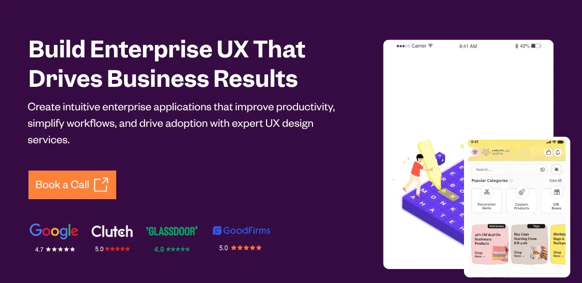
10 Enterprise UX Design Principles With Real Examples
Share
Share

Get a quick blog summary with


Key Highlights
### Key Highlights
- Enterprise UX design makes complex business software easier, faster, and more efficient to use.
- It focuses on role-based workflows, clear data handling, and task-specific interfaces.
- Strong enterprise UX improves productivity, reduces errors, and shortens training time.
- Design principles include automation, data visualization, scalability, accessibility, and consistency.
Enterprise UX design makes complex business software easy, fast, and efficient for users. Unlike consumer apps, enterprise tools support critical workflows such as sales, operations, and reporting, where usability directly affects productivity and adoption.
Good enterprise UX reduces errors, shortens training time, and helps teams complete tasks with clarity. At Tenet, we have worked with more than 450 companies across 15 countries, building products used by over 20 million people.
The principles in this guide are the same ones we apply when designing enterprise systems for our clients.
What is enterprise UX design?
Enterprise UX (User Experience) design is about making business software easier and better to use. Unlike apps you use for shopping or social media, enterprise tools like CRMs, ERPs, or SaaS platforms are built to help teams do important, often complicated work.
These tools handle lots of data, have different users with different jobs, and support complex tasks like managing sales, tracking inventory, or running reports.
Good enterprise UX solves that by making tools clear, fast, and role-specific. It simplifies tasks, handles large amounts of data, and ensures performance without compromising accuracy or security.
And it pays off: Every $1 spent on UX brings $100 in return (9,900% ROI).
At Tenet, we focus on designing these complex systems so that users can get their work done smoothly, without confusion or mistakes.
Explore our UI UX design services by country:
How Tenet helped Angles with UI UX design and app development
Angles had a great offline presence in Kuwait-but they knew it was time to level up digitally.
So they came to us.
The goal? A smooth, modern experience for every user, whether it’s a customer, a store manager, or a delivery person.
Here’s how we helped:
- Conducted in-depth UX research with their team
- Built three custom mobile apps for shoppers, admins, and delivery agents
- Created a web-based dashboard to manage everything in one place
- Simplified product discovery, enabled real-time tracking, and ensured secure interactions
- Used AI to personalize what each user sees
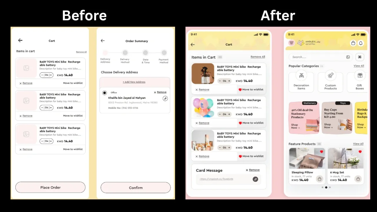
A look at the UX design transformation of Angles – before vs. after.
The outcome?
- Higher monthly revenue
- Bigger order sizes
- Better user retention
- And a digital experience that their customers actually enjoy using
Looking to improve your enterprise product UX?
👉 Explore our enterprise UX design services
Key UX principles and strategies for enterprise applications
Principle 1: Role-Based & Contextual UX Design
- Category: User Research / Usability / Performance
- Key Focus: Design tailored experiences based on user roles and context to improve efficiency and satisfaction.
- When to Use: In enterprise platforms where multiple user types (e.g., sales reps, managers, admins) interact with the system, each with distinct goals, workflows, and permissions.
What it means:
Role-based and contextual UX design is a design approach that tailors interfaces and workflows to specific user roles and tasks within an enterprise system.
Why it matters:
Enterprise tools often serve diverse roles, from frontline staff to senior leadership. A generic interface leads to overload and friction.
Role-based UX ensures each user sees only what they need, reducing distractions and mistakes. Contextual workflows further simplify navigation by guiding users through only the steps relevant to their role.
This clarity not only improves productivity but also cuts down training time and errors, both critical in large-scale business environments.
When to Use:
- Platforms with diverse user types (e.g., admins, sales, support)
- When workflows differ widely between departments
- To reduce onboarding time and prevent errors from access misuse
Example:
Salesforce uses role-based dashboards and workflows so that sales reps see pipeline views, service agents access ticket tools, and managers monitor KPIs. This reduces clutter and improves decision-making for each role.
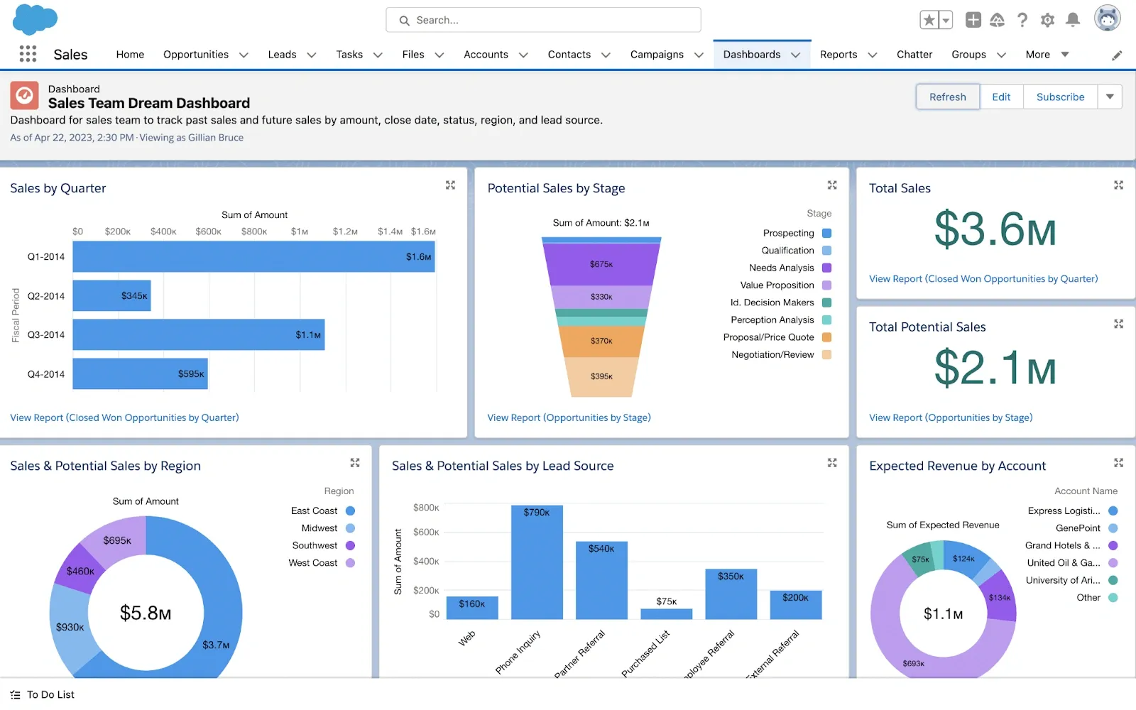
An image of Salesforce’s role-based dashboard for the sales team to track each and every aspect related to sales
Principle 2: Simplified Workflow Automation
- Category: Performance / Usability
- Key Focus: Automate repetitive tasks and reduce manual input to save time and minimize errors.
- When to Use: Ideal for enterprise apps with complex, repetitive processes such as marketing, project management, or HR systems.
What it means:
Simplified workflow automation is the practice of using design to streamline and automate repetitive tasks, reducing manual input and saving user time.
Why it matters:
In enterprise environments, users often perform the same tasks repeatedly like updating records, sending alerts, or moving items through stages.
Automating these workflows speeds up operations and frees users from tedious manual work. This not only improves productivity but also improves accuracy by reducing human errors.
Good automation design clearly shows users what’s automated and allows easy adjustments without overwhelming them with options. It’s essential for scaling operations without increasing workload.
When to Use:
- Apps with frequent manual steps (e.g., data updates, approvals)
- Projects where accuracy and scale are key
- When user burnout from repetitive tasks becomes evident
Example:
HubSpot automates marketing workflows, letting teams trigger emails, assign leads, and update contacts automatically based on user behavior, simplifying complex marketing campaigns and increasing conversion rates.
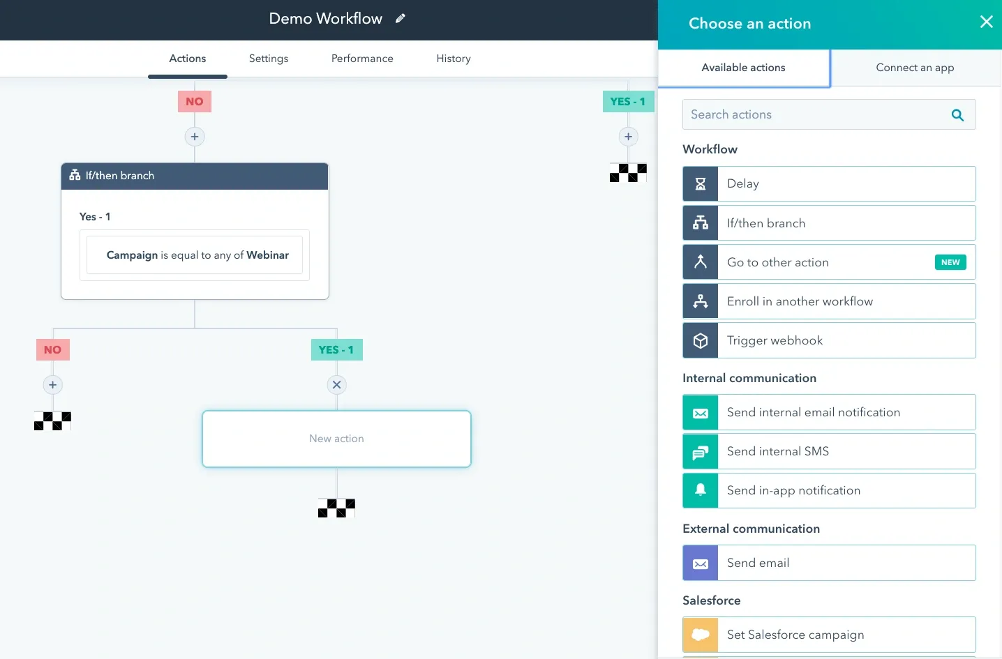
An image of HubSpot’s workflow builder interface, which visually maps automation steps.
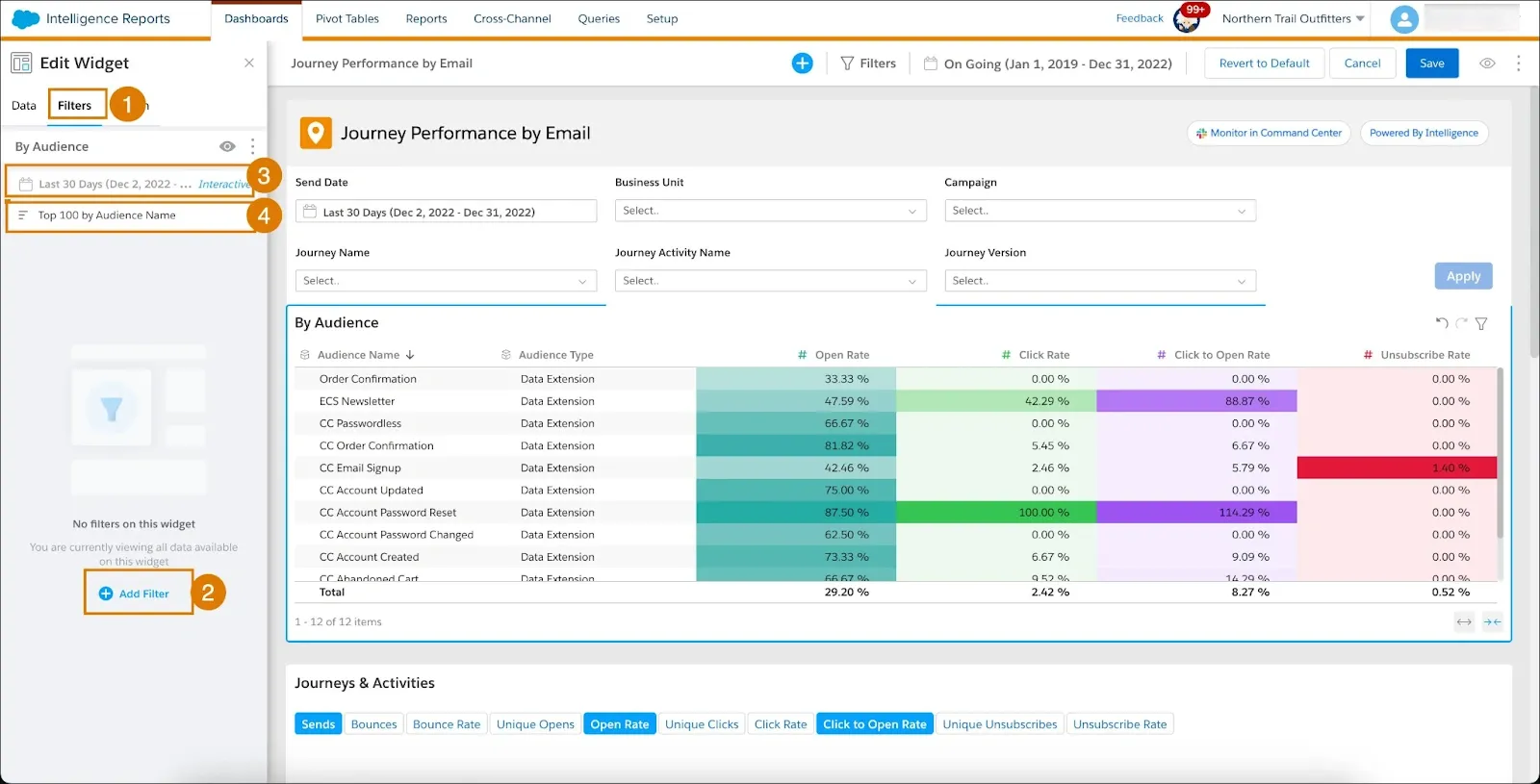
Principle 3: Data Visualization & Insights
- Category: Usability / Accessibility
- Key Focus: Present complex data clearly using charts, tables, and dashboards.
- When to Use: Best suited for data-heavy enterprise apps like BI tools, analytics platforms, and CRMs.
- Enterprise software often deals with vast amounts of data that can overwhelm users if not presented clearly.
What it means:
Data visualization and insights is the process of presenting complex data through charts, dashboards, and visuals to make information easy to understand and act on.
Why it matters:
Effective data visualization transforms raw data into actionable insights by using graphs, heatmaps, and dashboards. This helps users quickly grasp trends, track performance, and make informed decisions.
Accessibility is key-visuals should be easy to interpret and support different user needs. Well-designed dashboards reduce cognitive load and improve efficiency across teams.
When to Use:
- In analytics-heavy tools or business intelligence platforms
- When decision-makers need a quick grasp of KPIs or trends
- If raw tables or reports overwhelm users
Example
Tableau offers interactive dashboards that let users explore data visually and drill down into specifics, making complex datasets easy to understand and act upon.
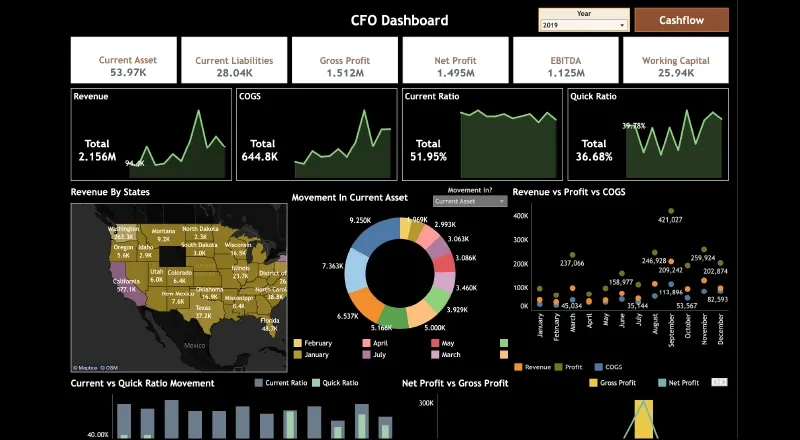
Tableau interactive dashboard showing charts
Principle 4: Performance & Scalability Optimization
- Category: Performance / Scalability
- Key Focus: Ensure fast load times and smooth scaling under heavy use.
- When to Use: Critical for enterprise apps supporting thousands of users or handling large volumes of data.
What it means:
Performance and scalability optimization is the UX strategy of ensuring that enterprise apps remain fast, responsive, and reliable as data volume and user load increase.
Why it matters:
Enterprise software often needs to serve many users simultaneously and process large datasets without slowing down.
Optimizing performance means designing systems that load quickly and respond instantly, even under peak demand. Scalability ensures the app can grow with your business - handling more users, data, and features without breaking.
When to Use:
- Apps expected to scale across regions or user roles
- Real-time systems like messaging, reporting, or task tracking
- Environments with low tolerance for downtime or lag
Example:
Slack efficiently supports millions of users with near real-time messaging and minimal latency, even during high traffic periods.
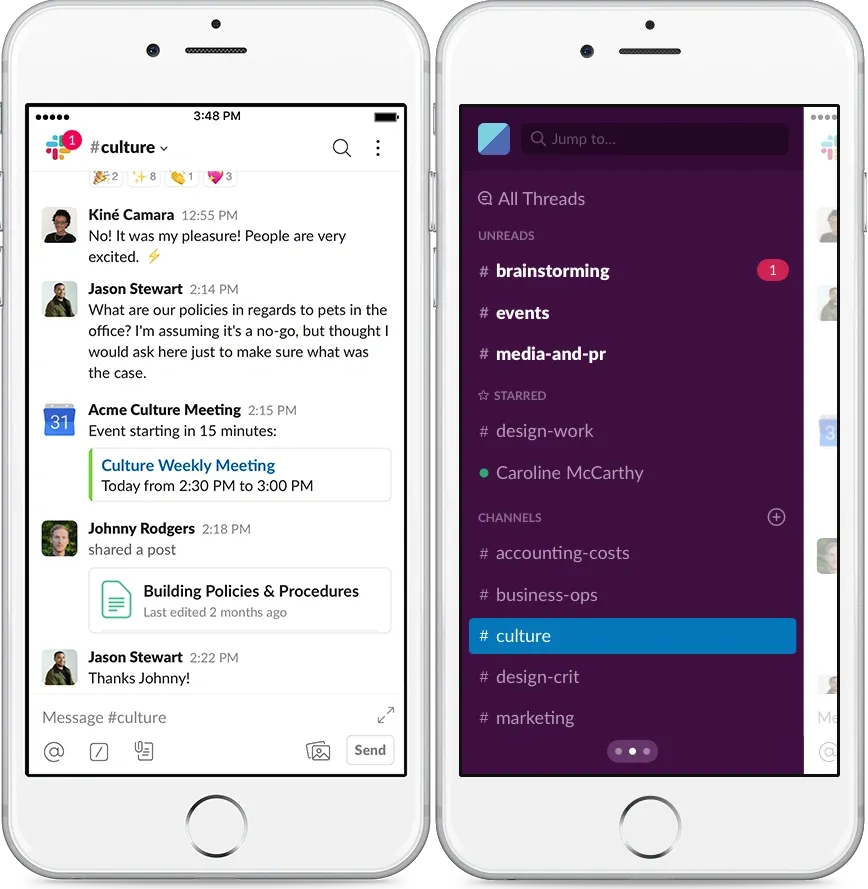
An visual showing Slack’s app interface showing multiple channels and message flows.
Principle 5: Accessibility & Inclusivity
- Category: Accessibility
- Key Focus: Design for users with disabilities and diverse needs.
- When to Use: All enterprise apps, especially those serving a broad and diverse user base.
- Enterprise software must be usable by everyone, including people with disabilities.
What it means:
Accessibility and inclusivity are the practice of designing apps that can be used by people with disabilities or diverse needs, ensuring equal access for all users.
Why it matters:
Accessibility features like screen readers, keyboard navigation, and proper color contrast help ensure no user is left behind.
Inclusive design improves overall user satisfaction and widens your product’s reach. Ignoring accessibility risks and legal issues can alienate users who rely on assistive technologies.
When to Use:
- Apps used across diverse demographics or regulated industries
- To comply with WCAG standards, ADA, or local accessibility laws
- When you aim to widen your user base and reduce discrimination
Example:
Microsoft Teams supports screen readers and keyboard navigation, ensuring smooth communication for all team members.
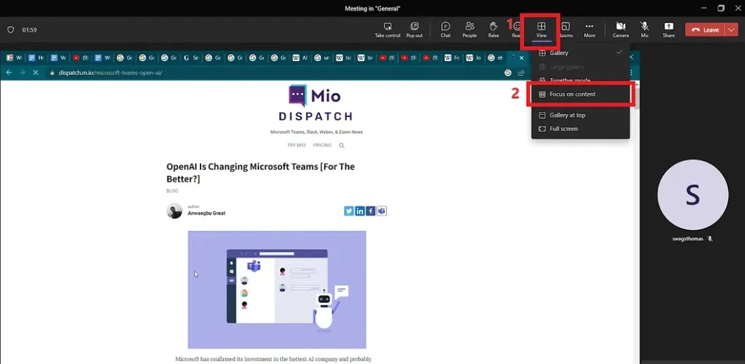
A visual showing the dashboard view before turning on Microsoft Teams Focus mode
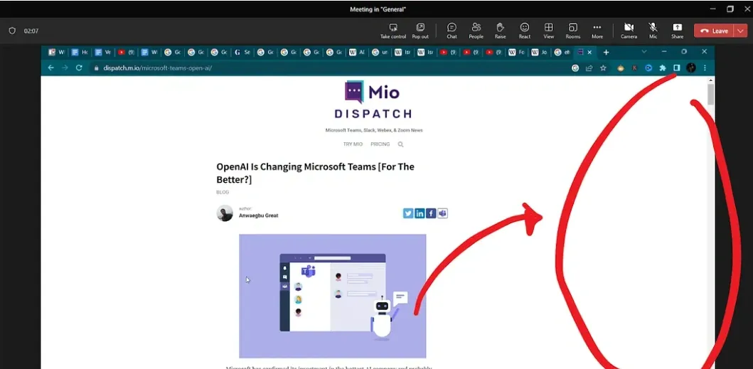
This image shows the dashboard view after turning on Microsoft Teams Focus mode
Principle 6: Consistency Across Platforms
- Category: Usability / Performance
- Key Focus: Maintain a uniform experience across web, mobile, and desktop.
- When to Use: Enterprise tools that are accessed on multiple devices or by distributed teams.
What it means:
Consistency across platforms is the design principle of maintaining a uniform experience in layout, functionality, and interactions across web, desktop, and mobile devices.
Why it matters:
Users expect the same look, feel, and functionality whether they’re on desktop, tablet, or phone. Inconsistent UI or behavior across these platforms can slow down workflows, confuse users, and lead to errors.
Maintaining visual and functional consistency ensures users can rely on familiar patterns, regardless of the device they’re using. It also reduces training time and support queries.
For large enterprises with distributed teams, this principle ensures a predictable and stable experience. Consistency also increases trust, users feel more confident using systems that behave the same way everywhere.
When to Use:
- Apps accessed across devices by remote or hybrid teams
- When UI inconsistency causes user confusion or error
- To minimize retraining or helpdesk queries
Example:
Google Workspace provides a seamless experience across Gmail, Docs, Sheets, and Meet, whether you’re on desktop or mobile, everything feels familiar.
Principle 7: Contextual Help & Onboarding
- Category: Usability / User Research
- Key Focus: Offer real-time guidance and training within the product interface.
- When to Use: Complex enterprise apps with steep learning curves or feature-rich environments.
What it means:
Contextual help and onboarding is the integration of tooltips, guides, and in-app instructions that assist users in learning features without leaving the interface.
Why it matters:
Enterprise software is often loaded with features and workflows that aren’t intuitive for first-time users or even experienced ones. Instead of relying solely on training manuals or support tickets, great UX builds learning directly into the interface.
Contextual help means users receive guidance exactly where and when they need it, whether that’s a tooltip, inline tip, or step-by-step walkthrough. This approach reduces onboarding time, improves feature adoption, and lowers support costs.
It's especially valuable in enterprise apps with role-based views, where different users need tailored assistance for their tasks.
When to Use:
- Feature-rich or complex enterprise software
- During first-time onboarding or product launches
- When users hesitate to adopt new features
Example:
Asana uses interactive onboarding and tooltips to guide users through setting up projects and tasks without needing external training.
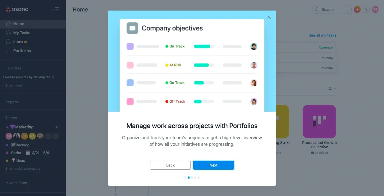
This image shows step-by-step guided learning directly within Asana
Principle 8: Security & Compliance Integration
- Category: Performance / Security
- Key Focus: Design secure user flows that also meet regulatory compliance.
- When to Use: Apps operating in regulated industries (e.g., finance, healthcare, government) or handling sensitive user data.
- In enterprise software, security and compliance aren’t optional add-ons, they’re core to the user experience. But security shouldn't come at the cost of usability.
What it means:
Security and compliance integration is the process of embedding authentication, permissions, and regulatory standards into the user experience without disrupting usability.
Why it matters:
A well-designed enterprise UX integrates secure authentication, data protection, and compliance requirements without disrupting the user journey. This includes user-friendly 2FA (two-factor authentication), permission-based access, audit logs, and consent flows.
UX must account for both security and usability to ensure users don’t bypass safe practices out of frustration. Embedding compliance (like HIPAA, GDPR, or SOC2) into the design also builds user trust and protects the organization from risk.
When to Use:
- Apps in finance, healthcare, government, or regulated industries
- Products handling personal, financial, or sensitive data
- If current users avoid security steps due to friction
Example:
Okta provides identity management with intuitive interfaces for login, role assignment, and compliance alerts.
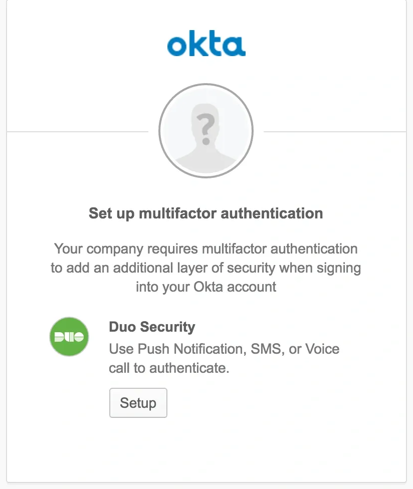
This image represents Okta’s duo security (multifactor authentication)
Principle 9: Error Prevention & Recovery
- Category: Usability
- Key Focus: Reduce user errors and offer simple ways to fix them.
- When to Use: Enterprise tools handling critical tasks, data entry, or transactions; especially in finance, HR, or operations.
What it means:
Error prevention and recovery is a UX approach that minimizes user mistakes and provides clear options to undo, fix, or recover from errors.
Why it matters:
In enterprise apps, one small mistake can lead to lost data, compliance risks, or blocked workflows. That’s why great UX doesn’t just react to errors, it prevents them in the first place.
This includes features like inline form validation, clear feedback messages, undo options, autosave, and version control.
It’s not just about helping users avoid errors, it's also about helping them recover fast when something goes wrong. Preventing user frustration and downtime is essential in high-stakes, data-heavy environments.
When to Use:
- In forms, data-entry interfaces, and transaction-based flows
- Tools with critical consequences for mistakes (e.g., HR, finance)
- To reduce support tickets caused by preventable errors
Example:
Google Docs automatically saves every few seconds and lets users go back to earlier versions through its version history. This reduces anxiety about losing work and gives users confidence in experimenting.
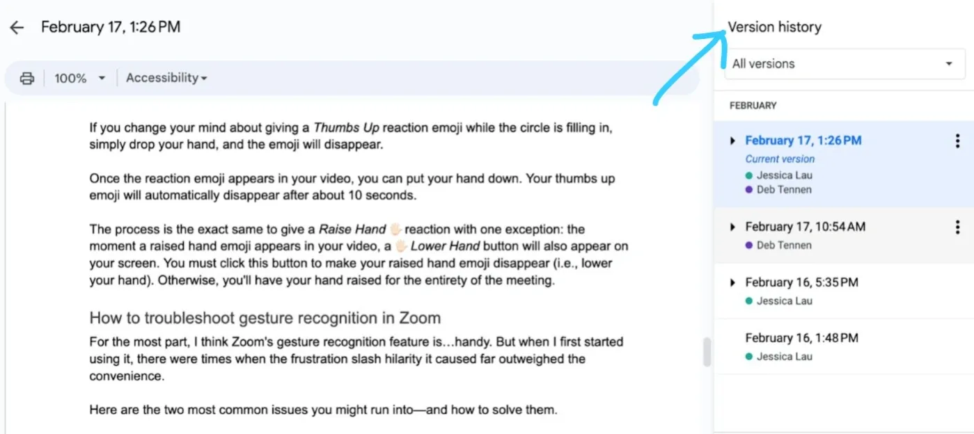
This image shows the Google Docs version history interface.
Principle 10: Customization & Flexibility
- Category: User Research / Scalability
- Key Focus: Let users tailor dashboards, views, and workflows to fit their specific needs.
- When to Use: In enterprise platforms with varied user roles, departments, or use cases, especially where different teams have unique goals or processes.
What it means:
Customization and flexibility enable users to modify dashboards, workflows, and settings to better match their roles, preferences, or team processes.
Why it matters:
One-size-fits-all doesn’t work in enterprise UX. Sales teams need one view, operations another, and leadership something else entirely. That’s where customization comes in.
By giving users control over dashboards, filters, notifications, and workflows, you improve productivity, reduce friction, and support real-world workflows.
Flexibility also improves adoption across departments and markets, making the product more scalable. It’s not about endless options, but smart defaults with the ability to adapt.
When to Use:
- Platforms used across multiple departments
- When user feedback shows friction in rigid workflows
- To increase adoption in global or enterprise-scale rollouts
Example:
Salesforce allows teams to create custom dashboards and reports tailored to their KPIs. It’s powerful because each user sees only what matters to them.
This image shows Salesforce's customizable dashboard interface.
2 Common UX Pitfalls in Enterprise Software and How to Fix Them
We asked UX and product experts to share the most common pitfalls they see in enterprise software and how enterprise brands can fix them. Here are their insights.
Feature overload destroys enterprise software usability
The biggest UX trap in enterprise software is the “feature overload” mentality. Businesses cram in features without considering real user workflows, and end up with interfaces that look like airplane cockpits.
I notice this often when comparing tools to those used in my own firm. Software vendors believe that the more features their product has, the more valuable it is. They are mistaken. Users become paralyzed by choice and fail to quickly find what they need. The result? Productivity drops, and adoption rates suffer.
The fix requires discipline. Start by mapping the daily activities of your users, not your company’s wish list. I learned this lesson when building learning platforms where frustrated students simply dropped out.
First, reduce your interface to the simplest actions, then add advanced features gradually by revealing them one at a time.
Companies should also apply the “10-second clarity test.” If a user cannot understand the main purpose of the product within 10 seconds, you have failed. Enterprise users are no different; they just have different goals.
Above all, stop committee design. Assign a UX gatekeeper who has the authority to say no to feature creep. The payoff is higher engagement and fewer support tickets for your users.
Disconnected Workflows Plague Enterprise Software Success
Having worked with enterprise software at DocuSign and implemented systems for hundreds of service businesses, I’ve seen that the biggest UX disaster is disconnected workflows that force users to constantly context-switch.
Enterprise software often treats each function as an island—your CRM doesn’t talk to your scheduling system, and that system doesn’t connect to your invoicing tool.
At Valley Janitorial, we found their team logging into seven different systems just to complete one customer job cycle. They had to check the CRM for client details, jump to a scheduling app, then manually re-enter everything into the invoicing system. This led to 40% more scheduling errors and forced their owner to work 60-hour workweeks just to manage data entry.
The fix isn’t building one mega-platform—it’s creating intelligent integrations that remove manual handoffs. Once we connected their systems with automated data flows, scheduling errors dropped by 40% and they saved over 45 hours each week. The software finally worked like their actual business process instead of forcing them to adapt to arbitrary software boundaries.
The enterprises winning today are the ones asking, “How does work actually flow?” instead of “What features can we cram in?”

Learn how Tenet can improve your enterprise UX
At Tenet, we’ve worked with over 450 companies across 15+ countries, building products that more than 20 million people now use.
Whether it’s simplifying internal tools or designing apps from scratch, we make sure the experience feels smooth and easy.
One of the examples is Al Jalila Foundation, for which we designed and developed a purpose-driven app.
We reimagined the user flow to reduce friction, added smart prompts to drive recurring donations, and integrated secure payment options.
The clean UI and intuitive navigation made it easy for users of all ages to engage, encouraging regular giving and amplifying the foundation’s mission to create lasting social impact.
Want to see how we can help, too?
Contact us today.
FAQs
What makes enterprise UX different from consumer app UX?
Enterprise UX focuses on complex workflows, diverse user roles, and data-heavy tasks within business environments. Unlike consumer apps, which prioritize simplicity and mass appeal, enterprise UX aims to optimize productivity, accuracy, and scalability for specialized users, often in regulated industries.
Why is role-based UX design critical for enterprise software?
Role-based UX customizes the interface for different users based on their responsibilities and permissions. This reduces clutter, prevents errors, and ensures security by limiting access. Personalizing the experience improves user efficiency and satisfaction, which is crucial in enterprise settings with many distinct user types.
How does good UX impact enterprise software ROI?
Good UX lowers training costs, decreases errors, and speeds task completion. This leads to higher adoption rates, improved productivity, and less need for customer support. Industry data shows that every $1 invested in UX can return $100, making it a highly cost-effective strategy for enterprise software.
What are the biggest UX challenges in enterprise apps?
The biggest UX challenges include managing complex workflows, supporting diverse roles, integrating with legacy systems, ensuring accessibility, and maintaining high performance under heavy usage. Balancing security and usability is also critical, especially in regulated industries.
How long does an enterprise UX redesign project take?
Enterprise UX redesigns usually take 3 to 9 months. The process includes research, prototyping, user testing, and iterative improvements. Time varies based on project complexity, user base size, and integration needs, ensuring the final design meets business and user requirements.
Expertise Delivered Straight to Your Inbox
Expertise Delivered Straight to Your Inbox


Got an idea on your mind?
We’d love to hear about your brand, your visions, current challenges, even if you’re not sure what your next step is.
Let’s talk


