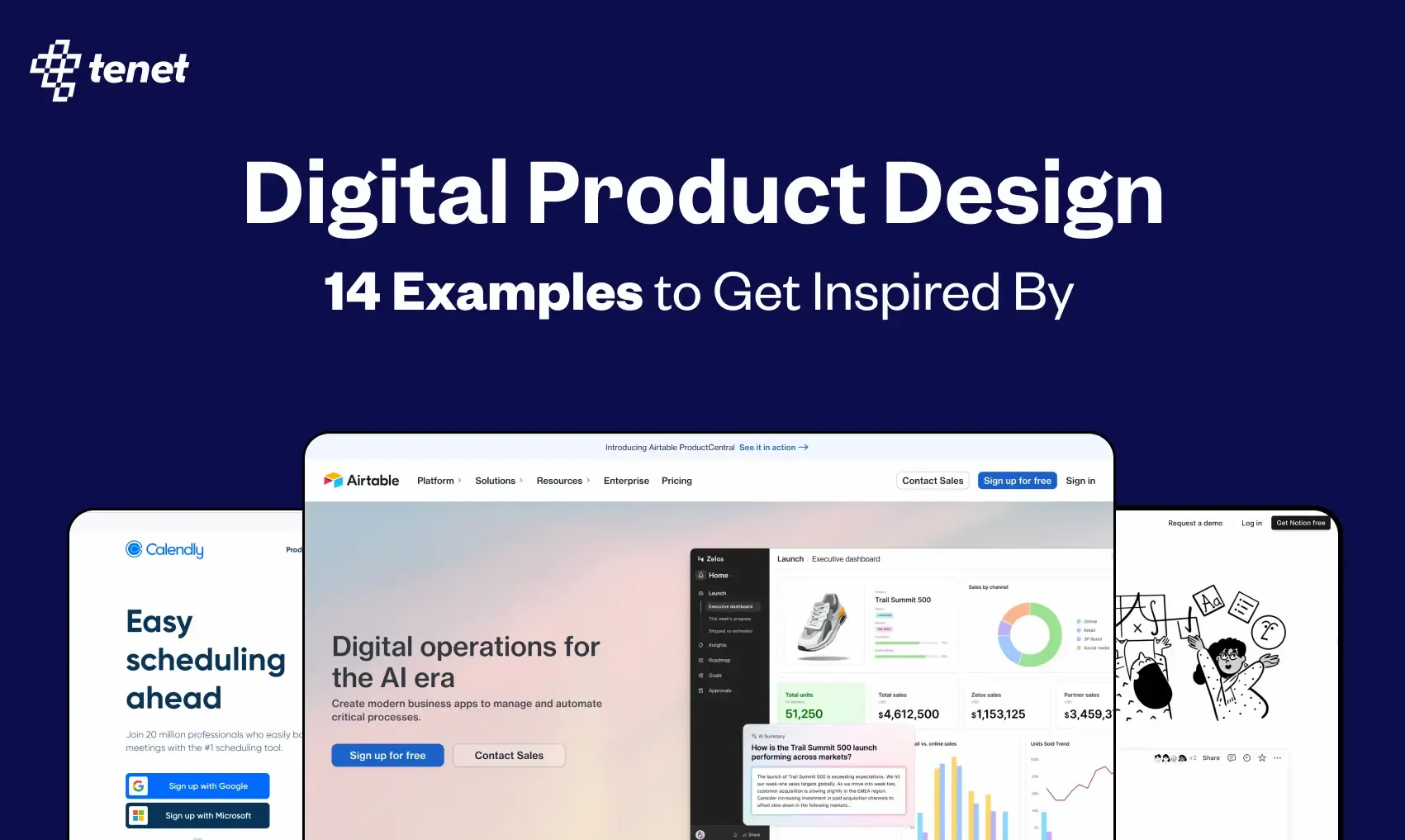
14 Digital Product Design Examples to Get Inspired By
 By
By Share
Share
Get a quick blog summary with


Would you stick around if Uber made it hard to book a ride, or if Netflix buried recommendations under endless menus? Definitely not! The best digital design products feel effortless. You open the app, tap a few times, and get exactly what you need. You barely even notice the design because it just works.
But when designs go wrong, you feel it immediately. The confusing layouts, unclickable buttons, and too many steps make users frustrated, and they leave.
At Tenet, the experience design company, we have impacted 20M+ people with a 98% client satisfaction rate by creating smooth, intuitive design experiences. We know what works and why.
In this guide, we’ll break down some of the best digital product design examples— helping you understand what works, why it works, and how you too can apply it to your own digital products!
What is a digital product design?
Digital product design is making things like apps or websites that you use on phones or computers. These include applications, platforms, or websites that not only look pleasing to the eye but also work effortlessly for the user.
A well-designed digital product keeps users coming back, ultimately leading to conversions.
They are built through research, design, and technology.
This process includes UI/UX design, prototyping, interaction design, accessibility, performance optimization, and branding.
Take Spotify, for example.
Did you ever find yourself lost or pausing for a moment, confused about where to find what you need?
That’s because Spotify’s personalized playlists, easy navigation, and UI make sure that we as users always know where to go next.
The experience feels natural and effortless. That’s one everyday example of digital product design done right.
Types of digital product design with real examples
Here's a concise TL;DR for the 14 digital product design examples:
- Calendly: Simplified scheduling with 5-step onboarding, intuitive side navigation, and smart defaults.
- Superhuman: Premium email client with command bar navigation and minimalist UI for focused productivity.
- Zapier: Clean automation platform with organized navigation, streamlined editor, and AI assistance for workflow creation.
- Loom: Video messaging tool with browser extension integration and outcome-focused onboarding.
- Dukaan: E-commerce platform with minimalist onboarding, clear checklist dashboard, and transparent navigation.
- Notion: All-in-one productivity tool with effortless simplicity, quick personalized onboarding, and extensive customization options.
- Beehiiv: Newsletter platform featuring functional dashboard, personalized onboarding, and subscriber preference management.
- Typeform: Conversational form builder with distraction-free design, thoughtful interface, and intuitive creation process.
- Tally: No-signup form builder with document-like interface and streamlined creation process.
- Airtable: Low-code platform with real-time visual feedback, split-screen customization, and intuitive app creation.
- Pitch: Presentation tool with interactive editing animations and smart templates with preview functionality.
- Bubble: No-code app builder with pixel-perfect design control, streamlined onboarding, and balanced learning resources.
- Canva: Graphic design platform with clutter-free canvas, vibrant color scheme, and smooth design workflow.
- Gumroad: Creator e-commerce platform with a minimalist interface, effortless product listing, and streamlined selling process.
Now, let’s dive deep into each.
1. Websites
Websites are the first interaction people have with the brand. The first impressions determine what users will think of the brand, how long will they stay and if they will even take action.
If a website is too information-heavy or cluttered, or if ‘why’ behind the business isn’t clear from the first looks users generally leave in a few seconds.
The right design solves for these challenges, and makes it easy to use on all devices, and it also guides users toward a purchase or a sign up.
2. Web and mobile applications
Web and mobile apps focus on ease of use and responsiveness. Since they serve a broad audience, the design must be simple, because nobody reads manuals for apps.
The challenge here is to cater to users on different devices, and good design perfectly bridges this gap. However, the smallest friction, like an unclear button, a complicated form, a frozen screen can make users leave.
3. SaaS platforms
Think of tools like Slack, Notion, or HubSpot. They’re definitely feature-heavy and designed for businesses, but they don’t feel overwhelming at all.
This is a sign of good design. It’s a famous saying that ‘good design is invisible’. It focuses on quick interactions, making the advanced features feel simple. Hence, users don’t get lost in unnecessary navigations and find what they need fast.
4. E-commerce platforms
Ever added something to your cart and abandoned it because the experience was complicated? Blame bad design! Amazon, Shopify, and Etsy are built for easy consumer buying.
Product pages, checkout flow, and payment is designed to decrease hesitation and increase purchases.
Since such platforms rely on quick decisions, digital design here ensures the process doesn’t feel time-taking, confusing, and tiring.
5. Digital services
Digital services include Netflix, Uber, Google Drive, online banking, and other platforms that continuously deliver smoother service that users rely on daily.
But why does design matter here?
Because users are engaging with a service that needs to be fluid, fast, and feel automatic.
The design here focuses on personalization and reducing decision fatigue.
👉 Explore our product design services by country (Get a free proposal):
- Digital Product Design Services in India
- Digital Product Design agency in UK
- Digital Product Design Services in US
- Digital Product Design company in Dubai
Digital product design examples to learn from in 2025
Let’s explore some of the best digital product design examples in 2025 to understand what works, what users like, and why.
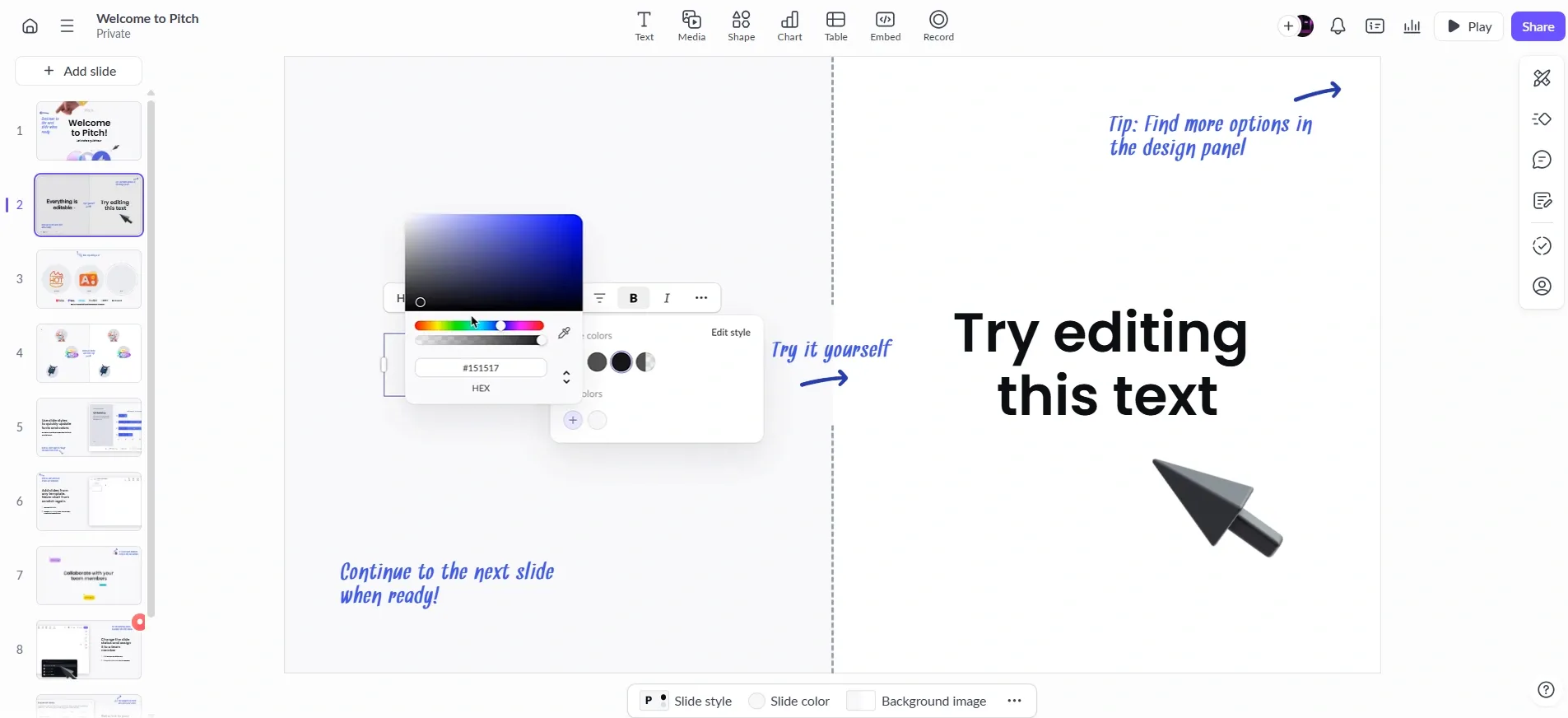
1. Calendly
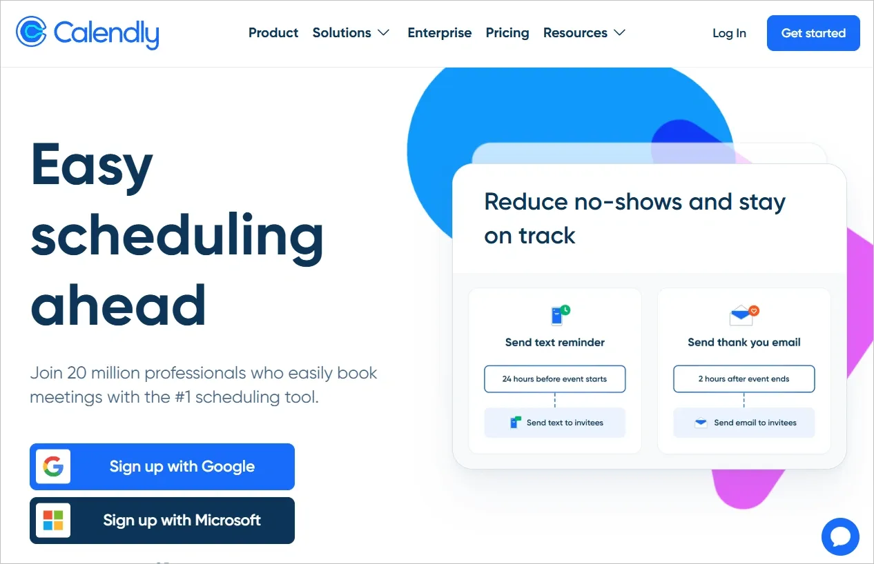
- Type of product: SaaS
Calendly is an automated scheduling tool which simplifies coordinating meetings. Instead of typical back-and-forth emails, invitees pick a time and the event is added directly to their calendar.
Smooth onboarding in just 5 steps: Instead of overwhelming users with information, it first collects necessary details such as your potential use-cases, which calendar you already use, and your availability each day of the week along with preferred meeting platform(Zoom, Gmeet, etc.).
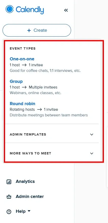
User-centric navigation and smart defaults: With the left-side navigation panel, you’ll always know where to go, be it managing events or editing your availability.
With 30-minute slots as the default, Calendly eliminates unnecessary decision-making.
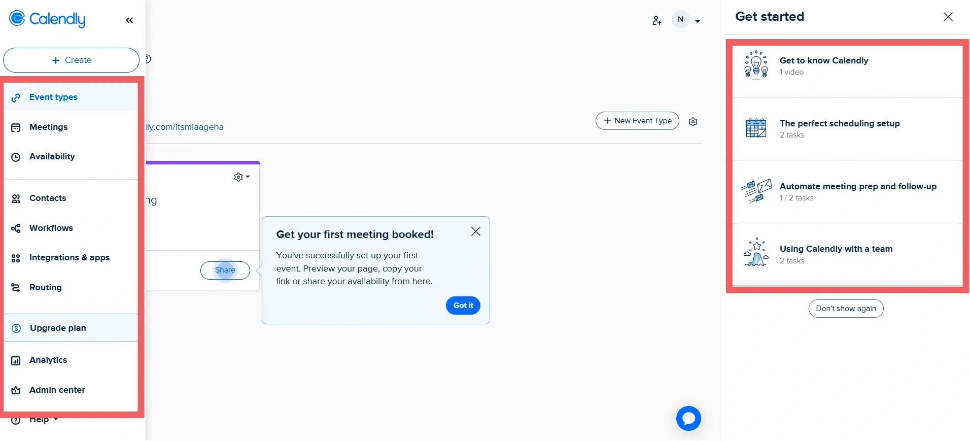
It’s also easier for users to book an event without extra steps:
Key lessons for designers
- Break down onboarding into simple, logical steps
- Place navigation where users expect it
- Use progressive guidance and avoid over-the-top tutorials
- Allow users to explore at their own pace
- Make use of smart defaults to keep users moving forward
- Design for both new and returning users
2. Superhuman
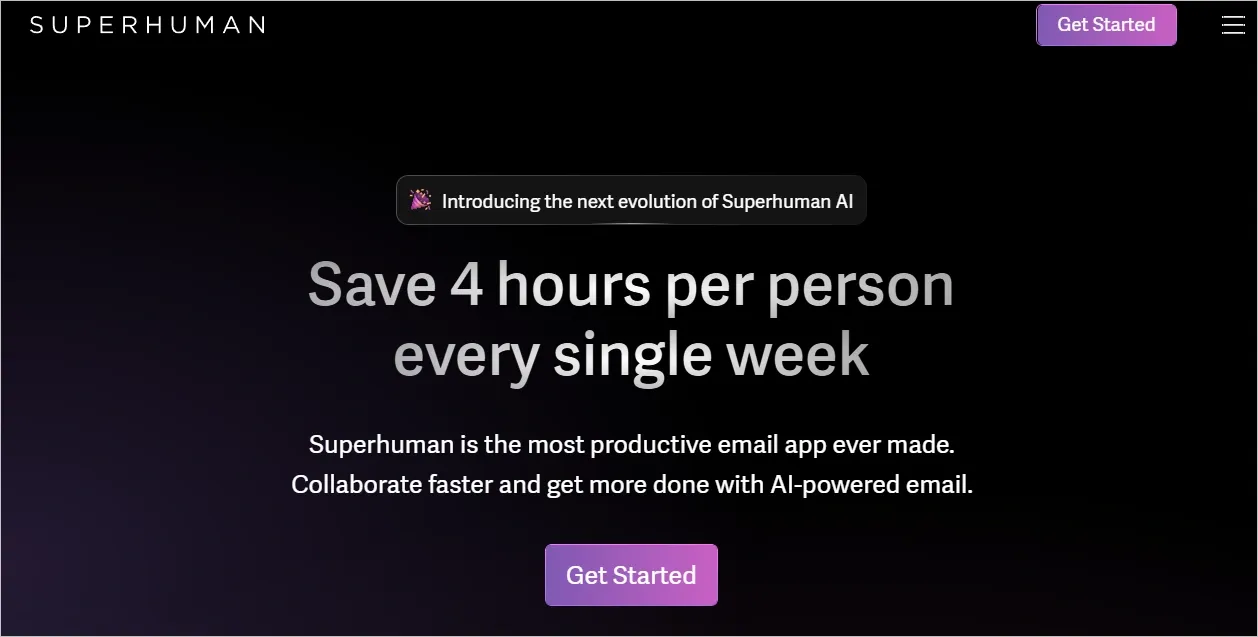
- Type of product: SaaS
Superhuman AI is a premium email client designed for professionals who spend a lot of time in their inbox. It offers a minimalist interface with powerful features like keyboard shortcuts, AI-powered email categorization, and scheduling tools.
Command bar-driven navigation: Superhuman uses a sleek command bar that allows users to execute routine email actions in a few keystrokes. This design choice cuts down on mouse clicks (just like how email professionals prefer to work!), and allows users to quickly reply and perform tasks without lifting their hands.
UI that’s strategic: Superhuman’s UI is as clear as it could be.
Every element is provided to guide the user through their inbox. It aims to let users focus on their emails rather than how to use it. These microinteractions mean users can quickly understand information and act, making email management simpler and enjoyable.
Key lessons for designers:
- Use subtle background gradients without competing with content
- Position CTAs with consistent placement for a clear conversation path
- Design typography systems with clear hierarchies
3. Zapier
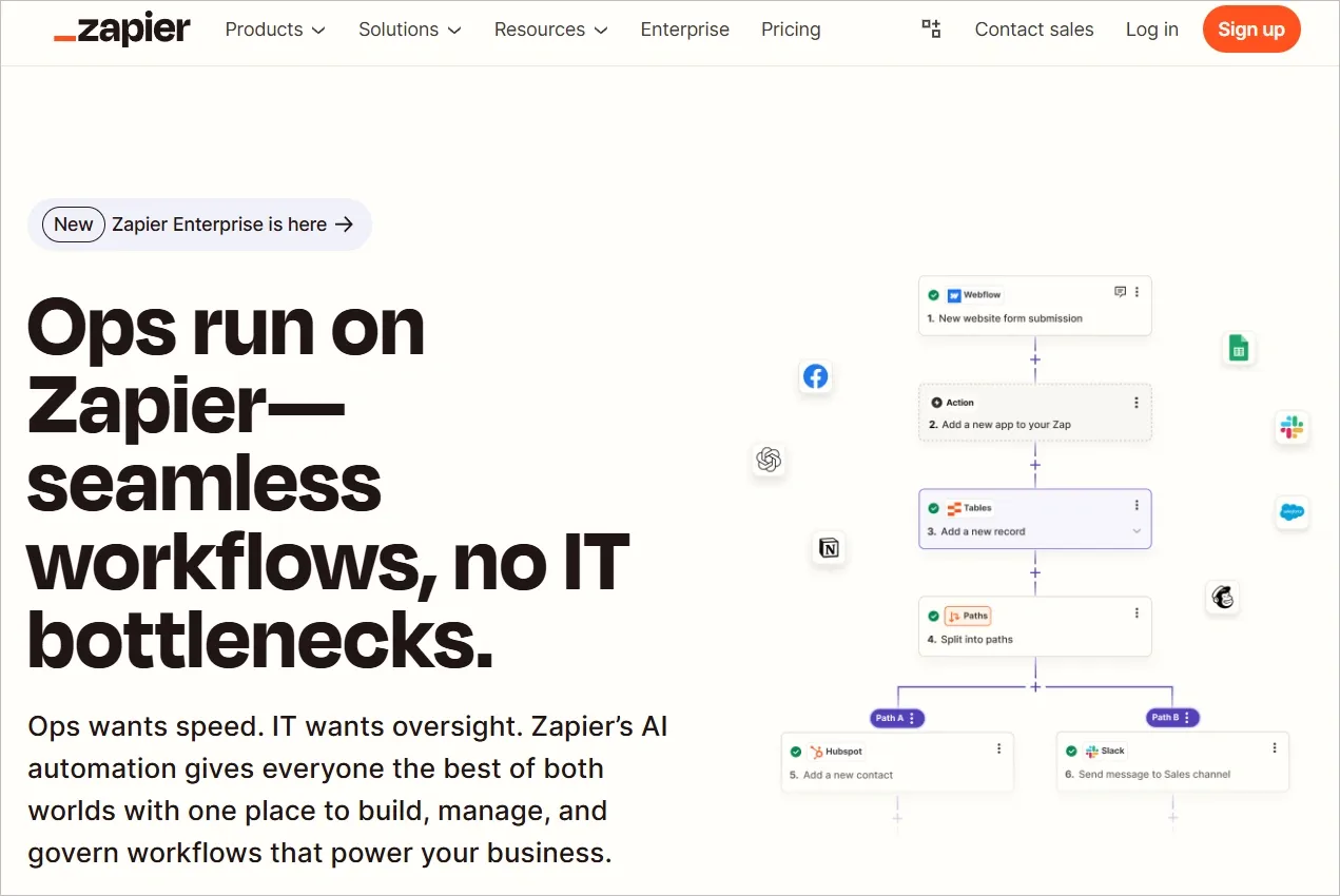
- Type of product: SaaS
Zapier is an automation tool that connects apps and services to automate workflows without coding. Users create automated actions triggered by specific events, saving time on repetitive tasks. It also has integrations for thousands of apps, helping improve productivity further.
First impressions: Zapier’s sign up process is minimal. Once inside, the incredibly organized home page stands out. It allows users to easily find what they need with a left navigation pane supported with distinctive & colorful icons.
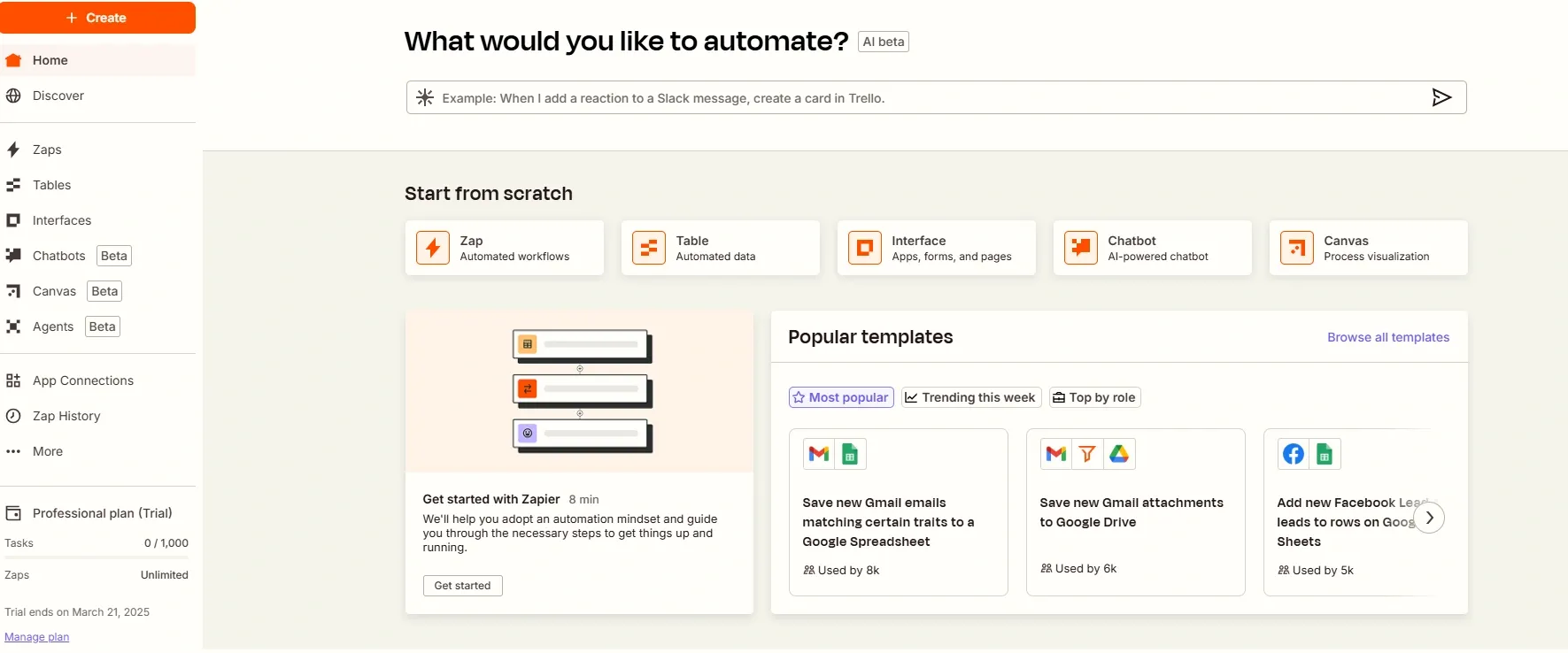
Streamlined zap editor: Zapier’s editor is a masterclass in clean design. The slim left-hand menu gives quick access to details and other tasks while the central workspace displays the entire automation flow. It takes the approach of positioning trigger and action steps side by side in real time while also removing the constant shift between edit and preview.
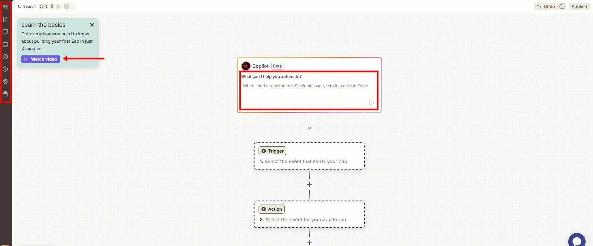
Additionally, to reduce manual effort, users can use AI to simply provide a brief description of the trigger and action.
Copilot generates the appropriate trigger and maps the action in seconds, which the user can add if they wish. Moreover, users can rely on AI to simplify Zap creation or troubleshooting.
Key lesson for designers
- Introduce key functionalities in expandable sections
- Layer features instead of overwhelming users
- Show the most relevant information first
- Consider allowing users to try the product in a low commitment way
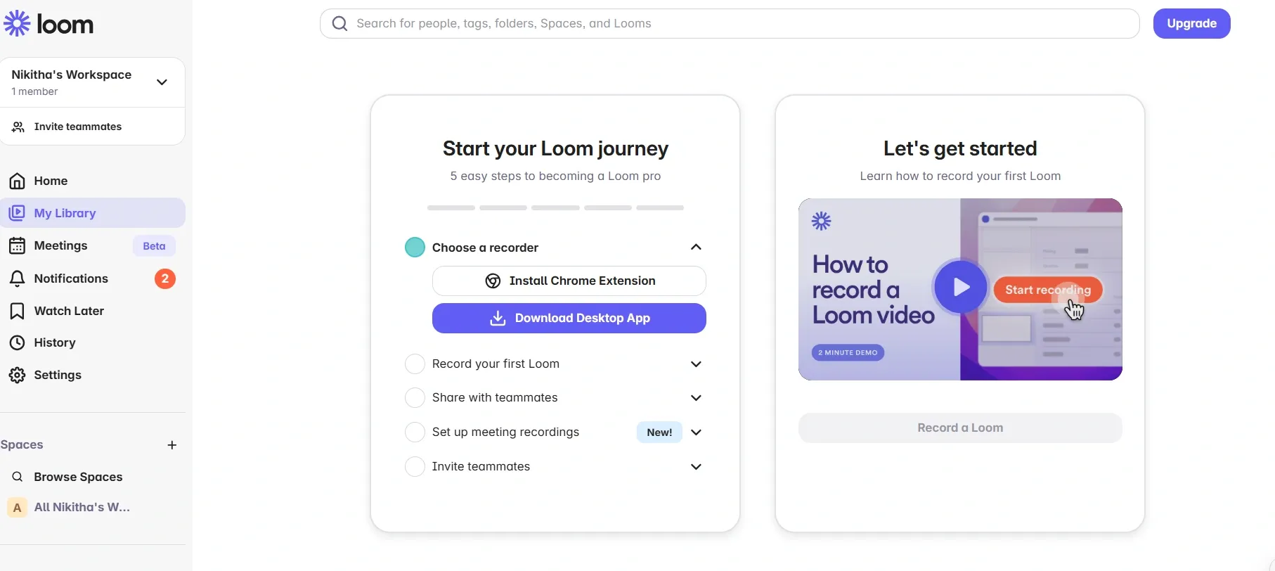
4. Loom
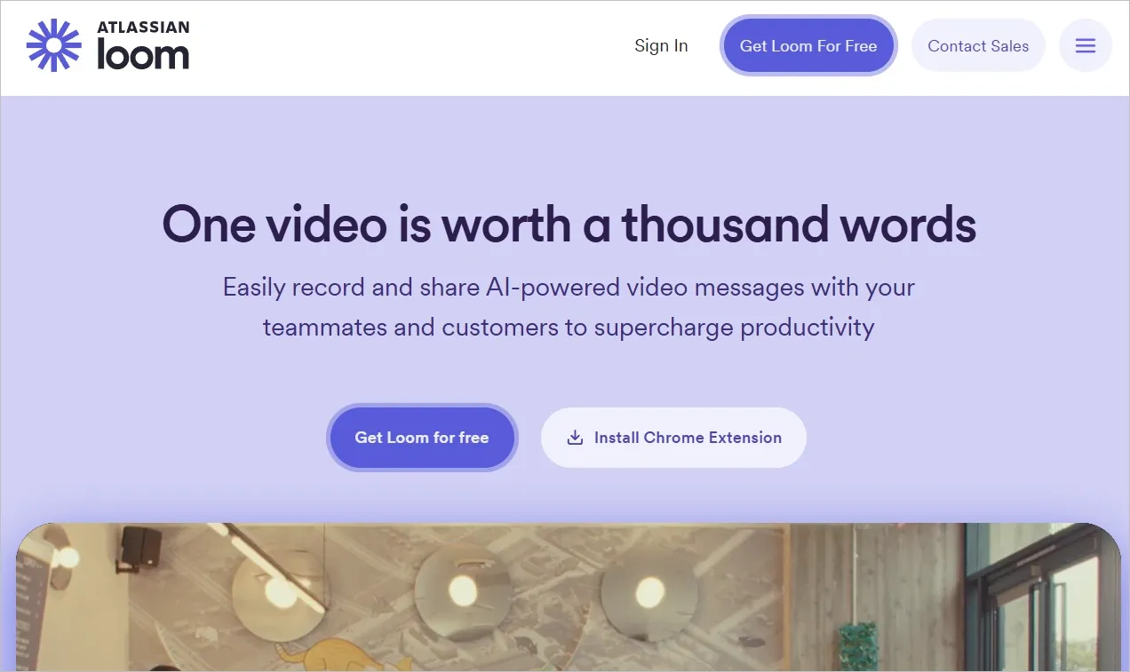
- Type of product: SaaS
Loom is a video messaging tool that allows users to record their screen, webcam, or both and instantly share the recorded video via a link.
It simplifies explanations, feedback, and collaboration. It aims to replace lengthy emails with clear, visual communication.
Seamless integration: Loom provides the choice of Chrome extension, allowing users to record their screen or facecam with audio from their browser. It’s a quicker way to create and share video messages without switching apps.
Outcome-based onboarding: Loom uses testimonials that build trust right off the signup screen. It requires pre-filing workspace details for intended use to reduce extra steps for users. The optional product tour also lets users opt in based on their needs.
5. Dukaan
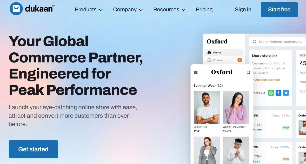
- Type of product: e-commerce SaaS
Dukaan is an e-commerce SaaS platform, similar to Shopify, that enables small businesses and entrepreneurs to create online stores without coding or design experience. It also offers a mobile app and web-based interface.
Also, it provides different storefronts, marketing tools, and integrations as well.
Streamlined onboarding and dashboard: The onboarding process is minimalist, requiring only two essential inputs - your country and business name.
The dashboard also presents a clean checklist layout to fill in extra information and begin your business.
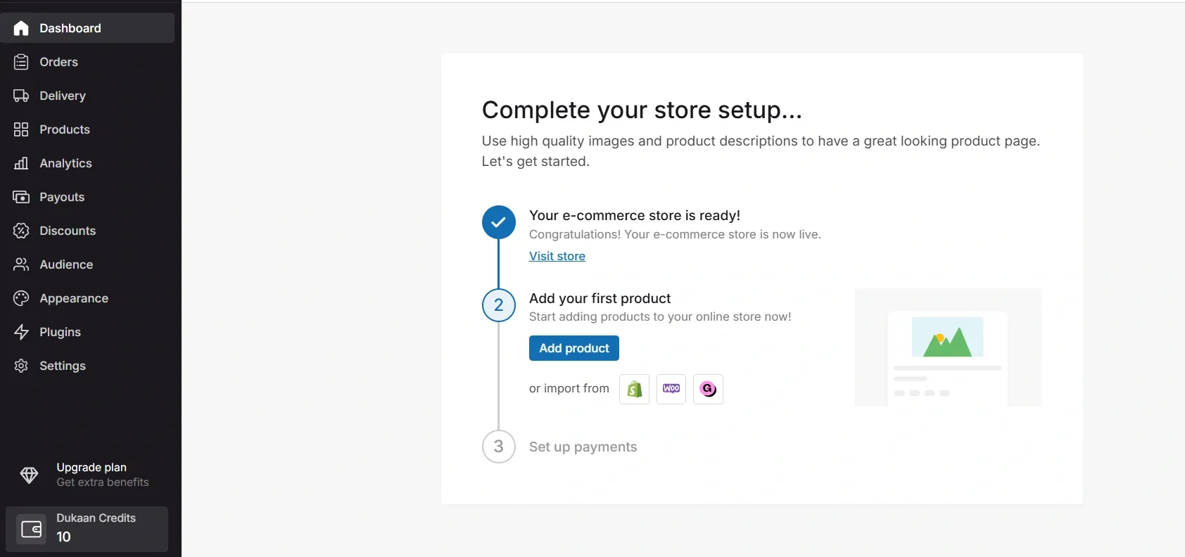
Performance optimized architecture: Dukaan loads quickly with a responsive design that efficiently handles images, scripts, and other elements. It also uses microcopy that’s simple, clear, and easy for users to understand.
Guided product setup: Unlike platforms that reveal required fields only after progressing through each step, Dukaan provides left-side navigation outlining all the required steps. This ensures they have complete visibility before committing.
Key lessons for designers:
- Use bite-sized, identifiable text for effortless reading
- Offer pre-built storefronts to enable quick store launches without coding/design skills
- Use a checklist dashboard to guide users with a clear, step-by-step task list
- Ask only essential details to speed up setup
6. Notion
- Type of product: SaaS, desktop/web/mobile app
Notion is a productivity tool that combines note-taking, project management, and collaboration in one workspace.
It’s an all-in-one productivity tool designed for both individuals and teams to create customizable workspaces for personal and team projects. It enables customization for workflows, wikis, and databases.
Effortless simplicity: Notion offers a minimalistic design which allows users to create pages, subpages, and databases even without any prior experience. The UI has an almost instant adaptability.
Any piece of content, be it text, image, table, or a list, can be moved, edited, and formatted with ease.
This allows users to focus on their work rather than spending time on how to use the tool.
The first page experience also provides guidance with practical examples, reducing the learning curve.
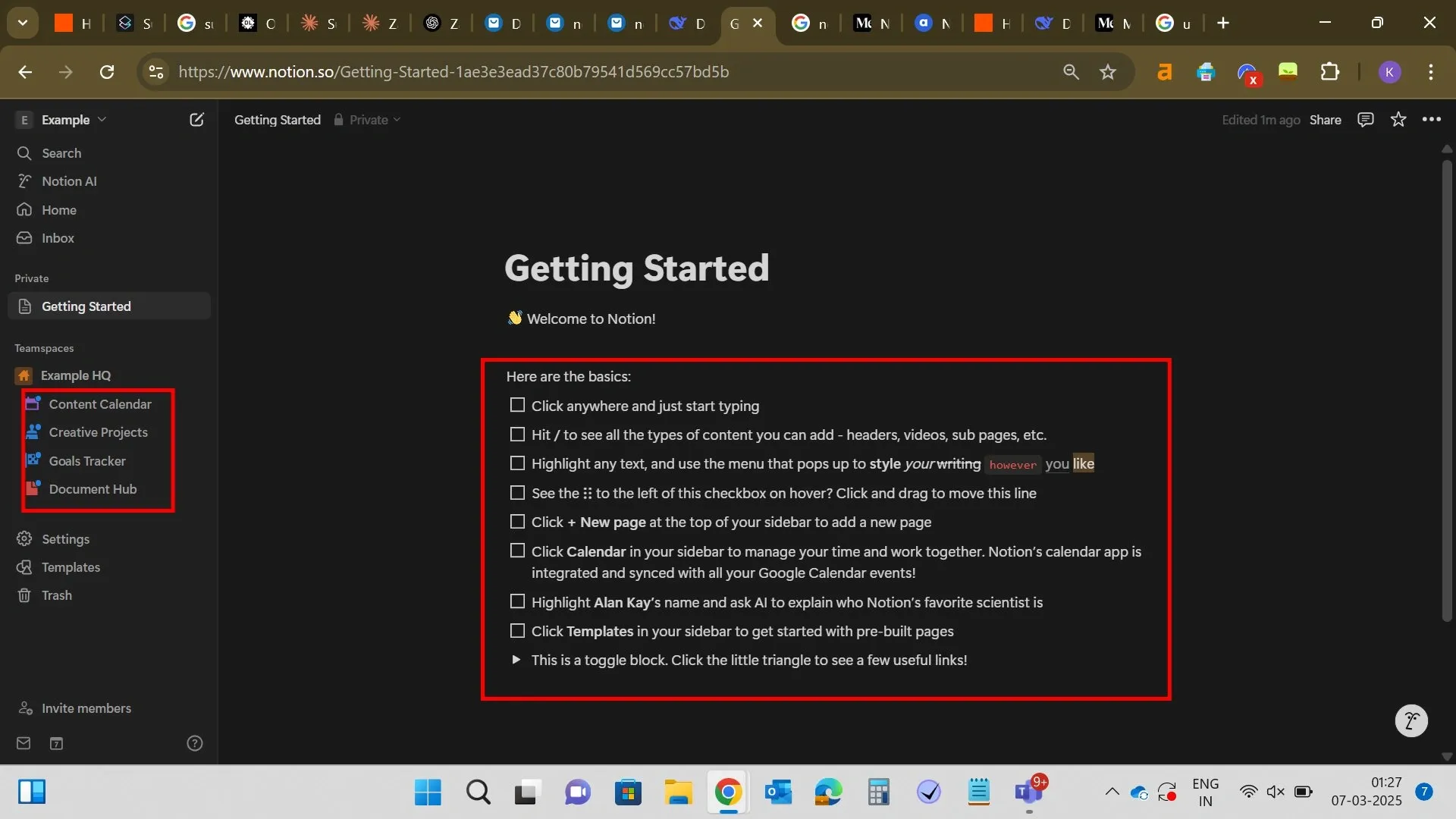
Onboard in seconds: The onboarding process only takes a few seconds, yet it highly personalizes your experience.
Notion pre-loads relevant pages and provides thousands of ready-made templates suited to the user’s needs.
Unmatched customizability: Users can create customized pages, dashboards, and databases along with the ability to toggle between different views, such as tables, lists, kanban boards, etc.
Lastly, Notion has built-in templates for everything from project management to personal journaling to wedding planning, but users can create anything as per their own use case.
Key lessons for designers:
- Ask minimal but purposeful onboarding questions
- Allow users to easily personalize pages, workflows, and dashboards to suit their needs
- Offer multiple views (tables, lists, Kanban) so users can choose what works best for them
- Speed up user adoption by auto-loading templates and pre-configured pages specific to different needs
7. Beehiiv
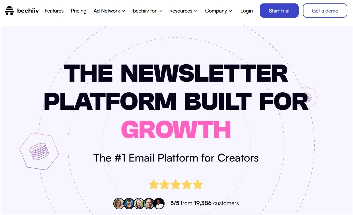
Type of product: SaaS
Beehiiv is a platform designed for creators to manage their newsletters. It combines tools for writing, publishing, and growing newsletters. It also supports website hosting, embeddable subscription forms, and monetization options.
Functional dashboard: The dashboard features a sidebar with clear categories along with a centralized analytics on the main panel. It provides subscriber’s insights in a clean, easy to understand format. Users praise Beehiiv for how they can easily manage newsletter without any confusion.
Onboarding and personalization: The onboarding process asks specific questions to help users feel confident and ready to publish from their first day. It helps users set brand colors, logos, URLs, and so on. This personalization ensures writers can hit the ground running, while also making it a standout feature for first-time users.
In fact, users have access to the subscriber preference center where they can create, rearrange, and edit preference options via a drag-and-drop feature. Each choice updates custom fields, like email preferences or subscription types, automatically. This allows users to personalize communication and adjust content based on what subscribers choose, all without extra setup.
8. Typeform
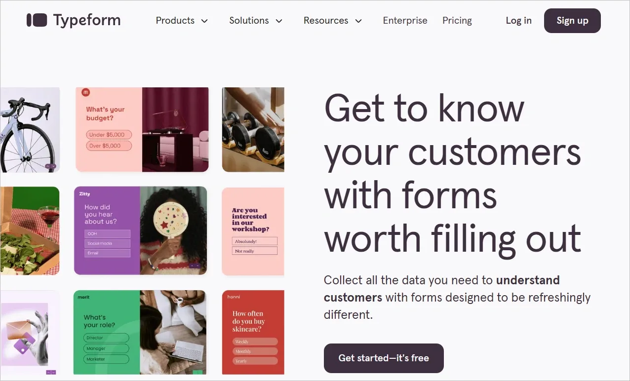
- Type of product: SaaS
Typeform is a software designed to create online forms, surveys, and quizzes with an interactive, conversational approach. It’s typically used by businesses for lead generation, customer feedback,surveys, and other types of research.
Conversational UX: Typeform doesn’t throw walls of questions at users. It serves one question at a time, guiding users through an experience that feels like a survey and more like a conversation. Some standout elements:
- A full-screen, distraction-free canvas that puts focus on the questions
- Smooth transitions between questions
- A progress indicator to keep users in a flow state
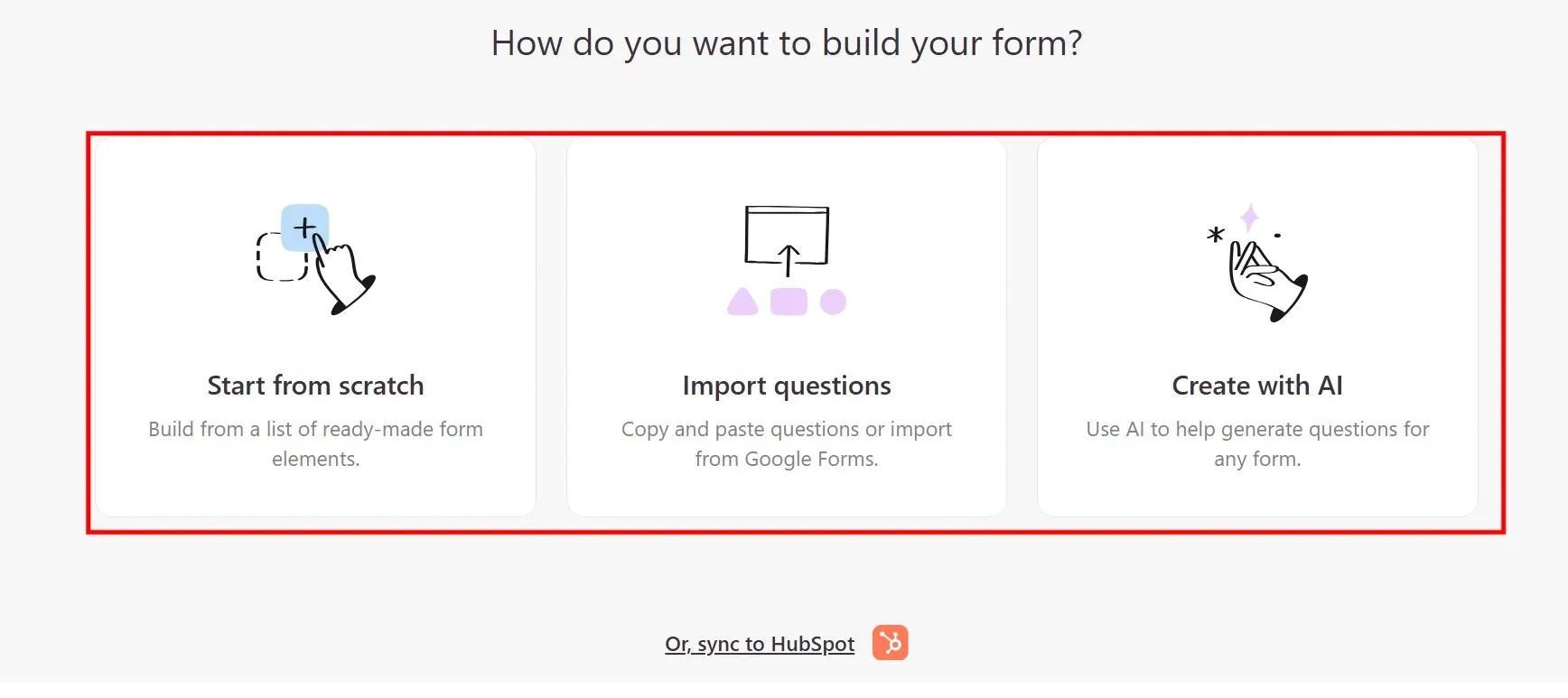
Thoughtful interface: After onboarding, the screen is structured so that the user’s next step is to build their first form. Advanced features are visible, but are also not in the way. Building forms is easier as users aren’t locked into strict structures, where they can’t edit. Click into a field, and users can instantly build their forms without pop-ups or separate panels.
Typeform provides guided question selection before users even start building.
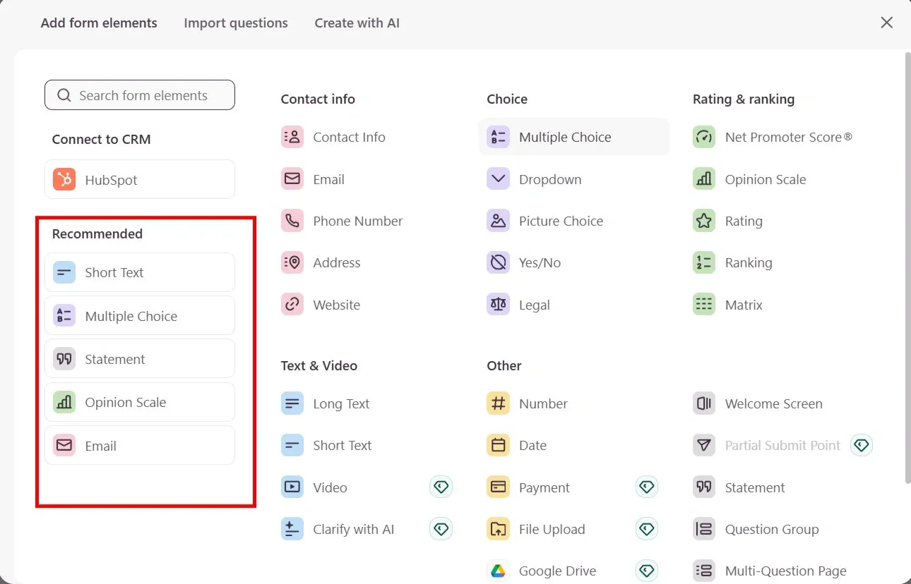
Intuitive form creation: The dual panel incredibly improves usability, left for question management and editing, right for settings, and the above panel for version history, previews, and customizations. The entire experience is seamless and enjoyable.
Key lessons for designers:
- Use a full-screen layout to keep users focused on the task at hand
- Let users easily create and personalize tasks without constant pop-ups
- Split important functions in full-screen mode to streamline user workflows
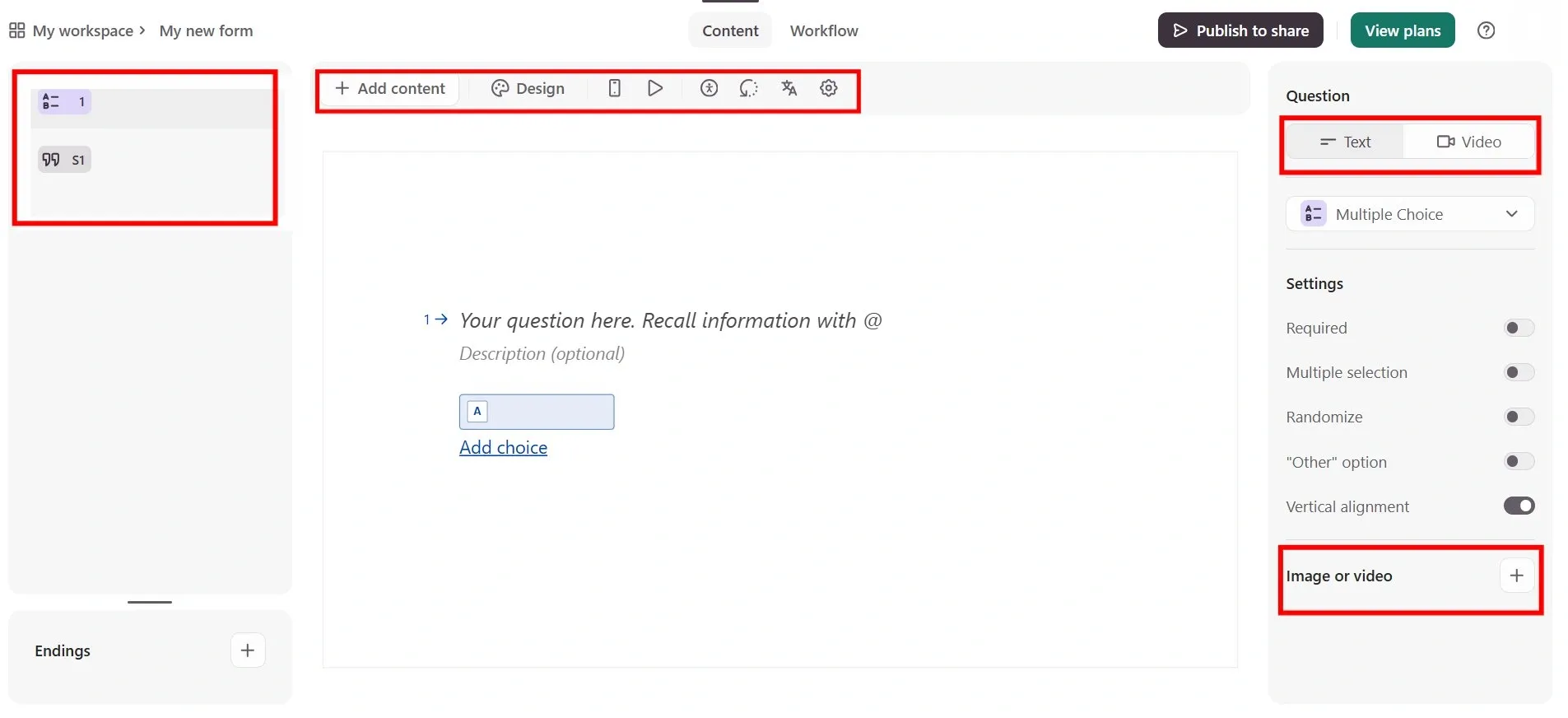
9. Tally
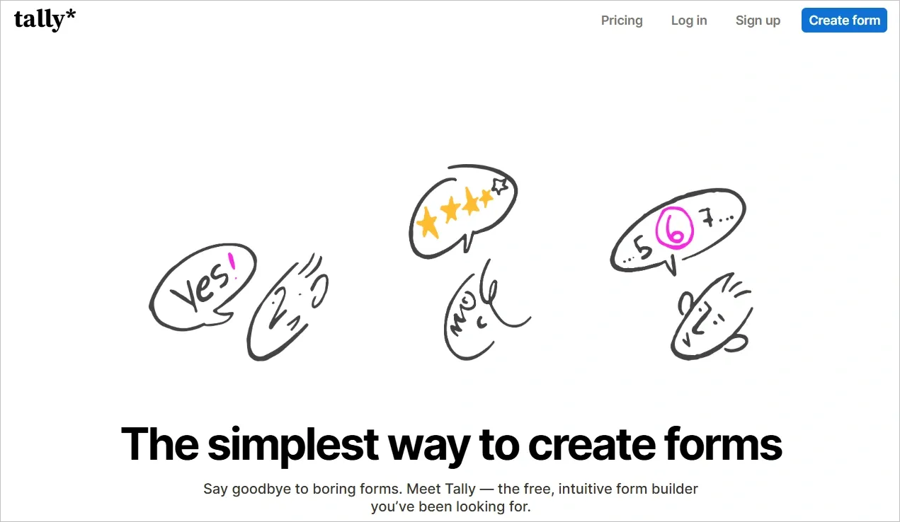
- Type of product: SaaS
Tally is a tool that helps people collect information easily using online forms. You can create surveys, feedback forms, and sign-up sheets without any coding. It includes automation, integrations, and real-time analytics to make data collection smooth and efficient.
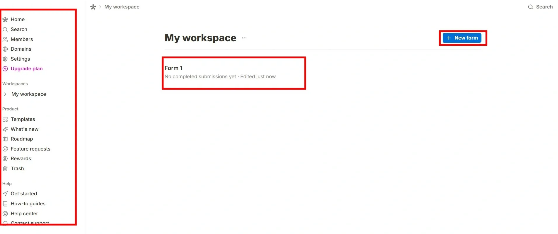
Easy to Start, No Sign-Up Needed
You can try Tally without creating an account. Just open it, build a form, and see how it works.
You only need to sign up when you decide to publish your form. This makes it easy for users to explore the tool without barriers.
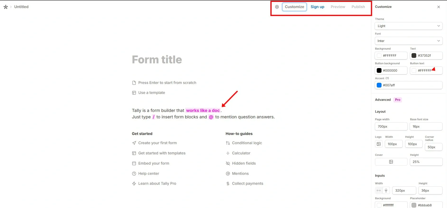
Clean and Simple Design
Tally’s interface looks like a document, similar to Microsoft Word or Notion. The form title is at the top, and there are no distracting menus or toolbars. The focus stays on content, making it easy to use. A pink highlight on the phrase "works like a doc" emphasizes this unique feature.
Quick Form Creation
When users decide to publish, signing up is fast—just two optional questions. After signing up, users enter a workspace focused only on forms, keeping things simple.
Key lessons for designers:
- Let users try the product before signing up.
- Use a clean, familiar interface that looks like a document.
- Focus on the main task (form creation) instead of extra menus.
- Give helpful hints inside the interface instead of using pop-ups.
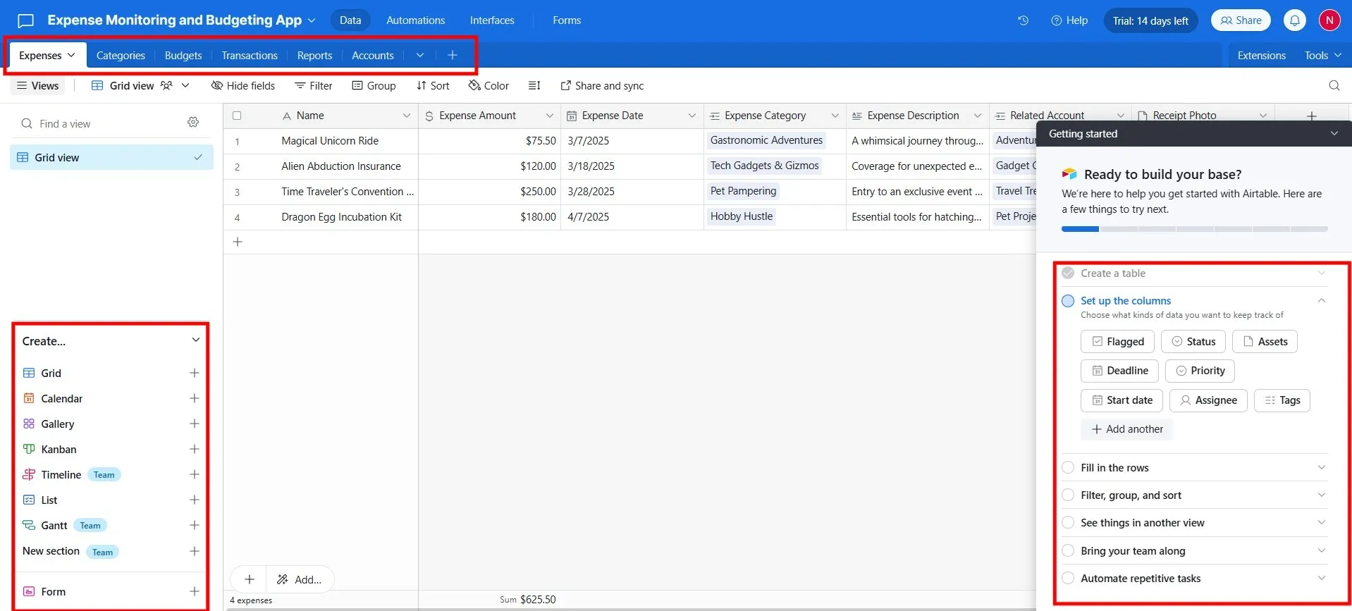
10. Airtable
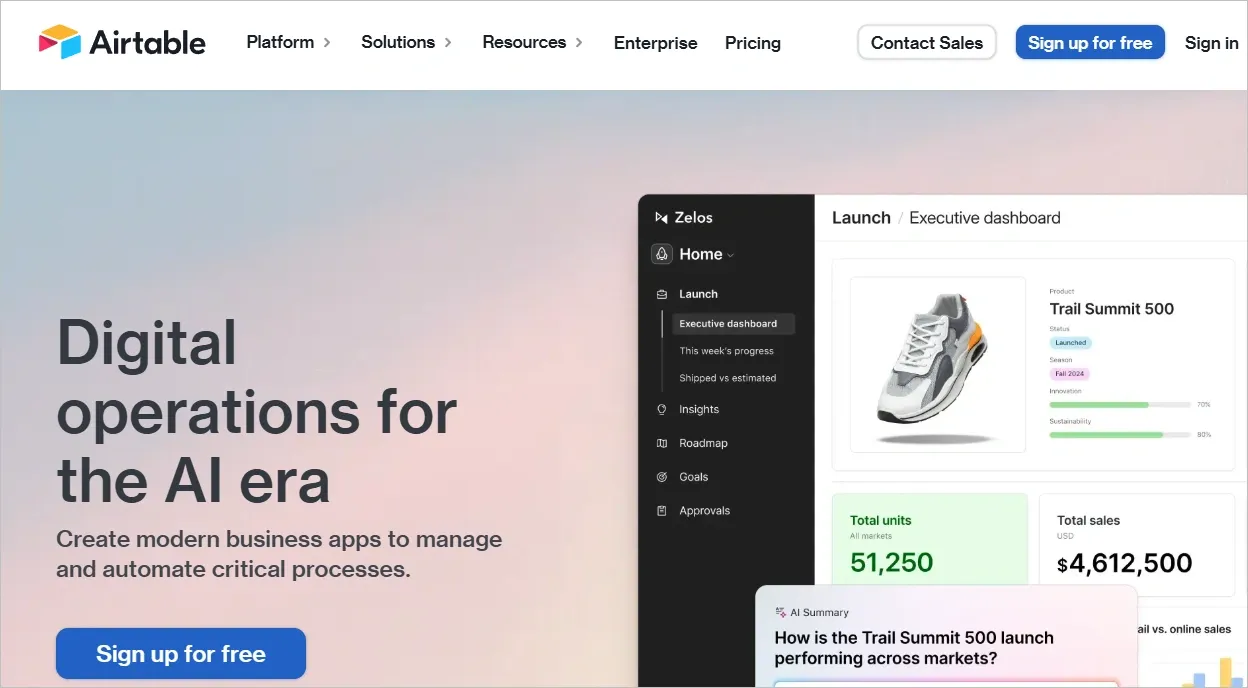
- Type of product: SaaS
Airtable is a low-code platform for building next-gen business apps. With its flexible database, automation, and integration abilities, Airtable allows users to create custom applications without the need for extensive coding.
It empowers users to operationalize their data, meaning they can structure, analyze, and pull information easily from its database, which integrates with platforms like Dropbox, Slack, Jira, etc.
WYSIWYG (What You See Is What You Get) in action: The Airtable interface immediately provides live feedback. Every change during onboarding, from colour adjustments to layout modifications, is shown in real time.
Navigation components change in response to content and app requirement edits, allowing users to create their own apps, literally.
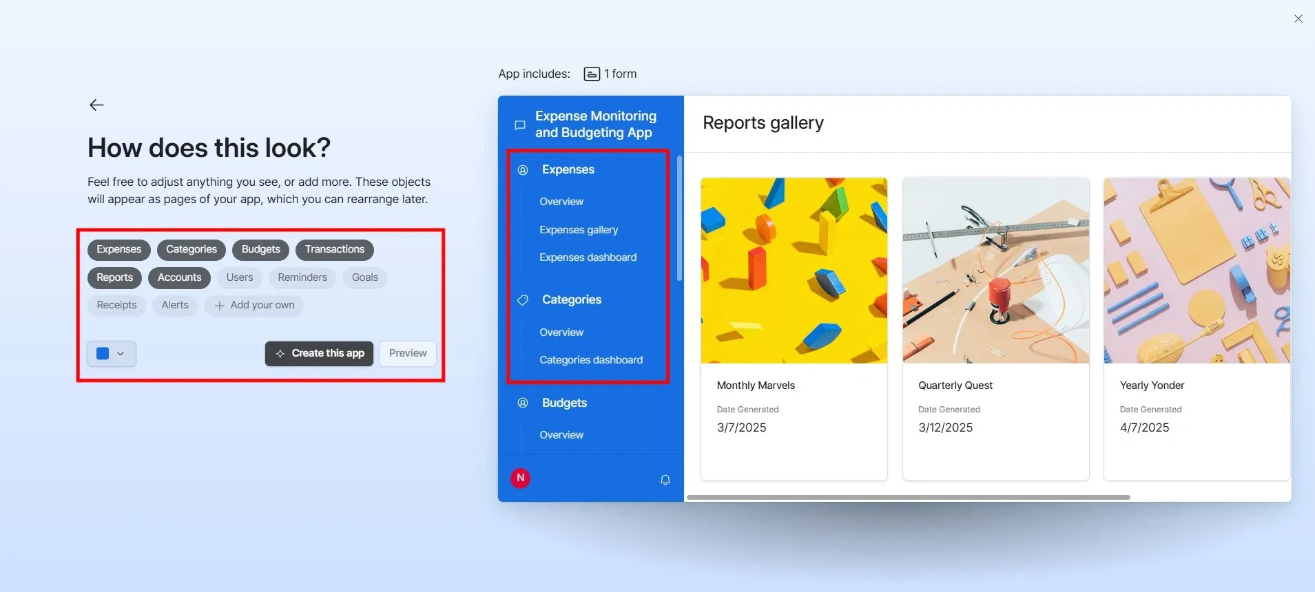
Real-time customization: With a split-screen approach, one side shows context-sensitive controls while the other updates with user changes.
The onboarding is a surprisingly fun experience, making users select theme colors for their app while editing what it looks like, and what information it would have.
Instant app creation: After creation, users can seamlessly add new elements like galleries, Kanban boards, and more to structure their database(s).
Quick-access popup panel and category bar displays help configure columns, automate workflows, and expand.
Key lessons for designers:
- Show changes in seconds, from color adjustments to layout edits, to let users adjust their app’s look and content
- Design onboarding to be minimalistic, focusing on natural nudges for exploration
- Let users achieve small wins before explaining advanced features
- Strategically place customization options in highly noticeable areas, making it easy to add elements in just one click
11. Pitch
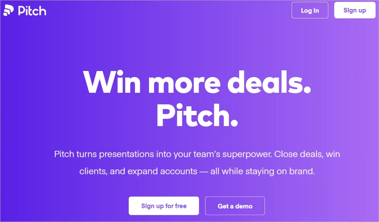
- Type of product: SaaS web application
Pitch is a complete sales pitching platform that improves a user’s presentation game from design to delivery. It allows users to create stunning, on-brand pitch decks through rich libraries, user-friendly UI, interactive instructions, and so on.
Pitch changes the way to present ideas, making it easier than ever to impress and persuade.
Interactive editing animation: Pitch makes use of animation to show users how to edit their slides, using effects, resizing, and tips.
Cursor highlights, click indicators, and instructional overlays provide clear guidance for an amazing interaction.
Presentation creation with smart templates: Pitch integrates everything within the creation screen itself. It offers AI-powered slides, imports, a blank canvas, and categorized templates all in one view.
A standout feature is its micro-animated template previews, where users can see templates in action before selecting. It eliminates tiresome back-and-forth navigation, overall.
Key lessons for designers:
- Use small preview animations to make interfaces feel alive
- Always show visual indicators like cursor highlights and click indicators to make editing instructions clearer
- Maintain consistently visual styles across all UI elements
- Use an integrated creation screen that combines AI-powered slides, imports, and templates in one view for easy access
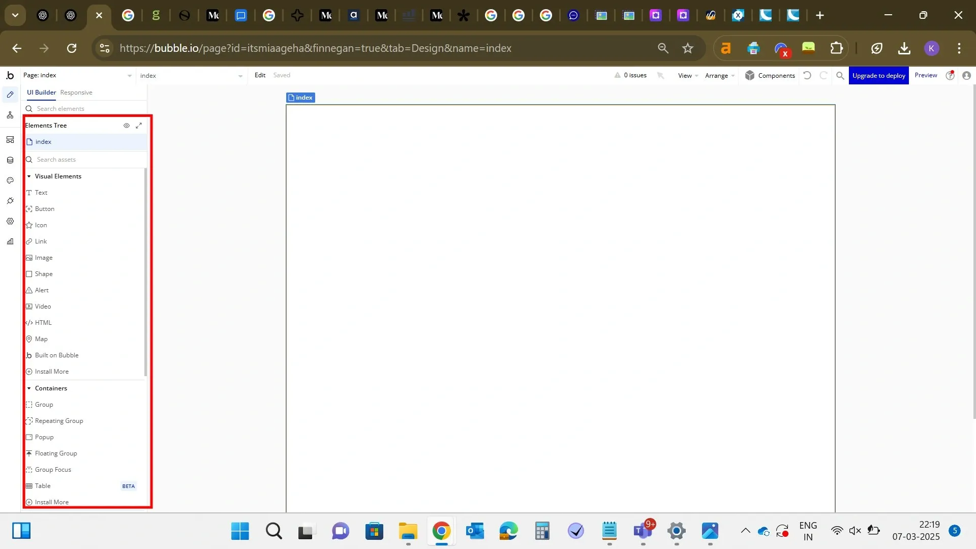
12. Bubble
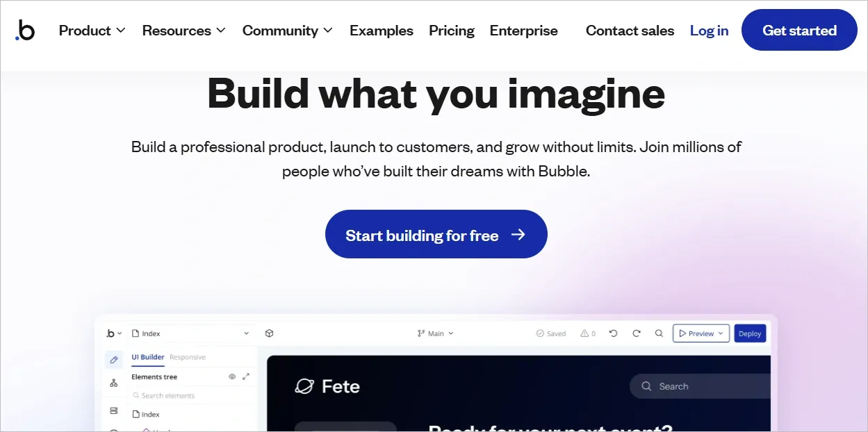
- Type of product: Web app builder, SaaS
Bubble is a no-code platform that allows users to build functional web applications without programming.
It’s designed for founders, designers, and developers who want to build and launch products quickly while maintaining full design and app control.
Pixel-perfect, grid-free design: Bubble uses a freeform design with absolute placement of elements, fine-tuned down to the pixel. It attracts users, who, from the start, want control over every margin, padding, and alignment.
Smooth first touchpoint: Bubble lets users build apps within the onboarding flow itself. Right from the first screen, you’re given a clear, high-impact choice: build with AI or go straight to the editor.
It makes the user’s first decision actionable without unnecessary steps.
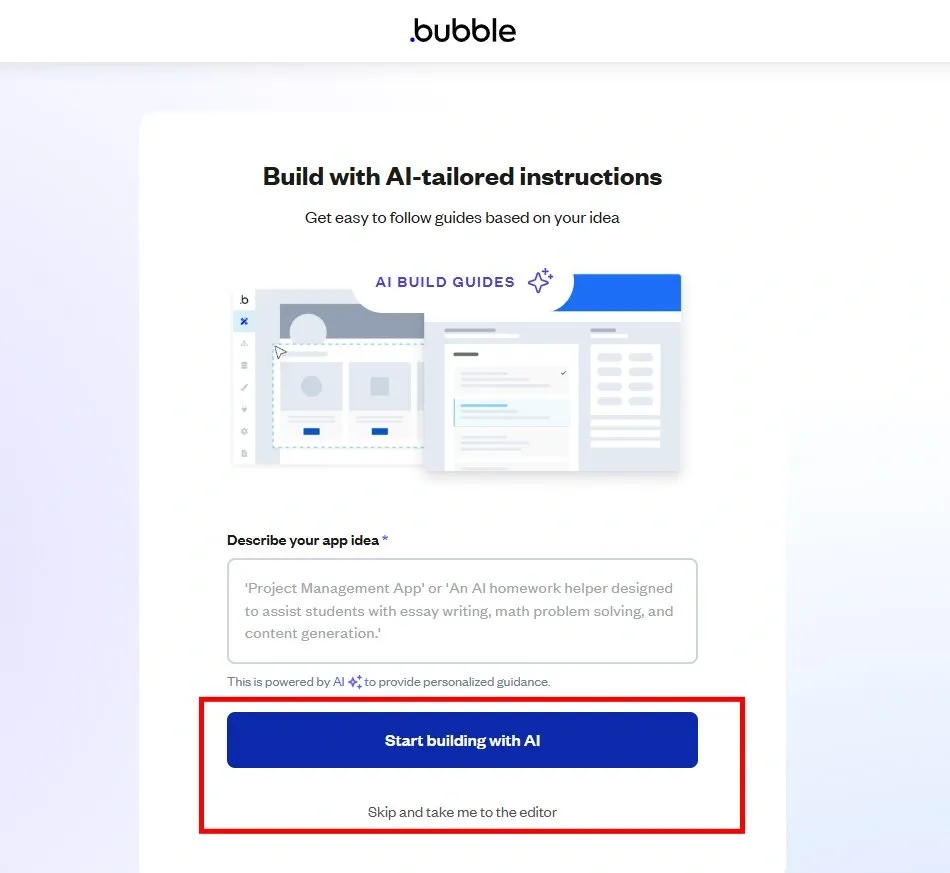
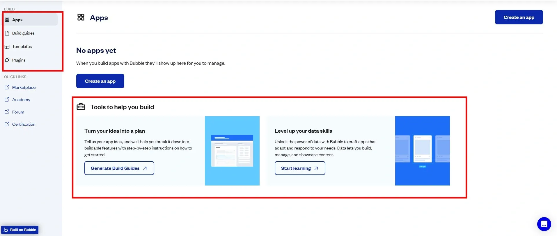
Balanced learning: Bubble has somehow perfected the art of hands-on customization and learning.
It offers access to resources on the homepage, including a dedicated Academy with video tutorials for new users to get started. For experienced users, they can begin creating their new app, plugins, and templates.
Key lessons for designers:
- Make onboardings interactive, and not just text based
- Keep choices minimal to reduce burden of decision making and speed up engagement
- Place skip options to respect both new and advanced users
13. Canva
- Type of product: SaaS, mobile and desktop app
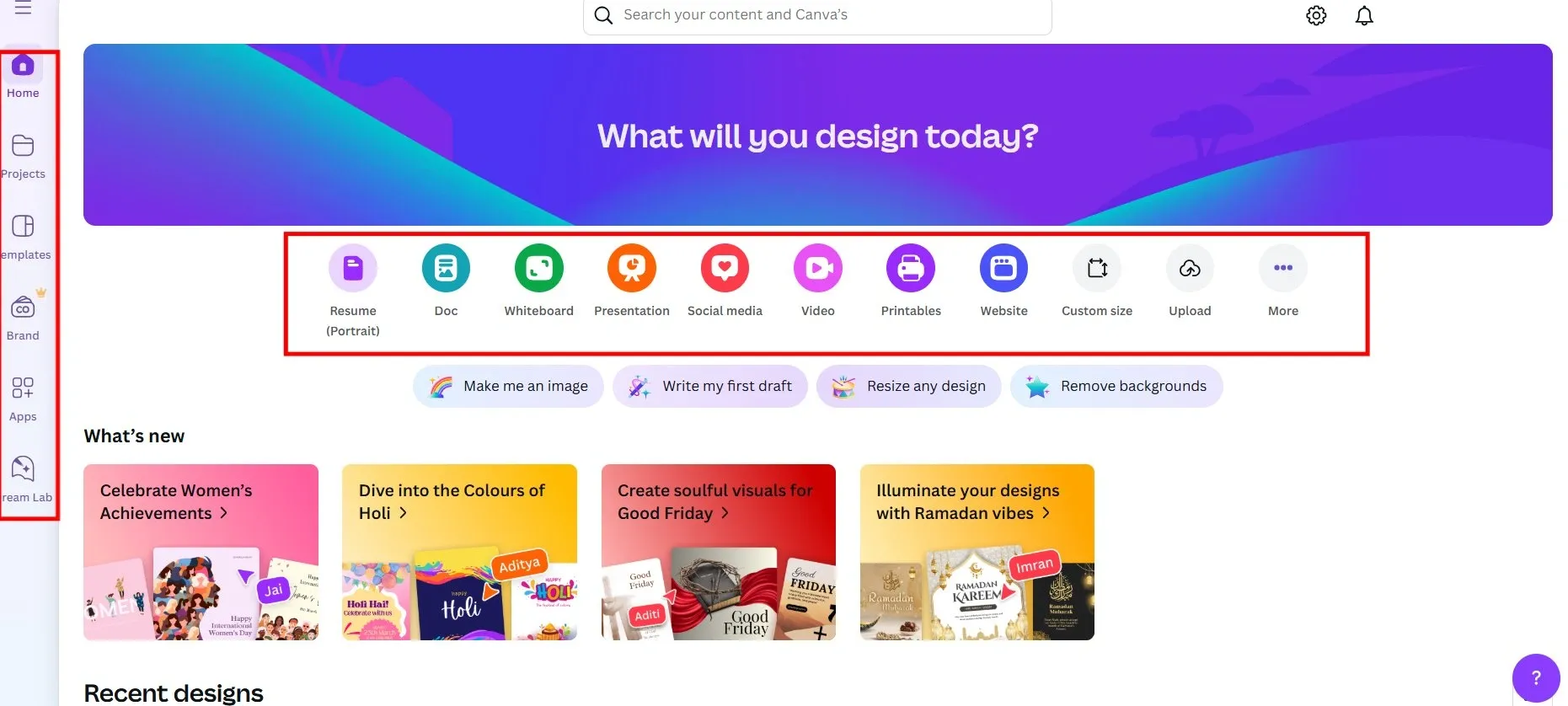
Canva is a graphic design platform where users create visuals easily. It boasts of huge template libraries, AI-powered design tools, and wide range of design needs. This include social media graphics, presentations, marketing materials, documents, and even websites.
Clutter-free canvas: Canva’s full-screen design removes distractions and focuses entirely on work. It uses a typical left-hand navigation and quick launch icons, making finding tools easier. This simplicity stands out by allowing users to jump into creative tasks.
Bold, vibrant colors: Canva uses a neutral background paired with bold accent colors to focus on calls to action and interactive elements. These well-chosen hues represent brand identify but also usability. The effective use of colour is a signature aspect that sets Canva’s design apart.
Smooth design workflow: Canva takes users straight to a blank canvas once they begin a project. The left panel provides access to hundreds of elements, templates, tools, and additional editing features along with AI features. This is an example of an uninterrupted workflow.
Key lessons for designers:
- Prioritize a clean workspace for better focus
- Allow easy access to elements and tools via floating quick-access icons or the left-hand navigation
- Keep all features within easy reach, but without overwhelm
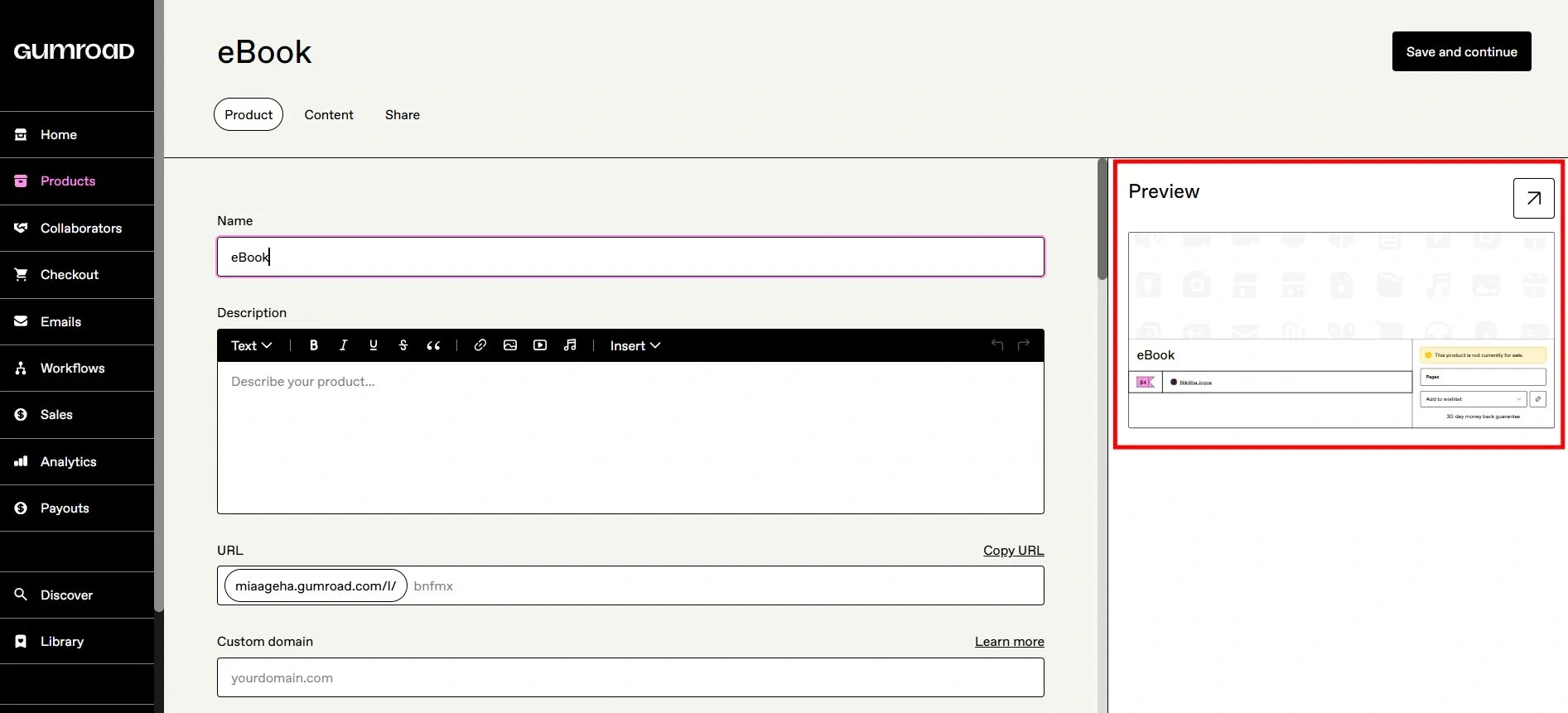
14. Gumroad
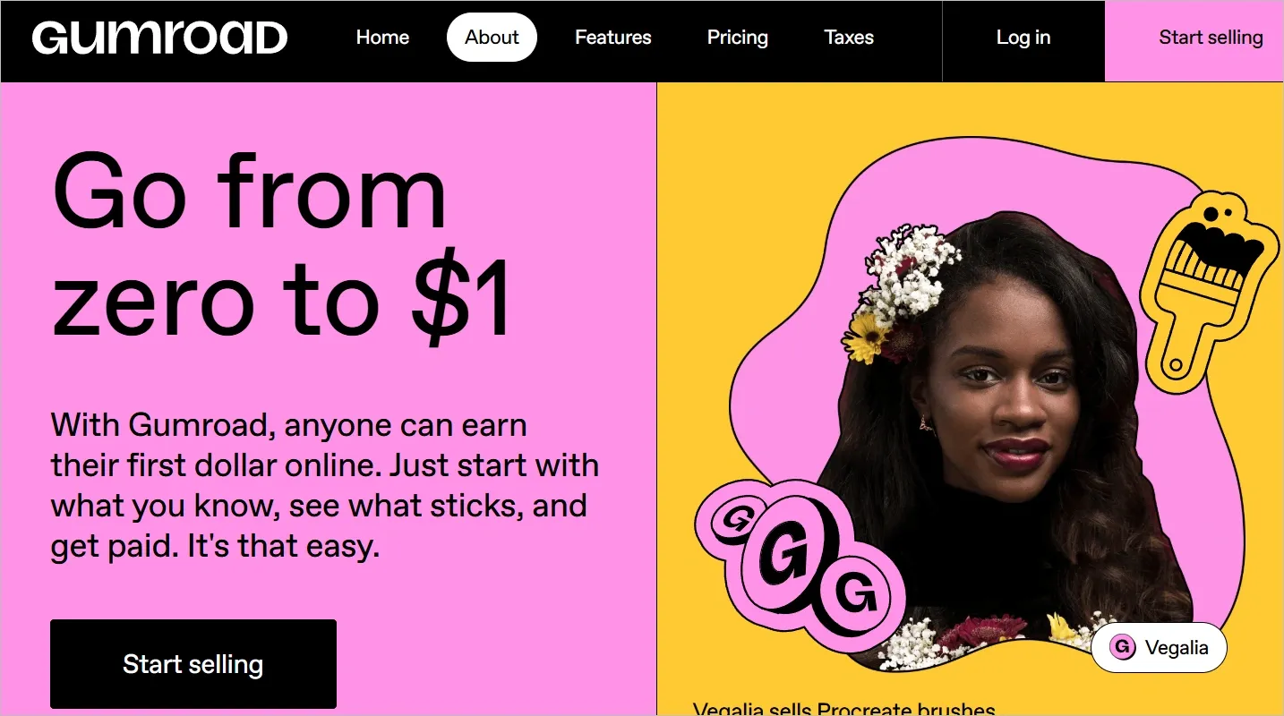
- Type of product: SaaS-based e-commerce
Gumroad allows creators to sell digital and physical products directly to their audience. It simplifies the process of monetizing content by offering tools for selling courses, ebooks, art, and so on without the need for a separate website.
It’s especially useful for independent creators, entrepreneurs, and businesses.
A no-nonsense interface: Gumroad’s UI is minimalistic, eliminating unnecessary options. It keeps it simple, offering just the essentials needed to buy and sell digital products. It doesn’t try to impress with flashy design, yet the interface is impressive.
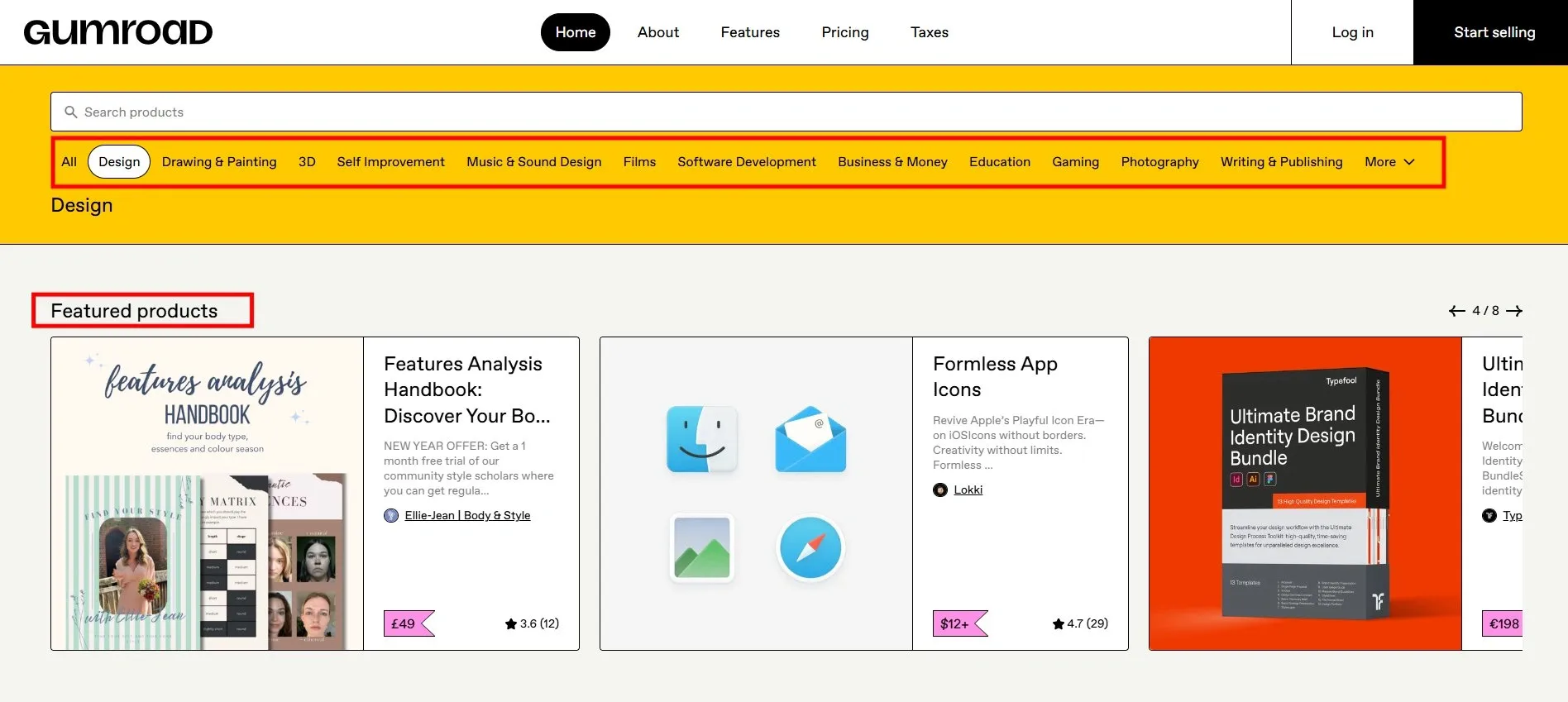
Effortless product listings: Setting up a product page on Gumroad is straightforward. Just upload your product, set a price, add a description, and hit publish. It avoids long setups and optimization, focus on hassle-free experience.
Why it stands out:
- No overwhelming dashboard, just a clean way to sell and buy
- Built with individual creators in mind
Minimalist product creation: If the user decides to start selling, Gumroad offers a two-step sign up that quickly authenticates users. The main dashboard shows a straightforward overview of balance, earnings, and tips for getting started.
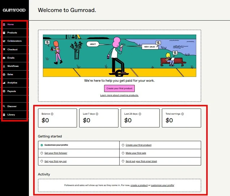
Users can quickly decide what they want to sell and the customization screen allows users to preview the product with an option to expand it to full-screen.
These details along with consistent color theme layout keep the focus on selling the product rather than interface noise.
Key lessons for designers:
- Focus on quick product setup to encourage more user interaction
- Remove steps that make listing and buying burdensome
- Allow users to perform a task (product setup) in a few clicks without complicated settings
👉 FURTHER READING:
How Tenet transforms your design into business growth
Some businesses spend thousands on a digital product that looks stunning, only to fail in converting users into customers.
Instead, we invest in business growth by starting with deep research to understand your users, and design interfaces that will drive action, and technology for better performance.
The numbers prove it works: 450+ successful projects with a 98% satisfaction rate. Our clients include major brands like Lazada, Sephora, and Kuoni.
We work alongside you, aligning every design decision with your users, business goals, and needs.
Contact our design experts and get a free proposal.
Get a free consultation call with our product design experts.
Get a free consultation call with our product design experts.


Got an idea on your mind?
We’d love to hear about your brand, your visions, current challenges, even if you’re not sure what your next step is.
Let’s talk


