
7 Homepage Design Tips for User Experience (+Examples)
 By
By Share

Share
Get a quick blog summary with



A homepage has only a few seconds to convince visitors to stay.
If they cannot quickly understand what you offer, who it is for, or what to do next, many will leave without taking action.
This often happens because websites are designed around how businesses present information rather than how people consume it.
After working on more than 450 website projects, our team at Tenet has identified a set of homepage design principles that help improve clarity, navigation, and conversions.
In this guide, we explain these principles and show how you can apply them to your own website.
Here are our handpicked home page design principles
1. Reduce Uncertainty from the First Second
A homepage should answer three questions within the first few seconds: What do you offer? Who is it for? Why should someone choose you?
If visitors have to scroll or interpret vague messaging before finding these answers, many will leave before exploring the rest of the website.
A clear value proposition removes this uncertainty by communicating your offering immediately and setting the right expectations. In fact, refining a vague headline into a clear value proposition can increase sitewide conversion rates by up to 17.04%.
Stripe's homepage is a good example of this principle in action:
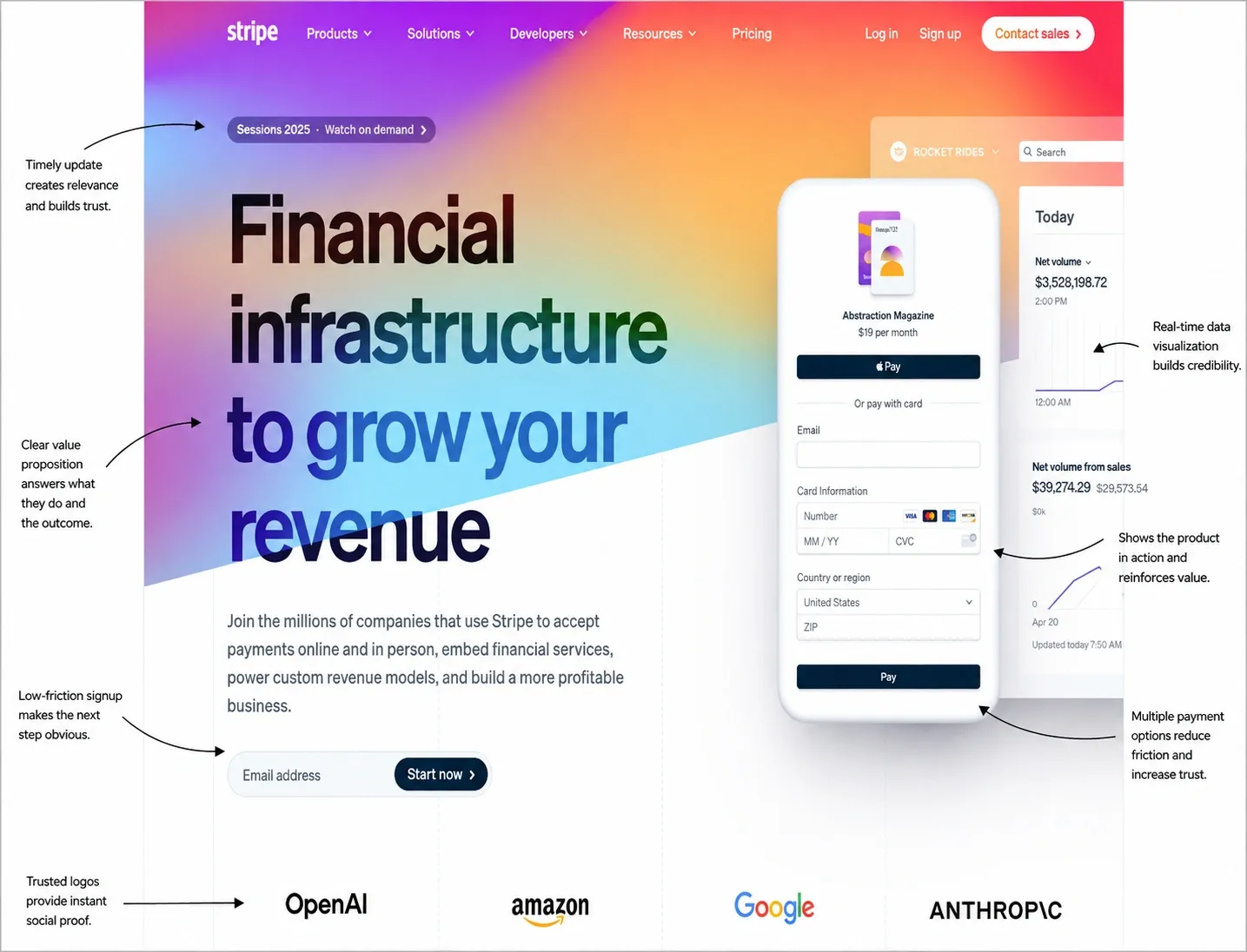
Its headline, "Financial infrastructure to grow your revenue," immediately explains what the company offers, while the product interface preview reinforces the message by showing the platform in use. Also, the prominent call-to-action gives visitors a clear next step instead of leaving them to figure out where to go.
2. Design for How People Scan
Visitors don't read a homepage from top to bottom; instead, they scan for information that helps them decide whether to continue exploring. That’s why you need a strong visual hierarchy that guides that behavior by giving the most important elements greater prominence through size, contrast, spacing, and placement.
When users can quickly identify the headline, supporting message, and primary call-to-action, they spend less time searching for information and more time engaging with the page. Since visitors form a first impression in as little as 50 milliseconds, the way information is organized is just as important as the message itself.
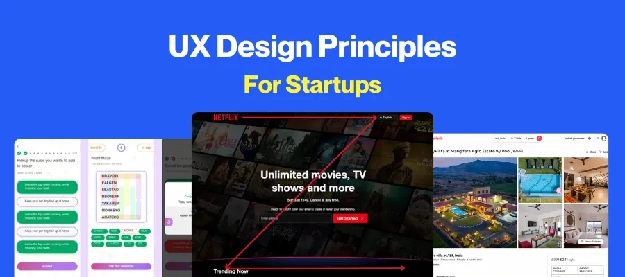
Here is an image of a heatmap illustrating how people naturally scan web pages instead of reading every word:
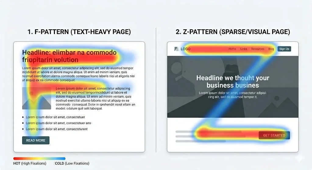
In the F-pattern, attention is concentrated around the headline, subheading, and the left side of the page. The Z-pattern shows the eye moving from the logo to the navigation, across the page, and finally to the primary call-to-action.
Designing your homepage around these patterns helps direct attention to the information that matters most.
3. Remove Friction from Navigation
Your homepage navigation should help visitors find what they need without making them think about where to click next. Every menu item should have a clear purpose and guide users toward the actions that matter most, whether that's exploring your services, viewing pricing, or contacting your team.
Adding too many navigation links increases the number of decisions visitors have to make, making it harder for them to reach their destination. In fact, simplifying website navigation has been shown to improve conversion rates by 100% to 200%.
Additionally, clear labels and well-defined categories also reduce unnecessary searching, helping visitors reach the information they need faster.
These examples show how effective navigation organizes large amounts of content without overwhelming users:
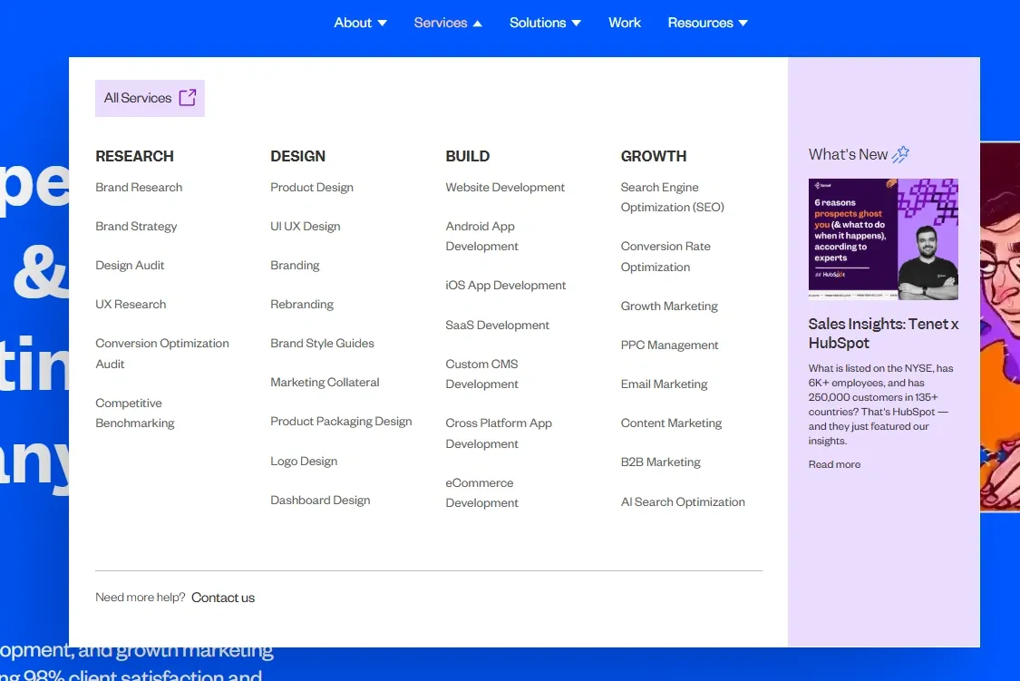
The first groups services into clear categories, making an extensive offering easier to scan.
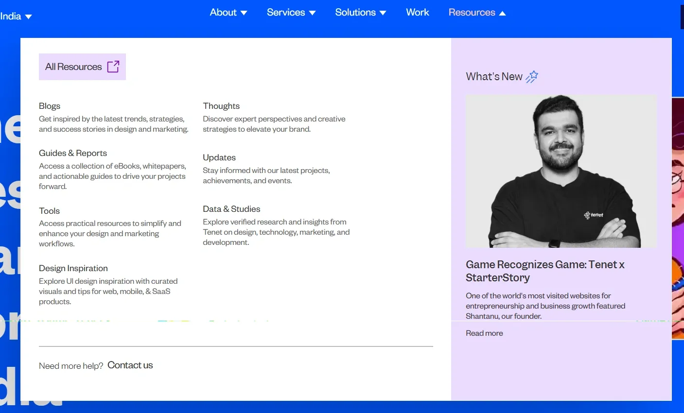
The second combines descriptive menu labels with short supporting text, giving visitors enough context to understand where each link will take them before they click.
4. Build Credibility at Every Scroll
People are more likely to trust what customers say about a brand than what the brand says about itself. Reviews, testimonials, client logos, and user-generated content provide independent validation that helps visitors feel more confident before taking the next step.
In fact, well-presented customer testimonials can increase conversion rates by up to 270%, making social proof an essential element of an effective homepage.
Here are some images showcasing different ways to establish credibility throughout a homepage:
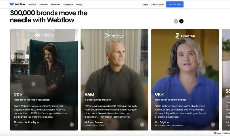
The first highlights measurable business results alongside a customer testimonial, allowing visitors to verify the impact before reading the quote.
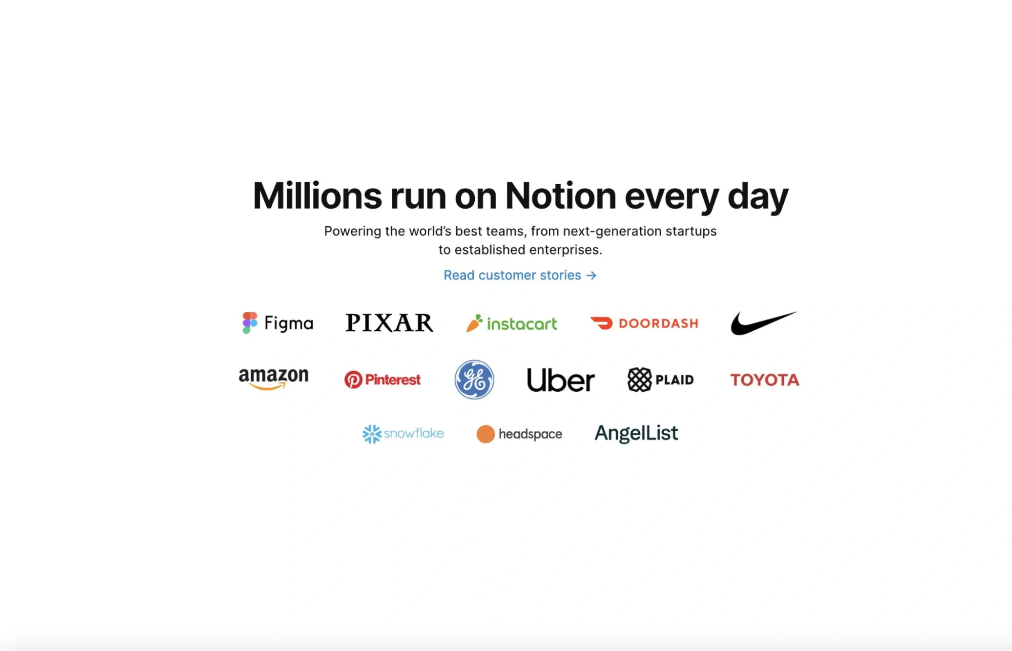
This image shows the placement of recognizable client logos near the hero section to build trust from the start.
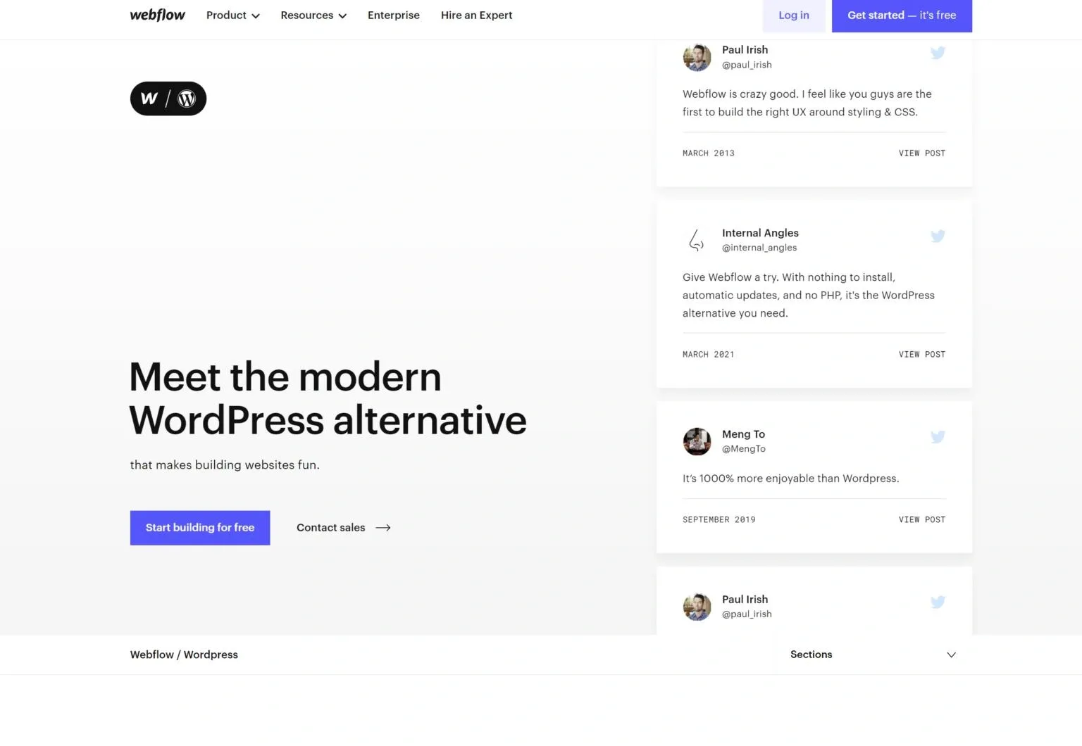
This third image shows how real customer posts from social media can be featured, showing authentic product experiences that extend beyond brand-created content.
👉 Our UI/UX Design approach at Tenet
5. Turn Your Brand into a Story
People connect with stories before they connect with products. Even stories are up to 7-13 times more memorable than facts alone, making visual storytelling one of the most effective ways to communicate your brand's value.
Instead of relying on generic stock photography, use visuals that help visitors understand the experience, emotion, or outcome your brand delivers. Like this,
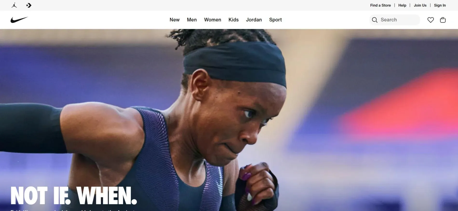
Nike demonstrates this by pairing a powerful action shot with the headline "NOT IF. WHEN." The image and copy work together to communicate determination and ambition, creating an emotional connection before visitors explore the rest of the homepage.
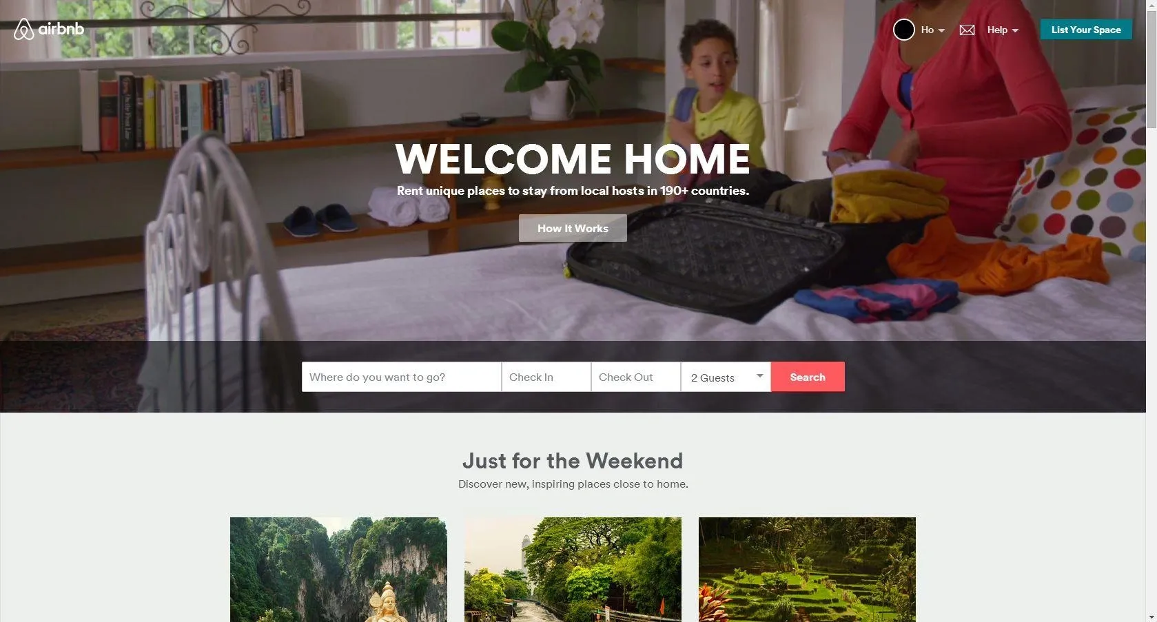
Whereas, Airbnb takes a different approach by using authentic destination imagery that helps visitors picture themselves in the experience. Rather than focusing on accommodation features, the homepage sells the feeling of travel, making the brand promise more relatable and memorable.
6. Build Recognition Through Consistent Brand Identity
Brand identity should remain consistent wherever customers encounter your business. Whether someone discovers your brand through your website, a social media ad, packaging, or an outdoor campaign, every interaction should feel like it comes from the same company.
Because a consistent brand presentation can increase revenue as it sticks in people’s minds, making them remember you whenever they want to buy your products or services. This makes visual consistency a business asset rather than just a design preference.
Here’s how Orallia demonstrates this principle by carrying its signature deep purple color palette, custom typography, and geometric logo across both its website and outdoor advertising.

Although the formats are completely different, the visual language remains consistent, making the brand instantly recognizable.
7. Match CTAs to User Intent
A call-to-action should appear when visitors have enough information to make a decision, not before. Its placement, design, and copy should reflect where users are in their journey through the homepage.
Just optimizing CTA copy and placement can increase landing page conversion rates by up to 232%, making it one of the most influential elements on the page.
Below are two examples showing how to keep the primary CTA consistent throughout the homepage.
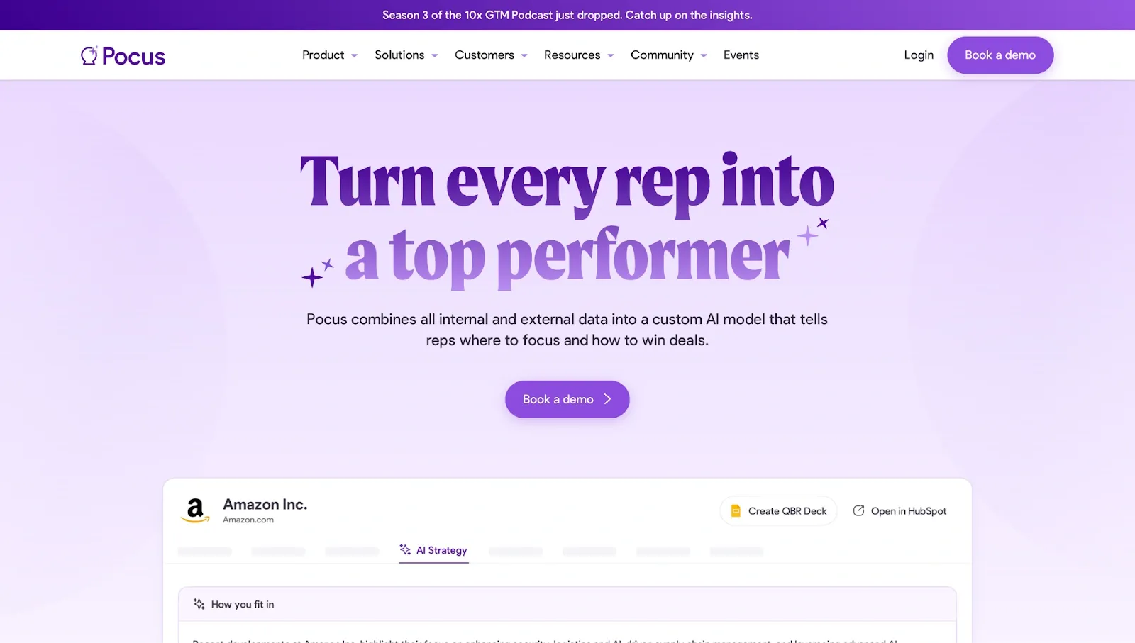
The first one shows how Pocus repeats the "Book a demo" button in both the navigation bar and hero section.
Keeping the same action visible at key points gives visitors a clear next step without forcing them to search for it.
Another example:
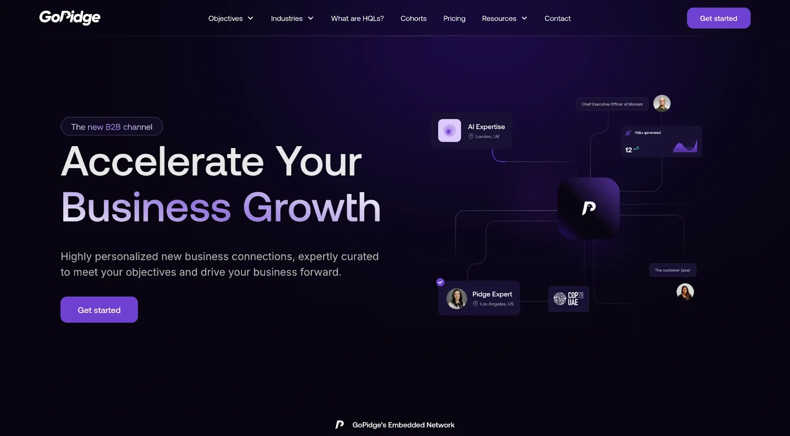
GoPidge follows a similar approach with its "Get started" CTA. The button stands out through strong color contrast and appears where users naturally pause after reading the supporting content, making the transition from exploration to action feel intuitive.
👉 Explore our Website design services by region:
- Website Design Agency in India
- Home Page Design Agency in London, UK
- Website Design Services in the USA
- Website Design Agency in UAE
Let our experts design your brand identity and website
Your homepage shapes how people perceive your business from the moment they arrive. Applying these principles can improve clarity, strengthen trust, and make it easier for visitors to take action.
At Tenet, we have delivered more than 450 branding and website projects across 15+ industries, helping businesses create consistent digital experiences that support growth.
Whether you're building a new website or refreshing an existing one, our team combines branding, UX research, and web development to create websites that perform as well as they look.
Our experts will help create a clear, engaging, and conversion-focused homepage.
Our experts will help create a clear, engaging, and conversion-focused homepage.











Got an idea on your mind?
We’d love to hear about your brand, your visions, current challenges, even if you’re not sure what your next step is.
Let’s talk


