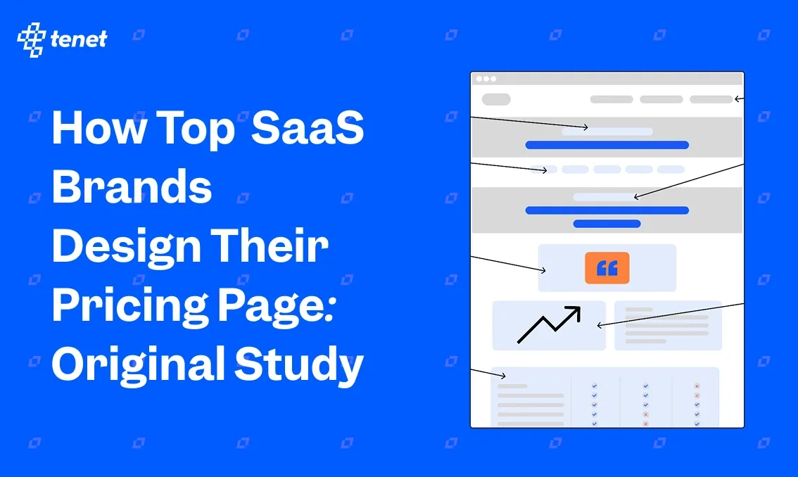
What To Include in Your SaaS Pricing Page? (Original Study)
Share
Share
Get a quick blog summary with


This original study analyzes what real SaaS companies include on their pricing pages.
Our goal was to understand what elements appear most often, what buyers expect to see, and what design choices help create a clear and high-converting pricing experience.
By reviewing actual pricing pages from fast-growing SaaS startups, we identified patterns that show what teams use to explain their plans, reduce friction, and support self-serve conversions. This research also highlights surprising gaps in trust signals, usability, and transparency.
These gaps turn into “what not to do” guidelines, so you can avoid mistakes that most SaaS companies still make.
💡 How we performed this study
We selected 10 SaaS websites from the “Top 50 Trending SaaS Startups” list by Ahrefs. This includes SaaS companies such as:
- Litespace
- Mastt
- Keylabs
- Dify
- Tabcut
- Collegecontact
- Atomicwork
- Exactly.ai
- Kick
- Zuma
Our goal was to study which pricing page elements are common, which are missing, and which patterns support good UX and conversions.
We manually reviewed each pricing page and collected data for many points, including features listed, CTA types, review visibility, header behavior, pricing transparency, volume discounts, comparison tables, and trust signals.
After collecting the data, we summarized and analyzed every element to identify trends, common practices, and clear opportunities for improvement.
The sample size is small, but it still shows what fast-growing SaaS companies in 2026 are doing. These patterns do not represent perfect best practices, but they show what is currently working for popular SaaS teams.
👉 Access the raw data sheet: Data SaaS Pricing Page Study: By Tenet
Here are 11 elements to add to your SaaS pricing page (TL;DR)
The visual below shows how a high-performing SaaS pricing page looks when all key parts work together.
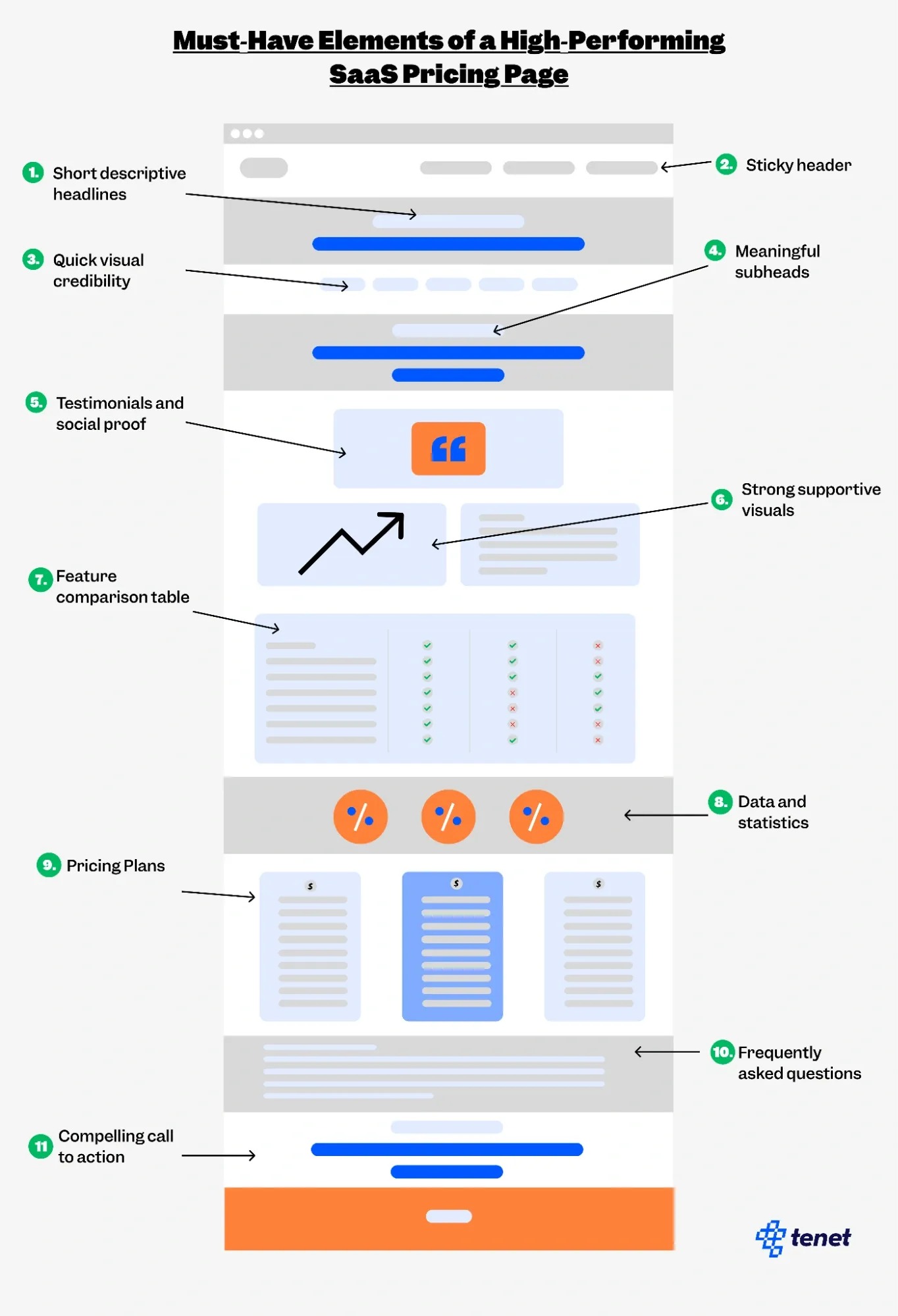
This includes:
- Short descriptive headlines
- Sticky header
- Quick visual credibility
- Meaningful subheadings
- Testimonials and social proof
- Strong supportive visuals
- Feature comparison table
- Data and statistics
- Pricing plans
- Frequently asked questions
- Compelling call to action
SaaS pricing page best practices: 12 elements to include
1. How many features do SaaS pricing pages usually include?
6 out of 10 SaaS pricing pages list around 23.8 features, which shows that many companies choose to highlight a large set of capabilities to present their software as complete and valuable. Listing many features may help visitors understand how the product works, what each plan level unlocks, and how the tool compares to alternatives.
A longer feature list also gives potential customers more points of relevance, making it easier for them to find specific functions they need from the product.
2. How common are Add-On sections on SaaS pricing pages?

Only 1 out of 10 SaaS pricing pages includes an Add-Ons section, indicating that most SaaS products prefer all-in-one plans without extra paid components. Add-Ons often work best for software that offers optional advanced modules or usage-based upgrades, which not every SaaS tool requires.
The low adoption rate suggests that many companies aim for simpler pricing to avoid user confusion. This pattern might also reflect a strategic choice to reduce cognitive load during the decision-making process.
3. Are comparison tables widely used on SaaS pricing pages?

5 out of 10 SaaS pricing pages include a comparison table, showing an even balance between those that use detailed plan comparisons and those that prefer simpler layouts. Comparison tables can help users understand differences in limits, features, and benefits, especially when multiple tiers exist.
A comparison table sample from Mastt:

Companies that skip comparison tables may do so because their pricing structure is straightforward, or they prefer storytelling over feature-by-feature breakdowns. This split indicates that comparison tables work in some contexts but not all.
4. What call-to-action text appears most often on SaaS pricing pages?

3 out of 10 pricing pages use CTAs such as “Get Started” or “Start for Free”, which appear more frequently than other variations. These CTAs create a sense of ease and low commitment, especially for products that prioritize onboarding speed.
Their popularity suggests that many SaaS teams prefer familiar, user-friendly language that encourages immediate interaction. This trend also reflects a broader shift toward product-led growth, where the goal is to reduce friction and let users explore the software quickly.
5. How often do SaaS pricing pages include FAQs?

6 out of 10 SaaS pricing pages include an FAQ section, showing that many companies use FAQs to address common concerns like billing, trial duration, plan differences, and contract terms. Including FAQs directly on the pricing page may help clarify confusion that often slows down purchase decisions.
This trend also suggests that customers frequently seek additional details before committing to a subscription. The presence of FAQs may be related to pricing complexity, customer expectations, or support cost reduction. For example, Litespace clearly answered all customer concerns using an FAQ section:

6. How common are free plans in SaaS pricing?

4 out of 10 SaaS companies offer a free plan, showing that freemium models are somewhat common but not universal. Free plans often work for products where value grows as users explore features or increase usage over time.
However, some companies may avoid free plans to maintain a premium brand position or reduce support costs. This mix suggests that freemium adoption depends heavily on product type, audience, onboarding difficulty, and long-term monetization strategy.
7. How many SaaS companies offer a free trial?

4 out of 10 SaaS companies offer a free trial, indicating moderate adoption. Trials are helpful for products that require hands-on experience to understand value. Still, many companies skip trials if onboarding is simple enough or if their target audience prefers guided demos.
This balanced usage pattern also suggests variations in go-to-market strategy: some businesses lean on product-led funnels, while others rely on sales-led conversations or detailed discovery calls.
In fact, Tabcut was the only SaaS brand out of the 10 we studied that offers a forever-free plan.

8. What is the most common number of plans on SaaS pricing pages?

7 out of 10 SaaS pricing pages use a 3-plan layout, making it the most widely adopted structure. Three plans often strike a balance between offering choice and avoiding overwhelm. This format typically includes an entry-level tier, a value-focused mid-tier, and a premium tier for advanced needs.
The consistency of the 3-plan approach suggests it enables easier comparisons and helps customers choose a subscription tier that fits their size, needs, and budget without introducing decision fatigue.
9. Do most SaaS companies show their prices openly?

8 out of 10 SaaS pricing pages display their prices clearly, suggesting transparency is a major trend across the industry. Open pricing makes it easier for users to evaluate affordability without needing to schedule a demo or contact sales.
This approach may also appeal to small and medium teams that prefer quick, self-serve decision-making. Hidden pricing appears less common and is typically associated with enterprise software that requires tailored quotes or negotiated contracts.
10. How often do SaaS pricing pages use a sticky header?

9 out of 10 SaaS websites use a sticky header, showing it is one of the most consistently adopted UX elements. Keeping navigation and CTAs visible while scrolling may help maintain user engagement by reducing the effort required to take action.
The high adoption rate suggests that sticky headers are seen as a practical way to improve usability. This pattern also points to the importance of persistent navigation in guiding users toward plan selection or signup options.
11. How common are enterprise contact forms on SaaS pricing pages?

4 out of 10 pricing pages include an enterprise contact form, showing that many SaaS tools have some form of enterprise interest, but not all depend on it. Companies that include these forms may offer custom pricing, tailored onboarding, or advanced support for large organizations.
Meanwhile, those without such forms may rely more on simple, self-serve pricing. This variation shows how different SaaS go-to-market strategies influence the structure of pricing pages.
12. How many SaaS companies offer volume discounts?

6 out of 10 SaaS companies offer volume discounts, which shows that most teams still use discount tiers to target larger accounts and high-seat buyers. Volume discounts help enterprise teams reduce cost per user as they scale, and they make higher seat counts more attractive.
This pattern also shows that discounts are still a common lever in sales-assisted funnels, where bigger teams expect better pricing as they grow.
At the same time, 4 out of 10 companies do not show volume discounts, which may slow decisions because business buyers cannot see the savings up front. Clear volume discount slabs help users understand total cost early and support both self-serve and sales-led conversions.
🚫 What We Found Surprising (And Recommend You Not Follow)
1. Do not hide your review count
In our study, 0 out of 10 pricing pages showed their review count.
Why we don’t recommend this: When users cannot see how many people have rated your product, they cannot judge its real-world trust or quality. Review count reduces doubt, shows legitimacy, and works as fast proof that others rely on your product. Without it, your pricing page feels unverified, which weakens conversions.
What to do instead: Add a clear star rating and review count from trusted platforms like G2 or Capterra. Otherwise, you can simply show your customers and highlight their reviews.
Here’s an example from Zuma’s pricing page:

2. Do not skip trust badges
Only 2 out of 10 pricing pages used trust or compliance badges like GDPR, SOC 2, or ISO.
Why we don’t recommend this: Customers want to know their data is safe. When your page does not show any security signals, it creates fear, especially for business buyers in finance, HR, and healthcare. Missing badges make your tool look less mature and less reliable, even if your security is strong.
What to do instead: Add simple badges that show encryption, compliance, privacy protection, and secure checkout.
3. Do not hide your cancellation policy
Across all pages, 0 out of 10 had a clear “cancel anytime” message.
Why we don’t recommend this: Buyers feel trapped when cancellation rules are hidden. Lock-in fear is one of the biggest reasons users avoid trials and paid plans. When you do not state cancellation freedom, users assume complicated contracts or hidden commitments. This slows the signup decision and lowers trust.
What to do instead: Add one simple line: “Cancel anytime. No long contracts.” This lowers risk and increases trial conversions.
4. Do not skip customer logos
Only 3 out of 10 showed logos of real customers.
Why we don’t recommend this: Customer logos act as instant social proof. Without them, visitors cannot see who else trusts your brand. This makes your product feel small or untested, especially for B2B buyers who want assurance that similar companies use your tool.
What to do instead: Add 6–10 logos of well-known or relevant clients under the pricing title or next to your CTA.
5. Do not leave buyers without live chat
Only 1 out of 10 pricing pages had live chat support.
Why we don’t recommend this: Pricing pages create many last-minute questions: billing cycle, plan differences, refund rules, usage limits, and contract terms. When users cannot get answers instantly, they leave. Missing live chat makes your pricing page feel cold and unsupported, which reduces conversion rates.
What to do instead: Add a live chat widget or instant support button so users can resolve doubts before they drop off.
6. Do not skip money-back guarantees (especially if you’re in the user acquisition stage)
In our study, 0 out of 10 SaaS pricing pages offered a money-back guarantee.
Why we don’t recommend this: When you do not offer any form of guarantee, buyers feel more risk before paying. Many users want a safety net, especially when the tool requires setup time or onboarding. Missing this option can make your pricing page feel strict and inflexible. Even if you offer a free trial, a small guarantee still removes fear for paid plans and reduces hesitation.
What to do instead: Add a simple risk-reversal line such as “14-day money-back guarantee” or “Full refund if you’re not satisfied.” This increases confidence and supports both self-serve and sales-led conversions.
💡 FURTHER RESOURCES
- What to Include in Your Ecommerce Product Page? (New Study)
- Conversion Rate Optimization Statistics You Should Know
- Interesting UX Statistics to Bookmark
- SaaS Market Statistics & Insights (Updated)
Final Words: What’s Next for You
This study gives you a clear picture of what fast-growing SaaS companies include on their pricing pages, what they skip, and where most teams still make mistakes.
Now it is your turn to use these insights to improve your own pricing page. Start by adding the elements that most SaaS teams rely on, such as clear feature lists, open pricing, clean plan layouts, CTAs that reduce friction, and FAQ sections that answer key questions. These elements create clarity and help users understand your value without extra effort.
Use this study as a checklist to refine your pricing page step by step. Test different layouts, add missing trust signals, and remove anything that slows down your users. The goal is simple: make your pricing page easy to understand, easy to trust, and easy to act on.
Book a free 30-minute call with Tenet and get a customized SaaS growth plan.
Book a free 30-minute call with Tenet and get a customized SaaS growth plan.


Got an idea on your mind?
We’d love to hear about your brand, your visions, current challenges, even if you’re not sure what your next step is.
Let’s talk


