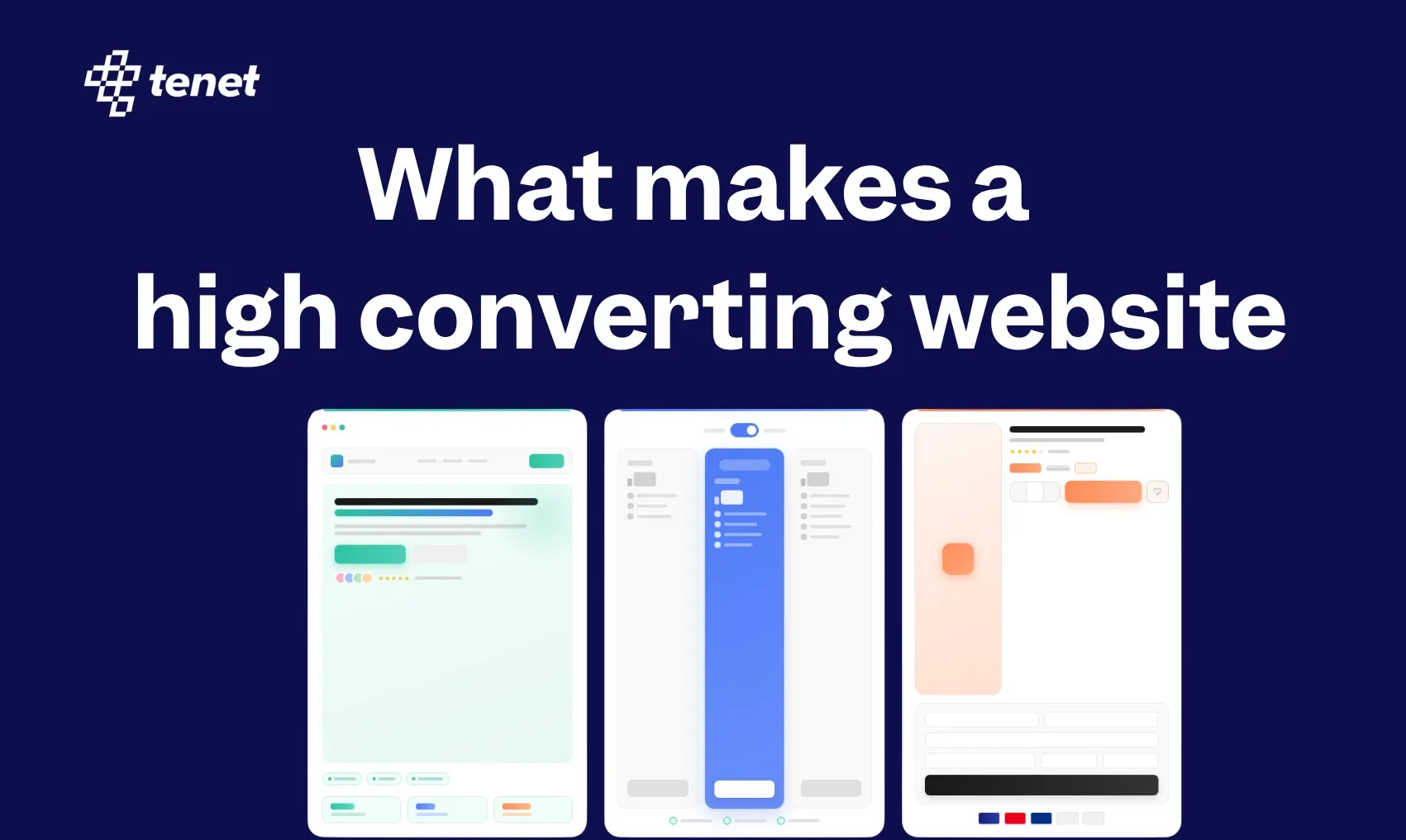
These 10 Elements Makes a High-Converting Website in 2026 🧲
Share
Share
Get a quick blog summary with


Key Highlights
- High-converting websites reduce friction, answer visitor questions fast, and guide action clearly.
- Clear first-screen messaging should explain the offer and target user within seconds.
- Strong CTAs, social proof, and trust signals increase clicks and reduce hesitation.
- Simple product explanations and authentic visuals help visitors understand value quickly.
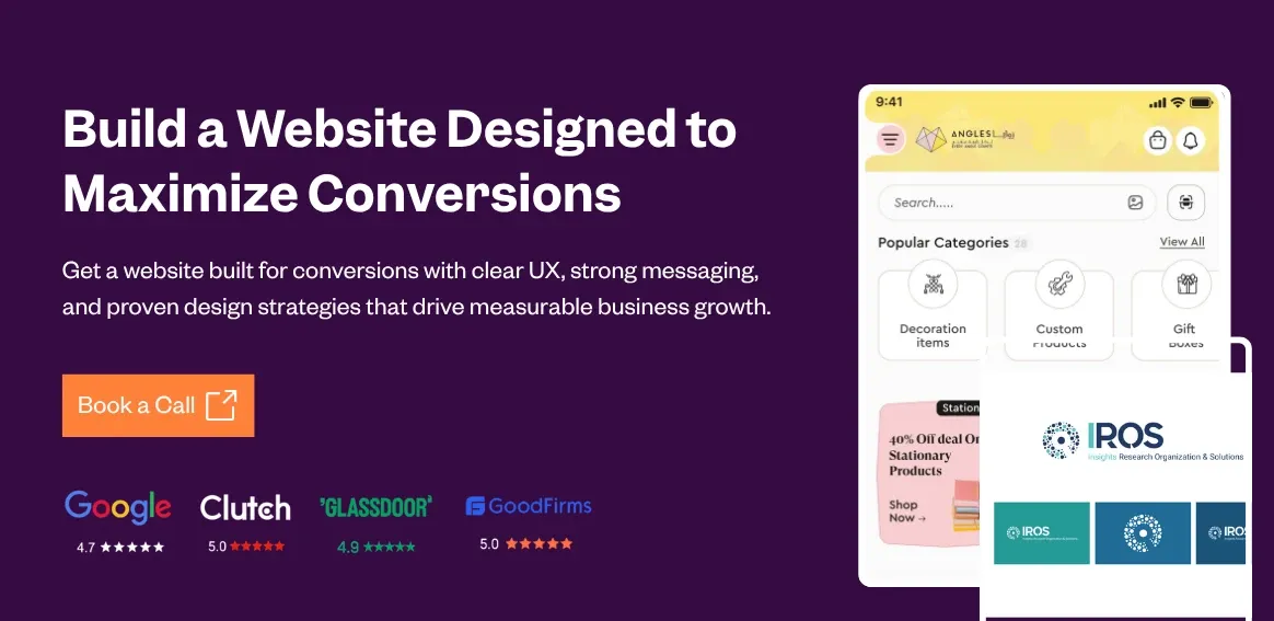
Your site gets the clicks, but where is the revenue?
Many businesses face this gap. They invest in ads, SEO, or social, build a clean website, and still see visitors leave without taking action. People land on the page, scan quickly, and exit. The result is lost conversions and missed revenue.
This is where most teams start asking, what makes a high-converting website?
At Tenet, we have seen and fixed this pattern across 350+ client projects in different industries. We focus on how real users behave on a page and design experiences that guide them toward action. This approach has helped improve purchases, form submissions, and qualified leads.
In this guide, we break down the key factors behind high-converting websites. You will get clear steps and real examples you can apply to turn traffic into revenue.
Key Elements of High-Converting Websites
👉 Need help with website planning, designing, and development? Explore our website design services by country:
- Web development agency in India
- Web development agency in London, UK
- Web development agency in the USA
- Web development agency in Dubai
High-converting websites succeed by aligning with how people actually behave online. They reduce mental effort, address doubts quickly, and guide visitors toward action without friction.
These principles came from extensive user testing and behavior data, showing that small, thoughtful changes often lead to much better engagement and more conversions.
1. Clear Brand Messaging on the First Screen
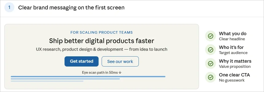
People form opinions about a website in about 50 milliseconds, which means when someone lands on your website, they are trying to answer one simple question: Is this relevant to me? If that answer is not obvious within a few seconds, most visitors leave.
That’s why the first screen of a page should immediately explain what the product or service does and who it is meant for. A clear headline paired with a short value proposition helps visitors quickly recognize that they are in the right place.
Messaging works best when it focuses on the user’s problem rather than the company’s ambition.
For example, the homepage of Tenet clearly states that it helps organizations design better digital products through product design and UX research.
Instead of relying on abstract positioning, the messaging quickly tells visitors what the company does and the type of work it specializes in.
When visitors can immediately understand the offering and see how it relates to their needs, they are far more likely to stay and explore the rest of the page.
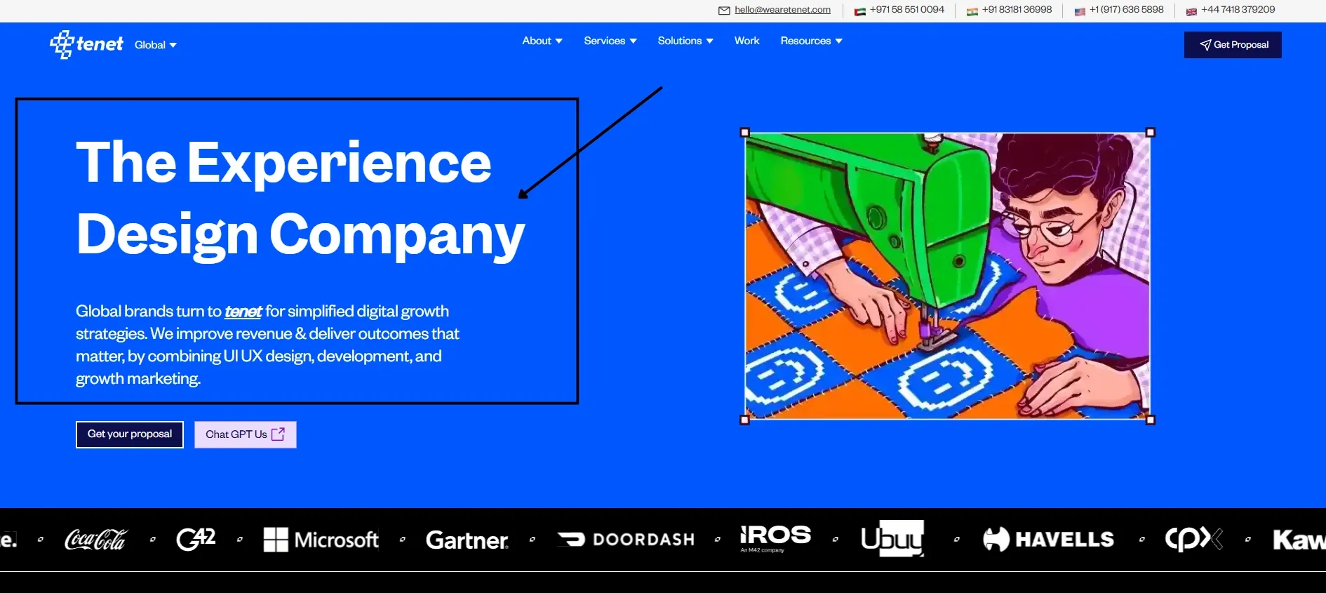
2. Strong and Visible Calls to Action
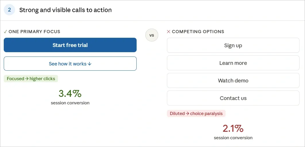
Visitors need to know the next step without guessing. High-contrast buttons with action-oriented text like "Start Free Trial" or "Get Started" stand out and reduce hesitation. Position the primary CTA where it flows naturally from the surrounding content.
This image shows how Tenet uses one CTA which is consistent and visible throughout the page:
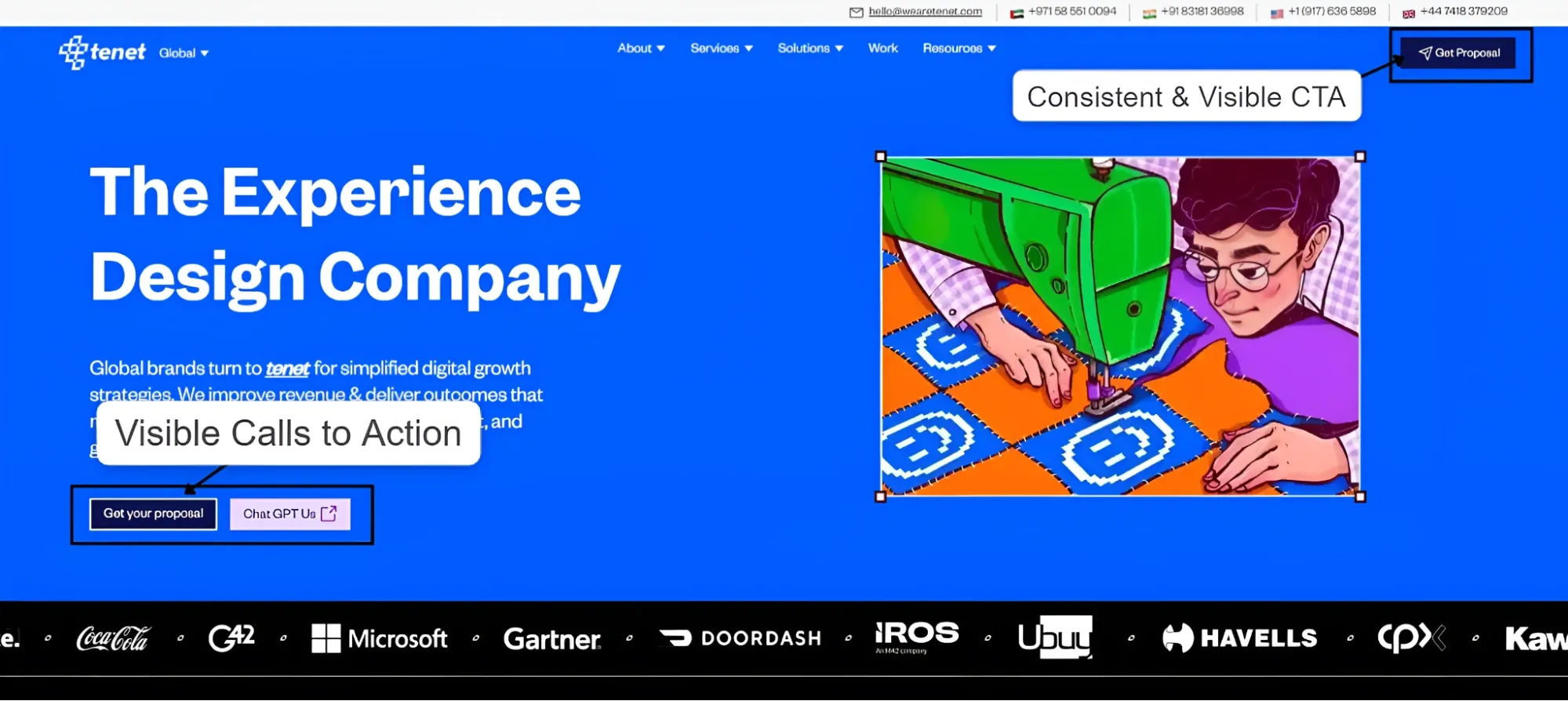
On the other hand, if you provide multiple competing options, it usually dilutes focus and drops clicks. Pages that highlight one primary action tend to perform better because they simplify decision-making. Supporting CTAs can still appear further down the page, allowing visitors who need more context to act once they feel ready.
Small design details also make a difference. Button size, placement, color contrast and wording all influence whether the action feels obvious and low-risk. Even minor adjustments in these elements often lead to measurable improvements in clicks and sign-ups.
3. Social Proof and Trust Signals
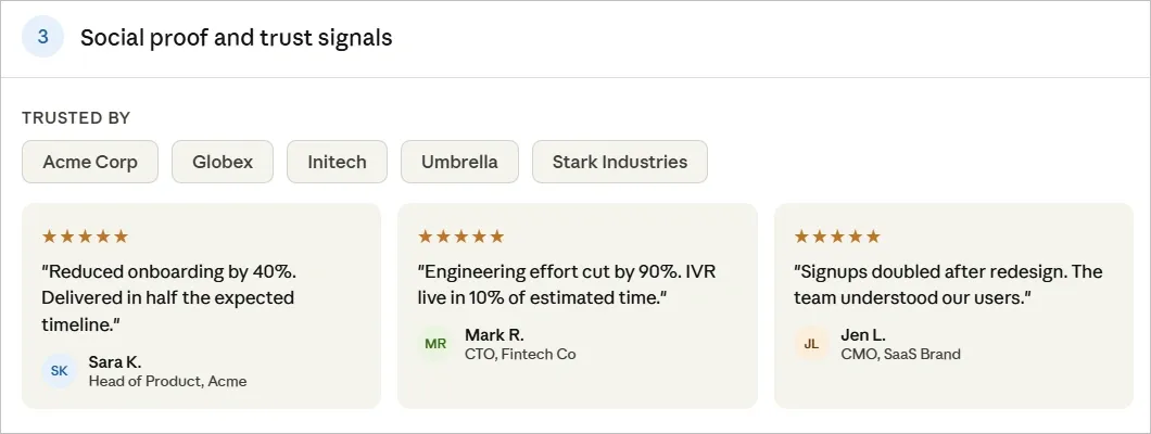
Visitors often trust other users more than brand claims. Testimonials that include real names, photos, and specific results help reduce doubt at important decision points. Placing them close to offers or calls to action can help visitors feel more comfortable moving forward.
Client logos, ratings, or user counts add quick credibility without requiring much explanation. These signals allow visitors to see that others have already used and trusted the product or service.
The following visual shows how Tenet use client logo at the start of the page to establish credibility:
For more complex or higher-value offerings, stronger forms of proof, such as case studies or video testimonials, can be more convincing. Detailed examples show how the product works in real situations and the kind of results it can deliver.
When the proof is clear and specific, it addresses skepticism early and helps visitors feel more confident about taking the next step.
4. Clear Explanation of the Product or Service
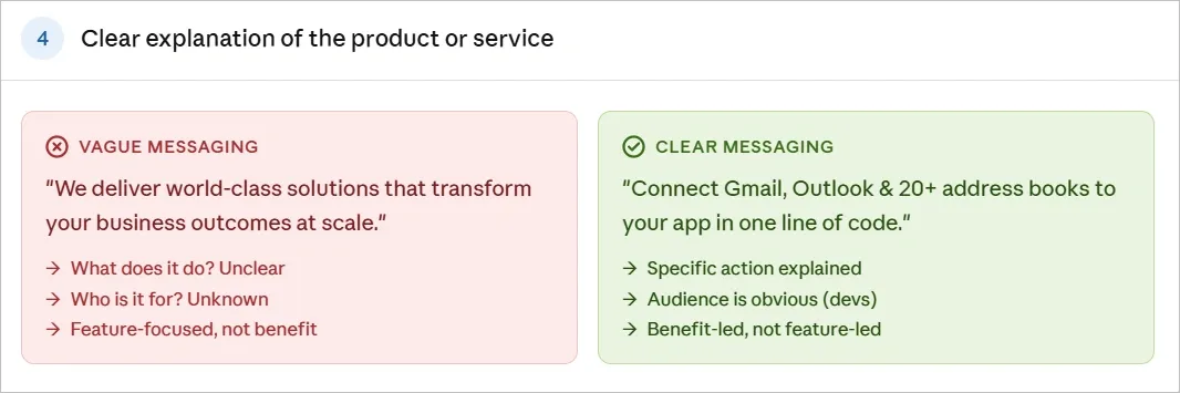
Visitors usually arrive with a few basic questions: What does this product do? How will it help me? The faster a page answers these questions, the easier it is for users to understand the offer.
Clear explanations work best when they use simple language, short paragraphs, and well-structured sections. Instead of listing features, focus on the benefit each feature provides. Using the same terms people use when searching can also make the message easier to connect with.
Vague descriptions often create confusion and push visitors to leave. Breaking complex products into clear steps or use cases helps people see how the solution fits their needs. Addressing common concerns such as cost, time required, or ease of setup can also remove hesitation early.
When the value is easy to understand, visitors are more likely to stay on the page, explore further, and consider taking the next step.
5. Logical User Flow That Guides Visitors
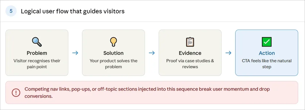
Effective pages follow the visitor's mental sequence: recognize the problem, see the solution, review evidence, then act. Structuring the page around this order minimizes distractions.
Make sure not to add too many links, menus, or competing elements, as they can break that flow and distract users from the main goal. On pages designed to convert, reducing unnecessary navigation helps keep attention on the key message and action.
Another thing to focus on is “Layout” as longer pages that guide visitors through information step by step often work better than pages that scatter details across different sections. This also includes clear headings, descriptive labels, and well-placed buttons, as they help users move through the content without feeling lost.
When the structure matches how people process information, the final action feels like the natural next step rather than a forced decision.
6. Visuals That Demonstrate Product Value
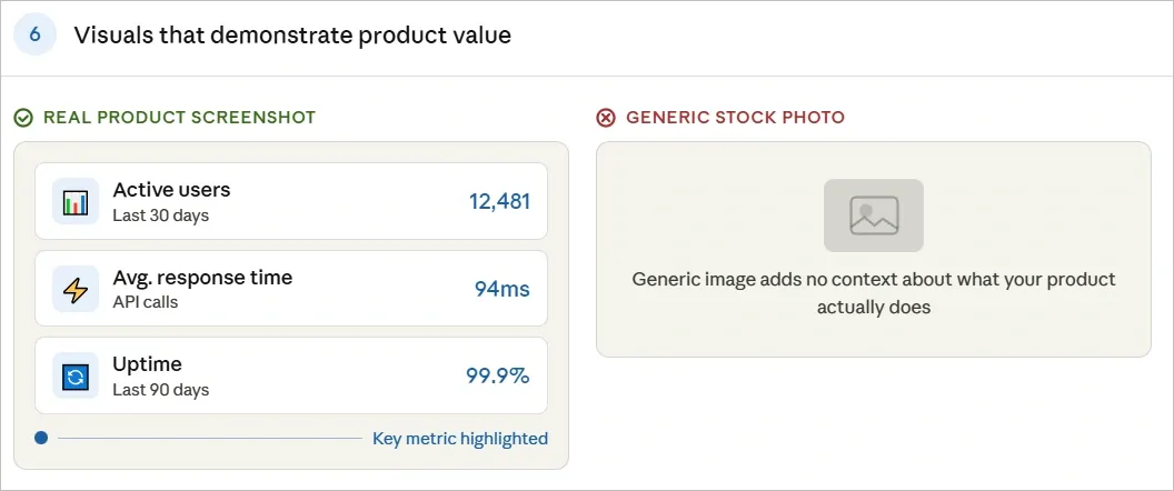
Visuals help visitors understand a product faster than text alone. Screenshots, short demos, or before-and-after examples allow people to see how a product works and what results it can deliver.
Authentic visuals are especially important for digital products. Real interface screenshots or product walkthroughs give users a clearer idea of what they will experience, while generic stock images add little value.
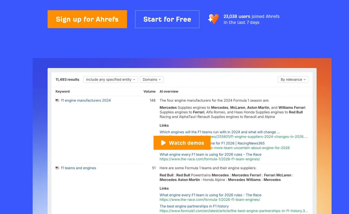
Here is how Ahrefs uses visual demonstration to showcase their product’s value and workflow:
Simple visual cues such as arrows, highlights, or annotations can also draw attention to key features or calls to action. For SaaS products and tools, product previews or use-case visuals often explain the value more clearly than long descriptions.
When visitors can quickly see how the product works and what it helps them achieve, they are more likely to stay on the page and explore further.
7. Fast Page Loading Speed
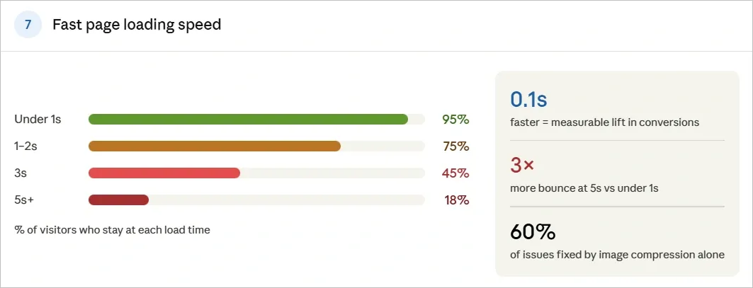
Page speed shapes first impressions before content even appears. Each additional second raises bounce probability, especially on mobile, where expectations for instant results are highest.
Optimizing images, minimizing code bloat, and choosing reliable hosting keep load times under a few seconds. Even small improvements matter; even research shows that a 0.1-second faster load can increase conversions by several percentage points in various industries.
Fast sites signal competence and respect for users' time. They retain more visitors and improve perceived quality, directly supporting higher conversion rates.
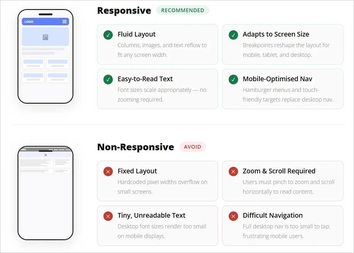
8. Mobile-First Responsive Design
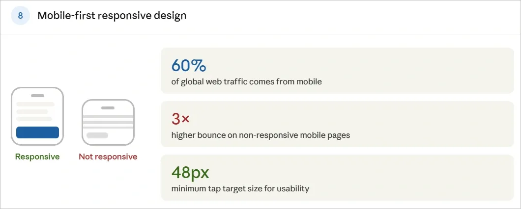
60% of global website visits now come from mobile devices, which means pages need to work well on smaller screens. If visitors have to zoom, struggle to tap buttons, or deal with cramped layouts, many will leave quickly.
Responsive design helps prevent these issues by adjusting layouts to different screen sizes.
In fact, elements like clear text, white-spacing, and large tap targets make it easier for users to read content and interact with the page on a phone.
Here is an image that clearly highlights the difference between a responsive and non-responsive design:
This shows why testing pages on real mobile devices is important, as designs that look fine on a desktop screen can behave very differently on a phone.
If websites are built with mobile users in mind, the experience feels smoother and more reliable, which helps keep visitors engaged and improves the chances of conversion.
9. Simple Navigation and Information Hierarchy
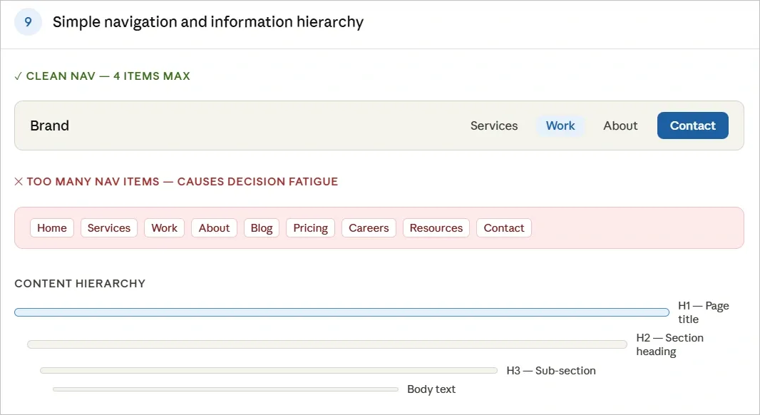
Visitors should be able to understand where to go on a website without thinking too much about it. That’s where clear menu, labels and a limited number of navigation options help people find important pages quickly.
A good information hierarchy also makes content easier to scan as the structured headings, spacing, and section guides readers toward the most important information first instead of presenting everything with equal weight.
When navigation is simple and the page structure is clear, visitors can move through the site with less effort. This makes it easier for them to explore the content and reach the action the page is designed for.
👉 Explore best practices for website navigation that help keep users engaged on your site.
10. Low-Friction Forms and Signup Flows
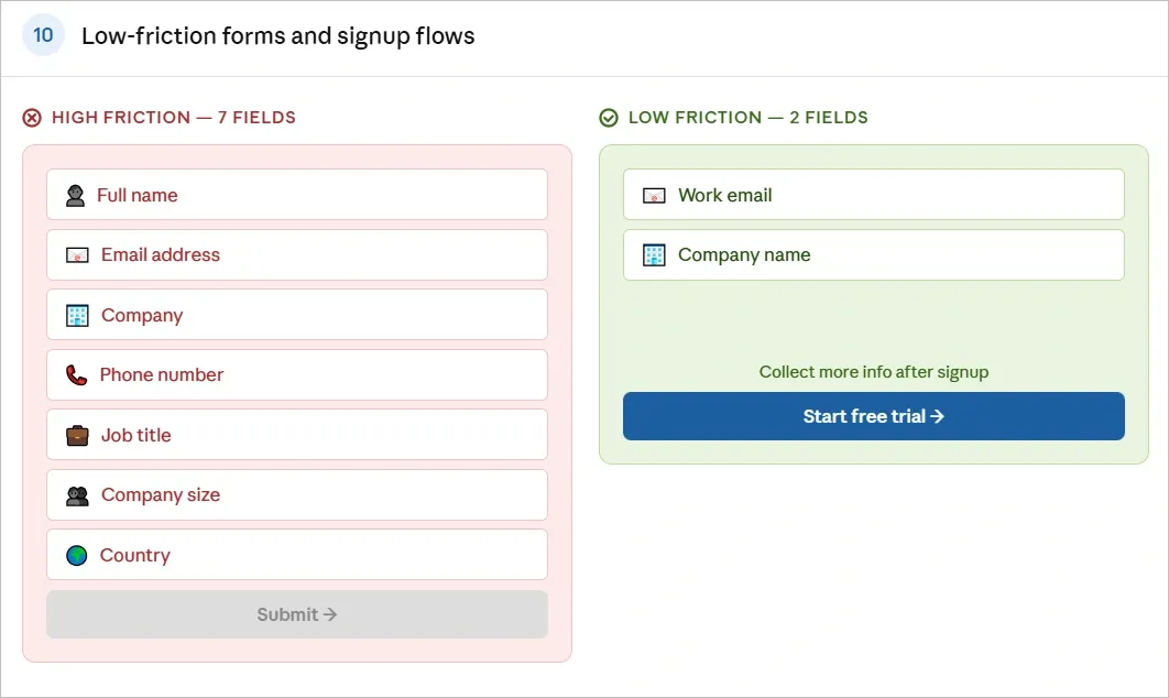
Forms are often the final step before someone signs up or makes a purchase. If the process feels long or complicated, many visitors leave even when they are interested. In fact, studies show the average web form abandonment rate is around 68%.
Keeping forms short and asking only for essential information makes them easier to complete. The more fields people see, the more likely they are to postpone or abandon the process.
This Tenet’s form is the best example to show how companies can get relevant information without friction and extremely long forms:
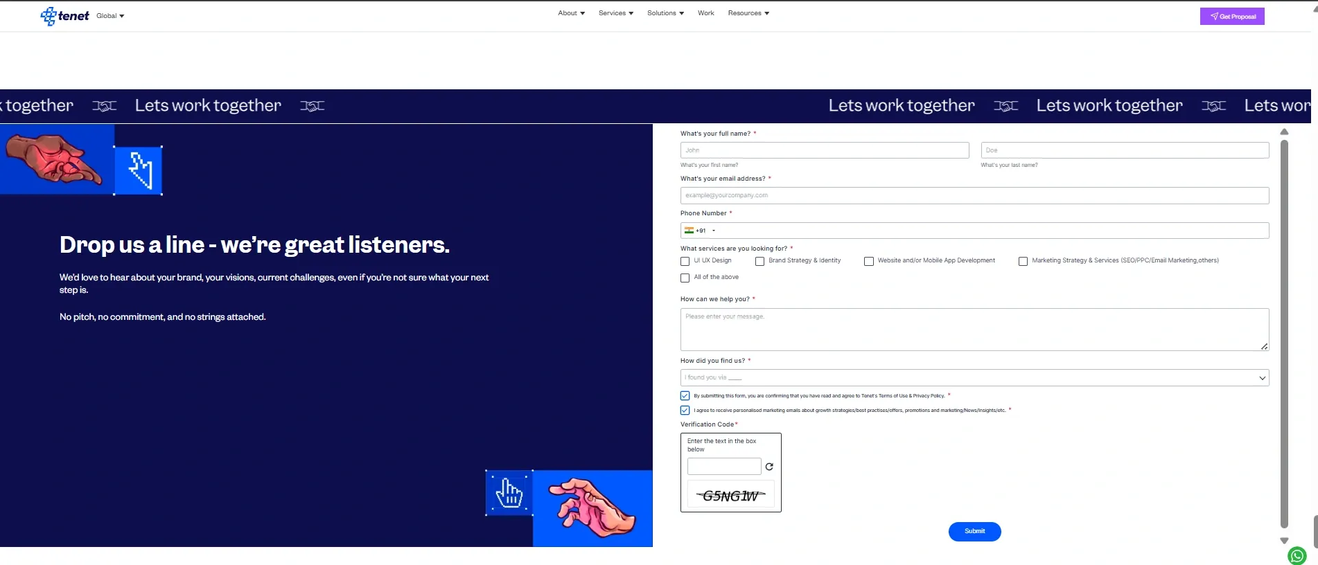
Clear, benefit-reminding forms respect time and lower final barriers. This often produces the largest relative gains because it captures users already close to converting.
⭐Here are some articles for future reference:
Also, feel free to check out our website design and development services to know more about what can make your website convert higher.
Examples of High-Converting Websites
1. MailReach
MailReach helps teams warm up email accounts so their cold outreach lands in the inbox instead of spam. The homepage keeps things simple, using a clean layout and direct messaging to explain the benefit quickly.
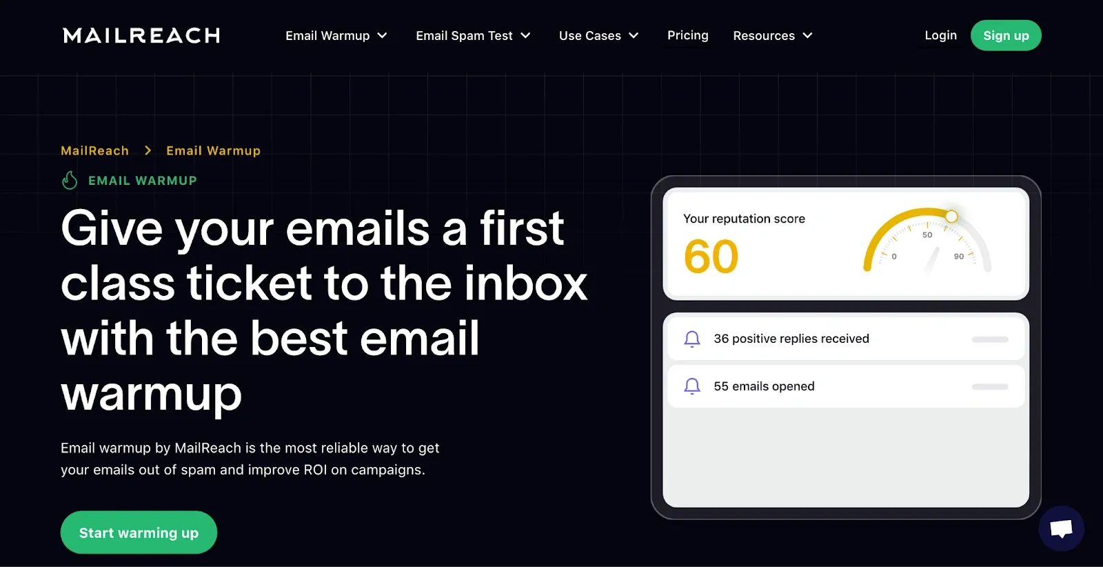
What They Do Well
The headline focuses on the main outcome users want: better email deliverability. Short supporting copy explains the product without going deep into technical detail, which makes the page easier to scan and understand.
The design is minimal, with clear CTA “Start Warming Up” that make it easy to start using the tool. Subtle animations guide attention without distracting from the core message.
After a redesign, the site saw measurable improvements. Session conversion increased from 2.1% to 3.4%, showing how clearer messaging and a simpler flow can directly improve sign-ups.
2. Nuraform
Nuraform allows users to create AI-powered forms from a simple prompt. Instead of starting with a blank template, visitors can immediately see how a form is generated, which helps them understand the product within a few seconds.
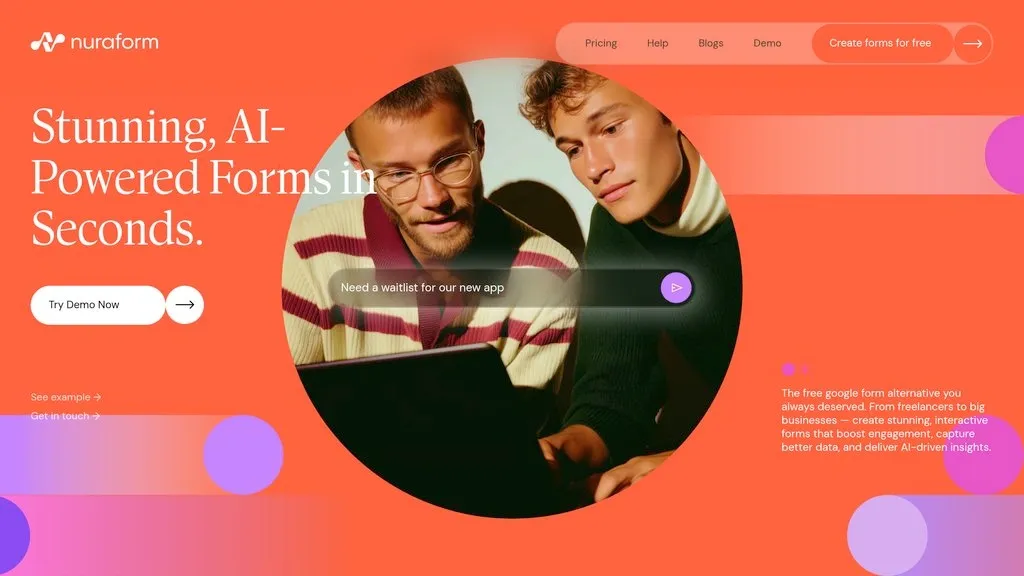
What They Do Well
The homepage shows the product in action right away. Animations and embedded previews demonstrate how a form can be created instantly, so visitors do not have to imagine how the tool works.
The messaging is also very clear about positioning. It highlights how the product sits between simple tools like Google Forms and more complex alternatives, helping visitors quickly understand where it fits.
Early traction adds credibility which is clear from how within a few months of launch, the product attracted over 10,000 users, with examples like nonprofits using it to manage volunteer sign-ups and creators handling high-volume preorder forms. Showing these outcomes helps visitors see practical use cases and encourages them to try the product themselves.
3. Fyno
Fyno helps businesses manage customer communication across channels like WhatsApp, SMS, and email from one platform, with a strong focus on reliability and compliance. The homepage explains this clearly with short product previews and simple messaging that shows how teams can control multiple channels without heavy engineering work.
What They Do Well
The site quickly shows the product in action through motion graphics and short demos. Instead of long explanations, visitors can see how messages move across channels and how workflows are built. This helps people understand the product faster and keeps them exploring the page.
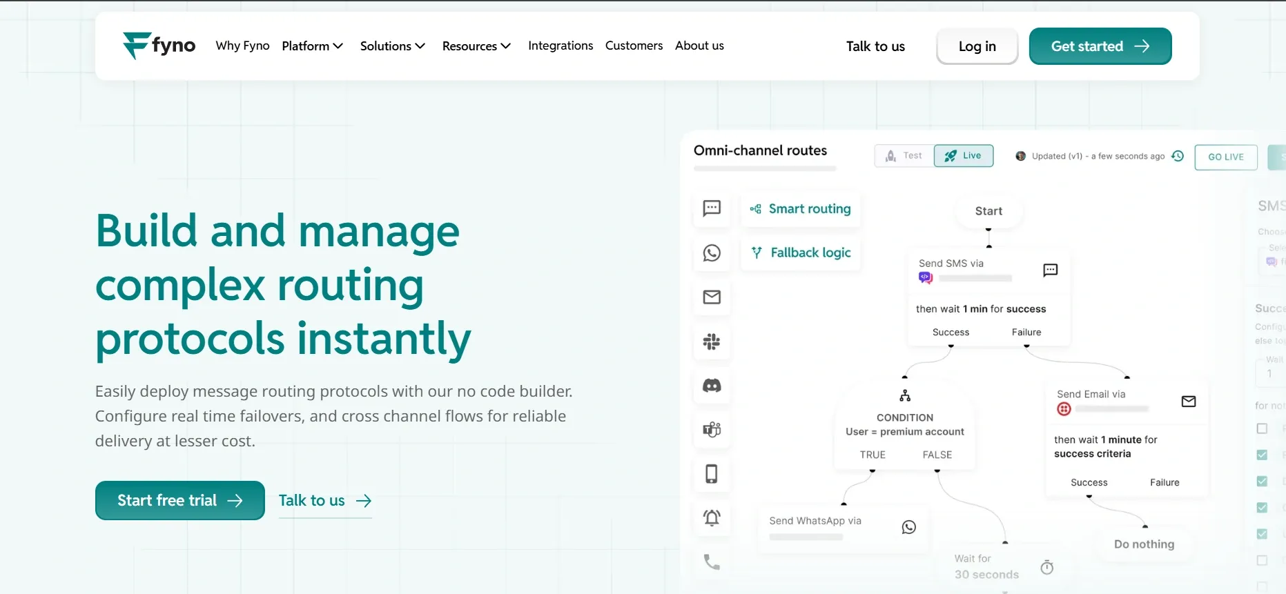
Customer outcomes are also used to prove the value. One fintech company reported launching complex IVR workflows in 10% of the estimated time, while reducing engineering effort by about 90%.
By showing clear results along with product visuals, the homepage makes a complex platform feel easier to understand. This clarity helps visitors move faster toward booking a demo or starting a conversation with the team.
4. CloudSponge
CloudSponge provides contact importing for apps, allowing users to bring in contacts from services like Gmail, Outlook, and other address books. The website redesign focused on simplifying navigation and making the core value clearer within the first few seconds.
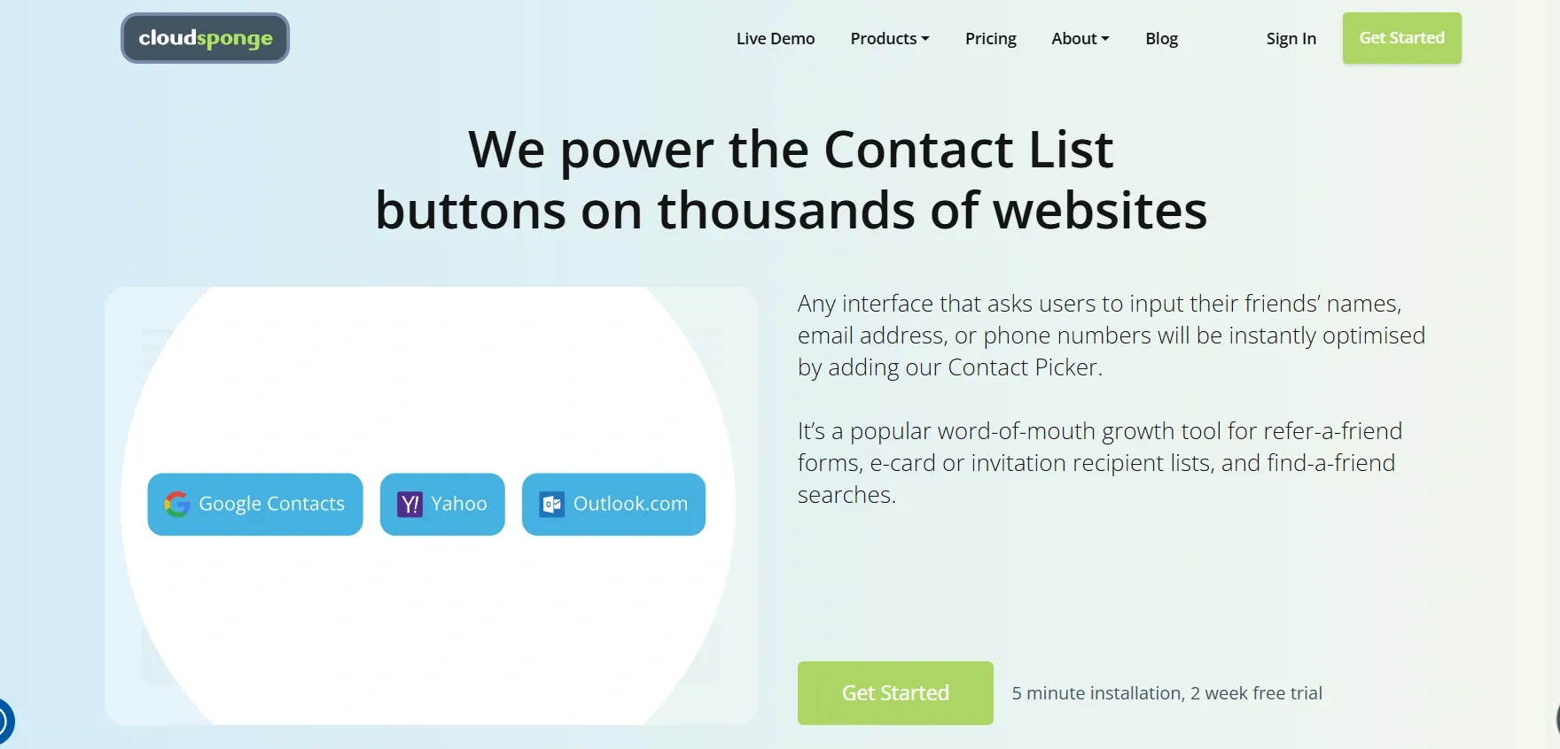
What They Do Well
The updated site highlights the main benefit immediately, helping visitors understand what the product does without digging through multiple pages. Navigation is simpler, and the messaging focuses directly on the problem developers are trying to solve.
These changes had a measurable impact. After the redesign, the site saw a 33% increase in conversions, showing how clearer messaging and a simpler structure can turn more visitors into signups.
Final Words
Websites work and provide high conversion when they provide an experience that is clear, the value is obvious, and the path to action is simple. As the examples in this article show, improvements such as clearer messaging, stronger proof, and simpler signup flows can significantly increase conversions.
At Tenet, we apply these same principles when designing digital products and websites. Our team has worked with 450+ companies across 15+ countries, creating platforms now used by over 20 million people worldwide.
One example is our work with Al Jalila Foundation, where we designed and developed a purpose-driven app and website to support their donation initiatives.

By simplifying the user journey, adding prompts for recurring contributions, and integrating secure payments, the experience became easier for users to engage with regularly.
If you're planning to redesign your website or build a new one from the ground up. Feel free to contact us today 🙂
Improve your ROI with a high-converting website. Get expert help
Improve your ROI with a high-converting website. Get expert help


Got an idea on your mind?
We’d love to hear about your brand, your visions, current challenges, even if you’re not sure what your next step is.
Let’s talk


