11 Common Web Design Mistakes & How To Fix Them
 By
By Share
Share

Get a quick blog summary with


A good website design builds trust, keeps visitors engaged, and helps businesses grow. Many websites lose users because of common design mistakes that make them hard to use or slow to load.
Poor navigation, weak CTAs, and cluttered layouts often cause people to leave before they take action.
This guide explains the eleven most common web design mistakes and shows clear ways to fix them.
Each section includes practical examples and proven methods that improve user experience, website speed, and search performance.
Here are the top web design mistakes to avoid
Before We Start:
Need help improving your website design or building a new one? Our expert team creates fast, user-friendly, and conversion-focused websites for businesses across the globe.

Explore our web design and development services by country:
- Web design services in India
- Web design services in London, UK
- Website design services in the USA
- Web design services in Dubai
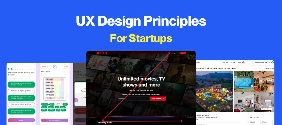
Mistake 1: Confusing Navigation Structure
Navigation failures occur when designers organize menus according to internal company logic rather than user mental models. Many teams create navigation hierarchies that make sense to them but don't align with how visitors naturally search for information.
This misalignment causes users to experience frustration and confusion when they can't quickly locate what they need. Clutch research reveals that 49% of consumers will leave a website with confusing navigation.
Here’s an example of using too many menu items in the header navigation:

How to fix it:
Start by implementing the "three-click rule" to ensure users can find any information within three clicks or fewer. Limit main menu items to 5-7 clearly labeled options, using descriptive terms instead of vague language like "Solutions". Create logical content hierarchies with breadcrumbs for complex sites and include a prominent search bar for content-heavy pages.
Test your navigation structure with real users through usability testing to identify friction points before launch. Finally, maintain consistent navigation patterns across all pages and highlight the user's current location within the site.
Example:
PrintGlobe conducted extensive navigation testing comparing three different category page layouts. Their winning variation combined grid view with left navigation and carousel functionality, resulting in an 18.5% increase in conversion rates.
The enhanced navigation helped customers locate products more efficiently and reduced pre-product page abandonment rates significantly.
Mistake 2: Slow Page Loading Speed
Research shows that 53% of mobile users abandon sites that take longer than 3 seconds to load, yet the average mobile load time is 8.6 seconds. Loading speed issues stem from multiple technical oversights during development. This includes:
- Unoptimized images consume excessive bandwidth, while bloated JavaScript and CSS files create processing bottlenecks.
- Many sites accumulate performance debt through heavy third-party scripts, inadequate caching strategies, and shared hosting environments that compete for server resources.
- Poor server response times and a lack of Content Delivery Network (CDN) implementation further compound these issues.
How to fix it:
Begin by compressing images using modern formats like WebP, which can reduce file sizes by up to 75% compared to JPEG while maintaining quality. Implement lazy loading for images and videos to defer non-critical content until needed.
Minify CSS, JavaScript, and HTML files to eliminate unnecessary characters and reduce file sizes. Enable browser caching and implement a CDN to serve content from geographically closer servers, reducing latency.
Upgrade to faster hosting solutions like VPS instead of shared hosting, and optimize server response time to achieve Google's recommended Time to First Byte (TTFB) of 0.8 seconds or below. Remove unused plugins and scripts that create unnecessary HTTP requests.
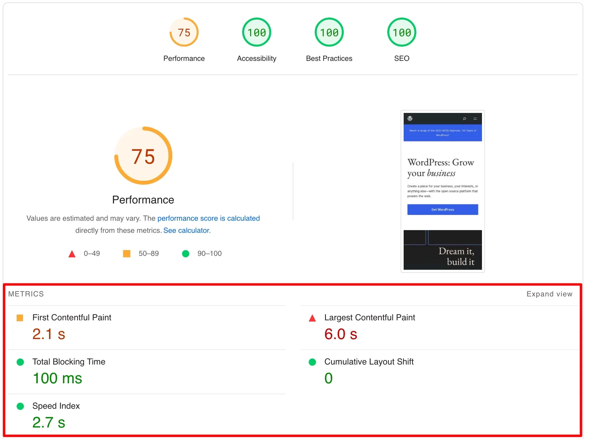
Image of Google PageSpeed Insights report illustrating how slow loading times and large contentful paint negatively affect website performance:
Example:
Fidelis, Inc., a Seattle-based IT firm, had PageSpeed performance scores of 13 for mobile and 41 for desktop due to unoptimized images and bloated JavaScript files.
After comprehensive optimization, including image compression, JavaScript minification, and CSS optimization, their performance scores improved to 93, resulting in load times that met industry benchmarks and significantly improved user experience.
Mistake 3: Poor Mobile Responsiveness
Teams often design desktop layouts first and modify mobile support later, resulting in fixed-width elements, inappropriate viewport settings, and touch targets that are too small. Neglecting mobile-first CSS techniques leads to non-scalable images and inconsistent grid behavior.
Missing the <meta name="viewport"> tag prevents browsers from rendering layouts adaptively, forcing users to pinch-zoom and scroll horizontally.
How to fix it:
Adopt a mobile-first development workflow: start CSS with base styles for the smallest viewport and progressively enhance for larger screens. Use flexible layouts built with CSS Grid and Flexbox, defining relative units (%, rem) rather than absolute pixels.
Include the viewport meta tag (<meta name="viewport" content="width=device-width, initial-scale=1">) to ensure proper scaling. Implement responsive images with srcset and sizes attributes to serve appropriately sized assets per device. Ensure touch targets meet the 44 × 44 px recommendation for tappable elements, improving usability on touch screens.
Validate responsiveness across devices with Chrome DevTools device simulator and Google’s Mobile-Friendly Test.
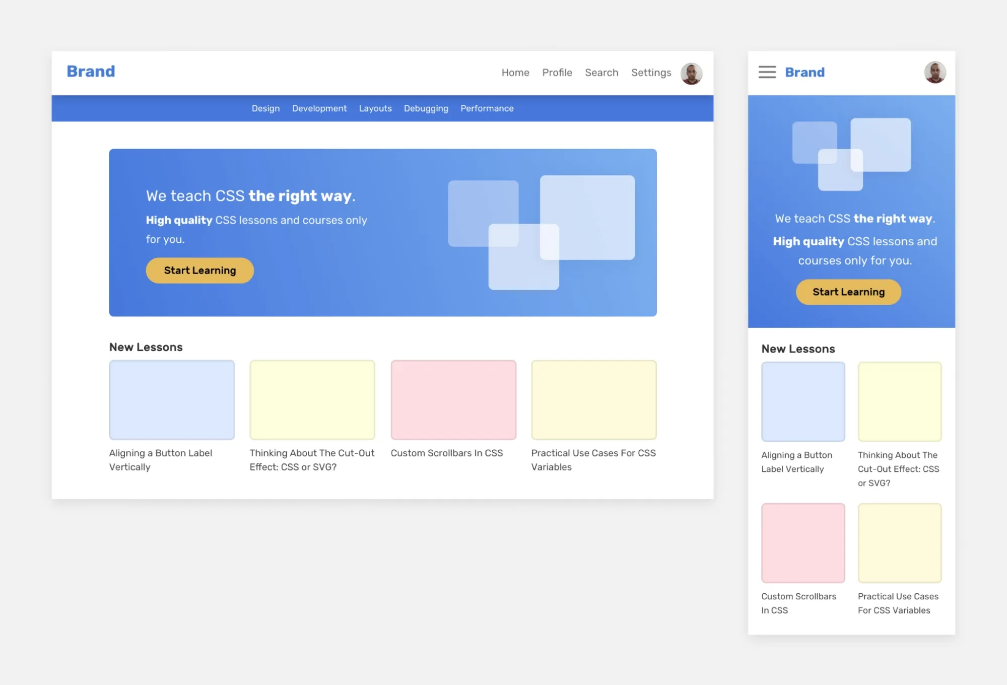
Here is a side-by-side layout that reveals how a responsive design delivers smooth usability across desktop and mobile, while static layouts fall short.
👉 Learn more about modern web design trends that prioritize mobile-first approaches.
Example:
Airbnb implemented deep linking across all marketing channels, which improved their mobile app install rate by 19% and drove 3.5 million app downloads in the first six months.
The optimization focused on creating seamless mobile experiences that retained user context even through the app install process, demonstrating how mobile-first strategies directly impact conversion metrics.
Mistake 4: Accessibility Compliance Failures
Teams treat accessibility as an afterthought instead of building it into their design process from the start. This leads to missing alt text for images, poor color contrast, and keyboard navigation issues. The WebAIM Million 2025 report shows that 94.8% of websites have detectable accessibility failures, with low contrast text being the most common issue, affecting 79.1% of sites.
How to fix it:
Implement WCAG 2.1 Level AA standards from project start. Ensure text contrast ratios meet 4.5:1 for normal text using contrast checker tools. Add descriptive alt text for meaningful images and use empty alt="" for decorative ones.
<img src="homepage-layout.png" alt="Modern homepage layout design preview">
Create proper heading hierarchy (H1-H6) and enable full keyboard navigation with visible focus indicators. Use semantic HTML elements like <button> and <nav> instead of generic divs, and include clear labels for all form fields.
👉 Discover key UX design statistics that highlight why accessibility matters for all users.
Mistake 5: Cluttered and Overwhelming Design
Stakeholders often demand showcasing every feature and promotion on a single page, leading to excess text, images, and widgets without a clear hierarchy. This information overload frustrates users and reduces trust.
How to fix it:
Introduce generous white space to separate sections and guide focus. Define a visual hierarchy - use size, color, and positioning to highlight priority elements. Group related items and remove non-essential content.
Break long text into concise paragraphs with clear headings. Remove unnecessary elements that don't serve user needs or support conversion goals, focusing on presenting only the most important information clearly and organized.
Example:
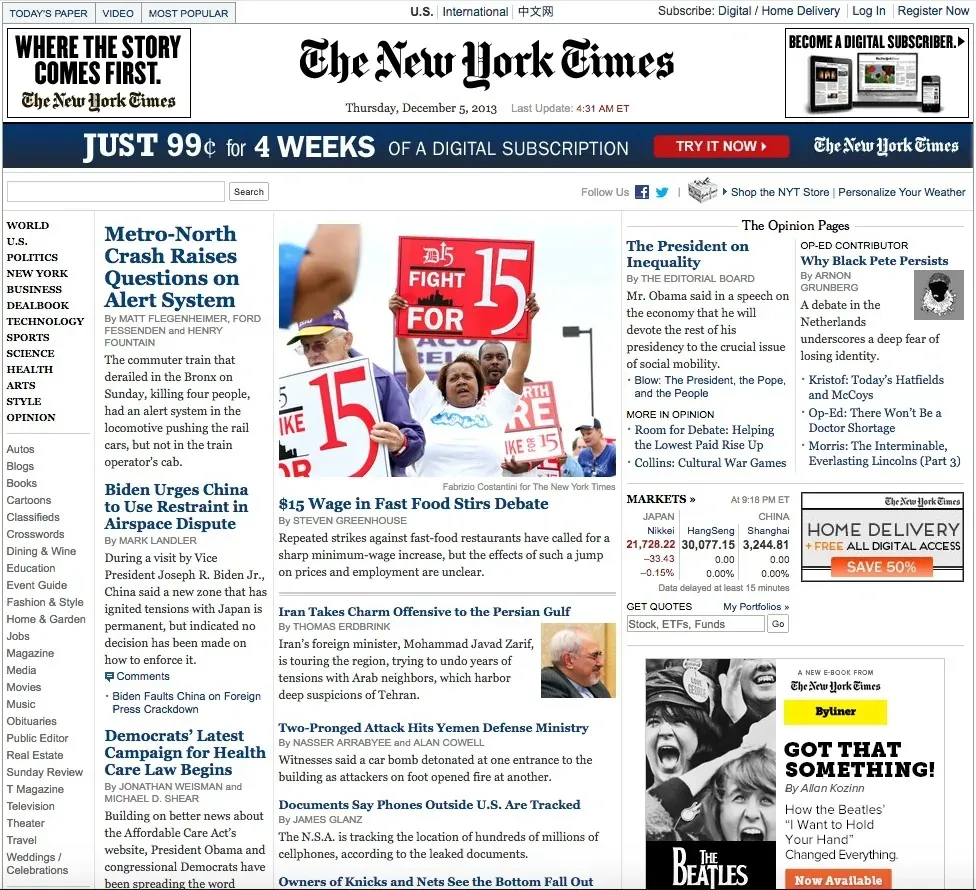
The New York Times shifted from full-width text blocks to narrow, centered columns, improving skim-ability and reducing reader fatigue. This redesign has become a benchmark for readable digital layouts.
Below is an image showing the NY Times’s front page in 2013:
Mistake 6: Weak Call-to-Action Elements
CTAs fail when their wording, design, or placement doesn’t align with user intent or draw attention. Vague labels like “Submit” or “Click Here” leave visitors unsure of what will happen next, while multiple competing CTAs dilute focus, causing decision paralysis.
How to fix it:
Use specific, benefit-driven copy (e.g., “Download My Free Ebook” instead of “Learn More”). Limit each page to one primary CTA and demote secondary actions to text links.
Ensure high contrast between the button and background and place the CTA above the fold, where it’s immediately visible. Match CTA copy to its destination- if the button promises a demo, link directly to a demo signup form.
Finally, test variations of copy, color, and placement through A/B testing tools to validate improvements.
🟩 Here are some CTA examples:
- Learn more → See how it works / Explore our process
- Get started → Start your free trial / Begin your project today
- Click here → View full details / Open pricing plans
- Submit → Send your request / Apply now
- Read more → Continue reading the full guide / View complete article
- Go now → Visit our resources page / Access your dashboard
- Try it → Test the tool now / Run a demo
- Sign up → Create your free account / Join the community
- Discover → Find the right plan for you / See what’s new
- Know more → Get detailed information / Check all features
Example:
Performable (now part of HubSpot) increased conversions by 21% simply by changing their CTA button color from green to red, demonstrating the high impact of visual cues at decision points.
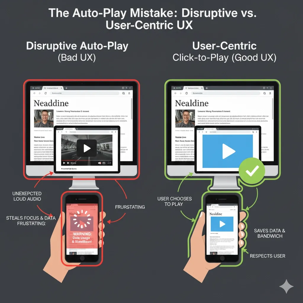
Mistake 7: Auto-Playing Media Content
Designers enable autoplay to grab attention, but this often backfires. Auto-playing videos and audio consume extra bandwidth and delay page rendering, harming performance.
Users find unexpected motion and sound disruptive, especially in shared or work environments, leading many to abandon sites with autoplay.
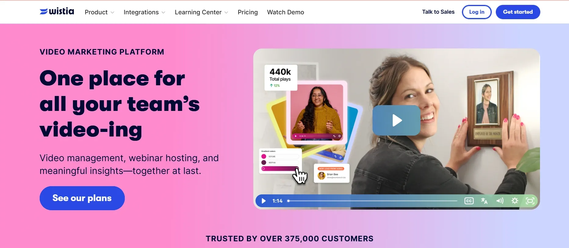
Here is a visual that compares Auto-play vs Click to play content:
How to fix it:
Disable autoplay by default. Replace it with a muted preview or thumbnail that initiates play only on user interaction. If the video must start automatically, mute it and offer clear controls to pause or mute the sound.
Defer video loading using lazy loading so that media files load only when scrolled into view. Validate performance improvements with tools like PageSpeed Insights.
Example:
Wistia removed auto-playing videos from its homepage and switched to click-to-play embeds. This change reduced their homepage load time by over 50% and increased sign-up conversions by 7%, proving that user-controlled media enhances both performance and engagement.
Picture demonstrating how Wistia has given a click-to-play option for the video on the landing page instead of auto-play:
Mistake 8: Poor Search Functionality
Search features often fail when they rely on basic keyword matching without accounting for synonyms, misspellings, or stemming. Developers may deploy default search implementations that lack typo tolerance, filtering options, or relevance tuning, leading to zero-result pages and user frustration.
How to fix it:
Integrate a modern search engine (e.g., Elasticsearch or Algolia) that supports fuzzy matching, autocomplete, and typo correction. Configure relevance weighting to prioritize popular or high-value content. Provide filtering facets (categories, date ranges, tags) so users can refine results.
Display “Did you mean…” suggestions for zero-result queries. Monitor search analytics to identify common queries and optimize content or synonyms accordingly.
Example
Crate & Barrel partnered with Lucidworks and GroupBy Inc. to rebuild its search and discovery system using machine learning and Google Cloud infrastructure. The new setup was to improve relevance, recognize natural language queries, and deliver faster, more accurate results.
And it sure does by resulting in a 44% rise in conversion rate, a 37% increase in AOV (average order value), and a 128% increase in revenue per visitor. The upgrade simplified product discovery and made online shopping far more intuitive for customers.
Mistake 9: Inconsistent Design Elements
Inconsistent use of colors, typography, and component styles arises when teams lack a unified design system or style guide. Over time, disparate UI patterns (buttons of varying shapes, headings with different fonts, and inconsistent spacing) erode visual coherence and user trust.
How to fix it:
Establish a design system documenting color palettes, typography scales, component libraries, and spacing rules. Use tools like Storybook to develop and preview UI components in isolation.
Enforce consistency through automated linters (eg, Stylelint for CSS) and integrate design tokens that sync styles between design tools (eg, Figma) and code. Conduct periodic UI audits to catch drift and update the design system accordingly.
Example:
Shopify’s Polaris design system standardizes the look and feel across all its products. By using Polaris, Shopify reduced UI inconsistencies by a large margin and sped up feature launches. Designers benefit from prebuilt components, and developers work with a shared, tested codebase.
This approach has helped Shopify maintain a cohesive user experience across millions of merchants worldwide.
Mistake 10: Ignoring SEO Best Practices in Design
Many websites still treat SEO as something that happens after the design phase. This leads to major issues like poor site structure, weak internal linking, duplicate content, and non-indexable pages.
These mistakes make it hard for search engines to understand your content and reduce visibility in search results.
How to fix it:
Follow these SEO-friendly web design practices from the start of your project:
1. Ensure search engines can index your pages
Use Google Search Console to check indexing reports and fix blocked URLs. Avoid using Disallow in robots.txt for important pages. Instead, use a noindex meta tag for pages you don’t want indexed.
2. Create a clear, simple site architecture
Organize your content so every page is reachable within three clicks. Use internal links and descriptive anchor text to connect related pages and help search engines understand page relationships.
3. Use a responsive and mobile-first design
Since Google uses mobile-first indexing, your site must work perfectly on smaller screens. Use flexible grids, readable fonts, and tap-friendly buttons to ensure usability and ranking consistency.
4. Optimize website speed and Core Web Vitals
Compress images, use modern formats like WebP, enable caching, and host on fast servers. Measure performance using Google PageSpeed Insights and fix issues affecting LCP, INP, and CLS scores.
5. Add descriptive meta tags and structured data
Write unique title tags and meta descriptions for each page. Use schema markup to define content types such as reviews, FAQs, or products, helping Google show rich snippets in search results.
6. Use HTTPS for security and trust
Secure your site with SSL (HTTPS). It’s a Google ranking factor and builds user trust by protecting data in transit.
7. Simplify URL structures
Keep URLs short, clean, and keyword-relevant. For example, use /web-design-services instead of /page?id=1234.
8. Optimize images for SEO
Use descriptive filenames and clear alt text to explain what each image shows. Example:
<img src="responsive-design-demo.png" alt="Example of a responsive website layout">
9. Provide transcripts for video or audio content
Text transcripts make multimedia accessible and indexable by search engines while improving user experience for visitors who can’t use audio.
10. Avoid duplicate content with canonical tags
When multiple URLs have similar content, use canonical tags to show search engines which version should be indexed.
Mistake 11: Overly Intrusive Pop-Ups and Ads
Pop‑ups and ads are meant to draw attention or capture leads, but when they appear the moment a page loads, or stack one after another, they interrupt reading and drive users away. This often happens when marketers prioritize short‑term conversions over long‑term engagement.
How to fix it:
Trigger pop‑ups only after a visitor engages - by scrolling, spending time onsite, or showing exit intent. Keep the message brief, include a clear close icon, and never block content entirely. Replace aggressive full‑screen pop‑ups with lighter slide‑ins or small banners along the edge of the page for less disruption.
Wisepops’ 2025 study, analyzing billions of pop-up displays, found that intrusive, instant‑load pop‑ups cause a measurable uptick in bounce rates, while delayed or behavior‑based pop‑ups improve outcomes.
Campaigns timed for user intent achieved an average conversion rate of 4.65%, compared to less than 3% for immediate pop‑ups.
How Tenet helps you fix your website design issues
Tenet focuses on identifying specific problems in your website’s design that hinder usability, performance, and user satisfaction. By examining how real users interact with your site, we highlight issues like complicated navigation, cluttered layouts, and poor mobile experience. Then our team creates clear, consistent designs that make the site easier to use and visually appealing.
For instance, in the Angles project, Tenet redesigned the website layout to improve content hierarchy and simplified navigation menus. The mobile version was optimized to load faster and present key information without overwhelming users.
These focused changes improved user flow and helped Angles engage visitors better through their website.
👉 Explore Tenet's web development services to see how they can transform your website, or Contact Us directly today.
Increase conversions with our expert web design services (Get a free proposal)
Increase conversions with our expert web design services (Get a free proposal)


Got an idea on your mind?
We’d love to hear about your brand, your visions, current challenges, even if you’re not sure what your next step is.
Let’s talk


