Landing Page Optimization Best Practices (+ Free Checklist)
Share
Share
Get a quick blog summary with


Key Highlights
- Small landing page changes can unlock 30% more conversions.
- Data-backed CRO strategies delivered measurable gains for clients.
- A 2% lift in optimization can add thousands in revenue.
- Results improved without increasing ad spend.
- The guide shows exact steps to turn pages into high-converting assets.
What if a few small changes to your landing page could unlock 30% more conversions?
That’s exactly what we achieved for our CRO clients using precise, data-backed strategies.
Even a 2% lift in landing page optimization can mean thousands in extra revenue— without increasing ad spend.
In this guide, we reveal the exact steps we used to drive those results and show you how to turn your landing page into a high-converting asset.
What is a landing page in digital marketing?
A landing page in digital marketing is a standalone web page designed to convert visitors into leads or customers. It typically includes a headline, supporting copy, a clear call-to-action, and minimal navigation.
Download the landing page optimization checklist.

Explore our UI UX design services by country:
- UI/UX Design Agency in India
- UI/UX Design Agency in London, UK
- UI/UX Design Services in US
- UI/UX Design Agency in Dubai
What is landing page optimization, and why does it matter?
Landing page optimization is the process of improving page elements to increase conversions. From a conversion rate optimization (CRO) point of view, it focuses on aligning the user's expectations with the content, minimizing friction, and guiding users toward action.
Here's why it matters in expert-level detail:
1. Increasing conversion rates by matching user intent
Conversion increases when a landing page matches what users expect after clicking an ad or link. If the ad promises a “free trial,” the page must immediately reflect that offer in the headline and call to action.
Aligning content with user intent reduces cognitive dissonance and builds trust, resulting in more form submissions or purchases.
2. Reducing cost per acquisition (CPA)
Every click costs money in paid campaigns. When a page converts more visitors without increasing traffic, the cost per lead or sale drops.
High-performing pages turn the same traffic into more results, making ad spend more efficient.
This is especially critical in competitive niches with high CPCs where waste must be minimized.
👉 Use our free CPA calculator
3. Improving user experience and reducing friction
Pages that are clear, fast, and easy to navigate keep users engaged. Removing unnecessary form fields, reducing load time, and using a clean design makes it easier for visitors to act.
Friction points—like cluttered landing page layout examples or vague CTAs—cause users to abandon. A seamless experience drives more conversions by keeping the focus on the goal.
4. Maximizing the value of existing traffic
Optimizing a page increases revenue without increasing ad budget. For example, doubling the conversion rate from 5% to 10% on a 10,000-visitor page effectively doubles the number of leads or customers.
This efficiency lets businesses grow profit without scaling traffic, improving ROI significantly.
5. Supporting A/B testing and continuous improvement
Testing variations of headlines, images, layouts, and CTAs allows marketers to see what performs best. Conversion tools like heatmaps and analytics provide insights into behavior. Winning tests are implemented, and new hypotheses are tested in cycles.
6. Aligning with sales psychology and funnel stages
A landing page should reflect where the user is in the buyer journey. Early-stage visitors need education, while later-stage visitors need urgency and social proof.
A well-structured page uses persuasive copy, testimonials, and visual cues that move the user from awareness to decision in a logical flow.
7. Building trust and authority through design
The landing page often forms the first impression of a brand. Poor design, weak messaging, or lack of trust signals can cause users to bounce.
Pages that include recognizable logos, secure payment icons, testimonials, and clean design elements create credibility. This trust makes users more likely to complete the desired action.
Landing page best practices for higher conversions
1. Make your value proposition instantly clear
A landing page’s value proposition is the foundation of its messaging. It quickly tells visitors what you offer, who it's for, and why it’s worth their time.
When placed prominently, a clear value proposition prevents confusion, builds trust, and encourages users to explore further.
Your value proposition should clearly answer:
- What do you offer?
- Who is it for?
- Why should someone choose you over competitors?
Displaying this message prominently above the fold improves clarity and conversion rates.
Steps to apply:
- Understand your audience’s pain points, desires, and motivations
- Highlight the key benefits that make your offer unique
- Write a short, simple value proposition in familiar language
- Place it at the top of the page in bold, easy-to-read text
- A/B test different versions to improve engagement and clarity
💡 Real example: Grammarly communicates a specific value proposition tailored to HR teams with clarity and precision.
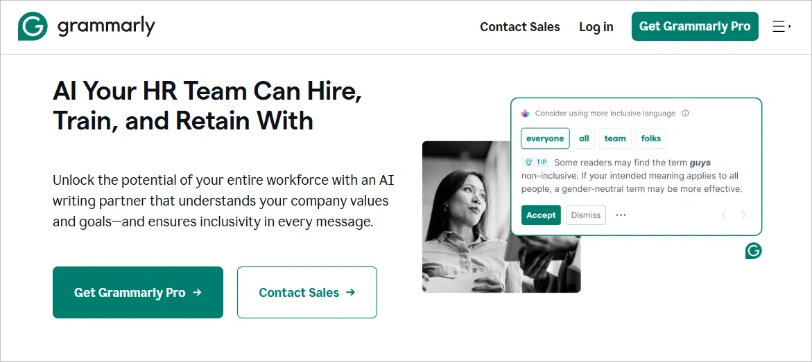
The messaging highlights a real-world benefit (hiring, training, and retaining with AI) and supports it with visual proof of product relevance, building instant trust and engagement.
2. Design a visually appealing and functional layout
The design of your landing page shapes how users feel about your brand. A clutter-free, visually consistent layout helps users focus on the content and take action. Good design not only supports credibility but also guides users naturally toward conversion goals.
First impressions matter— 46% of users judge a business by its website design. A clean, well-structured landing page builds trust and keeps users engaged.
Steps to apply:
- Use clean layouts like Z-pattern or F-pattern to guide the eye
- Keep the page uncluttered with intentional white space
- Choose brand-aligned colors and readable fonts
- Add high-resolution images and icons to support the message
- Ensure the page is mobile-friendly and responsive
- Use animations and micro-interactions sparingly to enhance flow
- Test design variations for performance using A/B tools
💡 Real example: Trello enhances its landing page experience using slider-based visuals to showcase its product in action.
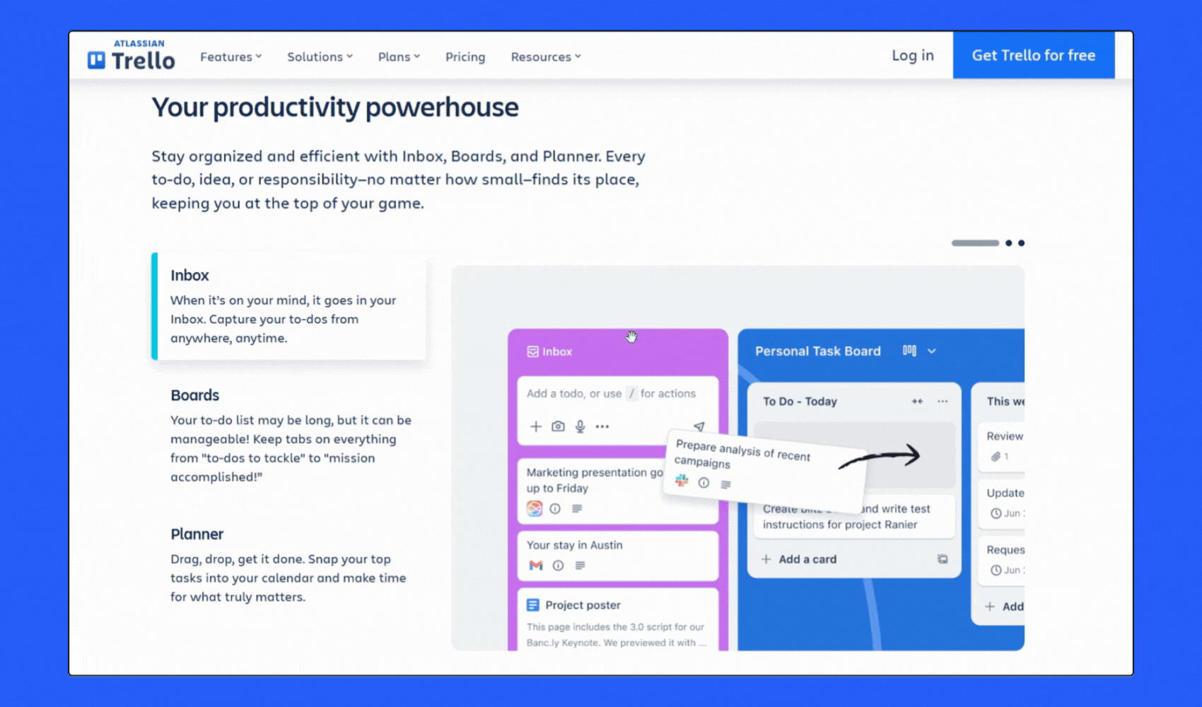
This dynamic, interactive design not only looks clean but also gives users a quick understanding of how the tool works, boosting engagement and usability.
3. Create clear, action-focused CTAs
Calls to action (CTAs) are the tipping point between engagement and conversion.
A well-optimized CTA tells users what to do next and why it benefits them. When placed strategically and written clearly, CTAs can significantly increase click-through rates and conversions.
Your call to action (CTA) should be visible, benefit-oriented, and encourage users to take the next step. CTAs play a major role in conversion optimization.
Steps to apply:
- Use action verbs like "Download," "Start," or "Get Now"
- Add value-focused language (e.g., “Start your free trial today”)
- Use contrasting button colors and readable font sizes
- Position CTAs above the fold, after persuasive sections, and at the end
- Test different styles, copy, and placements with tools like VWO
💡 Real example: ClickUp nails its CTA with a bold value proposition and a high-contrast button that communicates both action and benefit—"Get started. It’s FREE!"
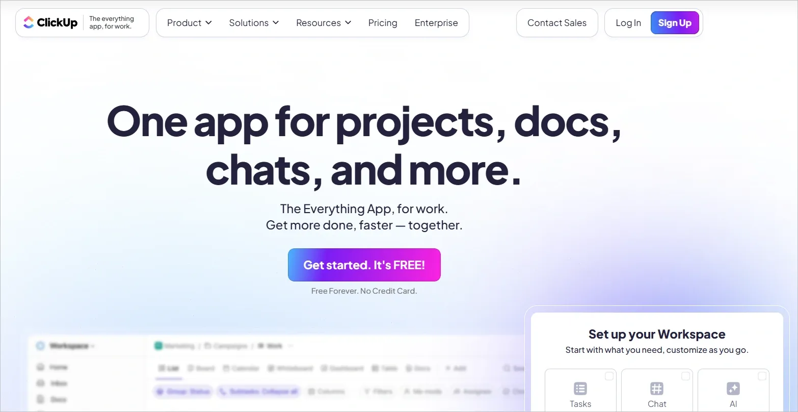
This clarity and visual hierarchy help guide users directly to conversion.
4. Improve landing page loading speed
Speed isn’t just about user experience—it directly affects bounce rates, conversion rates, and search engine rankings. Fast-loading landing pages keep visitors engaged and make them more likely to take the desired action.
Page speed is a critical factor for both user experience and SEO. Even a few seconds of delay can increase bounce rates.
Steps to apply:
- Compress images and use modern formats like WebP
- Minify code (CSS, JS, HTML) to reduce file size
- Enable browser caching and content delivery networks (CDNs)
- Lazy-load images and offscreen content to speed up initial loads
- Limit font variations and preload essential files
- Monitor performance using Google PageSpeed Insights or GTMetrix
💡 Real example: Ahrefs demonstrates top-tier landing page speed performance with a GTmetrix score of 94%, a Largest Contentful Paint under 800ms, and a fully loaded time of just 1.7 seconds.
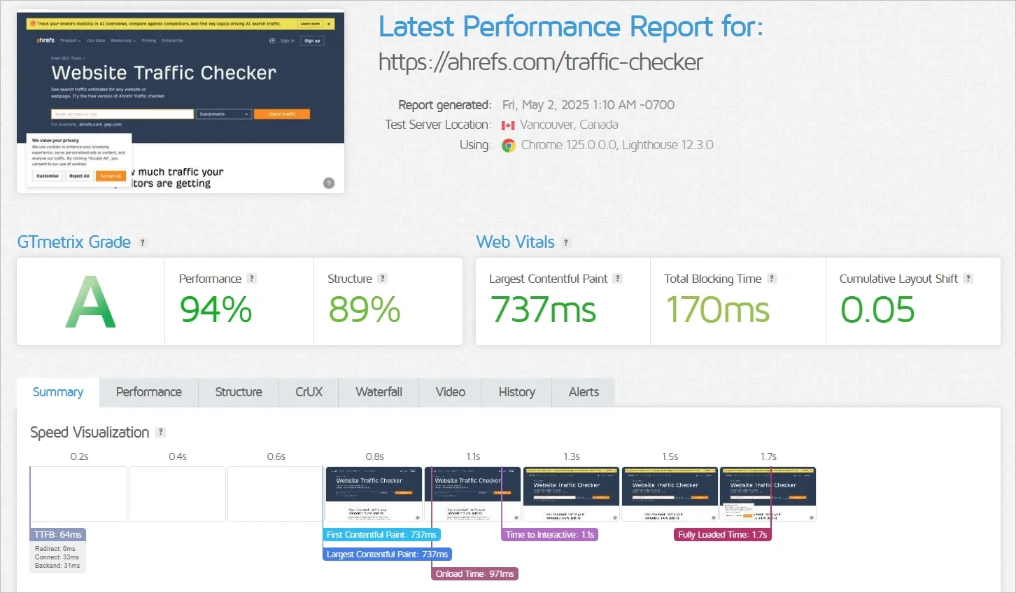
This shows how technical optimization directly supports both UX and SEO goals.
5. Add social proof and trust signals
Visitors are more likely to trust your product or service when they see that others do too.
Adding real testimonials, ratings, and recognizable trust badges makes your landing page more persuasive and reduces hesitation.
Social proof builds credibility and reduces hesitation. Trust signals help users feel secure about taking the next step.
Steps to apply:
- Add real customer testimonials with names and photos
- Include ratings, case studies, or influencer endorsements
- Display logos of clients or media mentions
- Use badges for secure payments, money-back guarantees, or certifications
- Place these elements near CTAs or above the fold for visibility
💡 Real example: Testimonial uses a real customer video in the hero section to build trust instantly.
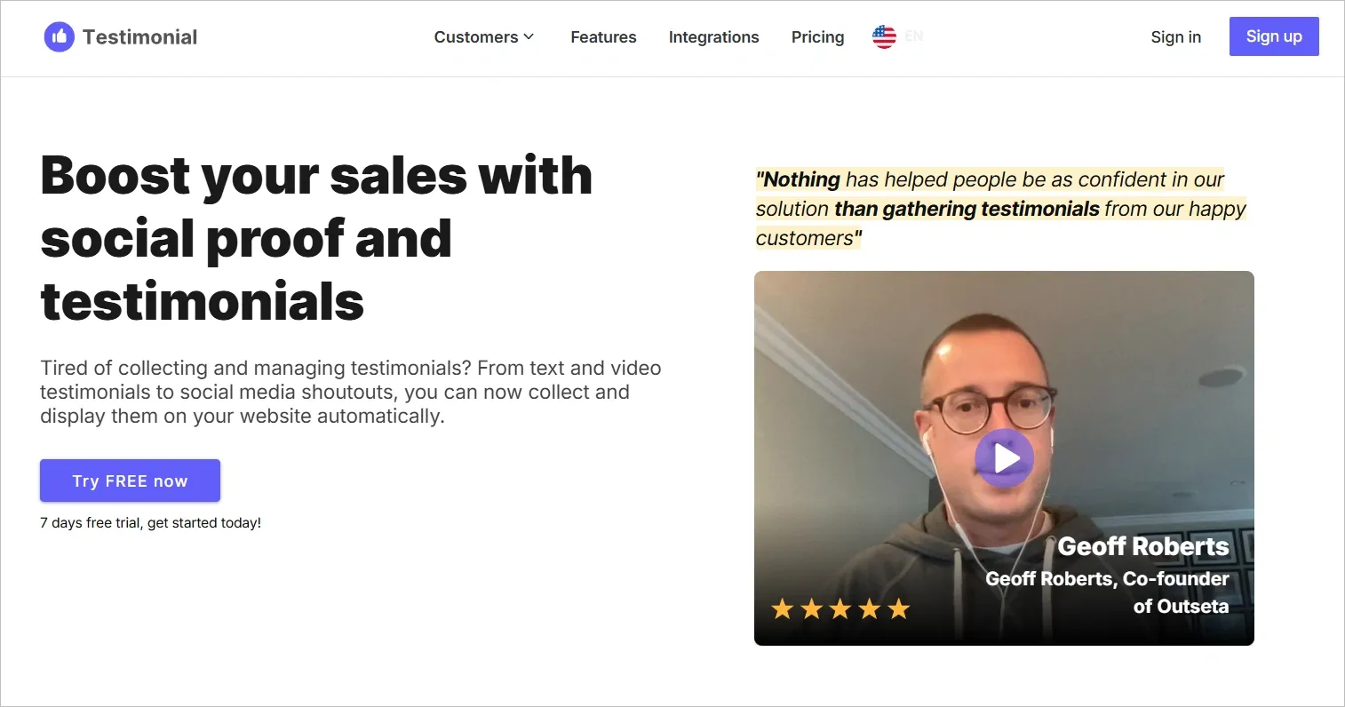
Combining authentic quotes, a clear rating, and visual testimonials creates persuasive social proof that encourages action.
6. Align headline messaging with ad copy
Users expect consistency. When your landing page reflects the exact message of your ad, it reassures visitors that they’ve come to the right place. This alignment builds trust, lowers bounce rates, and strengthens your brand’s credibility.
Consistency between ad copy and landing page content increases user trust and reduces bounce rates.
Steps to apply:
- Match the headline message and offer exactly with the ad
- Use a consistent tone, design theme, and brand visuals
- Reinforce the same keywords and value proposition as the ad
💡 Real example: Air Canada mirrors its ad copy and visuals on the landing page to maintain trust and continuity.
7. Use persuasive, benefit-led copywriting
Your copy should speak directly to your audience’s goals, fears, and desires. Instead of listing features, explain how your offer will improve their life. Benefit-driven messaging is key to persuading users to stay, trust, and convert.
Feature-focused copy doesn’t sell—benefit-driven messaging does. Focus on how your offer makes life better for your users.
Steps to apply:
- Highlight emotional and tangible benefits like saving time or gaining confidence
- Use simple language your audience uses
- Add urgency or scarcity (e.g., “Only 3 left in stock!”)
- Break text into short paragraphs and bullet points for readability
- Pair key copy with visuals to reinforce value
- Test headlines and body content to see what converts best
Real example: Basecamp uses persuasive storytelling to position itself as the ultimate solution after users try and abandon other tools.
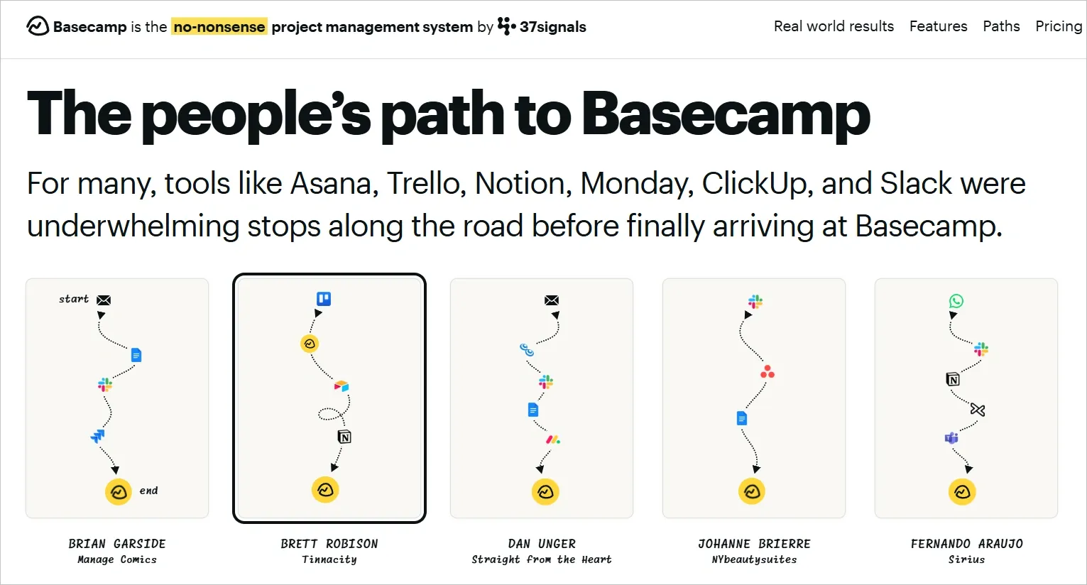
This narrative-driven copy taps into real user experiences and frustrations, making the benefit of switching to Basecamp immediately clear and emotionally resonant.
8. Personalize content for different user segments
Every visitor is different— and your landing page should reflect that.
By personalizing content to different audience segments, you create more relevant experiences that increase engagement and drive higher conversion rates.
Personalized landing pages resonate more with visitors and can boost conversion rates by up to 15%.
Steps to apply:
- Segment users by demographics, traffic source, or intent
- Customize headlines, testimonials, and CTAs for each segment
- Use dynamic content tools like HubSpot, Unbounce, or Optimizely
💡 Real example: Notion personalizes its landing page for engineers by using tailored messaging like "Notion for engineering" and targeted benefits.
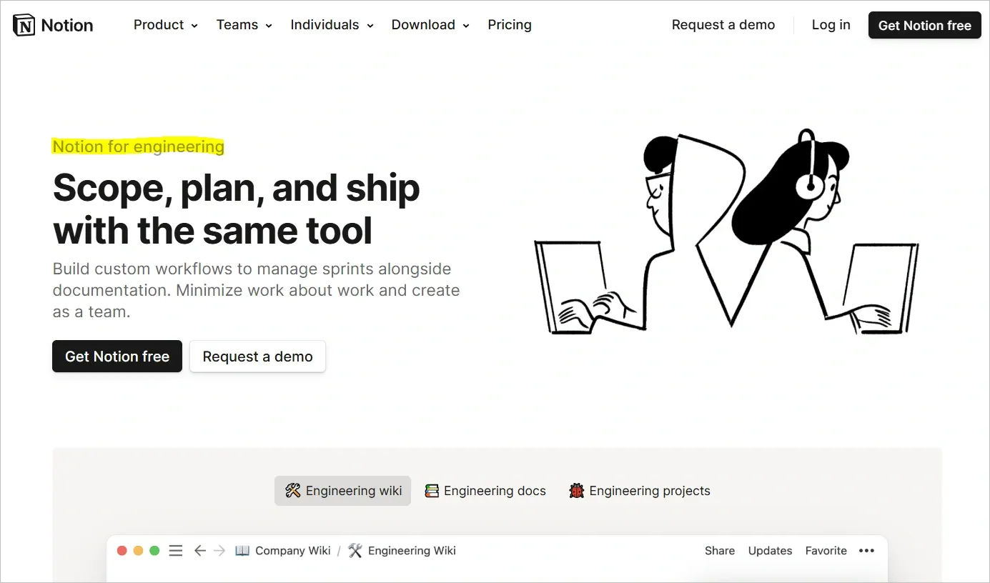
This approach instantly connects with a specific user segment, improving relevance and increasing the likelihood of conversion.
9. Showcase your hero product
Your hero product represents your best work or most popular offering.
Featuring it prominently on your landing page captures immediate attention, builds curiosity, and often leads users straight to conversion.
Highlighting your best-selling or most impactful product builds interest quickly and encourages conversions.
Steps to apply:
- Feature the product prominently above the fold
- Use high-quality images, videos, and lifestyle visuals
- Show user benefits, social proof, and trust elements
- Use a bold headline to explain why it’s a top choice
- A/B test different layouts and messages for conversion performance
💡 Real example: Ahrefs highlights its Site Explorer as the hero product by showcasing live SEO metrics and clear value.
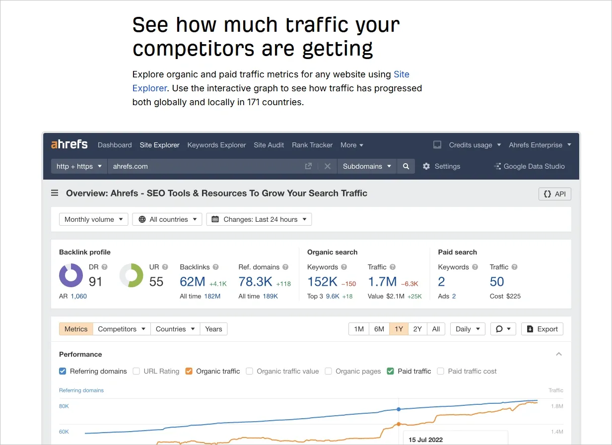
The interactive data preview and benefit-driven headline immediately capture interest and guide users toward exploring the tool.
Applying these proven landing page optimization strategies helps align your content with search intent, improve SEO, and increase engagement.
Start with one section, measure its impact, and iterate for long-term growth.
👉 Need help in implementing these landing page best practices?
Contact our CRO experts at Tenet offers conversion-focused UI/UX and CRO services personalized to your business goals.
How Tenet can help you increase landing page conversions
Tenet has served 44+ brands across 7+ countries with CRO services, increasing conversion rates for landing pages of these brands, without any additional marketing spend.
We have a client satisfaction rate of 98% and a repeat client rate of over 45%.
In our circles, we are notorious for one thing - we do not compromise with quality, it doesn't matter how many iterations it takes
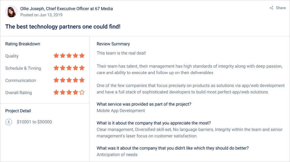
Check out what DoorDash, a listed multi-billion dollar company, has to say about our services:
Get started with an end-to-end audit of your landing page! It will reveal all the ‘gaps’ in it!
FAQs
How does landing page SEO optimization differ from general SEO?
Landing page SEO optimization is focused on aligning a single page with specific search queries to drive highly targeted organic traffic. This includes optimizing the page’s headline, meta title, URL slug, internal links, and body content using high-intent keywords.
Unlike general SEO that spans multiple site pages, landing page SEO must tightly align keyword usage with clear, fast-loading, conversion-focused content.
It's critical that SEO-optimized landing pages balance search visibility with persuasive copy and usability.
What’s the purpose of a landing page in digital marketing?
The purpose of a landing page is to guide users toward one specific conversion goal—whether it’s capturing leads, making a purchase, registering for a webinar, or downloading a resource.
Unlike homepages, which serve as a general gateway to various site sections, landing pages eliminate distractions and focus on one message, one action.
This clarity improves the conversion rate by reducing cognitive load and aligning closely with user intent from paid ads, email campaigns, or organic search.
How can improving landing page performance affect my campaign ROI?
Improving landing page performance can drastically enhance ROI without increasing ad spend. A 20–50% lift in conversion rate means more leads or sales from the same traffic volume.
By improving elements like page speed, headline clarity, CTA visibility, and trust indicators, users are more likely to complete the desired action.
This leads to lower cost-per-acquisition (CPA), better lead quality, and stronger customer lifetime value—especially in performance-driven campaigns.
What are tips for landing page design that increase engagement?
Here are essential tips for landing page design include:
- Use a grid-based structure with balanced white space
- Follow an F-pattern or Z-pattern for content flow
- Apply a brand-consistent color palette with 1–2 accent colors
- Choose large, readable fonts and maintain a clear hierarchy
- Incorporate high-quality images or explainer videos
- Ensure mobile responsiveness with intuitive tap targets
- Make CTAs prominent, short, and benefit-driven
These tips improve visual appeal, readability, and user interaction—crucial for landing page conversion optimization.
What is the difference between homepage optimization and landing page optimization?
Homepage optimization focuses on improving the main entry point of a website, which typically serves multiple user paths and goals. It involves improving navigation, brand messaging, and access to various services or content areas.
Landing page optimization, on the other hand, is laser-focused on one campaign or objective, like lead capture or product sign-up.
It removes unnecessary links, distractions, and choices to direct attention toward a single CTA. Each serves a different role within the overall user journey.
How to optimize a landing page that’s not converting?
If your landing page isn’t converting, start with diagnostics. Use heatmaps and analytics to identify where users drop off.
Here’s what you can do:
Check if the value proposition is unclear or buried, CTAs are hidden, or loading time exceeds 3 seconds. Rework the copy to focus on user benefits instead of features.
Simplify the layout, reduce form fields, and add social proof.
Then test one variable at a time—like headline, CTA, or hero image—using A/B testing.
Landing page vs homepage: what’s the difference?
The main difference between a landing page and a homepage is their purpose and focus. A landing page is designed for a single conversion goal with minimal distractions, often linked to ads or campaigns.
A homepage serves as the main gateway to a website, offering broad navigation and multiple paths for users to explore.
How long should a landing page be?
A landing page should be short—150 to 300 words—for simple actions like email sign-ups, but longer—800 to 2,000+ words— when selling high-ticket items or addressing complex objections.
The ideal length depends on the offer’s complexity, user familiarity with the brand, and the amount of information needed to build trust.
What is a good conversion rate for landing pages?
A good conversion rate for landing pages typically ranges from 3% to 12%, depending on the industry. Here's a landing page conversion rate across different industries:
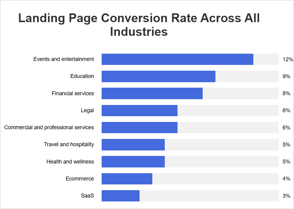
Events and entertainment lead at 12%, education converts at 9%, and financial services reach 8%. Legal services average 6%, travel and health 5%, ecommerce 4%, and SaaS platforms around 3%.
Expertise Delivered Straight to Your Inbox
Expertise Delivered Straight to Your Inbox


Got an idea on your mind?
We’d love to hear about your brand, your visions, current challenges, even if you’re not sure what your next step is.
Let’s talk


