10-Step UX Design Process: Create Better Digital Products
Share
Share
Get a quick blog summary with
61% of users abandon a website if its navigation feels confusing. Yet most businesses still launch digital products without following a clear plan for creating good user experiences.
The UX design process is a step-by-step method that helps teams build websites, apps, and digital products that people actually want to use.
Whether you're building your first website or improving an existing product, understanding how to create better user experiences can save you time and money while increasing customer satisfaction.
This guide walks you through the UX design process step by step. You will learn how to research users, design solutions, and test them to avoid mistakes.
What is UX design?
UX design is the practice of creating digital products that meet users’ needs and expectations. It combines user research, interaction design, and usability testing to shape how people feel and behave when they use a website or app.
Good UX design makes tasks simple. It lets users find information quickly and complete their goals with minimal effort. For example, 88% of users say they’re unlikely to return to a site after a poor experience, while intuitive menus help keep them engaged.
By focusing on real user needs rather than personal preferences, UX design ensures products are reliable, efficient, and enjoyable.
Key elements of UX design:
- User Research: Gathering insights on user behavior and goals.
- Information Architecture: Organizing content so it naturally fits with users’ mental models.
- Interaction Design: Shaping the way users engage with and respond to interface elements.
- Usability Testing: Validating designs with real users before launch.
Here is an example of a landing page with a clear value proposition and simple navigation, helping users understand benefits and easily explore services.
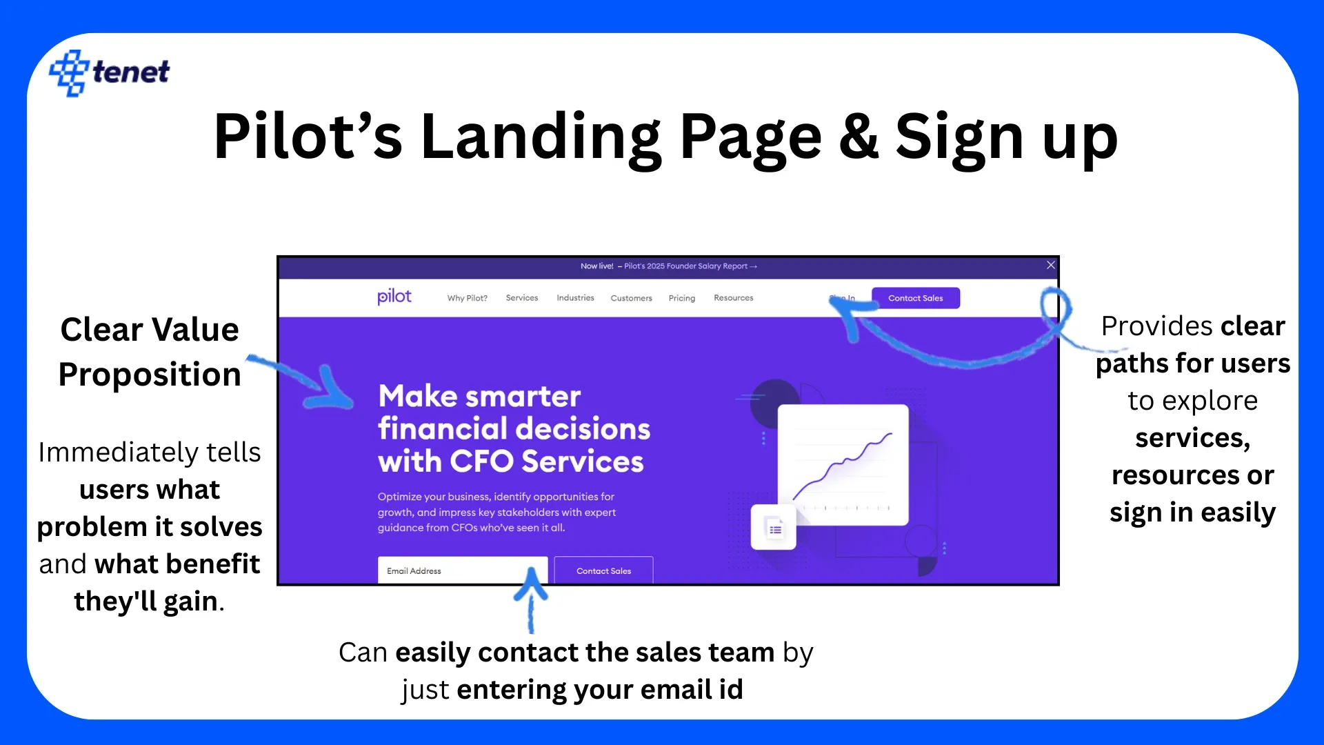
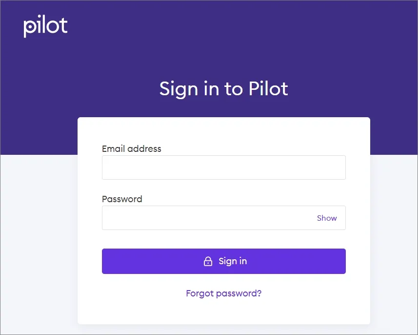
Here is another image showing a clean and straightforward sign-in page that allows users to access their accounts, demonstrating efficiency in interaction design quickly.
👉 Hire our UX design research experts and see improve your customers’ user experience.
Why does the UX process matter for product success?
A product’s success depends on how well it solves real user problems while also supporting business goals. Even the most powerful features or visually appealing designs can fail if users find them frustrating, confusing, or irrelevant.
The UX design process provides a structured, step-by-step way to avoid these pitfalls. It starts with understanding user needs, then creating, testing, and refining solutions before launch.
This evidence-based approach reduces costly mistakes, improves usability, and greatly increases the chances of launching a product that both people love and businesses can profit from.
Key benefits of following a UX process:
Want to build a digital experience that works for your users?
👉 Explore our UI UX design services (trusted by brands like Gartner, N42, Kawasaki, Havells, Etc.)
What is a mental model, and why does it matter in UX?
A mental model is the way users think something should work, shaped by their previous experiences, habits, and exposure to similar products. In UX design, a mental model acts like a map in the user’s mind. It guides how they expect to navigate a product, what icons or buttons should do, and where key features are located. If a product matches these expectations, it feels intuitive and natural. If it does not, users often feel lost, make mistakes, or abandon the product.
Why do mental models matter in UX?
- Predictable navigation: Users rely on mental models to find features quickly and confidently.
- Error reduction: Matching user expectations lowers mistakes and frustration.
- Efficiency: Users complete tasks faster with less cognitive effort.
- Trust and satisfaction: Familiar patterns increase confidence in the product.
- Onboarding ease: When interfaces reflect what users already know, less training and support are required.
In the eCommerce space, the shopping cart icon is universally recognized. Take an example from Amazon:
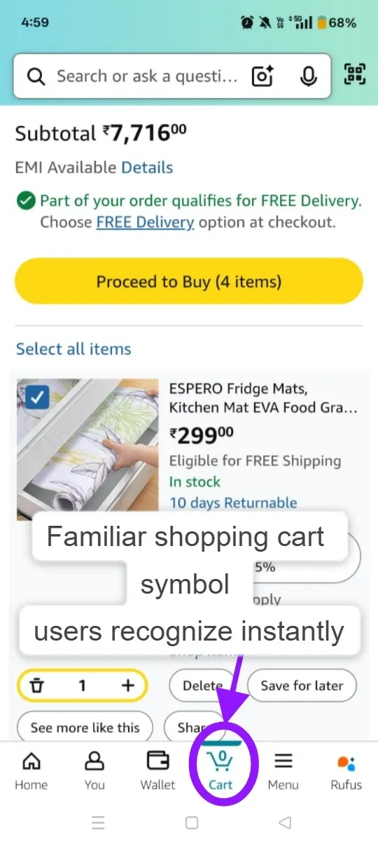
Users expect it to hold items and provide a checkout path because this behavior is consistent across most online stores. When a site follows this mental model, shopping feels seamless.
👉 Here are some of our UI/UX design resources:
- UX Design for AI Products
- Enterprise UX Principles With Examples
- 11 Startup UX Design Principles
- B2B UX Design Examples
Here is a 10-step UX design process
1. Align Business Goals, Brand Attributes, and Stakeholders
Clarify business objectives, brand qualities, and stakeholder roles before starting design.
Why this is important:
Early strategic alignment prevents miscommunication, repeated revisions, and unclear decision-making. It establishes a clear foundation that ensures all design choices support business goals and brand voice.
What this step involves:
At the start of a UX project, the team conducts a workshop or kickoff meeting to extract success metrics, define the brand persona, and identify core decision-makers (general manager, marketer, tech lead, etc.).
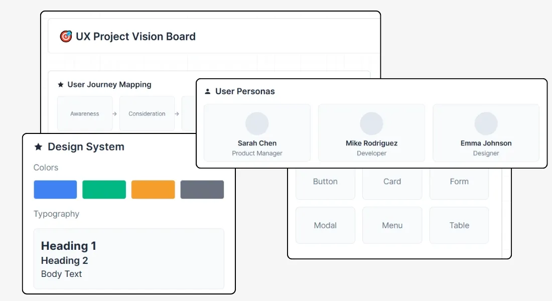
In fact, the team uses frameworks like CORE (culture, customer, voice, benefit, value) to map out brand attributes and ensure everyone agrees on user priorities and what success looks like.
How to do it effectively:
- Conduct stakeholder interviews and structured workshops to identify key priorities, expectations, and project constraints.
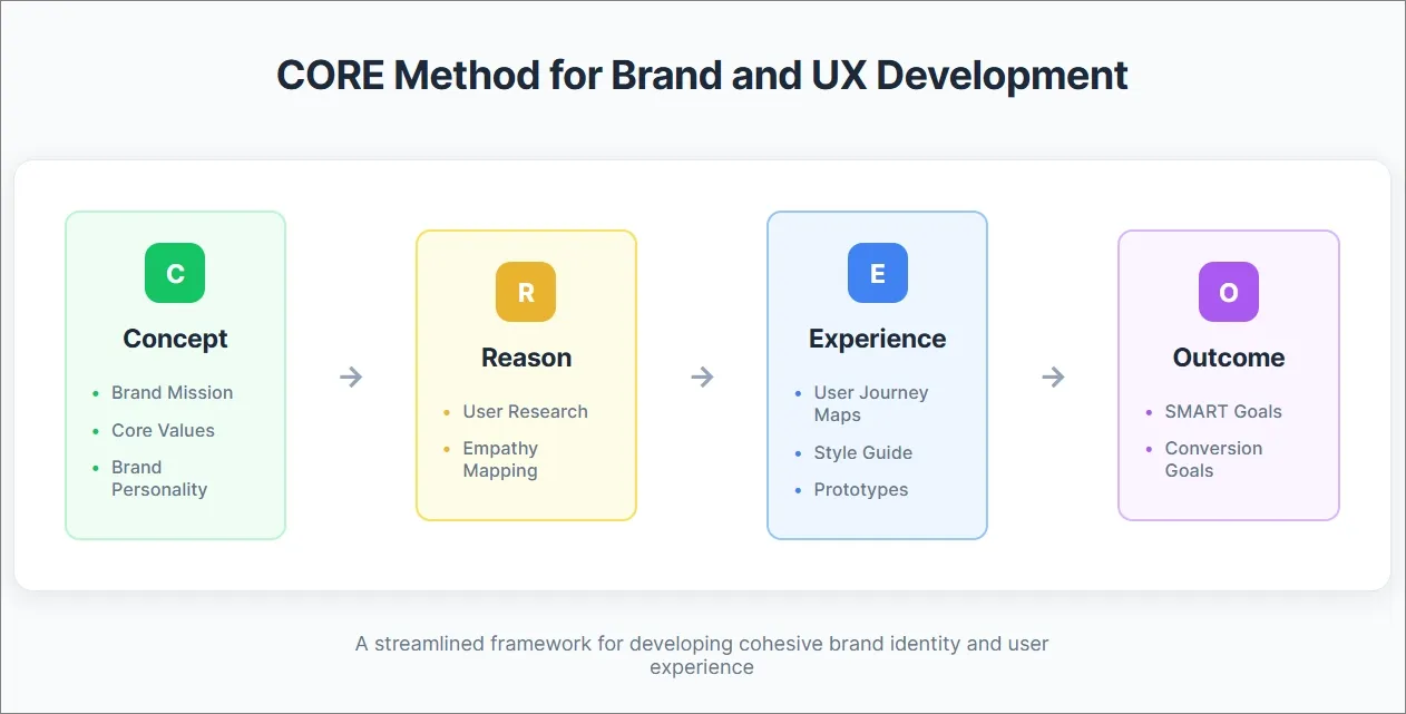
- Apply the CORE method to build a shared understanding of brand tone and customer needs. Document these clearly in a brand and UX blueprint.
Here is a visual representation of the CORE method, a practical framework for mapping brand attributes, voice, user priorities, and success goals at the start of the UX process.
- Assign clear decision-making authority and roles early - define who approves wireframes, content, and major design changes.
- Develop and circulate a single source of truth (e.g., strategy doc or Notion board) summarizing goals, KPIs, role assignments, and approval flows to avoid future confusion.
- Common mistakes to avoid: skipping this step leads to never-ending feedback cycles, disputes over design directions, and misaligned UX outcomes. Always align on goals before starting wireframes, even if timeline pressures exist.
This alignment phase accelerates design decisions, reduces revision cycles, and lays the groundwork for consistent, targeted UX that truly reflects the brand’s purpose and business needs.
2. Create User Profiles and Define Behavioral Intent
Build user personas focused on behavior, motivations, and goals, not just age or demographics.
Why this is important:
Deep behavioral profiling ensures the UX features and flows are designed for real user challenges and aspirations. It moves the team beyond surface-level assumptions and supports highly relevant, targeted product experiences.
What this step involves:
The project team conducts interviews, analyzes usage data, and reviews user feedback to capture authentic needs, emotional drivers, and decision-making hurdles. Each persona documents practical goals, pain points, and the context in which users engage the product. These insights guide how the product personalizes experiences, smooth navigation, and strikes the right emotional tone.
How to do it effectively:
- Interview real users and review analytics to uncover motivations, frustrations, and desired outcomes (not just who they are, but why they act).
- Develop detailed personas: for example, a “returning executive user” who values speed and concierge-level support, or a “tech-savvy family traveler” focused on easy sharing and joint planning.
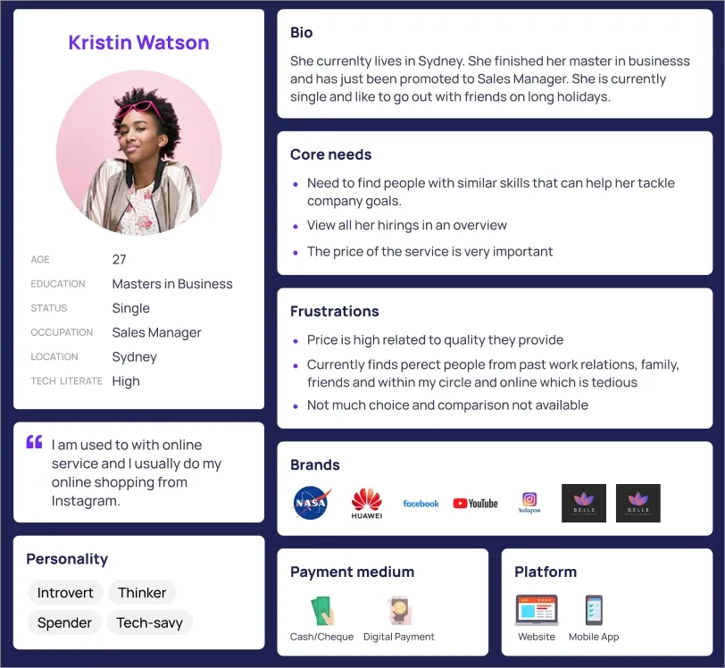
Here is a user persona paired with an empathy map that captures what users say, think, do, and feel - providing a clear understanding of their motivations and challenges.
As a starting point, you can use this free Figma user persona template:
- Map user goals to specific features (like personalized dashboards or collaborative trip planners), showing how behavior translates into UX requirements.
- Involve stakeholders from marketing, support, and product teams to validate assumptions and enrich the personas with fresh perspectives.
- Avoid generic personas; instead, document behavioral intent and core obstacles (“wants hassle-free checkout after a long flight” or “needs guided recommendations as a first-time user”).
Effective behavioral profiles empower teams to prioritize features and design choices that genuinely address users’ real-world contexts and emotional needs, leading to more successful and engaging products.
3. Conduct Competitive Audit and Content Inventory
Review competitor products and analyze your current content to identify strengths, gaps, and improvement areas.
Why this is important:
Competitive UX auditing and content inventory prevent “design in a vacuum” by grounding your UX in actual market realities and existing resources. It helps teams prioritize updates, avoid redundancy, and learn from others’ successes and failures.
What this step involves:
Teams systematically assess navigation, conversion flows, content hierarchy, and visual approaches used by direct and adjacent competitors. Simultaneously, they audit the current site/app for outdated content, duplications, dense sections, and any structural inconsistencies. The process clarifies where the product stands, which pages or flows need overhaul, and what’s still valuable.
How to do it effectively:
- Research direct and nearby competitors, capturing screenshots and key flow diagrams. Note user journeys, booking flows, and conversion mechanisms.
- List all existing pages, content modules, and assets; flag those that are outdated, underperforming, or poorly organized.
- Benchmark navigational structure, page hierarchy, and CTAs from competitors to identify best practices and market norms.
- Involve designers, content strategists, and product owners in identifying what to keep, merge, remove, or rebuild.
- Avoid the trap of copying competitors blindly; use audit findings to inform, never dictate, your own UX strategy. Prioritize context-specific improvements over generic features.
A thorough competitive and content audit ensures the new UX is both user-centric and firmly rooted in the business’s context and competitive landscape.
4. Run Mental Modeling and Task-Gap-Opportunity Mapping
Collaboratively map out user tasks, problem areas, and potential improvements with the team.
Why this is important:
This process uncovers hidden user needs and feature priorities by directly visualizing real journeys, frustrations, and opportunities. It drives deeper alignment across stakeholders and clarifies what to fix or build next.
What this step involves:
Facilitators run interactive workshops using sticky notes and whiteboards (physical or digital) to capture what users do, where they struggle, and where new solutions might help. Notes are grouped into themes with affinity mapping, highlighting common pain points and revealing valuable opportunities for UX innovation.
How to do it effectively:
- Invite a cross-functional group (designers, engineers, content, marketing, leadership) to the mapping session for a broad perspective.
- Use user journey walkthroughs: document each action the user takes, then highlight pain points and missing elements at each step.
- Encourage everyone to write tasks, gaps, and opportunities on separate sticky notes, arranging them visually along the user journey.
- Apply affinity mapping to cluster themes and identify shared user challenges; prioritize critical gaps and standout opportunities.
- Avoid letting the session become too abstract; focus the discussion on specific user roles, actual data, and actionable outcomes. Capture session findings in a clear summary for project reference.
Applying mental modeling and task-gap-opportunity mapping at this stage helps surface critical insights, align the team, and set precise priorities for the next steps in the UX process.
5. Plan Content and Asset Production Early
Map out required content and assets for every page or section right from the wireframing stage.
Why this is important:
Proactive planning helps avoid last-minute chaos, project delays, and incomplete user experiences. It keeps design and development moving by ensuring content and assets are ready when needed, reducing bottlenecks and costly revisions.
What this step involves:
The team inventories all types of content (text, images, video, forms, icons) and assigns ownership and deadlines before wireframes are finalized. Missing assets are flagged early so placeholders and specs can guide future production, keeping stakeholders aligned and the project on schedule.
How to do it effectively:
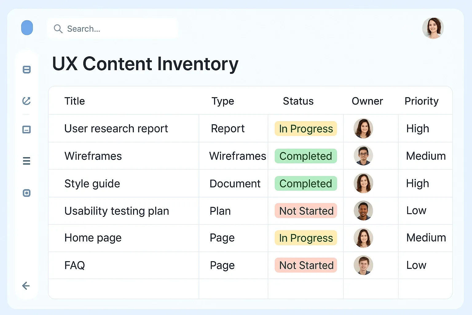
- Create a content inventory for each page, listing every asset and required format upfront.
Here is a UX content inventory that tracks the type, status, owner, and priority of every essential asset - ensuring nothing falls through the cracks during design and development.
- Assign clear ownership for each element- identify who’s responsible for text, imagery, videos, and forms (content writers, designers, client team, etc.).
Here is a collaborative digital whiteboard showing wireframe planning with placeholders and specification notes, enabling teams to identify missing assets and key content needs early.
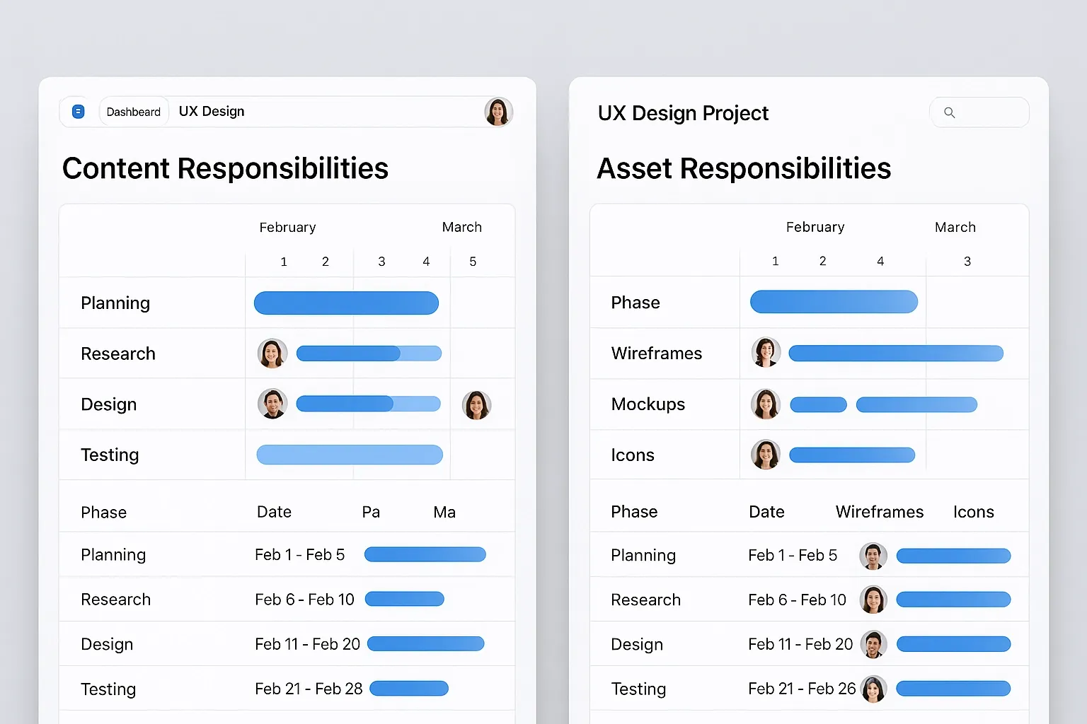
- Set deadlines for producing content and assets, and track them in the project timeline.
Here is a project timeline that visualizes each phase of the UX journey - mapping tasks, deadlines, and team responsibilities to keep production on schedule.
- Use temporary placeholders and clearly define specifications if any assets are missing, to avoid blocking design progress.
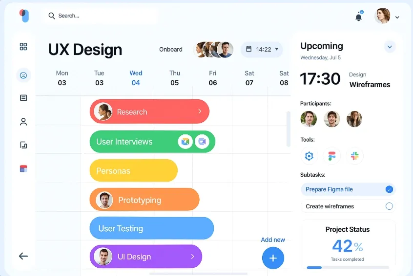
Here is a dashboard for content and asset responsibilities, clearly assigning roles and deadlines to team members, which makes collaboration easy and prevents bottlenecks.
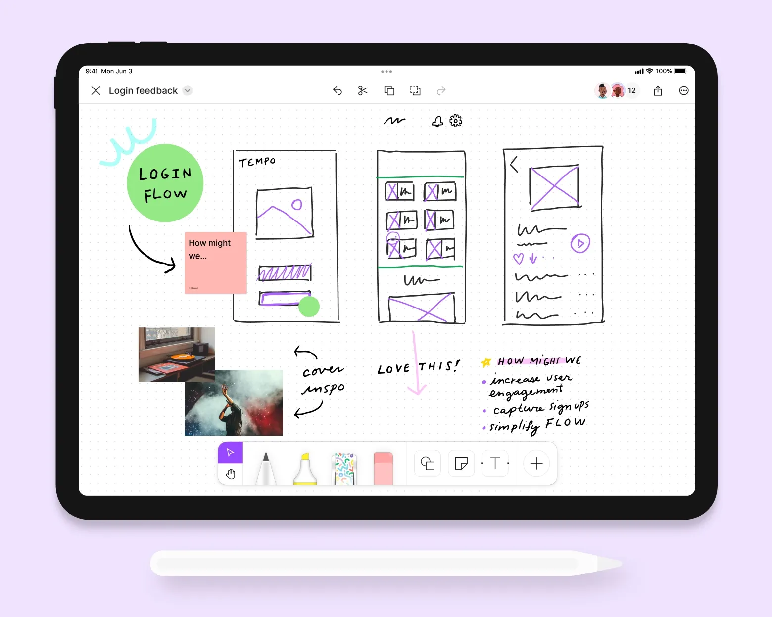
- Continuously review and update the asset checklist during design and development to make sure nothing gets overlooked.
- Avoid assuming “content will be ready later”- always verify readiness before finalizing layouts or moving to development.
By proactively planning content and asset production, teams avoid last-minute surprises, smooth collaboration, and ensure a coherent, high-quality user experience at launch.
6. Write User Stories and Define Use Cases
Convert user profiles and tasks into clear, actionable user stories that tie directly to design features.
Why this is important:
Clear user stories and use cases ensure every feature and piece of content serves a genuine user need. They help teams prioritize development, clarify goals, and avoid building unnecessary or confusing functionality.
What this step involves:
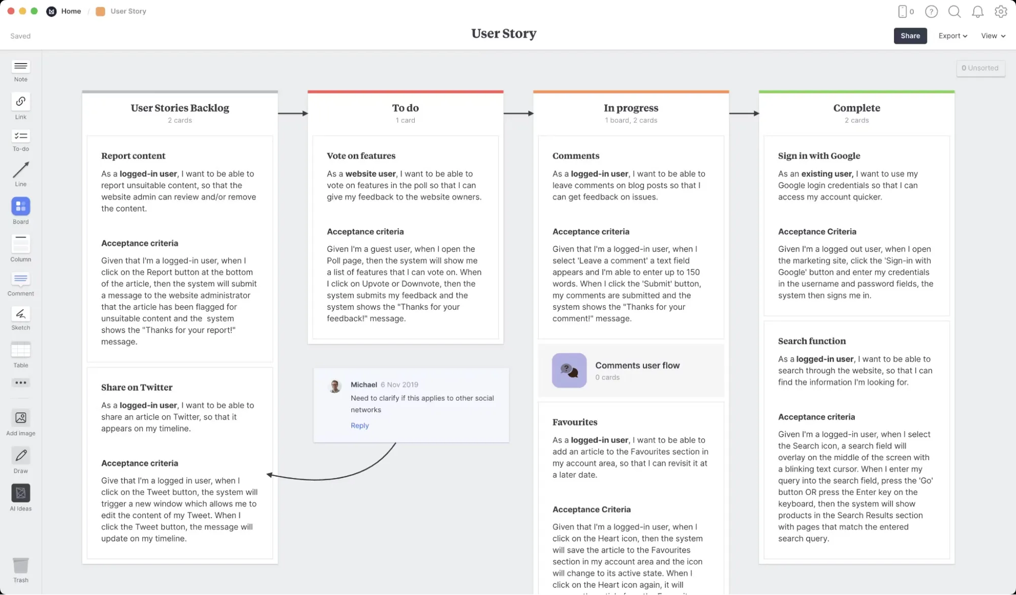
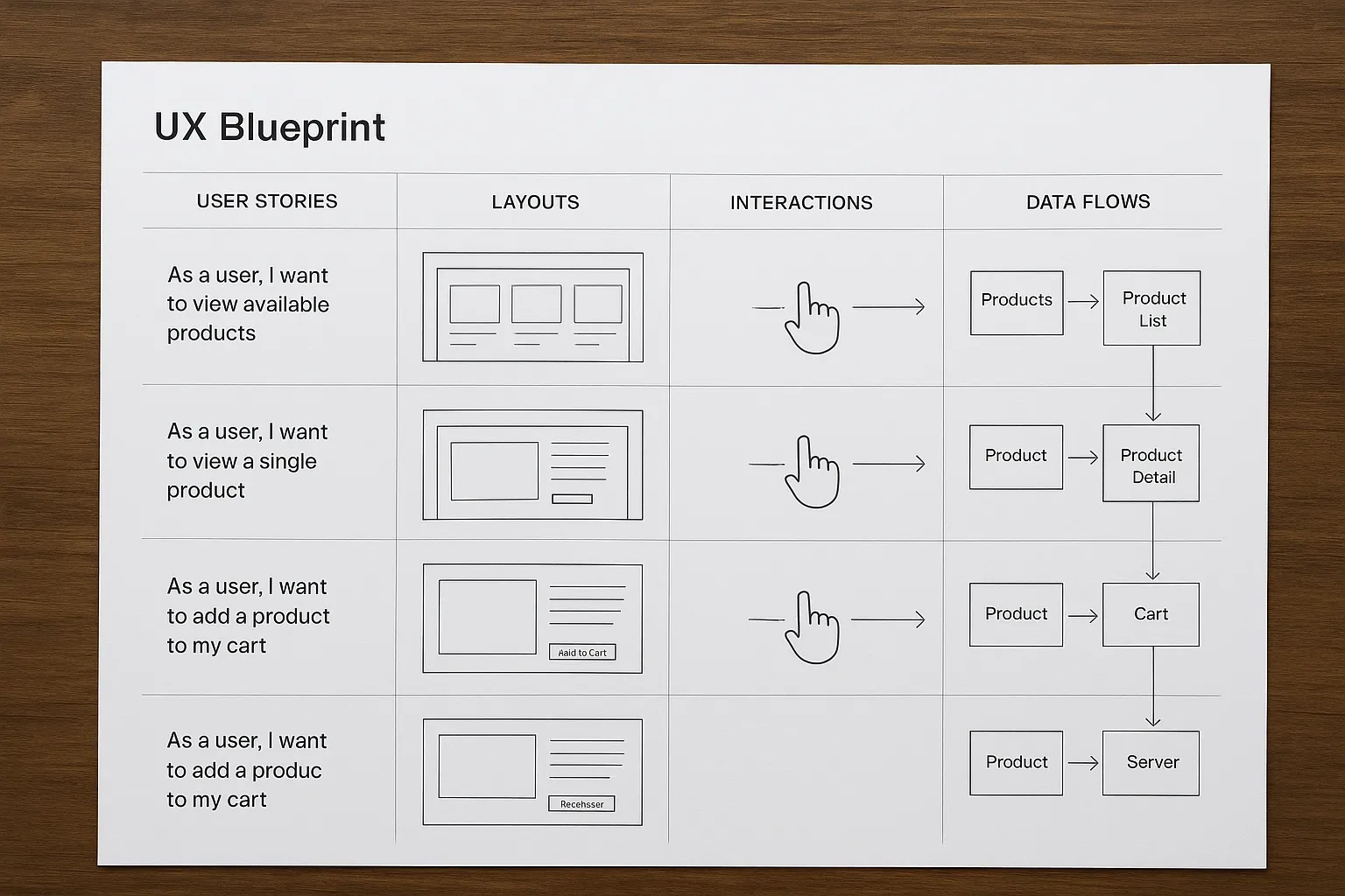
The team documents user stories using the format: “As a [user type], I want to [action], so I can [goal].” Use cases are mapped directly to layouts, interactions, and data flows, creating a practical blueprint for design and development.
Here is a visual user story board showing backlog, to-do, in-progress, and completed user stories with detailed acceptance criteria, enabling clearer prioritization and development planning.
How to do it effectively:
- Gather user profiles and task insights, then brainstorm user stories with the whole team to encourage multiple perspectives.
- Write stories that are specific and realistic (e.g., “As a returning customer, I want to view trip history so I can rebook easily.”).
- Link each story to features, content needs, and interface elements- show the direct connection between user goal and design solution.
Here is a UX blueprint visually mapping user stories to layouts, key interactions, and data flows - ensuring design solutions directly support documented user needs.
- Regularly review and refine use cases to keep them aligned with updated business priorities and user research.
- Avoid vague or generic stories; make every story actionable and relevant to a real interaction.
- Validate use cases with stakeholders and users when possible to ensure coverage and accuracy.
Strong user stories and well-defined use cases act as a blueprint for both design and development- ensuring the interface is focused, intuitive, and genuinely valuable to its audience.
7. Redesign Information Architecture and Navigation
Restructure site or app organization using user decision-making patterns to simplify choice and navigation.
Why this is important:
Smart information architecture (IA) reduces cognitive load, improves findability, and prevents users from feeling overwhelmed or lost. Well-organized navigation lets users flow smoothly to key content and actions.
What this step involves:
Teams analyze user flows and decision processes, then reorganize the sitemap and navigation so important sections like booking, packages, or help are prioritized. Fragmented pages are merged, low-value legacy content is removed, and hierarchy is optimized based on standard reading patterns.
How to do it effectively:
- Map critical user journeys and decision points before restructuring IA to ensure navigation supports real-world scenarios.
- Prioritize high-value actions and categories at the top or left of menus (following Western reading patterns and user expectations).
- Merge redundant or fragmented pages to reduce clutter and present a clearer path to key tasks.
- Rename menu items and sections with direct, descriptive labels so users instantly understand what they’ll find.
- Test the new IA with users and team members to catch confusing organization or missing content before implementation.
- Avoid overcomplicating navigation or using jargon - clarity and intuitive access are paramount.
A thoughtfully redesigned IA and navigation lay the groundwork for a frictionless user experience, helping users reach their goals faster and more confidently.
8. Sketch Low-Fidelity Wireframes with User-Goal Alignment
Draft basic layout sketches focused on meeting intersecting user and business goals -before refining visuals.
Why this is important:
Sketching low-fidelity wireframes enables teams to quickly validate structure, flow, and priorities without getting distracted by colors, fonts, or fine details. It drives clear discussion around layout logic, ensuring user and business needs are addressed before deep design work begins.
What this step involves:
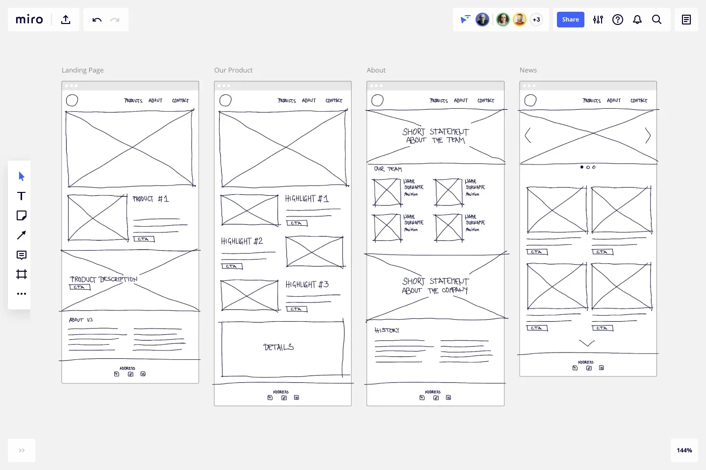
Designers use pen-and-paper or simple digital tools to lay out core elements (hero section, value proposition, call-to-action, forms, testimonials) as rough blocks- mapping user journeys, business objectives, and content placement. The aim is to collaboratively review layout ideas and refine them efficiently.
Here is a set of low-fidelity wireframes created in Miro, illustrating the early stage layout and user flow mapping before adding visual polish.
How to do it effectively:
- Gather input on user goals and critical business actions before sketching - align every block with a real purpose.
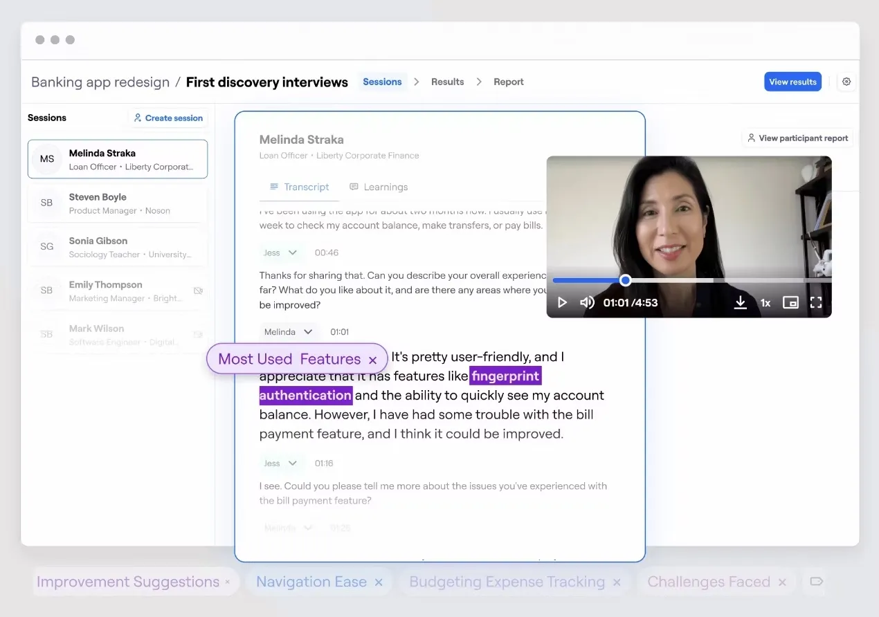
Here is a glimpse into user interview analysis that informs wireframe priorities, ensuring every design decision is driven by real user motivations and needs.
- Use hand-drawn sketches or basic shape tools (like Whimsical or Miro) to keep work fast and flexible.
- Focus on core page structure: placement of content modules, navigation, key interactions, and conversion points.
- Review sketches with team members from design, product, and content, adjusting to feedback on sequence and focus.
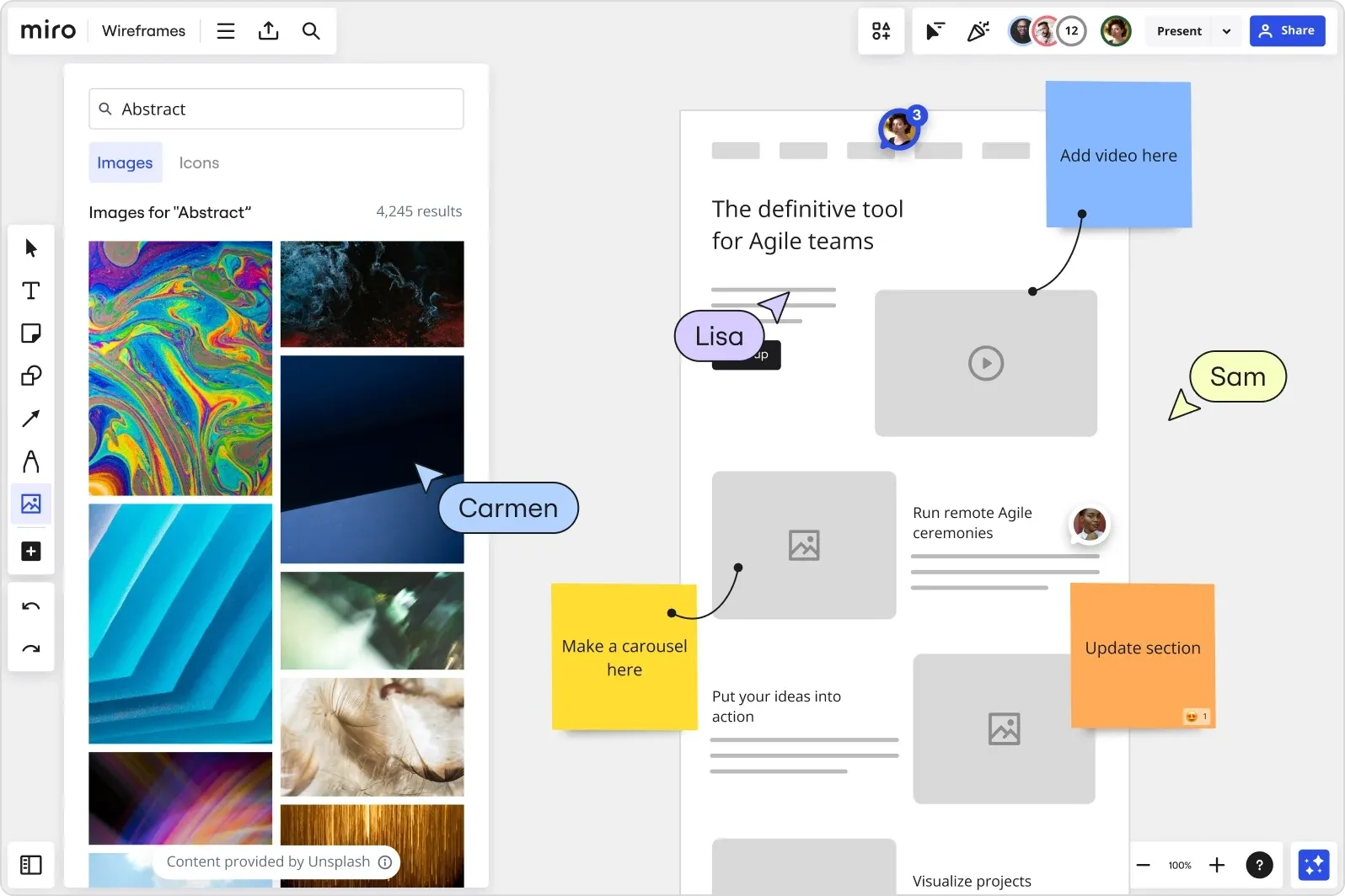
Here is how teams collaborate on wireframes using digital tools, like Miro, with real-time comments and sticky notes to refine user-focused layouts quickly and efficiently.
- When creating wireframes, avoid polishing visual details or adding placeholder text too early. The focus should remain on the abstract layout until the overall structure is validated.
- Work in quick iterations because the main advantage of wireframing is speed. Test and explore multiple arrangements before deciding on the final layout.
Low-fidelity wireframes are a powerful way to align the team, prioritize user and business needs, and lay a solid foundation for effective digital experiences.
9. Design Digital Wireframes and Plan Content Placement
Translate sketches into digital wireframes and map real content and assets to layout areas.
Why this is important:
Digital wireframes bring clarity to structure and content flow. They allow design teams and stakeholders to visualize actual content in context, support responsive planning, and set up a strong foundation for final UI design and development.
What this step involves:
Designers create wireframes using tools like Figma or Adobe XD, laying out page elements (videos, forms, copy blocks) with fidelity to planned features and user goals. Content modules and asset placements reflect real needs (not dummy text or random visuals), so that every part of the layout is purposeful.
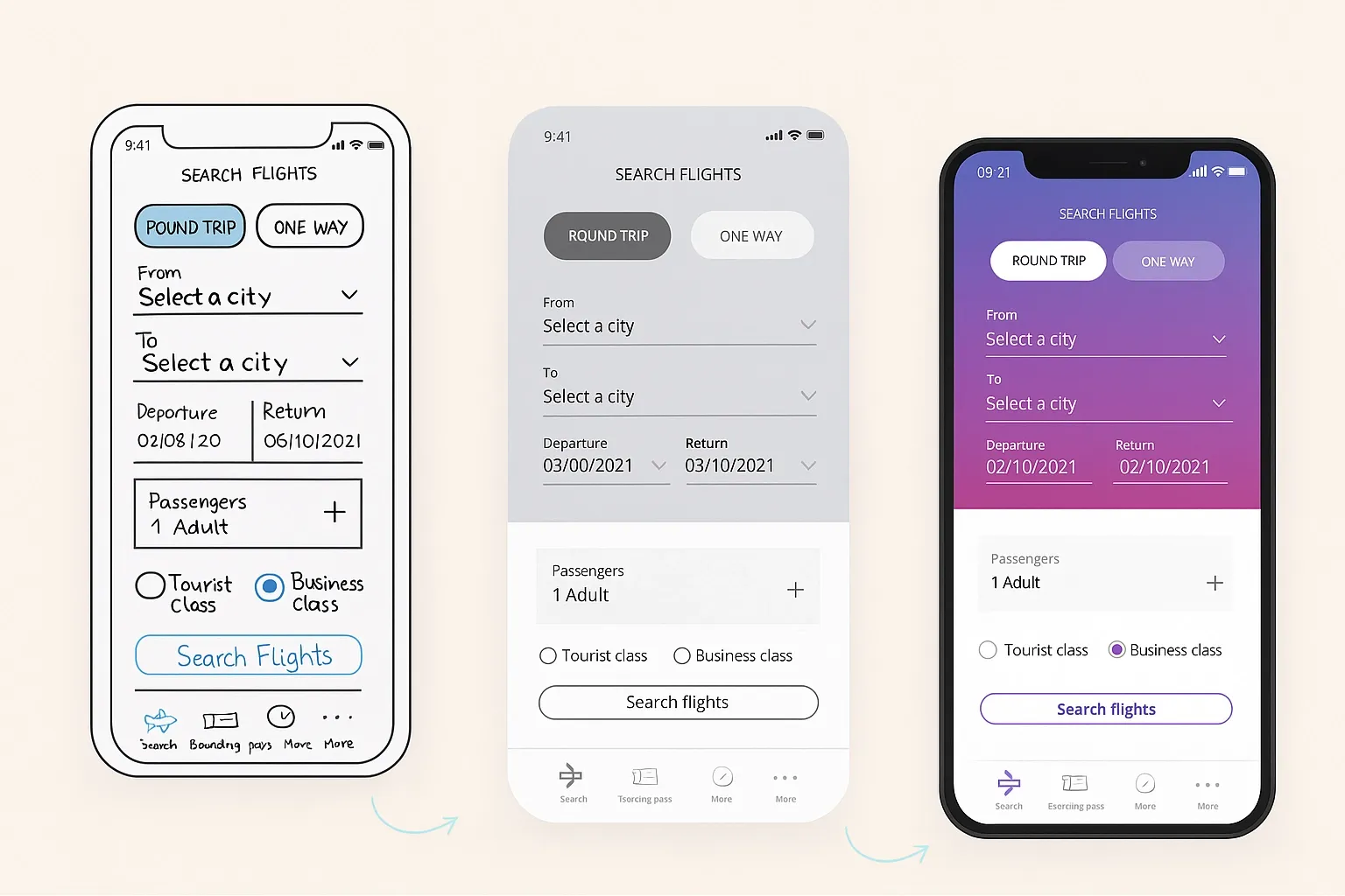
Progression from initial sketch to digital wireframe to polished UI illustrates how user goals and business requirements are mapped visually throughout the design process.
Below is an example of the design process from wireframe to polished UI:
How to do it effectively:
- Import layout logic from sketches, and assign actual content and asset placeholders to each wireframe block.
- Use professional wireframing tools to create easily editable, sharable, and responsive designs.
- Map each wireframe element to a specific user goal or business requirement, and avoid filler content (“Lorem Ipsum”) whenever possible.
- Review placements and hierarchy for clarity and logical progression, ensuring user and business priorities are visually respected.
- Collaborate across UX, content, and development teams to validate asset requirements and keep everyone aligned on what’s needed next.
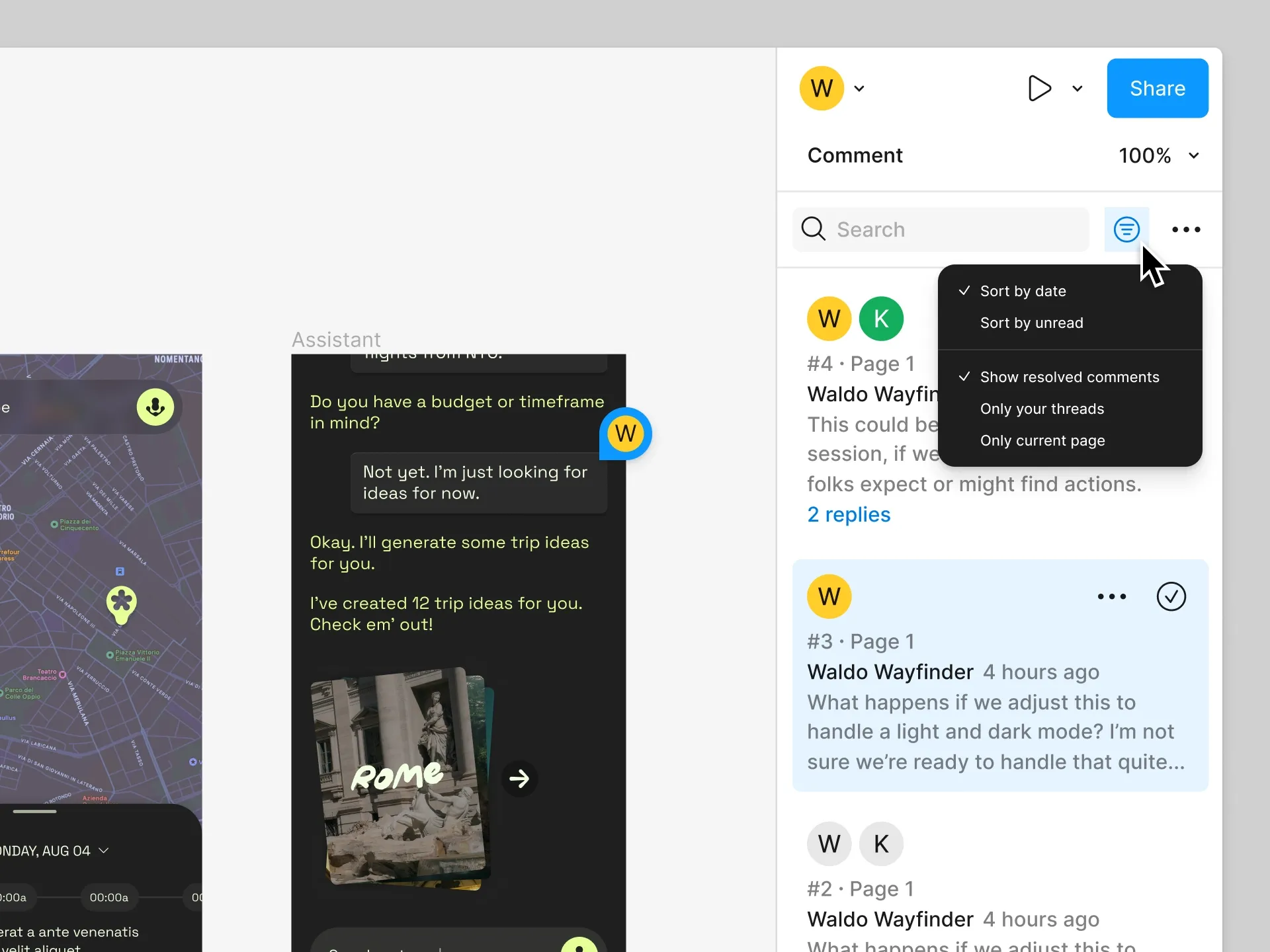
Here is another visual showing that design tools offer threaded discussions, sorting options, and resolved comment tracking to keep wireframe feedback organized and actionable throughout the collaborative design process.
- Avoid overcomplicating wireframes with excessive color or detail; focus on structure, mechanics, and placement.
Digital wireframes bridge the gap between rapid sketching and polished UI design, ensuring every page and screen is planned with actual content, layout logic, and stakeholder alignment.
10. Test, Refine, and Deliver Developer-Ready Outputs
Validate wireframes with user testing, revise based on feedback, and prepare precise deliverables for developers.
Why this is important:
Rigorous testing and refinement catch usability issues before development begins, saving time and money on rework. Clear, organized deliverables enable developers to accurately build what was designed, ensuring fidelity between design intent and final product.
What this step involves:
Teams run structured usability tests (in-person or remote) using wireframes or clickable prototypes.
Here is an image showing a Usability test heatmap that reveals user interaction patterns, highlighting navigation hotspots and friction points for refinement.
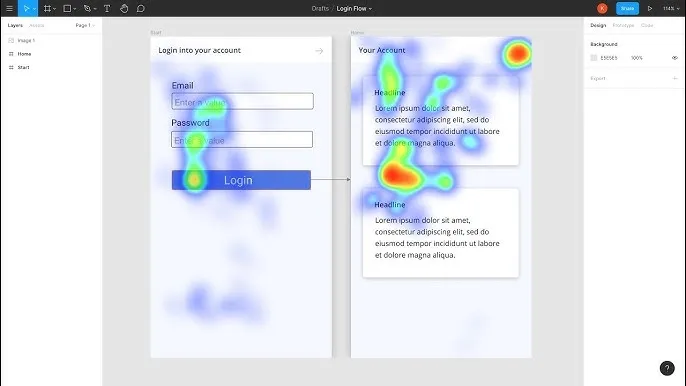
Findings inform layout and navigation tweaks, which are incorporated before final handoff. Designers document specs, layout rules, content blocks, and asset exports, ensuring everything developers need is ready and accurate for implementation.
How to do it effectively:
- Conduct real user testing sessions to gather honest feedback on navigation, interactions, and content clarity.
- Record pain points, misinterpretations, or task failures, then iterate on wireframes to resolve these issues.
- Clearly prepare and organize handoff materials, such as spec documents, responsive breakpoints, content modules, and exported assets, for easy access and use.
- Include annotated user flows and any required email or post-launch journeys developers need to support.
- Involve developers in early reviews so technical feasibility and edge cases are flagged before build starts.
- Avoid loose or incomplete handoffs; always double-check deliverables against project requirements to minimize confusion or errors.
Effective testing, refinement, and handoff safeguard the quality and functionality of the final product, ensuring the user experience envisioned by designers is delivered in the live environment.
💡 Let us help you find some of the best UI/UX design companies by country:
- UI/UX Agencies in London
- UI UX Design Companies in Dubai You Can Trust
- Top UI/UX Design Companies in the UK To Scale
- Best UI UX Design Agencies in Sharjah
How Tenet helped Pazazz with UX design and e-commerce development
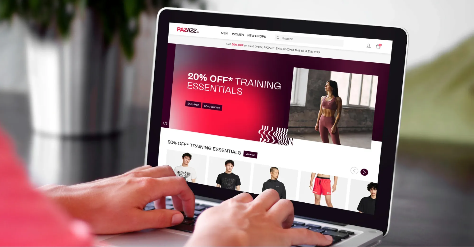
Pazazz was ready to grow its athleisure brand in APAC but needed a clear digital experience that reflected its values and boosted sales. When we collaborated with Pazazz, their goal was to build a user-friendly ecommerce platform that connects with customers and supports their active lifestyle.
Here’s how we helped:
- Conducted brand workshops to define key attributes like confidence and motivation
- Designed a cohesive visual identity, including logo and packaging
- Developed a conversion-focused e-commerce website built around real user shopping behaviors
- Implemented AI-driven product recommendations to personalize shopping
- Set up detailed analytics for ongoing user insights and optimization
The outcome?
- Increased user engagement
- Easier product discovery and smoother checkout
- Improved sales and stronger brand presence in a competitive market
Below is the redesigned Pazazz ecommerce platform showcasing a clean, user-friendly interface that enhances product discovery and supports better sales performance.
👉 Explore our UI UX design services for different industries:
- Ecommerce UI UX design services
- Healthcare UI/UX design services
- Fintech UX design services
- SaaS UI/UX design and development services
- EdTech UI/UX design services
Final words
The success of any digital product hinges on how good its UX is, and a GOOD UX doesn’t happen by chance. It comes from a repeatable process that ties strategic goals to user behavior and practical design steps.
Effective UX includes clear communication among teams, grounded user insights, and thoughtful prioritization of features. When this framework is followed, projects stay on track, deliver relevant solutions, and create lasting value for both users and organizations.
Increase Your Conversions with Better UX
Increase Your Conversions with Better UX

Got an idea on your mind?
We’d love to hear about your brand, your visions, current challenges, even if you’re not sure what your next step is.
Let’s talk


