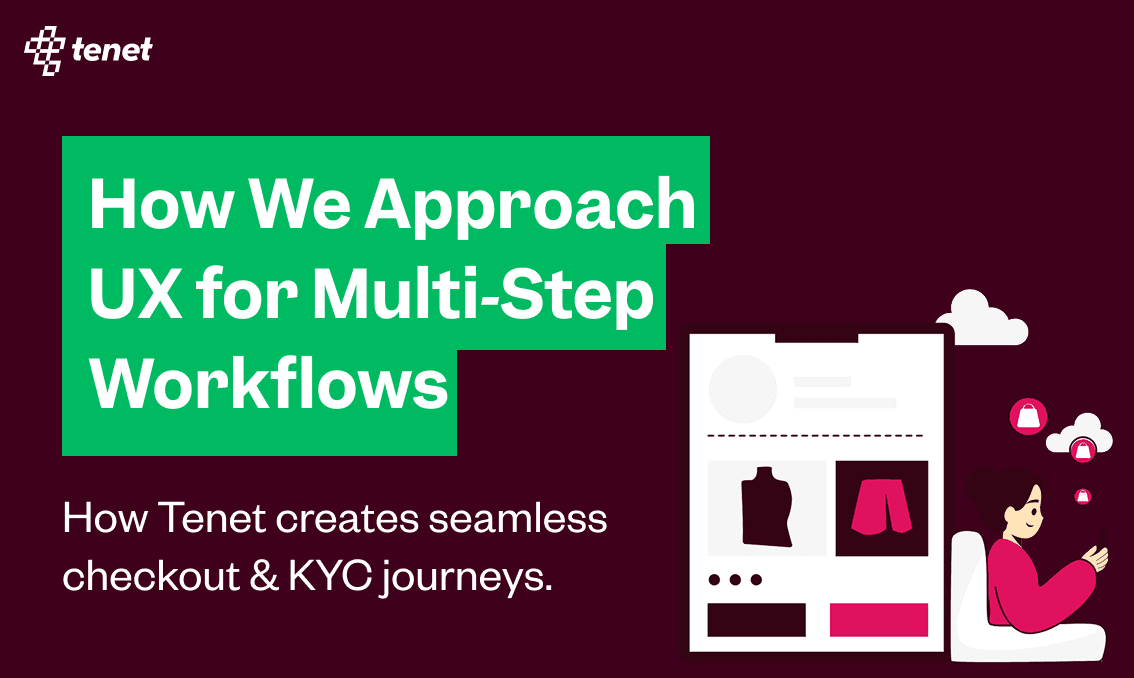
How We Approach UX for Multi-Step Workflows Like Checkout
Share
Share
Get a quick blog summary with


Most design teams think that multi-step workflows fail because they are long. But the truth is that it depends on how the human brain processes effort, trust, and progress at each stage.
A checkout flow or a KYC form is actually a journey where users are constantly deciding whether to continue or drop off. At Tenet, we have always treated these workflows as a chance to build confidence and momentum but not as a barrier.
From our years of expertise designing digital experiences, we have built some of the most effective checkout and KYC journeys that have unlocked billions of dollars in revenue for our global clients across 15+ industries.
In this article we will show you how we handle UX for complex, multi-step workflows and what makes them work in the real world. So, let us start by understanding what it is exactly.
The Real Battle Is Cognitive & Emotional, Not Technical
Let us break a common myth in UX design. Many design teams assume that the number of fields in a form is what causes users to abandon. But the main challenge is not the length of the form or even the fields but it is actually how the brain experiences sudden jumps in effort. When it drips in over time, people can handle complexity.. What breaks their flow is the abrupt shift in cognitive load.
Let’s consider an example to get a better idea. Picture Sarah who is 32 and she is trying to buy a birthday gift online at 2pm on a Tuesday while her boss is breathing down her neck about a deadline.
She sees an item she likes, clicks on “Buy Now,” and Step 1 requests her email. Easy for her as she types it in 3 seconds flat. Her brain processes this as one simple task, done.
Step 2 suddenly shows her a form with 8 different fields like Street Address, Apartment, City, State, ZIP, Country, Address Line 2, and an extra checkbox. Her working memory which was comfortably handling one piece of information suddenly gets slammed with eight different decisions. She stared at the form and after a distraction and confusion abandoned the checkout.
The real insight is that it was not about eight fields being “too many.” It was about the jump from one field to eight fields that broke her mental model. If Step 1 had three fields, Step 2 could have five without a problem. It is about pacing the increase, not reducing everything.
How Airbnb Used This Insight?
Airbnb solved this with simple yet effective steps in their property booking form as shared below:
- Step 1: “Where are you going?” (1 field).
- Step 2: “What dates?” (2 fields).
- Step 3: “How many guests?” (1 field).
- Step 4: “Your details” (3 fields).
Same total information but each step increased the load smoothly. Instead of sudden jumps, the user felt steady progress.
Trust Has a Valley, Not a Line
In complex flows like KYC or payments, trust is not built in a straight line. It rises and falls at specific points, and if we do not design for those moments, users drop off. There is usually a stage in the middle where the stakes suddenly feel higher, and people hesitate. To make this clear, let us look at Jake’s example.
Jake, 28, is applying for a business credit card online. Step 1 asks for his name and email. Easy. It feels casual, like browsing. Step 2 asks for company details such as name and revenue.
Still fine, because it makes sense for a business card. But Step 3 suddenly asks for his Social Security Number, annual income, and employment details. This is where everything changes. Jake’s brain shifts from “just exploring” to “this is serious.” He worries about rejection, about damaging his credit score, and starts to doubt if he should continue. His palms get sweaty, and he minimizes the browser.
But here’s what happens if Jake pushes through to Step 4: his brain switches again. Kahneman’s research shows that once people have invested effort, losses feel twice as powerful as gains. Jake thinks, “I already filled out all this stuff. I’d be stupid to quit now.” At this stage, he is more committed because of the effort already spent.
How We At Tenet Would Deal With This?
Right before that critical Step 3, we would add a confidence bridge. For example, a message saying: “You’re doing great! Just 2 quick steps left, then you’ll have instant approval.”
This reassurance changes Jake’s emotional state at the exact moment his trust dips. By recognizing the valley and lifting him over it, we reduce panic and encourage him to keep going.
Users Don’t Think in Linear Steps, They Think in Clusters
When we design workflows, we often imagine them as neat, linear steps: Step 1, Step 2, Step 3, and so on. But users do not think that way. They mentally group related tasks into clusters. For example, “payment details” is not just a single field but it is a card number, billing address, and security code together. If a flow forces them to jump back and forth across steps, it breaks this mental grouping and creates frustration.
Take Emma’s example. She is buying concert tickets and reaches a step asking for her phone number. No explanation is given. In her mind, phone numbers belong to the “security or ticket delivery” cluster. Without context, she assumes it is about sales calls or spam texts. Suddenly the workflow feels like it is working against her rather than for her.
This is where the difference between good and bad design shows up.
- Bad approach: Asking for information without explaining its purpose. “Phone number” just looks like data collection.
- Good approach: Providing context that fits the cluster in the user’s mind. “Phone number (so we can text you your tickets and notify you if the show time changes).”
Suddenly, Emma feels the number is part of the ticket delivery experience, a cluster that makes sense to her.
Progress Is Psychological, Not Mathematical
We have designed over 100+ progress indicators for B2C checkouts, B2B onboarding flows, and international brands running compliance-heavy KYC journeys. One thing has become clear every time: progress is not about math, it is about psychology.
When a user sees “40% complete,” the brain interprets it as a calculation that I am not even halfway through, this is going to take forever. But when the same flow shows “Step 2 of 4 complete” with visible checkmarks, the brain interprets it as an achievement, I have already finished two steps, I am halfway there. The motivation shifts from finishing a long process to celebrating small wins along the way.
This insight is critical because people continue tasks not just when they are fast, but when they feel rewarding. Each completed step provides a small dopamine hit that keeps users moving forward.
Recovery Builds More Trust Than Perfection
One of the biggest mistakes in UX design is assuming that users expect everything to work perfectly. In reality, what matters more is how the system helps them recover when things go wrong. People forgive errors if they feel supported, and in many cases, that support actually builds more trust than if the error had never happened.
A great example is Typeform’s auto-save. When you are filling out a long Typeform, a tiny “Saved” indicator appears in the corner every 30 seconds. Most people barely notice it consciously, but subconsciously it reassures them: “Good, I won’t lose my work if something goes wrong.” This is psychological insurance. Even if their browser crashes or their internet cuts out, users know the system has their back.
That small detail changes the emotional experience. Instead of feeling anxious about losing progress, users feel secure. And that sense of security keeps them engaged through to completion.
Continuity Is as Important as Speed
These days, users don’t always complete a long workflow in one sitting. Life gets in the way — meetings, travel, or simply needing more time to find the right information. So when they come back, the experience should not force them to start over. They should be able to pick up exactly where they left off, without stress or repetition.
Take Carlos’s example. He starts applying for a mortgage on his work computer during lunch. He finishes three steps, then has to get back to work. Later that evening, he wants to continue on his phone. In most systems, he would be forced to restart the entire process, which often leads to abandonment.
But Plaid’s solution sends him a secure magic link via email. When Carlos taps it, the form opens on his phone at the exact step where he stopped, with all his information saved. It feels effortless, and he thinks: “Wow, they actually care about making this easy for me.”
You can see the same principle in action with the UK visa application. The process is long and complex, but they capture your email upfront and autosave progress as you go. If you switch from a laptop to a tablet mid-process, you can use a secure link from your inbox to resume instantly. This design respects the reality that big tasks rarely happen in one go.
Continuity reassures users that the system is working with them, not against them. It is just as important as speed, because speed alone means nothing if users are forced to repeat steps every time they return.
Client Success Story: Turning a Broken Checkout Into a Competitive Advantage
Last year, one of our B2B SaaS clients approached us with a critical problem. Their product demos were converting well, but their checkout flow was losing millions. Despite strong interest, nearly 73% of users abandoned during signup. They knew the product was valuable, but the journey to get there was broken.
We partnered with them to redesign the entire experience, focusing not just on reducing friction but on aligning the flow with how users actually think and feel during multi-step journeys.
The Breaking Points We Discovered
Through user research and 45 recorded sessions our team identified three psychological breaking points:
- Cognitive Overload: Step 2 jumped from a single email field to a heavy form with company details, size, phone number, and multiple dropdowns. Users felt overwhelmed, often saying, “This feels like doing my taxes.”
- Trust Valley Panic: Credit card details were requested before users had even seen the product interface. This triggered doubt about commitment and cancellation.
- Value Disconnect: Phone numbers were required for “verification” without explanation which was making users suspect unwanted sales calls.
The Redesign That Changed Everything
Our solution was rooted in psychological progress architecture:
- Step 1: Micro-commitment – A simple work email field to get users started.
- Step 2: Identity Cluster – Only company name and size, keeping the cognitive load manageable.
- Step 3: Value-First Experience – Users set up a workspace, chose a template, and invited teammates before payment. This let them experience value early.
- Step 4: Trust Bridge – Phone number requested with context: “For account security only — never for marketing calls.”
- Step 5: Payment With Context – Clear messaging: “Your 14-day trial starts free. Cancel anytime. We’ll remind you before charges.”
We also enabled non-linear editing, cross-device continuation, and friendly error recovery to keep users moving confidently through the journey.
The Results
- Conversion rates increased from 27% to 47% in just three months.
- Mobile conversions jumped 89% thanks to cross-device flows.
- Support tickets about “confusing checkout” dropped by 82%.
- The client recovered $2.7M in annual revenue.
What Their Founder Said
"We thought our checkout was just a necessary formality. Tenet showed us it could be a strategic advantage. The new flow feels professional, transparent, and user-first. Customers now tell us our signup process is smoother than our competitors, and that sets the tone for everything that follows." – Founder & CEO, Leading B2B SaaS
Designing Workflows That Win Trust and Revenue
You now have a clear view of how multi-step workflows succeed or fail not because of the number of fields, but because of how the human brain handles trust, effort, and momentum. At Tenet, we are a global design and growth marketing agency, and our team has designed hundreds of checkouts, KYC flows, and complex forms for clients across 15+ industries. Each of these has been crafted to reduce abandonment and unlock real revenue impact.
For more such stories and case studies, you can explore our blog and client success pages. And if you are an organization looking to redesign your checkout, onboarding, or compliance workflows, we would love to help. Simply fill out our contact form, and our team will get back to you within 2 hours with the next steps.
Expertise Delivered Straight to Your Inbox
Expertise Delivered Straight to Your Inbox


Got an idea on your mind?
We’d love to hear about your brand, your visions, current challenges, even if you’re not sure what your next step is.
Let’s talk


