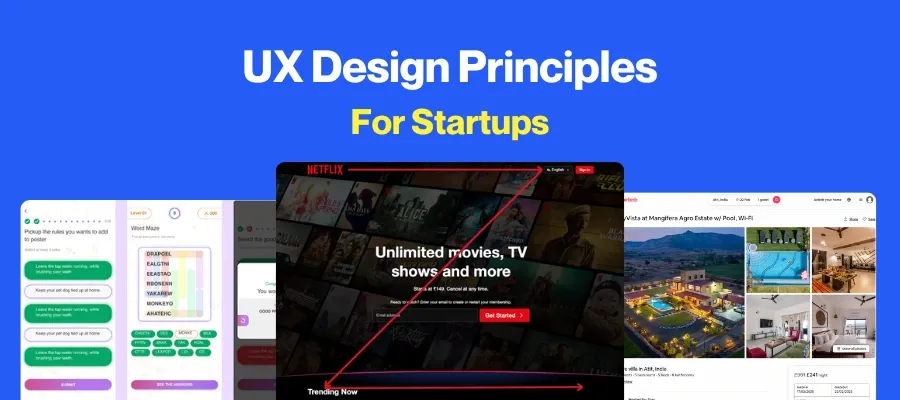
Digital Product Design Process: 8 Must-Have Steps
 By
By Share
Share
Get a quick blog summary with


At Tenet, we have helped businesses turn ideas into successful digital products, completing over 450 projects across different industries.
Our experience shows that great products do not happen by chance. They come from a clear design process. Without it, teams guess user needs, waste resources, and release products that are quickly forgotten.
So, we understand everything around designing and developing products for startups and enterprises.
In this guide, we shared our process of digital product design, backed by real projects and case studies. You will learn how to define a vision, design for users, test prototypes, and refine until launch.
What is digital product design?
Digital product design is the process of creating digital solutions that effectively and practically solve specific user problems. It involves designing products such as software applications, websites, and platforms that deliver value to users by addressing their needs and challenges.
This process is iterative, meaning designers continuously refine and improve the product based on user feedback and market demands.
For instance, look at Slack, a digital product designed specifically for team communication and collaboration. Its interface lets users organize conversations into channels, start direct messages, and easily find important information, whether they're on a computer or a phone.
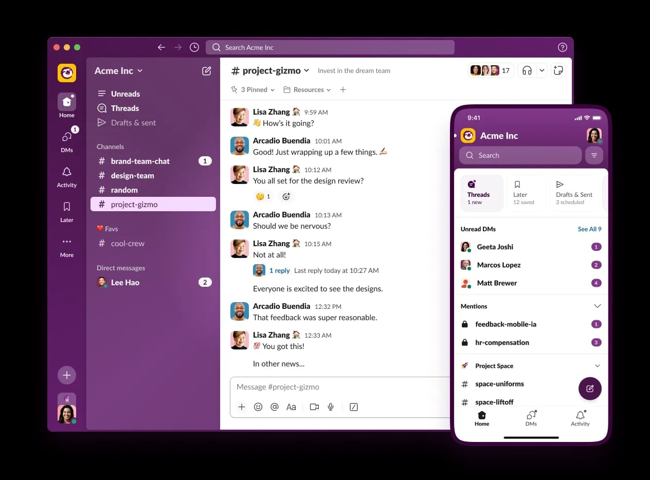
Every detail, from the sidebar navigation to the simple message layout, shows how thoughtful design helps users focus on their work without getting lost or distracted.
Slack’s approach to product design neatly combines user needs, a clean visual style, and ongoing improvements based on real feedback, making it a strong example of digital product design done well.
Digital product design combines three key elements:
- User Experience (UX): Focuses on understanding the users - their behaviors, needs, and pain points, and designing a smooth, intuitive journey that helps them accomplish their goals with ease.
Here is an image illustrating user experience research through a persona map created in a collaborative workspace.
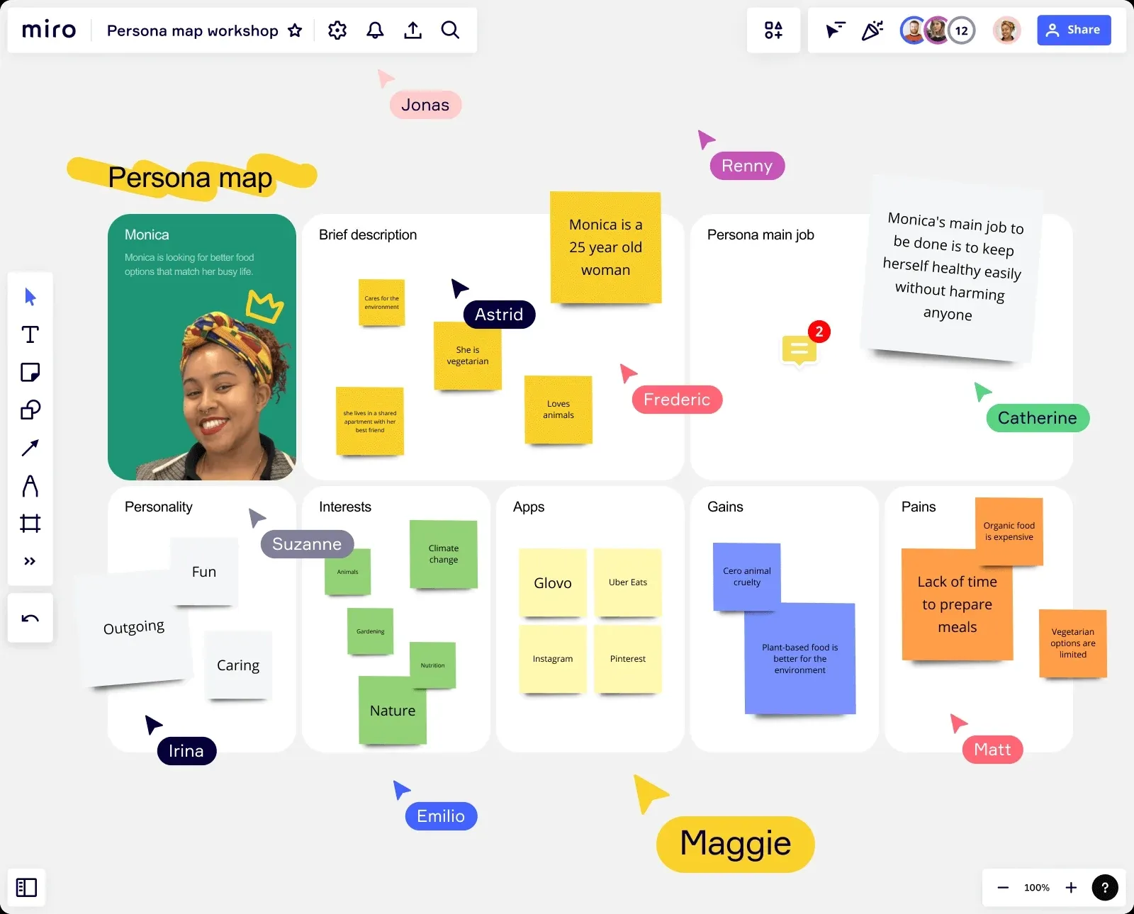
This map outlines a user’s profile in depth, highlighting personality traits, interests, motivations, and specific pain points.
By capturing these real user insights visually, teams can tailor their design approach to solve actual user problems and create meaningful, user-centered digital products. These detailed personas guide decisions at every stage of the product design process.
- User Interface (UI): Brings the design to life visually and interactively. UI deals with the look and feel of the product, including layout, colors, typography, and brand consistency, making sure the product is both attractive and easy to use.
Here is an image that illustrates user interface design:
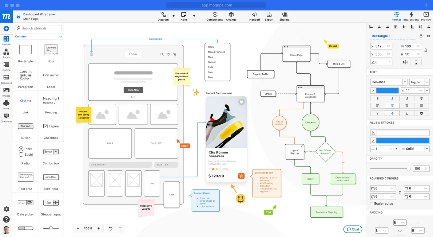
This visual represents the process of building wireframes and flowcharts for a dashboard, laying out navigation, category structure, and interactive elements.
It highlights how designers create simple, usable layouts and organize information to make products easy to use.
- Product Strategy: Ensures the design aligns with business goals. It involves planning the product’s vision, defining its unique value, setting success criteria, and integrating user needs with market demands and technical possibilities.
Here is an image representing the product strategy aspect of digital product design. This detailed app analytics dashboard provides insights into important metrics such as total installs, daily active users, session counts, and marketing spend.
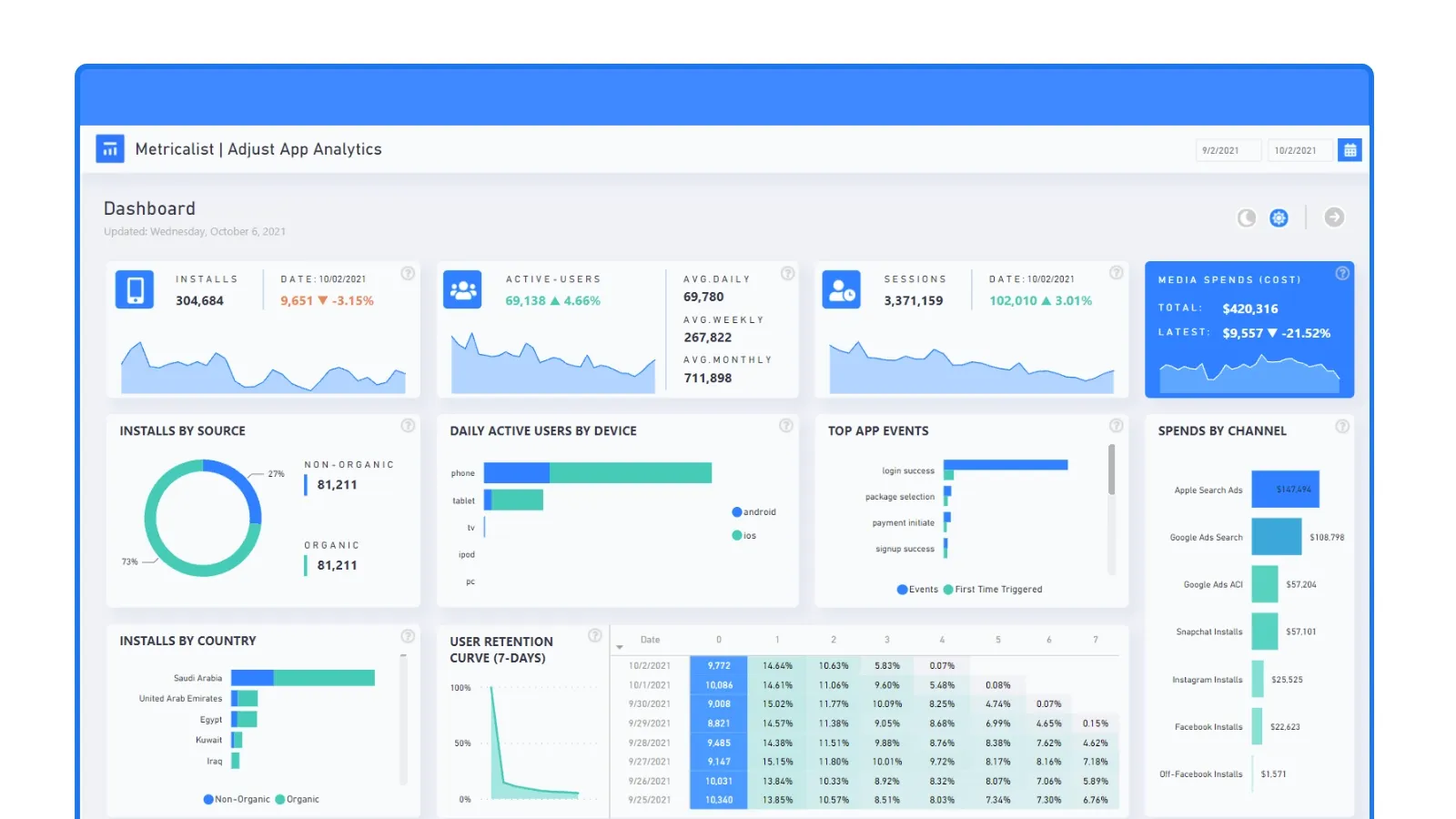
Visualizations like retention curves and event tracking allow design and product teams to monitor how the product performs in real life, identify trends, and make informed decisions to align the design process with business goals and user engagement.
👉 To learn more about designing easy-to-use interfaces, see our UI/UX Design Guides.
👉 Explore our digital product design services by country:
- Digital Product Design Agency in Dubai
- Digital Product Design Services in the UK
- Digital Product Design Services in India
- Digital Product Design Agency in New York
Digital product design process
1. Define the product vision and success metrics
Set a clear strategic foundation that explains why the product is being built, who it’s for, and how its success will be measured.
Why this is important:
Without a shared vision, teams can face scope creep, conflicting priorities, and wasted resources. Defining success metrics ensures everyone is working toward the same measurable outcomes, both for business goals and user value.
What this involves:
Ensure all stakeholders are aligned on the product’s purpose, target users, unique value proposition, and expected outcomes. Establish measurable targets such as user adoption rate, retention, or revenue. Make this vision accessible so it guides every design and development decision.
How to do it effectively:
- Host a workshop to ensure alignment of vision among product managers, designers, developers, and stakeholders.
Use a tool that can help identify and organize key stakeholders by their influence and importance, guiding teams on how to manage communication, expectations, and responsibilities throughout the project lifecycle.
- Document the vision in a product brief or vision board so that it remains visible throughout the project.
Here is an image showing a product vision canvas created in Miro.
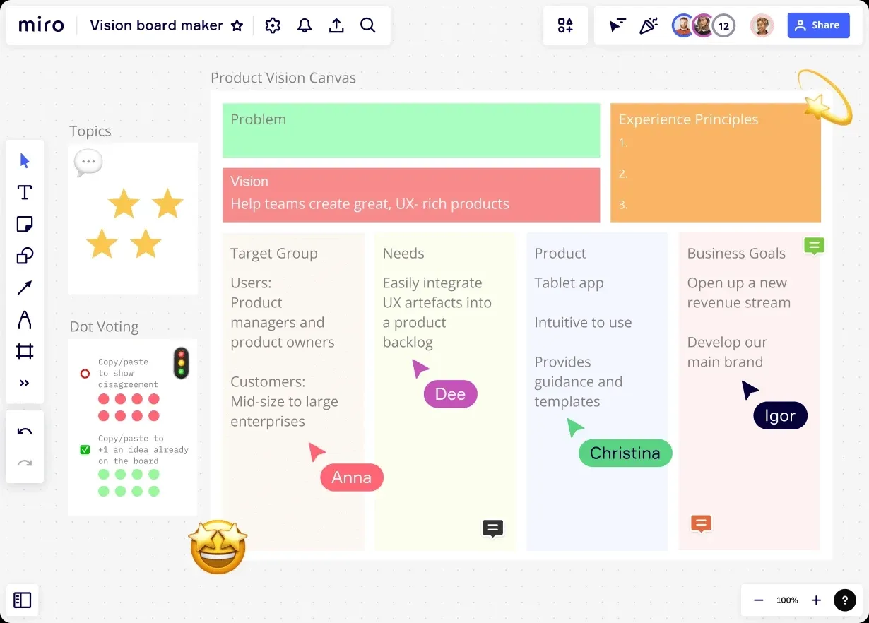
This visual brings together the core elements of a product’s strategic foundation - clear problem statement, vision, target audience, user needs, product scope, business goals, and experience principles, helping teams align priorities from the beginning.
- Use OKRs or KPIs that tie design impact to business and user goals.
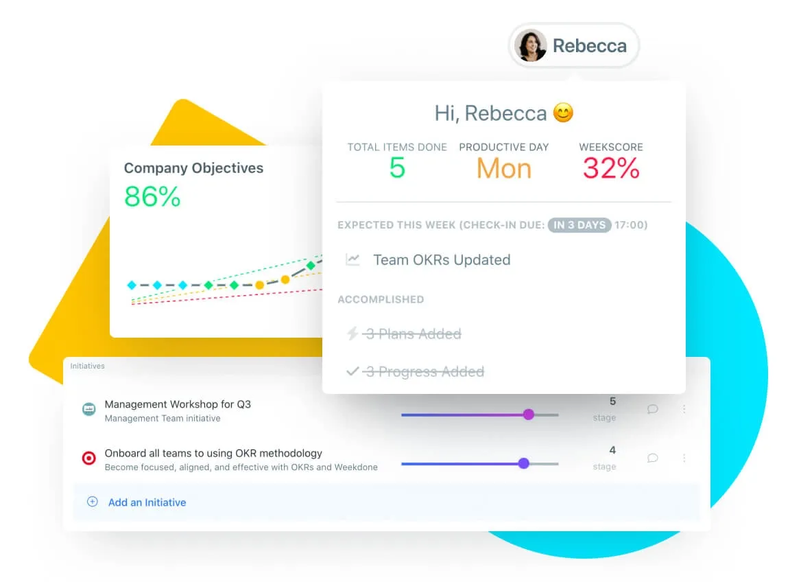
The view organizes company-wide and team-specific goals, clearly showing progress on key results. This helps ensure the entire team is working toward the same measurable outcomes.
Image Source: Here is an image featuring a dashboard that tracks weekly performance, completed plans, and company objectives. This type of visual gives teams a quick way to monitor ongoing progress and stay focused on actionable targets.
- Define a “north star” metric that represents long-term product success.
Here is an image showing examples of north star metrics used by popular digital products.
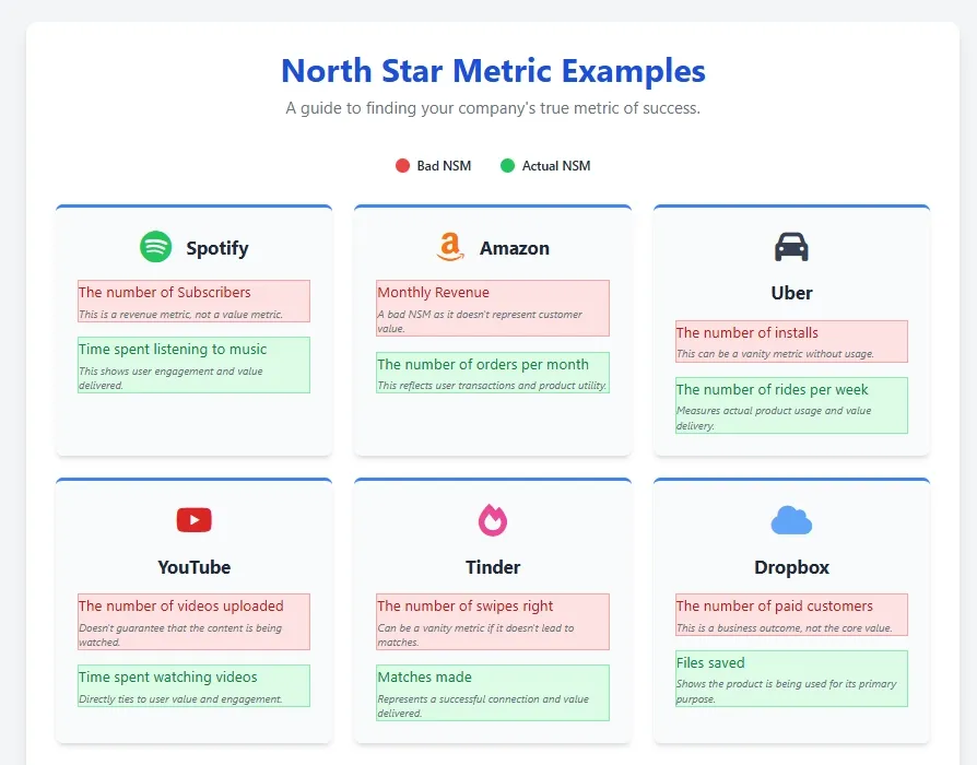
It compares common mistakes, such as focusing only on installs or revenue, with optimal metrics that reflect real user value and engagement, including time spent listening on Spotify, orders per month on Amazon, or matches made on Tinder.
This visual clarifies how choosing the right north star metric helps teams measure meaningful product success.
- Instead of making broad claims like “make it the best app,” break down what “best” actually means, whether it’s improving app store ratings, increasing daily active users, reducing drop-off rates, or boosting feature adoption. Set specific, trackable objectives tied to measurable outcomes so progress can be clearly evaluated.
2. Research and understand users and the market
Gather detailed insights about your users, their needs, behaviors, and pain points, as well as analyze the market landscape to identify opportunities and challenges.
Why this is important:
Without thorough research, design decisions are based on assumptions, which can lead to products that do not meet real user needs or fail to stand out in the market. Research helps validate ideas, uncover unmet needs, and inform strategic design choices.
What this involves:
Collect qualitative data through interviews and surveys, and quantitative data from analytics and usage patterns. Analyze competitors to spot gaps and identify business constraints. The results typically include user personas, empathy maps, and journey maps that guide design.
How to do it effectively:
- Conduct user interviews and surveys to gather firsthand insights about motivations and frustrations.
Under given is a research summary board that organizes user interview and survey data into actionable insights and recommendations, laying a factual foundation for design decisions.
- Analyze website or app analytics to track user behavior and identify patterns.
- Conduct competitor research to evaluate market positioning and identify opportunities for differentiation.
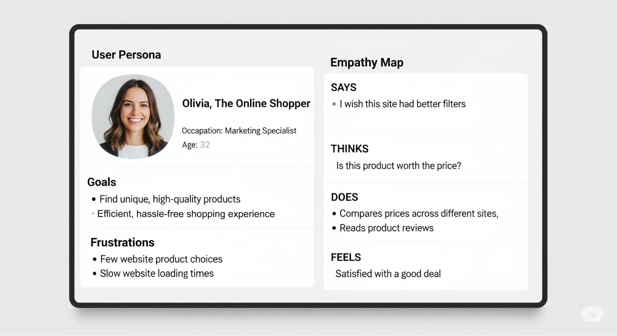
- Create personas and empathy maps that represent key user segments and their needs.
Here is an image showing a user persona and empathy map capture typical goals, frustrations, thoughts, and behaviors, making user motivations and barriers clear for effective design planning.
- Map user journeys to visualize how users interact with the product and where pain points arise.
3. Map user journeys and define core workflows
Create visual representations of the user’s experience and key interactions, focusing on their path through the product to complete important tasks.
Why this is important:
Mapping user journeys helps translate research insights into actionable design flows, ensuring the product meets real user needs at every touchpoint. It also highlights pain points and decision moments, which reduces confusion and improves overall usability.
What this involves:
Identify all critical user interactions and decision points within the product. Use journey maps and flowcharts to outline the steps users take from start to finish, including edge cases. This acts as a blueprint for ideation and design development.
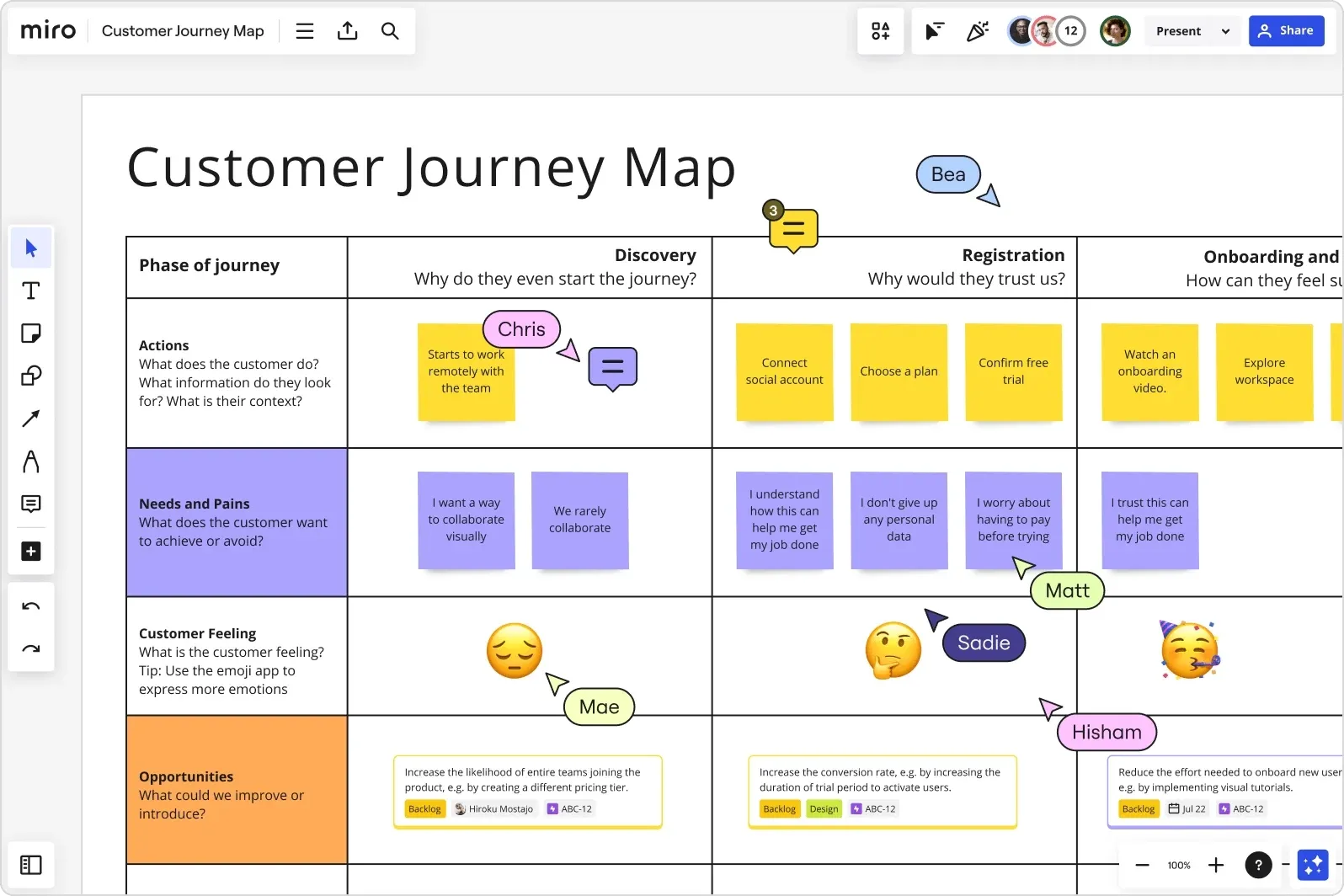
Here is a customer journey map that breaks down the user experience across discovery, registration, and onboarding phases, documenting actions, needs, emotions, and improvement opportunities at each touchpoint to guide product design decisions.
How to do it effectively:
- Use collaboration tools like Miro, Lucidchart, or FigJam for creating and sharing journey maps and workflows.
This collaborative workspace demonstrates how teams use digital tools to map user workflows alongside research artifacts like moodboards, personas, and brand documentation, creating a comprehensive foundation for design development.
- Collaborate with UX designers, product managers, and developers to collect a wide range of perspectives.
- Focus on key user goals and pain points; break down complex flows into manageable steps.
- Validate journeys by testing with actual users or referencing user research data.
- Avoid overcomplicating flows; prioritize simplicity and clarity while covering all common scenarios.
4. Create low-fidelity wireframes and prototypes
Sketch out early versions of the product, focusing on basic layout, flow, and functionality before adding detailed visuals.
Why this is important:
Low-fidelity wireframes help identify major usability issues and allow teams to quickly test structure and logic. This approach avoids wasting effort on polished designs that may not solve core user needs or workflow problems.
What this involves:
Design simple, rough layouts (on paper or in digital tools) to map out where information, buttons, and features should appear. Build clickable prototypes to simulate real interactions and gather feedback early.
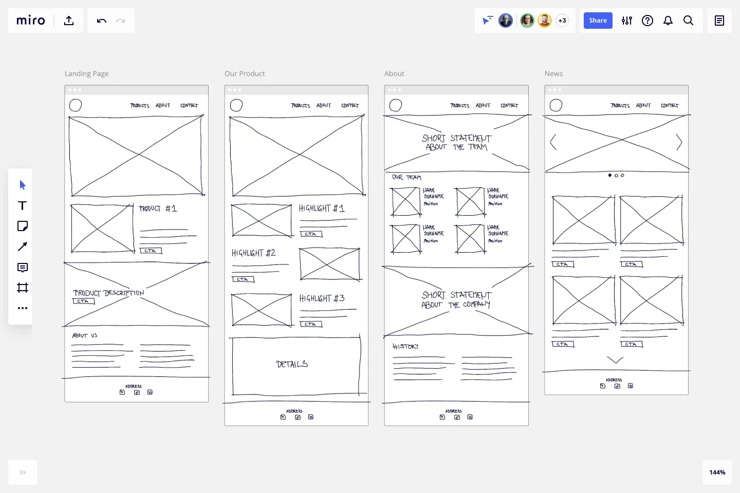
These wireframes demonstrate low-fidelity layouts for different website pages, showing how content hierarchy, navigation placement, and basic structure are mapped out before adding visual details or branding elements.
How to do it effectively:
- Start with quick paper sketches or simple digital wireframes using tools like Figma or Adobe XD.
- Focus on content placement, task order, and clear pathways for users, not final visuals.
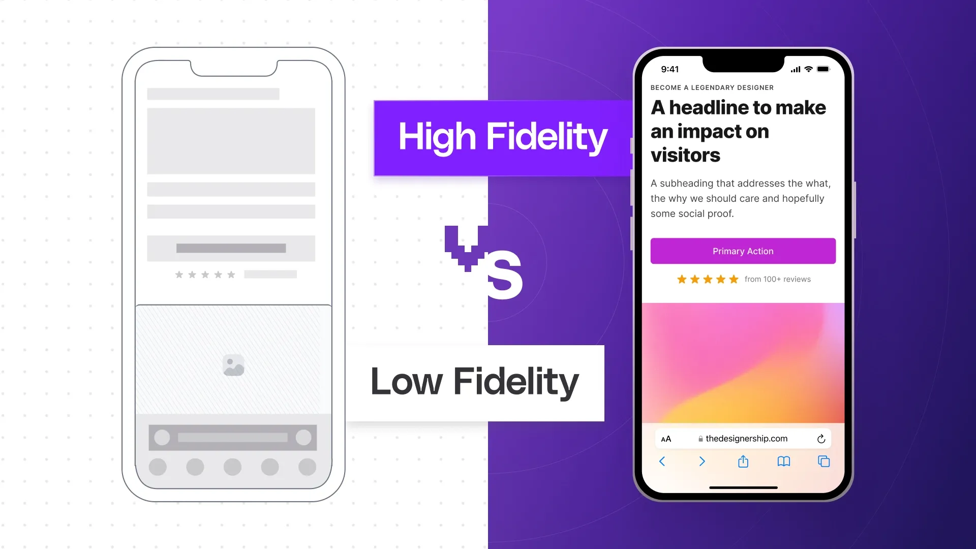
This comparison illustrates the difference between low-fidelity wireframes (left) and high-fidelity designs (right), highlighting how early-stage wireframes prioritize layout and functionality over polished visuals and styling.
- Create basic clickable prototypes to test the flow and gather user/stakeholder feedback fast.
These mobile app wireframes show how user flow and screen-to-screen interactions are planned at a low-fidelity level, focusing on content organization and navigation patterns rather than detailed interface design.
- Involve team members and actual users to review wireframes, ensuring everyone agrees on the direction before investing in details.
- Avoid the common pitfall of jumping straight into high-fidelity UI or losing sight of content hierarchy.
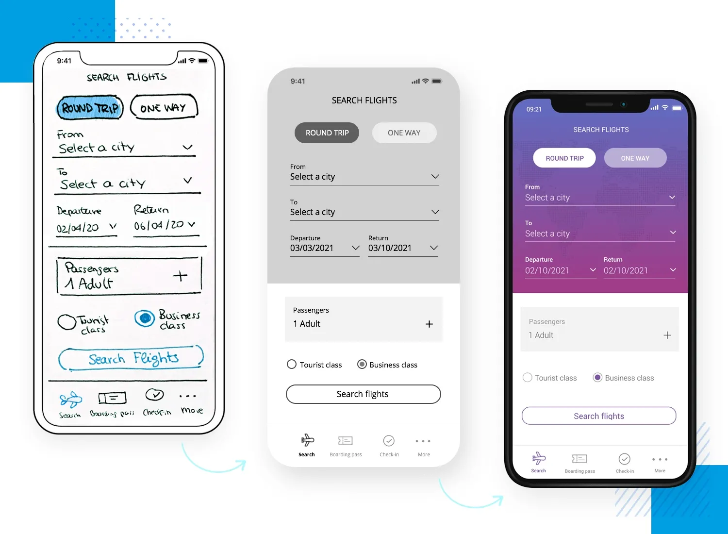
5. Design high-fidelity UI and interaction patterns
Transform wireframes into detailed, polished interfaces that express your brand and create a smooth user experience.
Why this is important:
High-fidelity design allows for finalizing visual style, accessibility, and interactivity, ensuring consistency and usability before development starts. It bridges the gap between concepts and production-ready assets.
What this involves:
Apply visual identity, design systems, color, typography, spacing, and micro-interactions to the wireframes. Ensure designs work across screens and devices (responsive), and prepare files for developer handoff.
The image given below shows the step-by-step evolution from a hand-drawn wireframe to a high-fidelity app interface, demonstrating how layout, content, and branding are refined through the design process.
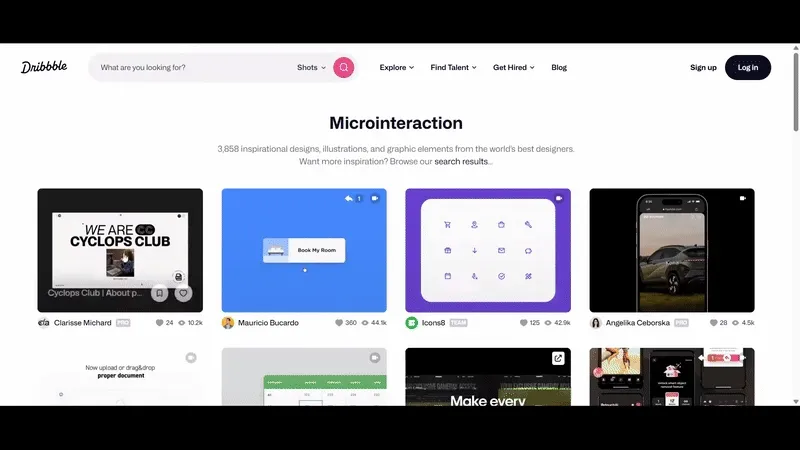
Here is another visual that represents a variety of microinteractions in modern interfaces, demonstrating how small animated feedback elements, like button transitions or gesture responses, add delight and clarity to the user experience.
How to do it effectively:
- Use tools such as Figma, Sketch, or Zeplin to apply brand styles, spacing, and interactive details.
- Involve designers, accessibility specialists, and developers to review for clarity and technical feasibility.
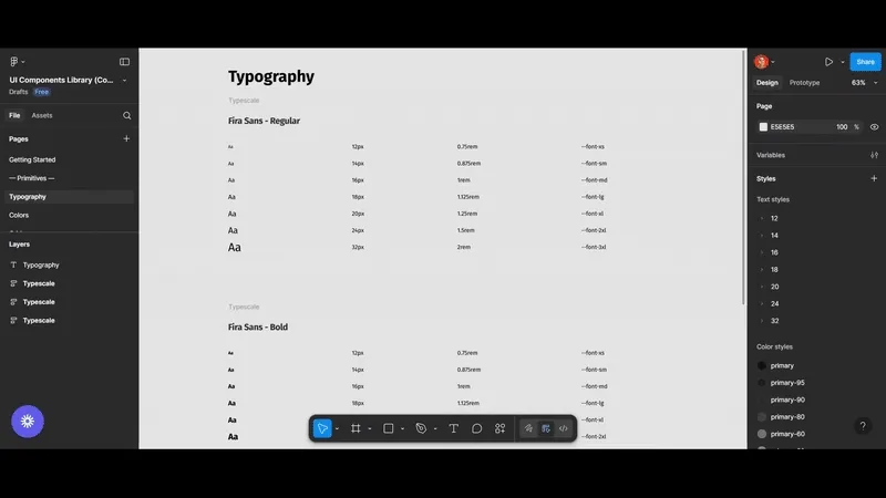
- Reference a design system or component library to keep patterns consistent.
Here is a visual that demonstrates a component library structured in Figma, showing how reusable UI elements and style guides maintain consistency and efficiency in design systems.
- Regularly test UI for accessibility, responsive layout, and visual hierarchy.
- Avoid neglecting accessibility or responsive design requirements, and don’t overcomplicate visual elements.
6. Test and validate with real users
Evaluate design prototypes with real users to identify usability issues and validate that your product solves actual problems before development.
Why this is important:
Testing prevents costly mistakes by catching confusing flows, unexpected behaviors, and unmet needs early. It ensures the design delivers a smooth experience and meets real user expectations - not just those of the product team.
What this involves:
- Run usability tests using prototypes, either moderated (with a facilitator) or unmoderated (self-guided), remotely or in person.
This chart classifies usability testing into four categories by moderation (moderated vs. unmoderated) and setting (in-person vs. remote).
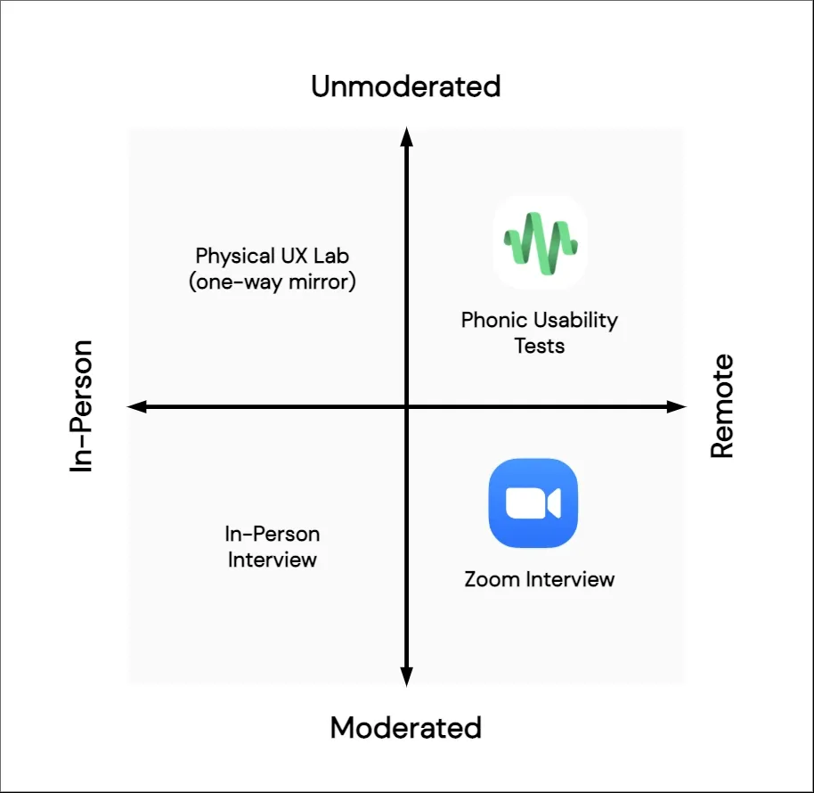
Moderated tests, like in-person and Zoom interviews, involve facilitators guiding users and capturing real-time feedback. Unmoderated tests, such as physical UX labs and remote automated phonic tests, allow users to complete tasks independently while being observed or recorded.
This framework helps teams select the right testing method based on flexibility, depth of insights, cost, and scale.
- Collect feedback, measure task completion rates, and record where users struggle.
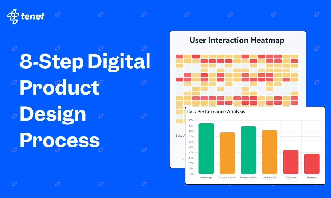
Here's a User Interaction Heatmap displaying click density patterns from usability testing:
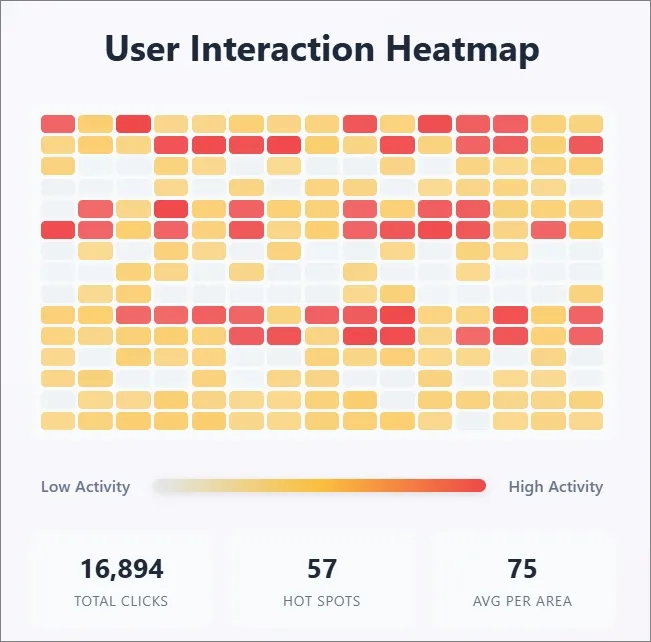
Red hotspots reveal high-engagement areas, while gray zones indicate low interaction.
This quantitative data validates design decisions, identifies conversion bottlenecks, and guides interface optimization by showing actual user behavior versus designer intentions.
How to do it effectively:
- Use prototyping tools like Figma or InVision for clickable demos during tests.
Here is a visual representing remote, data-driven usability testing using heatmaps:
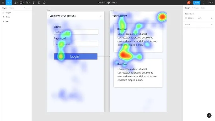
The tool tracks real user clicks and attention on prototype screens to reveal interaction patterns and friction points that aren’t obvious in team reviews.
- Involve a diverse group of real users, not just internal stakeholders or fellow designers.
- Ask clear, non-leading questions and observe behavior rather than rely on opinions.
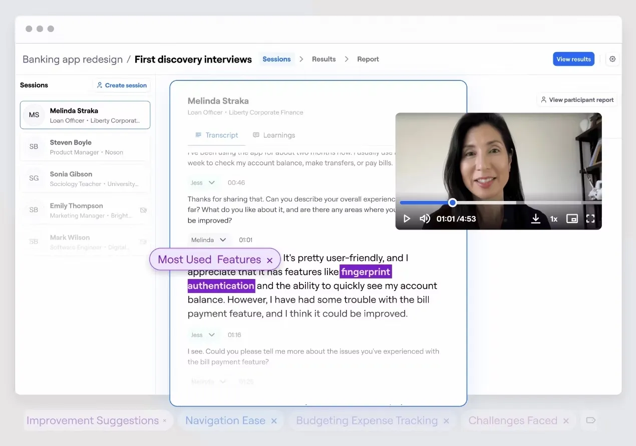
Here’s an example of moderated usability testing that captures feedback, frustrations, and insights for product improvements:
- Experiment with A/B testing to compare different approaches or layouts.
This visual shows task-based usability testing, where users directly interact with interface components, like arranging navigation elements, to validate ease of use and logical flow before full development.
- Avoid testing with too few participants or ignoring user feedback that doesn’t fit your original solution.
7. Handoff to development with clear documentation
Transfer finalized design assets and specs to developers with comprehensive documentation and ongoing support to ensure accurate implementation.
Why this is important:
Clear handoff minimizes confusion, misinterpretation, and errors during build, protecting design quality and intent. Poor handoff leads to rework, delays, and gaps between design and the launched product.
What this involves:
Prepare organized design files, annotated with specs, component usage, and interaction notes. Collaborate closely with developers to explain logic, address questions, and verify that the build matches design.
How to do it effectively:
- Use tools like Figma Dev Mode, Zeplin, or Storybook to provide accessible, well-annotated files.
The following visual demonstrates how Storybook is used to document and showcase UI components with detailed descriptions, interactive states, and usage guidelines.
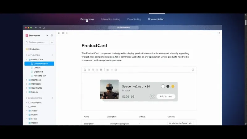
It visualizes how teams organize design specifications and share comprehensive component libraries, enabling smooth collaboration and reducing ambiguity during the development handoff process.
- Host walkthrough meetings or recordings to explain design choices and clarify tricky interactions.
Together, these artifacts help ensure that developers understand the visual direction, brand attributes, and key requirements, bridging the gap between design vision and successful implementation.
- Share component libraries and design tokens to support consistent implementation.
By clearly presenting these visual standards, designers ensure that developers have accessible, up-to-date guidelines for implementing consistent and high-quality UI during the handoff process.
- Set up a feedback loop during development, including design reviews and QA checks.
- Avoid leaving handoff to static files alone; missing context or ignoring edge cases can weaken the final product.
8. Monitor, iterate, and improve post-launch
Continuously track how your product performs after launch, gather user feedback, and make ongoing improvements to enhance user experience and achieve business goals.
Why this is important:
Launching a product is just the beginning. Monitoring helps identify new pain points, usage trends, and opportunities. Iterative improvements keep the product relevant, competitive, and aligned with evolving user needs.
What this involves:
Use analytics, heatmaps, and customer feedback to measure key metrics like retention, task completion, and satisfaction. Prioritize updates based on impact and feasibility. Run design sprints or quick releases to test and validate changes.
How to do it effectively:
- Set up analytics tools (e.g., Google Analytics, Mixpanel) to track user behavior and performance indicators.
Here is an image of Mixpanel’s dashboard, which visualizes critical product performance metrics such as user retention, task completion rates, and geographic data segmentation:
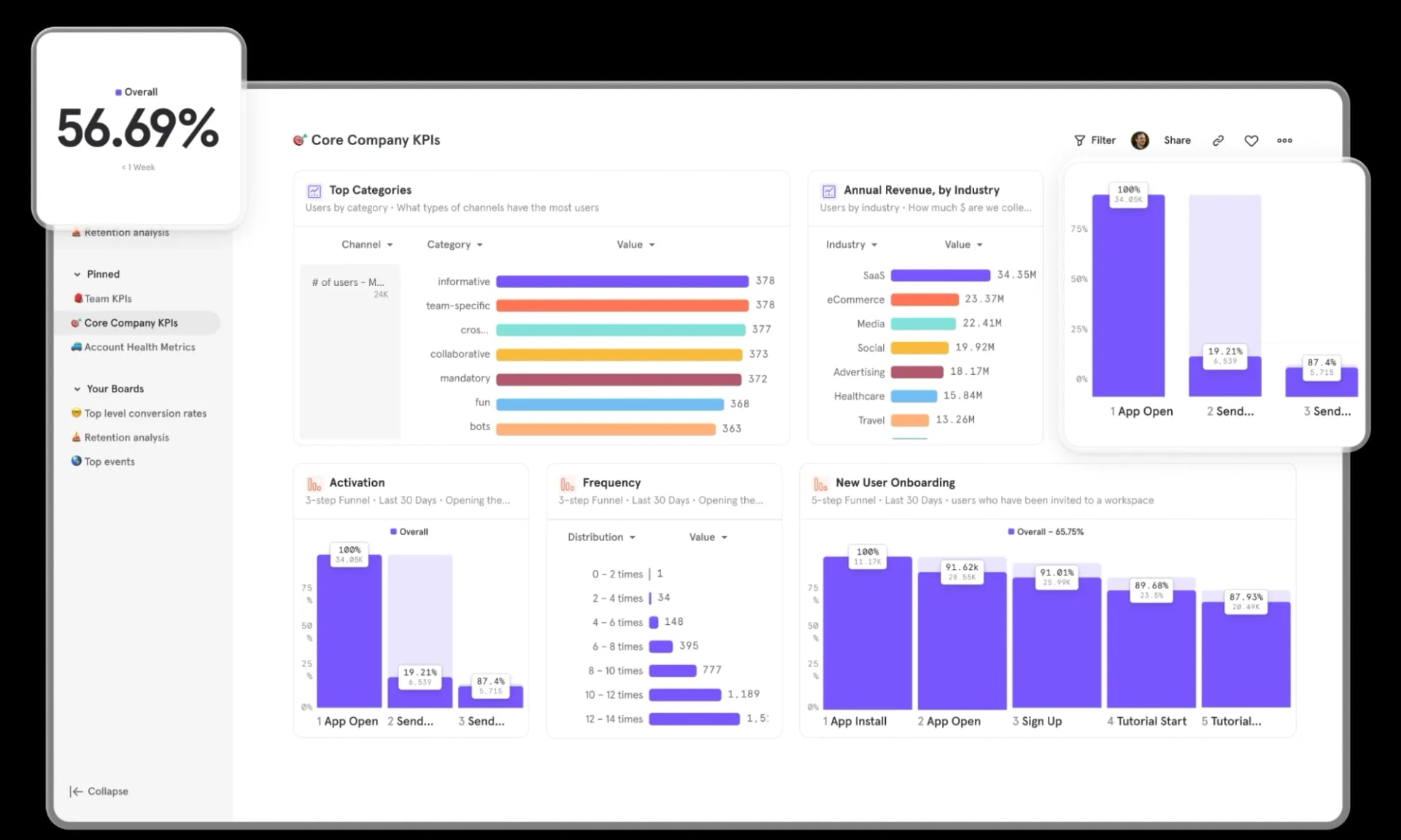
It exemplifies how teams use quantitative analytics tools to track user behavior and identify areas for improvement following a product launch.
- Collect qualitative feedback through surveys, reviews, and support channels.
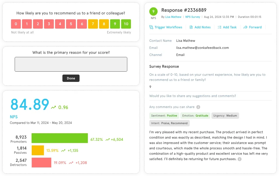
This image illustrates the collection and analysis of Net Promoter Score (NPS) survey responses, combining user ratings with detailed qualitative feedback. Visualizing customer sentiment and suggestions aids iterative improvements aligned with user needs and business goals.
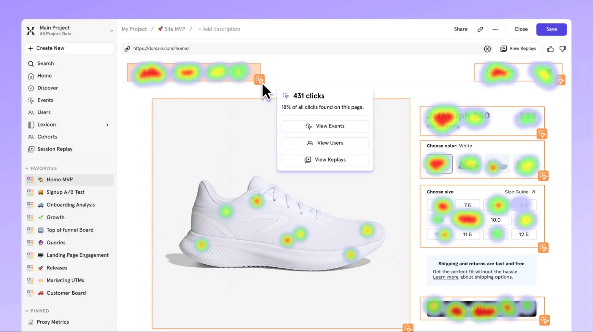
- Use heatmaps and session recordings to observe real user interactions.
This heatmap example displays user interaction intensity across different parts of a product page, revealing high-engagement zones and potential usability issues. Heatmaps help teams gather precise insights into user behavior, informing focused design iterations.
- Prioritize improvements by balancing business goals with user needs.
- Embrace an iterative mindset with regular design and development cycles post-launch.
- Avoid treating the launch as the final step; continuous improvement is key to product success.
👉 For practical examples of product design in action, explore our Design Product Design Examples.
UX Design Case Study: How Tenet Helped Pazazz with Product Design Services
One of our clients, Founder Sajil Shah, recognized this gap and partnered with Tenet. Their vision was clear: build a fitness platform named Strongr that focuses on personalized training and incremental progress rather than one-size-fits-all plans.
Our Approach at Tenet:
We began by thoroughly understanding the client’s vision and learning about the users of the app. This helped us identify different user types and create features that fit individual fitness needs.
From the outset, we focused on developing a robust, adaptable system that could accommodate personalized workouts and seamlessly integrate with other services. We also added easy-to-use shopping features within the app.
Working in regular short cycles, we designed, tested, and improved the app step by step, using feedback to make sure it met real user needs.
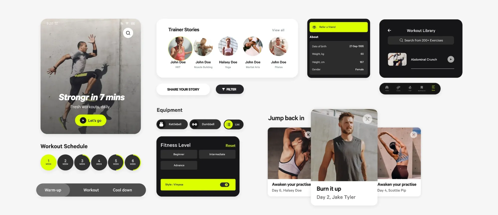
Here are some screens from Strongr showing our work and showing how users manage workouts, track progress, customize profiles, discover recipes, and find expert guidance, all designed to keep fitness practical and motivating, day after day.
Results:
Strongr now offers a personalized fitness experience that feels natural and supportive. With real-time progress tracking and customized workout plans, users stay motivated and build strength over time.
By focusing on what users need and aligning with the client’s goals, we helped Pazazz create an app that truly supports people on their fitness journey.
👉 Check out the full case study here.
You can also explore our Digital Product Design Services to learn how we create user-centered, impactful solutions, or contact us directly for personalized guidance for your project needs.
Final Words
Digital product design is about solving real problems for people. The best products come from a simple process: listen to users, keep their needs in focus, and improve based on feedback.
Every stage from research to launch benefits from honest attention to detail and a willingness to adjust. Whether you’re starting or updating an existing product, making time to understand and support your users leads to results that last.
Need help designing or developing your digital products? Get expert help.
Need help designing or developing your digital products? Get expert help.


Got an idea on your mind?
We’d love to hear about your brand, your visions, current challenges, even if you’re not sure what your next step is.
Let’s talk


