How to Rebrand Without Confusing Your Loyal Customers
Share
Share
Get a quick blog summary with


A rebrand is a high-stakes gamble with your existing revenue. While the goal is to attract new customers, the risk is alienating the ones who already pay your bills.
Iconic brands that failed this test, like Tropicana, which lost $30 million in two months, did so because they broke the emotional link between the customer and the product.
To prevent a "recognition crash," you need a transition strategy. At Tenet, we've completed 450+ projects that have impacted more than 20 million users worldwide, so we understand how change affects real people.
This guide, built on what we've learned across those projects, shows you how to introduce changes in stages so your brand stays recognizable, relatable, and reliable from start to finish.
Why do companies rebrand even when they know the risks?
1. To Create a Unified Brand After Mergers and Acquisitions
When two companies come together, each one brings its own name, logo, and history into a single organization. Customers get confused when they see different brand names on different products or services.
A single unified brand removes that confusion and tells the market that these two businesses are now one team. The risk is losing the loyalty tied to each original name, but the clarity of one brand often wins out.
Example:
The 2000 merger of Glaxo Wellcome and SmithKline Beecham created GlaxoSmithKline.
Over two decades later, in 2022, the company shortened its name to simply GSK as part of a larger shift. After spinning off its consumer healthcare business (now Haleon), GSK focused entirely on biopharmaceutical innovation.
Here is a clear image showing how the merger of Glaxo Wellcome and SmithKline Beecham created GlaxoSmithKline and then became gsk:
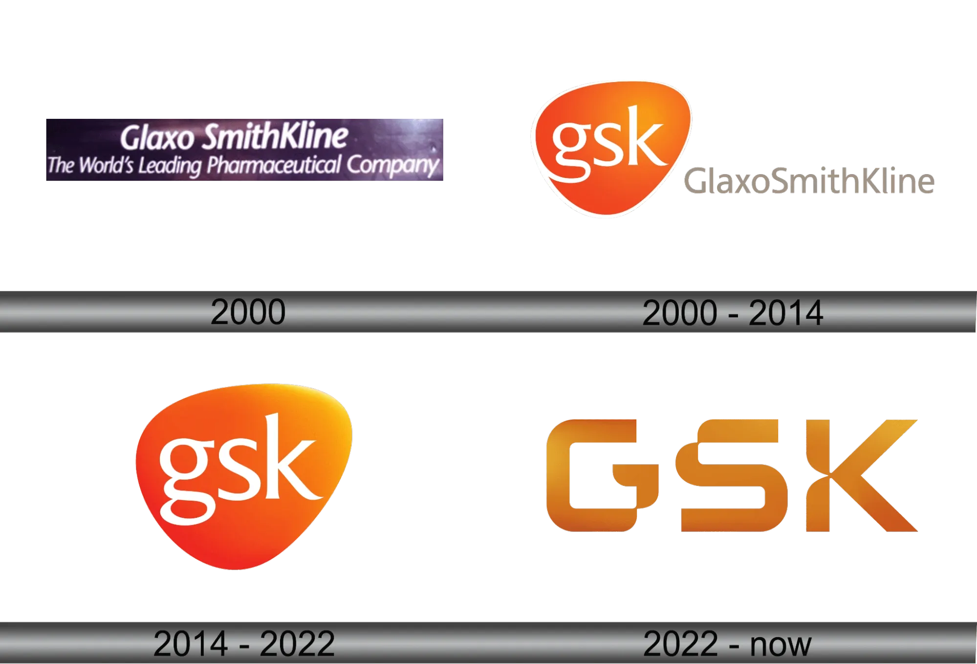
The shorter name reflected how people inside and outside the company already referred to it, while the new visual identity emphasized science, technology, and a forward-looking purpose to "get ahead of disease together."
This helped unify the brand around its core biopharma ambitions rather than a long, merged corporate title.
👉 For companies going through a merger or acquisition, a defined brand strategy before design begins keeps transitions smooth, and the Brand Strategy page explains how this foundation is built.
2. To Target New Audiences
Sometimes a brand that works well for one generation fails to connect with another. Companies need to grow, and growth often means selling to new groups of people.
Changing the brand helps signal to a new audience that this product or service is for them, too. The danger is that loyal customers might feel left behind, but standing still means the business stops growing.
Example:
Old Spice had long been perceived as a stagnant "grandfather's brand" by the 2000s, with a target demographic skewed toward men aged 50 and older. By 2010, the brand aimed to capture the essential 18–34-year-old male demographic.
The company launched a full repositioning that included new packaging, updated logo elements, and a memorable advertising campaign called "The Man Your Man Could Smell Like," featuring Isaiah Mustafa.
Here is the visual from “The Man Your Man Could Smell Like” campaign:

The ads used quick-cut humor and surreal scenarios aimed at both men and the women who might buy the product for them. The campaign started online and quickly went viral.
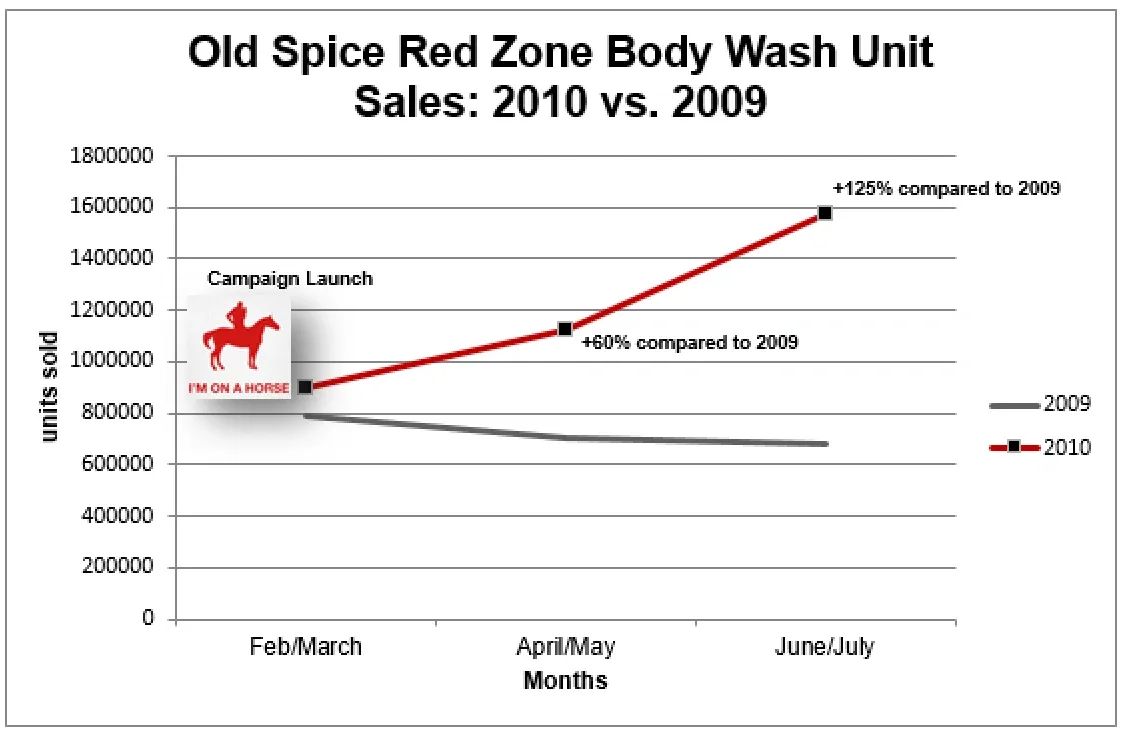
By May 2010, Old Spice sales had increased 60% from the previous year. By July 2010, that number was 125%, which was an all-time high for the brand. Shortly after the campaign, they became the top brand for men’s body wash.”
This graph shows the boom in sales of Old Spice after rebranding:
The old "grandfather" image was replaced with a younger, energetic personality that still kept the core product appeal.
👉 Shifting your brand to a new audience without losing existing customers starts with understanding visual identity, and this guide on How to Design a Brand Identity explains the process step by step.
3. To Stand Out from Competitors Through Market Differentiation
When every competitor looks and sounds the same, customers cannot tell anyone apart.
A rebrand can break this pattern by highlighting what makes a company different. The risk is that different doesn't always mean better, but blending in comes with its own set of problems.
Example:
Dunkin' had long been known as Dunkin' Donuts. By 2018, internal data showed that beverages accounted for about 60% of sales in the U.S.
The company wanted to emphasize its role as a beverage-led, on-the-go brand rather than primarily a donut shop.
In 2019, it officially dropped "Donuts" from the name and updated its branding while keeping the familiar colors and font. The change aligned with efforts to modernize service, focus on convenience, and compete more directly with other coffee chains.
You can notice that the Dunkin' Donuts logo removed Donut after rebranding:
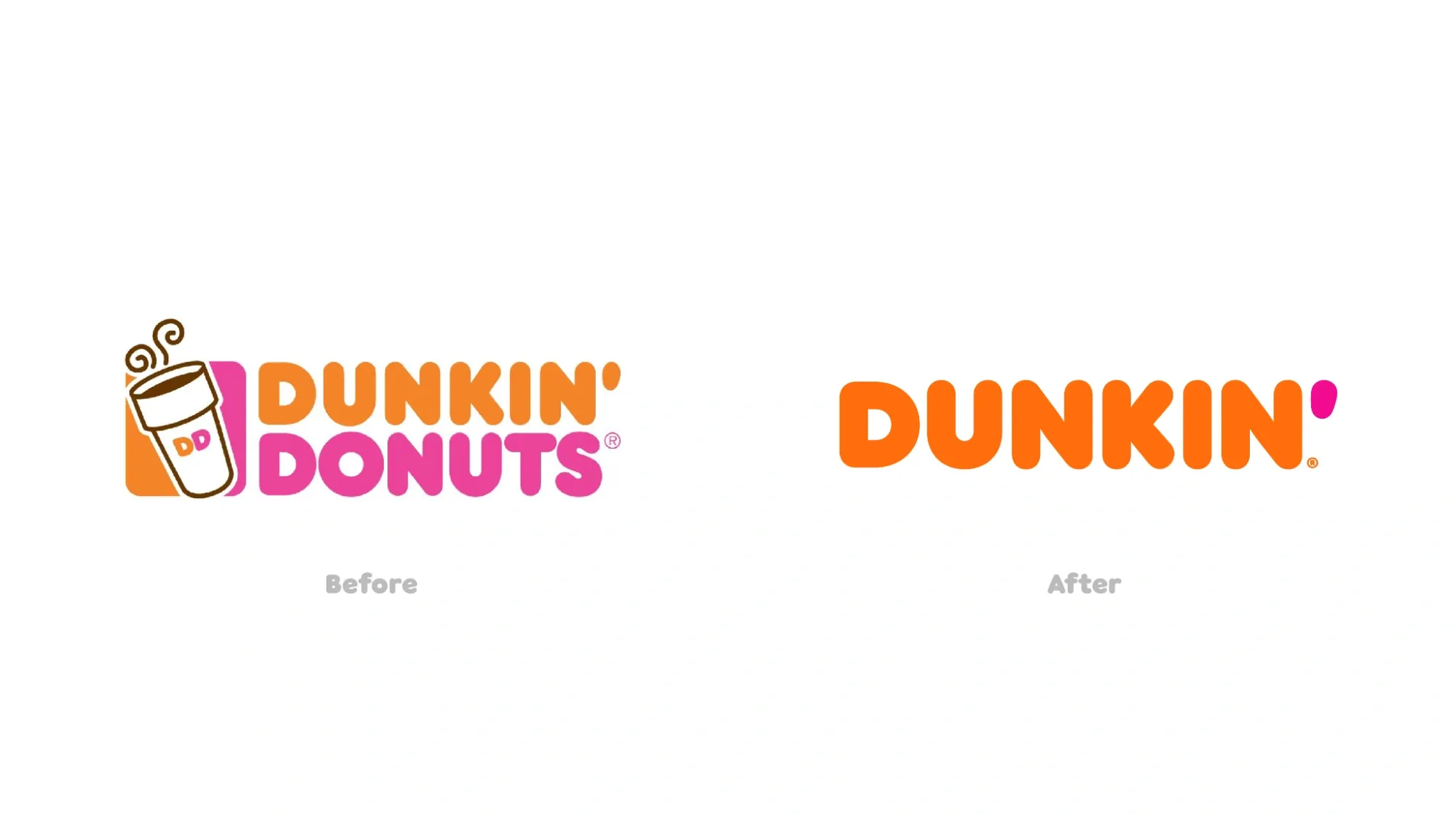
Donuts remained on the menu in large numbers, but the name shift helped reposition the brand in customers' minds as a broader quick-service option.
👉 Knowing your position against competitors before a rebrand ensures intentional differentiation, and the Competitive Benchmarking page shows how market gaps are identified.
4. To Align Brand with a New Business Strategy or Model Shift
A company might start as a product seller and then move into offering services. The old brand often carries the wrong message for the new strategy.
Changing the brand brings the external image in line with the internal business model to avoid customer confusion.
Example:
In 2021, Facebook changed the name of its parent company to Meta.
Here are some images showing how Facebook rebranded its parent company & presented it in front of people:


The move reflected a major strategic shift toward building the metaverse, immersive virtual environments where people could connect, work, and create beyond traditional social media.
The name "Meta," drawn from the idea of something "beyond," signaled that the company saw itself as a broader technology platform focused on virtual and augmented reality, not just the Facebook app.
This helped communicate the long-term vision to investors, employees, and the public while the individual apps (Facebook, Instagram, etc.) kept their names.
5. To Refresh an Outdated Brand Image
A brand from the 1990s can look old-fashioned today, even if the product is still good. An outdated look makes customers wonder if a company can keep up with the times.
A refresh updates the look for current expectations without necessarily changing what the company offers.
Example:
King Arthur Flour, founded in 1790, had been America's oldest flour company for over 230 years.
In 2020, during a surge in home baking interest, the company changed its name to King Arthur Baking Company. The update included a new logo with a wheat crown element that highlighted its focus on baking rather than just flour production.
You can see in the image how, under rebranding the logo have been changed from an armed man to a wheat crown:
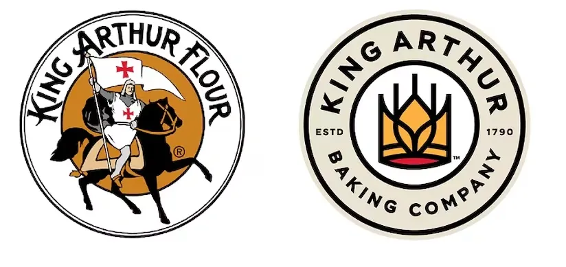
The company explained that the name better reflected what it had always been (a resource for bakers offering recipes, tools, and ingredients) and made the brand feel more current and inclusive without losing its long history of quality.
👉 Refreshing visual identity while keeping brand recognition is a key design challenge, and the Visual Branding guide explains how to modernize without losing equity.
6. To Fix Negative Public Perception or Crisis
Sometimes a brand becomes associated with a bad event, a product failure, or a public scandal. The name itself starts to carry baggage that makes customers hesitate.
A rebrand allows the company to leave some of that history behind and start fresh.
Example:
The Co-op in the UK faced a major crisis in 2013–2014 after a large financial black hole was discovered in its banking division and a former chairman was involved in a public scandal.
Several years later, in 2016, the group launched a rebrand that revived elements of its classic 1960s logo style. The effort was part of a broader recovery plan that included new leadership, structural changes, and a stronger emphasis on its member-owned model.
Source: This is the old vs new logo version of Co-op (because of rebranding):
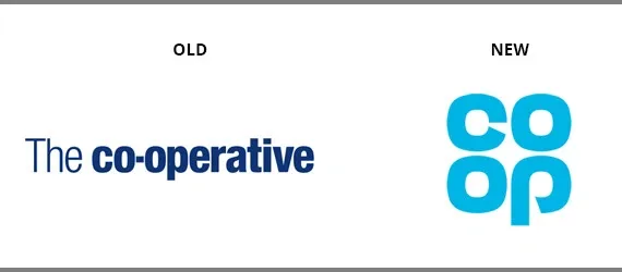
The visual refresh aimed to signal that the organization had moved past the difficult period and was returning to its cooperative roots with renewed confidence.
👉 Rebuilding brand trust after a crisis requires more than a new logo, and the Brand Growth and Recognition page explains how reputation and messaging restore confidence.
7. To Enter New Countries or Market Segments Through Global Expansion
A name that works well in one country might mean something rude or confusing in another. A rebrand helps avoid these problems before a company spends significant money on international marketing.
The risk is that the new brand feels less authentic to the original market.
Example:
Airbnb grew rapidly from a room-sharing service into a global platform.
In 2014, it introduced a new symbol called the Bélo - a simple, stylized mark designed to represent belonging. The symbol combined elements standing for people, places, love, and the letter "A" from Airbnb.
This shows how Airbnb uses Bélo to create a sense of belonging:
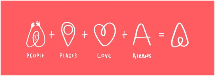
It was created to be universal, easy for anyone to draw, and focused on the idea of "belong anywhere."

This helped shift the brand perception from basic accommodations to a community-centered experience that worked across borders and languages as the company expanded into more countries and market segments.
8. To Signal a Fresh Start Under New Leadership or Ownership
When new leaders take over, they often want to show that things will be different. A rebrand acts as a public signal that the old way is over.
Example:
Apple, in the late 1990s, under Steve Jobs' return, moved away from its struggling image as a niche computer maker. The brand was repositioned around simplicity, innovation, and lifestyle appeal, supported by campaigns like "Think Different."
Here is the image of the “Think Different” campaign of Apple:
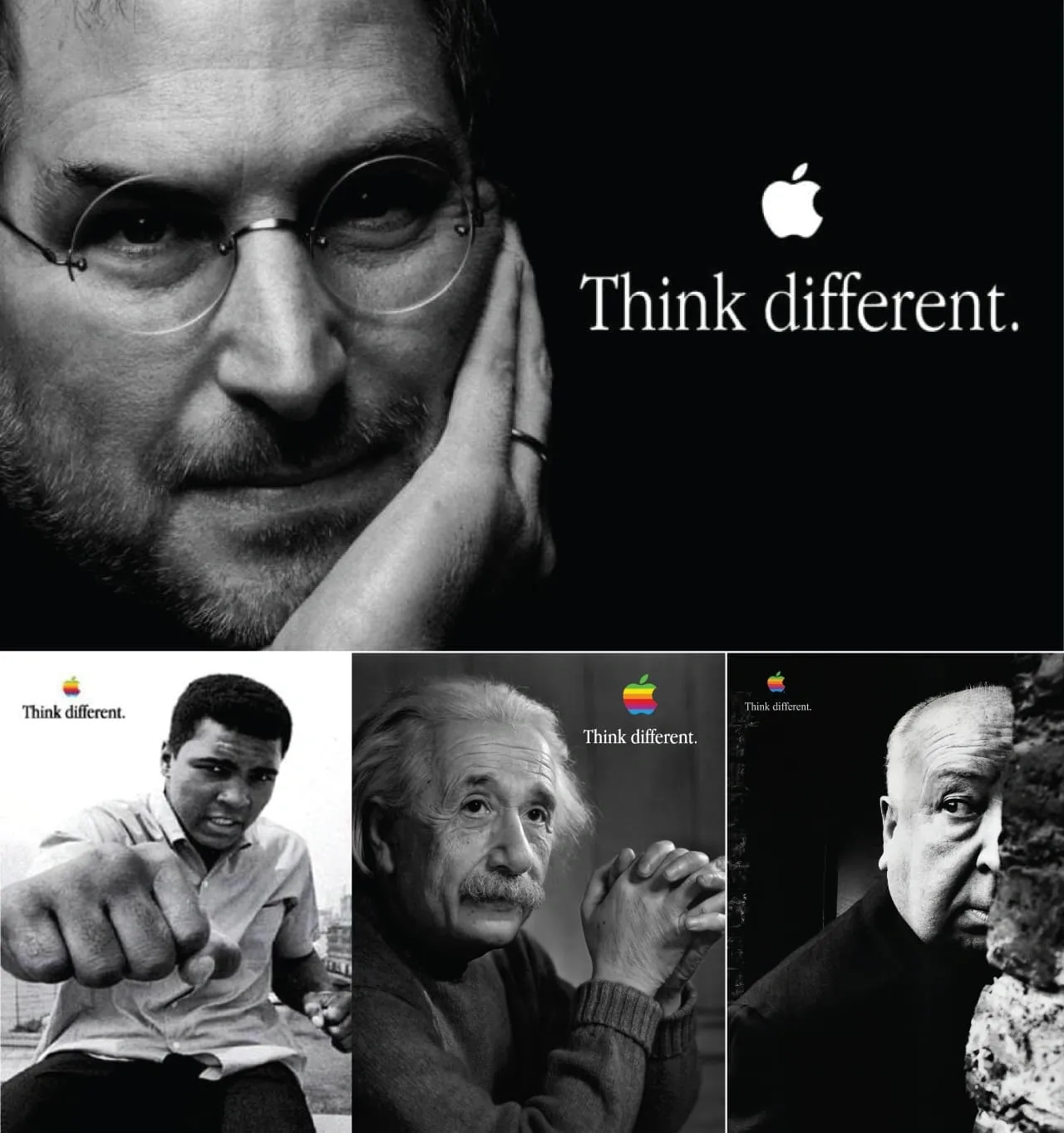
This helped signal a renewed focus and contributed to the company's later growth into consumer electronics and services.
9. To Resolve Legal or Trademark Requirements
Sometimes a company receives a legal notice telling them that their name or logo belongs to someone else. Trademark disputes can lead to expensive lawsuits.
In these cases, a company rebrands because it has no real choice.
Example:
The World Wrestling Federation (WWF) had used its initials for years. The World Wide Fund for Nature (also known as WWF) had prior rights to the initials in many countries.
After legal disputes and court rulings in the UK that limited how the wrestling organization could use "WWF," the company changed its name to World Wrestling Entertainment (WWE) in 2002.
This visual shows how the WWF logo ( because there was a change in the name from “World Wrestling Federation” to “World Wrestling Entertainment”) was changed after 2002:
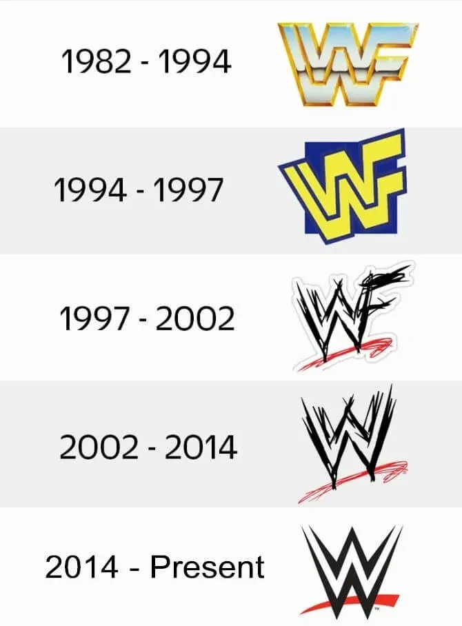
The decision removed ongoing legal risks and allowed the brand to continue operating without restrictions on its initials or certain logos.

Rebranding mistakes: How to rebrand without confusing your customers
1. Changing everything at once without a transition period
Changing everything at once without giving loyal customers any time to adjust is a common mistake.
Companies often launch a new name, logo, website, and packaging on the same day. They assume customers will figure it out on their own.
But loyal customers land on a completely unfamiliar page and think they have navigated to the wrong site or that the company has been sold to someone else.
Solution:
- Introduce the rebrand in clear phases over several weeks or months.
- Update your social media profiles first, then your email templates, then your website, and finally your packaging.
- Between each phase, send a short email or post an update explaining what just changed and what will change next.
- This gives customers time to connect the old look with the new one without feeling lost.
👉 A phased rollout only works with clear visual rules, and the Brand Style Guide page shows how consistency is maintained across every stage.
2. Hiding the reason for the rebrand
Giving a vague or generic reason for the rebrand is a mistake that confuses loyal customers. Many companies put out a press release that says we have refreshed our brand to better serve you.
This statement means nothing to a loyal customer. Treating the explanation as an unimportant formality leaves people feeling uncertain and suspicious.
Solution:
- State the real reason clearly and honestly without hiding behind marketing language.
- If you merged with another company, say that plainly.
- If your old logo looked outdated, say that directly.
- If a legal dispute forced the name change, explain that, too.
- Put a simple page on your website titled why we changed our brand and write three or four straightforward sentences.
- Customers will trust a clear reason much more than a polished non-answer.
3. Forgetting to test the new brand with existing customers
Designing the new brand without showing it to existing customers first is a mistake that leads to problems after launch. Companies often hire an agency, work in a closed room for months, and then surprise customers with the new look.
This treats the rebrand as purely an internal decision when loyal customers are the ones who have to live with it.
Solution:
- Before the public launch, show the new brand to a small group of loyal customers.
- Ask them specific questions like what do you think this new logo means, does this color feel like us, and do you understand why we made this change.
- Take their answers seriously and make adjustments based on what confuses them.
- A few hours of testing can save weeks of customer complaints.
4. Changing the brand without changing the product
Rebranding to distract from a bad product or poor service is a mistake that customers notice immediately. Some companies change their name and logo because they know people are unhappy with what they are selling.
They think a fresh coat of paint will hide deeper problems, but loyal customers see through this trick very quickly.
Solution:
- Fix the real problem before you change the brand.
- If your product breaks too often, improve the manufacturing.
- If your customer support is slow, hire more people.
- Then rebrand to celebrate the fix, not to hide from the problem.
- Loyal customers will notice the improvement and respect the honesty of the timing.
5. Abandoning the old brand completely overnight
Deleting every trace of the old brand the moment the new one launches is a mistake that hurts loyal customers emotionally. Companies take down old signs, remove old logos from trucks, and redirect old URLs to the new homepage.
This treats the old brand like something to be ashamed of. But loyal customers have memories tied to that old brand.
Solution:
- Keep a small piece of the old brand alive for at least a full year.
- Put a timeline on your about page that shows the old logo alongside the new one.
- Use the old colors as an accent in some of your designs.
- Leave a short note on your old website that says we have moved and explains the change.
- This tells loyal customers that you remember your own history and respect the relationship they built with the older version of your brand.
👉 Honoring the old brand while moving to the new one requires a visual identity system that bridges both, and the Rebranding Services page explains how a structured transition is planned.
6. Ignoring how the rebrand will look on small screens
Ignoring how the rebrand will look on small screens is a mistake that hurts the customer experience. Many rebrands look great on a computer monitor but fall apart on a mobile phone.
A logo with tiny details becomes unreadable. A color that pops on a large screen looks muddy on a small one. A font that feels clean on a desktop becomes cramped on a phone.
The mistake is designing only for desktop viewing when most loyal customers will see your new brand on their phone first.
Solution:
- Test every brand element on a mobile screen before launch.
- Shrink your logo to the size it will appear in a mobile header and check if it is still readable.
- Read your new font on a small display at different brightness levels.
- Check your new colors in bright sunlight and in low light.
- If something looks bad on a phone, go back and simplify it.
- Ask a few loyal customers to view the new brand on their phones and tell you what looks wrong.
7. Launching the rebrand on a busy day
Launching the rebrand on the same day as another major announcement is a mistake that overwhelms loyal customers. Companies sometimes combine a rebrand with a new product launch, a price increase, or a big sale.
When customers see a new logo, a new product, and a new price on the same day, they cannot tell what changed and what stayed the same.
Solution:
- Launch the rebrand on a quiet day with no other announcements.
- Let the new look settle for at least two to three weeks.
- Then introduce other changes one at a time.
- Each change gets its own attention, and customers never feel overwhelmed.
- If you have to announce something else, wait or move the rebrand to a different week.
8. Not listening to customer feedback after the launch
Not listening to customer feedback after the launch is a mistake that turns confusion into frustration. A rebrand launches and customers start complaining on social media or in support emails.
Some companies ignore this feedback. Others defend their new brand aggressively.
The mistake is treating customer confusion as a failure of the customer rather than a failure of the rebrand. This attitude makes loyal people feel unheard and disrespected.
Solution:
- Watch customer feedback closely for the first two weeks after launch.
- Pay attention to specific complaints that multiple customers repeat.
- If people keep saying the new logo looks like a different company, take that seriously.
- You do not have to reverse the entire rebrand based on feedback.
- But you might need to adjust a color, add back a familiar element, or write a better explanation.
- Respond to complaints with a simple thank you for telling us instead of getting defensive.
- Make one visible change based on feedback and announce it. This proves you are listening.
👉 Measuring rebrand success means tracking the right post-launch signals, and the Brand Growth and Recognition page outlines key engagement, sentiment, and loyalty metrics to monitor.
A successful rebranding case study
Tenet, a strategic branding and digital agency, helped IROS (an M42 company) rebrand by transforming its identity from a local Contract Research Organization (CRO) into a cohesive, forward-thinking brand positioned for global expansion under the M42 umbrella.
Tenet’s work focused on aligning IROS’s visual and messaging identity with its core values of innovation, collaboration, commitment, and precision.
Here is how Tenet helped IROS in its rebranding journey:
1. Strategic Brand Development
Discovery and Research: We conducted internal stakeholder interviews and workshops to distill IROS's DNA, personality, and core values, which were identified as Innovation, Collaboration, Commitment, and Precision.
Here is an image showing the discovery & research done by Tenet’s team for IROS:
- Positioning & Messaging: We established a new brand strategy centered on the theme "Catalyst," positioning IROS as a driving force for transformative breakthroughs and drug development.
- Tagline Creation: We developed the tagline "Catalyzing Breakthroughs," emphasizing IROS's role in the UAE healthcare landscape.
2. Visual Identity Transformation
Logo Design: We designed a new logo that highlights collaboration at its core.
The following visual is of IROS’s logo designed by Tenet:
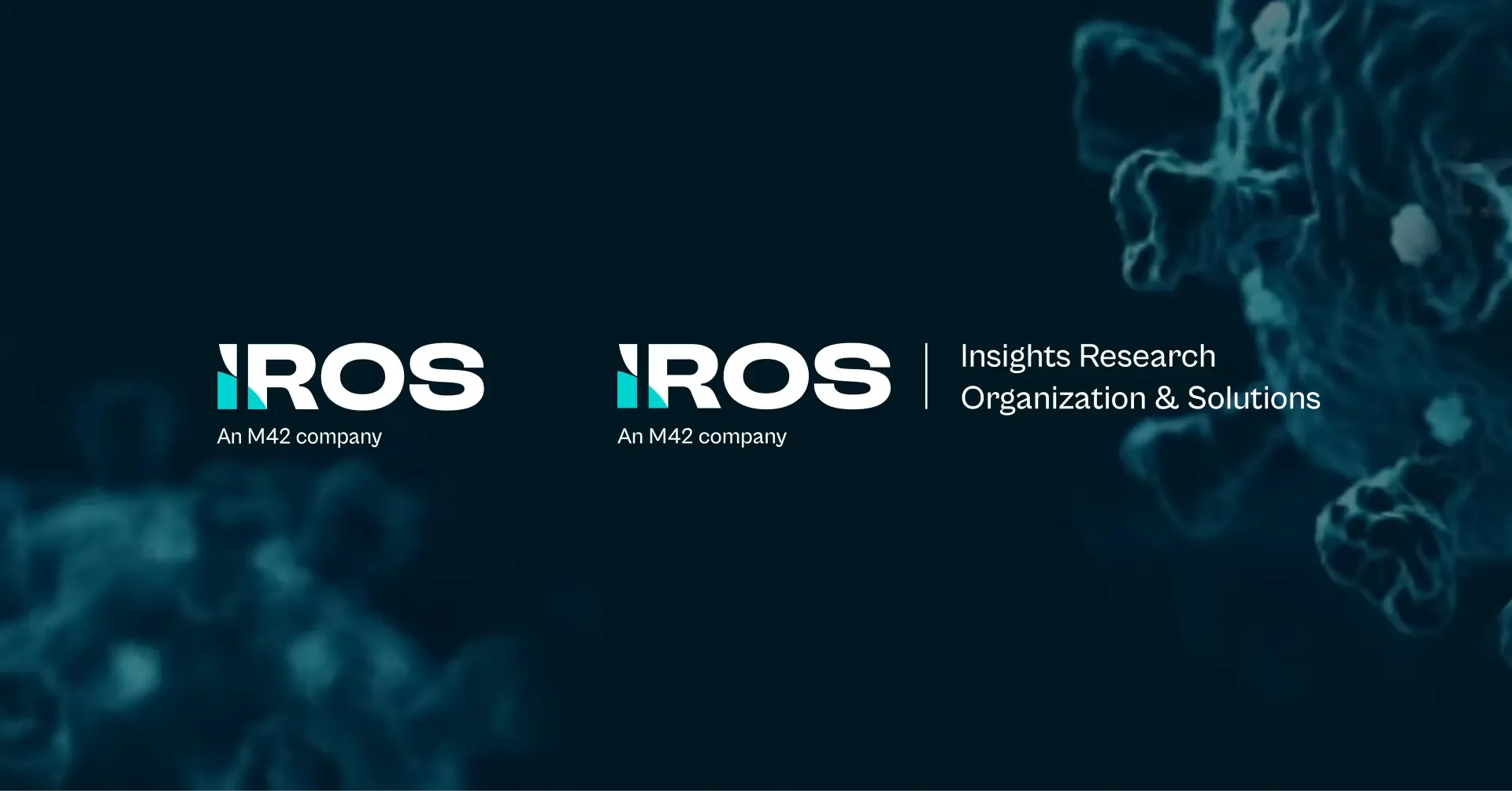
- Visual Elements: We created "Formix," a unique visual element representing IROS's dedication to innovation, discovery, and progress.
- Color and Typography: The new identity introduced a turquoise primary color and used the typeface Cabinet Grotesk to give the brand a modern, contemporary feel.
3. Digital Experience Rebuild
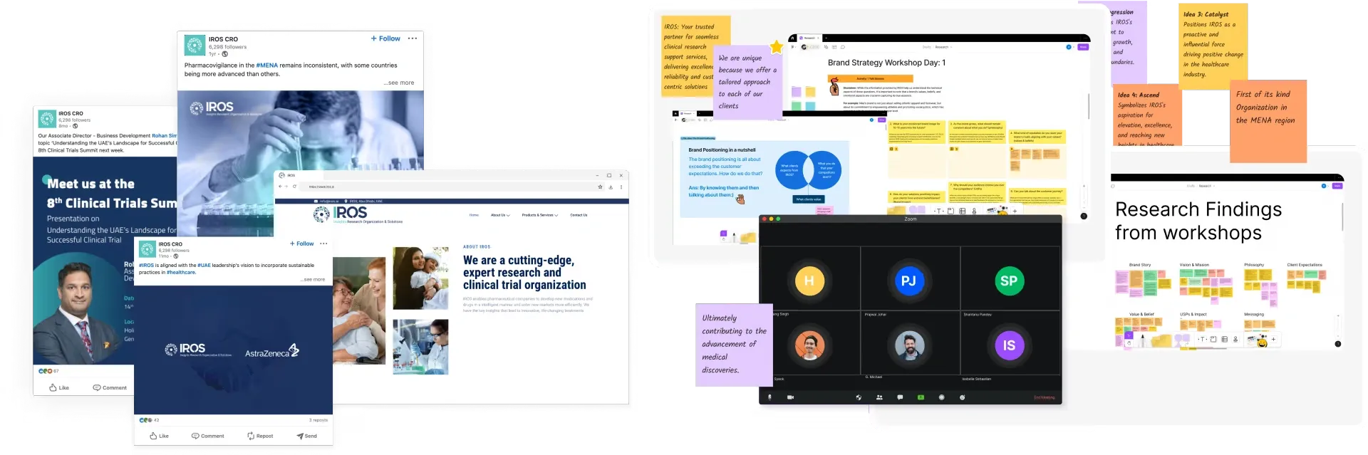
Website Design & Development: Tenet created a new, user-centric website to replace a previously fragmented digital presence.
Here is an image showing the IROS website & app design:

Information Architecture: We developed a new sitemap and user experience (UX) to enhance information adoption and align with audience needs.
Results:
- Consistency: Tenet provided established guidelines to ensure the new brand is used consistently by internal teams, leading to a professional, unified external image.
- Market Impact: The rebranding helped IROS, which became part of the M42 merger (G42 Healthcare and Mubadala Health), align with its new parent How to Rebrand Without Confusing Your Loyal Customersforward-thinking nature.
- Measurable Results: Following the rebranding, IROS achieved a 55% increase in website engagement and 4x more qualified leads from its site.
Feel free to reach out to our team to discuss your brand goals, challenges, or upcoming plans- we’d be happy to help you shape what comes next.
FAQs
How do you rebrand without losing customers?
Focus on gradual change, clear communication, and consistency. Retain core identifiable elements (like signature colors or logo shapes) to maintain familiarity.
Communicate the "why" transparently to customers early on, involving them in the process to build buy-in. Finally, roll out changes slowly in stages instead of all at once.
How long should a rebrand take?
A simple visual refresh can take 4–8 weeks, while a comprehensive corporate rebrand typically requires 12–18 months. This duration ensures sufficient time for research, strategy, legal trademarking, and a coordinated rollout across all internal and external touchpoints.
What should you not change in a rebrand?
Protect your core value proposition and customer experience. These elements form the foundation of trust and recognition. You can update logos, colors, or messaging style, but avoid altering what your brand fundamentally delivers or how customers interact with you.
How does Tenet measure rebrand success?
Tenet tracks customer retention rate, engagement metrics (such as repeat visits, time spent, and interaction levels), and loyalty indicators, such as Net Promoter Score or repeat-purchase ratio.
These show whether existing customers continue to trust and engage with the brand after the change, rather than focusing only on new awareness.
Get expert guidance on brand strategy, visual identity, and rollout planning to keep customers engaged throughout the transition.
Get expert guidance on brand strategy, visual identity, and rollout planning to keep customers engaged throughout the transition.


Got an idea on your mind?
We’d love to hear about your brand, your visions, current challenges, even if you’re not sure what your next step is.
Let’s talk


