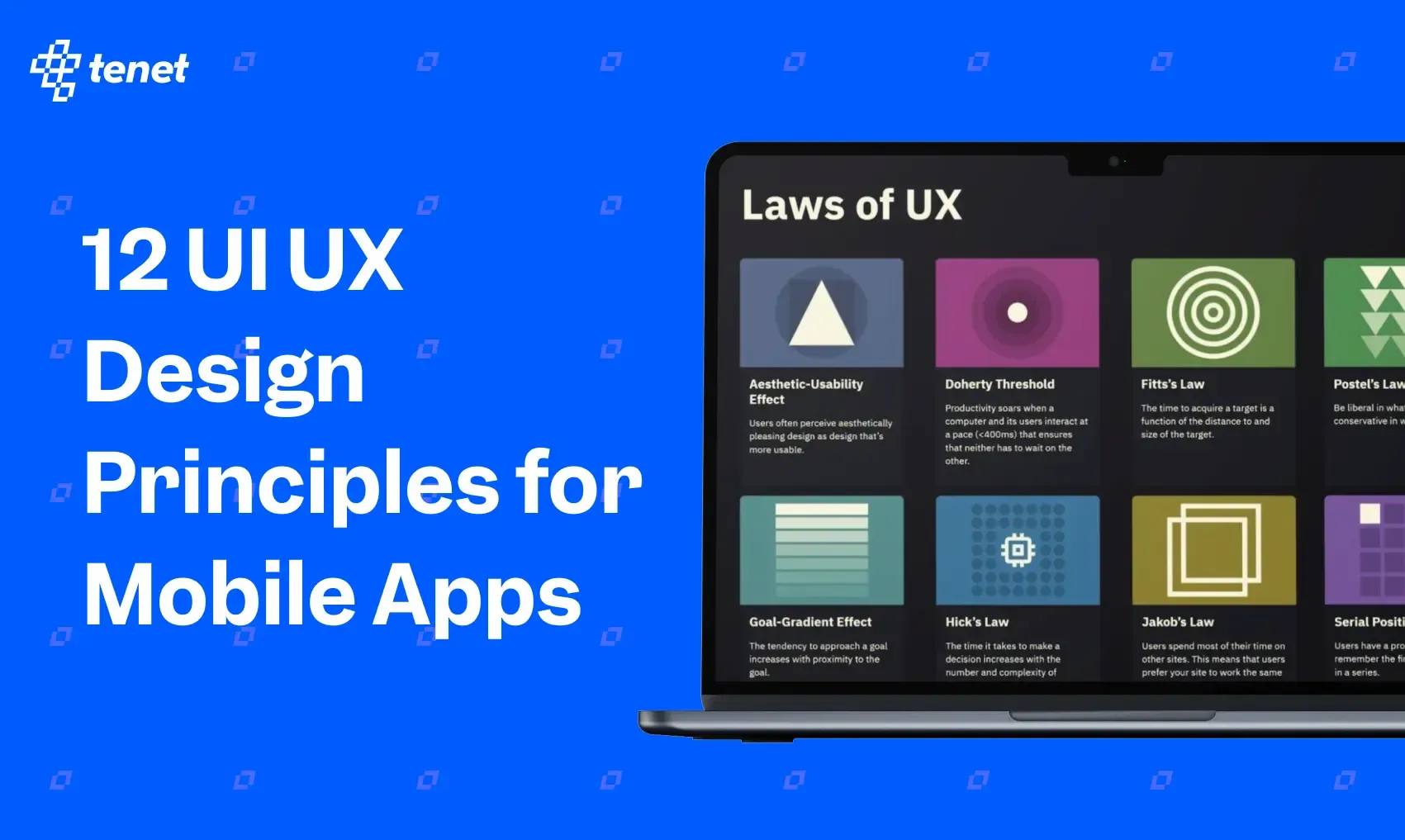
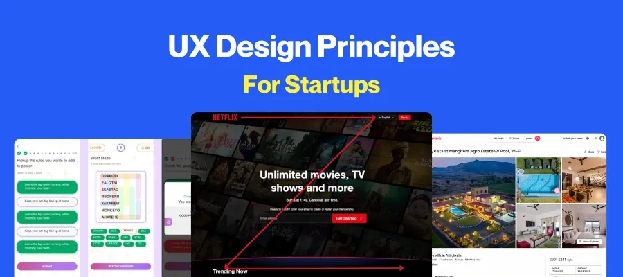
12 UI UX Design Principles For Mobile Apps (+ Examples)
 By
By Share
Share
Get a quick blog summary with


Key Highlights
### Key Highlights
- UI shapes the app’s look and controls interaction through buttons, icons, and layouts.
- UX determines how easy, intuitive, and enjoyable the app feels to users.
- Poor UI/UX increases frustration, lowers usage, and can reduce revenue.
- Design principles like Hick’s Law and Fitt’s Law improve clarity and usability.
A great mobile app isn’t just about features— it’s about seamless UI/UX design that enhances usability and engagement.
Poor design leads to frustration and lost users, while intuitive design drives success.
In this guide, we break down 12 key UI/UX principles with real-world examples to help you create a mobile app users love.
What is UI/ UX in mobile applications?
UI (User Interface) refers to visual and interactive elements of a product, such as buttons, icons, and layouts. UX (User Experience) design, as the name suggests, refers to the experience of using your product.
Your mobile app needs a UI (User Interface) design—its layout, buttons, and icons—that determines whether users will love your app and choose it over competitors.
A good UI ensures a UX (User Experience) that is intuitive, and enjoyable—in user terms, a good UX means that an app is easy to use and does what it promises.
UX is commanding enough investment and attention, that Forrester has launched an assessment tool to help banks benchmark the quality of their app’s UX.
Moreover, businesses are investing heavily in this component of app development. The UI/UX design market size is estimated at US$ 2.20 billion.
👉 Explore our UI UX design services by country:
- UI UX Design Agency In India
- UI UX Design Agency In London, UK
- UI UX Design Services In USA
- UI UX Design Agency In Dubai
Why UI/UX Design Matters for Mobile Apps
1. Poor UI/UX Means Low App Usage + High Frustration
Imagine this scenario: You’re trying to book a cab for an important meeting but the ride-hailing app is glitching. You use another app. If you’ve had this experience with the said app, you reflexively file a mental note that this could happen again (effectively de-prioritizing the app as your first choice in the future).
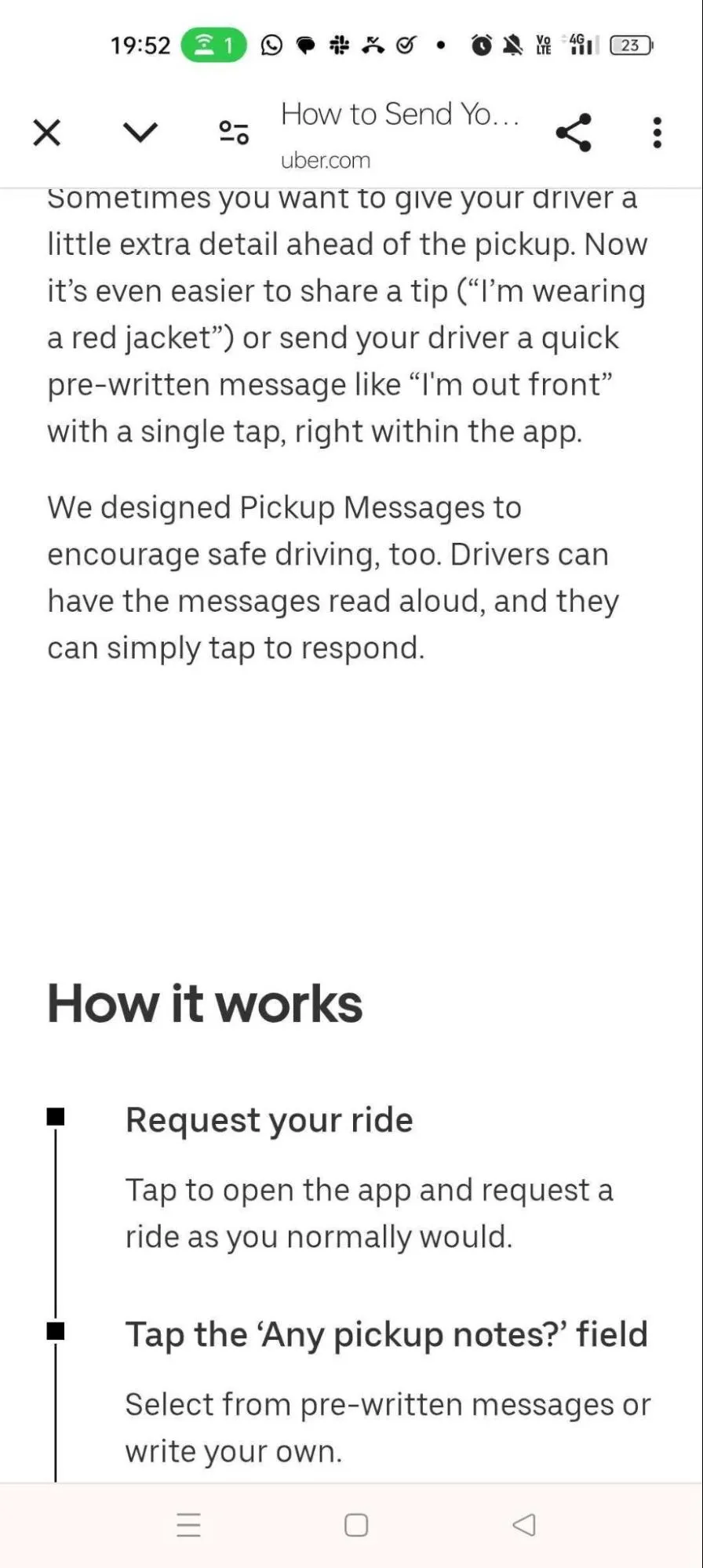
Uber, in its early days, faced user frustration due to communication gaps (including language barriers) that made pickups a chaotic experience. Their mobile app’s UI/ UX design team added visual cues like live location sharing to overcome gaps. They also added pre-typed messages for drivers and passengers like “I’ve arrived at your location.” and “Where are you?” or “I’m wearing a red jacket”.
Uber even added explainers on how to use the new, convenient features.
Here’s an example:
2. Low App Usage + Frustration = Revenue Lost
Ineffective UI/UX design for mobile apps directly impacts revenue. Uber reportedly saw reduced passenger anxiety and more reliable pickups after making improvements to their mobile application’s interface.
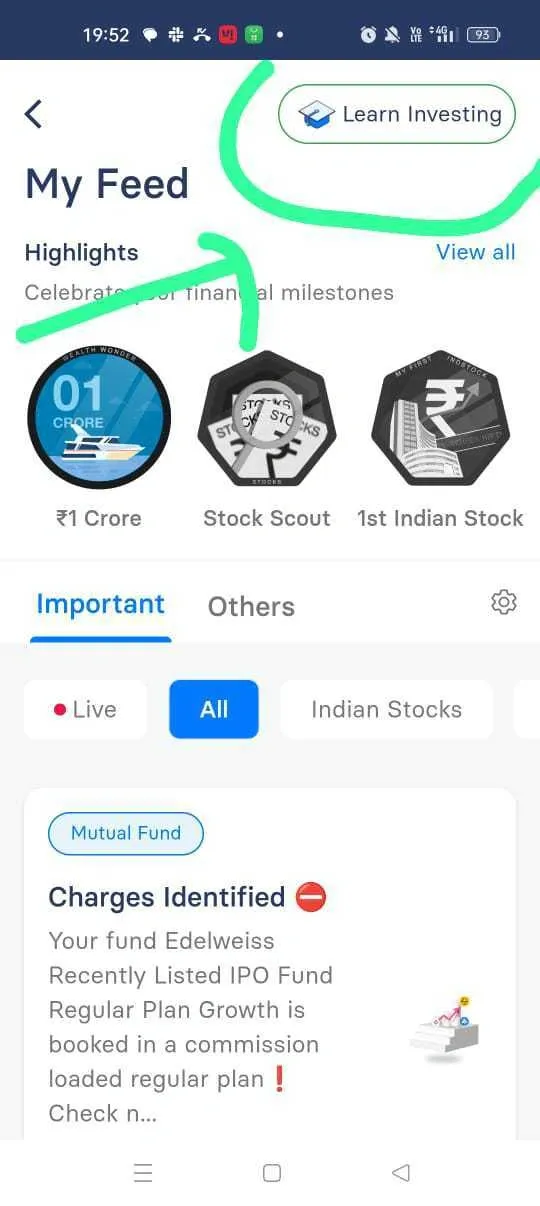
On the other hand, here’s what happens when you haven’t thought through your mobile app’s UI design and its impact on UX. These are reviews of Workday:
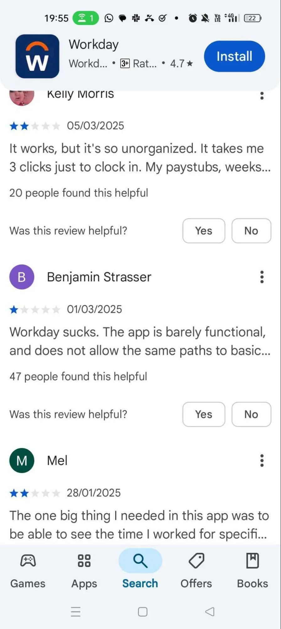
Negative reviews aren’t the worst part. The people who found them helpful represent lost potential customers.
It’s easy to see that these users—and others reading these reviews who might want the same things from the Workday app— may look for alternatives.
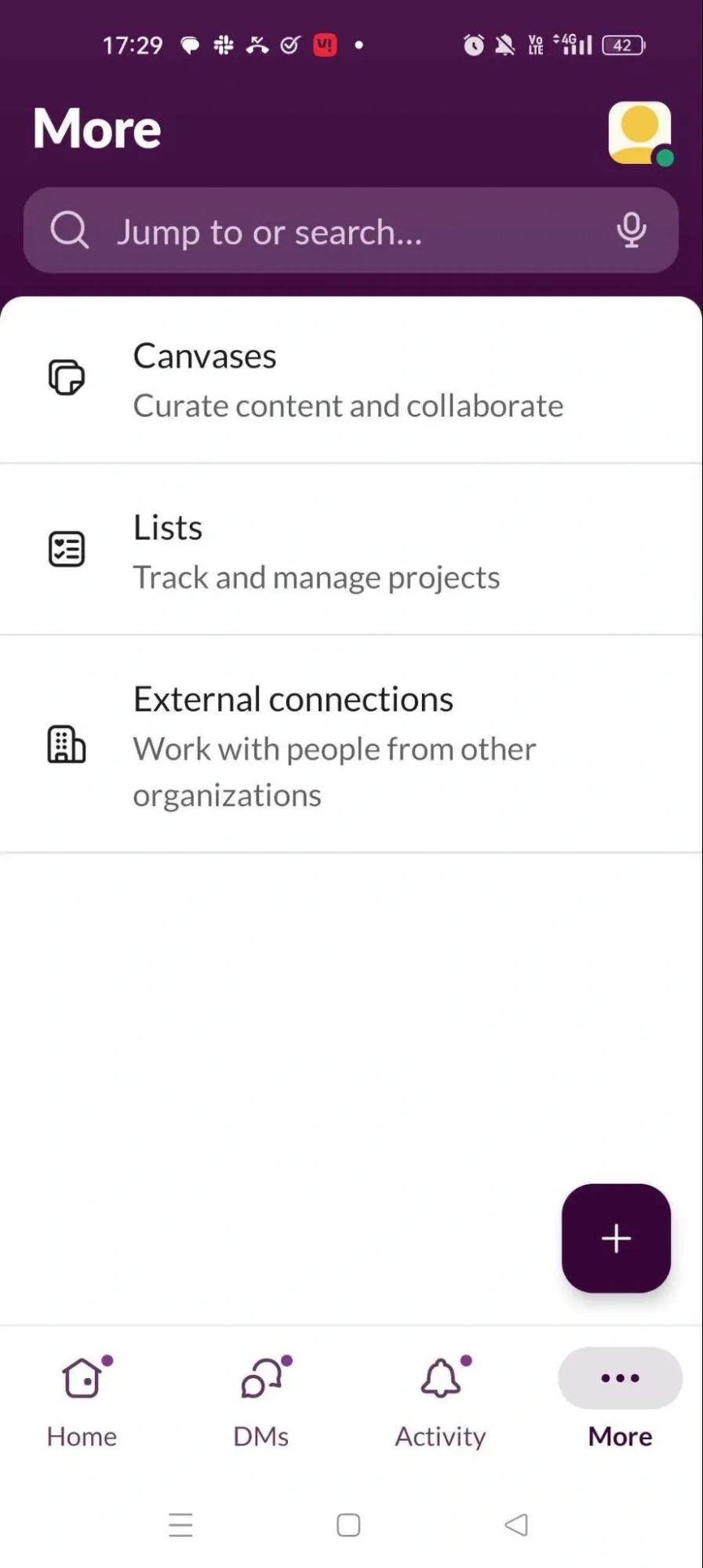
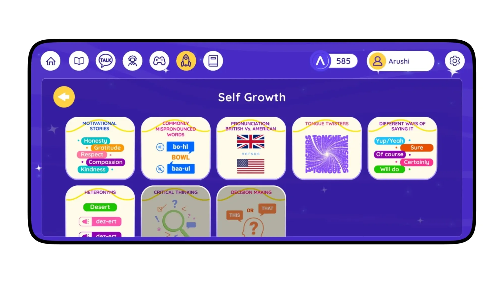
Mobile App UI/UX Design Principles
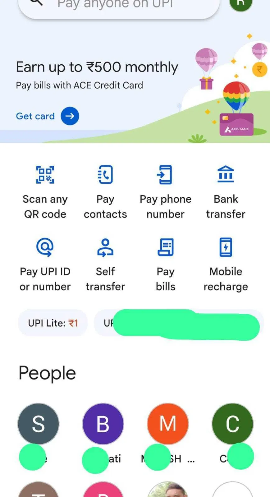
1. Hick's Law
This principle of UI/ UX design for mobile apps states that decision-making time is proportional to the number of choices available.
What this means for your UX team: Designers should aim to reduce selection overload by reducing—or at least simplifying—the choices available.
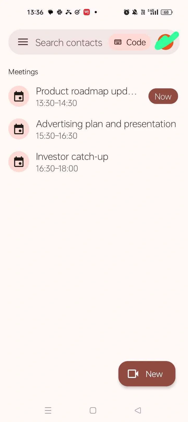
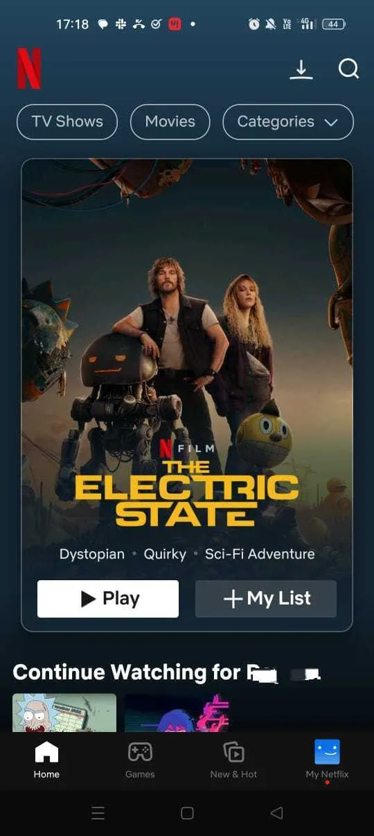
Notice how Gpay’s most popular Scan QR feature is in the most accessible and intuitive spot—in the top left corner, where the eye begins to read.
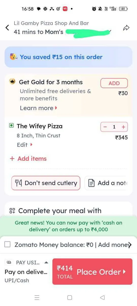
Here’s another example from Zomato:
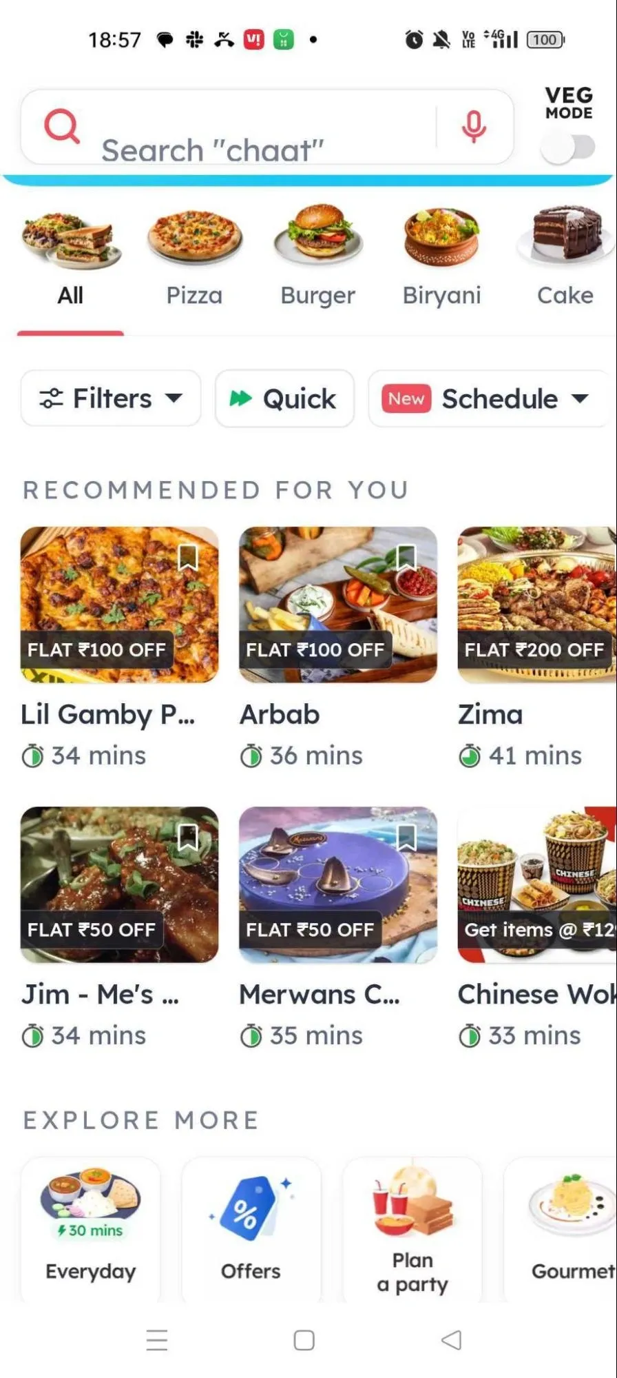
For Zomato, where more choices and quick decisions are both crucial, notice how they improve the UI/ UX by allowing users to select a category.
2. Fitt’s Law
This law states that large, more accessible elements on your mobile application’s interface will enjoy greater utilization.
What this means for your UI/ UX team: Make your interactive elements larger and more easily accessible.
Example 1: Slack
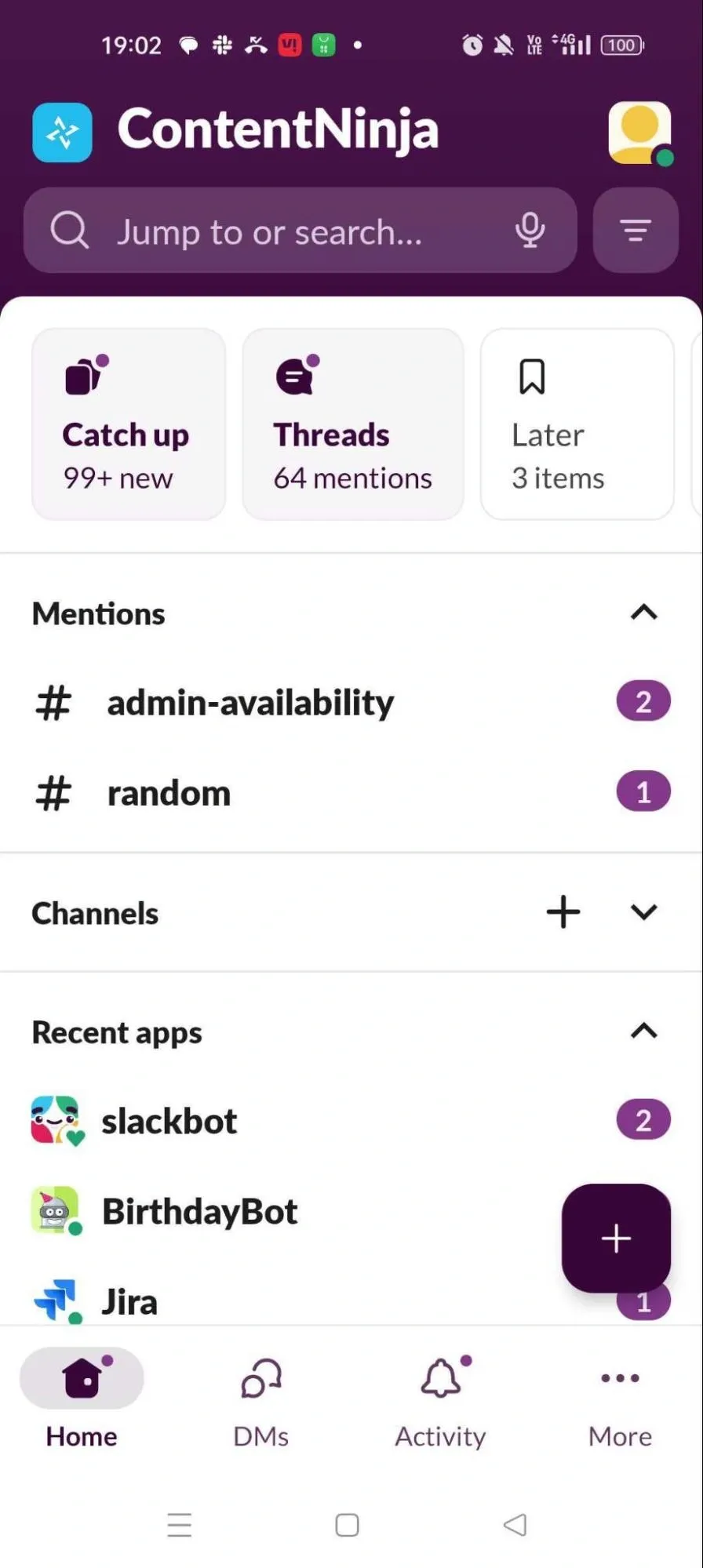
Notice that the most visible button here is the new message button—a lot of users open their Slack app to send a message. The other larger buttons are related to high traffic areas like Search, and threads where the user has been tagged.
Example 2: LinkedIn
Notice how the most-used engagement buttons and the search function represent the biggest elements on a LinkedIn app screen.
Example 3: Google Meet
Users can join a meeting or start a new one in one click from Meet’s clean app launch screen. There’s already very little on the screen, and core functions (join a meeting and start a meeting) are most prominent.
3. Law of Proximity
According to this principle of UI/ UX design for mobile apps, items standing next to each other are perceived as related.
Turn this into an UI/ UX instruction: Group related items to make your UI more intuitive. Also consider the idea of relatedness from your user’s POV.
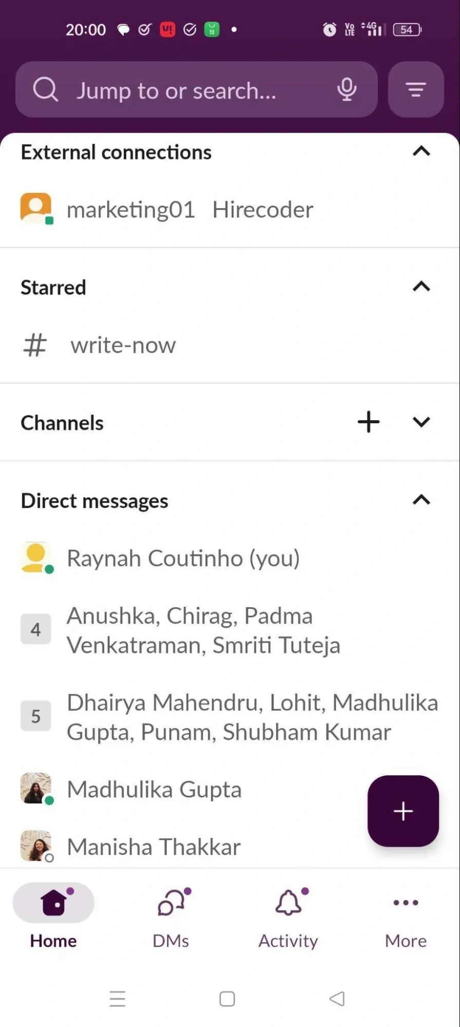
For example, for Slack’s business customers, not sending an internal message to a client channel is crucial. Slack practices the law of proximity right by separating External Connections and (internal) Channels.
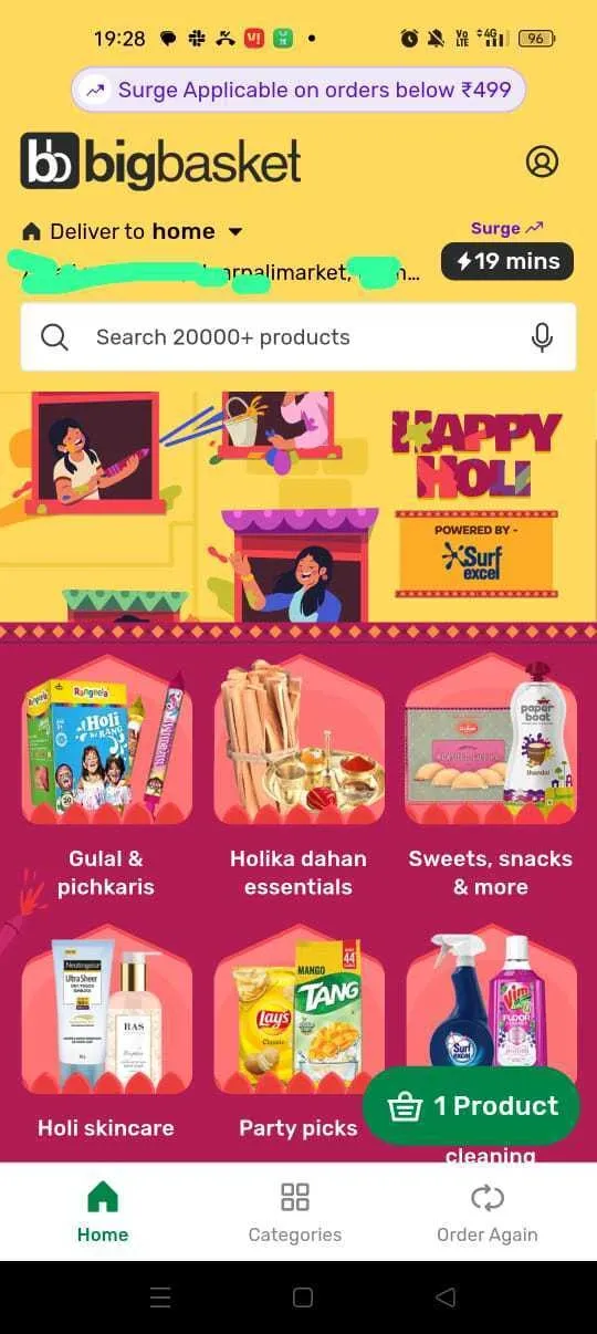
Here’s a similar example from BigBasket:
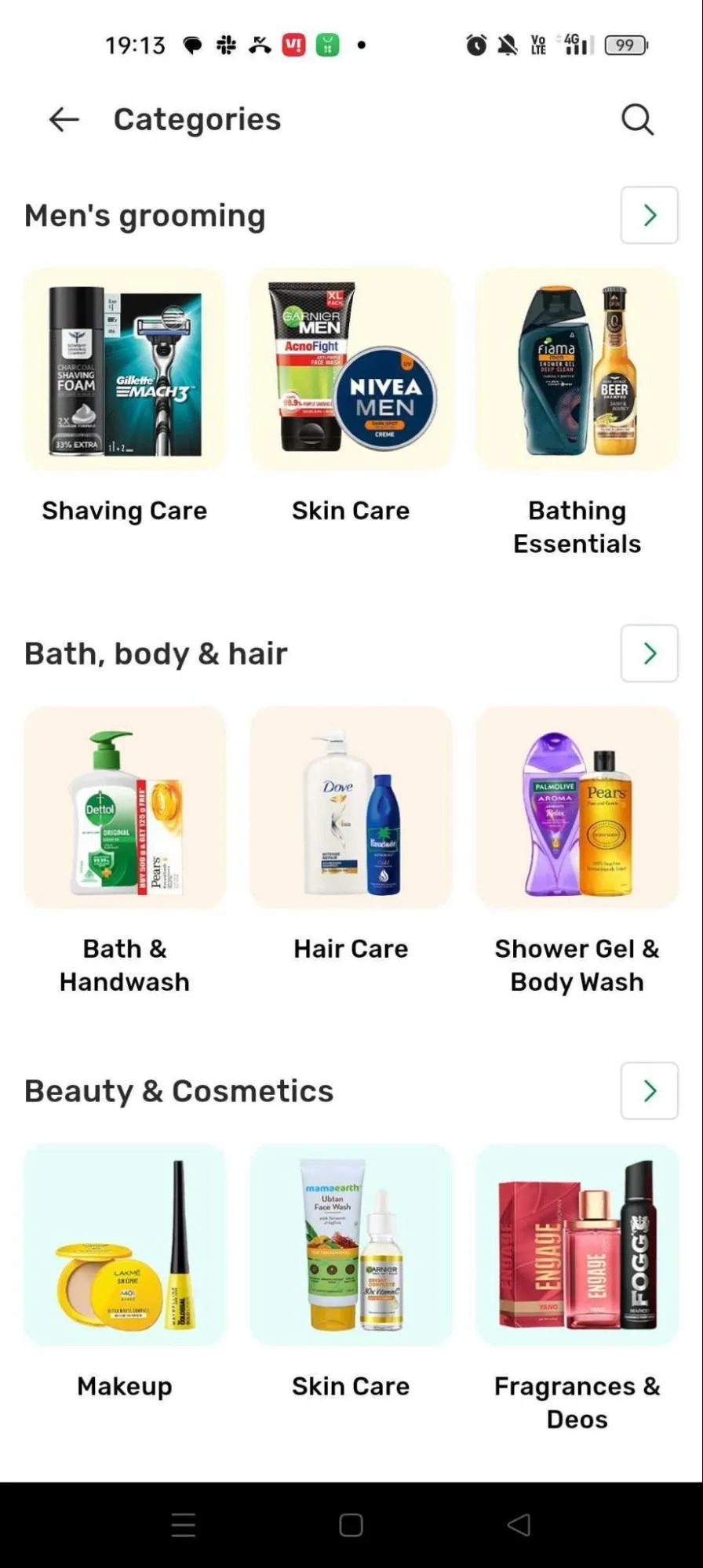
Grocery delivery app, BigBasket leans into the law of proximity by putting related categories of products next to one another for intuitive browsing.
Another example from INDMoney:

INDMoney groups all SIP investment-related actions (for different investment categories) in one fold of this tab.
4. Miller’s Law
(Most) people can only retain 7—give or take 2—items in their active memory at a given time.
What to tell your UI/UX designers: Avoid enlisting more than 5 items when creating navigation structures and presenting information on your mobile application’s interface.
Try grouping items to reduce list length.
5. Law of Familiarity
This law states that users feel more comfortable with interfaces that follow the same patterns.
Turn this into a UI/ UX rule for mobile application design: Not everyone enjoys Apple’s market standing, to pull off a completely different UI style from everyone else on the market.
Have your designers follow the UI patterns that other apps used by your TG would typically utilize. A competitive UX audit helps you understand these details.
Get in touch with us, and we’d be delighted to show you a sample.
Observe the following two popular grocery delivery apps side by side— notice the delivery time and location appears at the top 20% of the screen, while the cart/ basket appears at the bottom 25% of the screen.
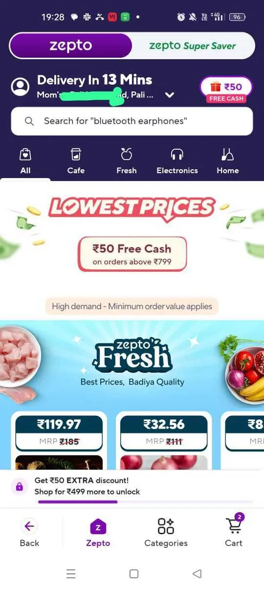
An app breaking away from this familiar style would automatically be perceived as less user-friendly.
6. Kano Model
Your mobile app’s features fall into three categories, according to this principle—basic, performance, and delight. Looking at it this way helps you prioritize features strategically, and plan your app’s product roadmap more efficiently.
What this means for you and your UI/ UX design team: Categorize and prioritize your mobile app’s features as per the Kano Model, rather than your gut.
For example, in the Workday example from our intro, it would appear that the first thing its team needs to prioritize is fixing its clock-in and work-time visibility features.
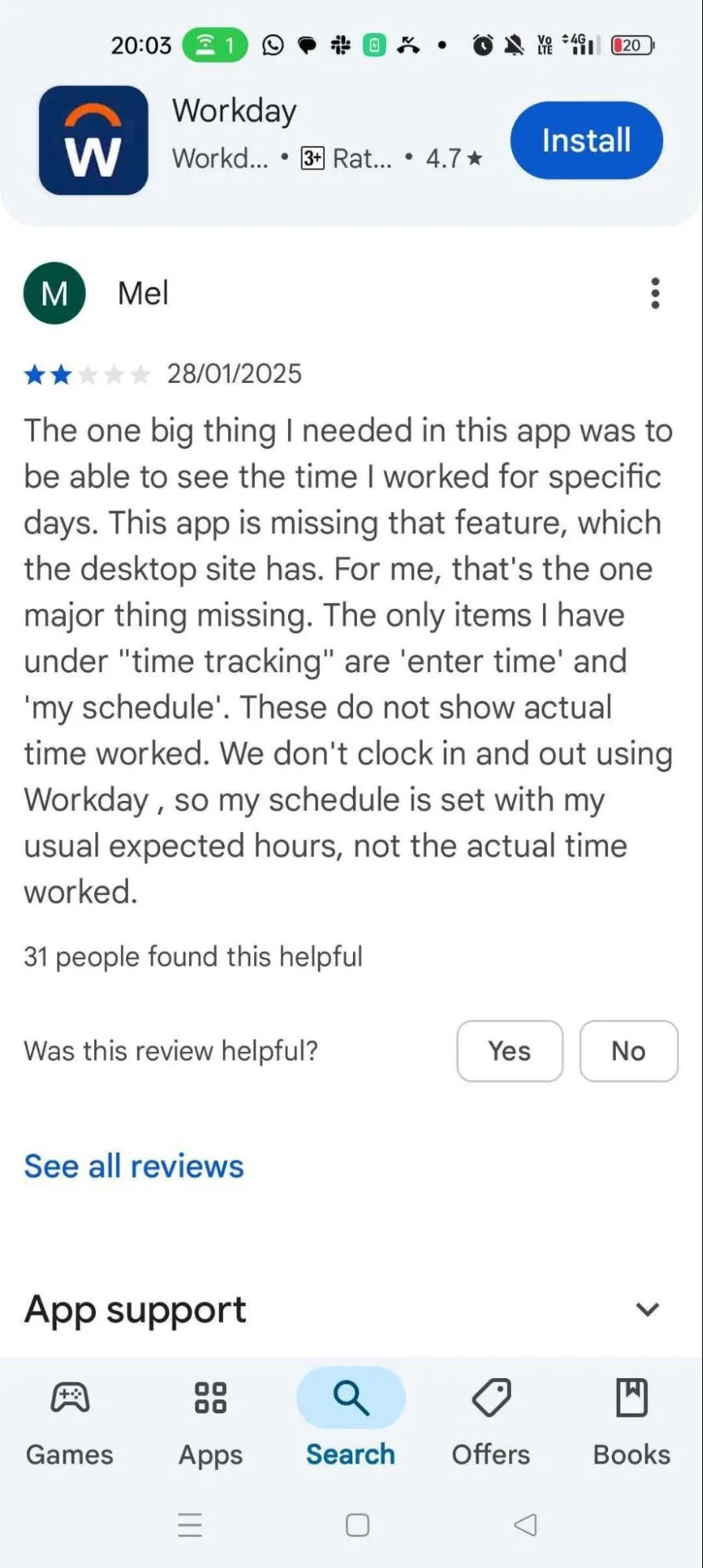
User frustration appears to stem from having functions that aren’t crucial to their experience, but not the ones they need most.
7. Aesthetic–Usability Law
Users assume a mobile app that looks good, also works well, according to this UI/ UX design law. This also means your apps should look current, following trending design styles and even colors (where possible, in alignment with your brand’s personality).
What this means for your UI/UX efforts: Invest consistently in design to keep your mobile app’s aesthetic current and pleasing. The minute your app starts “looking outdated”, there’s a high chance that people will also begin doubting its functionality or choose more aesthetically on-point alternatives.
8. Fogg’s Behavior Model
This principle proposes that the desired customer behavior is most likely to occur when motivation, ability, and triggers converge.
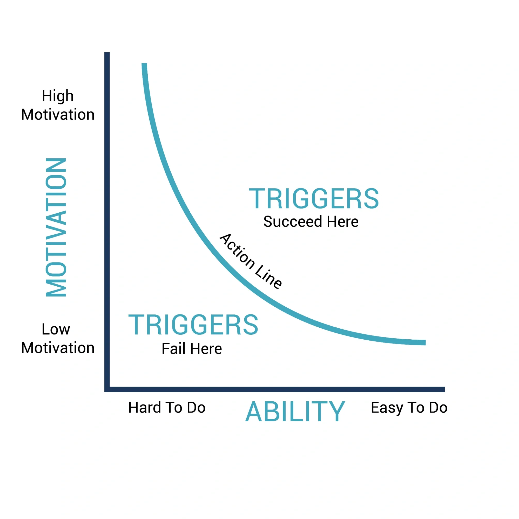
Let’s put this into the context of a ride-hailing app like Uber.
- Motivation might look like: “I need to get from point A to point B quickly.”
- Ability might look like: “I have the ability to book a ride easily, thanks to an app on my phone (that’s also easy-to-use).”
- Trigger: “The Book Now button on my favorite app, and notifications about ride-sharing discounts, and weekend offers.”
Easy enough for Uber; more complex when you’re Groww or INDMoney (both are fintech apps), where the paradigm shifts as follows:
- Motivation might look like: “I need to invest for tax savings, capital growth or some financial goal (like a family holiday, wedding or big-ticket purchase).”
- Ability (or the lack thereof) might look like: “I don’t know anything about investing in stocks and mutual funds.”
That’s where your UI/ UX can help bridge the gap: A Learn How Mutual Funds Work section, for instance, could educate users and drive ability.
- Trigger: “The Invest Now button on my app, notification prompts from my mobile app, and reminders about NFOs and tax deadlines.”
How does this impact UI/ UX design for mobile apps: To make conversions (or other desired actions) occur on your mobile app, you need to prompt the action and enable your customers’ ability to act.
If many users are dropping off at check-out, for instance, it may indicate a poor payment UI/UX, insufficient payment modes or system glitches.
Here’s an example from INDMoney:
Investment app INDMoney promotes Ability with a Learn Investing module that users can reach in 2 clicks from the app launch screen.
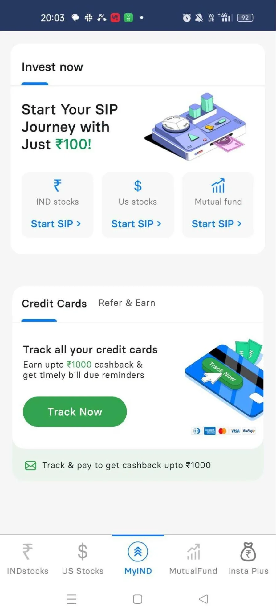
They provide prompts to encourage investors to invest, like “start with just Rs 100!”
👉 FURTHER READING:
- Startup UX Design Principles
- UI UX Design Companies in Dubai You Can Trust
- SaaS UX Design Best Practices
Mobile App UI/UX Heuristic Principles
9. Heuristic Principle of Visibility
Ensure predictability for the user by offering visibility into system status. The goal is to give them confidence in their action and determine next steps.
Turn this into a UI/ UX instruction: Find ways for your mobile application’s interface to communicate status as quickly as possible.
Has the user’s message been sent?
Is their order on its way?
Has a driver been assigned for their journey?
Here are two examples from Uber and Zomato:
10. Heuristic Principle of Damage Control
Greater confidence and utilization (and consequently, improved customer success) come from users experimenting with various features. However, this means that users might make mistakes.
That’s why undo, unsend and cancel features are a crucial part of any user interface.
What this means for your mobile app’s UI/ UX design: Add accessible and easy-to-use exit buttons. Encourage your designers to identify new undo action ideas and faster mechanisms for current cancel actions.
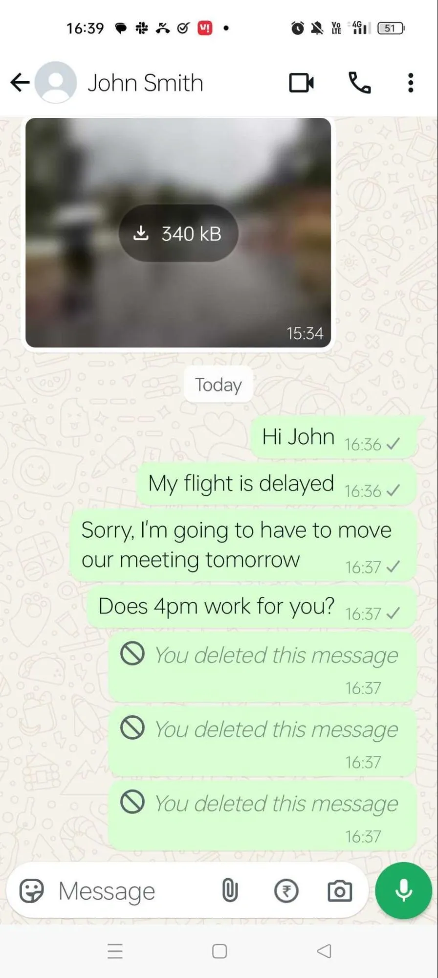
Users have praised WhatsApp’s delete message feature, although there is criticism that they could have built it better, i.e., without leaving the “This message was deleted” footprint.
This principle of damage control also extends to error recovery and troubleshooting. Express these in language your user understands— Netflix maintains a loyal customer base despite its frustrating error codes, but not every brand has that kind of market edge.
Also, always suggest how the user can diagnose and recover from the error.
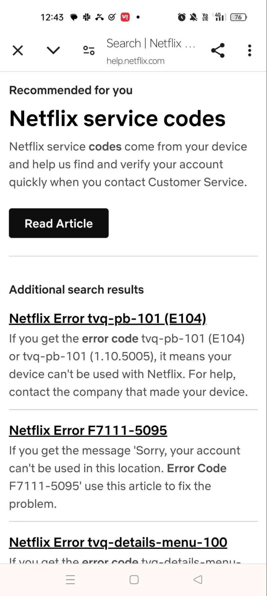
While error codes aren’t the best way to go, Netflix attempts to make the experience less frustrating: a quick Google search takes you to this troubleshooting page.
11. Heuristic Principle of Expert’s Convenience
Design your mobile app interface to appeal to both beginners and advanced users, enabling shortcuts and quicker access for frequently performed actions.
In some cases, you might need to make a tradeoff that sounds like this: You want your app to be intuitive and easy to use.
However, if you were only allowed to complicate things a little, you could deliver still greater value.
Good news: You may not have to make the tradeoff after all. You could offer added functionality (that accelerates actions for experienced users) through shortcuts, integrations, and personalizations around frequently used actions.
Let’s understand this principle with real SaaS examples:
Example 1: Google search suggestions
Most people will Google a word or phrase to look it up— frequent users may also use the image search feature for quicker research.
Example 2: Slack
Most users operate Slack like a messaging service, but it also has features like Lists, that deeper users might use as a document repository.
What this means for your UI/ UX designers: Ask your team to identify opportunities to add accelerators like touch gestures and customizations for functionalities.
Successful Mobile UX Design Examples: Get Inspired
We’ve covered the top principles that should guide your UI/UX efforts with examples from popular everyday apps and business apps.
Next, let’s look at three popular mobile app examples, and observe their best UX elements:
1. Airbnb
Grocery and food delivery apps tend to take busy homepages as inherent.
Clutter appears to be the price users pay when they ask for options. Not Airbnb, where design is often credited for its immense success.
They’ve managed to offer options within a clean interface. In fact, Airbnb has over 150 million users, globally.
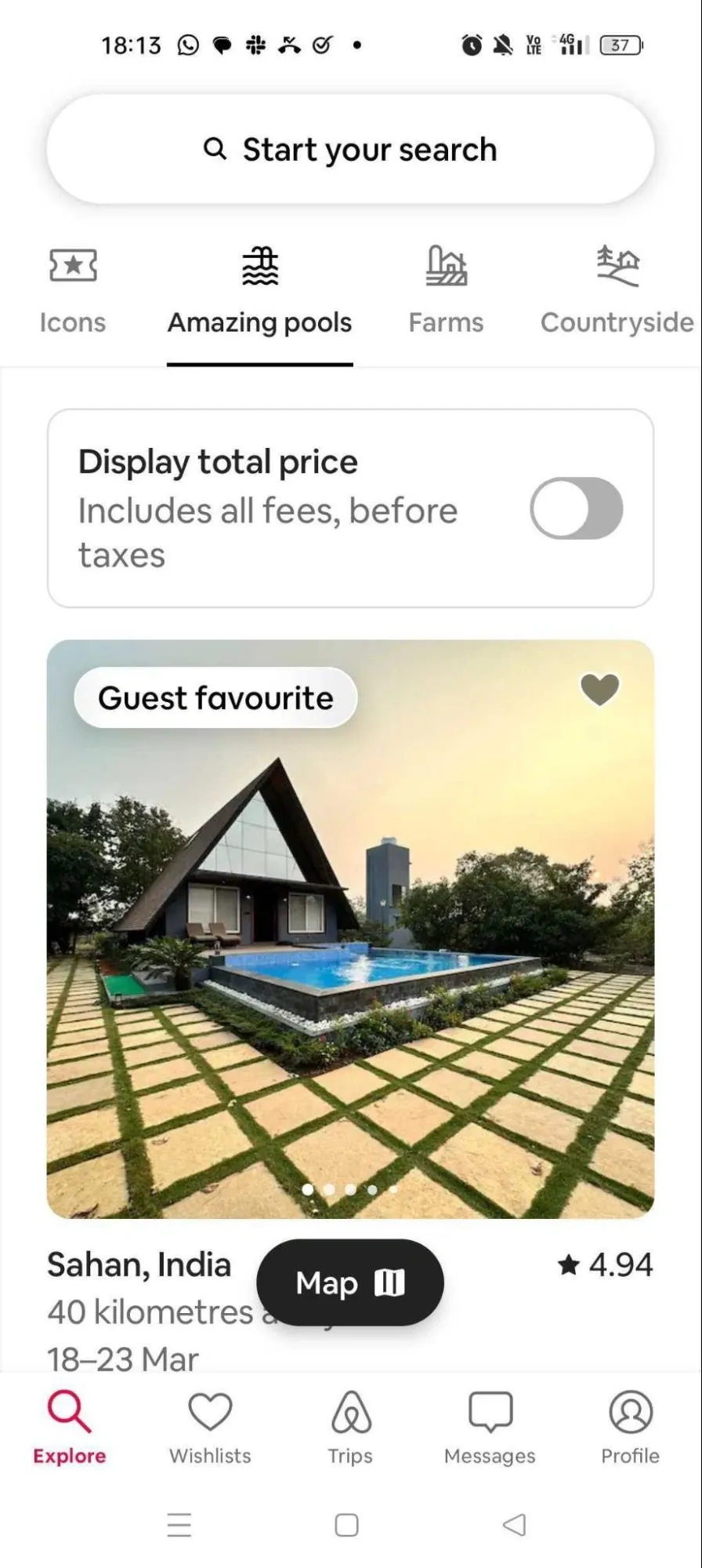
Selectable categories like amazing pools, farms, countryside, and beachside, help users fine-tune their search.
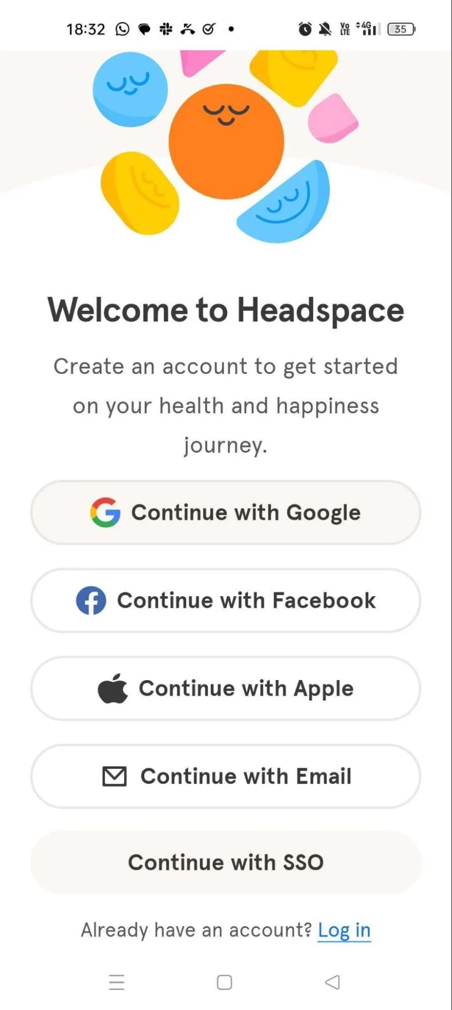
2. Headspace
For Headspace to succeed, it needed more than just a great product. It had to overcome the inertia that inhibits uptake for fitness and wellness apps.
Headspace used strategic UI/ UX elements to help users stop getting in their own way— thereby setting the stage for greater utilization and improved customer success.
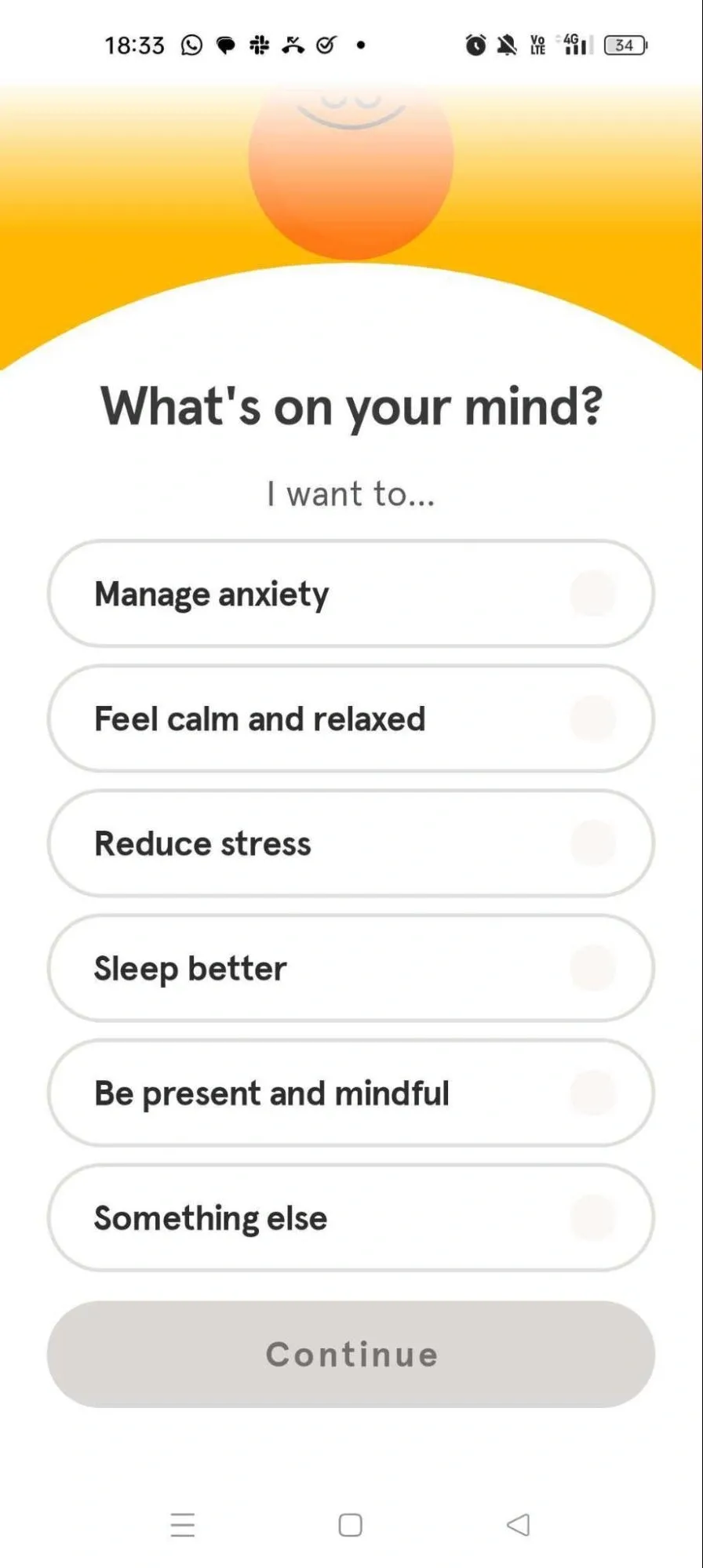
Here’s how Headspace onboard their users:
Step 1. Simplified onboarding was crucial to ensuring the UX diminished—rather than intensified—inertia.
Step 2. Personalizations allow users to fine-tune their app experience.
Step 3. Headspace attempts instant value exposition and customer action by adding a wellness exercise to onboarding.
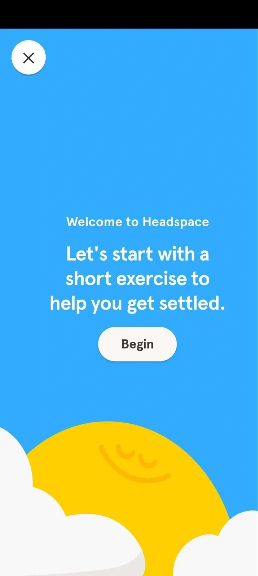
Headspace has clocked over 70 million app downloads.
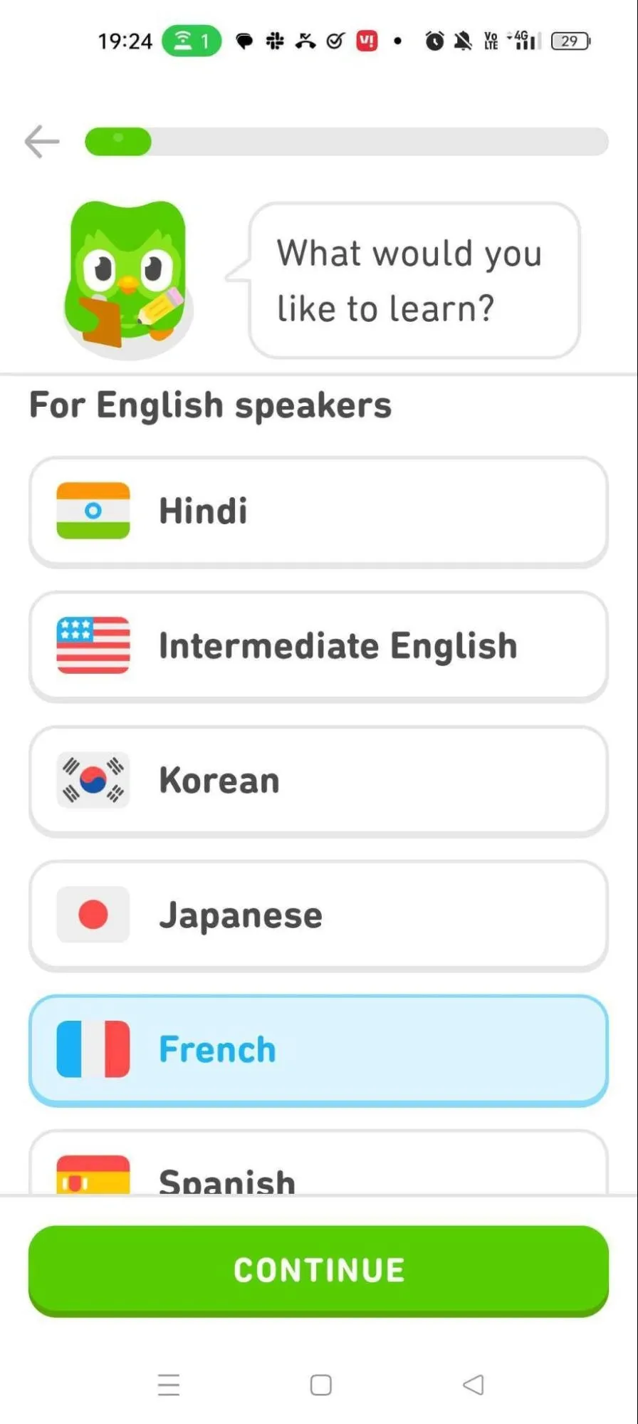
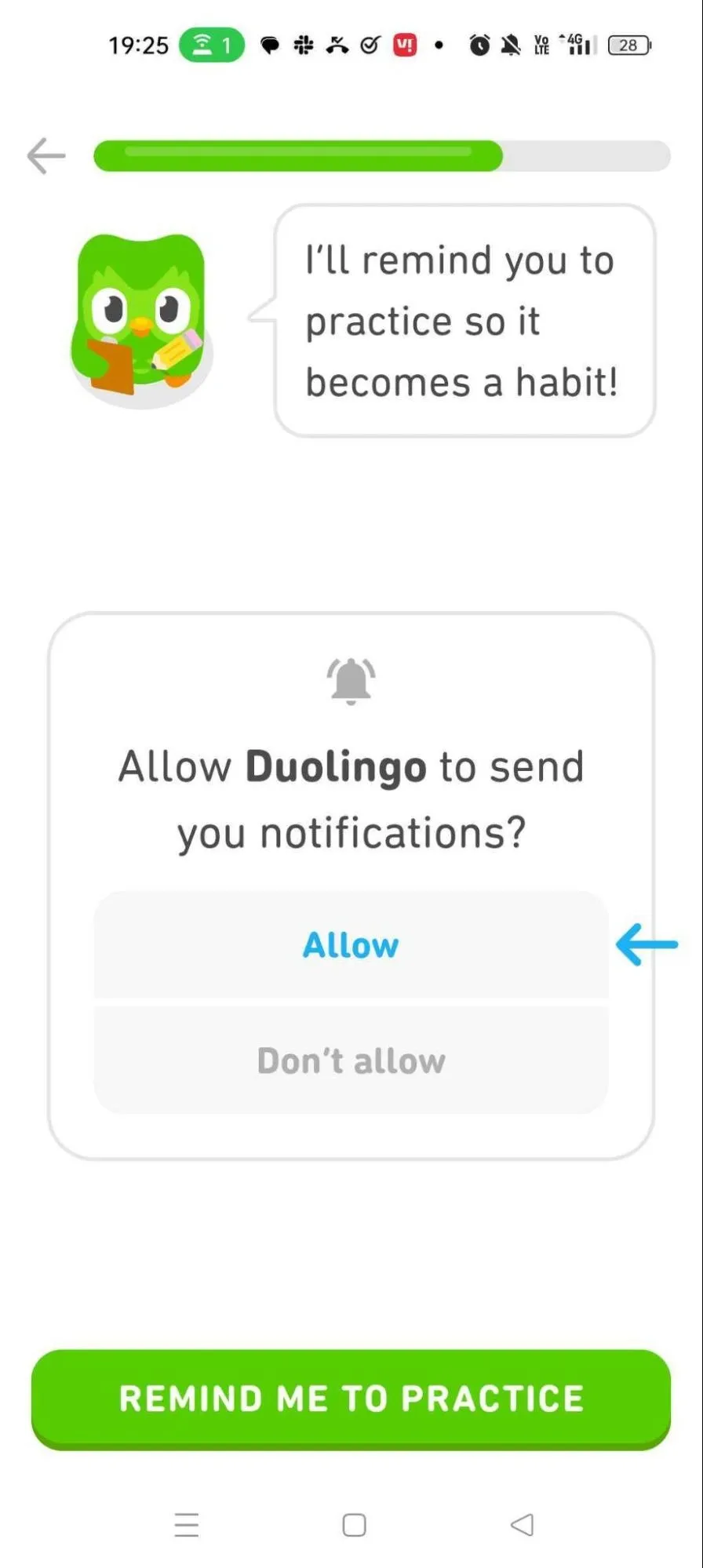
3. Duolingo
Here are some app screenshots with explanation:
Instead of tedious forms, users cut straight to the chase and select the language they intend to learn.
To promote improved customer success, Duolingo’s UI offers users the option of signing up for notifications.
Personalizations allow Duolingo to target users with different time availability levels—these personalizations also guide the UI/UX downstream.
Also notice the status bar, that displays onboarding progress. Remember the law of visibility we talked about earlier in this blog?
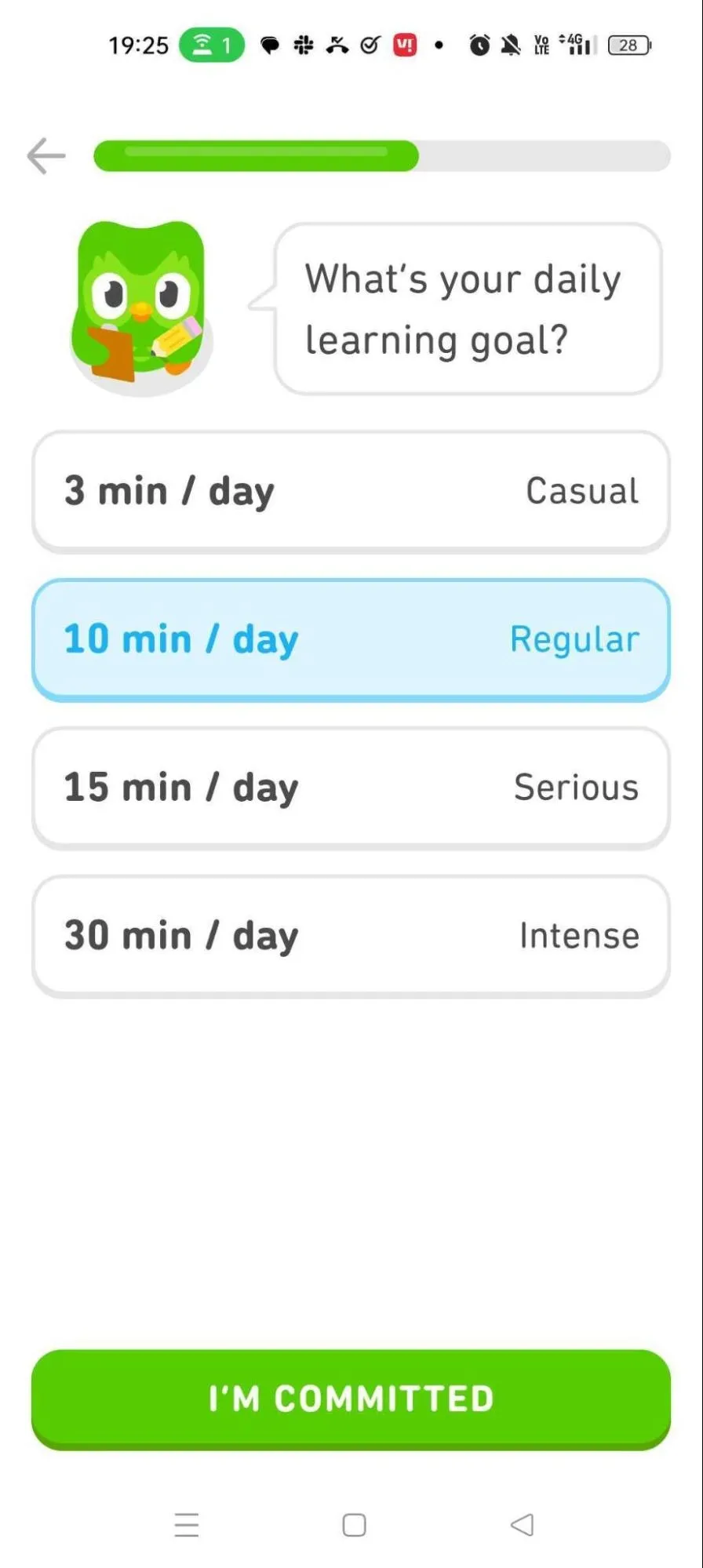
Duolingo has over 500 million users with an average of 37 million active on a monthly basis.
👉 FURTHER READING:
- Best UX Audit Tools (Shared by Our UX Experts)
- IMPORTANT UI UX Design Trends
- How Much Does UI/UX Design Cost?

Get Started On Your Mobile App
The most valuable mobile app idea with a poor UI/ UX can still fail.
That’s why you need a team that will turn your vision into a mobile app that users love, enjoy and recommend. We’re that team!
With over 400+ projects in the bag, we at Tenet, have the expertise to ensure your app succeeds. We have demonstrated excellence across the UI/UX development pipeline, from user research to wireframing and prototyping, all the way to app launch.
One example of our UI/UX development capabilities is the AcePlus e-learning app.
The app needed an intuitive UI/UX to deliver an easy-to-use, engaging, gamified learning experience for children. It also had to be data-secure, to ensure the privacy and safety of young users.
Our team created an app that checked all the client’s UI/UX boxes: user-friendliness, interactive elements, and gold-standard data privacy.
We achieved all of this— development of the AcePlus mobile app with 15 interactive games, a secure backend, and a super-admin panel—in just 7 months.
Following the UI/UX redesign, the app has achieved nationwide engagement, marking a significant expansion from its initially limited reach in Kolkata, India.
We can do the same, and more, for you.
Whether you’re launching your first app, or making updates to meet evolving tastes, ensure success by working with the leading UI/UX design agency.
Ready to transform your mobile app idea into a success story?
Contact us to get your free UI UX design proposal.
Contact our UI UX experts & know how we can help
Contact our UI UX experts & know how we can help


Got an idea on your mind?
We’d love to hear about your brand, your visions, current challenges, even if you’re not sure what your next step is.
Let’s talk


