How to Design Profitable SaaS Landing Pages (10 Factors)
Share
Share
Get a quick blog summary with


Most SaaS landing pages don’t fail because of bad design—they fail because they don’t convert.
At Tenet, we’ve helped over 300 clients across 15+ countries design landing pages and digital experiences that have generated $1.54 billion in revenue and investment outcomes.
Our work has powered conversions for early-stage startups, Fortune 1000 companies, and scaled SaaS teams alike.
In this guide, we’ll break down 10 proven design principles that make landing pages convert—fast.
From high-impact CTAs to mobile-first layouts and frictionless UX, you’ll learn exactly how to build SaaS landing pages that turn clicks into trials and browsers into buyers.
What is a SaaS Landing Page?
A SaaS landing page is a dedicated web page designed to convert visitors into users or customers for a Software as a Service product. An effective landing page highlights the software’s features, benefits, and call-to-action, often with testimonials, demos, or pricing to drive sign-ups or trials.
It’s often the final step in a paid ad, email, or outbound campaign, where someone clicks through expecting a solution.
That’s why every SaaS landing page must instantly answer:
- What does this software do?
- How will it help me?
- What’s the next step?
The most effective SaaS landing pages:
- Present a clear value proposition (not just features)
- Include product visuals or demo videos
- Add social proof from other users
- Offer a low-friction CTA (like “Start Free Trial” or “Book a Demo”)
- Strip out all unnecessary elements like top navs, external links, or unrelated messaging
You’ll often see these pages used to:
- Promote a new SaaS feature
- Capture leads from performance marketing
- Convert high-intent visitors during a product launch or sales campaign
A SaaS landing page is not about storytelling or branding. It’s a conversion asset - designed to remove friction, build trust fast, and drive action.
💡 Want our SaaS and UI UX design experts to help you audit and optimize your landing pages? Explore what SaaS services we offer:
- SaaS development services
- Full-service SaaS marketing services
- SaaS UI UX design agency
- SaaS SEO services that deliver measurable ROI
- SaaS email marketing agency(5x leads & conversions)
What’s the difference between a saas landing page and a homepage?
The main difference between a SaaS landing page and a homepage is intent and focus. A SaaS landing page targets a specific campaign or audience segment with one goal—usually sign-ups or trials—using focused messaging, minimal navigation, and persuasive elements.
A homepage introduces the brand, offers broad navigation, and supports multiple user journeys.
Here's a clear table comparing a SaaS Homepage vs. SaaS Landing Page, based on purpose, structure, and impact, with actionable takeaways built in:
Why are landing pages important in SaaS?
Let’s break down why landing pages are important, with real numbers, real platforms, and clear reasoning.
1. They boost conversion rates by 2–3x
Landing pages are designed with a single, focused objective, be it capturing leads, securing demo bookings, or encouraging free trial sign-ups. Unlike homepages, which often present multiple navigation options and distractions, landing pages streamline the user journey toward a specific action.
In 2025, the median landing page conversion rate across all industries is 6.6%, with the SaaS sector averaging 3.8%.
This indicates that startups can significantly enhance their conversion rates by directing traffic to purpose-built landing pages rather than general homepages.
Here’s the average landing page conversion rate across different industries:
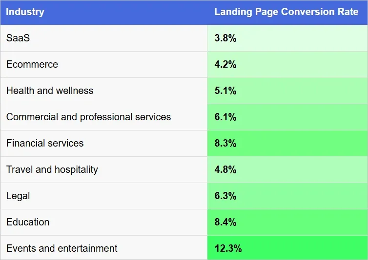
👉 Find more SaaS market statistics (trends report).
2. Reduce Your Customer Acquisition Cost (CAC)
If you’re spending $5 or $50 per click, it adds up fast. But if most visitors drop off because they don’t find what they came for… that’s just wasted budget.
Landing pages reduce that waste.
They eliminate clutter, remove friction, and make it easy for users to act, whether that’s booking a demo or downloading a lead magnet.
💡 Takeaway for startups:
The more focused your landing page, the cheaper it is to get someone into your funnel.
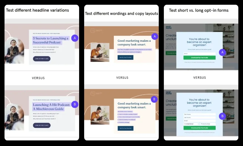
3. Perfect for A/B Testing and Optimization
Your homepage has too many moving parts. You can’t tell which part is helping or hurting your conversions.
Landing pages are ideal for A/B testing because they focus on one headline, one offer, and one CTA.
This simplicity allows SaaS companies to test headlines, images, and calls-to-action to see what performs best.
The images below show A/B testing done on the headline, copy, and opt-in forms:
4. Maximize ROI from Paid and Performance Campaigns
Picture this: You're running a Google ad offering a “Free Notion template for remote teams.” But the ad links to your homepage.
Now the user has to scroll around, try to find the offer (if it exists at all), and maybe… they bounce.
But what if that click went to a dedicated landing page with:
- The same headline as your ad
- One form field to download the template
- A visual showing what they’ll get
- No distractions
That’s how you turn clicks into conversions.
Startup tip:
Align your ad copy + your landing page = higher conversion + better Quality Score + lower CPC.
5. Build Trust Fast for Skeptical Buyers
Startups often struggle with credibility. So when someone lands on your site, they’re looking for reasons to trust you. A landing page gives you space to build that trust quickly.
How?
- Add testimonials
- Share short success stories
- Show client logos
- Mention compliance (like SOC2, GDPR) if relevant
This removes doubts and reassures visitors that they are making the right decision.
Here’s an example from Smartlead.ai of using customer testimonials:
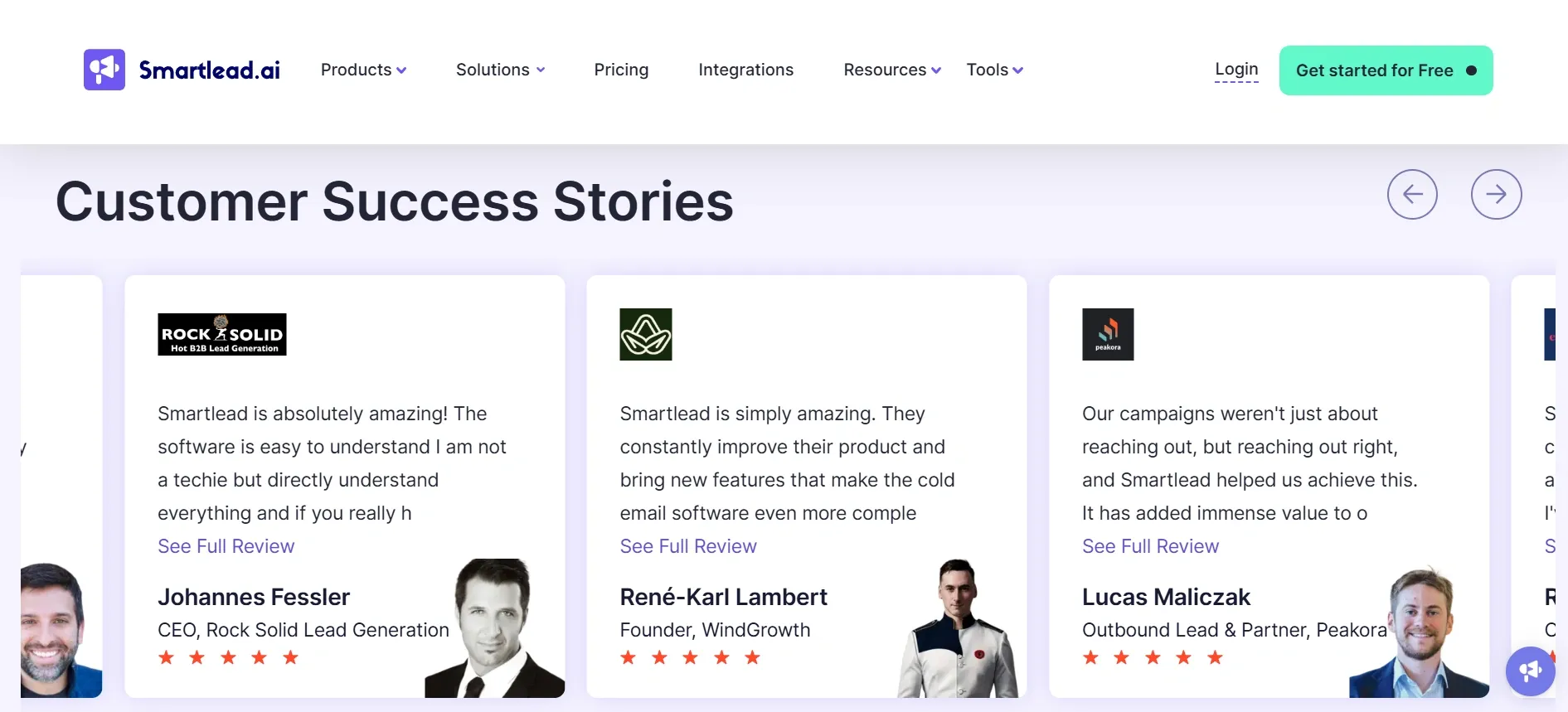
Another example of adding third-party reviews:
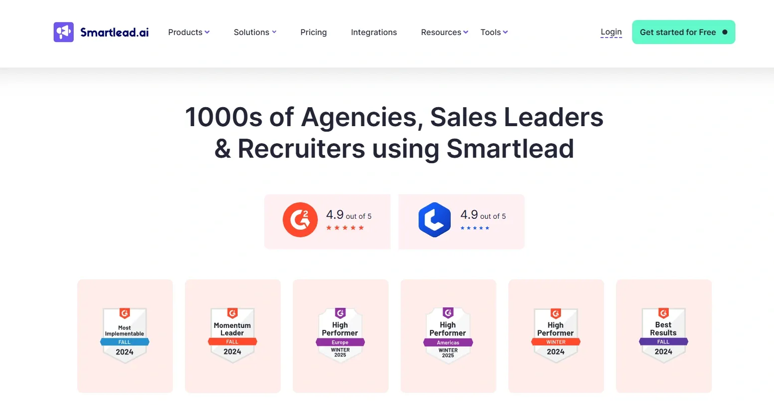
These images show how Smartlead.ai builds trust using badges and customer stories on the landing page.
👉 Take inspiration from our SaaS laning page examples
10 key principles to design a high-converting SaaS landing page
Designing a SaaS landing page isn’t about flashy visuals—it’s about driving action.
These 10 key SaaS landing page UX design principles will help you build landing pages that convert visitors into leads and paid customers.
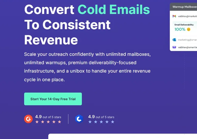
1. Grab Attention Instantly with a Value-First Headline
Category: Communication
What it is:
The headline is the most important part of a landing page. It must grab attention immediately by explaining the core benefit of your SaaS product. Focus on solving a problem or providing value in the simplest, most direct way.
Why it matters:
It’s the first thing users read; if it doesn’t grab attention and explain the value quickly, they’ll bounce.
For example:
- Effective: “Automate Your Email Campaigns in Minutes”
- Ineffective: “Revolutionary Email Marketing Solution”
How to implement:
- Place your headline prominently above the fold, where it's visible without scrolling.
- Use benefit-first language focused on solving the user's top pain point.
- Avoid jargon—use simple, direct words that even a 7th grader can understand.
- Write 3–5 headline variations and run A/B tests to see which gets the best engagement.
- Use tools like Headline Analyzer by CoSchedule to score clarity and emotional impact.
Here’s a side-by-side comparison of an effective vs. ineffective SaaS landing page headline.
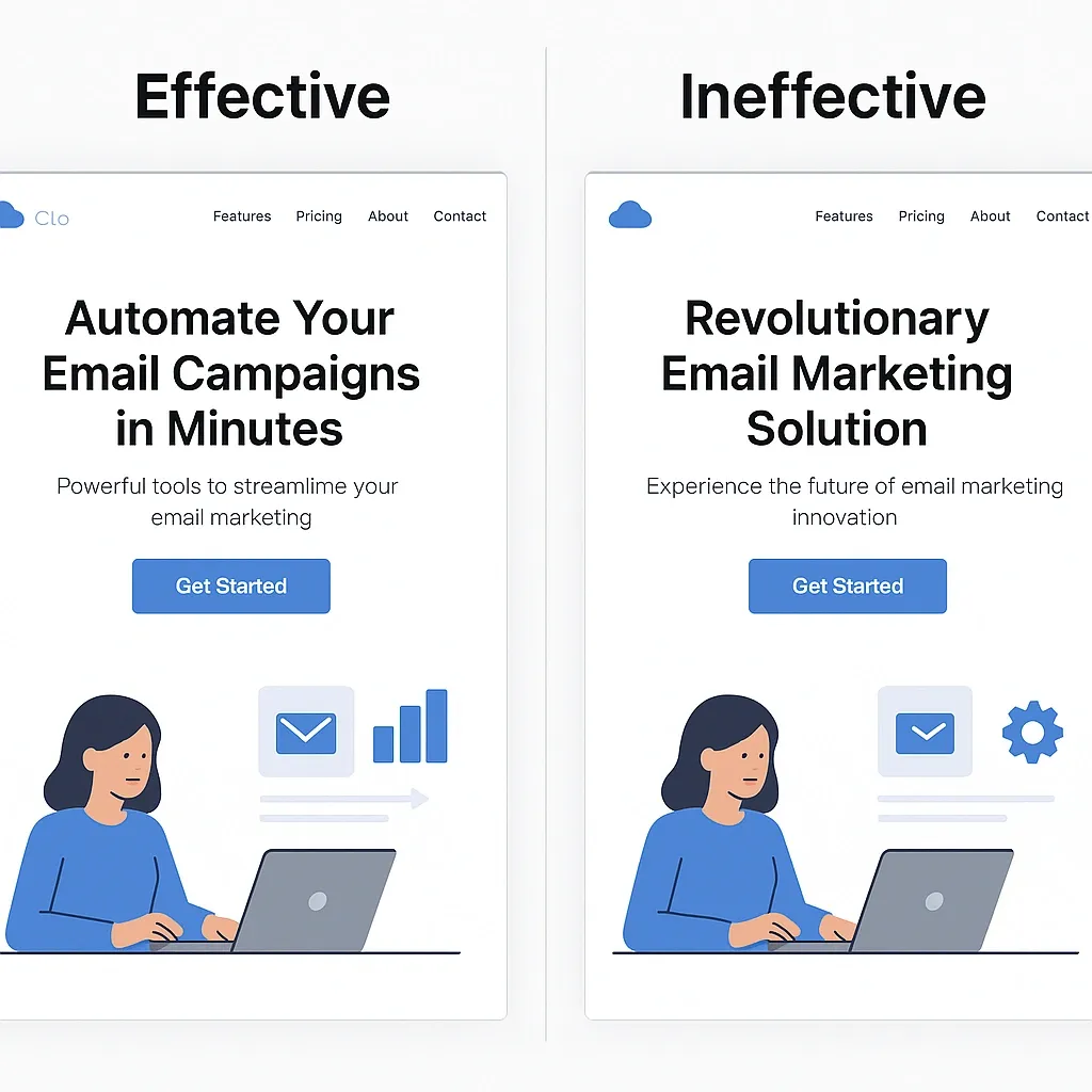
The effective version clearly states the benefit—“Automate Your Email Campaigns in Minutes”—while the ineffective one uses vague, buzzword-heavy language without addressing user value.
2. Add Clarity with a Supporting Subheadline
Category: Communication
What it is:
Just below the headline, add a short subheadline that explains the value further. This should offer a bit more detail or reinforce the benefit mentioned in the headline. It can help make the value proposition even clearer.
Why it matters:
It bridges the gap between the headline and the rest of the content, giving visitors a fuller understanding right away.
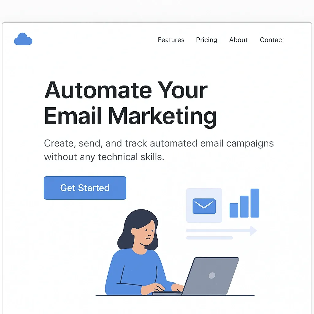
For example:
- Subheadline: “Create, send, and track automated email campaigns without any technical skills.”
How to implement:
- Position the subheadline directly under your headline as a continuation of the story.
- Use it to explain how you deliver the benefit mentioned in the headline.
- Keep it short—1 to 2 lines max—and easy to read.
- Emphasize the value or simplicity of your solution using outcome-driven language.
- Make sure it complements the headline without repeating it.
Example of an effective SaaS landing page subheadline 👇
3. Show, Don’t Tell—Use Product Visuals or Demo Videos
Category: Engagement
What it is:
Screenshots, GIFs, or short videos showing how your SaaS works.
Why it matters:
People need to see the product in action. Including screenshots, videos, or GIFs gives potential customers a clear idea of what they can expect. Visuals are often more effective than lengthy text, as they demonstrate the actual experience of using the product.
For example:
- A screenshot of your SaaS dashboard highlighting key metrics.
- A 60-second explainer video showing how to create a campaign in your product.
- A GIF looping the main feature workflow (e.g., drag-and-drop automation builder).
How to implement:
- Place your main product screenshot or video near the top of the page—ideally next to or under your subheadline.
- Use high-resolution images that highlight key features and functionality (avoid blurry or cluttered visuals).
- For videos, keep it under 90 seconds and use captions for clarity.
- Add a “Play” button overlay and embed on fast-loading players like Loom, Vimeo, or Wistia.
- Label visuals with short, benefit-focused captions to guide attention and explain the value.
Here’s an image showcasing product visuals & demo video:
4. Drive Action with a High-Impact CTA
Category: Conversions
What it is:
The CTA is the action you want visitors to take, whether it’s signing up for a trial, booking a demo, or starting an account. It should be clear, actionable, and easy to find.
Why it matters:
The CTA is the tipping point between interest and action. Even if your landing page is perfect, a weak or unclear CTA can cause users to hesitate or leave.
A strong, well-placed CTA reduces friction, tells visitors exactly what to do next, and drives your most important metric- “conversions”. When users instantly understand the benefit of clicking, they're far more likely to take action.
For example:
A button that says:
- “Start Your Free Trial”
- “Book a Demo”
- “Get Started”
How to implement:
- Use a large, contrasting button with actionable text like “Start Free Trial” or “Get Instant Access.”
- Repeat the CTA in 2–3 places on the page: once above the fold, again in the middle, and one near the bottom.
- Align button color with your brand palette but make sure it stands out.
- Keep form fields minimal—name and email only, unless absolutely necessary.
- Surround the CTA with trust elements like “No credit card required” or “Cancel anytime” to reduce hesitation.
5. Sell Outcomes, Not Features, with Benefit-Driven Copy
Category: Communication
What it is:
Short text blocks that focus on outcomes instead of features.
Why it matters:
Visitors don’t read, they scan. In a few seconds, your copy needs to show them what’s in it for them.
Long, feature-heavy text can overwhelm or bore users. Benefit-driven copy keeps them engaged by speaking their language, solving their pain points, and painting a picture of how your product improves their lives. It builds momentum toward your CTA and reinforces your value proposition.
For example:
- Feature: “AI-powered chat support”
- Benefit: “Instantly answer customer questions 24/7, saving your team hours a day.”
How to implement:
- Break text into short 2–3 line paragraphs, using bold text and subheadings to guide skimming.
- Focus on what the user will gain—not just what your tool does.
- Start each section with a question or pain point (“Tired of switching tabs to manage tasks?”).
- Support benefits with a short feature mention if needed, but keep benefits first.
- Read the page out loud to ensure it sounds clear and conversational.
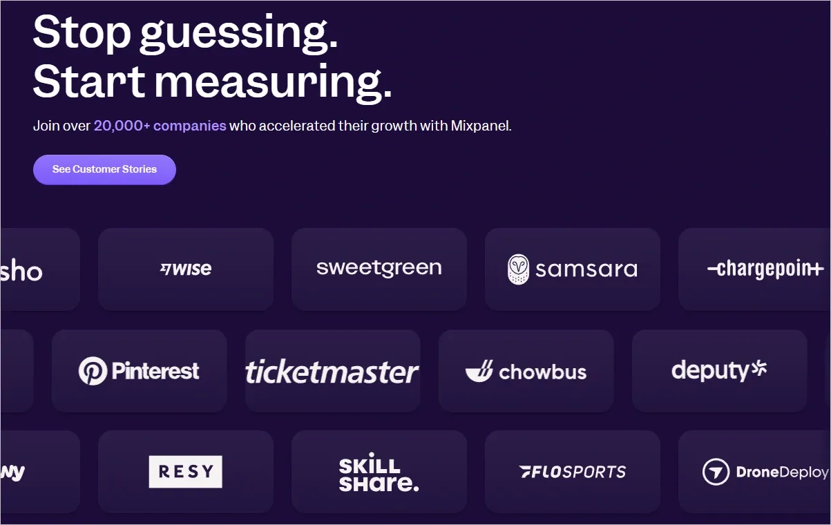
6. Use Social Proof to Build Trust Quickly
Category: Social Proof
What it is:
Evidence that others trust and benefit from your product.
Why it matters:
To build trust, include testimonials from real users, customer logos, or reviews from platforms like G2 or Trustpilot. Social proof helps validate the quality and effectiveness of your product by showing that others have benefited from it.
For example:
You can include:
- Testimonials with customer photos and names
- Reviews from credible sources
- Logos of well-known companies that use your product
How to implement:
- Collect 3–5 testimonials from happy customers, ideally with names, job titles, and photos.
- Place a rotating slider or logo strip near the CTA or just after explaining benefits.
- Include third-party badges like G2, Capterra, or Trustpilot, along with average star ratings.
- Use a mix of short quotes (“Saved us 10+ hours per week!”) and story-based testimonials (“We switched from X to Y…”).
- Ensure social proof is spread throughout the page— not just at the bottom.
Social proof is especially powerful for first-time visitors who may be skeptical of your claims. Example from Mixpanel:
In fact, we also showcase our reviews on service landing pages to build trust and credibility:
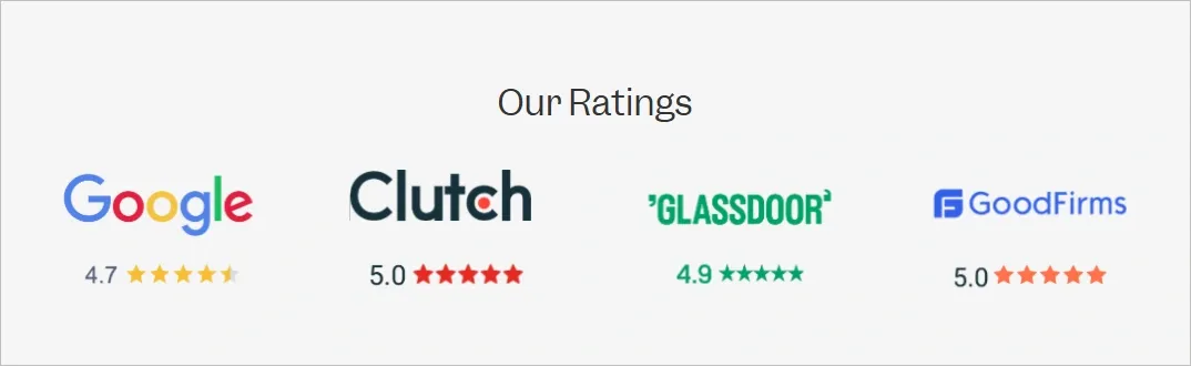
7. Reassure Visitors with Trust Signals and Safeguards
Category: Conversions
What it is:
Elements that reduce anxiety and reinforce credibility/security.
Why it matters:
Visitors want to feel secure before taking action. Add trust signals to your page to assure visitors that their personal information will be kept safe. Trust signals include:
- “No credit card required.”
- Security badges or encryption icons (e.g., SSL certificates)
- Privacy policies and GDPR compliance statements
These elements help reduce anxiety and increase conversions.
For example:
- “SOC 2 Certified” or “GDPR Compliant” badges
- “No credit card required” next to your CTA
- “Used by 1,000+ teams globally”
- Security icons (lock symbol, HTTPS, etc.)
How to implement:
- Place key trust signals near the CTA to reassure users before they take action.
- Use visual cues like recognizable icons, lock symbols, and clean badge designs.
- Add a small section at the bottom of the page explaining your privacy policy or compliance certifications.
- Mention “No credit card required” or “Cancel anytime” where sign-up friction exists.
Image showing Security badges like SOC 2 on the landing page
8. Design for Speed and Devices—Mobile-First, Always
Category: Engagement
What it is:
Mobile-optimized, fast-loading page that works across all devices.
Why it matters:
More than 50% of web traffic now comes from mobile. If your page loads slowly or displays poorly, users will drop off before they even read your headline. Speed and responsiveness directly affect bounce rate, engagement, and ultimately conversions. A laggy page creates friction; a fast, responsive one creates trust.
For examples:
- Mobile-first layout with optimized images
- Page load speed below 3 seconds
- Simplified navigation for smaller screens
How to implement:
- Use tools like Google PageSpeed Insights or GTmetrix to test and optimize performance.
- Compress images and minimize third-party scripts.
- Use responsive design frameworks like Bootstrap or CSS Grid.
- Test on multiple devices (mobile, tablet, desktop) to ensure a consistent experience.
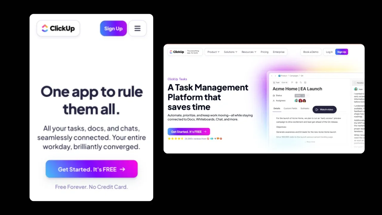
Here’s a screenshot from ClikUp mage showing both a mobile and desktop-friendly landing page:
9. Keep It Simple with a Clean, Conversion-Focused Layout
Category: Engagement
What it is:
A layout that’s free from clutter, easy to navigate, and visually guides the user through your message and CTA without distractions.
Why it matters:
Visitors make snap judgments. A clean layout ensures they don’t get overwhelmed or lost. It improves readability, keeps attention on what matters, and gently nudges users toward the desired action. Messy, noisy pages confuse and increase drop-off.
Examples:
- Clear visual hierarchy with bold headlines and subheads
- Ample white space between sections
- Minimal or no top navigation to reduce exit points
How to implement:
- Use a one-column layout or grid to guide the reader’s eye top to bottom.
- Remove top nav bars, footers, or unnecessary links—your landing page should have one goal.
- Use consistent spacing (padding/margin) between sections to avoid visual noise.
- Stick to 2–3 brand colors, 1–2 fonts, and clear visual hierarchy (H1 > H2 > Body).
- Apply white space generously to improve scannability and focus.
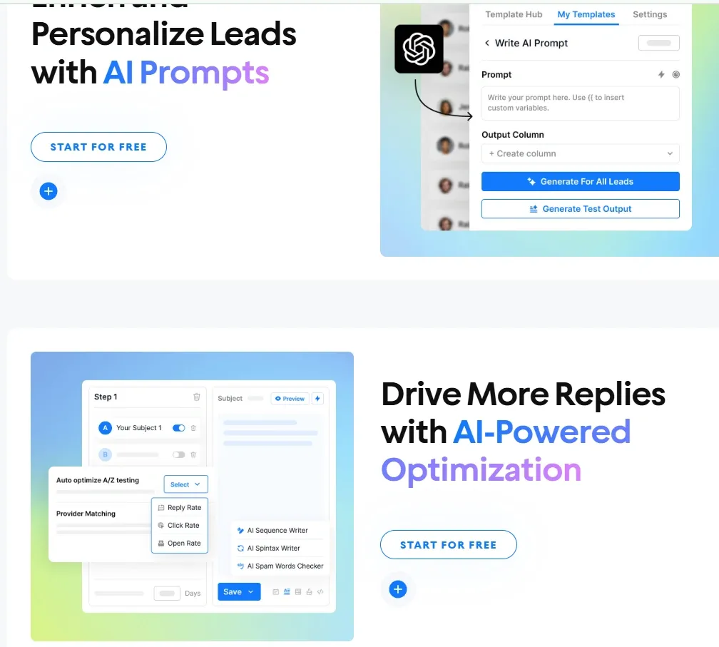
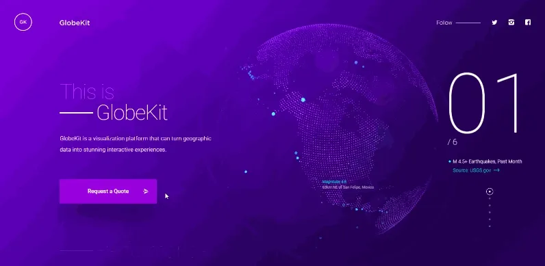
10. Increase Engagement with Interactive Touchpoints
Category: Engagement
What it is:
Functional tools or features on your page that allow users to interact with your product before converting—like pricing calculators, product selectors, or interactive demos.
Why it matters:
People don’t want to read—they want to experience. Interactive elements make your product more tangible, memorable, and personalized. They increase time on page, deepen understanding, and boost the likelihood of sign-ups or demos because users feel involved in the process.
Examples:
- Pricing calculator that adjusts based on team size or features
- Quiz to recommend the right product plan
- Interactive product tour or clickable demo
How to implement:
- Use low-code platforms like Outgrow, Candu, or Typeform to build calculators, quizzes, or selectors.
- Embed interactive tools above the fold or after the benefits section.
- Keep interactions short—3–5 steps max—to avoid user drop-off.
- Add dynamic outputs (e.g., “Your plan starts at $49/month”) to show value instantly.
- Use event tracking (Google Analytics, Mixpanel) to measure engagement and optimize based on drop-off points.
A GIF showing an interactive element in the SaaS landing page:
👉 Learn how much SaaS development costs.
Ready to design your SaaS landing page that actually converts?
Your landing page is more than just a digital brochure, it’s your first (and sometimes only) shot at turning interest into intent.
If it doesn’t communicate what you do, who it's for, and why it matters within seconds, users will scroll on.
At Tenet, we believe good design isn’t just about aesthetics. It’s about building trust, removing friction, and guiding visitors toward action effortlessly.
From high-converting landing pages to complete product websites, we’ve partnered with early-stage startups and scaled teams to create experiences users remember and act on.
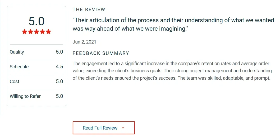
Here’s what our customers say about our brand:
Need help designing a landing page that doesn’t just win awards but wins customers?
👉 Contact us to build something that works.
FAQs related to SaaS landing page design
1. What is the main purpose of a SaaS landing page?
The main purpose of a SaaS landing page is to convert visitors into leads, users, or customers by presenting a focused message, clear value proposition, and a single call-to-action such as “Start Free Trial” or “Book a Demo.”
2. How is a SaaS landing page different from a homepage?
A SaaS landing page is built for one goal—conversion. It removes distractions and guides users to act. A homepage supports multiple user journeys like brand discovery, blog reading, and hiring, offering general navigation and broader messaging.
3. What elements make a SaaS landing page high-converting?
Key elements include a clear headline, supporting subheadline, product visuals or videos, a strong CTA, benefit-driven copy, social proof, trust signals, mobile optimization, clean layout, and optional interactive elements like calculators or demos.
4. Why should SaaS startups avoid sending ad traffic to the homepage?
Sending paid traffic to a homepage leads to confusion and drop-offs. Landing pages match the intent of the ad, provide a single message, and improve conversion rates by up to 2–3x compared to general pages.
5. What is a good conversion rate for a SaaS landing page?
A good SaaS landing page typically converts at around 3.8% in 2025. High-performing pages can exceed 6% depending on the offer, audience targeting, and design clarity.
6. How do landing pages help reduce Customer Acquisition Cost (CAC)?
Landing pages reduce CAC by focusing user attention on one action, lowering bounce rates, and increasing the return on every ad click. This improves funnel efficiency and maximizes the value of each visit.
7. What type of content works best for SaaS landing pages?
Benefit-driven content works best. Highlight how your product solves a problem, use testimonials, show product visuals, and avoid jargon. Focus on clarity and relevance over creativity or branding.
8. How can I build trust on a SaaS landing page?
Build trust using testimonials, customer logos, third-party reviews, trust badges (e.g., SOC2, GDPR), and language like “No credit card required.” Place these near your CTA to reduce hesitation and boost conversions.
Get expert help in building your SaaS app platform
Get expert help in building your SaaS app platform


Got an idea on your mind?
We’d love to hear about your brand, your visions, current challenges, even if you’re not sure what your next step is.
Let’s talk


