13 UX Design Mistakes You Should Avoid in 2026
 By
By Share
Share

Get a quick blog summary with


User experience (UX) design is the process of creating digital products that offer meaningful, relevant, and efficient interactions for users.
A well-crafted user experience not only improves satisfaction but also helps increase engagement, loyalty, and measurable business outcomes.
Having worked with over 300 clients worldwide and completed more than 450 projects, Tenet has witnessed how, despite advances in design tools and methodologies, many products still suffer from common UX mistakes that undermine usability and frustrate users.
Our extensive experience has helped us identify the key errors that consistently hinder user success and business outcomes, and these are precisely what we will share with you in this blog.
It combines industry research with Tenet’s real-world expertise to provide actionable insights for designers, product managers, and teams dedicated to enhancing their digital experiences and achieving sustainable results.
UX design mistakes you need to avoid in 2026

Mistake 1: Forgetting the user
The issue: When product teams focus mainly on design trends, business goals, or internal preferences without continuously considering the end users, the resulting experience often alienates or frustrates users.
Ignoring real user needs and behaviors leads to features that confuse users or workflows that do not align with their expectations, causing disengagement and higher abandonment rates.
The fix:
Keep users at the center of every design decision by involving them regularly through user testing, feedback loops, and analytics. Emphasize empathy-driven design practices and prioritize functionality that solves user problems over aesthetics or internal preferences.
Spotify exemplifies this approach by continuously analyzing user behavior and feedback, iterating its interface to ensure it remains intuitive and user-friendly. This user-centric focus has helped maintain high engagement and satisfaction amidst growing platform complexity.
👉 Explore our UI UX design services by country:
Mistake 2: Building a Product Instead of an MVP
The issue: Many teams invest significant time and resources into developing fully featured products before validating core concepts with users. This approach often leads to wasted effort on unnecessary features, delayed launch times, and missed opportunities to learn from real user interactions early in the development cycle.
The fix:
Adopt a Minimum Viable Product (MVP) mindset by focusing on core functionalities that solve the primary user problem. Launch early with these essentials, gather user feedback, and iteratively improve the product based on real-world usage.
Here’s a clean Product Validation Funnel showing four stages such as Problem Validation, Solution Validation, Feature Testing, and PMF.
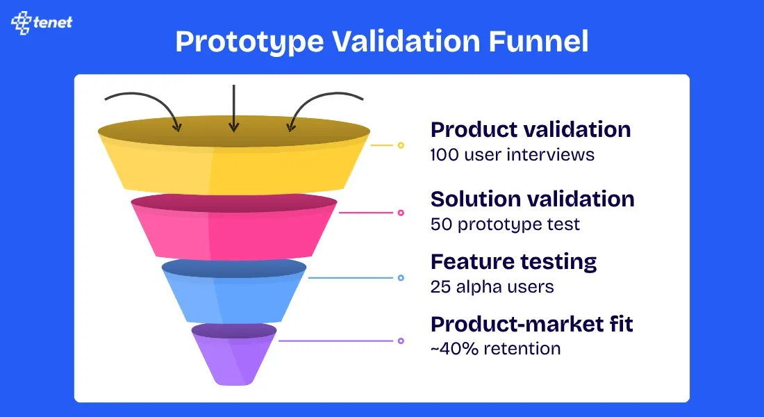
Dropbox is a classic example of successfully using the MVP approach; before building the full product, Dropbox released a simple explainer video demonstrating the core functionality, which helped validate user interest and guide subsequent development.
Mistake 3: Striking the Wrong Balance Between Aesthetics and Functionality
The issue: Focusing too much on visual appeal at the expense of usability can make interfaces confusing or difficult to navigate. Conversely, prioritizing functionality alone may lead to dull, uninspiring designs that fail to engage users emotionally.
Striking the right balance is essential because aesthetics create a positive first impression and emotional connection, while functionality ensures users can efficiently accomplish their tasks.
Overemphasis on either can compromise the overall user experience, causing frustration or disengagement.
The fix:
Adopt a design approach that integrates aesthetics and functionality harmoniously. Use visual hierarchy, whitespace, and consistent design language to enhance usability without sacrificing appeal. Involve users to validate that the design is both beautiful and intuitive.
Employ microinteractions and feedback mechanisms that enrich the experience without overwhelming users.
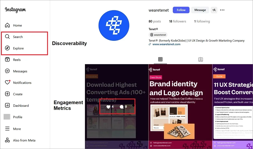
Instagram provides an excellent example of this balance. The platform maintains a clean, visually appealing interface while ensuring core functions like posting, discovering content, and engaging with others remain intuitive and accessible.
Mistake 4: Ignoring User Needs and Feedback
The issue: Many design teams collect user feedback through surveys, reviews, and support tickets, but fail to act on these insights meaningfully. This disconnect creates a cycle where users feel unheard, leading to decreased engagement, negative reviews, and eventual platform abandonment.
Teams often dismiss feedback as outliers, prioritize internal roadmaps over user requests, or implement changes that address symptoms rather than root causes of user frustration.
The fix:
Establish systematic processes for collecting, analyzing, and implementing user feedback. Create clear channels for users to share their experiences, regularly review feedback patterns, and communicate back to users about how their input influenced product decisions.
Prioritize high-impact user pain points over nice-to-have features, and involve users in the solution design process through co-creation sessions or beta testing programs.
Snapchat's 2018 redesign offers a clear example of ignoring user feedback. The update, which jumbled Stories into the messaging inbox, confused users and sparked backlash. In markets like the U.K., Australia, and Canada, 83% of App Store reviews were negative.
The redesign coincided with Snapchat’s revenue falling short of Wall Street expectations and a loss of $443 million in Q3 2017.
This case shows how dismissing user feedback can lead to measurable damage to both the user base and business performance.
Mistake 5: Bombarding Users with Pop-ups
The issue: Many websites and apps overwhelm users with excessive pop-ups for newsletters, notifications, cookie consent, special offers, and app downloads within seconds of arrival. This aggressive approach interrupts user flow, creates frustration, and often drives users away before they can engage with the actual content.
Multiple pop-ups appearing simultaneously or in quick succession create a barrier between users and their intended tasks, leading to higher bounce rates and negative brand perception.
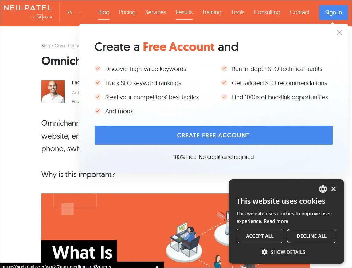
The following image shows how, after entering Neil Patel's website, the screen gets filled with pop-ups related to cookies and for information collection:
The fix:
Implement strategic timing and contextual relevance for pop-ups. Limit the number of interruptions, use exit-intent triggers instead of immediate displays, and ensure each pop-up provides genuine value to the user. Consider less intrusive alternatives like inline banners, slide-ins, or sticky headers that don't completely block content access.
Research shows that modern users encounter multiple types of pop-ups in a session ( from cookie notices to promotional offers ) and this “overlay overload” significantly degrades their experience, especially on smaller screens where screen space is limited.
One study found users encountered an average of 25 pop-ups per week, leading to widespread negative reactions and “popup fatigue.” They often close pop-ups reflexively or leave sites without engaging due to excessive interruptions.
Mistake 6: Overwhelming Users with Too Much Information
The issue: Presenting users with excessive information all at once increases cognitive load and causes confusion, frustration, and decision paralysis. When interfaces are cluttered with too many options, dense text, or complex visuals, users struggle to find what they need or complete tasks efficiently.
When users can't quickly identify what's important or relevant to their goals, they become frustrated and often leave without completing their intended actions.
Here is an image showing Yale School of Art’s website with loads of information that seems so confusing to read:

The fix:
Apply progressive disclosure by revealing information gradually and contextually. Break content into smaller, manageable chunks and guide users step-by-step through complex processes. Use visual hierarchy and whitespace strategically to emphasize key actions or messages.
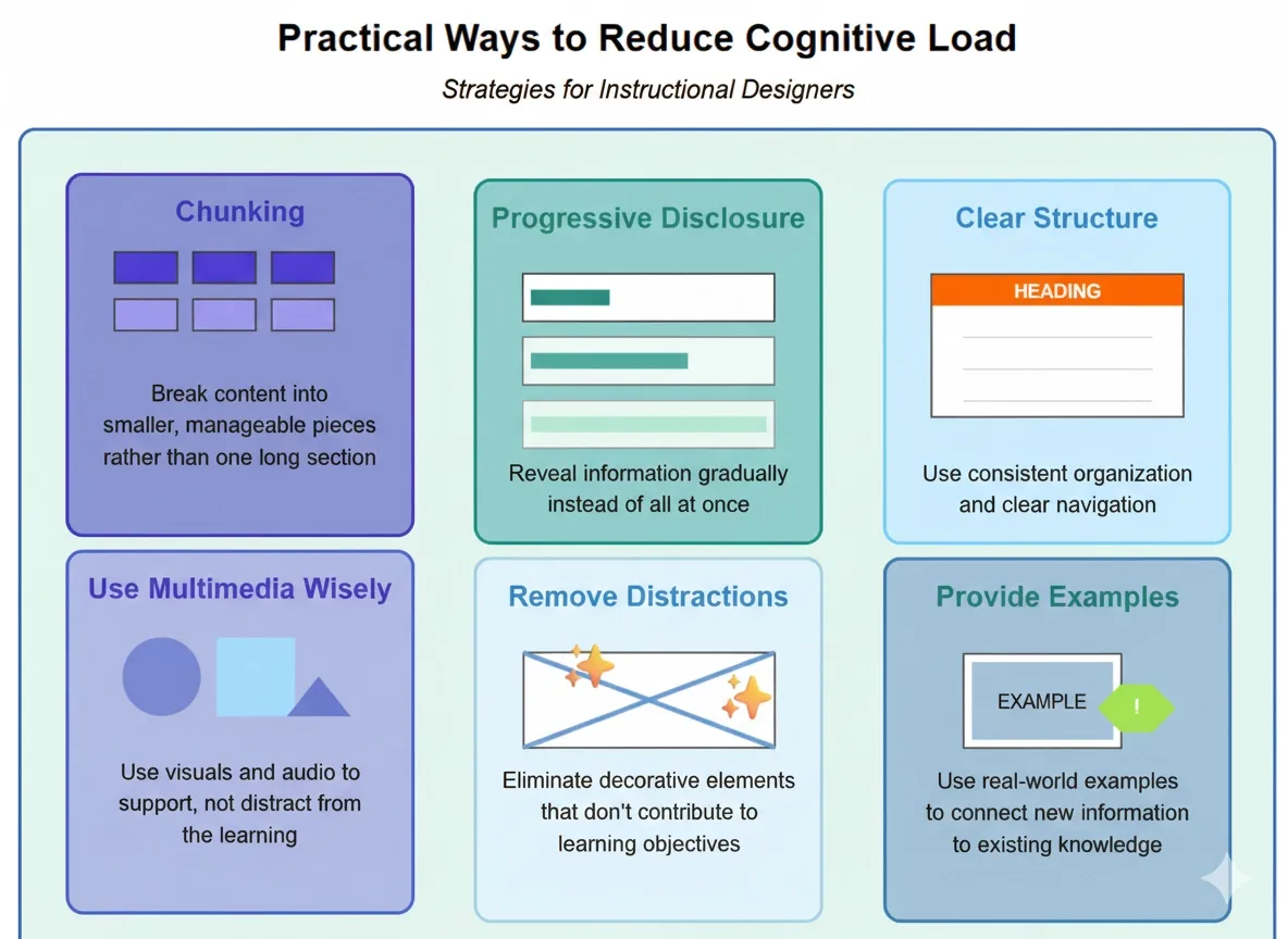
This visual shows practical ways to reduce cognitive overload, including progressive disclosure and clear structure.
Userpilot demonstrates effective solutions to information overload through strategic progressive disclosure. Rather than cramming everything users need on one screen, which can overwhelm them, Userpilot splits things up over multiple screens to reduce the user's cognitive load.
For example, when setting up integrations, Userpilot uses short guiding messages while hiding secondary steps to prevent users from feeling overwhelmed when completing the setup. They also show three choices when beginning a flow for an in-app experience, making it clearer to users what they should do next, rather than presenting dozens of options simultaneously.
This approach helps users focus on core actions without being distracted by advanced features they don't immediately need.
👉For SaaS companies dealing with complex dashboards and feature-heavy interfaces, specialized SaaS UI UX design expertise can help implement progressive disclosure effectively without overwhelming users.
Mistake 6: Including Unresponsive Design Elements
Many websites and applications fail to adapt properly across different devices and screen sizes, creating frustrating experiences for users.
Unresponsive elements like fixed-width layouts, tiny buttons, overlapping text, or horizontal scrolling force users to zoom, scroll excessively, or struggle with navigation. This leads to higher bounce rates and lost conversions, especially as mobile usage continues to dominate web traffic.
The fix:
Implement responsive design principles from the start, using flexible grids, scalable images, and CSS media queries to ensure smooth experiences across all devices. Prioritize mobile-first design, test on multiple screen sizes, and ensure touch targets are appropriately sized for mobile interaction. Use progressive enhancement to add features for larger screens while maintaining core functionality on smaller devices.
The impact of unresponsive design is clearly reflected in user behavior patterns. The average bounce rate is 43% on desktop but jumps to 51% on mobile, indicating that users are significantly more likely to abandon sites with poor experiences, and this higher abandonment rate directly affects business outcomes.
👉For businesses expanding across multiple platforms, cross-platform app development ensures consistent responsive experiences across all devices and operating systems.
Mistake 7: Ignoring Accessibility
The issue: Failing to integrate accessibility into UX design creates barriers for people with disabilities, making digital products difficult or impossible for them to use. This oversight limits the audience reach, excludes potential users who rely on assistive technologies, and can result in legal consequences for non-compliance with accessibility laws. Moreover, it negatively impacts overall usability and damages brand reputation.
The fix:
Accessibility must be integrated from the earliest stages of design and development. Follow guidelines like WCAG 2.1 (Web Content Accessibility Guidelines) and test for compliance regularly using automated tools and human audits.
Design with sufficient contrast, provide meaningful alt text, ensure full keyboard operability, and avoid using color as the sole means of conveying information.
Incorporate feedback from users with disabilities and conduct usability testing with assistive technologies. Making your product accessible improves usability for everyone, reduces legal risk, expands market reach, and reflects a commitment to inclusivity.
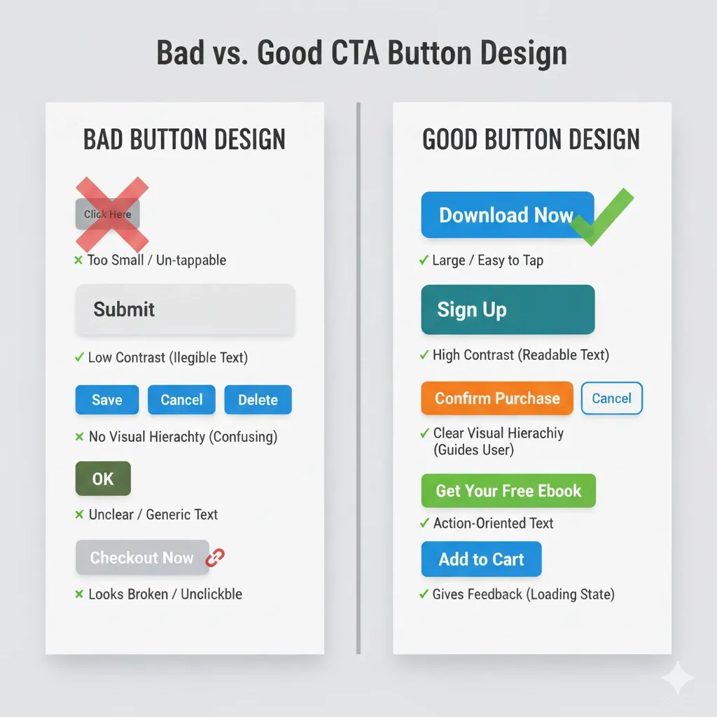
Mistake 9: Misleading Users with Links and Buttons
The issue: Confusing links and buttons or using ambiguous labels causes users to misunderstand what will happen when they click. For example, links styled like buttons may look like actions but actually navigate away, or buttons may be labeled with unclear terms that don’t explain their function. This inconsistency leads to hesitation, errors, and frustration, ultimately degrading the user experience and reducing conversion rates.
The fix:
Maintain a clear distinction between links and buttons both visually and functionally. Links should navigate users to new pages or locations, while buttons should trigger actions like submitting forms or opening dialogs.
Use clear, concise, and descriptive labels for all interactive elements, ensuring users know exactly what to expect. Design buttons to look clickable with proper size, contrast, and spacing to avoid accidental clicks or confusion. Consistency in style and behavior enhances predictability and helps users complete tasks confidently.
The following picture contrasts between bad and good CTA button design - clarity, hierarchy, and actionability drive better user interactions.
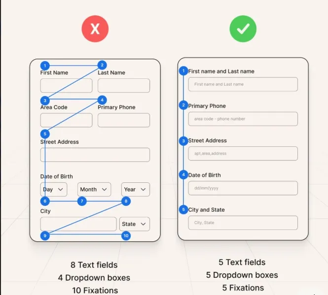
Mistake 10: Ignoring the Importance of Forms
The issue: Forms are critical touchpoints in digital experiences, often serving as the gateway to sign-ups, purchases, or lead generation. Poorly designed forms create friction that frustrates users, leading to higher abandonment rates and lost conversions. Common problems include overly long forms, confusing layouts, unclear labels, and a lack of feedback or error prevention, all of which negatively impact user trust and completion rates.
The fix:
Prioritize form usability by keeping forms concise and only asking for essential information. Use a single-column layout to maintain a clear visual flow and reduce cognitive load. Group related fields to help users process information smoothly, and arrange questions from simple to complex to maintain momentum.
Incorporate inline validation to provide immediate feedback and reduce errors. Consider breaking long forms into multiple steps with progress indicators to make the task more manageable. Clear, descriptive labels and contextual help ensure users understand requirements, increasing form completion and satisfaction.
This shows a confusing form layout compared to a simplified design, making forms easier and faster to complete.
For example, Amazon’s checkout form is a strong example of effective form design. It breaks the process into multiple steps: shipping, payment, and review, allowing users to focus on one task at a time. The form provides clear labels, inline error messages, and prominent calls to action, significantly reducing friction and increasing conversion rates up to 30%.
👉E-commerce businesses particularly benefit from optimized forms, as poor checkout experiences directly impact revenue. Consider conducting an eCommerce UX audit to identify and fix form-related conversion barriers.
Mistake 11: No Clear Call-to-Action
The issue: Without a clear and compelling call-to-action (CTA), users may feel lost or unsure about what step to take next. Vague, generic, or poorly positioned CTAs fail to guide users toward desired actions, resulting in confusion, hesitation, and missed conversion opportunities. Common issues include weak or ambiguous CTA text (e.g., “Click here”), excessive competing CTAs on a page, or CTAs that blend into the background and go unnoticed.
For example, Hinge’s homepage hides the “Download App” button behind labels like “How We Do It” and “Join Us,” forcing visitors to scroll through lengthy content before finding the download link.
Here is the image of Hinge’s landing page without a proper CTA:

The fix: Design CTAs that are visually distinctive and strategically placed to stand out. Use concise, action-oriented language that clearly states the benefit or next step, such as “Start Free Trial” or “Get Your Discount.”
Limit the number of CTAs per page to reduce choice overload and focus user attention on primary goals. Differentiate primary CTAs from secondary ones through size, color, and placement.
Continuously test CTA variations through A/B testing to optimize performance and user engagement. For instance, increasing the size of the CTA button can increase click-through rates by up to 90%, demonstrating the impact of visual prominence on user interaction.
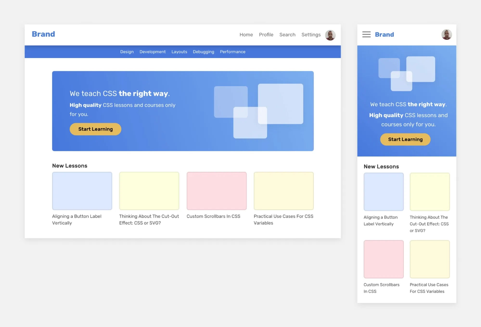
Mistake 12: Poor Responsive Experience
The issue: Websites and apps that do not provide a smooth and consistent experience across devices cause frustration and drive users away.
Elements that don’t adapt properly to various screen sizes, such as distorted images, difficult navigation, or unreadable text, create barriers for mobile and tablet users. With most internet traffic now coming from mobile devices, poor responsiveness leads to high bounce rates, lost conversions, and diminished trust.
Here is a side-by-side layout that reveals how a responsive design delivers smooth usability across desktop and mobile, while static layouts fall short.S
The fix:
The impact of poor responsive design is immediately visible in user behavior metrics. Websites not optimized for mobile have an average 60% bounce rate, significantly higher than well-optimized sites.
So, make sure to implement responsive design using a mobile-first approach to ensure interfaces adapt fluently across devices. Optimize navigation for touch, prioritize fast load times, and test on multiple devices and browsers for consistency.
Performance optimizations like image compression and minimal scripts enhance user experience further. Responsive design also increases SEO rankings, as search engines prioritize mobile-friendly sites.
👉Understanding fundamental design principles is crucial for creating responsive experiences.
Learn more about what effective UI design entails and how it contributes to smooth cross-device functionality.
Mistake 13: Designing Without a Design System
The issue: Designing digital products without a design system leads to visual inconsistencies, fragmented user experiences, and inefficient collaboration among design and development teams.
Without shared guidelines for components, typography, colors, and interaction patterns, products tend to feel disjointed and confusing. This also results in longer development cycles and higher maintenance costs due to duplicated efforts and repeated fixes.
The fix: Create and maintain a design system that defines standards for UI elements, interaction behaviors, and visual styles. A good design system promotes consistency, accelerates design and development work, and ensures scalable growth while preserving a cohesive brand experience. It facilitates communication across teams and enhances overall product quality.
For example, Airbnb developed its design system, "Design Language System (DLS)," which unified its web and mobile platforms under consistent visual and interaction patterns.
The DLS helped Airbnb scale rapidly by enabling teams to work more efficiently and deliver a seamless, trustworthy user experience worldwide.
💡 Further resources:
- UX Design for AI Products: A Practical Guide for Designers
- 🎨 Important UI UX Design Trends
- 10 B2B UX Design Examples with Key Lessons
How to Calculate UX Design ROI: (Formula and Examples)

How Tenet helps you fix your UX design mistakes
Tenet is a specialized UI/UX design and growth marketing agency specializing in delivering user-centered solutions that simplify complex experiences. With over 450 projects completed and clients spanning 15+ industries, we help businesses unlock growth by enhancing usability, engagement, and conversion through research-backed design and agile development.
Our approach includes deep UX research, tailored design systems, intuitive interfaces, continuous testing, and growth-focused optimizations - all designed to fix common UX pitfalls.
One of our projects involved Angles, Kuwait’s leading lifestyle retail brand, which had a strong offline presence but needed a modern digital upgrade.
We conducted in-depth UX research and built three custom mobile apps - for shoppers, store managers, and delivery personnel, along with a unified web-based dashboard. Our design simplified product discovery, enabled real-time tracking, ensured secure transactions, and used AI for personalized experiences.
The UX design transformation of Angles shows a clear before and after.
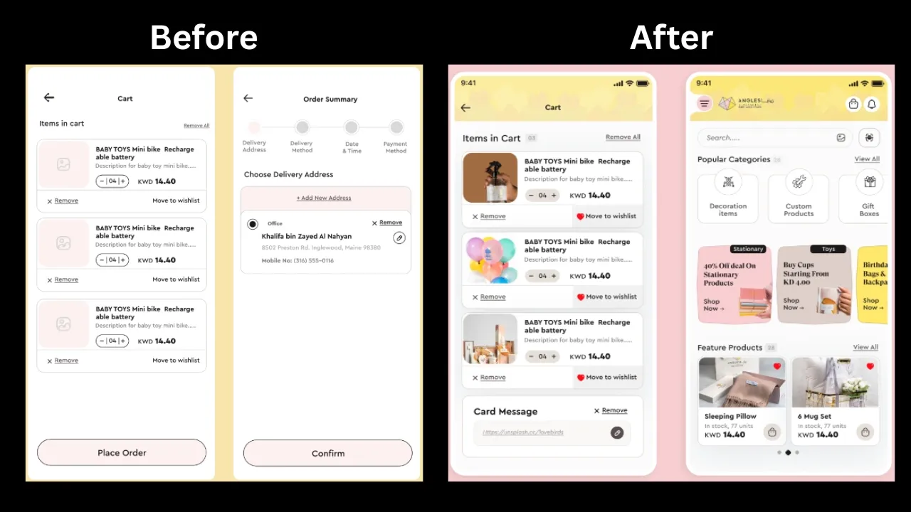
The outcome was a significant increase in monthly revenue, larger average orders, better user retention, and a digital journey that customers genuinely enjoy 🙂
If you want to fix your UX pain points and create digital experiences that truly connect with users, explore our comprehensive UI UX design services or get a detailed UX audit to identify specific improvement opportunities for your digital product.
Need help with a UX design audit? Get a free proposal from our experts
Need help with a UX design audit? Get a free proposal from our experts


Got an idea on your mind?
We’d love to hear about your brand, your visions, current challenges, even if you’re not sure what your next step is.
Let’s talk


