MVP UX Design: Minimum Viable Product Design Process in UX
Share
Share

Get a quick blog summary with


What does an MVP need to prove before anything else? Not growth. Not scale. Not even demand. It needs to prove that users can complete the one task for which the product exists. Most MVPs skip this step. They launch with partial flows, unclear screens, and open questions, then treat user drop-off as feedback. It isn’t. If people cannot move through the product without help, you are not learning about the idea. You are learning about friction. MVP UX design exists to remove that friction early. At Tenet, this thinking has guided 400+ product builds used by millions, helping teams reach product direction clarity 2–3 months earlier in the MVP cycle. This post explains how to design MVP UX as a learning system, not a rushed deliverable.
What Does MVP Mean in UX Design?
In UX design, an MVP (Minimum Viable Product) is the smallest product experience that allows users to solve a real problem and allows teams to learn from real behavior.
From a UX perspective, “minimum” does not mean incomplete or careless. It means removing anything that distracts from the primary user goal. Every screen, interaction, and piece of content in an MVP exists for a reason: to support one key outcome.
A well-designed MVP UX answers critical questions early:
- Do users immediately understand what this product is for?
- Can they complete the main task without explanation?
- Where do they hesitate, abandon, or get confused?
If the UX is unclear, the feedback you collect is unreliable. That’s why MVP UX design is less about speed and more about precision.
What Are the Differences Between MVP, Prototype, and Beta Release?
MVP, prototype, and beta release are often used as interchangeable terms, but they serve very different roles in the product lifecycle. Treating them as the same usually leads to poor UX decisions and misleading feedback.
The key difference lies in why each exists and how user feedback should be interpreted at that stage.
The table below breaks down the practical differences between an MVP, a prototype, and a beta release from a UX perspective.
How do you prioritize features during MVP UX design?
Feature prioritization in MVP UX design starts with a hard truth: you cannot test everything at once. If you try, you will not learn anything clearly.
The purpose of an MVP is to validate one core assumption about user behavior. Every feature included should exist to test that assumption. Anything else distracts from it.
Start by defining the primary user problem and the single action that represents success. This action is the backbone of the MVP. If a feature does not help users reach that action, it does not belong in the first version.
To avoid opinion-led decisions, teams rely on simple, proven prioritization methods:
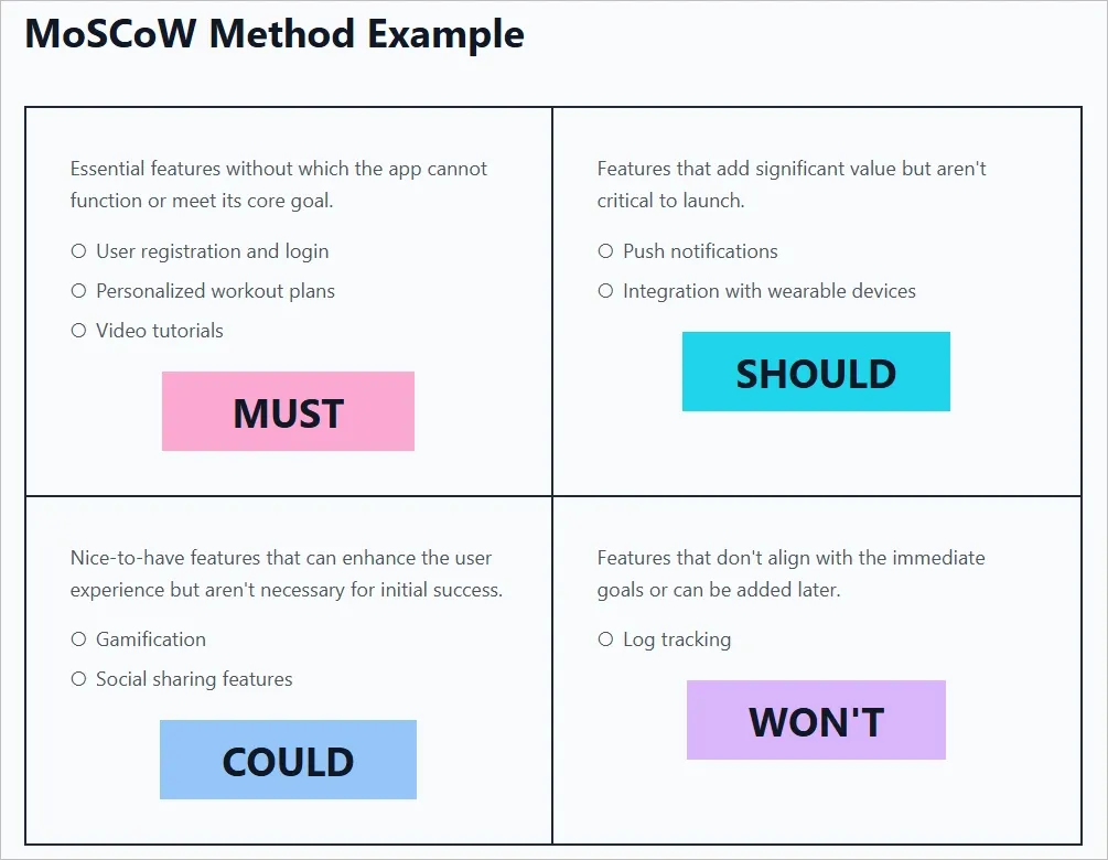
- MoSCoW method
Features are categorized as Must-have, Should-have, Could-have, and Won’t-have. In an MVP, only Must-have features are built. This forces teams to commit to what truly matters and let go of everything else.
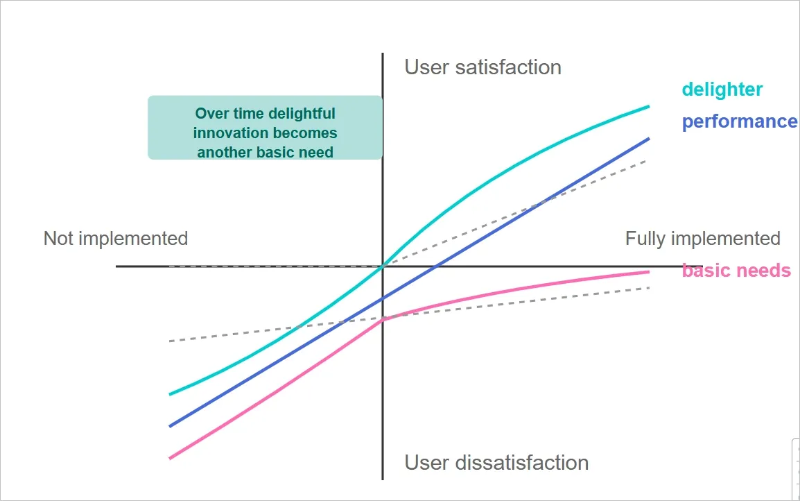
- Kano model
Features are grouped by how they affect user satisfaction. Basics must work without friction. Performance features improve the experience in direct proportion. Delighters are intentionally postponed until the core experience is validated.
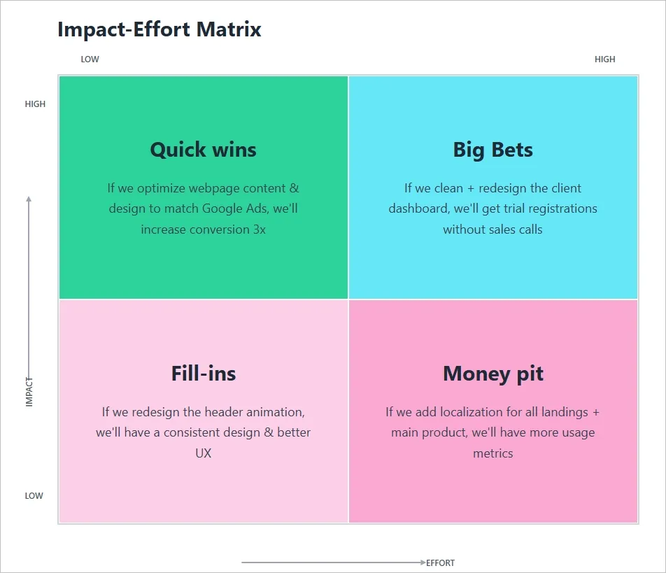
- Value vs. effort matrix
Features are mapped based on the value they provide to users and the effort required to build them. High-value, low-effort features take priority. Everything else waits.
- RICE scoring
Features are scored based on reach, impact, confidence, and effort. This method is useful when teams need a structured way to compare options and challenge gut-driven decisions.
- 80/20 rule
A small number of features usually deliver most of the value. Identifying and building only those features keeps the MVP focused and reduces unnecessary complexity.
Good prioritization feels uncomfortable because it requires removing features that seem useful or impressive. That discomfort is a signal that the MVP is doing its job.
When fewer features exist, user behavior becomes easier to interpret. Feedback becomes clearer. Decisions become grounded in evidence instead of assumptions. That is what makes an MVP viable.
MVP UX design process (step by step)
Step 1: Define the core problem and success metrics
This step clarifies what problem the MVP is solving and how you will know if it is working. Without this clarity, teams end up designing features instead of validating real user value.
The goal is to identify the single user action that proves the product is useful and define measurable signals that confirm or reject that assumption.
How to do it
- Write a clear problem statement using this format: "[Target user] needs a way to [perform action] so they can [achieve outcome]"
- Define 2-3 testable hypotheses (e.g., "Users will complete onboarding in under 2 minutes" or "60% will complete the primary task on first attempt")
- Identify your primary success metric (completion rate, time to value, return rate within 48 hours)
- Document what success looks like in numbers, not vague goals like "users will love it"
- Validate alignment across product, design, and engineering before moving into flows or screens
Tools to use
- Notion or Miro for documenting problem statements and hypotheses
- Google Analytics or Mixpanel for defining trackable success metrics
- Amplitude for planning behavioral analytics and cohort analysis
Step 2: Conduct focused user research
This step helps you replace assumptions with real input from people who actually face the problem. MVP research is not about large samples or perfect data. It is about spotting clear patterns that explain how users currently deal with the problem and where they struggle most.
The aim is to understand context, behavior, and language before designing any flows or screens.
How to do it
- Conduct 5-8 user interviews with people who actively experience the problem you are solving
- Use open-ended questions: "Walk me through the last time you experienced [problem]" and "What have you tried to solve this?"
- Run competitive analysis to see how others address this problem and where their weaknesses are
- Send short surveys (5-7 questions, under 3 minutes) to 50-100 people for quantitative validation
- Document user pain points, current behaviors, and exact phrases they use to describe the problem
- Create a list of assumptions about user behavior, then design questions that challenge those assumptions
Tools to use
- Zoom or Google Meet for remote user interviews
- Otter.ai for automatic interview transcription
- Typeform or Google Forms for surveys
- Dovetail or Airtable for organizing research findings
👉 Check out our UX research services that can help you uncover these patterns early, preventing costly design revisions later in the MVP cycle.
Step 3: Prioritize features for the first usable version
This step decides what actually gets built. Without clear prioritization, MVPs quietly turn into half-finished products that take too long to launch and still fail to answer the core question. The goal here is to include only what is required to prove or disprove the main assumption defined in Step 1.
Every feature must justify its existence by supporting the primary user action or helping measure it.
How to do it
- List every potential feature the team has discussed
- Apply the MoSCoW method: categorize each feature as Must-have, Should-have, Could-have, or Won't-have
- For MVPs, build only Must-have features; defer everything else to post-launch iterations
- Use a Value vs. Effort Matrix: plot features on high/low value and high/low effort axes, prioritize high-value, low-effort wins
- Identify the 20% of features that deliver 80% of value so you can focus development on what truly matters to users.It shows both what to do (identify the 20% features) and why (they drive most of the value).
- Challenge every feature with: "Can users complete the core task without this?" If yes, remove it
- After prioritization, cut another 20% and see if the MVP still works
Tools to use
- Miro or FigJam for collaborative prioritization workshops
- ProductPlan or Productboard for feature prioritization frameworks
- Notion or Airtable for maintaining a feature backlog.
Step 4: Map user flows and create wireframes
Before building anything interactive, the product needs a clear path from entry to completion. User flows and wireframes help teams visualize how someone moves through the product without distractions like colors or branding.
This step reveals confusion early. If the flow does not make sense in a simple wireframe, it will not work once real users interact with it.
How to do it
- Start with the entry point: what is the first thing a user sees when they open the product?
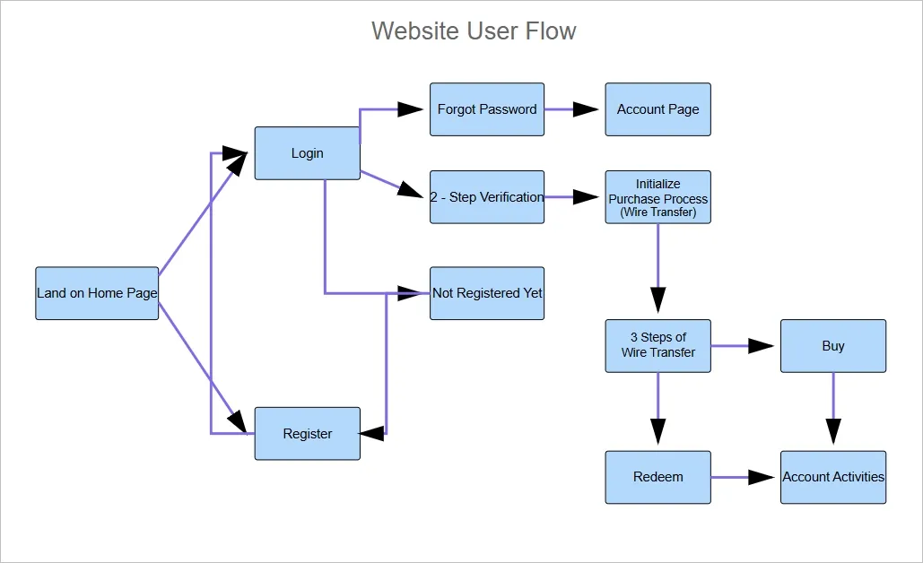
- Map each step users must take to complete the core action using flowchart notation (rectangles for screens, diamonds for decisions, arrows for transitions)
- Identify friction points: unnecessary steps, form fields you do not need immediately, confusing button labels, unclear next actions
Here is an image illustrating a user flow mapping the complete journey from landing page to purchase.
- Apply the Three-Click Rule: can users reach the core action in three clicks or fewer? If not, eliminate steps
- Sketch low-fidelity wireframes for each screen showing content blocks, interactive elements, and navigation structure
- Test wireframes with internal teams using the 5-second test: show a wireframe for 5 seconds and ask "What is this screen for?" and "What would you do first?"
- Simplify any screen where people cannot answer those questions clearly
Tools to use
- Whimsical or Lucidchart for user flow diagrams
- Balsamiq for rapid low-fidelity wireframing
- Figma or Wireframe.cc for digital wireframes
- Miro for collaborative flow mapping sessions
👉 Learn more about the complete wireframe design process and how it reduces design rework by up to 40%.
Step 5: Build and test an interactive prototype
An interactive prototype allows teams to test behavior before committing to code. It answers practical questions like whether users understand what to do next and where they hesitate or drop off.
This step reduces risk by exposing usability issues early, when changes are fast and inexpensive compared to fixing them after development.
How to do it
- Build a clickable prototype using your wireframes with basic transitions between screens
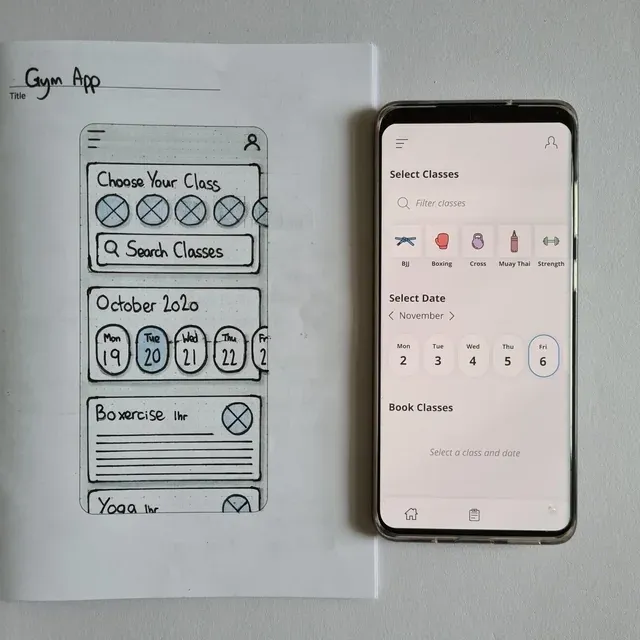
The following image showcases the conversion of a low-fidelity wireframe to a clickable prototype:
- Include all screens in the core user flow with realistic content (no lorem ipsum)
- Make buttons, form fields, and navigation interactive so users can move through the flow naturally
- Add error states and feedback messages (e.g., "Email address is required")
- Recruit 5-6 participants who match your target audience and have no context about your product
- Give them a specific task: "Use this product to [complete core action]" without explaining how it works
- Conduct moderated usability testing: ask them to think aloud, observe where they hesitate, and take detailed notes on behavior
- Track task completion rate, time on task, error rate, and user satisfaction
- Look for patterns: if multiple users fail at the same point, redesign that part immediately
Tools to use
- Figma for prototyping with design systems
- Adobe XD or Framer for interactive prototypes with micro-interactions
- Maze for unmoderated usability testing with built-in analytics
- UserTesting or Lookback for recruiting participants and conducting moderated tests.
👉 Professional UX research services conduct unbiased usability testing with your target audience, providing actionable insights you can trust.
Step 6: Design high-fidelity UI mockups
High-fidelity mockups translate structure and behavior into a polished visual system. This is where the product starts to look and feel real, but the goal is not decoration. The goal is clarity, consistency, and usability at scale.
This step matters because visual decisions directly affect trust, comprehension, and ease of use. A well-designed interface reduces friction, sets expectations, and ensures the product can grow without visual chaos later.
How to do it
- Choose 2 fonts maximum: one for headings, one for body text (use readable fonts like Inter, Roboto, or SF Pro)
- Create a color palette: 1-2 primary colors, 1-2 neutral grays, 1 accent color for CTAs
- Use a consistent spacing system (8px grid is standard) to maintain visual rhythm
- Design button states: default, hover, active, and disabled so users get clear feedback on interactions
- Apply visual hierarchy: make the most important elements largest and darkest, use high-contrast colors for primary CTAs
- Ensure color contrast meets WCAG AA standards (4.5:1 for body text, 3:1 for large text)
- Use text size of at least 16px for body copy and provide visible labels on form fields (not just placeholders)
- Create a simple component library documenting reusable UI elements (buttons, form fields, cards) with all their variations
Tools to use
- Figma for UI design and collaboration
- Sketch for a Mac-only alternative
- Adobe XD for Adobe Creative Cloud users
- Coolors or Adobe Color for color palette generation
👉 Explore digital product design examples that demonstrate how intuitive UX drives user engagement and conversion.
Step 7: Hand off to development and iterate post-launch
The MVP does not end at handoff. This step ensures that design intent is clearly communicated to developers and that learning continues after launch. Poor handoffs lead to misalignment, rework, and frustration on both sides.
Post-launch iteration is critical because real user behavior often differs from assumptions. This step closes the loop by using live data and feedback to refine the product instead of treating launch as the finish line.
How to do it
- Annotate designs with exact spacing, sizing, and responsive breakpoints (mobile: 320px, tablet: 768px, desktop: 1440px)
- Document interaction states: hover, active, disabled, and loading states for all interactive elements
- Specify typography details: font family, size, weight, line height, and letter spacing
- Provide color values in hex codes or RGB for all colors used
- Export assets in multiple formats (SVG for icons, PNG/WEBP for images)
- Schedule a design walkthrough meeting with developers to explain each screen and interaction
- Set up analytics to track activation rate, core action completion, drop-off points, and time to value
- Collect post-task surveys (1-3 questions): "Did you accomplish what you wanted? Why or why not?"
- Conduct user interviews with 5-8 active users to understand their experience
- Use data to prioritize the next iteration: fix issues that cause drop-offs, not features that seem cool
Tools to use
- Figma Dev Mode for developer handoff with code snippets and specs
- Zeplin for design specs and asset export
- Google Analytics, Mixpanel, or Amplitude for tracking user behavior
- Hotjar for session recordings and heatmaps
- Typeform or Usabilla for in-app feedback collection
👉 Read about product development strategies that help startups iterate efficiently without losing focus on the core problem.

How the Tenet team helps startups create a winning MVP
A successful MVP is about clarity, not shortcuts. It focuses on learning quickly, validating assumptions, and solving the core user problem. Without this focus, teams waste time building unnecessary features and risk launching a product that doesn’t deliver value.
At Tenet, we’ve designed 400+ products for startups to enterprises, turning ideas into focused MVPs.
Our process starts by uncovering blind spots during discovery, prioritizing features based on real impact, and designing flows that reduce friction before development even begins. We create interactive prototypes, test them with real users, and iterate using actual data, not guesses.
This approach ensures every feature has a purpose, every interaction is intentional, and startups reach product clarity 2–3 months faster.
Here’s what our customers say about our brand:

If you’re ready to validate your idea and launch an MVP that actually works, reach out to us, and we’ll be happy to guide you from concept to validated product.
Design an MVP that users understand and use correctly with our UX design experts
Design an MVP that users understand and use correctly with our UX design experts


Got an idea on your mind?
We’d love to hear about your brand, your visions, current challenges, even if you’re not sure what your next step is.
Let’s talk


