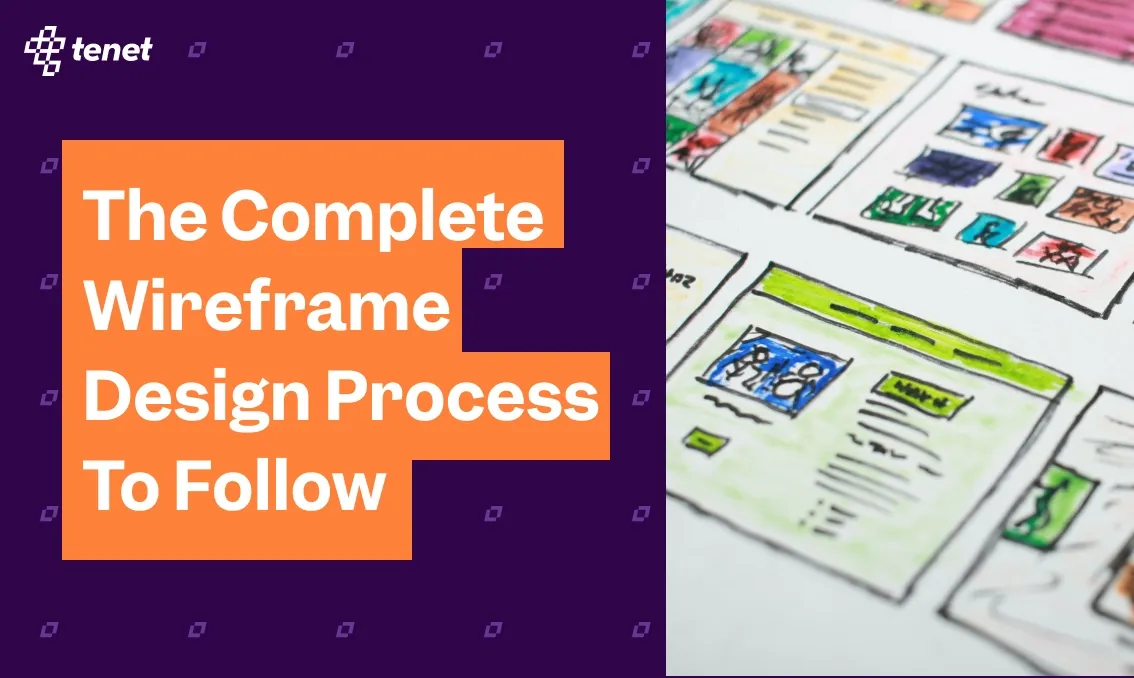
The Complete Wireframe Design Process To Follow
Share
Share
Get a quick blog summary with


One of the biggest reasons digital products fail early isn’t poor development; it’s unclear design direction.
When teams jump straight into high-fidelity designs without mapping structure and user flow first, they face endless revisions, delayed launches, and wasted development hours.
At Tenet, we’ve seen how a well-planned wireframe can reduce design rework by up to 40% and accelerate product launches across multiple industries.
In this guide, we’ll walk you through how professional teams approach the wireframe design process, from defining user goals to building interactive layouts, and how we apply the same framework to help our clients ship better products, faster.
What is a Wireframe?
A wireframe is a basic visual layout that outlines how a digital product, like a website or app, will look and function before any design or code work begins.
A wireframe shows the basic structure and layout of a screen. It helps teams understand how users move from one screen to another without focusing on colors or fonts.

Why your digital product design project needs wireframing
1. Validates Ideas Before Expensive Development
Every feature costs time and budget to build. Wireframes let you test user flows, navigation patterns, and interface logic before writing a single line of code.
Research by the Design Management Institute shows that design-led companies outperform the S&P 500 by 219% over 10 years and that advantage begins with early design thinking through wireframes.

Wireframes function as hypothesis tests for product assumptions. Each layout, navigation path, or content block represents a hypothesis about how users will interact with your product.
This visual demonstrates how teams can use simple, low-fidelity wireframes to validate feature ideas and user flows before investing in design or development.

Testing these hypotheses through paper prototypes or clickable wireframes helps identify usability gaps, confusing flows, or missing features within hours, rather than discovering them after weeks of development.
The result: fewer redesigns, faster validation, and significantly lower development risk.
2. Aligns Stakeholders and Teams Early
Founders, product managers, designers, and developers often hold different mental models of how a product should behave. Wireframes establish a shared visual language that bridges these perspectives.
- Technical teams can assess feasibility and integration requirements early.
- Business teams can verify that user journeys align with growth and conversion goals.
- Product teams can confirm that features support roadmap priorities.
Because wireframes expose misalignment early, teams can resolve conflicts when changes are still inexpensive. A developer may highlight backend constraints; a business stakeholder may notice a missing upsell step; these conversations happen before development starts, not midway through it.
By focusing discussions around a tangible visual, wireframes replace abstract debates with specific, actionable decisions, reducing miscommunication and costly rework.
Here’s an image that illustrates cross-functional team alignment on Miro visually.

3. Reduces Development Time and Costs
Clear wireframes serve as blueprints for development, providing detailed page structure, interface behavior, and user flows. This clarity minimizes uncertainty, misinterpretation, and confusion, enabling developers to build with confidence and precision.
Annotated wireframes specify exactly what happens when users click buttons, submit forms, or encounter empty states, reducing the back-and-forth clarification and context switching for developers.
4. Keeps Focus on Functionality, Not Aesthetics
Reviewing high-fidelity designs too early often leads teams into subjective debates over visual elements such as colors, fonts, and imagery.
Wireframes intentionally strip away these distractions, ensuring the conversation stays centered on usability, layout clarity, task completion flow, and information hierarchy.
The deliberate lack of visual polish in wireframes removes distractions. Reviewers can't debate whether a button should be blue or green because buttons are just gray rectangles.
Instead, they can concentrate on what really matters:
- Does the layout make logical sense?
- Can users complete key actions effortlessly?
- Is information prioritized in the right order?
This process ensures that core functionality is validated before investing in visual polish. After all, a beautiful interface built on poor navigation still fails the user. Wireframes make sure the foundation is solid before design begins.
5. Enables Rapid Iteration Based on Feedback
Changing a wireframe takes minutes, whereas changing developed code takes hours or days. Wireframes let you test multiple approaches quickly, gather feedback from users or stakeholders, and refine the product structure without expensive rework.
During user research, clickable wireframes reveal usability issues early: where users hesitate, misinterpret flows, or struggle to complete actions. These insights guide refinement before development even begins.
Because wireframes demand minimal time and effort, teams can easily discard weak ideas and pursue stronger alternatives. This freedom cuts the pressure to stick to early ideas and supports real testing. By the time the design reaches the detailed and development stages, all major layout decisions are already tested and improved.
👉To fully understand how wireframing fits into the bigger picture, explore our detailed UX design process guide that covers everything in detail.
Stages of a professional wireframe design process
Stage 1. Research and Requirements Gathering
Wireframing doesn’t begin with sketching boxes or buttons; it begins with understanding. Before anything else, you need clarity on who your users are and what problems your product will solve for them.
What to do in this stage:
Start by gathering insights about your target users through interviews, surveys, and behavioral data. Identify the core tasks users want to accomplish and the business outcomes your product must deliver.
Then conduct stakeholder interviews to extract business requirements, technical constraints, and success metrics.
Interview actual users or potential users to understand their current workflows, pain points, and mental models. If redesigning an existing product, analyze usage data to identify drop-off points, underutilized features, and common user paths.
What will you produce?
- User personas that represent primary audience segments, each with distinct goals, technical comfort levels, and usage contexts.
- User journey maps that outline the steps users take from initial awareness through task completion, revealing pain points and opportunities.
- A prioritized feature list that ranks functionality by user needs and business impact, clearly distinguishing essential launch features from enhancements planned for later iterations
- Technical constraints documentation that notes backend, API, and third-party integration limitations affecting design decisions
Timeline:
1–3 weeks, depending on complexity. Rushing this phase means wireframes built on assumptions, not evidence.
Stage 2. Information Architecture and Content Strategy
Before drawing interfaces, structure how information will be organized throughout your product.
What to do in this stage:
Start by creating a sitemap that outlines all pages or screens and how they connect. The sitemap visualizes the complete scope of what you're building and reveals the relationships between different sections.
For a content-heavy site, this might include hundreds of pages organized into hierarchical categories. For an app, this shows the screen-to-screen flow.
Next, define the navigation hierarchy so users can move between sections logically. Decide whether your product needs global navigation (for main sections), contextual navigation (for related content), or a mix of both.
Then, plan content placement and hierarchy within each page or screen. Use the inverted pyramid principle (lead with the most important information, followed by supporting details).
Remember, users typically scan in F-shaped or Z-shaped patterns, so place critical content where eyes naturally land.
This sample image shows what an F-shaped or Z-shaped pattern looks like on a screen:

What will you produce:
- Validate structure through card sorting exercises where users group related items to confirm your information structure matches their mental models.
- You can perform Tree testing that reveals whether users can find specific content or features within your proposed structure. Present users with a text-only site structure and ask them to locate specific information.
- Finally, review your existing content to determine what to keep, update, or remove before wireframing.
Stage 3. Low-Fidelity Wireframes
Once your structure is defined, it’s time to start with rough sketches or basic digital wireframes using simple boxes, lines, and placeholder text. Low-fidelity wireframes are intentionally crude to keep focus on layout and functionality rather than visual details.
This picture clarifies what low-fidelity looks like and how the detail level is intentionally minimal.

Low-fidelity wireframes answer questions like:
- Where should the search bar be located?
- How many navigation items fit comfortably?
- What content should appear above the fold?
- How do users move from browsing to purchasing?
- Should filters appear in a sidebar or dropdown menu?
- How many steps does checkout require?
What should you do
Start with basic shapes, like using rectangles for images, text lines, and simple boxes or circles for buttons and interactive elements. Indicate what each element is with labels rather than actual content. Focus on relative placement and hierarchy, not pixel-perfect alignment.
You can use any medium that allows for quick iteration, like pen and paper, whiteboards, or digital tools like Figma, Sketch, or Adobe XD, work for this stage. The medium matters less than the speed of iteration.
Pen and paper work well for initial exploration, but Digital tools help the most when you need to share, comment, or prototype interactions for remote collaboration.
What will you produce:
Wireframes that answer critical questions like Can they complete core tasks?
Do they understand what each section represents?
Does the flow feel natural?
After that, create multiple low-fidelity variations for critical pages or complex interactions. Sketch three different approaches to the same problem.
Evaluate trade-offs before committing to one direction. This divergent thinking phase explores possibilities before converging on a solution.
Timeline
Low-fidelity wireframes typically take between 1 and 2 weeks, depending on the product's complexity.
👉Explore more about how professional UI/UX design services integrate wireframing and user-centered design to enhance digital products.
Stage 4. Mid-Fidelity Wireframes
Once the basic structure is validated, add more detail to your wireframes (known as a mid-fidelity wireframe). Mid-fidelity wireframes include actual content hierarchy, realistic text lengths, proper spacing between elements, and clear indications of interactive components.
What should you do
Begin by showing different states for interactive elements like buttons, forms, or dropdowns. A button might have default, hover, active, and disabled states. Form fields need empty, filled, focus, and error states. Document these states in the wireframes so everyone understands the full behavior.
Also, include navigation breadcrumbs, filters, search results, and other functional elements users will encounter. Add pagination controls for lists, sorting options for tables, and any tools users need to work with data or content.
Try to avoid filler text and use real or representative content instead of lorem ipsum placeholder text when possible. Lorem ipsum hides content problems. Using actual headlines, product descriptions, or form labels reveals issues with space constraints, unclear terminology, or missing information.
What will you produce:
At this stage, mid-fidelity wireframes should accurately represent screen complexity without visual design elements (colors, fonts, branded assets). Also, make sure to add concise annotations explaining what happens when users click, hover, scroll, or interact with elements. Specify whether actions trigger immediate responses, display loading states, or navigate to other screens.
For multi-device products, include responsive wireframes showing how layouts adapt from desktop to tablet to mobile and show how content reflows, navigation collapses, and functionality changes based on screen size.
Timeline:
Mid-fidelity wireframes take 2 to 4 weeks for most projects. This phase requires more deliberate design decisions as you move from rough concepts to detailed specifications.
Stage 5. High-Fidelity Wireframes and Annotations
Next are high-fidelity wireframes, which add the final layer of detail needed for designers and developers to build the product.
These wireframes include precise measurements, exact content placement, detailed interaction specifications, and comprehensive annotations explaining how each component behaves.
What should you do
At this stage, wireframes should include exact spacing, alignment, and content placement, along with clear interaction behavior. Note down each interaction pattern, like what happens when users hover over elements, click buttons, or encounter errors.
Specify responsive behavior for different screen sizes if building for the web and define their loading states (content/data loading display), empty states (zero items in lists/search results), and error states (problem communication and resolution).
Moreover, add notes explaining business rules, validation requirements, conditional displays, or any behavior that isn't obvious from the visual alone.
The following visual shows a high-fidelity wireframe along with annotations:

💡 You may use tools like Figma, Sketch, or Adobe XD to create clickable prototypes that link screens together. This allows stakeholders to experience the full user journey, from entry to task completion, and validate that every interaction works as intended.
What will you produce:
Detailed blueprints that specify component behavior: character limits, required formats (phone numbers, dates), file upload capabilities, and supported types. Address edge cases: network drops, invalid input, and session expiration. Wireframes that eliminate ambiguity about what to build.
Timeline
Expect this phase to take 3 to 6 weeks, depending on scope and complexity.
Stage 6. Review, Testing, and Iteration
Wireframes aren't static documents. They evolve based on feedback and testing.
What should you do
Run usability sessions with 5–8 users, where potential users try to complete realistic tasks using your wireframes. Observe where they hesitate, what they click, and what confuses them.
Encourage them to think aloud as they navigate so you can understand their expectations. Use specific scenarios, such as “Find and purchase a blue sweater in size medium,” instead of vague instructions.
Present wireframes to stakeholders (for feedback on business requirements and feasibility), developers (to ensure technical constraints are considered), and marketing teams (to verify that wireframes support campaign landing pages or promotional features).
Based on feedback, refine your wireframes before moving to visual design or development. It's normal to go through multiple iterations at each fidelity level as you discover issues and improve the user experience.
Lastly, track changes with version control and document reasons for updates.
💡 Remember, some issues only surface through testing. Users might misinterpret labels, struggle with long forms, or abandon flows with unclear next steps. Each testing round helps you fix these pain points before they turn into expensive issues to resolve in development.
What will you produce:
- A version-controlled archive of wireframes that tracks changes and prevents confusion about which version is current.
- Clear documentation outlining the reasoning behind design decisions for future team reference.
- Usability test reports that highlight recurring issues, such as confusing labels, complex forms, or unclear next steps.
- Iterated wireframes that directly address user feedback and observed pain points, improving with each round of testing.
Timeline
Testing and iteration run throughout the entire wireframing process, typically adding one to three weeks across all stages. The time spent here pays off as it prevents costly redesigns and ensures your final product truly works for your users.
Stage 7. Handoff to Design and Development
Once your wireframes are validated and refined, it’s time to transition them into production. This stage ensures that designers and developers can confidently bring your ideas to life without any guesswork.
What should you do
Start by organizing all wireframes logically with clear labels and version numbers. Create a comprehensive flow diagram showing how screens connect and note down any unresolved questions or pending decisions that might impact design or functionality.
For visual design transition, provide designers with complete wireframes and annotations explaining functional requirements with notes about any constraints designers should consider, such as accessibility requirements, brand guidelines, or technical limitations.
For direct development, ensure detailed behavior specifications, documented content, defined data sources, and outlined edge cases/error scenarios.
What will you produce:
- A single, centralized source of truth containing the latest wireframes and documentation to prevent outdated materials from causing incorrect builds.
- Comprehensive flow diagrams and annotations that explain key design decisions, functional requirements, accessibility needs, and technical constraints.
- Documentation of unresolved questions or pending decisions to keep the team informed.
- A formal handoff meeting where you walk stakeholders through wireframes, clarify decisions, answer questions, and surface potential misunderstandings that documentation alone might miss.
- Ongoing availability during design and development phases to clarify scenarios not explicitly covered in the wireframes.
Timeline
Takes a few days, but its impact lasts throughout the project as a clear, well-documented handoff prevents months of confusion, miscommunication, and unnecessary rework, ensuring a smooth transition into the next phase.
If your product integrates AI features, learn how wireframing adapts to AI-specific UX challenges in our UX design for AI products article.
💡 FURTHER RESOURCES
- UX Strategies to Boost Conversions: What Worked & Why?
- UX Design Mistakes You Should Avoid
- How to Calculate UX Design ROI: (Formula and Examples)
How Tenet helped Angles with Mobile & Website Development
Angles, Kuwait’s leading lifestyle retail brand, required a fully connected digital ecosystem, comprising mobile apps for iOS and Android, a web platform, a management dashboard, and a delivery driver app.
The challenge was to create four distinct systems that worked seamlessly together while serving completely different user roles: customers, store managers, and delivery staff.
Through structured wireframing, every journey was mapped before design or development began, from browsing products and managing inventory to completing deliveries. Each screen defined data flow, user interactions, and edge cases clearly, ensuring all platforms worked as one.
Here is the image showing the wireframing done for Angles:

The result?
A unified experience that improved customer engagement, increased average order value, and reduced friction across teams.
The visual below represents the final look of Angles’s app:

By identifying issues early in the wireframe stage, Angles avoided costly redesigns, proving that a strong wireframe process isn’t just a design step, but a foundation for scalable, high-performing digital products.
If you’d like to learn more about how structured wireframing and thoughtful design can create smooth digital experiences like Angles, feel free to explore our UI/UX design approach or reach out.
Improve your product experience with expert UX support
Improve your product experience with expert UX support


Got an idea on your mind?
We’d love to hear about your brand, your visions, current challenges, even if you’re not sure what your next step is.
Let’s talk


