
How to Reduce SaaS Churn With Better UX? (8 Fixes)
 By
By Share

Share

Get a quick blog summary with



Zoom didn't gain market share by offering more features than its competitors. It won because users could start a meeting with a single click.
Many SaaS companies take the opposite approach. They invest heavily in support teams and new features to reduce churn while overlooking the UX issues inside their product.
When users struggle to navigate the interface or reach value quickly, they don't stay.
After working on 450+ digital product projects at Tenet, we've seen how small UX bottlenecks quietly drain retention and revenue.
This guide shows you how to identify those friction points and design an experience that keeps customers coming back.
What is a SaaS Churn?
SaaS churn refers to the percentage of customers who stop using or cancel their subscription to your software during a specific period. It's one of the most important metrics for subscription-based businesses because it directly affects recurring revenue, customer lifetime value (LTV), and long-term growth.
Here is the standard formula for calculating SaaS churn Rate:
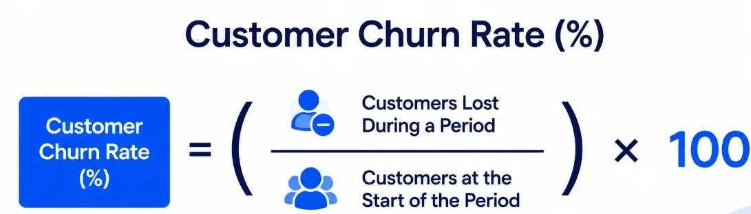
Example:
Suppose your SaaS product starts the month with 1,000 customers. During that month, 50 customers cancel their subscriptions.
Customer Churn Rate = (50 ÷ 1,000) × 100 = 5%
This means your business lost 5% of its customer base during that month. Tracking this metric consistently can help you identify retention issues early and measure whether changes to your product, onboarding, or user experience are reducing churn over time.
👉 Feel free to check out our guide about 100+ SaaS Churn Rate Statistics for every SaaS founder for industry churn benchmarks and retention insights.
Explore our customized SaaS Design services by country:

How poor UX can negatively impact SaaS churn rate
Below are some of the most common UX issues that contribute to SaaS churn.
1. Users Struggle to Find Value Quickly
A new user should be able to understand the product's value without completing a long setup process first. When the first session is filled with configuration screens, empty dashboards, permissions, and feature choices, users have to invest time before seeing what the product can actually do.
That extra effort can make the product feel like work before it has had a chance to prove its usefulness.
Airtable reduces this problem by giving new users ready-made templates instead of starting with a blank database.
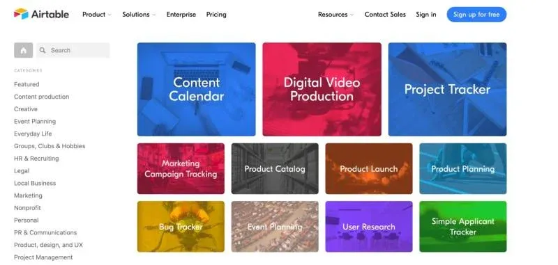
Users can choose a template, add their own information, and immediately see it organized into something useful. More advanced options are available once they have a reason to explore them, allowing users to experience the product before dealing with its full complexity.
2. Small UX Frustrations Can Drive Users Away
Users can tolerate a small inconvenience once. The problem begins when they repeatedly have to search for familiar actions, work through unnecessary steps, or figure out where a particular control has moved.
These moments may seem minor individually, but they interrupt the task the user came to complete. Over time, the product starts feeling harder to use than it should, which can push users toward an alternative.
Canva keeps many of its editing controls close to the element being edited. Select text and the relevant formatting options appear in the toolbar; select an image and the available image-editing controls change accordingly.
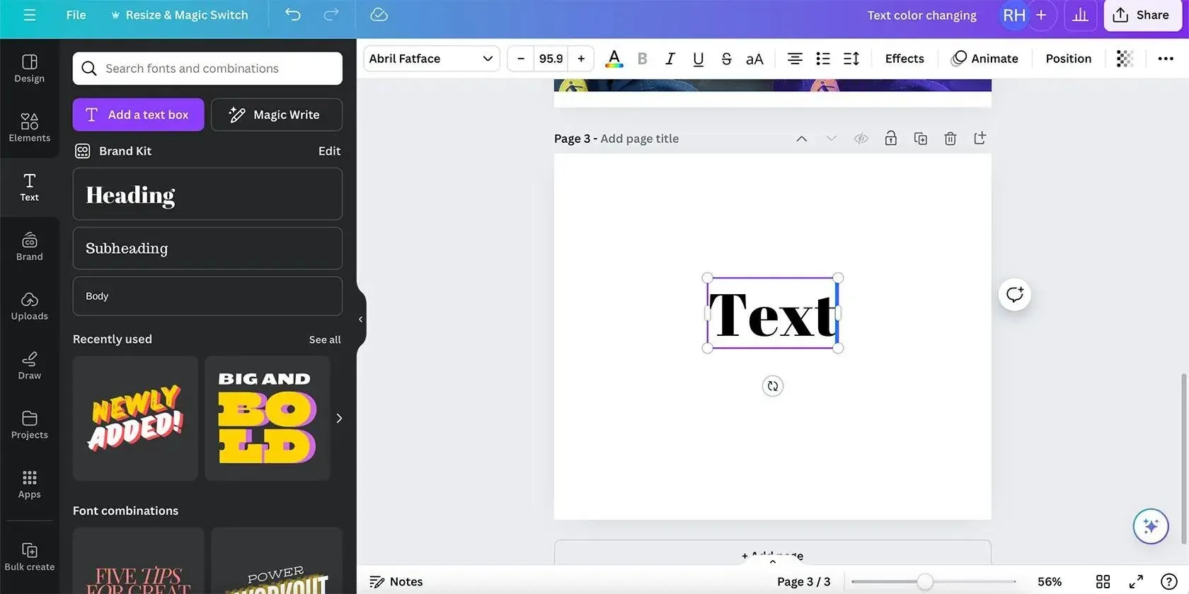
This way, users don't have to leave their workspace and search through several menus every time they want to make a common adjustment.
3. Poor Onboarding Creates Early Churn
Many SaaS products treat onboarding as a product tour. Users are shown every feature before they've accomplished anything meaningful. As a result, they remember very little and struggle to get started once the tour ends.
Miro handles this differently by giving new users templates and activities they can work with immediately. Instead of explaining every toolbar option upfront, the experience gets users onto a canvas where they can start adding, moving, and editing content.
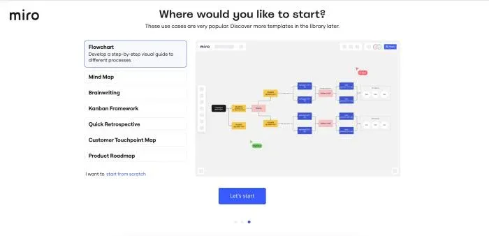
Users learn what the product can do while completing an actual task, which also gives them a reason to explore the interface further.
4. Confusing Navigation Makes Everyday Tasks Harder
As a SaaS product grows, it usually adds more features, settings, and tools. Over time, users may have to click through several menus just to find something they have used before.
When basic tasks become difficult to locate, users may contact support more often or stop using the feature altogether.
The best example of clear navigation is Linear. It keeps its main navigation simple and also offers a command menu for finding actions quickly.
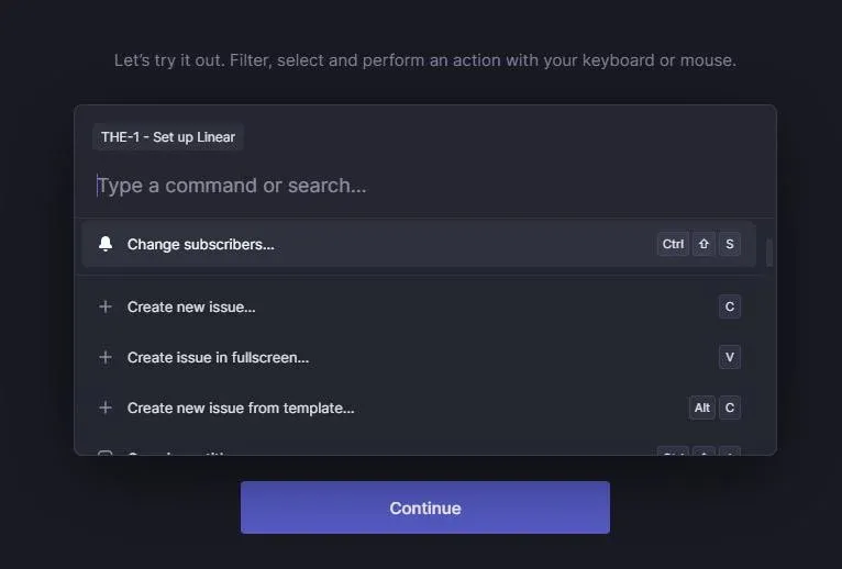
A user can search for an action instead of moving through multiple menus to find it. This makes the product easier to navigate even as more features are added.
5. Slow or Clunky Interfaces Push Customers Away
Speed matters when users rely on a SaaS product throughout the day. A page that takes too long to load, a button that responds slowly, or an editor that lags during simple actions can interrupt the task the user is trying to complete.
When those delays happen repeatedly, the product becomes frustrating to use.
Figma is designed around real-time editing, so users expect changes to appear as they work.
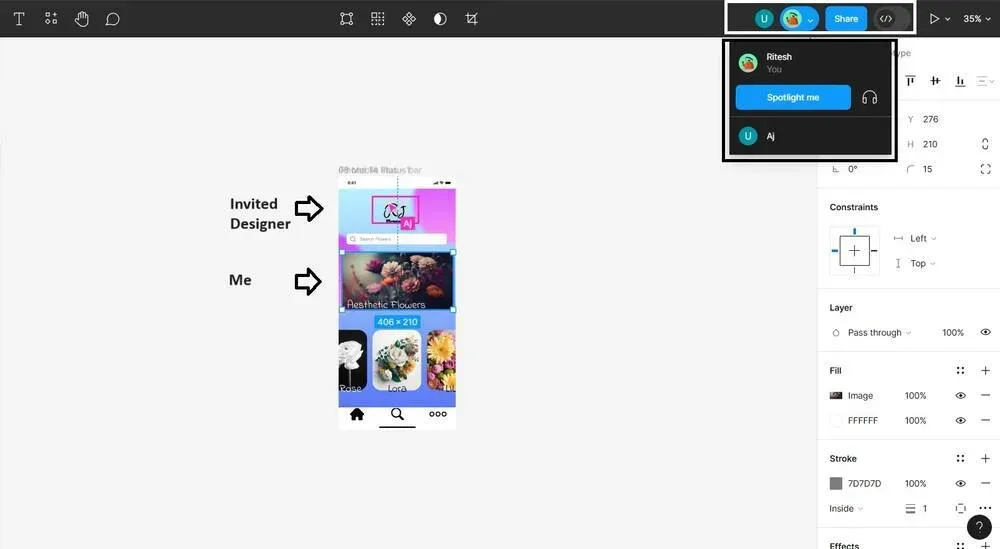
Whether someone is moving an object, editing text, or leaving a comment, the interface needs to respond quickly enough that the action feels immediate. When that responsiveness breaks down, even simple design tasks become harder to complete.
6. Lack of Clarity Makes Products Harder to Use
Users should not have to guess what a button will do, what information a field requires, or what happens after they complete an action. Unclear labels, vague instructions, and missing feedback make simple tasks harder to complete and can leave users unsure whether they have done something correctly.
Stripe handles complex financial workflows with clear labels, structured forms, and helpful explanations throughout its dashboard and documentation.
For example, when setting up payments or managing subscriptions, users are given context around the information they need to provide and what each setting affects.
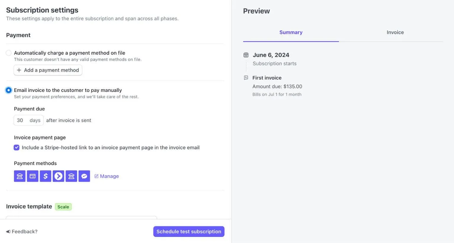
This makes complex tasks easier to understand without requiring users to figure out the interface on their own.
Feel free to check out the guides for future reference:
- UI/UX Design Services Cost
- SaaS Pricing Page Design That Drives Decisions
- What To Include in Your SaaS Pricing Page
- 10 B2B UX Design Examples with Key Lessons
Common UX Problems That Reduce SaaS Churn and How to Tackle Them
1. Complicated Onboarding
Many SaaS products try to introduce too much during onboarding. New users are asked to fill out forms, configure settings, explore different features, and sit through product tours before they have completed a single useful task. This can leave users trying to understand the product before they have experienced why they need it.
One of the best examples of a simpler approach is Slack. Instead of walking new users through every feature at once, Slack gets them into a conversation and lets them send their first message early.
Integrations, preferences, and other settings can be explored later, once users understand how the product fits into their work.
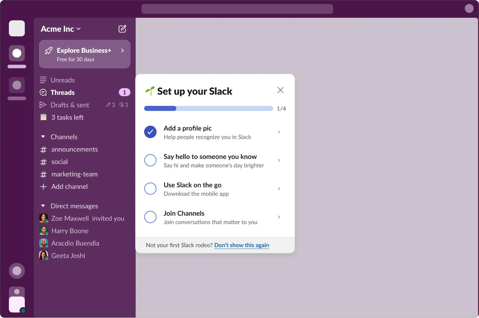
How to fix this
- Remove onboarding steps that do not help users complete their first useful task or provide information the product genuinely needs at that stage.
- Give users one clear action to complete first instead of presenting several features and setup choices at the same time.
- Ask for optional information later when users have a reason to provide it rather than making it part of the initial setup.
- Replace long product tours with short prompts that appear when users encounter a feature for the first time.
- Give users templates, sample data, or a pre-configured workspace when starting from a blank screen would require unnecessary setup.
- Track where users leave the onboarding process and compare those drop-off points with the steps they were asked to complete beforehand.
2. Confusing Navigation
As SaaS products evolve, new features are often added without rethinking the overall navigation. New features get added to existing menus, similar functions end up in different places, and users have to remember where they found something the last time.
Over time, this increases the effort required to use the product and makes everyday workflows feel unnecessarily complicated.
Notion addresses this by organizing information around pages, nested navigation, and a persistent sidebar.
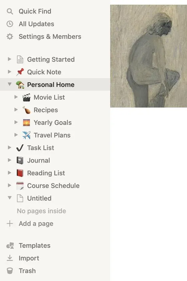
Instead of exposing every capability at once, the interface allows users to structure their workspace in a way that matches how they work. Frequently used pages remain easy to access, while less common actions stay out of the way.
How to fix this
- Group features according to the tasks users need to complete rather than the way your internal teams or product architecture are organized.
- Keep frequently used actions easy to reach while moving less common settings into secondary menus.
- Review your navigation whenever you add several new features so that older sections do not become overcrowded.
- Use labels that describe what users will find inside each section instead of relying on internal product terminology.
- Ask users to complete common tasks during usability testing and note where they stop, backtrack, or open search to find what they need.
3. Unclear Value Demonstration
Users can use a SaaS product regularly without having a clear sense of what they are getting from it. If the product quietly handles tasks in the background but rarely shows the results, customers may start questioning whether the subscription is worth continuing.
This becomes especially important when the benefit is something that is difficult to notice, such as time saved, mistakes avoided, or improvements made over time.
Grammarly makes its value more visible through its writing insights. Its weekly reports show users information such as how much they wrote, how their accuracy changed, how varied their vocabulary was, and how their activity compares with previous weeks.
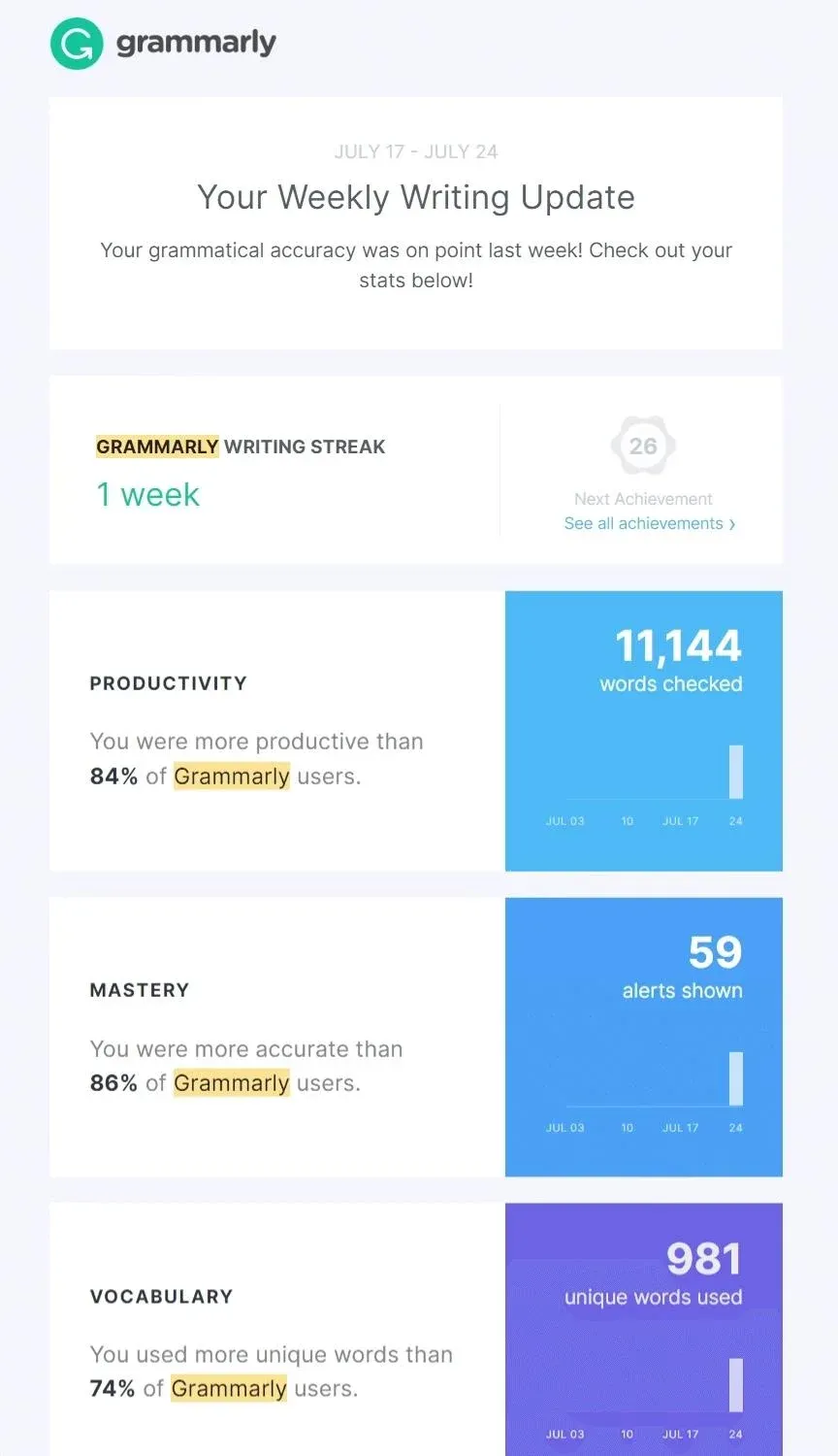
Instead of leaving users to judge the benefit of Grammarly from individual corrections, these summaries give them a broader view of what they have achieved with the product.
How to Fix It
- Identify the outcome that matters most to your customers and find a clear way to show how the product contributes to it.
- Add useful progress or usage information to places customers already visit instead of making them search for reports about their results.
- Show the results of work the product handles in the background, such as hours saved, errors prevented, tasks automated, or revenue generated.
- Send regular summaries when the benefit is easier to understand over a week or month than during a single session.
- Personalize these metrics around how each customer uses the product rather than showing everyone the same set of numbers.
- Use meaningful milestones to help customers recognize progress, particularly when the product's benefits build gradually over time.
4. Poor Mobile Experience:
Mobile accounted for 52.23% of worldwide web traffic in June 2026, compared with 47.77% from desktop. Yet many SaaS products still treat mobile as an extension of the desktop experience.
Because of this, important actions become difficult to complete on smaller screens, dashboards require excessive scrolling, and navigation designed for a mouse can become frustrating when used with a thumb. For users who need to check information or complete a quick task away from their desk, these problems can make the product harder to use.
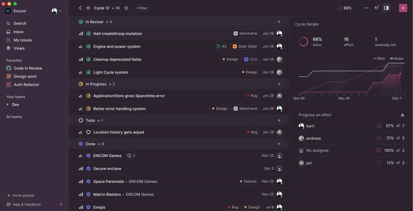
One example of a more focused approach is Linear. Its mobile experience prioritizes tasks such as checking issues, responding to notifications, and making quick updates instead of trying to reproduce the entire desktop workspace.
How to Fix It
- Identify the tasks customers actually complete on mobile and prioritize those workflows instead of trying to reproduce the entire desktop product.
- Redesign buttons, forms, menus, and navigation for touch interaction rather than simply scaling down the desktop interface.
- Remove secondary information from mobile screens when it makes the primary task harder to complete.
- Replace wide tables and complex dashboards with mobile-friendly summaries that show the most important information first.
- Test the product on physical devices and different screen sizes to catch problems that may not appear in a desktop browser emulator.
- Compare mobile and desktop task completion rates to find workflows where mobile users take longer, abandon tasks, or need more support.
5. Lack of In-App Guidance
Even experienced users can get stuck when a feature works differently from what they expect. If the interface gives them no explanation, example, or next step, they may leave the product to search for an answer or contact support.
When this happens repeatedly, users can start avoiding features simply because they are difficult to understand.
Figma handles many of these moments within the product itself.
Empty states explain what users can do next, contextual prompts introduce features when they become relevant, and tooltips provide additional information without taking users away from their current task.
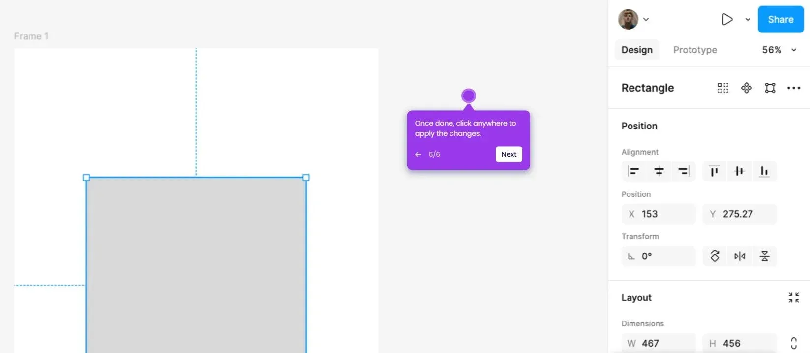
This means users can discover how different parts of the product work while they are actually using them.
The most useful guidance appears when a user needs it. It should answer the immediate question or show the next step without making the user stop what they are doing.
How to Fix It
- Add short explanations beside unfamiliar controls so users understand what an option does before they have to search for an answer.
- Use empty states to show users what belongs in a section and give them a clear first action instead of leaving a blank screen.
- Show guidance when users encounter a feature for the first time rather than presenting every instruction during onboarding.
- Write error messages that explain what went wrong and what the user can do next instead of displaying technical error codes.
- Add relevant help links directly inside complex workflows so users can get more information without leaving the task.
- Review features with low adoption and check whether users are missing them because the interface does not explain when or why they should be used.
6 Inconsistent Design
As SaaS products grow, different teams often add new features over several years. Without a shared design system, those features can start looking and behaving differently.
A button may work one way in one section and another way elsewhere, while similar actions appear in different places. Users then have to spend extra time figuring out how familiar interactions work each time they move through the product.
Atlassian addresses this through the Atlassian Design System, which provides shared components, interaction patterns, typography, colours, and accessibility guidelines across products such as Jira and Confluence.
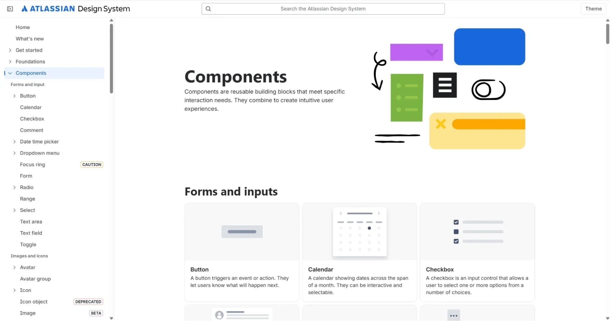
When users move between different parts of the ecosystem, familiar patterns make the interface easier to understand because they don't have to relearn basic interactions each time.
How to Fix It
- Create a shared design system that documents reusable components, typography, colours, spacing, icons, and common interaction patterns.
- Standardize recurring interactions such as buttons, forms, navigation, tables, filters, and confirmation dialogs so they work the same way throughout the product.
- Give designers and developers a shared component library so new features are built from established patterns instead of recreated from scratch.
- Review new features before release to catch changes that introduce a different layout, interaction, or visual treatment for an existing task.
- Audit older parts of the product regularly and replace outdated components when they no longer match the current design system.
7. Difficult Account Management
Managing an account should not require users to search through the product or contact support for routine tasks. Still, so many SaaS products make actions such as changing a subscription, updating payment details, inviting team members, or adjusting permissions unnecessarily difficult to find.
When customers cannot manage these tasks on their own, even a simple administrative request can become frustrating.
See how Notion fixes this by keeping these settings within a dedicated workspace area, where users can manage billing, members, permissions, integrations, and other account preferences.
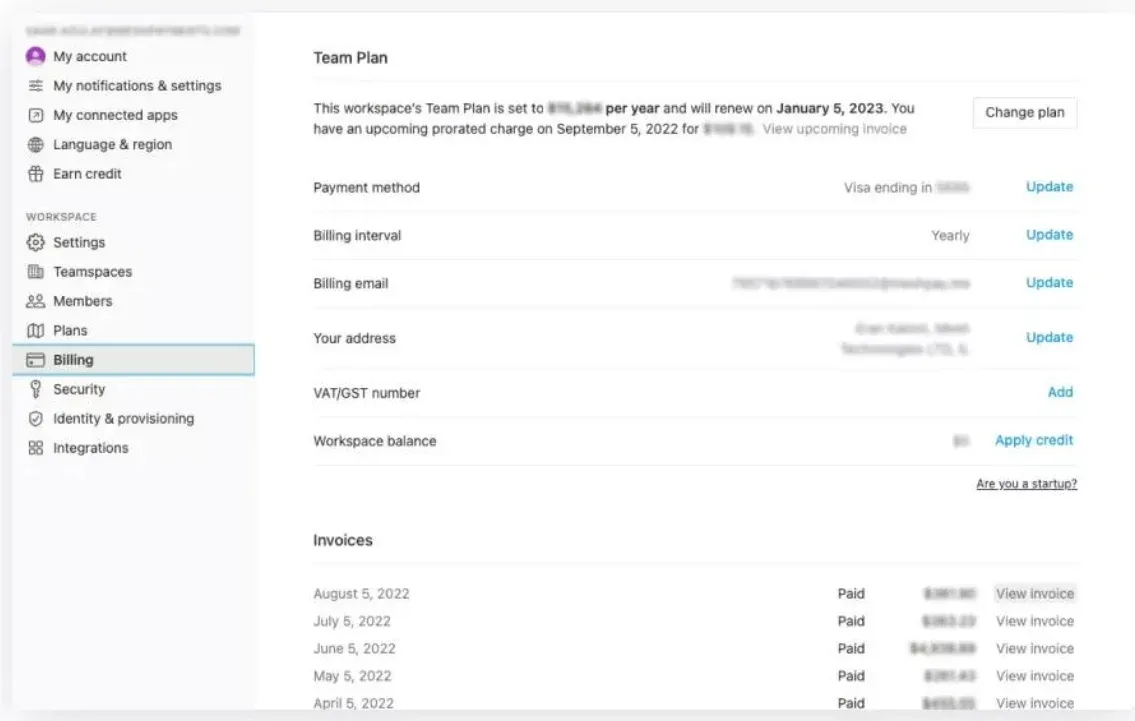
The different sections are clearly labeled, so administrators can find the setting they need without having to search through the main product or contact support for basic changes.
How to Fix It
- Bring billing, subscription, security, notifications, team management, and integrations together in a clearly organized settings area.
- Use labels that describe the task users want to complete instead of internal terms that may be unfamiliar to customers.
- Let users handle routine tasks themselves, including changing plans, updating payment details, inviting team members, and managing permissions.
- Show clear confirmation messages after important changes so users know whether an action was completed successfully.
- Test common account workflows with real users and look for unnecessary searches, repeated clicks, or steps that require support assistance.
8. Poor Error Handling
Errors are inevitable in any SaaS product. The difference lies in how the product responds when they occur.
Generic messages such as "Something went wrong" or "Invalid input" leave users guessing what happened and how to fix it. When people repeatedly encounter unclear errors, confidence in the product quickly declines.
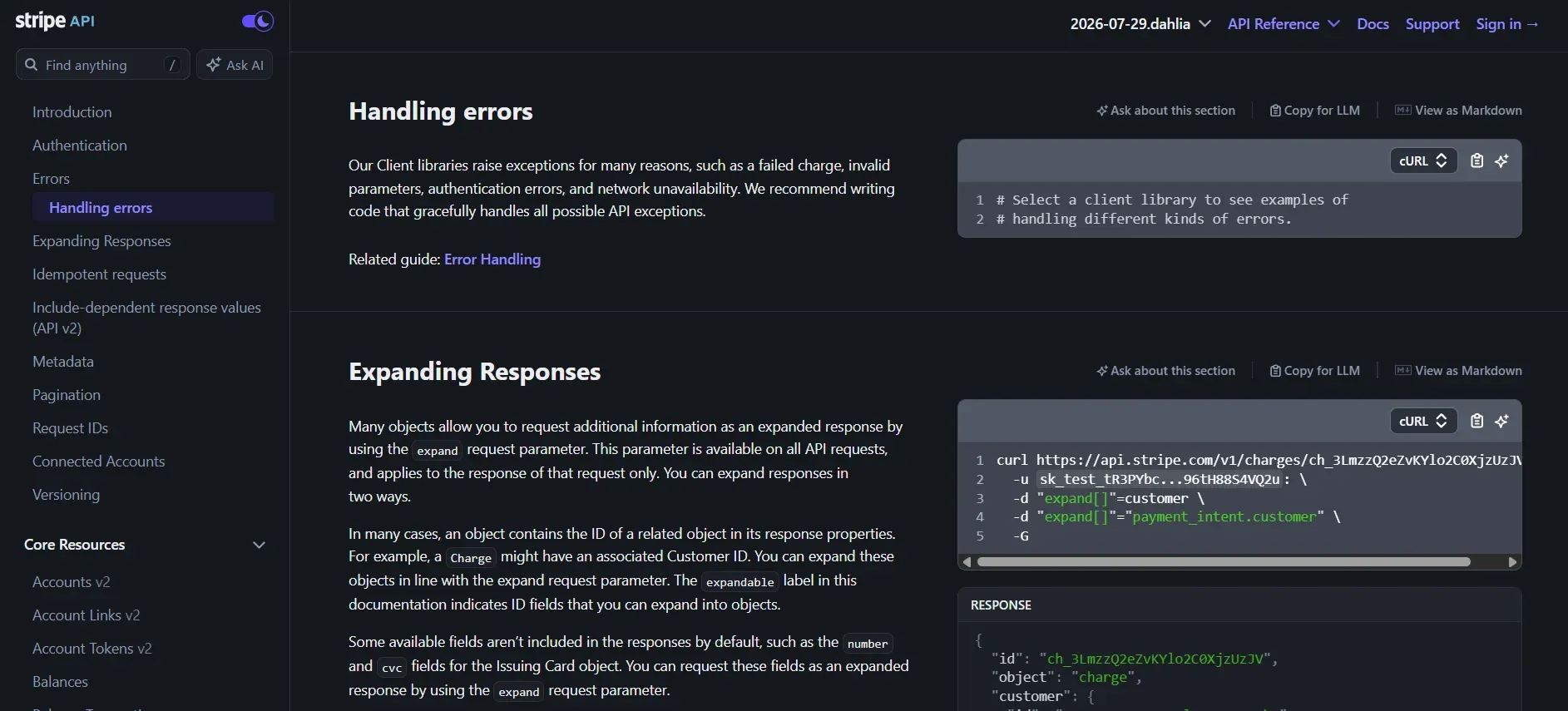
Stripe approaches error handling differently.
Whether users are integrating APIs, configuring payments, or completing forms, error messages clearly explain what went wrong, why it happened, and the steps needed to resolve the issue. Rather than interrupting the workflow, the interface helps users recover and continue with minimal frustration.
How to Fix It
- Explain both the problem and the solution in every error message so users immediately understand what happened and what action they should take next.
- Validate information as users enter it instead of waiting until form submission to surface multiple errors at once.
- Preserve user input whenever an action fails so users can make corrections without re-entering information.
- Provide clear recovery options such as Retry, Edit Information, or Contact Support to help users continue their task without starting over.
- Review error logs alongside session recordings to identify recurring points of failure and prioritize fixes that have the biggest impact on user experience.

Get a free SaaS UX audit report from our design experts
Reducing SaaS churn starts with understanding where users struggle. Small usability issues across onboarding, navigation, and core workflows can make it harder for customers to adopt your product and continue using it.
At Tenet, we combine UX research, product strategy, and interface design to help SaaS companies build products that are easier to learn, navigate, and use. Our SaaS UX audit includes:
- Reviewing onboarding flows to identify unnecessary steps and drop-off points.
- Evaluating navigation, information architecture, and core user workflows.
- Assessing feature discoverability to ensure users can easily find and adopt key functionality.
- Identifying usability issues across critical screens, interactions, and user journeys.
- Delivering a prioritized UX audit report with practical recommendations for your product, design, and engineering teams.
Our team has designed and improved SaaS and enterprise platforms for companies including Yomly, G42 Healthcare, ASDAV, and other digital products across HR, healthcare, enterprise software, and fintech.
Whether you're improving an existing SaaS product or preparing for your next release, our design experts can help you create a more intuitive product experience.
Discover UX Issues That Could Be Driving Churn. Talk to Our Experts
Discover UX Issues That Could Be Driving Churn. Talk to Our Experts

















Got an idea on your mind?
We’d love to hear about your brand, your visions, current challenges, even if you’re not sure what your next step is.
Let’s talk


