
Dashboard UX Design Best Practices 8+ Years of Experience
 By
By Share

Share

Get a quick blog summary with



Novu's dashboard redesign, which included a smart onboarding checklist, reduced average time to first workflow from 18 minutes to just 4 minutes and increased trial-to-paid conversion by 27%.
For a product team, that's a powerful reminder that user experience doesn't just influence how a dashboard looks. It influences how quickly people understand it, adopt it, and continue using it.
At Tenet, we've designed 450+ digital products for organizations including Google, KPMG, Deloitte, and Paytm, helping create experiences that collectively serve more than 20 million users worldwide.
In this guide, we'll explore the exact UX design principles, patterns, and best practices that we use for our enterprise clients.
What is a dashboard in digital products?
A dashboard in digital products is a central screen that collects important data from different parts of a system and shows it in a simple, visual way so users can understand performance quickly.
It sits on top of underlying data sources like product activity, user behavior, sales, or system logs. Instead of showing raw data, it converts it into meaningful metrics like revenue, conversions, active users, or system health.
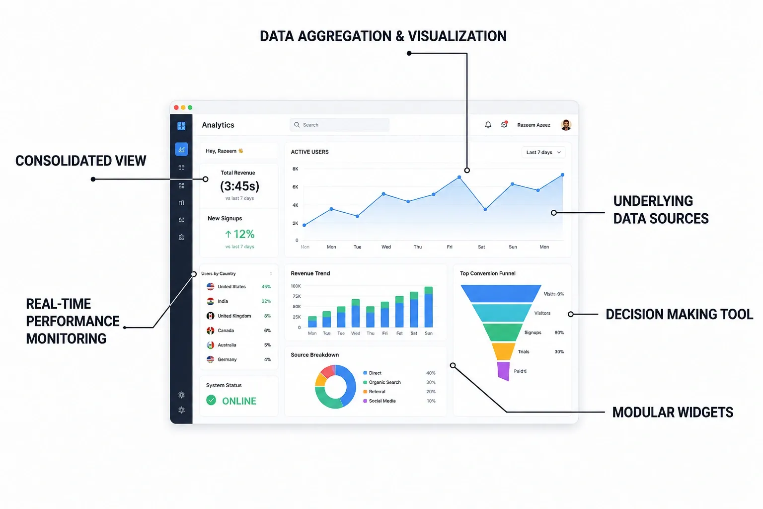
Each section of a dashboard is usually tied to a specific data query and updates either in real time or at regular intervals, depending on how the product is designed.
In simple terms, it is a single place where complex data is summarized, allowing users to monitor what is happening and make decisions without digging through multiple tools.
Need help in UX design? Learn how our experts can help you:
Types of Dashboards in UX Design (with real examples)
A dashboard in UX design is categorized by its user goals, data complexity, and update frequency. Here are the four primary types of dashboards used in digital products, complete with real-world examples:
1. Operational Dashboards
These dashboards are built for situations where conditions change quickly and users need to respond immediately. They surface live or frequently updated system data such as active users, ongoing transactions, service health, queue backlogs, or error spikes, often prioritizing what is currently happening over historical context.
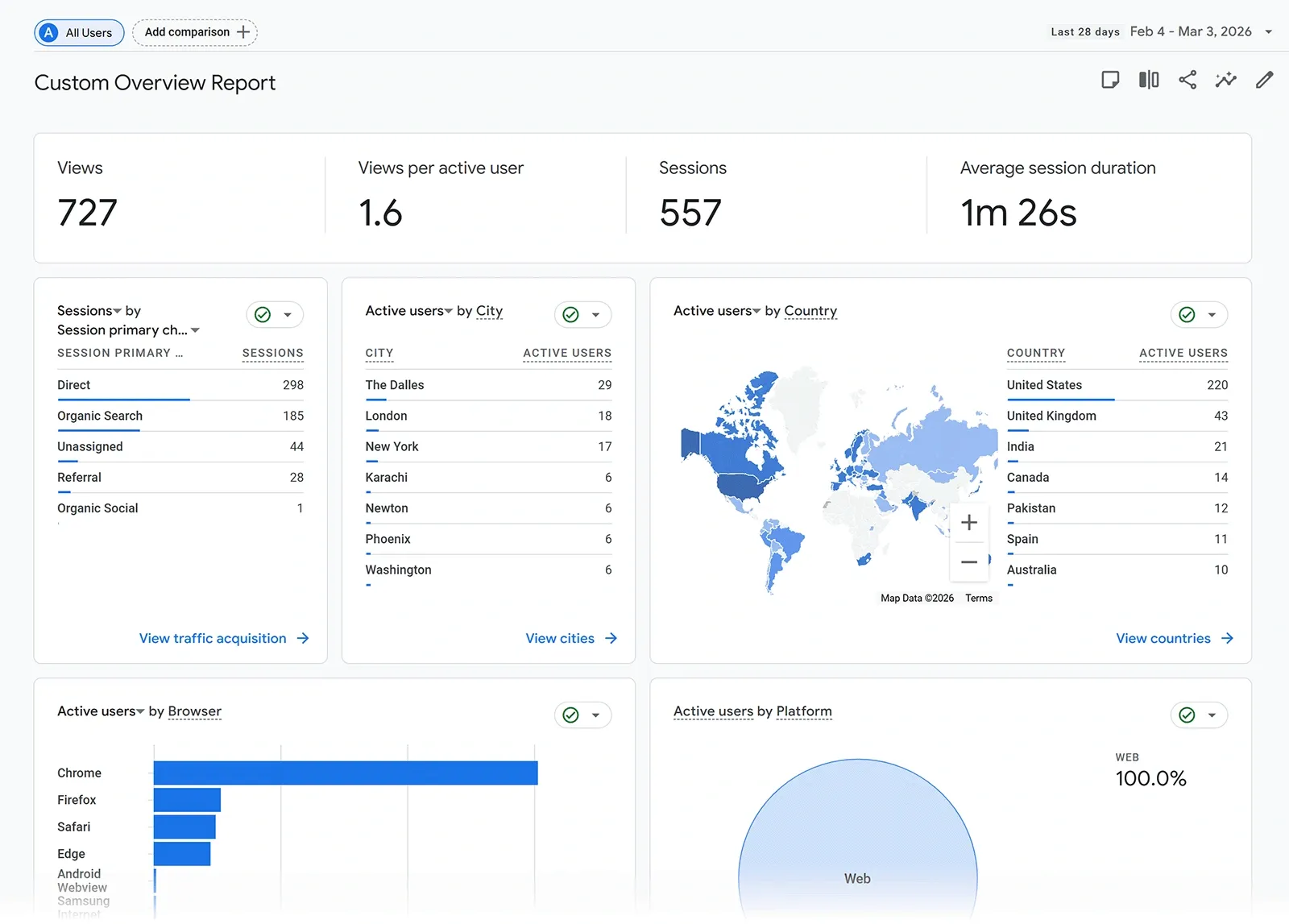
For example, the Google Analytics Realtime dashboard shows live visitor activity, traffic sources, and page views as they happen, while Datadog helps engineering teams track server load, latency, and system failures in real time so they can fix issues before they affect users.
2. Analytical Dashboards
These dashboards are designed for digging into historical data to understand patterns, trends, and relationships across different variables. They usually support filtering, segmentation, and drill-downs that let users move from high-level trends into detailed breakdowns.
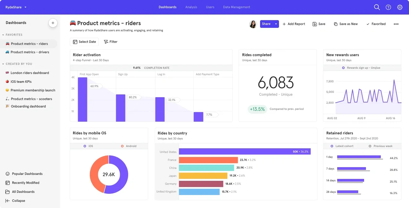
In tools like Amplitude or Mixpanel, a product manager might analyze user retention by cohort, compare conversion rates across acquisition channels, or trace where users drop off in a funnel to understand behavioral patterns over weeks or months.
3. Strategic Dashboards
These dashboards are built for leadership teams who need a fast, high-level view of business performance against long-term goals. They focus on a small set of core KPIs such as revenue growth, churn rate, pipeline health, or target achievement, often shown alongside trends or targets for quick evaluation.
4. Tactical / Platform Dashboards
These dashboards sit closer to daily work execution and act as a control center for managing tasks, workflows, and ongoing activities inside a product. They combine status visibility with direct actions like creating, updating, or assigning work, making them more interactive than purely analytical or strategic dashboards.
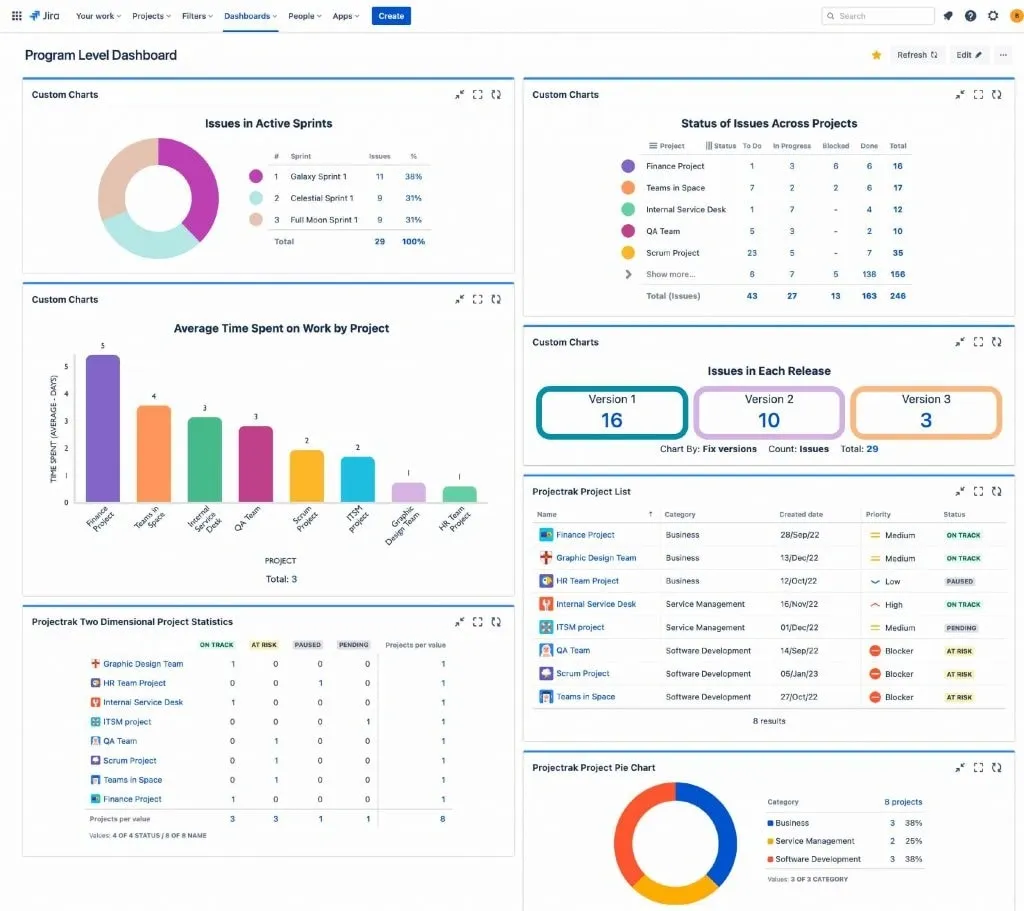
In Jira, users can see sprint progress, assigned issues, and backlog status while also creating new tickets or updating workflows, while Shopify dashboards let merchants manage orders, products, and store activity from a single workspace.
👀 Check out some amazing examples of UX Design:
Enterprise UX design mistakes every SaaS or web app must ignore
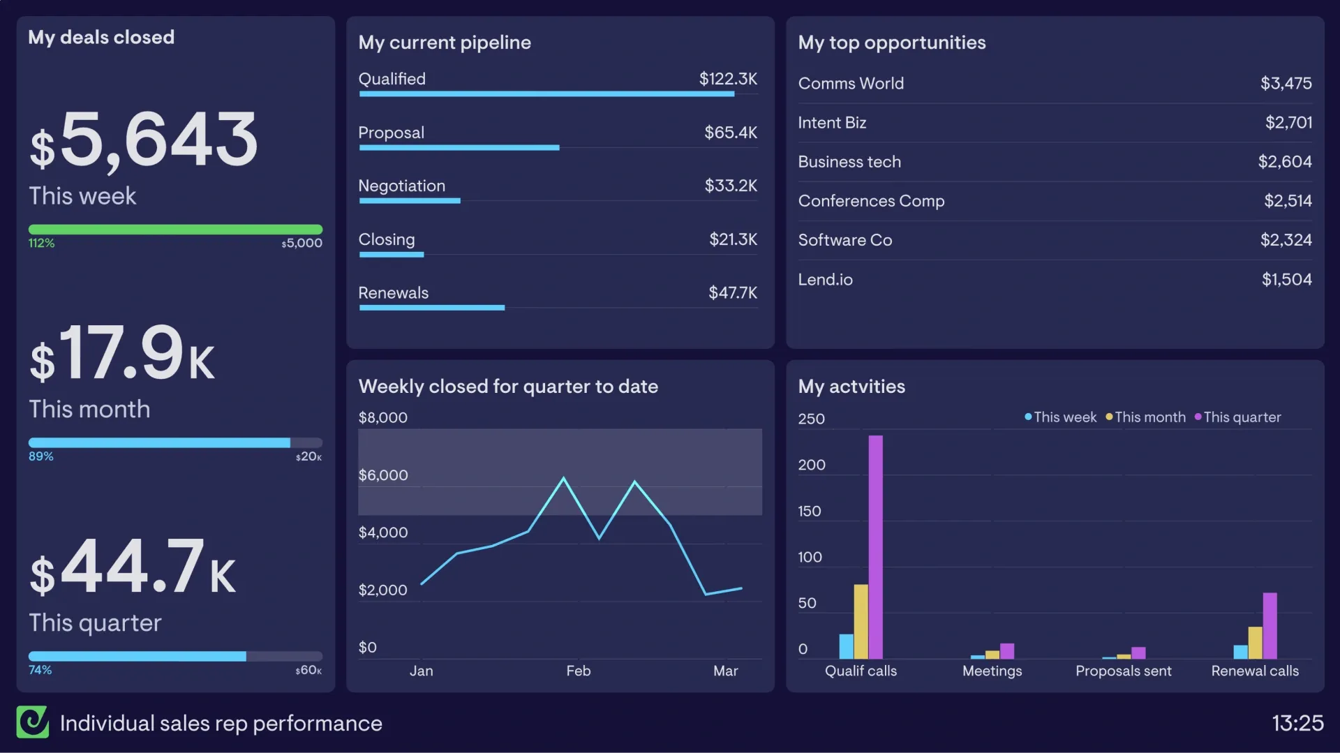
Mistake 1: Designing for “all users” instead of specific roles
Enterprise products often serve executives, managers, analysts, and frontline employees within the same system. When every user gets the same dashboard and navigation, interfaces become crowded with features and data that many people never use. This makes it harder to find relevant information and complete routine tasks efficiently.
Here’s how Geckoboard's dashboard is built for different roles, Sales Manager & CFO:
Mistake 2: Overloading users with data instead of guiding them
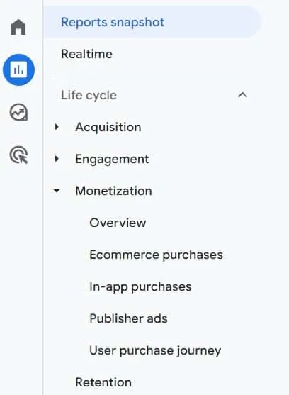
A common dashboard mistake is displaying every available metric, chart, and report on a single screen. While the intention is to provide complete visibility, the result is often information overload. Users spend more time searching for meaningful insights and less time acting on them.
Google Analytics 4 has solved this thing for users by separating reporting into focused sections such as Acquisition, Engagement, Monetization, and Retention instead of presenting all available metrics in one view.
Mistake 3: Ignoring load time and perceived performance
Most people think a few seconds of loading time is just a minor annoyance. However, research reveals that 1.0 seconds is the absolute hard limit of the human attention span. The moment a dashboard filter or search result takes longer than one second, the brain physically breaks its train of thought.
Consider an employee who clicks through data 60 times a day. If each click has a two-second delay, they waste two hours of focused work time every month just waiting for screens to load.
Multiply that across a team of 50 people, and the company loses 100 hours of productive work every single month to loading wheels.
Mistake 4: Ignoring information hierarchy
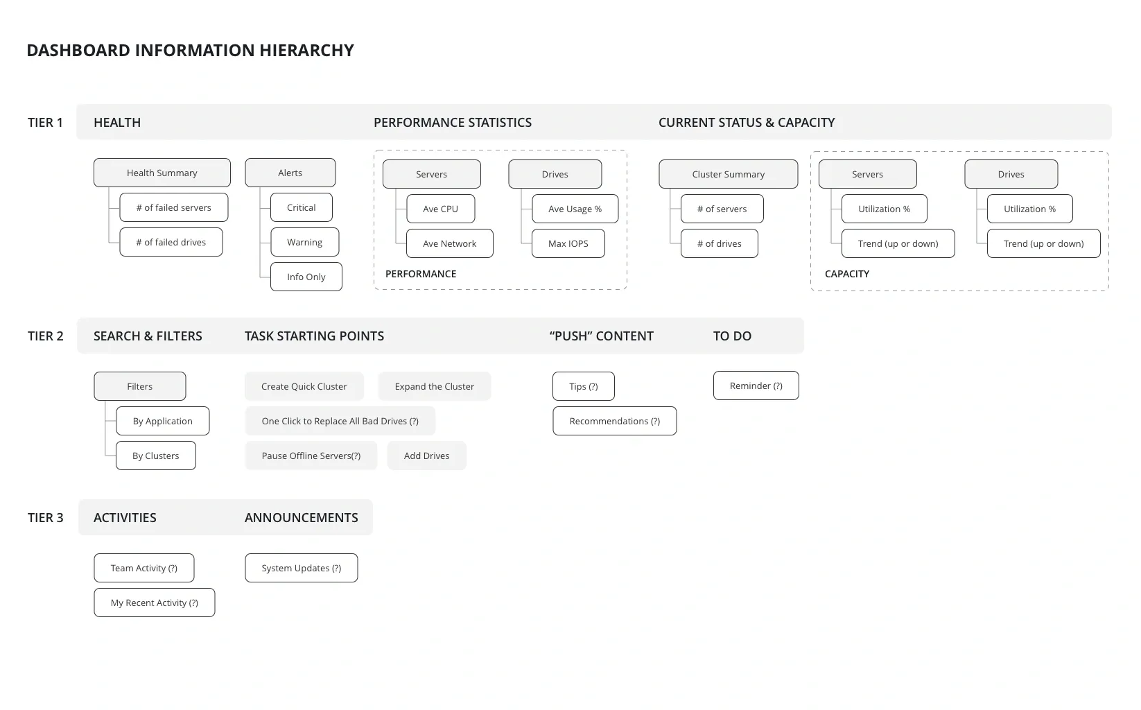
Not all information deserves equal attention because when dashboards give every chart, table, and metric the same visual weight, users are forced to determine priorities on their own. This makes it harder to spot important insights, and the interface feels more complex than it needs to be.
Here is a simple image showing how the dashboard info hierarchy should be structured:
Mistake 5: Poor handling of permissions and role-based access
A massive real-world example of poor access control happened when First American Financial leaked 885 million records because anyone could change a digit in a web link to view other customers' tax forms and bank details.
To fix such errors, any type of dashboards must adopt a Zero Trust approach, meaning the system automatically blocks access to every single chart and dataset unless a user's specific role explicitly permits them to see it.
Mistake 6: Hiding or overloading search & filters
Burying search tools or dumping too many filters on a screen instantly destroys data discoverability. According to usability research, poor filtering stands as one of the top five user experience failures globally, causing 76% of major digital platforms to suffer from severe usability issues that lead users to abandon the system.
For example, major grocery dashboards like Tesco have historically faced heavy criticism for cluttered results and a lack of clear search guidance, which drastically increases the time it takes users to find basic items.
To fix this, dashboard designs must implement a progressive disclosure pattern, keeping the most heavily used search controls visibly anchored at the top of the interface while neatly tucking advanced parameters away inside a collapsible side drawer.
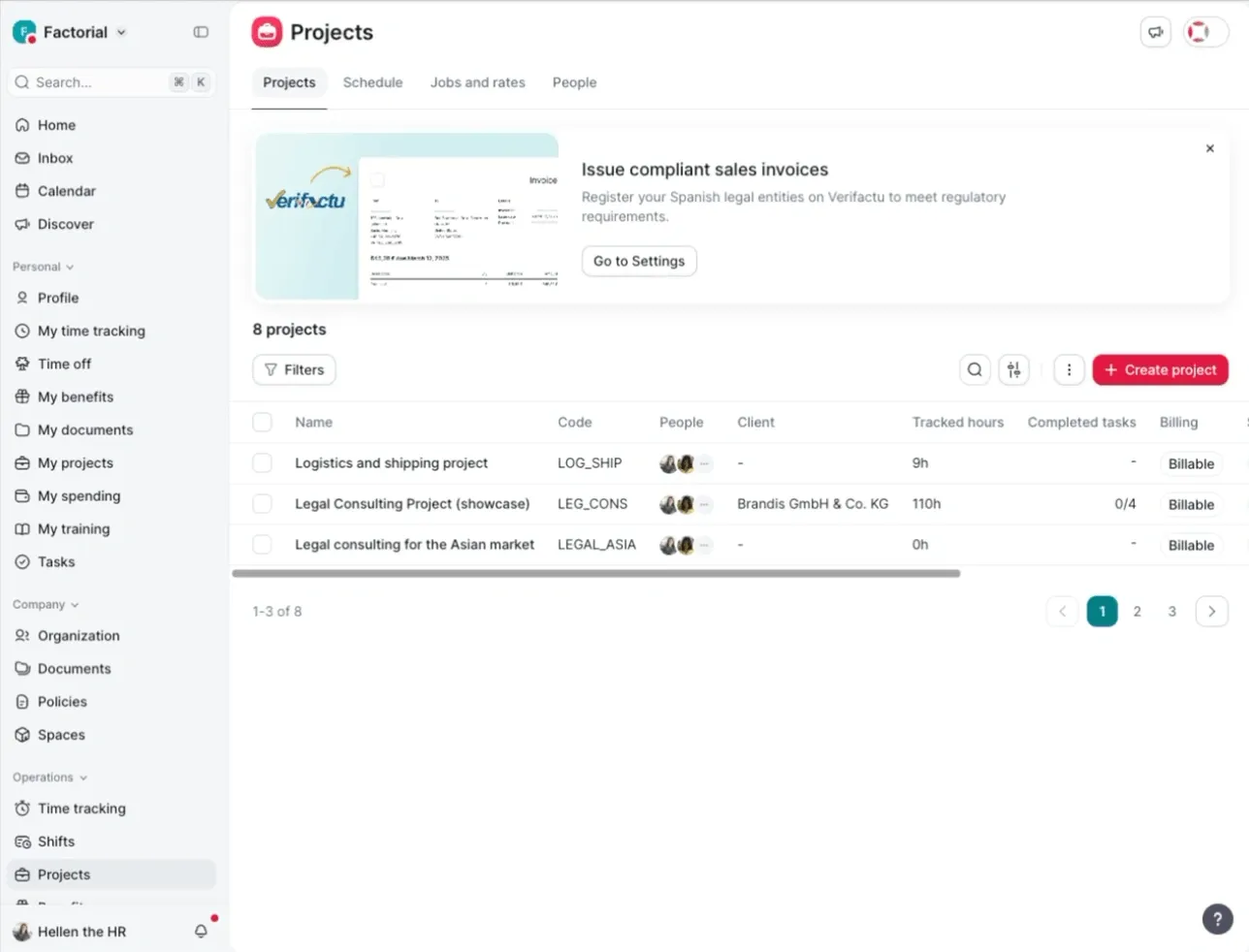
Mistake 7: No bulk actions or batch operations
When a dashboard handles heavy enterprise datasets but makes people process items individually, it creates severe processing bottlenecks and introduces a 6.5% error rate from manual data fatigue. A functional workspace must allow users to select multiple items, view clear eligibility rules, and apply changes in a single operation.
If you do not provide efficient shortcuts for repetitive tasks, your dashboard becomes an administrative bottleneck instead of an efficiency tool.
The GIF is a clear example of how a dashboard should help with bulk actions:
Dashboard UX design best practices
1. Establish Visual Hierarchy and Placement
A dashboard is not meant to display everything at once. Its job is to help users understand the state of a business, product, or system as quickly as possible.
This is done with the help of “Visual hierarchy,” as it determines what users see first, what they notice next, and where they go when they need more detail. This reduces scanning effort and helps users move from high-level outcomes to supporting details without getting lost.
Best Practices
- Use an asymmetric grid that places key metrics at the top and detailed charts below, so users can understand performance before exploring deeper insights.
- Position the most critical real time metric in the top left, where users naturally look first.
- Leave enough space between dashboard sections to separate different datasets and reduce visual clutter.
- Show no more than four key metric cards in the top row to keep the dashboard easy to scan.
- Place detailed tables and audit logs in the lower section so summaries stay visible without distraction.
- Keep navigation items, such as profile settings and workspace switchers, inside a narrow sidebar to maximize space for data.
2. Choose the Right Data Visualizations
Users open dashboards to identify patterns, compare performance, spot anomalies, or track progress. When the visualization does not match the task, important insights become harder to see.
The goal is not to make the dashboard visually impressive; it is to make comparisons, trends, and relationships immediately obvious.
Best Practices
- Use line charts only to show trends over time. For category comparisons, choose bar or column charts instead.
- Switch to horizontal bar charts when category names are long to keep labels easy to read.
- Avoid pie charts when comparing many categories or when the percentage differences are very small.
- Use stacked bar charts only when the total value matters more than the size of each individual segment.
- Replace crowded scatter plots with hexbin maps when overlapping data points make patterns difficult to see.
- Use dual axis charts only when the two metrics are closely related, and clearly label each axis.
- Show progress against targets with bullet graphs instead of radial gauges because they save space and are easier to compare.
3. Apply Color and Visual Psychology
Color is one of the fastest ways to communicate information in a dashboard. Users often notice color before they read labels, numbers, or supporting text. When used thoughtfully, color can draw attention to important changes, highlight risks, indicate status, and help users distinguish between related datasets.
This visual represents how colour impacts how your brain perceives the data:
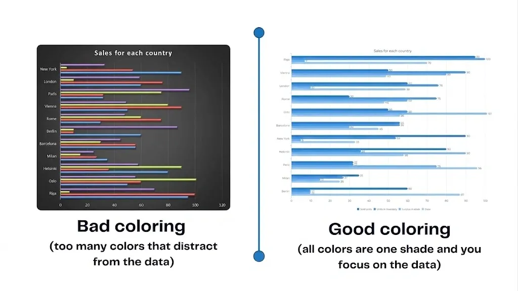
However, when too many colors compete for attention, users lose the ability to distinguish what is truly important. A dashboard where every widget is brightly colored creates the same problem as a dashboard with no visual hierarchy at all.
Best Practices
- Use neutral colors such as gray or blue for the dashboard background and regular data, so important information stands out.
- Reserve bright colors for status indicators, using red for critical issues, amber for warnings, and green for positive results.
- Do not rely on red and green alone to communicate status. Add icons or text labels to make the dashboard accessible to color blind users.
- Use different shades of the same color to show data intensity on heatmaps instead of using multiple unrelated colors.
- Keep colors consistent across every chart and dashboard so the same category or metric always uses the same color.
- Maintain high contrast between text and backgrounds to ensure numbers and labels remain easy to read.
- Display missing or unavailable data in gray to distinguish it from actual zero values clearly.
4. Optimize Interactivity and Controls
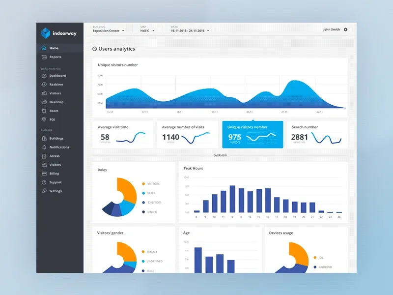
Most dashboards are not static reports. Users need to filter data, adjust time ranges, compare segments, drill into details, and move between different levels of information. Interactivity gives users control over how they explore data, but every control added to a dashboard also increases complexity.
Here is an example of the above:
Best Practices
- Keep filters in the same location across every dashboard, such as a top bar or left sidebar, so users can find them quickly.
- Update results automatically after users finish typing instead of requiring a manual search or apply button.
- Let users click a chart element to filter and update all related charts on the page.
- Provide quick date range options, such as "Last 7 Days" or "Previous Quarter," along with a manual calendar.
- Show breadcrumbs whenever users drill into detailed data, making it easy to return to previous views.
- Open detailed information with a click instead of a hover to prevent accidental layout changes.
- Use loading indicators and hover states to confirm that the dashboard is processing user actions.
- Keep filters synchronized across dashboards so selected regions or date ranges remain the same when users switch tabs.
5. Contextualize the Data
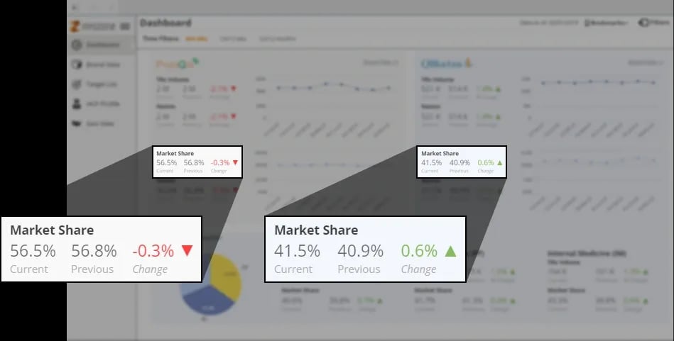
A dashboard that simply displays metrics forces users to interpret them themselves. For example, seeing 10,000 new users or a 5% churn rate means very little without knowing how those numbers compare to previous periods, business goals, or expected performance.
This is just a tiny example of how contexualization looks like on dashboard:
Best Practices
- Show the percentage change next to every key metric so users can compare current performance with the previous period or target.
- Add target lines to charts so users can instantly see whether performance is above or below the goal.
- Display small trend lines beside key metrics or tables to show recent performance without taking extra space.
- Include tooltips that explain how complex metrics are calculated to avoid confusion across teams.
- Show the last data refresh time so users know how current the information is.
- Group related metrics by business function instead of technical categories to match the user's workflow.
- Use clear status labels, such as "Above Target" or "Below Threshold," to help non-technical users understand performance quickly.
6. Design for System Performance
Dashboard users often rely on the information in front of them to make decisions, monitor operations, or investigate issues. When the interface feels slow, users become less confident in both the system and the data it provides. Delays also interrupt analysis workflows, forcing users to spend more time waiting than working.
Best Practices
- Show the percentage change next to every key metric so users can compare current performance with the previous period or target.
- Add target lines to charts so users can instantly see whether performance is above or below the goal.
- Display small trend lines beside key metrics or tables to show recent performance without taking extra space.
- Include tooltips that explain how complex metrics are calculated to avoid confusion across teams.
- Show the last data refresh time so users know how current the information is.
- Group related metrics by business function instead of technical categories to match the user's workflow.
- Use clear status labels, such as "Above Target" or "Below Threshold," to help non-technical users understand performance quickly.
7. Role-Based Views and Personalization
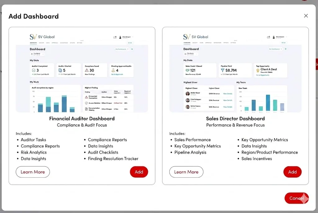
A one-size-fits-all dashboard often creates two problems. Some users are overwhelmed with information they never use, while others struggle to find the metrics they depend on every day.
The following image shows the role-based dashboard for two completely different teams:
Best Practices
- Design different dashboard layouts for each user role, showing business KPIs to executives and detailed operational data to technical teams.
- Let users add, remove, and rearrange dashboard widgets to create a workspace that matches their needs.
- Save user preferences, such as filters, table layouts, and zoom levels, so the dashboard remembers them after every login.
- Show advanced tools only to users who need them, keeping the interface simple for everyone else.
- Hide pages, tabs, and sensitive data that are not relevant to a user's role or permissions.
- Add a workspace switcher so users who manage multiple teams or projects can move between dashboards quickly.
- Allow users to pin frequently used charts and metrics for faster access from a personalized dashboard.
8. Typography and Data Density
Typography and data density dictate how easily a user can read and digest numbers on a screen. High data density is often necessary for expert users who need to monitor vast amounts of information simultaneously, while lower density suits casual or executive viewers.
Managing this balance requires precise typographic choices, strict alignment, and deliberate spacing so that dense rows of numbers remain legible and do not dissolve into a wall of text.
Best Practices
- Use monospaced numbers in tables and metric cards so values line up and are easier to compare.
- Choose simple, easy-to-read fonts that remain clear even at small sizes.
- Use clear font size differences between headings, labels, and body text to create a strong visual hierarchy.
- Keep table labels short, or show the full text when users hover over longer labels.
- Make small text easier to read by increasing its font weight instead of changing its color.
- Adjust row spacing based on user needs, using compact layouts for data-heavy views and larger spacing for summary dashboards.
Get your product dashboard UX designed by our UX experts
A poorly optimized dashboard can cause user frustration and missed insights, while an excellent one empowers your users to make critical decisions at a glance.
With 450+ projects delivered globally, our team has worked on building digital products across SaaS, fintech, and enterprise platforms. Over time, we’ve seen a clear pattern: when dashboards are simplified and structured well, users make better decisions with less effort.
When you partner with our experts, you get:
- Clear Decision Mapping: We design based on what users need to decide, not just the data available. Instead of overcrowding screens, we structure information around real user actions.
- Simple Data Visualization: We turn complex data into clean, easy-to-read visuals that highlight what matters without unnecessary noise.
- Experience Across B2B & SaaS Products: From analytics tools to CRMs and fintech platforms, we understand how different product environments change design needs.
- Practical UX Reviews: For existing dashboards, we review user flows, identify friction points, and suggest improvements that make the product easier to use.
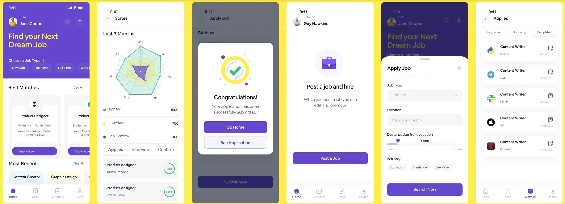
Here is an example of one of our recent UX design projects:
If you want to design a dashboard that feels clear and easy to use, connect with our team at hello@wearetenet.com or reach out to discuss your project.
Design a Smarter, More Intuitive Dashboard from our experts
Design a Smarter, More Intuitive Dashboard from our experts





















Got an idea on your mind?
We’d love to hear about your brand, your visions, current challenges, even if you’re not sure what your next step is.
Let’s talk


